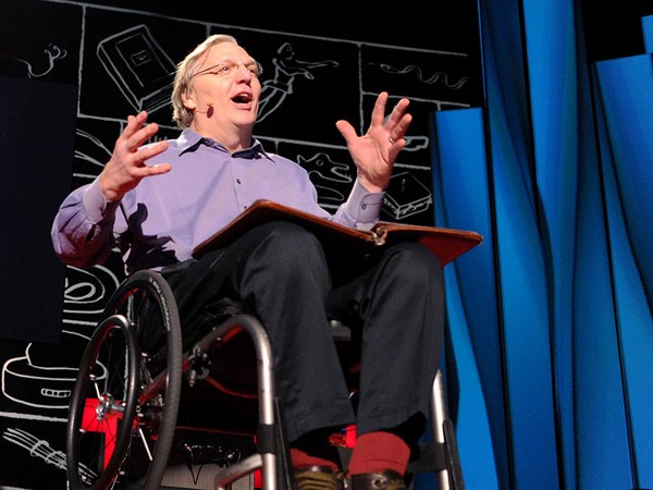
I was listed on the online biography that said I was a design missionary. That's a bit lofty; I'm really more of something like a street walker. I spend a lot of time in urban areas looking for design, and studying design in the public sector. I take about 5,000 photographs a year, and I thought that I would edit from these, and try to come up with some images that might be appropriate and interesting to you. And I used three criteria: the first was, I thought I'd talk about real design within reach, design that's free, not design not quite within reach, as we're fondly known by our competition and competitors, but stuff that you can find on the streets, stuff that was free, stuff that was available to all people, and stuff that probably contains some other important messages.
제가 온라인 바이오그래피에 디자인 선교사라 되어있더군요 그건 좀 과한 표현같구요. 그것보단 저는 그냥 행인이라고 해두죠 저는 도시에서 많은 시간 디자인을 찾아다닙니다 그리고 공공 시설의 디자인을 관찰하죠. 보통 한해에 제가 찍는 사진이 5000장인데, 그 사진들을 편집하여 몇가지를 가지고 왔습니다 여러분들께 흥미로운 것이면 좋겠네요. 3가지 기준으로 나누어 보았습니다 첫번째, 제가 말하고 싶은 디자인은 우리가 접할수있는 디자인, 항상 우리에게 자유로이 주어진 디자인 입니다, 경쟁사에 의한 우리가 쉽게 접하지 못하는 디자인이 아닌. 우리가 길거리에서 흔히 자유롭게 찾을수 있는, 누구에게나 열려있는 디자인입니다. 그리고 그것들은 중요한 메세지도 많이 담고 있지요.
I'll use these sidewalks in Rio as an example. A very common public design done in the '50s. It's got a nice kind of flowing, organic form, very consistent with the Brazilian culture -- I think good design adds to culture. Wholly inconsistent with San Francisco or New York. But I think these are my sort of information highways: I live in much more of an analog world, where pedestrian traffic and interaction and diversity exchange, and where I think the simple things under our feet have a great amount of meaning to us.
Rio의 인도를 예로 들겠습니다. 이건 50년대에 만들어진 아주 평범한 공공 디자인입니다. 흐르는 듯한 자연의 형태를 가지고있고 브라질 문화도 함께 담고 있죠. 저는 좋은 디자인은 그 문화에 공헌해야한다고 생각합니다. 이것이 샌프란 시스코나 뉴욕에서라면 전혀 조화되지 못한 디자인이 되겠죠. 이 모든것들이 정보를 담고 있다 생각합니다. 저는 아날로그 세상에 살고 있는것이 좋습니다 쏟아지는 행인들의 물결과, 접촉, 다양성이 오고가는 곳, 그리고 그곳은 우리 발아래의 단순한 것들이 우리에게 얼마나 많은 의미를 가져다 주는지 알려주죠.
How did I get started in this business? I was a ceramic designer for about 10 years, and just loved utilitarian form -- simple things that we use every day, little compositions of color and surface on form. This led me to starting a company called Design Within Reach, a company dealing with simple forms, making good designers available to us, and also selling the personalities and character of the designers as well, and it seems to have worked. A couple of years into the process, I spent a lot of time in Europe traveling around, looking for design.
제가 어떻게 이 일을 시작하게 되었냐구요? 저는 10년간 도자기 디자이너 였구요 그리고 실용적 물건들에 흠뻑 빠지게 되었습니다. 그것들은 우리가 일상에서 흔히 접하는 물건들이고 모양과 색상에 있어서도 단순한 것들이었습니다 그리고 지금의 Design Within Reach 회사를 시작하게 되었죠. 단순한 모양을 만들어 내고, 우리에게 좋은 디자이너를 배출해 내는것, 그리고 디자이너들 각자의 캐릭터와 개성을 알리는 일을 합니다 그 모든것이 잘되가고 있는것 같습니다 저는 2년간의 작업기간을, 디자인을 공부하러 유럽을 돌아다녔습니다.
And I had a bit of a wake-up call in Amsterdam: I was there going into the design stores, and mixing with our crowd of designers, and I recognized that a whole lot of stuff pretty much looked the same, and the effect of globalization has had that in our community also. We know a lot about what's going on with design around the world, and it's getting increasingly more difficult to find design that reflects a unique culture. I was walking around on the streets of Amsterdam and I recognized, you know, the big story from Amsterdam isn't what's in the design stores, it's what's out on the streets, and maybe it's self-explanatory, but a city that hasn't been taken over by modernism, that's preserved its kind of architecture and character, and where the bicycle plays an important part of the way in which people get around and where pedestrian rights are protected. And I write a newsletter that goes out every week, and I wrote an article about this, and it got such enormous response that I realized that design, that common design, that's in the public area means a lot to people, and establishes kind of a groundwork and a dialog.
그러던중 암스텔담에서 생각의 전환을 가져다준 일이 있었습니다. 저는 여러 디자인숍들을 가보았습니다 저희 디자이너들도 함께요. 많은 물건들이 많은 물건들이 매우 비슷하더군요, 세계화의 영향이 우리 커뮤너티에도 역시 자리 잡고 있었습니다. 지금 우리는 전세계적으로 디자인이 어떻게 되어가는지 더 잘 알게되니 개성을 가진 문화를 찾는것이 더 힘들어 집니다 제가 암스텔담의 길거리를 걷다가 정말 큰것은, 디자인 가게 안이 아니라 길거리 밖이라는걸 알게 되었습니다 설명이 필요없겠지만, 도시가 모더니즘에 사로잡히지 않고 그만의 건축과 개성을 유지하고 있으며 자전거가 사람들의 교통수단으로 큰 역활을 하고, 행인들의 권리가 보호되는곳이겠죠. 제가 매주 쓰는 뉴스레터가 있습니다 이 주제에 대해 기사를 썻는데 아주 많은 반응을 받았습니다 우리가 보통 알고 있는 평범한 디자인, 공공장소에서 평범히 볼수있는 그 디자인들이 사람들에게 큰 의미를 준다는걸요. 그리고 대화의 토대를 만듭니다.
I then kind of thought about the other cities in Europe where I spend a lot of time looking for design, like Basel, where Vitra is located, or in northern Italy -- all cities where there are a whole lot of bicycles, and where pedestrian areas -- and I came to the conclusion that perhaps there was something about these important design centers that dealt with bicycles and foot traffic, and I'm sure the skeptic eye would say, no, the correlation there is that there are universities and schools where people can't afford cars, but it did seem that in many of these areas pedestrian traffic was protected. You wouldn't look at this and call this a designer bike: a designer bike is made of titanium or molybdenum. But I began looking at design in a place like Amsterdam and recognized, you know, the first job of design is to serve a social purpose. And so I look at this bike as not being a designer bike, but being a very good example of design.
그래서 제가 많은 시간을 돌아다닌 유럽의 다른 도시들도 생각해 봤습니다 Vitra가 위치한 Basel이나 북 Italy와 같이 자전거가 아주 많은 도시들. 그리고 행인들이 걸어다니는 장소들... 제가 생각하기게 이들 중요한 다자인 장소에는 뭔가 특별한 것이 있었습니다 바로 이 장소들이 자전거와 사람의 통행과 밀접한 관계가 있다는 것이지요 물론 이 둘 사이가 무슨 관계가 있을까 의문하실 분들도 있을껍니다 주로 이곳은 대학교와 학교등이 있는곳으로 학생들이 차를 살수가 없기때문이기도 하지요 하지만 이 장소들은 행인들의 통행이 보호되는 곳이기도합니다 이 자전거를 보면서 디자이너의 작품이라 말하실 분은 없으실껍니다 다자이너의 작품이라면 타이테니엄와 몰리브덴으로 만들어져야 했겠지요 하지만 전 암스텔담같은 장소의 디자인을 보면서 디자인의 첫번째 할일은 사회의 목적을 서비스해야 합니다 그래서 이 자전거를 다자이너의 작품이라 하진 않겠지만 다자인의 아주 좋은 예라고 할수있죠
And since that time in Amsterdam, I spent an increasing amount of time in the cities, looking at design for common evidence of design that really isn't under so much of a designer's signature. I was in Buenos Aires very recently, and I went to see this bridge by Santiago Calatrava. He's a Spanish architect and designer. And the tourist brochures pointed me in the direction of this bridge -- I love bridges, metaphorically and symbolically and structurally -- and it was a bit of a disappointment, because of the sludge from the river was encrusted on it; it really wasn't in use. And I recognized that oftentimes design, when you're set up to see design, it can be a bit of a letdown.
암스텔담에서 저는 많은 시간 도시에서 지내며, 디자인의 공통된 증거를 찾아다녔습니다 디자이너의 signature에 영향 받지 않은 디자인들 말이죠. 제가 최근 부에노스 아이레스에서 Santiago Calatrava가 디자인한 다리를 보러갔습니다. 그는 스페인의 건축가이자 디자이너죠 여행 책자를 보고 다리를 찾아갔는데 전 비유적, 상징적, 구조상으로 다리를 좋아합니다 그런데 이 다리는 실망감이었어요 강의 침전물이 녹슬고 있고, 다리 자체도 잘 이용되지 않았습니다 제가 느낀건 디자인이란 눈으로 보기위한 디자인이 될때의 디자인은 실망감이 될수도 있다는 것입니다
But there were lots of other things going on in this area: it was a kind of construction zone; a lot of buildings were going up. And, approaching a building from a distance, you don't see too much; you get a little closer, and you arrive at a nice little composition that might remind you of a Mondrian or a Diebenkorn or something. But to me it was an example of industrial materials with a little bit of colors and animation and a nice little still life -- kind of unintended piece of design. And going a little closer, you get a different perspective. I find these little vignettes, these little accidental pieces of design, to be refreshing. They give me, I don't know, a sense of correctness in the world and some visual delight in the knowledge that the building will probably never look as good as this simple industrial scaffolding that is there to serve.
하지만 이곳에 다른 흥미있는것들이 많았어요 공사현장같았는데 빌딩들이 들어서고 있었습니다. 멀리서는 볼수없던것이 가까이 다가갈수록 작고 아름다운 구조를 만들어 내고 있었습니다 Mondrian이나 Diebenkorn의 작품을 연상시키더군요. 하지만 제게 그것은 색깔과 애니메이션을 입은 산업 자재였습니다 그리고 마치 하나의 정물화와도 같은 의도되지 않은 디자인 이었습니다. 더 가까이 가면 또다른 시각을 보게되는데요 이러한 모양을 발견했죠 이러한 의도되지 않은 디자인 작품들이 뭔가 신선하고 제게로 하여금 뭐라 할까... 세상의 정확성과 시각적 기쁨을 줍니다 마치 지금 저 빌딩이 공사현장의 발판만큼도 못해 보일수 있다는 거죠.
Down the road, there was another building, a nice visual structure: horizontal, vertical elements, little decorative lines going across, these magenta squiggles, the workmen being reduced to decorative elements, just a nice, kind of, breakup of the urban place. And, you know, that no longer exists. You've captured it for a moment, and finding this little still life's like listening to little songs or something: it gives me an enormous amount of pleasure. Antoine Predock designed a wonderful ball stadium in San Diego called Petco Park. A terrific use of local materials, but inside you could find some interior compositions. Some people go to baseball stadiums to look at games; I go and see design relationships. Just a wonderful kind of breakup of architecture, and the way that the trees form vertical elements.
길 아래로 빌딩 하나가 더 있었습니다, 시각적으로 아주 보기 좋았는데요 수평선, 수직선의 요소와 작은 라인들이 이 마젠타색의 곡선을 지나고 일꾼들 조차도 장식의 일부분이되는, 도시공간에서의 어찌보면 분리라고도 할수 있겠죠. 어쩜 더 이상 존재하지 않는것. 이런것들은 아주 잠시 우리에게 발견되죠 마치 우리가 노래를 듣는것과 마찬가지로 아주 큰 행복감을 줍니다 Antoine Predock이 San Diego에 있는 아주 멋진 야구장을 디자인했습니다 Petco Park라고 그 지역의 재료들을 아주 멋지게 사용했습니다 스테디엄 안으로 들어가면 한 인테리어 구조를 보게됩니다 대부분의 사람들이 경기를 보러 스테디엄에 가지만 저는 디자인의 관계를 보러 갑니다 건축의 구조를 적절히 분리시키고 나무들이 수직의 볼거리를 제공해줍니다
Red is a color in the landscape that is often on stop signs. It takes your attention; it has a great amount of emotion; it stares back at you the way that a figure might. Just a piece of barrier tape construction stuff in Italy. Construction site in New York: red having this kind of emotional power that's almost an equivalent with the way in which -- cuteness of puppies and such. Side street in Italy. Red drew me into this little composition, optimistic to me in the sense that maybe the public service's mailbox, door service, plumbing. It looks as if these different public services work together to create some nice little compositions. In Italy, you know, almost everything, kind of, looks good. Simple menus put on a board, achieving, kind of, the sort of balance. But I'm convinced that it's because you're walking around the streets and seeing things. Red can be comical: it can draw your attention to the poor little personality of the little fire hydrant suffering from bad civic planning in Havana. Color can animate simple blocks, simple materials: walking in New York, I'll stop.
빨강색은 자연의 색이고 보통 "멈춤"싸인에 사용되죠 빨강색은 당신의 시선을 잡고 많은 감정을 담고, 전달할수 있는 색입니다. 이탈리아 공사현장 경계 테이프처럼 뉴욕의 공사현장처럼 빨강색은 감정적 힘을 담고 있는 색입니다. 비슷한 예를 들자면 우리가 귀여운 강아지를 볼때와 마찬가지로요 이탈리아의 길 한편. 빨강색이 제 시선을 끌더군요. 긍정적으로 보자면 공공의 서비스인 편지함과, 문 서비스, 배관 이 모든 공공의 서비스들이 아주 멋진 조합을 만들어 내는듯했습니다. 물론 아시겠지만 이탈리아선 거의 모든것들이 보기가 좋습니다 보드에 붙어있는 간단한 메뉴부터 조화를 이루고 있죠 하지만 어찌보면 당신이 길을 지나고 많은것들을 볼수 있기 때문이겠죠 빨강은 웃음을 줄수도 있습니다 당신의 시선을 사로잡죠 이 작은 소화전의 캐릭터는 하바나의 열악한 도시계획으로 힘들어하고 있군요. 색은 단조로움을 살맛나게 할수도 있습니다 단순한 재료들 까지도요. 뉴욕을 걸으며 멈춰서서는
I don't always know why I take photographs of things. A nice visual composition of symmetry. Curves against sharp things. It's a comment on the way in which we deal with public seating in the city of New York. I've come across some other just, kind of, curious relationships of bollards on the street that have different interpretations, but -- these things amuse me. Sometimes a trash can -- this is just in the street in San Francisco -- a trash can that's been left there for 18 months creates a nice 45-degree angle against these other relationships, and turns a common parking spot into a nice little piece of sculpture. So, there's this sort of silent hand of design at work that I see in places that I go.
저는 이유도 없이 사진을 마구 찍어됩니다. 대칭의 아름다운 조화와 날카로움과 대비되는 곡선 뉴욕의 공공좌석에 대한 코멘트를 담은 것이기도 합니다 또 다른게 있다면 길위에 놓여진 배 기둥같은것들의 관계도 다르게 해석할수도 있다는 것입니다. 하지만 이런것들에서 재미를 느낍니다 어떤 쓰레기토은 -- 이건 샌프란시스코에 있는 한 쓰레기통인데요 -- 18개월동안 그냥 그곳에 버려져있었습니다 45도 각도를 유지하며 주위 것들과 조화를 이루고, 이것이 평범한 주차장을 하나의 작은 조각예술로 만들지 않았습니까. 디자인 작품이 있는 그 장소에는 디장인의 무언의 손이 있는것 같습니다 제가 가본 곳들은 그랬던것 같습니다.
Havana is a wonderful area. It's quite free of commercial clutter: you don't see our logos and brands and names, and therefore you're alert to things physically. And this is a great protection of a pedestrian zone, and the repurposing of some colonial cannons to do that. And Cuba needs to be far more resourceful, because of the blockades and things, but a really wonderful playground.
Havana는 아름다운 곳이죠. 상업적으로 붐비는 곳과는 다르게 우리가 보는 로고나 브랜드 상품의 이름들은 볼수가 없습니다 그래서 모든것이 몸에 더 와닿게 느껴지죠 이곳은 행인들의 보호가 잘되어 있는곳입니다 오래전 식민지의 대포가 다시 잘 씌여지고 있죠. 쿠바가 좀더 낳은 지모를 발휘해갸겠죠, 장애물이 있지만 좋은 놀이터가 될수 있습니다.
I've often wondered why Italy is really a leader in modern design. In our area, in furnishings, they're sort of way at the top. The Dutch are good also, but the Italians are good. And I came across this little street in Venice, where the communist headquarters were sharing a wall with this Catholic shrine. And I realized that, you know, Italy is a place where they can accept these different ideologies and deal with diversity and not have the problem, or they can choose to ignore them, but these -- you don't have warring factions, and I think that maybe the tolerance of the absurdity which has made Italy so innovative and so tolerant. The past and the present work quite well together in Italy also, and I think that it's recognizable there, and has an important effect on culture, because their public spaces are protected, their sidewalks are protected, and you're actually able to confront these things physically, and I think this helps people get over their fear of modernism and other such things.
전 가끔씩 왜 이탈리아가 모던디자인의 리더인지 궁금합니다 특히 가구로는 이탈리아가 세게 탑이죠 네덜란드도 잘하지만 이탈리아도 대단하죠 베니스의 작은 길거리를 자나는데요 공산주의 본부가 있는 곳이였습니다 천주교의 성골함이 있는 벽을 같이 쓰더라구요. 그래서 제가 생각하기에 이탈리아는 서로 다른 아이디어와 다양성이 어울러지면서도 문제가 생기지 않는 곳이라는 생각이 들더군요. 혹은 그냥 무시하던지 하지만 이들은 서로 부딪힐 만한 꺼리도 없습니다. 아마도 이러한 부조합도 참아질수 있는 곳이죠. 그것이 이탈리아를 혁신적이게 만들지 않았을까 생각해봅니다 관대함 까지도요. 과거와 현재가 잘 어울러 진곳도 이탈리아죠 쉽게 찾아볼수 있고, 문화에도 중요한 영향을 줍니다 그럴수 있는건, 그들의 공중 장소들이 안전하게 보호되있기 때문입니다 보행자 길 또한 보호되어 있지요. 그래서 실제로 이러한 것을 어렵지 않게 경험해 볼수 있습니다. 몸으로 부딛히면서요. 이것이 시민들로 하여금 모더니즘에대한 공포를 뛰어넘게 만들지 않았을까요
A change might be a typical street corner in San Francisco. And I use this -- this is, sort of, what I consider to be urban spam. I notice this stuff because I walk a lot, but here, private industry is really kind of making a mess of the public sector. And as I look at it, I sort of say, you know, the publications that report on problems in the urban area also contribute to it, and it's just my call to say to all of us, public policy won't change this at all; private industry has to work to take things like this seriously.
샌프란시스코의 길가 이 사진을 보여드리죠 - - 보시면 뭐랄까, 이것이 제가 생각하는 도시에 대한 공격 입니다 당연히 많이 돌아다니다보니 보게되는 것이지만 가끔은 개인 산업이 공동의 장소를 망가뜨리는거 같습니다 또 느끼는 것은, 말하자면, 뉴스나 매거진 같은 것도 한몫을 단단히 하는거죠 제가 하고 싶은 말은 사회 정책만으로는 이것들을 바꿀수가 없다는 겁니다 개인 산업들이 이러한 문제를 심각하게 생각해야 될것입니다
The extreme might be in Italy where, again, there's kind of some type of control over what's happening in the environment is very evident, even in the way that they sell and distribute periodicals. I walk to work every day or ride my scooter, and I come down and park in this little spot. And I came down one day, and all the bikes were red. Now, this is not going to impress you guys who Photoshop, and can do stuff, but this was an actual moment when I got off my bike, and I looked and I thought, it's as if all of my biker brethren had kind of gotten together and conspired to make a little statement. And it reminded me that -- to keep in the present, to look out for these kinds of things.
극단적 얘기로 이탈리아를 예로들면 관리된 무언가가 있다는거죠 주위환경에서 일어나는 모든것에 말이죠, 잡지등을 파는것에도 말입니다. 저는 걷거나 스쿠터를 타고 출근합니다 그리고 여기 작은 장소에 항상 주차하지요. 하루는 길을 겉은데 모든 자전거가 빨강색이였습니다 잠깐, 여기서 물론 포토샵 같은걸 하시는 분들께는 전혀 관심을 끌일이 아니지만 이건 정말 있었던 순간이였습니다 저 자전거에서 내려서 보며 생각하길, 마치 이건 내 모든 자전거 형제들이 같이 모여 음모라도 꾸미고 있는것 같았다니까요. 제가 느낀건 제가 현실에 존재함을 이러한 것을 찾아냄으로써 일깨워 주었습니다.
It gave me possibilities for wonder -- if maybe it's a yellow day in San Francisco, and we could all agree, and create some installations. But it also reminded me of the power of pattern and repetition to make an effect in our mind. And I don't know if there's a stronger kind of effect than pattern and the way it unites kind of disparate elements. I was at the art show in Miami in December, and spent a couple of hours looking at fine art, and amazed at the prices of art and how expensive it is, but having a great time looking at it. And I came outside, and the valets for this car service had created, you know, quite a nice little collage of these car keys, and my closest equivalent were a group of prayer tags that I had seen in Tokyo. And I thought that if pattern can unite these disparate elements, it can do just about anything.
놀라움의 가능성도 주었습니다 샌프란 시스코에 노랑색 날이 있을수 있는것과 같이, 우리가 원한다면 어떠한 설치미술을 만들수도 있지 않겠습니까. 또하나 제게 생각나게한 힘은 패턴과 반복이 우리에게 영향을 준다는 것입니다. 패턴처럼 강한 영향을 남기는 것이 있을까요, 서로다른 요소들을 조합할수 있는 힘말이죠. 12월달 마이에미에 있었던 art show를 봤습니다 두어시간 미술감상을 하면서 미술 작품으 값에 놀랐습니다. 물론 감상하는것에 푹 빠져있었지만요 나오면서 차 valet 주차하는곳에서 이렇게 흥미로운 collage를 발견했는데, 모두 차키들이었습니다. 기도자들의 기도문을 끼워둔것과도 비슷하죠 이건 토쿄에서 찍은 것이구요 그래서 전 생각하길 만약 패턴이 이렇게 서로다른 요소들을 융합할수 있다면 그건 정말 그 무엇도 할수 있는게 아닌가 하구요
I don't have very many shots of people, because they kind of get in the way of studying pure form. I was in a small restaurant in Spain, having lunch -- one of those nice days where you had the place kind of to yourself, and you have a glass of wine, and enjoying the local area and the culture and the food and the quiet, and feeling very lucky, and a bus load of tourists arrived, emptied out, filled up the restaurant. In a very short period of time, completely changed the atmosphere and character with loud voices and large bodies and such, and we had to get up and leave; it was just that uncomfortable. And at that moment, the sun came out, and through this perforated screen, a pattern was cast over these bodies and they kind of faded into the rear, and we left the restaurant kind of feeling O.K. about stuff.
제가 사람은 많이 찍지 않습니다. 왜냐면 순수한 형태를 공부하기에 사람들은 방해가 됩니다. 스패인의 작은 레스토랑에서 점심을 먹을때 였던거 같군요 그런 좋은 날 있죠... 나만을 위한 공간같이 느껴지는 그런곳 와인을 마시며 그곳 정서를 느끼고 문화를 느끼고 음식을 경험해보고 조용한 가운데, 아~ 내가 굉장히 운이 좋다고 느낄때 관광버스 하나가 도착했습니다 그 많은 관광객들이 차에서 내려 레스토랑에 한가득 들어왔습니다. 아주 짧은 시간안에 그곳의 모든 분위기가 시끄러운 목소리와 큰 몸들이 얽혀있는 곳이 되어버렸습니다. 그래서 그만 나가려고 했습니다. 그만큼 불편할 정도였어요. 그때, 떠나려는 그 순간, 해가 다시 나타나고 구멍뚫린 스크린 사이로 패턴들이 사람들위로 듸리워졌습니다 그중은 뒤쪽으로 흩어지기도 하구요. 그리고 난뒤 우리는 레스토랑을 나름데로 기분좋게 나갈수 있었죠
And I do think pattern has the capability of eradicating some of the most evil forces of society, such as bad form in restaurants, but quite seriously, it was a statement to me that one thing that you do, sort of, see is the aggressive nature of the industrial world has produced -- kind of, large masses of things, and when you -- in monoculture, and I think the preservation of diversity in culture is something that's important to us.
제 생각에 패턴은 사회의 정화의 가치를 가지고 있는것 같습니다. 사회의 나쁜 요소들도 뽑아내 버리지 않을까요 레스토랑안의 아주 미운 모양들처럼 말이죠 하지만, 심각하게 그것이 제게 준 메세지가 있다면 우리가 주의할것은, 우리가 보는것이 우리가 단일 문화에 있다면 산업세계가 만들어낸 그런 부정적 모습들 밖에는 볼수 없음을 말해줍니다 그래서 문화의 다양성의 보호가 우리에게 정말 중요한 화두라는것입니다
The last shots that I have deal with -- coming back to this theme of sidewalks, and I wanted to say something here about -- I'm, kind of, optimistic, you know. Post-Second World War, the influence of the automobile has really been devastating in a lot of our cities. A lot of urban areas have been converted into parking lots in a sort of indiscriminate use. A lot of the planning departments became subordinated to the transportation department. It's as easy to rag on cars as it is on Wal-Mart; I'm not going to do that. But they're real examples in urbanization and the change that's occurred in the last number of years, and the heightened sensitivity to the importance of our urban environments as cultural centers. I think that they are, that the statements that we make in this public sector are our contributions to a larger whole.
마지막으로 보여드릴 사진은 보도의 주제로 다시 돌아오겠습니다. 제가 말하려는것은 우선은 제가 긍정적인 사람이라는것 알아주세요. 2차 세계대전 이후 자동차의 영향은 많은 도시들을 황폐시켰습니다. 많은 도시의 땅이 주차장으로 바뀌고 마구잡이로 이용되었습니다. 많은 도시사업 부서가 교통부서의 아래 부서로 들어가면서, 차를 사용하는일이 Wal Mart를 가는 일만큼이나 쉬워졌습니다 전 그렇게 하지 않을것이지만 그것들은 도시화의 실제 예들입니다 지난 세월동안의 변화와 우리 도시 환경이 문화의 센터로서의 중요성으로 부곽되고 있습니다 우리가 만드는 공공 시설에 대한 생각이 공헌이 될것입니다 더 크게까지요.
Cities are the place where we're most likely to encounter diversity and to mix with other people. We go there for stimulation in art and all those other things. But I think people have recognized the sanctity of our urban areas. A place like Chicago has really reached kind of a level of international stature. The U.S. is actually becoming a bit of a leader in kind of enlightened urban planning and renewal, and I want to single out a place like Chicago, where I look at some guy like Mayor Daley as a bit of a design hero for being able to work through the political processes and all that to improve an area. You would expect a city like this to have upgraded flower boxes on Michigan Avenue where wealthy people shop, but if you actually go along the street you find the flower boxes change from street to street: there's actual diversity in the plants. And the idea that a city group can maintain different types of foliage is really quite exceptional.
도시는 우리가 여러가지 다양성을 경험하게 되는 곳입니다 다른 사람과 함께 어울리게되는 곳이죠. 예술적 자극과 그 외 많은것들을 위한 곳입니다 사람들이 우리 도시의 존엄성을 인지하고 있다고 생각합니다. 시카고같은 곳은 국외적으로 많은 성장을 이루었습니다 미국이 도시 사업과 재활에 리더로 거듭나고 있는것 같습니다 시카고를 특별한 도시로 나누고 싶은데요, Mayor Daley를 다지인 영웅이라 말하고 싶습니다. 그는 정치적 과정을 거쳐서 지역발전에 많은 힘을 기울였습니다. 이런 도시를 지날때면 사람들은 좀더 업그레이드된 꽃화분등을 기대할지 모르죠 특히나 부유한 사람들이 쇼핑하는 Michigan Ave같은곳에 말이죠 하지만 실제로 가보면 꽃화분은 거리마다 모두 다르고 그 종류또한 모두 다양합니다 하나의 도시 그룹이 서로다른 종류를 보전할수 있다는것이 대단하다 봅니다
There are common elements of this that you'll see throughout Chicago, and then there are your big-D design statements: the Pritzker Pavilion done by Frank Gehry. My measure of this as being an important bit of design is not so much the way that it looks, but the fact that it performs a very important social function. There are a lot of free concerts, for example, that go on in this area; it has a phenomenal acoustic system. But the commitment that the city has made to the public area is significant, and almost an international model. I work on the mayor's council in San Francisco, on the International Design Council for Mayors, and Chicago is looked at as the pinnacle, and I really would like to salute Mayor Daley and the folks there. I thought that I should include at least one shot of technology for you guys. This is also in Millennium Park in Chicago, where the Spanish artist-designer Plensa has created, kind of, a digital readout in this park that reflects back the characters and personalities of the people in this area. And it's a welcoming area, I think, inclusive of diversity, reflective of diversity, and I think this marriage of both technology and art in the public sector is an area where the U.S. can really take a leadership role, and Chicago is one example.
시카고에서 볼수있는 이것과 당신의 big-D design 메세지 프랭크 개리가 완성한 Pritzker Pavilion에는 공통된 요소가 있습니다 제가 가늠하는 디자인의 중요성은 겉모습에 있는것이 아닙니다 대신 그것이 사회서 어떠한 역활을 해내는가가 중요한 것이지요 Pritzker Pavilion에서는 정말 많은 콘서트가 있습니다, 예를들어 가보면 이곳은 엄청만 소리 시스템이 있거든요. 도시가 공공에게 주는 역활이 중요하고 국외적으로도 좋은 본보기가 되지요 전 San Francisco의 고문으로 있는데요 Mayors의 국제 디자인 고문입니다. 시카고가 으뜸으로 뽑힙니다 그래서 저는 Mayor Daley와 그의 사람들을 존경합니다 하나 더 보여들일것이 있는데요 테크날러지를 담은 사진으로요. 이건 시카고에 있는 밀레니엄 공원입니다 스패인 예술가 Plensa가 만들었죠 디지털 판독기 같은 이것은 이곳에 사는 사람들의 캐릭터와 다양성을 보여주는 작품입니다 언제나 환영의 장소이죠, 제 생각엔, 다양성을 담고있고, 그 다양성을 잘 표현하는 곳이라 생각합니다. 이러한 테크날러지와 예술의 결정체가 있는 이곳, 미국은 리더쉽의 역활을 잘 하고 있다는것을 보여줍니다 시카고는 그것의 한 예이구요
Thank you very much.
감사합니다