Those of us who believe in heaven have some sort of idea of what heaven would be. And in my idea, heaven is satisfied curiosity. I think of heaven as a really comfortable cloud where I can just lie down with my belly down, like I was watching TV when I was a child, and my elbows up. And I can basically look everywhere I want, see every movie I've always wanted to see. And in the same kind of trance that you can feel sometimes in the subway in New York when you're reading, there's something really soothing and easy.
Well, the funny thing is that I already have that kind of life, in a way, because I discovered ... it took me a while to understand it, but when I discovered around 24 years of age that I was much more comfortable with objects than with people, I finally decided to really embrace this passion. And I basically live my life in sort of a trance, and I look around and everything I see is just the beginning of a long story.
Just to give you an example: this is the exhibition, Humble Masterpieces, as it was at MoMA in 2004. We were in Queens, we were building the big, big, big, big building in Midtown, so we were in the small, small, small boondocks. That was one of the funnest moments of my career.
But it's not only that. The typeface -- the typeface is Helvetica; it's its 50th anniversary this year. And so I start thinking -- Max Miedinger and all those Swiss designers together, trying to outdo Akzidenz-Grotesk, and come up with a new sans-serif typeface -- and the movie starts playing in my head already. And of course, you can imagine, with Humble Masterpieces it was the same thing multiplied by a hundred. And I do hope, by the way, that the real goal of the exhibition is going to have the same effect on you.
The exhibition was meant to be a way to have children think of doing ... you know when they do homeworks at home? Instead of having a tray with two peas, I was hoping that they would go into the kitchen cabinet or the mother's handbag and do their museum-quality design collection on a tray.
So, everybody's always suggesting new humble masterpieces, and at MoMA we put out some books just for people to suggest their own humble masterpieces. And when you do that, usually you get 80 percent porn and 20 percent real suggestions, and instead it was all -- almost -- all good suggestions.
And a lot of nationalism came in. For instance, I didn't know that the Spaniards invented the mop, but they were very proud so every Spaniard said "la frego." And Italians did the pizza. And I wanted to show you, also, the suggestions from Kentucky are pretty good -- they had moonshine, laundry detergents and liquid nails.
And I keep it going, and I just got, (Laughter) also, this suggestion from Milan: it's our traffic divider, which we call "panettone," and it's painted; it's these beautiful concrete things that you use around Milan to define all the lanes of traffic. So, think of your own, send them on if you want to -- they're always welcome.
But an exhibition like that made me understand even more what I've been thinking of for 13 years ever since I got to MoMA. I'm Italian. In Italy, design is normal. Different parts of the world have a knack for different things. I was just recently in Argentina and in Uruguay, and the default way of building homes in the country is a beautiful modernism that you don't see elsewhere, but the contemporary art was terrible.
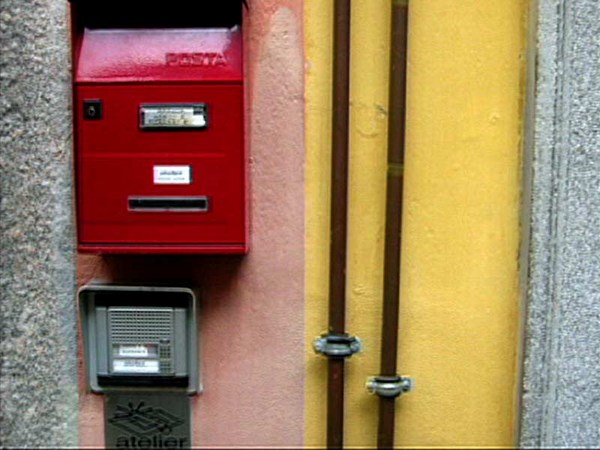
In Italy, in Milan especially, contemporary art really doesn't have that much of a place. But design -- oh, my God. What you find at the store at the corner, without going to any kind of fancy store, is the kind of refined design that makes everybody think that we are all so sophisticated. It's just what you find at the store.
And New York has another kind of knack for contemporary art. I'm always amazed -- three-year-olds know who Richard Serra is and take you to the galleries. But design, for some reason, is still misunderstood for decoration. It's really interesting: what many people think when I say the word "design" is they think of this kind of overdesigned -- in this case, it's overdesigned on purpose, but -- decoration, interior decoration. They think of somebody choosing fabrics.
Design can be that, of course, but it can also be this. It can be a school of design in Jerusalem that tries to find a better way to design gas masks for people, because, as you know, Israel deploys one gas mask per person including babies. So, what these designers do is they find a way to lower the neckline, so that instead of being completely strangled, a teenager can also sip a Coke.
They tried to make a toddler's gas mask in such a way that the toddler can be held by the parent because proximity of the body is so important. And then they make a little tent for the baby. However cruel, however ruthless you can think this is it's a great design, and it is miles away from the fancy furniture, but still, it's part of my same field of passion.
What I've been doing at MoMA since the beginning is to try to harness the power of MoMA because it's great to work there. You really have power in that people usually tend to know about your exhibition or see the exhibitions, and that is power because in a design museum I wouldn't have as many visitors. I'm very well aware that 80 percent of my public is there to see Picasso and Matisse, and then they stumble upon my show and I keep them there.
But what I've been trying to do is something that the curators at MoMA in my department have been doing ever since the museum was founded in 1929, which is to try and see what's going on in the world and try to use that authority in order to make things better. There have been many episodes, and actually Eames Demetrius may be here in the audience, but in two instances, his great-grandfather, grandfather -- I'm always a little perplexed about the relation, exactly -- Charles Eames the first time and then Charles and Ray Eames the second time were involved in two competitions: one in 1940, it was about organic furniture, and the second one in 1948 was low-cost furniture for the GIs coming back from the war that then sparked a whole line of furniture. And then there was good design for very low price. There were a lot of programs in architecture and design that were about pointing people in the direction of a better design for a better life.
So, I started out in '95 with this exhibition that was called Mutant Materials in Contemporary Design. It was about a new phase, in my opinion, in the world of design in that materials could be customized by the designers themselves. And that put me in touch with such diverse design examples as the aerogels from the Lawrence Livermore Lab in California; at that time, they were beginning to be brought into the civilian market. And at the same time, the gorgeous work of Takeshi Ishiguro, who did these beautiful salt-and-pepper containers that are made of rice dough. So you see, the range is really quite diverse.
And then, for instance, this other exhibition that was entitled Workspheres in 2001, where I asked different designers to come up with ideas for the new type of work styles that were happening in the world at that time. And you see IDEO there. It was beautiful -- it was called Personal Skies. The idea was that if you had a cubicle, you could project a sky on top of your head and have your own "Cielo in Una Stanza" -- a sky in a room -- it's a very famous Italian song.
And other examples: this was Marti Guixe about working on the go, and Hella Jongerius, my favorite, about how to work at home. And this lets me introduce a very important idea about design: designers are the biggest synthesizers in the world. What they do best is make a synthesis of human needs, current conditions in economy, in materials, in sustainability issues, and then what they do at the end -- if they are good -- is much more than the sum of its parts.
Hella Jongerius is a person that is able to make a synthesis that is really quite amazing and also quite hilarious. The idea behind her work was that at that time, everybody was saying you have to really divide your life. Instead, she said, "No, no. Work and leisure can be together." Yeah, that's particularly gorgeous -- it's the TV dinner of 2001.
There have been many other exhibitions in the meantime, but I don't want to focus on my shows. I would like, instead, to talk about how great some designers are. I've always had a hard time with the word "maverick." I came to the United States 13 years ago, and to this day I have to ask, "What does that mean?" So, this morning I went to see on the dictionary and it said that there was this gentleman that was not branding its cattle. Therefore, he was not following everybody's lead, and therefore, he was a maverick. So, designers do need to be mavericks, because the best way to design a successful object -- and also an object that we were missing before -- is to pretend that either it never existed or that people will be able to have a new behavior with it.
So, Safe is the last exhibition that I did at MoMA and it ended at the beginning of last year. It was about design that deals with safety and deals with protection. It's a long story because it started before 2001 and it was called Emergency. And then when 9/11 happened, I had a shock and I canceled the exhibition until, slowly but surely, it came back -- as a half-full glass instead of half-empty -- and it was about protection and safety.
But it ranged from such items as a complete de-mining equipment to these kind of water-sterilizing straws, so it was really wide-ranging. It also had ... you know, Cameron and I worked a little bit together, and some of the entries that you see in his website were actually in the exhibition. But what is interesting is that we don't need to talk about design and art anymore; design uses whatever tools it has at its disposal in order to make a point. It's a sense of economy and a sense, also, of humor.
This is a beautiful project by Ralph Borland, who's South African. It's a suit for civil disobedience. The idea is that when you have a riot or a protest and the police comes towards you, you're wearing this thing -- it's like a big heart and it has a loudspeaker over your heart so your heartbeat is amplified -- and the police is reminded; it's like having a flower in front of the rifle. And also, you can imagine, a whole group of people with the same suit will have this mounting collective heartbeat that will be scary to the police.
So, designers sometimes don't do things that are immediately functional, but they're functional to our understanding of issues. Tony Dunne and Fiona Raby did this series of objects that are about our anguish and our paranoia, like this hideaway furniture that's made in the same wood as your floor so it disappears completely and you can hide away; or even better, the huggable atomic mushroom, which got me an article on the Bulletin of Atomic Scientists of the United States -- I don't think it ever happened before at MoMA; or this Faraday Chair that is supposed to protect you from radiations.
But the interesting thing in the exhibition is the discovery that the ultimate shelter is your sense of self, and there are quite a few designers that are working on this particular topic. This is Cindy van den Bremen, who is a Dutch designer that's done this series of Capsters. They are athletic gear for Muslim women that enable them to ski, play tennis, do whatever they want to do without having to uncap themselves.
And sometimes by doing this kind of research, you encounter such beautiful ideas of design. Twan Verdonck is really young, I think he's 27, and working together with some psychologist he did a series of toys that are for sensorial stimulation for children that have psychological impairments. They're quite beautiful. They range from this fluffy toy that is about hugging you -- because autistic children like to be hugged tight, so it has a spring inside -- all the way to this doll with a mirror so the child can see him or herself in the mirror and regain a sense of self.
Design really looks upon the whole world and it considers the world in all of its different ranges. I was recently at a conference on luxury organized by the Herald Tribune in Istanbul. And it was really interesting because I was the last speaker and before me there were people that were really talking about luxury, and I didn't want to be a party pooper but at the same time I felt that I had to kind of bring back the discourse to reality.
And the truth is that there are very different kinds of luxury, and there's luxury that is relative for people that don't have that much. I want to make this point by showing you two examples of design coming from a sense of economy -- very, very clear limits. This is Cuba, and this is the recycling of a squeaky toy as a bicycle bell, and this is a raincoat that is made out of rice sacks. So they're quite beautiful, but they're beautiful because they're so smart and economical.
And here is the work of two brothers from Sao Paulo, Fernando and Humberto Campana, who got inspired by the poverty and smartness that they saw around them to do pieces of furniture that now are selling for an enormous amount of money. But that's because of the kind of strangeness of the market itself.
So really, design takes everything into account, and the interesting thing is that as the technology advances, as we become more and more wireless and impalpable, designers, instead, want us to be hands-on. Sometimes hammer-on. This is a whole series of furniture that wants to engage you physically. Even this chair that you have to open up and then sit on so that it takes your imprint, all the way to this beautiful series of objects that are considered design by Ana Mir in Barcelona. From this kind of bijou made with human hair to these chocolate nipples to these intra-toe candies that your lover is supposed to suck from your toes. (Laughter)
It's quite beautiful because somehow, this is a gorgeous moment for design. Many years ago I heard a mathematician from Vienna, whose name was Marchetti, explain how the innovation in the military industry -- therefore, secret innovation -- and the innovation in the civilian society are two sinusoids that are kind of opposed. And that makes sense. In moments of war there's great technological innovation, and in the world you have to do without -- well, during the Second World War, you had to do without steel, you had to do without aluminum. And then as peace comes, all of these technologies get all of a sudden available for the civilian market. Many of you might know that the Potato Chip Chair by Charles and Ray Eames comes exactly from that kind of instance: fiberglass was available for civilian use all of a sudden.
I think that this is a strange moment. The rhythm of the sinusoids has changed tremendously, just like the rhythm of our life in the past 25 years, so I'm not sure anymore what the wavelength is. But it surely is a very important moment for design, because not only is the technology proceeding, not only is computing technology making open-source possible also in the world of design, but also the idea of sustainability -- which is not only sustainability from the viewpoint of CO2 emissions and footprint, but also sustainability of human interrelationships -- is very much part of the work of so many designers. And that's why designers, more and more, are working on behaviors rather than on objects. Especially the good ones, not all of them.
I wanted to show you, for instance, the work of Mathieu Lehanneur, which is quite fantastic. He's another young designer from France who's working -- and at this point he's working, also, with pharmaceutical companies -- on new ways to engage patients, especially children, in taking their medicines with constancy and with certainty.
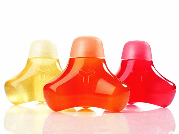
For instance, this is a beautiful container for asthma medicine that kind of inflates itself when it's time for you to take the medicine, so the child has to go -- pffff! -- to release and relieve the container itself. And this other medicine is something that you can draw on your skin, so intradermal delivery enables you to joyfully be involved in this particular kind of delivery. Similarly, there's the work of people like Marti Guixe that tries to involve you in a way that is really about making everything pass through your mouth so that you learn from your mistakes or from your taste, orally.
The next show that I'm going to work on -- and I've been bugging a lot of you about this here -- is about the relationship between design and science. I'm trying to find not the metaphors, but, rather, the points in common -- the common gripes, the common issues, the common preoccupations -- and I think that it will enable us to go a little further in this idea of design as an instruction, as a direction rather than a prescription of form.
And I am hoping that many of you will respond to this. I've sent an email already to quite a few of you. But design and science and the possibility of visualizing different scales, and therefore, really work at the scale of the very small to make it very big and very meaningful. Thank you. (Applause)
