To be new at TED -- it's like being the last high-school virgin. (Laughter) You know that all of the cool people are -- they're doing it. And you're on the outside, you're at home. You're like the Raspyni Brothers, where you've got your balls in cold water. And -- (Laughter) -- you just play with your fingers all day. And then you get invited. And you're on the inside, and it's everything you hoped it would be. It's exciting and there's music playing all of the time and then suddenly it's over. And it's only taken five minutes. And you want to go back and do it again. But I really appreciate being here. And thank you, Chris, and also, thank you, Deborah Patton, for making this possible.
So anyway, today we'll talk about architecture a little bit, within the subject of creation and optimism. And if you put creation and optimism together, you've got two choices that you can talk about. You can talk about creationism -- which I think wouldn't go down well with this audience, at least not from a view where you were a proponent of it -- or you can talk about optimisations, spelled the British way, with an S, instead of a Z. And I think that's what I'd like to talk about today. But any kind of conversation about architecture -- which is, in fact, what you were just talking about, what was going on here, setting up TED, small-scale architecture -- at the present time can't really happen without a conversation about this, the World Trade Center, and what's been going on there, what it means to us.
Because if architecture is what I believe it to be, which is the built form of our cultural ambitions, what do you do when presented with an opportunity to rectify a situation that represents somebody else's cultural ambitions relative to us? And our own opportunity to make something new there? This has been a really galvanizing issue for a long time. I think that the World Trade Center in, rather an unfortunate way, brought architecture into focus in a way that I don't think people had thought of in a long time, and made it a subject for common conversation. I don't remember, in my 20-year career of practicing and writing about architecture, a time when five people sat me down at a table and asked me very serious questions about zoning, fire exiting, safety concerns and whether carpet burns. These are just not things we talked about very often. And yet, now, it's talked about all the time. At the point where you can weaponize your buildings, you have to suddenly think about architecture in a very different way. And so now we're going to think about architecture in a very different way, we're going to think about it like this.
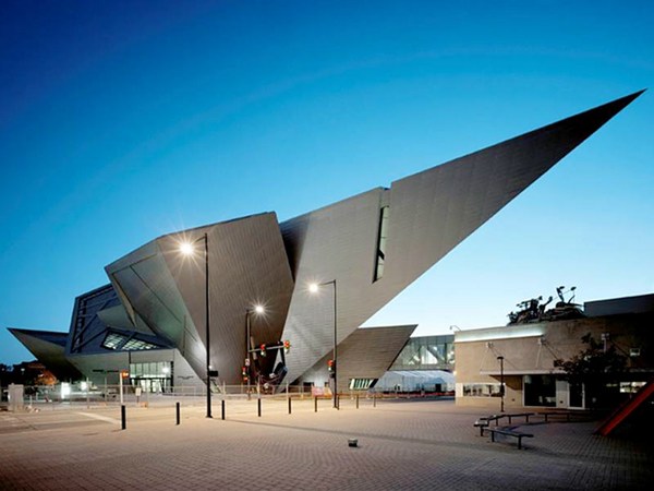
How many of you saw USA Today, today? There it is. Looks like that. There's the World Trade Center site, on the front cover. They've made a selection. They've chosen a project by Daniel Libeskind, the enfant terrible of the moment of architecture. Child-prodigy piano player, he started on the squeezebox, and moved to a little more serious issue, a bigger instrument, and now to an even larger instrument, upon which to work his particular brand of deconstructivist magic, as you see here. He was one of six people who were invited to participate in this competition, after six previous firms struck out with things that were so stupid and banal that even the city of New York was forced to go, "Oh, I'm really sorry, we screwed up." Right. Can we do this again from the top, except use some people with a vague hint of talent, instead of just six utter boobs like we brought in last time, real estate hacks of the kind who usually plan our cities. Let's bring in some real architects for a change. And so we got this, or we had a choice of that. Oh, stop clapping.
(Laughter)
It's too late. That is gone. This was a scheme by a team called THINK, a New York-based team, and then there was that one, which was the Libeskind scheme. This one, this is going to be the new World Trade Center: a giant hole in the ground with big buildings falling into it. Now, I don't know what you think, but I think this is a pretty stupid decision, because what you've done is just made a permanent memorial to destruction by making it look like the destruction is going to continue forever. But that's what we're going to do. But I want you to think about these things in terms of a kind of ongoing struggle that American architecture represents, and that these two things talk about very specifically. And that is the wild divergence in how we choose our architects, in trying to decide whether we want architecture from the kind of technocratic solution to everything -- that there is a large, technical answer that can solve all problems, be they social, be they physical, be they chemical -- or something that's more of a romantic solution.
Now, I don't mean romantic as in, this is a nice place to take someone on a date. I mean romantic in the sense of, there are things larger and grander than us. So, in the American tradition, the difference between the technocratic and the romantic, would be the difference between Thomas Jefferson's Cartesian grids spreading across the United States, that gives us basically the whole shape of every western state in the United States, as a really, truly, technocratic solution, a bowing to the -- in Jefferson's time -- current, popular philosophy of rationalism. Or the way we went to describe that later: manifest destiny. Now, which would you rather be? A grid, or manifest destiny? Manifest destiny.
(Laughter)
It's a big deal. It sounds big, it sounds important, it sounds solid. It sounds American. Ballsy, serious, male. And that kind of fight has gone on back and forth in architecture all the time. I mean, it goes on in our private lives, too, every single day. We all want to go out and buy an Audi TT, don't we? Everyone here must own one, or at least they craved one the moment they saw one. And then they hopped in it, turned the little electronic key, rather than the real key, zipped home on their new superhighway, and drove straight into a garage that looks like a Tudor castle.
(Laughter)
Why? Why? Why do you want to do that? Why do we all want to do that? I even owned a Tudor thing once myself.
(Laughter)
It's in our nature to go ricocheting back and forth between this technocratic solution and a larger, sort of more romantic image of where we are. So we're going to go straight into this. Can I have the lights off for a moment? I'm going to talk about two architects very, very briefly that represent the current split, architecturally, between these two traditions of a technocratic or technological solution and a romantic solution. And these are two of the top architectural practices in the United States today. One very young, one a little more mature. This is the work of a firm called SHoP, and what you're seeing here, is their isometric drawings of what will be a large-scale camera obscura in a public park. Does everybody know what a camera obscura is? Yeah, it's one of those giant camera lenses that takes a picture of the outside world -- it's sort of a little movie, without any moving parts -- and projects it on a page, and you can see the world outside you as you walk around it.
This is just the outline of it, and you can see, does it look like a regular building? No. It's actually non-orthogonal: it's not up and down, square, rectangular, anything like that, that you'd see in a normal shape of a building. The computer revolution, the technocratic, technological revolution, has allowed us to jettison normal-shaped buildings, traditionally shaped buildings, in favor of non-orthogonal buildings such as this. What's interesting about it is not the shape. What's interesting about it is how it's made. How it's made. A brand-new way to put buildings together, something called mass customization. No, it is not an oxymoron. What makes the building expensive, in the traditional sense, is making individual parts custom, that you can't do over and over again. That's why we all live in developer houses. They all want to save money by building the same thing 500 times. That's because it's cheaper.
Mass customization works by an architect feeding into a computer, a program that says, manufacture these parts. The computer then talks to a machine -- a computer-operated machine, a cad-cam machine -- that can make a zillion different changes, at a moment's notice, because the computer is just a machine. It doesn't care. It's manufacturing the parts. It doesn't see any excess cost. It doesn't spend any extra time. It's not a laborer -- it's simply an electronic lathe, so the parts can all be cut at the same time. Meanwhile, instead of sending someone working drawings, which are those huge sets of blueprints that you've seen your whole life, what the architect can do is send a set of assembly instructions, like you used to get when you were a child, when you bought little models that said, "Bolt A to B, and C to D." And so what the builder will get is every single individual part that has been custom manufactured off-site and delivered on a truck to the site, to that builder, and a set of these instruction manuals. Just simple "Bolt A to B" and they will be able to put them together. Here's the little drawing that tells them how that works -- and that's what will happen in the end.
You're underneath it, looking up into the lens of the camera obscura. Lest you think this is all fiction, lest you think this is all fantasy, or romance, these same architects were asked to produce something for the central courtyard of PS1, which is a museum in Brooklyn, New York, as part of their young architects summer series. And they said, well, it's summer, what do you do? In the summer, you go to the beach. And when you go to the beach, what do you get? You get sand dunes. So let's make architectural sand dunes and a beach cabana. So they went out and they modeled a computer model of a sand dune. They took photographs, they fed the photographs into their computer program, and that computer program shaped a sand dune and then took that sand dune shape and turned it into -- at their instructions, using standard software with slight modifications -- a set of instructions for pieces of wood. And those are the pieces of wood. Those are the instructions. These are the pieces, and here's a little of that blown up.
What you can see is there's about six different colors, and each color represents a type of wood to be cut, a piece of wood to be cut. All of which were delivered by flat bed, on a truck, and hand assembled in 48 hours by a team of eight people, only one of whom had ever seen the plans before. Only one of whom had ever seen the plans before. And here comes dune-scape, coming up out of the courtyard, and there it is fully built. There are only 16 different pieces of wood, only 16 different assembly parts here. Looks like a beautiful piano sounding board on the inside. It has its own built-in swimming pool, very, very cool. It's a great place for parties -- it was, it was only up for six weeks. It's got little dressing rooms and cabanas, where lots of interesting things went on, all summer long.
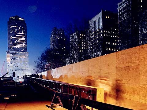
Now, lest you think that this is only for the light at heart, or just temporary installations, this is the same firm working at the World Trade Center, replacing the bridge that used to go across West Street, that very important pedestrian connection between the city of New York and the redevelopment of the West Side. They were asked to design, replace that bridge in six weeks, building it, including all of the parts, manufactured. And they were able to do it. That was their design, using that same computer modeling system and only five or six really different kinds of parts, a couple of struts, like this, some exterior cladding material and a very simple framing system that was all manufactured off-site and delivered by truck. They were able to create that. They were able to create something wonderful. They're now building a 16-story building on the side of New York, using the same technology. Here we're going to walk across the bridge at night. It's self-lit, you don't need any overhead lighting, so the neighbors don't complain about metal-halide lighting in their face. Here it is going across. And there, down the other side, and you get the same kind of grandeur.
Now, let me show you, quickly, the opposite, if I may. Woo, pretty, huh. This is the other side of the coin. This is the work of David Rockwell from New York City, whose work you can see out here today. The current king of the romantics, who approaches his work in a very different fashion. It's not to create a technological solution, it's to seduce you into something that you can do, into something that will please you, something that will lift your spirits, something that will make you feel as if are in another world -- such as his Nobu restaurant in New York, which is supposed to take you from the clutter of New York City to the simplicity of Japan and the elegance of Japanese tradition. "When it's all said and done, it's got to look like seaweed," said the owner. Or his restaurant, Pod, in Philadelphia, Pennsylvania.
I want you to know the room you're looking at is stark white. Every single surface of this restaurant is white. The reason it has so much color is that it changes using lighting. It's all about sensuality. It's all about transforming. Watch this -- I'm not touching any buttons, ladies and gentlemen. This is happening by itself. It transforms through the magic of lighting. It's all about sensuality. It's all about touch. Rosa Mexicano restaurant, where he transports us to the shores of Acapulco, up on the Upper West Side, with this wall of cliff divers who -- there you go, like that. Let's see it one more time. Okay, just to make sure that you've enjoyed it. And finally, it's about comfort, it's about making you feel good in places that you wouldn't have felt good before. It's about bringing nature to the inside.
In the Guardian Tower of New York, converted to a W Union Square -- I'm sorry I'm rushing -- where we had to bring in the best horticulturists in the world to make sure that the interior of this dragged the garden space of the court garden of the Union Square into the building itself. It's about stimulation. This is a wine-buying experience simplified by color and taste. Fizzy, fresh, soft, luscious, juicy, smooth, big and sweet wines, all explained to you by color and texture on the wall. And finally, it's about entertainment, as in his headquarters for the Cirque du Soleil, Orlando, Florida, where you're asked to enter the Greek theater, look under the tent and join the magic world of Cirque du Soleil. And I think I'll probably leave it at that. Thank you very much.
