Type is something we consume in enormous quantities. In much of the world, it's completely inescapable. But few consumers are concerned to know where a particular typeface came from or when or who designed it, if, indeed, there was any human agency involved in its creation, if it didn't just sort of materialize out of the software ether.
Pismo je nešto što konzumiramo u ogromnim količinama. U većem delu sveta je potpuno neizbežno. Ali malo korisnika se brine o tome odakle je pojedino pismo došlo, ili kada ili ko ga je dizajnirao, ako je u njegovom stvaranju zaista bio uključen ljudski faktor, ako se nije samo materijalizovalo iz etra softvera.
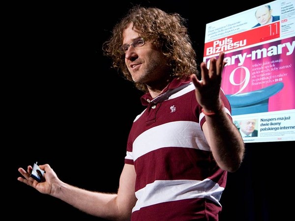
But I do have to be concerned with those things. It's my job. I'm one of the tiny handful of people who gets badly bent out of shape by the bad spacing of the T and the E that you see there. I've got to take that slide off. I can't stand it. Nor can Chris. There. Good.
Ali ja moram da brinem oko ovih stvari. To mi je posao. Jedan sam od šačice ljudi koji se strašno iznervira lošim razmakom između T i E koji ovde vidite. Moram da sklonim ovaj slajd. Ne mogu da ga podnesem. A ni Kris. Tako. Dobro.
So my talk is about the connection between technology and design of type. The technology has changed a number of times since I started work: photo, digital, desktop, screen, web. I've had to survive those changes and try to understand their implications for what I do for design. This slide is about the effect of tools on form. The two letters, the two K's, the one on your left, my right, is modern, made on a computer. All straight lines are dead straight. The curves have that kind of mathematical smoothness that the Bézier formula imposes. On the right, ancient Gothic, cut in the resistant material of steel by hand. None of the straight lines are actually straight. The curves are kind of subtle. It has that spark of life from the human hand that the machine or the program can never capture. What a contrast.
Moj govor je o vezi između tehnologije i dizajna slova. Tehnologija se promenila nekoliko puta otkad sam počeo da radim: foto, digitalno, desktop, monitor, internet. Morao sam da preživim te promene i pokušam da razumem njihov uticaj na ono što radim kroz dizajn. Ovaj slajd je o uticaju alata na oblik. Dva slova, dva K, ovo vama levo, meni desno, je moderno, napravljeno na računaru. Sve prave linije su potpuno prave. Krivine imaju matematičku uglađenost koju nameće Bezijeova formula. Desno, staro prelomljeno pismo, sečeno rukom u otpornom materijalu - čeliku. Nijedna od pravih linija nije zapravo prava. Krivine su nekako suptilne. Ima onu iskru života nastalu ljudskom rukom koju mašina ili program nikada ne mogu uhvatiti. Kakva razlika.
Well, I tell a lie. A lie at TED. I'm really sorry. Both of these were made on a computer, same software, same Bézier curves, same font format. The one on your left was made by Zuzana Licko at Emigre, and I did the other one. The tool is the same, yet the letters are different. The letters are different because the designers are different. That's all. Zuzana wanted hers to look like that. I wanted mine to look like that. End of story. Type is very adaptable. Unlike a fine art, such as sculpture or architecture, type hides its methods. I think of myself as an industrial designer. The thing I design is manufactured, and it has a function: to be read, to convey meaning. But there is a bit more to it than that. There's the sort of aesthetic element. What makes these two letters different from different interpretations by different designers? What gives the work of some designers sort of characteristic personal style, as you might find in the work of a fashion designer, an automobile designer, whatever?
Dobro, slagao sam. Lažem na TED-u. Stvarno mi je žao. Oba su napravljena na računaru, isti softver, iste Bezijeove krive, isti format fonta. Ovo na vašoj levoj strani napravila je Zuzana Ličko na Emigreu, a ja sam napravio drugo. Alat je isti, ipak slova su različita. Slova su različita jer su i dizajneri različiti. To je sve. Zuzana je želela da njeno izgleda tako. Ja sam želeo da moje izgleda ovako. Kraj priče. Slova su vrlo prilagodljiva. Za razliku od visoke umetnosti, poput vajsrstva ili arhitekture, tipografija krije svoje metode. Sebe smatram industrijskim dizajnerom. Ono što dizajniram se proizvodi i ima svrhu: da se čita, da prenese značenje. Ali tu ima još nečeg. Postoji i određeni element estetike. Šta to ova slova čini nečim više od različitih interpretacija različitih dizajnera? Šta to radu nekih dizajnera daje poseban lični stil, kakav bi mogli da vidite kod modnih dizajnera, dizajnera automobila, i tome slično?
There have been some cases, I admit, where I as a designer did feel the influence of technology. This is from the mid-'60s, the change from metal type to photo, hot to cold. This brought some benefits but also one particular drawback: a spacing system that only provided 18 discrete units for letters to be accommodated on. I was asked at this time to design a series of condensed sans serif types with as many different variants as possible within this 18-unit box. Quickly looking at the arithmetic, I realized I could only actually make three of related design. Here you see them. In Helvetica Compressed, Extra Compressed, and Ultra Compressed, this rigid 18-unit system really boxed me in. It kind of determined the proportions of the design. Here are the typefaces, at least the lower cases. So do you look at these and say, "Poor Matthew, he had to submit to a problem, and by God it shows in the results." I hope not. If I were doing this same job today, instead of having 18 spacing units, I would have 1,000. Clearly I could make more variants, but would these three members of the family be better? It's hard to say without actually doing it, but they would not be better in the proportion of 1,000 to 18, I can tell you that. My instinct tells you that any improvement would be rather slight, because they were designed as functions of the system they were designed to fit, and as I said, type is very adaptable. It does hide its methods. All industrial designers work within constraints. This is not fine art.
Priznajem da sam u određenim slučajevima kao dizajner osetio uticaj tehnologije. Ovo potiče iz sredine 60-ih, prelaz od livenih slova ka foto-slaganju, od toplog ka hladnom. To je donelo određene prednosti, ali i jedan nedostatak: sistem razmaka sa samo 18 pojedinačnih jedinica na koje se smeštaju slova. U to vreme su tražili da dizajniram niz zbijenih bezserifnih pisama sa što više varijanti u okviru ovih 18 jedinica. Nakon brzog proračuna sam shvatio da mogu da napravim samo tri srodna dizajna. Tu ih i vidite. Ovaj sistem me je zaista sputao dok sam pravio zbijenu, ekstra zbijenu i ultra zbijenu Helvetiku. Unapred je odredio srazmere gotovog dizajna. Ovo su ta pisma; bar mala slova. Onda ovo vidite i kažete: ,,Jadni Metju, naleteo je na problem, i rezultati to pokazuju.'' Nadam se da nije tako. Da danas radim istu stvar, umesto 18 jedinica razmaka imao bih 1.000. Očito bih mogao da sastavim više varijanti, ali da li bi postojeće bile bolje? Teško je reći ako se ne uradi, ali sigurno ne bi bile bolje kao što je 1.000 više od 18. Predosećam da bi poboljšanja bila neznatna, jer su pisma dizajnirana u odnosu na sistem u kom se koriste, i, kao što već rekoh, slova su prilagodljiva. Zaista kriju svoje metode. Svi industrijski dizajneri rade naspram ograničenja. Nije kao kod visoke umetnosti.
The question is, does a constraint force a compromise? By accepting a constraint, are you working to a lower standard? I don't believe so, and I've always been encouraged by something that Charles Eames said. He said he was conscious of working within constraints, but not of making compromises. The distinction between a constraint and a compromise is obviously very subtle, but it's very central to my attitude to work.
Pitanje je, da li ograničenja nameću kompromis? Da li spuštamo standard ako prihvatamo ograničenja? Smatram da nije tako, i uvek me ohrabruju reči Čarlsa Imsa. Rekao je da pristaje na ograničenja, ali ne na kompromis. Razlika između ograničenja i kompromisa je mala, ali predstavlja ključni deo mog stava prema radu.
Remember this reading experience? The phone book. I'll hold the slide so you can enjoy the nostalgia. This is from the mid-'70s early trials of Bell Centennial typeface I designed for the U.S. phone books, and it was my first experience of digital type, and quite a baptism. Designed for the phone books, as I said, to be printed at tiny size on newsprint on very high-speed rotary presses with ink that was kerosene and lampblack. This is not a hospitable environment for a typographic designer. So the challenge for me was to design type that performed as well as possible in these very adverse production conditions. As I say, we were in the infancy of digital type. I had to draw every character by hand on quadrille graph paper -- there were four weights of Bell Centennial — pixel by pixel, then encode them raster line by raster line for the keyboard. It took two years, but I learned a lot. These letters look as though they've been chewed by the dog or something or other, but the missing pixels at the intersections of strokes or in the crotches are the result of my studying the effects of ink spread on cheap paper and reacting, revising the font accordingly. These strange artifacts are designed to compensate for the undesirable effects of scale and production process. At the outset, AT&T had wanted to set the phone books in Helvetica, but as my friend Erik Spiekermann said in the Helvetica movie, if you've seen that, the letters in Helvetica were designed to be as similar to one another as possible. This is not the recipe for legibility at small size. It looks very elegant up on a slide. I had to disambiguate these forms of the figures as much as possible in Bell Centennial by sort of opening the shapes up, as you can see in the bottom part of that slide.
Sećate se kad ste ovo čitali? Telefonski imenik. Ostaviću ovaj slajd da se malo prisetite. Ovo su rane probe Bel Sentenial pisma koje sam sredinom 70-ih dizajnirao za američke telefonske imenike i tu sam se prvi put susreo sa digitalnim slovima, pravo vatreno krštenje. Kao što rekoh, dizajnirano za imenike, da se sitno štampa na novinskom papiru veoma brzim rotacionim mašinama, sa mastilom od kerozina i čađi. Vrlo loši uslovi za dizajn pisma. Moj posao je bio da dizajniram pismo koje bi dobro podnelo ove nepovoljne uslove proizvodnje. Već sam rekao da je to bio početak digitalnih slova. Svako slovo sam morao ručno da crtam na milimetarskoj hartiji - Bel Sentenial je imao četiri reza - piksel po piksel, zatim da programiram za tastaturu liniju po liniju rastera. Trebalo mi je dve godine, ali sam dosta naučio. Slova izgledaju kao da ih je izgrizao pas ili nešto slično, ali pikseli nedostaju na ukrštanju linija i prevojima jer sam morao da nadomestim efekat razlivanja mastila po jeftinom papiru. Te nepravilnosti su tu kako bi ublažile nepovoljan uticaj veličine slova i procesa proizvodnje. U AT&T su na samom početku želeli imenike da ispišu Helvetikom, ali u filmu o Helvetici, ako ste ga gledali, moj prijatelj Erik Spikerman kaže kako su slova tog pisma dizajnirana da budu što sličnija jedno drugom. Tu nema čitljivosti pri malim veličinama. Na slajdu deluje vrlo elegantno. Kod Bel Sentenial sam morao da učinim oblike slova što različitijim tako što sam ih nekako otvorio, kao što se vidi na dnu slajda.
So now we're on to the mid-'80s, the early days of digital outline fonts, vector technology. There was an issue at that time with the size of the fonts, the amount of data that was required to find and store a font in computer memory. It limited the number of fonts you could get on your typesetting system at any one time. I did an analysis of the data, and found that a typical serif face you see on the left needed nearly twice as much data as a sans serif in the middle because of all the points required to define the elegantly curved serif brackets. The numbers at the bottom of the slide, by the way, they represent the amount of data needed to store each of the fonts. So the sans serif, in the middle, sans the serifs, was much more economical, 81 to 151.
Sad smo stigli do sredine 80-ih, početak ere digitalnih, vektorskih fontova. U to vreme je postojao problem sa veličinom fontova, prostorom u memoriji koji je potreban da bi se čuvali i pretraživali. To je ograničavalo broj fontova koje možete čuvati na sistemu za slaganje. Analizirao sam podatke i utvrdio da je za uobičajeno serifno pismo koje vidite levo potrebno skoro dva puta više prostora nego za bezserifno u sredini, zbog tačaka potrebnih kako bi se uobličile elegantne krivine serifa. Usput, brojevi na dnu slajda predstavljaju količinu prostora potrebnu za čuvanje fontova. Vidimo da je bezserifni, u sredini, bez serifa, mnogo ekonomičniji, 81 prema 151.
"Aha," I thought. "The engineers have a problem. Designer to the rescue."
Pomislio sam: ,,Ah, inženjeri su u problemu. Dizajneri će rešiti.''
I made a serif type, you can see it on the right, without curved serifs. I made them polygonal, out of straight line segments, chamfered brackets. And look, as economical in data as a sans serif. We call it Charter, on the right.
Napravio sam serifno pismo, to sa desne strane, bez krivina na serifima. Bili su poligonalni, sastavljeni od pravih linija, zarubljenih ivica A vidite da i štedi prostor poput bezserifnog. To desno smo nazvali Čarter.
So I went to the head of engineering with my numbers, and I said proudly, "I have solved your problem."
Uzeo sam proračune i otišao kod glavnog inženjera i ponosno rekao: ,,Rešio sam problem.''
"Oh," he said. "What problem?"
Pitao me je: ,,Koji problem?''
And I said, "Well, you know, the problem of the huge data you require for serif fonts and so on."
Rekoh: ,,Znate, problem sa prevelikim serifnim fontovima i tako dalje.''
"Oh," he said. "We solved that problem last week. We wrote a compaction routine that reduces the size of all fonts by an order of magnitude. You can have as many fonts on your system as you like."
,,A to. To smo rešili prošle nedelje. Napisali smo program koji smanjuje veličinu svih fontova po redu veličine. Sad možete da ih imate koliko god želite.''
"Well, thank you for letting me know," I said.
,,Hvala što ste me obavestili'', rekoh.
Foiled again. I was left with a design solution for a nonexistent technical problem.
Opet neuspeh. Sad sam imao rešenje za tehnički problem koji više ne postoji.
But here is where the story sort of gets interesting for me. I didn't just throw my design away in a fit of pique. I persevered. What had started as a technical exercise became an aesthetic exercise, really. In other words, I had come to like this typeface. Forget its origins. Screw that. I liked the design for its own sake. The simplified forms of Charter gave it a sort of plain-spoken quality and unfussy spareness that sort of pleased me. You know, at times of technical innovation, designers want to be influenced by what's in the air. We want to respond. We want to be pushed into exploring something new. So Charter is a sort of parable for me, really. In the end, there was no hard and fast causal link between the technology and the design of Charter. I had really misunderstood the technology. The technology did suggest something to me, but it did not force my hand, and I think this happens very often.
Ali tu meni priča postaje zanimljiva. Nisam ga samo bacio u ljutnji. Istrajao sam. I ono što je u početku bila vežba iz tehnike je preraslo u vežbu iz estetike. Drugim rečima, zavoleo sam to pismo. Zaboravite kako je nastalo. Dizajn mi se sviđao zbog samog sebe. Jednostavan oblik je Čarteru dao određeni skroman karakter i nenametljivu ogoljenost, što mi je prijalo. Za vreme inovacija u tehnici, dizajneri žele da na njih utiče ono što se dešava. Želimo da odgovorimo. Želimo da nas teraju da istražujemo. Na neki način, Čarter je oslikao mene. Na kraju nije bilo očite uzročno-posledične veze između tehnologije i dizajna Čartera. Potpuno sam pogrešno razumeo tehnologiju. Ona mi jeste nešto nagovestila, ali me ni na šta nije prisilila, i čini mi se da se to često dešava.
You know, engineers are very smart, and despite occasional frustrations because I'm less smart, I've always enjoyed working with them and learning from them. Apropos, in the mid-'90s, I started talking to Microsoft about screen fonts. Up to that point, all the fonts on screen had been adapted from previously existing printing fonts, of course. But Microsoft foresaw correctly the movement, the stampede towards electronic communication, to reading and writing onscreen with the printed output as being sort of secondary in importance.
Inženjeri su veoma pametni, i pored povremenog nerviranja, jer nisam toliko pametan, uvek uživam da sarađujem sa njima i učim od njih. S tim u vezi, sredinom 90-ih sam razgovarao sa Majkrosoftom o fontovima za ekrane. Do tada su fontovi na ekranima bili samo prilagođeni fontovi za štampu. Ali u Majkrosoftu su tačno predvideli pokret, juriš ka elektronskoj komunikaciji, ka čitanju i pisanju na ekranima, gde bi štampa bila u drugom planu.
So the priorities were just tipping at that point. They wanted a small core set of fonts that were not adapted but designed for the screen to face up to the problems of screen, which were their coarse resolution displays. I said to Microsoft, a typeface designed for a particular technology is a self-obsoleting typeface. I've designed too many faces in the past that were intended to mitigate technical problems. Thanks to the engineers, the technical problems went away. So did my typeface. It was only a stopgap. Microsoft came back to say that affordable computer monitors with better resolutions were at least a decade away. So I thought, well, a decade, that's not bad, that's more than a stopgap.
U tom trenutku su prioriteti tek počeli da se menjaju. Želeli su manji početni paket fontova koji nisu adaptirani, već dizajnirani za ekrane, koji bi izašli na kraj sa niskom rezolucijom prikaza. Rekao sam im da pisma koja se dizajniraju za potrebe tehnologije brzo zastare. Već sam dizajnirao dosta pisama koja su trebala da uklone tehničke probleme. Tehnički problemi bi nestali zahvaljujući inženjerima, a sa njima i pisma. Bila su samo zakrpe. Majkrosoft mi je odgovorio da će se pristupačni monitori sa boljom rezolucijom pojaviti tek za deset godina. Pomislio sam, čitava decenija nije loša, ipak je više od zakrpe.
So I was persuaded, I was convinced, and we went to work on what became Verdana and Georgia, for the first time working not on paper but directly onto the screen from the pixel up. At that time, screens were binary. The pixel was either on or it was off. Here you see the outline of a letter, the cap H, which is the thin black line, the contour, which is how it is stored in memory, superimposed on the bitmap, which is the grey area, which is how it's displayed on the screen. The bitmap is rasterized from the outline. Here in a cap H, which is all straight lines, the two are in almost perfect sync on the Cartesian grid. Not so with an O. This looks more like bricklaying than type design, but believe me, this is a good bitmap O, for the simple reason that it's symmetrical in both x and y axes. In a binary bitmap, you actually can't ask for more than that. I would sometimes make, I don't know, three or four different versions of a difficult letter like a lowercase A, and then stand back to choose which was the best. Well, there was no best, so the designer's judgment comes in in trying to decide which is the least bad. Is that a compromise? Not to me, if you are working at the highest standard the technology will allow, although that standard may be well short of the ideal. You may be able to see on this slide two different bitmap fonts there. The "a" in the upper one, I think, is better than the "a" in the lower one, but it still ain't great. You can maybe see the effect better if it's reduced. Well, maybe not.
Tako su me ubedili i počeli smo da radimo na Verdani i Džordžiji i prvi put nismo radili na papiru već sa samim pikselima, direktno na ekranu. Ekrani su tada bili binarni. Pikseli su bili uključeni ili isključeni. Ovde se vidi obris slova, velikog H, u tankoj crnoj liniji, u memoriji se čuva kao kontura, postavljen preko bitmape, u sivoj boji, koja predstavlja prikaz na ekranu. Bitmapa se rasterizuje od konture. Kod velikog H su sve linije prave, i ove dve su skoro potpuno uspravne po Dekartovom koordinatnom sistemu. Kod O nije tako. Ovo više liči na zidanje nego dizajn slova, ali mi verujte da je ovo dobro bitmapno O, jer je simetrično prema x i y osi. Kod binarnih bitmapa bolje od toga i ne može. Povremeno bih za zahtevnija slova napravio tri ili četiri verzije, na primer za malo A, zatim se udaljio da vidim koja je najbolja. Nije bilo najbolje, pa dizajner mora da odluči koja je najmanje loša. Da li je to kompromis? Mislim da nije, ukoliko radite na najbolji način koji tehnologija dopušta, iako je on možda daleko od idealnog. Na ovom slajdu se vide dva različita bitmapna fonta. Čini mi se da je malo A u gornjem bolje od malog A u donjem, ali opet nije odlično. Možda se bolje vidi ako se smanji. Možda i ne.
So I'm a pragmatist, not an idealist, out of necessity. For a certain kind of temperament, there is a certain kind of satisfaction in doing something that cannot be perfect but can still be done to the best of your ability. Here's the lowercase H from Georgia Italic. The bitmap looks jagged and rough. It is jagged and rough. But I discovered, by experiment, that there is an optimum slant for an italic on a screen so the strokes break well at the pixel boundaries. Look in this example how, rough as it is, how the left and right legs actually break at the same level. That's a victory. That's good, right there. And of course, at the lower depths, you don't get much choice. This is an S, in case you were wondering.
Znači da sam pragmatičan, a ne idealista, iz potrebe. Za ljude određene ćudi je zadovoljstvo uraditi nešto ne savršeno, već najbolje što se može. Ovo je malo H iz italik Džordžije. Izgleda iskrzano i grubo. I jeste iskrzano i grubo. Ali sam eksperimentom utvrdio da za italike na ekranu postoji optimalan nagib kod kog se potezi pravilno prelamaju na granicama piksela. Na ovom primeru se vidi da se leva i desna nožica prelamaju na istoj visini, uprkos gruboći. To je pogodak. To je dobro. A na nižim rezolucijama ni nemate izbora. To je S, za slučaj da niste sigurni.
Well, it's been 18 years now since Verdana and Georgia were released. Microsoft were absolutely right, it took a good 10 years, but screen displays now do have improved spatial resolution, and very much improved photometric resolution thanks to anti-aliasing and so on. So now that their mission is accomplished, has that meant the demise of the screen fonts that I designed for coarser displays back then? Will they outlive the now-obsolete screens and the flood of new web fonts coming on to the market? Or have they established their own sort of evolutionary niche that is independent of technology? In other words, have they been absorbed into the typographic mainstream? I'm not sure, but they've had a good run so far. Hey, 18 is a good age for anything with present-day rates of attrition, so I'm not complaining.
Prošlo je već 18 godina od kako su Verdana i Džordžija objavljene. Majkrosoft je bio u pravu, zaista je trebalo 10 godina, ali ekrani sada imaju visoku prostornu i odličnu fotometrijsku rezoluciju, zahvaljujući omekšavanju ivica i tome slično. Sad kad su u tome uspeli, da li je došao kraj fontovima koje sam dizajnirao za ekrane niskih rezolucija? Da li će nadživeti ekrane koji su zastareli i navalu novih fontova za internet? Ili su zauzeli sopstveno mesto u evoluciji, koje ne zavisi od tehnologije? Drugim rečima, da li su postali deo mejnstrima tipografije? Nisam siguran, ali do sad im je dobro išlo. Osamnaest godina je sasvim dobro, s obzirom na današnji vek proizvoda, tako da ne mogu da se požalim.
Thank you.
Hvala vam.
(Applause)
(Aplauz)