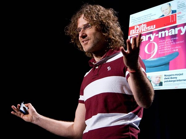
الحروف المطبعية هي شيء نستهلكه بكميات هائلة. في كثير من أنحاء العالم، هي شيء لا مفر منه تماما. لكن بعض المستخدمين فقط هم من يهتمون بمعرفة من أين أتى خط معين أو متى أو من قام بتصميمه، أو حتى إن كانت هناك أي وكالة شاركت بصنعه، أو فقط بتجسيده خارج أثير البرمجيات. لكن، لابد لي أن أكون مهتمًا بهذه الأشياء. لأنها مهنتي. أنا واحد من أناس قلائل ينزعجون وبشدة من المسافة الرديئة بين حرف T وحرف E كما ترون هناك. لا بد أن أغير شريحة العرض. لا أستطيع تحملها. ولا كريس نفسه. جيد. حديثي هنا عن العلاقة بين التقنية وتصميم الخط. التقنية تغيرت عدد من المرات منذ أن بدأت العمل: الصور الرقمية، سطح المكتب، الشاشة، صفحات الويب. كان لابد لي من مواصلة العيش ومقاومة هذه التغييرات ومحاولة فهم انعكاسها على ما أقوم به من تصميم. هذه الشريحة توضح تأثير الأدوات على النموذج. هذان الحرفان، هما حرف K، الحرف الذي على يساركم، على يميني، هو حرف عصري، صنع بواسطة الكمبيوتر. جميع الخطوط المستقيمة دقيقة الاستقامة. المنحنيات لها تلك النوعية من المنحنيات الرياضية التي تفرضها معادلة بيزيير. على اليمين، هذا حرف قوطي قديم، قطع من مادة مقاومة من الفولاذ بواسطة اليد. ليس أي من هذه الخطوط المستقيمة فعلي الاستقامة. المنحنيات من النوع الرقيق المتقن. تجد فيها بريق الحياة من يد الإنسان والذي لا آلة أو برنامج يمكن أن يخلقها. يال التناقض. حسنًا، أخبرتكم بكذبة. كذبة في TED. أنا متأسف جدًا. كل من الحرفين السابقين صنعا بواسطة الكمبيوتر، نفس البرنامج، ونفس منحنيات بيزييرـ ونفس تنسيق الخط. الحرف الذي على يساركم صنعته سوزانا ليكو في مجلة الأميجري، وأنا صنعت الآخر. الأدوات نفسها، لكن الحروف مختلفة. الحروف مختلفة. لأن المصممين مختلفين. هذا كل شيء. سوزانا أرادت أن يكون حرفها بهذا الشكل. وأنا أردت حرفي أن يكون بهذا الشكل. انتهت القصة. الخط متكيف جدًا. على عكس الفنون الجميلة، مثل النحت أو العمارة، الخط يخفي أساليبه. أعتبر نفسي كمصمم صناعي. الشيء الذي أصممه هو منتج، وله وظيفة: أن يكون مقروء، وأن ينقل المعنى. ولكن هناك ما هو أكثر قليلا من ذلك. هناك نوع من عنصر الجمال. ما الذي يجعل هذين الحرفين مختلفين. من تفسيرات مختلفة بواسطة مصميين مختلفين؟ ما الذي يعطي عمل بعض المصممين نوع من السمات الشخصية، مثل ما يمكنكم إيجاده في أعمال مصممي الأزياء، مصممي السيارات، أيا كان؟ أعترف أنه كانت هناك حالات، حيث كمصمم شعرت فيها بتأثير التكنولوجيا. هذا من منتصف الستينات، التغيير من خط بالمعدن إلى صورة، الساخن إلى البارد. هذه جلبت بعض الفوائد لكن أيضًا عيوب معينة: نظام التباعد الذي وفر 18 وحدة منفصلة للحروف ليتم استيعابها في النص. طُلب مني في ذلك الوقت أن أصمم سلسلة من خطوط sans serif الكثيفة مع أكبر عدد من التنوع قدر الامكان داخل مربع طوله 18 وحدة. بنظرة حسابية سريعة، أدرت أنه يمكني فقط عمل ثلاثة بنفس التصميم. كما تشاهدون هنا. بخط هلفتيكا المضغوط، ومع ضغط إضافي، ومع ضغط بشكل فائق، هذا نظام 18 وحدة جامدة حوصرت بداخله حقًا. إنها نوع من تحديد تناسب التصميم. هذا هو تصميم الخطوط، على الأقل في حالة الحروف الصغيرة. بالتالي هل تنظرون إلى هذه وتقولون، "مسكين ماثيو، كان عليه أن يخضع لمشكل، وقسما إنه ليظهر في النتائج". لا أتمنى ذلك. لو كنت أعمل نفس العمل اليوم، بدلا من وجود 18 وحدة تباعدية، سأود أن تكون هناك 1000. أتمكن من بذل المزيد من التغييرات، كما يتضح، لكن هل أعضاء العائلة الثلاثة سيظهرون بشكل أفضل؟ من الصعب القول من دون القيام به فعليا، لكنها لن تكون أفضل في النسبة من 1000 إلى 18، أستطيع قول ذلك. موهبتي تخبركم أن أي تحسن سيكون طفيفًا إلى حد ما، لأنها صممت لتلائم وظائف النظام الذي صممها، وكما قلت سابقًا، الخط قابل للتكيف جدًا. إنه يخفي أساليبه. جميع المصممين الصناعين يعملون ضمن قيود. هذه ليست فنون جميلة. السؤال هنا، هل القيود تفرض تنازلات؟ عندما تقبل القيد، هل ستعمل بأقل مستوى؟ لا أظن ذلك، لأني كنت دائما أشجع بشيء قاله تشارلز ايمز. قال كنت دائما مدركا للعمل ضمن القيود، لكن ليس لتقديم تنازلات. ظاهريًا، الفرق بين القيود والتنازلات دقيق جدًا، لكنه مركزي جدًا بالنسبة لموقفي تجاه عملي. تذكرون تجربة القراءة هذه؟ دليل الهاتف. سأبقي على هذه الشريحة لتتمكنوا من الاستمتاع بالحنين للماضي. هذه من منتصف السبعينيات في وقت مبكر من تجارب تصميمي لخط بيل المئوي لأدلة الهاتف الأمريكية، وكانت تجربتي الأولى مع الخط الرقمي، كانت أولية إلى حد بعيد. صُممت لدليل الهاتف، كما قلت، ليتم طباعتها بحجم صغير جدًا على ورق الصحف على سرعة عالية جدًا بالمطابع الدوارة بالحبر المكون من الكيريوسين والكربون الأسود. هذه ليست بيئة مريحة لمصممي الخطوط المطبعية. لذا بالنسبة لي كان التحدي بتصميم خط يتم تنفيذه قدر المستطاع في هذه الظروف الإنتاجية السلبية جدًا. كما أقول، كنا في الحقبة المبكرة للخطوط الرقمية. كنت أضطر إلى رسم كل حرف باليد على ورق الرسم البياني الكدريل - كانت هناك أربعة أوزان لخط بيل المئوي - بيكسل بجانب بيكسل، ثم ترميزهم بخطوط نقطية بجانب خطوط نقطية للوحة المفاتيح. استغرق الأمر سنتين، لكني تعلمت الكثير. تبدو هذه الحروف كما لو أنها مُضِغَت من قبل كلب أو غيره، لكن نقاط البيكسل المفقودة عند تقاطعات من جرة القلم أو من النسيج هي نتيجة دراستي لآثار الحبر المنشور على الورق الرخيص وإعادة تمثيل، ومراجعة الخط وفقًا لذلك. هذه القطع الغريبة تم تصميمها لتعويض الآثار غير المرغوب فيها لمقياس الرسم وعملية الإنتاج. في البداية، كانت AT & T ترغب في ضبط أدلة الهاتف باستخدام خط هلفتيكا، لكن كما قال صديقي سبيكرمان في فيلم هلفتيكا، إذا كنتم قد رأيتم ذلك، الحروف في خط هلفتيكا صممت لتكون مماثلة لبعضها البعض قد الإمكان. هذه ليست وصفة للتوضيح مع الأحجام الصغيرة. تبدو أنيقة جدًا على الشريحة في الأعلى. اضطررت لإزالة غموض هذه الأشكال من الأعداد قدر الإمكان في خط بيل المئوي بواسطة فتح هذه الأشكال للأعلى، كما ترون في الجزء السفلي من الشريحة. حتى الآن نحن لا نزال في منتصف الثمانينيات، في الأيام الأولى للخطوط الرقمية العريضة، تكنولوجيا فيكتور. في ذلك الوقت، كانت هناك مشكلة مع حجم الخطوط، كمية البيانات المطلوب إيجادها وتخزين الخط في ذاكرة الكمبيوتر. قلصت عدد الخطوط التي يمكن أن تحصل عليها على نظام التنضيد الخاص بك في أي وقت. قمت بتحليل البيانات، ووجدت أن النموذج التقليدي لخط سيريف كما ترون على اليسار يحتاج تقريبًا إلى ضعفي حجم البيانات مثل خط سانز سيريف في المنتصف بسبب جميع النقاط مطلوبة لتحديد القواس المنحنية بأناقة. بالمناسبة، الأرقام أسفل الشريحة تمثل كمية البيانات اللازمة لتخزين أي من هذه الخطوط. فخط سانز سيرف، في المنتصف هو الأعلى اقتصاديًا، 81 إلى 151. "أها" كنت أظن. "المهندسون لديهم مشكلة. المصمم مهمته الإنقاذ." صممت خط سيريف، كما يمكنكم مشاهدته على اليمين، بدون منحنيات أنا جعلتها مضلعة، خارج قطاعات الخط المستقيم، وقوسين مشطوبين. وانظروا، أصبح اقتصاديًا في البيانات مثل خط سانز سيرف. نسميها ميثاق، على اليمين. بعدها ذهبت إلى رئيس المهندسين مع أرقامي، وقلت له بكل فخر، "لقد حللت مشكلتك". "أوه" قال. "ما المشكلة؟". فقلت: " حسنًا، كما تعلمون، المشكلة في البيانات الضخمة التي تحتاجها لخط سيريف، وهلم جرًا." "أوه" قال: " لقد حللنا تلك المشكلة في الأسبوع الماضي." لقد كتبنا روتين ضغط ليقلل حجم جميع الخطوط حسب أهميتها. يمكنك الحصول على العديد من الخطوط على النظام الخاص بط كما تريد". قلت: "حسنًا، شكرًا لأنكم سمحتم لي أن أعرف". أُحبطت مرة أخرى. لقد غادرت مع حل فني لمشكلة تقنية غير موجودة. لكن من هنا أصبحت القصة مثيرة لاهتمامي. لم أرمي فقط تصميمي بعيدًا في نوبة غضب. أنا مثابر. ما بدأ كعملية تقنية أصبح حقًا ممارسة جمالية. بعبارة أخرى، أصبحت أحب تصميم الخطوط. نسيت أصولها. لا أريدها. أعجبني التصميم لذاته. أبسط أشكال من الميثاق تعطي نوعًا من سهولة الجودة وقلة بالتصميم الأنفوسي السهل الذي يسرني. كما تعلمون، في حقبة الابتكارات التقنية، يريد المصممون أن يتأثروا بما هو في الأجواء. نريد الاستجابة. نريد أن نُدفع لاكتشاف شيء جديد. في الحقيقة، الامتياز هو نوع من المثل بالنسبة لي. في النهاية، ليس هناك علاقة سببية قوية وسريعة بين التقنية وامتياز التصميم. حقًا، أسأت فهم التقنية. تقترح التقنية أشياء بالنسبة لي، لكنها لا ترغمني، أعتقد أن ذلك يحدث غالبًا. تعلمون، المهندسون شديدو الذكاء، وبالرغم من الاحباطات العرضية لأني أقل ذكاءً، دائمًا ما كنت أستمتع بالعمل معهم والتعلم منهم. بالمناسبة، في منتصف التسعينيات، بدأت بالتحدث إلى شركة مايكروسوفت حول خطوط الشاشة. إلحاقًا لهذه النقطة، جميع الخطوط على الشاشة قد تم تكييفها من قائمة سابقة من خطوط الطباعة. لكن مايكروسوفت تنبأت بشكل صحيح بتسارع الأحداث والاندفاع نحو الاتصالات الإلكترونية، للقراءة والكتابة على الشاشة وإخراج المطبوعات بمرحلة تالية في الأهمية. وبالتالي فالأولويات كانت تميل عند هذه النقطة. أرادوا مجموعة أساسية صغيرة من الخطوط التي لم تكن متلائمة لكنها مصممة للعرض على الشاشة لمواجهة مشاكل الشاشة، التي كانت دقة العرض فيها رديئة. قلت لمايكروسوفت، الخط المصمم لتكنولوجيا معينة هو خط عفا عليه الزمن. لقد صممت الكثير من الخطوط في الماضي بهدف التخفيف من حدة المشاكل التقنية. بفضل المهندسين، ذهبت تلك المشاكل التقنية بعيدًا. ومعها ذهب خطي المطبعي. فقط، كان ذلك بديلًا مؤقتًا. عادت مايكروسوفت مجددًا إلى القول بأن شاشات الكمبيوتر ستصبح بسعر معقول مع دقة عرض أفضل بعد عقد من الزمان ليس بعيد. لذا فكرت، حسنًا عقد من الزمن، هذا ليس سيئًا، هذا أكثر من بديل مؤقت. لذا كنت مقتنعًا، وواثقا، وذهبنا للعمل على ما يعرف الآن بخط فيردانا وجورجيا، لأول مرة لم أعمل على الورق إنما مباشرة على الشاشة بمقاييس البيكسل. في ذلك الوقت، كانت الشاشات تعمل بنظام ثنائي البيكسل كانت إما مفعلة أو معطلة. هنا ترون الخطوط العريضة للحرف، حرف H الكبير عبارة عن الخط الأسود الرفيق، المحيط، كيف تم تخزينه في الذاكرة، مركب على الخريطة الرقمية، التي هي المنطقة الرمادية، وهكذا تعرض على الشاشة. الخطوط الرقمية منقطة من الخطوط الخارجية. هذا هو حرف الH الكبير، عبارة عن خطوط مستقيمة، االخطوط متزامنة مع بعضها بشكل مثالي على الشبكة الديكارتية. الأمر لا يبدو كذلك مع حرف O. هذا أشبه ببناء حجري أكثر من تصميم خطي لكن صدقوني، هذه أفضل خريطة رقمية لحرف O، لسبب بسيط لأنها متناظرة حول المحورين الأفقي والعمودي. في الواقع، مع الخريطة الرقمية الثنائية، لا يمكن أن تطلب أكثر من ذلك. أود تحسينها في بعض الأحيان، من يعلم، ثلاثة أو أربعة نماذج مختلفة من حرف صعب مثل حرف A الصغير، ثم العودة مرة أخرى واختيار أفضل النتائج. حسنًا، لم يكن هناك شكل أفضل، فقرر المصممون في محاولة لاتخاذ القرار أي النتائج أقل رداءةً. هل هذا يعتبر حلًا وسطيًا؟ ليس بالنسبة لي، إذا كنت تعمل في أعلى مستوى متاح من التقنية، بالرغم من أن هذا المستوى قد يكون أقل بكثير من المثل الأعلى. يمكن أن تروا ذلك على هذه الشريحة نوعان مختلفان من الخطوط الرقمية. حرف a في الأعلى، على ما أعتقد أفضل من حرف ال a في الأسفل، لكنه يبقى ليس الأفضل. يمكنكم رؤية التأثير أفضل إذا تم تخفيضه. حسنًا، ربما لا. إذا أنا واقعي، ولست مثاليًا، بدافع الضرورة. لنوع معين من المزاجية، هناك نوع معين من الرضا للقيام بعمل شيء لا يمكن أن يكون مثاليًا لكن يظل يمكن إتمامه بأفضل ما عندك من قدرات. هذا حرف H الصغير بخط جورجيا المائل. الصورة النقطية له تبدو مسننة ومضطربة إنها مسننة وخشنة. لكني اكتشفت من خلال التجربة، أن هناك انحرافا أفضل للخط المائل على الشاشة بالتالي يصبح كسر الحركات أفضل عند الحدود البكسلية. أنظروا إلى هذا المثال، بخشونته، كيف جعل الساق اليمنى واليسرى مقطوعة في الواقع عند نفس المستوى. هذا انتصار. هذا جيد حتى الآن. وبالطبع، بأقل قول، لم تحصل على الكثير من الاختيارات. هذا حرف S، في حال كنتم تتساءلون. حسنًا، هذا قبل 18 سنة من الآن عندما تم إنتاج خط فيردانا وجورجيا. مايكروسوفت كانت على حق فعلًا، استغرق الأمر 10 سنوات جيدة، لكن عروض الشاشة الآن لديها دقة عرض حيزي محسّن، ودقة عرض ضوئية محسّنة بكثير بفضل مضادات التعرج وهلم جرًا. حتى الآن، مهمتهم قد أنجزت، فهل يعني ذلك زوال خطوط الشاشة التي صممتها للشاشات الرديئة مرة أخرى؟ هل ستنجو هذه الشاشات التي عفا عليها الزمن من طوفان خطوط الويب الجديدة القادمة للأسواق؟ أم أنهم أسسوا بأنفسهم مكانة متطورة مستقلة عن التكنولوجيا؟ بعبارة أخرى، هل استوعبوا تيار الخطوط المطبعية؟ لست متأكدًا، لكن لديهم إنطلاقة جيدة حتى الآن. مهلًا، 18 هو السن المناسب لأي شيء مع المعدلات الحالية من الانهاك، لذا أنا لا أتذمر. شكرًا لكم. (تصفيق)
Type is something we consume in enormous quantities. In much of the world, it's completely inescapable. But few consumers are concerned to know where a particular typeface came from or when or who designed it, if, indeed, there was any human agency involved in its creation, if it didn't just sort of materialize out of the software ether. But I do have to be concerned with those things. It's my job. I'm one of the tiny handful of people who gets badly bent out of shape by the bad spacing of the T and the E that you see there. I've got to take that slide off. I can't stand it. Nor can Chris. There. Good. So my talk is about the connection between technology and design of type. The technology has changed a number of times since I started work: photo, digital, desktop, screen, web. I've had to survive those changes and try to understand their implications for what I do for design. This slide is about the effect of tools on form. The two letters, the two K's, the one on your left, my right, is modern, made on a computer. All straight lines are dead straight. The curves have that kind of mathematical smoothness that the Bézier formula imposes. On the right, ancient Gothic, cut in the resistant material of steel by hand. None of the straight lines are actually straight. The curves are kind of subtle. It has that spark of life from the human hand that the machine or the program can never capture. What a contrast. Well, I tell a lie. A lie at TED. I'm really sorry. Both of these were made on a computer, same software, same Bézier curves, same font format. The one on your left was made by Zuzana Licko at Emigre, and I did the other one. The tool is the same, yet the letters are different. The letters are different because the designers are different. That's all. Zuzana wanted hers to look like that. I wanted mine to look like that. End of story. Type is very adaptable. Unlike a fine art, such as sculpture or architecture, type hides its methods. I think of myself as an industrial designer. The thing I design is manufactured, and it has a function: to be read, to convey meaning. But there is a bit more to it than that. There's the sort of aesthetic element. What makes these two letters different from different interpretations by different designers? What gives the work of some designers sort of characteristic personal style, as you might find in the work of a fashion designer, an automobile designer, whatever? There have been some cases, I admit, where I as a designer did feel the influence of technology. This is from the mid-'60s, the change from metal type to photo, hot to cold. This brought some benefits but also one particular drawback: a spacing system that only provided 18 discrete units for letters to be accommodated on. I was asked at this time to design a series of condensed sans serif types with as many different variants as possible within this 18-unit box. Quickly looking at the arithmetic, I realized I could only actually make three of related design. Here you see them. In Helvetica Compressed, Extra Compressed, and Ultra Compressed, this rigid 18-unit system really boxed me in. It kind of determined the proportions of the design. Here are the typefaces, at least the lower cases. So do you look at these and say, "Poor Matthew, he had to submit to a problem, and by God it shows in the results." I hope not. If I were doing this same job today, instead of having 18 spacing units, I would have 1,000. Clearly I could make more variants, but would these three members of the family be better? It's hard to say without actually doing it, but they would not be better in the proportion of 1,000 to 18, I can tell you that. My instinct tells you that any improvement would be rather slight, because they were designed as functions of the system they were designed to fit, and as I said, type is very adaptable. It does hide its methods. All industrial designers work within constraints. This is not fine art. The question is, does a constraint force a compromise? By accepting a constraint, are you working to a lower standard? I don't believe so, and I've always been encouraged by something that Charles Eames said. He said he was conscious of working within constraints, but not of making compromises. The distinction between a constraint and a compromise is obviously very subtle, but it's very central to my attitude to work. Remember this reading experience? The phone book. I'll hold the slide so you can enjoy the nostalgia. This is from the mid-'70s early trials of Bell Centennial typeface I designed for the U.S. phone books, and it was my first experience of digital type, and quite a baptism. Designed for the phone books, as I said, to be printed at tiny size on newsprint on very high-speed rotary presses with ink that was kerosene and lampblack. This is not a hospitable environment for a typographic designer. So the challenge for me was to design type that performed as well as possible in these very adverse production conditions. As I say, we were in the infancy of digital type. I had to draw every character by hand on quadrille graph paper -- there were four weights of Bell Centennial — pixel by pixel, then encode them raster line by raster line for the keyboard. It took two years, but I learned a lot. These letters look as though they've been chewed by the dog or something or other, but the missing pixels at the intersections of strokes or in the crotches are the result of my studying the effects of ink spread on cheap paper and reacting, revising the font accordingly. These strange artifacts are designed to compensate for the undesirable effects of scale and production process. At the outset, AT&T had wanted to set the phone books in Helvetica, but as my friend Erik Spiekermann said in the Helvetica movie, if you've seen that, the letters in Helvetica were designed to be as similar to one another as possible. This is not the recipe for legibility at small size. It looks very elegant up on a slide. I had to disambiguate these forms of the figures as much as possible in Bell Centennial by sort of opening the shapes up, as you can see in the bottom part of that slide. So now we're on to the mid-'80s, the early days of digital outline fonts, vector technology. There was an issue at that time with the size of the fonts, the amount of data that was required to find and store a font in computer memory. It limited the number of fonts you could get on your typesetting system at any one time. I did an analysis of the data, and found that a typical serif face you see on the left needed nearly twice as much data as a sans serif in the middle because of all the points required to define the elegantly curved serif brackets. The numbers at the bottom of the slide, by the way, they represent the amount of data needed to store each of the fonts. So the sans serif, in the middle, sans the serifs, was much more economical, 81 to 151. "Aha," I thought. "The engineers have a problem. Designer to the rescue." I made a serif type, you can see it on the right, without curved serifs. I made them polygonal, out of straight line segments, chamfered brackets. And look, as economical in data as a sans serif. We call it Charter, on the right. So I went to the head of engineering with my numbers, and I said proudly, "I have solved your problem." "Oh," he said. "What problem?" And I said, "Well, you know, the problem of the huge data you require for serif fonts and so on." "Oh," he said. "We solved that problem last week. We wrote a compaction routine that reduces the size of all fonts by an order of magnitude. You can have as many fonts on your system as you like." "Well, thank you for letting me know," I said. Foiled again. I was left with a design solution for a nonexistent technical problem. But here is where the story sort of gets interesting for me. I didn't just throw my design away in a fit of pique. I persevered. What had started as a technical exercise became an aesthetic exercise, really. In other words, I had come to like this typeface. Forget its origins. Screw that. I liked the design for its own sake. The simplified forms of Charter gave it a sort of plain-spoken quality and unfussy spareness that sort of pleased me. You know, at times of technical innovation, designers want to be influenced by what's in the air. We want to respond. We want to be pushed into exploring something new. So Charter is a sort of parable for me, really. In the end, there was no hard and fast causal link between the technology and the design of Charter. I had really misunderstood the technology. The technology did suggest something to me, but it did not force my hand, and I think this happens very often. You know, engineers are very smart, and despite occasional frustrations because I'm less smart, I've always enjoyed working with them and learning from them. Apropos, in the mid-'90s, I started talking to Microsoft about screen fonts. Up to that point, all the fonts on screen had been adapted from previously existing printing fonts, of course. But Microsoft foresaw correctly the movement, the stampede towards electronic communication, to reading and writing onscreen with the printed output as being sort of secondary in importance. So the priorities were just tipping at that point. They wanted a small core set of fonts that were not adapted but designed for the screen to face up to the problems of screen, which were their coarse resolution displays. I said to Microsoft, a typeface designed for a particular technology is a self-obsoleting typeface. I've designed too many faces in the past that were intended to mitigate technical problems. Thanks to the engineers, the technical problems went away. So did my typeface. It was only a stopgap. Microsoft came back to say that affordable computer monitors with better resolutions were at least a decade away. So I thought, well, a decade, that's not bad, that's more than a stopgap. So I was persuaded, I was convinced, and we went to work on what became Verdana and Georgia, for the first time working not on paper but directly onto the screen from the pixel up. At that time, screens were binary. The pixel was either on or it was off. Here you see the outline of a letter, the cap H, which is the thin black line, the contour, which is how it is stored in memory, superimposed on the bitmap, which is the grey area, which is how it's displayed on the screen. The bitmap is rasterized from the outline. Here in a cap H, which is all straight lines, the two are in almost perfect sync on the Cartesian grid. Not so with an O. This looks more like bricklaying than type design, but believe me, this is a good bitmap O, for the simple reason that it's symmetrical in both x and y axes. In a binary bitmap, you actually can't ask for more than that. I would sometimes make, I don't know, three or four different versions of a difficult letter like a lowercase A, and then stand back to choose which was the best. Well, there was no best, so the designer's judgment comes in in trying to decide which is the least bad. Is that a compromise? Not to me, if you are working at the highest standard the technology will allow, although that standard may be well short of the ideal. You may be able to see on this slide two different bitmap fonts there. The "a" in the upper one, I think, is better than the "a" in the lower one, but it still ain't great. You can maybe see the effect better if it's reduced. Well, maybe not. So I'm a pragmatist, not an idealist, out of necessity. For a certain kind of temperament, there is a certain kind of satisfaction in doing something that cannot be perfect but can still be done to the best of your ability. Here's the lowercase H from Georgia Italic. The bitmap looks jagged and rough. It is jagged and rough. But I discovered, by experiment, that there is an optimum slant for an italic on a screen so the strokes break well at the pixel boundaries. Look in this example how, rough as it is, how the left and right legs actually break at the same level. That's a victory. That's good, right there. And of course, at the lower depths, you don't get much choice. This is an S, in case you were wondering. Well, it's been 18 years now since Verdana and Georgia were released. Microsoft were absolutely right, it took a good 10 years, but screen displays now do have improved spatial resolution, and very much improved photometric resolution thanks to anti-aliasing and so on. So now that their mission is accomplished, has that meant the demise of the screen fonts that I designed for coarser displays back then? Will they outlive the now-obsolete screens and the flood of new web fonts coming on to the market? Or have they established their own sort of evolutionary niche that is independent of technology? In other words, have they been absorbed into the typographic mainstream? I'm not sure, but they've had a good run so far. Hey, 18 is a good age for anything with present-day rates of attrition, so I'm not complaining. Thank you. (Applause)