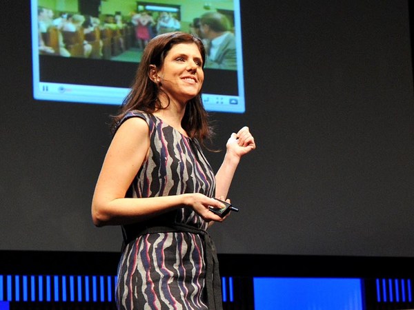
What do you think of when I say the word "design"? You probably think of things like this, finely crafted objects that you can hold in your hand, or maybe logos and posters and maps that visually explain things, classic icons of timeless design. But I'm not here to talk about that kind of design. I want to talk about the kind that you probably use every day and may not give much thought to, designs that change all the time and that live inside your pocket. I'm talking about the design of digital experiences and specifically the design of systems that are so big that their scale can be hard to comprehend. Consider the fact that Google processes over one billion search queries every day, that every minute, over 100 hours of footage are uploaded to YouTube. That's more in a single day than all three major U.S. networks broadcast in the last five years combined. And Facebook transmitting the photos, messages and stories of over 1.23 billion people. That's almost half of the Internet population, and a sixth of humanity.
当我说“设计”这个词的时候 你会想到什么? 你可能会想到 可以触摸到的精致的物品 也可能是一个商标,海报,或地图 一些能从视觉上解释说明事物的东西 经得起时间考验的图标设计 但今天,我要讲的并不是那样的设计 我想说的是 那种也许你每天都会使用的 但是却又没有关注太多的设计 那些设计一直在改变 并且在我们的生活中无处不在 我要说的设计 是一种数字化的体验 具体来说就是系统设计 它庞大的规模 超乎想象 讲一个谷歌的事实 它每天有超过十亿的搜索量 每一分钟,就有超过长达100个小时的 视频被传到YouTube上 单这一天的量 甚至比美国三大广播网络 在过去五年里加起来的总和还要多 而且脸书(facebook) 也在超过12.3亿人之间 传播照片 消息和事件 这几乎是网络使用者的一半 也是世界人口的六分之一
These are some of the products that I've helped design over the course of my career, and their scale is so massive that they've produced unprecedented design challenges. But what is really hard about designing at scale is this: It's hard in part because it requires a combination of two things, audacity and humility — audacity to believe that the thing that you're making is something that the entire world wants and needs, and humility to understand that as a designer, it's not about you or your portfolio, it's about the people that you're designing for, and how your work just might help them live better lives. Now, unfortunately, there's no school that offers the course Designing for Humanity 101. I and the other designers who work on these kinds of products have had to invent it as we go along, and we are teaching ourselves the emerging best practices of designing at scale, and today I'd like share some of the things that we've learned over the years.
它们是一些 我在职业生涯中参与设计的产品 它们极大的规模 创造了前所未有的 设计挑战 但是,事实上 关于大规模设计 真正困难的地方在于 它需要把大胆和谦逊 结合在一起 大胆是去相信你所设计的东西 是整个世界所希望和需要的 而谦逊让是去理解, 作为一个设计师 这个设计品不只是关于 你个人或者你的作品集 它在于如何针对性地为用户们设计 以及所设计的产品是否让他们 过上更好的生活 很不幸的是,现在并没有一所学校 开一门“设计以人为本”的课 我和一些同样 设计这类产品的设计师们 在设计的过程中不得不自创了这门课 并且来教授自己 要在实践中形成最好的规模设计 今天,我将和大家分享 这么多年期间,我们学到的一些经验 关于设计规模的规则
Now, the first thing that you need to know about designing at scale is that the little things really matter. Here's a really good example of how a very tiny design element can make a big impact. The team at Facebook that manages the Facebook "Like" button decided that it needed to be redesigned. The button had kind of gotten out of sync with the evolution of our brand and it needed to be modernized. Now you might think, well, it's a tiny little button, it probably is a pretty straightforward, easy design assignment, but it wasn't. Turns out, there were all kinds of constraints for the design of this button. You had to work within specific height and width parameters. You had to be careful to make it work in a bunch of different languages, and be careful about using fancy gradients or borders because it has to degrade gracefully in old web browsers. The truth is, designing this tiny little button was a huge pain in the butt.
你首先需要知道的是 点滴的小事影响深远 这里有一个很好的例子可以用来解释 为什么一个非常小的设计会造成很大的影响 脸书的管理团队 成功设计了 脸书上那个写着“赞”的图标 决定要对它进行重新设计 这个按键有些跟不上 我们品牌演变的步伐 它需要变得现代化 可能你会认为,好吧, 那只不过是一个小小的按键 所以它可能只是一个非常简单的 设计任务,但事实并非如此 后来,当我们设计这个按键的时候 存在着各种各样的约束 你必须在一个大量的参数的环境中工作 你必须注意这个按键可以不同语言环境中 都能有效果 同时也要避免花哨或者花哨的界限 因为这个按键要在 旧式浏览器中优雅地渐渐退出 而事实是,即使是设计这么小的按键 也是个是非常痛苦的过程 这是新设计的按键
Now, this is the new version of the button, and the designer who led this project estimates that he spent over 280 hours redesigning this button over the course of months. Now, why would we spend so much time on something so small? It's because when you're designing at scale, there's no such thing as a small detail. This innocent little button is seen on average 22 billion times a day and on over 7.5 million websites. It's one of the single most viewed design elements ever created. Now that's a lot of pressure for a little button and the designer behind it, but with these kinds of products, you need to get even the tiny things right.
在过去的几个月里,带领这个项目的设计师估计 花费了超过280个小时 重新设计这个按键 你可能要问,究竟为什么我们要 在这么一样小东西上花费这么长的时间 这是因为当你在做设计的时候 细节上是不存在大小之分的 这个不起眼的小图标 平均每天被浏览220亿次 出现在超过750万的网页上 它是史上最具设计元素的产品 现在你知道为什么 我说在这个小小的按键 设计的背后隐藏着设计者巨大的压力 但是对于这类的产品 即使是小的事情也必须要做好 另外一件你需要明白的事情就是
Now, the next thing that you need to understand is how to design with data. Now, when you're working on products like this, you have incredible amounts of information about how people are using your product that you can then use to influence your design decisions, but it's not just as simple as following the numbers. Let me give you an example so that you can understand what I mean. Facebook has had a tool for a long time that allowed people to report photos that may be in violation of our community standards, things like spam and abuse. And there were a ton of photos reported, but as it turns out, only a small percentage were actually in violation of those community standards. Most of them were just your typical party photo. Now, to give you a specific hypothetical example, let's say my friend Laura hypothetically uploads a picture of me from a drunken night of karaoke. This is purely hypothetical, I can assure you. (Laughter) Now, incidentally, you know how some people are kind of worried that their boss or employee is going to discover embarrassing photos of them on Facebook? Do you know how hard that is to avoid when you actually work at Facebook? So anyway, there are lots of these photos being erroneously reported as spam and abuse, and one of the engineers on the team had a hunch. He really thought there was something else going on and he was right, because when he looked through a bunch of the cases, he found that most of them were from people who were requesting the takedown of a photo of themselves. Now this was a scenario that the team never even took into account before. So they added a new feature that allowed people to message their friend to ask them to take the photo down. But it didn't work. Only 20 percent of people sent the message to their friend. So the team went back at it. They consulted with experts in conflict resolution. They even studied the universal principles of polite language, which I didn't even actually know existed until this research happened. And they found something really interesting. They had to go beyond just helping people ask their friend to take the photo down. They had to help people express to their friend how the photo made them feel.
如何在设计过程中应用数据 当你在设计一件这样的产品的时候 你有大量关于 人们会怎样使用你的产品的信息 这将会影响你的 设计理念 但是这不仅仅只关系到一堆数字 让我来举一个例子 你就会明白我在说什么了 脸书在很久之前就有一个工具 是用来让人们反馈那些照片 可能会给人们带来不便的照片, 例如就好像垃圾邮件和滥用信息 每天有成千上万的照片被上传 但是事实证明 只有很小的一部分 违反社区标准 大多数是派对的照片 我们来假设一个具体的例子 比如假设我有个好朋友叫劳拉 她上传了一张 我醉酒后在卡拉ok的照片 我向你保证,这真的只是一个假设 (笑声) 顺便说一句 你也知道现在有一些人担心 他们的老板或是员工 看到他们在脸书上的 不雅照片 你知道不让我的朋友看见这些照片有多么困难么 尤其是我还在facebook上班! 所以,当大量这类照片被当成是 垃圾信息或是信息滥用来处理的时候 团队的一个工程师有了预感 他觉得这当中一定有什么 而且 他是对的 因为当他看到这么多案例以后 他发现大多数的反馈信息 是来自那些照片的当事人 他们要求删除有他们自己的照片 在这之前,我们的团队 从未考虑到这个情况问题 所以他们新加了一个功能 就是允许人们发信息给他们的朋友 让他们把照片删除 但是,这并不起作用 只有百分之二十的人 给他们的朋友发了消息 所以我们的工作人员又回到了这个问题上 他们咨询了专家该如何解决冲突 他们甚至学习了 礼貌用语的通用原则 直到他们做了这项研究以前 我都不知道还有这样原则存在, 我们的工作人员发现了 一件很有趣的事情, 他们不仅仅帮助人们让他们朋友 把照片从网上删除 同时也让他们的朋友了解到 被上传照片的人的心情 如今的设计就是这个经历所带来的
Here's how the experience works today. So I find this hypothetical photo of myself, and it's not spam, it's not abuse, but I really wish it weren't on the site. So I report it and I say, "I'm in this photo and I don't like it," and then we dig deeper. Why don't you like this photo of yourself? And I select "It's embarrassing." And then I'm encouraged to message my friend, but here's the critical difference. I'm provided specific suggested language that helps me communicate to Laura how the photo makes me feel. Now the team found that this relatively small change had a huge impact. Before, only 20 percent of people were sending the message, and now 60 percent were, and surveys showed that people on both sides of the conversation felt better as a result. That same survey showed that 90 percent of your friends want to know if they've done something to upset you. Now I don't know who the other 10 percent are, but maybe that's where our "Unfriend" feature can come in handy.
当我看到自己这张假设的照片的时候 它既不是垃圾邮件也不是滥用邮件 但是我真的不希望在网上看到这张照片 所以我反馈了意见,并写道 “我在这张照片里,但是我不喜欢这张照片” 然后我们进一步去探讨 为什么你不喜欢这张有你自己的照片 我选择了:“它让我感到难堪“ 然后我被鼓励去发消息给我的朋友 然而这就是不同的关键 脸书上会给我提供专门的建议用语 用来帮助我和劳拉交流 我对这个照片的想法 我们的工作人员发现, 这个小小的改变 带来了巨大的影响 在这之前,只有20%的人 会发信息给他们的朋友 但是现在有60%的人会去发消息 据调查显示 对话的双方 最后都会觉得不错 据同一调查显示 你90%的朋友希望知道自己是否 做了什么让你不高兴的事情 我不知道另外10%的人的想法 但是也许就是到了我们“解除好友”的按键 非常好用的时候了 正如你所看到的
So as you can see, these decisions are highly nuanced. Of course we use a lot of data to inform our decisions, but we also rely very heavily on iteration, research, testing, intuition, human empathy. It's both art and science. Now, sometimes the designers who work on these products are called "data-driven," which is a term that totally drives us bonkers. The fact is, it would be irresponsible of us not to rigorously test our designs when so many people are counting on us to get it right, but data analytics will never be a substitute for design intuition. Data can help you make a good design great, but it will never made a bad design good.
这些改变是很微妙的 当然,这个过程中我们用了很多数据 来支持我们的决定 同时我们以反复试验, 研究,测试,直觉以及人类的同理心为主 这是艺术和科学的融合 现在有时候,我们也把这些设计者 叫做“数据驱动者” 这完全一个让我们疯狂的词 事实上,我们会因为没有严格测试我们的设计产品 而被认为是不负责任的 尤其是当有那么多的人在 指望着我们做对事情的时候 但是数据分析 绝对不会代替设计的直觉 数据能帮助我们使设计变得更加完美 但是绝对不会把一个不好的设计变成好的
The next thing that you need to understand as a principle is that when you introduce change, you need to do it extraordinarily carefully. Now I often have joked that I spend almost as much time designing the introduction of change as I do the change itself, and I'm sure that we can all relate to that when something that we use a lot changes and then we have to adjust. The fact is, people can become very efficient at using bad design, and so even if the change is good for them in the long run, it's still incredibly frustrating when it happens, and this is particularly true with user-generated content platforms, because people can rightfully claim a sense of ownership. It is, after all, their content.
下一个你必须要去理解的事情是 当你想要改变的时候 需要格外仔细 我经常开玩笑说 我在设计产品变动的介绍词 花费了大量的时间 这几乎和我在做产品改动的时间是一样的 而且我敢肯定 当一件事情需要我们做出很多改变的时候 我们也要对自己做出调整 事实上,人们会因为使用了 不好的设计而变得更有效率 虽然从长远角度上看, 这个改变是对大家有好处的 但是有不好的设计产生的时候, 它仍被认为是一个失败的设计 而且这个在 用户创建的内容平台中证实了 因为人们会去维护他们的主人翁意识 毕竟脸书上所说的是他们自己
Now, years ago, when I was working at YouTube, we were looking for ways to encourage more people to rate videos, and it was interesting because when we looked into the data, we found that almost everyone was exclusively using the highest five-star rating, a handful of people were using the lowest one-star, and virtually no one was using two, three or four stars. So we decided to simplify into an up-down kind of voting binary model. It's going to be much easier for people to engage with. But people were very attached to the five-star rating system. Video creators really loved their ratings. Millions and millions of people were accustomed to the old design. So in order to help people prepare themselves for change and acclimate to the new design more quickly, we actually published the data graph sharing with the community the rationale for what we were going to do, and it even engaged the larger industry in a conversation, which resulted in my favorite TechCrunch headline of all time: "YouTube Comes to a 5-Star Realization: Its Ratings Are Useless."
几年前,当我还在YouTube(视频网站)工作的时候 我们尝试着怎样才能 鼓励更多的人去评价视频 当我们查看数据的时候, 发现了一些很有趣的事情 几乎所有的人都给与了别人 最高的五星的评价 只有极少数的一些人会使用 最少的一星评价 并且几乎没有人会使用 两星,三星或是四星的评价 所以我们决定简化这样的评估模式 我们把它变成只有好和坏两种选择的模式 这对于参与评估的人们来说简单多了 但是,人们非常注重 五星评估系统 上传视频的人也很满意他们的评估等级 成百万的使用者已经习惯了 旧的五星评分方式 所以,为了帮助人们 更快的熟悉和接受这个新的设计 我们把之前的数据图表 放在了网上告诉人们 我们要去改变的原因 没想到在大家的交流过程中 话题被扩大了,于是产生了 我最爱的科技博客(新兴互联网公司评论的博客) 的标题: “YouTube的五星级觉醒: 它的五星评级制毫无用处” 虽然不可能完全避免改变带来的反感
Now, it's impossible to completely avoid change aversion when you're making changes to products that so many people use. Even though we tried to do all the right things, we still received our customary flood of video protests and angry emails and even a package that had to be scanned by security, but we have to remember people care intensely about this stuff, and it's because these products, this work, really, really matters to them.
尤其是改变了那多人已经熟悉的产品 即使我们试着把所有的事情做对 可是还是受到了如同洪水般的 抗议视频和投诉邮件 甚至我们还收到了一个 需要接受安全扫描的包裹 然而,从另外一个角度来 我们也知道到人们对这个改变非常关注 也是因为这个产品对于他们来说 是真的真的很重要 现在我们知道了
Now, we know that we have to be careful about paying attention to the details, we have to be cognizant about how we use data in our design process, and we have to introduce change very, very carefully. Now, these things are all really useful. They're good best practices for designing at scale. But they don't mean anything if you don't understand something much more fundamental. You have to understand who you are designing for.
细节的重要性 我们也意识到, 如何在设计中使用数据 而且,在我们给人们介绍产品改变的时候 也要非常小心仔细 这些方法是非常有用的 它们是在设计规模时候最好的练习方法 但是如果你不能懂得其中的最基本道理, 那么它对于你说就什么都不是 你必须明白,你究竟是在为谁设计 当你建立的设计目标是
Now, when you set a goal to design for the entire human race, and you start to engage in that goal in earnest, at some point you run into the walls of the bubble that you're living in. Now, in San Francisco, we get a little miffed when we hit a dead cell zone because we can't use our phones to navigate to the new hipster coffee shop. But what if you had to drive four hours to charge your phone because you had no reliable source of electricity? What if you had no access to public libraries? What if your country had no free press? What would these products start to mean to you? This is what Google, YouTube and Facebook look like to most of the world, and it's what they'll look like to most of the next five billion people to come online. Designing for low-end cell phones is not glamorous design work, but if you want to design for the whole world, you have to design for where people are, and not where you are.
为了全人类而设计的时候 然后你以一个认真的态度去达成那个目标 有些时候你在自己的立场上 迷失方向 现在,就在旧金山, 当我们到达一个没有信号的区域 因为无法使用手机导航来 寻找到新开的流行的咖啡店 我们就开始不开心了 但是如果你因为没有可靠的电源设备 而得开四个小时的车去 找给手机充电的电源设备 如果你不被允许进入公共图书馆了 如果这个国家都没有自由媒体了 如果这些产品对你的要求严格了 这就是为什么谷歌,YouTube 和facebook 被世界所期待 这也是为什么 未来的50亿人 会去上网 设计一个低端的手机 并不是一个吸引人的工作 但是,如果你是为了整个世界在设计 你就必须站在人们的角度上考虑 而不是你自己的角度 所以,我们应该如何记住把这个大的思考立场呢?
So how do we keep this big, big picture in mind? We try to travel outside of our bubble to see, hear and understand the people we're designing for. We use our products in non-English languages to make sure that they work just as well. And we try to use one of these phones from time to time to keep in touch with their reality.
我们尝试站在使用者的角度去思考 我们尝试着去理解他们 我们也邀请那些说不同语言人使用我们的产品 以确保所有的程序都能正常运行 而且我们尝试着时常使用这些手机 以确保我们了解用户的实际使用情况 所以这个对全球范围的设计有什么意义?
So what does it mean to design at a global scale? It means difficult and sometimes exasperating work to try to improve and evolve products. Finding the audacity and the humility to do right by them can be pretty exhausting, and the humility part, it's a little tough on the design ego. Because these products are always changing, everything that I've designed in my career is pretty much gone, and everything that I will design will fade away. But here's what remains: the never-ending thrill of being a part of something that is so big, you can hardly get your head around it, and the promise that it just might change the world.
这是一项困难而且出力不讨好的工作 去尝试着改善和发展产品 以谦逊的心态为基本 却又不缺乏大胆创新的心思 去把设计做对做好 是相当辛苦的 而且在设计部分,对设计的自尊心是个考验 因为产品总是在不断的变化 而我在设计生涯中的所有产品都会随着这些 更新换代而消失 而且未来我要做的设计 也会随着时间的流逝而消失 而留下的是 是永无止境的刺激和快感 想到自己是如此巨大创造的一部分 会让我脑子转不过弯来 更何况它包含了 也许能够改变世界的承诺 谢谢
Thank you.
(鼓掌)
(Applause)