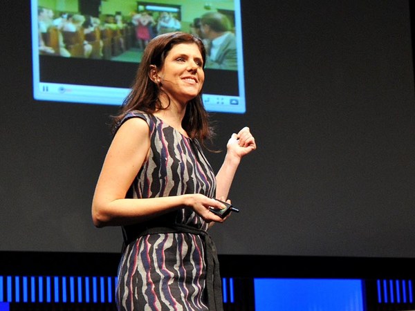
What do you think of when I say the word "design"? You probably think of things like this, finely crafted objects that you can hold in your hand, or maybe logos and posters and maps that visually explain things, classic icons of timeless design. But I'm not here to talk about that kind of design. I want to talk about the kind that you probably use every day and may not give much thought to, designs that change all the time and that live inside your pocket. I'm talking about the design of digital experiences and specifically the design of systems that are so big that their scale can be hard to comprehend. Consider the fact that Google processes over one billion search queries every day, that every minute, over 100 hours of footage are uploaded to YouTube. That's more in a single day than all three major U.S. networks broadcast in the last five years combined. And Facebook transmitting the photos, messages and stories of over 1.23 billion people. That's almost half of the Internet population, and a sixth of humanity.
"Tasarım" dediğimde aklınıza ne geliyor? Muhtemelen bu gibi şeyleri düşünüyorsunuz; güzel bir forma sahip, ellerinle hissedebileceğin ürünler ya da logolar, posterler ve görsel açıklama yapan haritalar. Modası geçmeyen tasarımın klasik parçaları. Fakat burda olma nedenim bu tür bir tasarımı anlatmak değil. Benim anlatmak istediğim her gün kullandığınız, muhtemelen çok da farkına varmadığınız, cebinizde yaşayan ve sürekli değişen tasarım. Bahsettiğim tasarım dijital deneyimlerin, özellikle de sistemlerin tasarımı, bu sistemler o kadar büyük ki, büyüklüğünü kavramak bile zor olabilir. Örneğin; Google her gün bir milyardan fazla aramayı çalıştırıyor. Her dakika, 100 saatten uzun kayıt YouTube'a yükleniyor. Bu da tek bir günde, Amerika'daki en büyük üç TV kanalının son beş yılda yaptığı yayının toplamını geçiyor. Facebook, 1,23 milyardan fazla insanın fotoğraftlarını, mesajlarını ve hikayelerini yayınlıyor. Bu İnternet kullanıcılarının neredeyse yarısına, tüm insanlığın da altı da birine denk geliyor.
These are some of the products that I've helped design over the course of my career, and their scale is so massive that they've produced unprecedented design challenges. But what is really hard about designing at scale is this: It's hard in part because it requires a combination of two things, audacity and humility — audacity to believe that the thing that you're making is something that the entire world wants and needs, and humility to understand that as a designer, it's not about you or your portfolio, it's about the people that you're designing for, and how your work just might help them live better lives. Now, unfortunately, there's no school that offers the course Designing for Humanity 101. I and the other designers who work on these kinds of products have had to invent it as we go along, and we are teaching ourselves the emerging best practices of designing at scale, and today I'd like share some of the things that we've learned over the years.
Bunlar, kariyerim boyunca tasarlanmasına yardım ettiğim ürünlerden bazıları. Boyutları o kadar büyük ki, tasarımla çözülmesi gereken alışılmadık problemleri oluyor. Fakat, büyük sistemler için tasarlamanın esas zorluğu iki önemli şeyi aynı anda barındırmayı gerektirmesi; özgüven ve alçak gönüllülük. Tüm dünyanın istediği ve ihtiyaç duyduğu şeyleri yaptığına inanacak özgüvene ve yaptıklarının seninle veya senin portfolyonla ilgili olmadığının, tasarladığın insanlarla ve onların daha iyi bir hayat yaşamasına yardım etmekle ilgili olduğunun farkında olacak bir alçak gönüllülüğe sahip olmak. Günümüzde ne yazık ki "İnsanlık İçin Tasarıma Giriş" dersi veren bir okul yok. Ben ve benzer ürünler tasarlayan diğerler tasarımcılar bunu deneyimleyerek keşfetmek zorunda kaldık. Büyük sistemler için tasarlamakla ilgili ortaya çıkan en iyi yöntemleri kendi kendimize öğretiyoruz. Şimdi tecrübeyle öğrendiklerimizden birkaçını paylaşmak istiyorum. Büyük sistemler için
Now, the first thing that you need to know about designing at scale is that the little things really matter. Here's a really good example of how a very tiny design element can make a big impact. The team at Facebook that manages the Facebook "Like" button decided that it needed to be redesigned. The button had kind of gotten out of sync with the evolution of our brand and it needed to be modernized. Now you might think, well, it's a tiny little button, it probably is a pretty straightforward, easy design assignment, but it wasn't. Turns out, there were all kinds of constraints for the design of this button. You had to work within specific height and width parameters. You had to be careful to make it work in a bunch of different languages, and be careful about using fancy gradients or borders because it has to degrade gracefully in old web browsers. The truth is, designing this tiny little button was a huge pain in the butt.
tasarımla ilgili bilmeniz gereken ilk şey; küçük şeyler gerçekten önemlidir. Çok küçük bir tasarım öğesinin ne kadar büyük bir etki yaratabildiğine güzel bir örnek vereceğim. Facebook'taki "Beğen" butonundan sorumlu ekip bu buton yeniden tasarlanması gerektiğine karar verdiler. Buton markanın gelişimine ayak uyduramamıştı ve daha modern hale getirilmesi gerekiyordu. "Hmm, alt tarafı küçük bir buton, oldukça net ve kolay bir tasarım işi olmalı" diye düşünebilirsiniz. Ama öyle olmadı. Bu butonla ilgili farklı farklı kurallar olduğu ortaya çıktı. Belirli bir yükseklik ve genişlikte çalışmak zorunluğu vardı. Tasarım, farklı dillerde kullanıldığında da bozulmadan görünmeliydi. Eski İnternet tarayıcılarında sıkıntısız görüntülenebilmesi için gösterişli renk ve şekil kullanımlarında dikkatli olunması gerekiyordu. İşin doğrusu, bu küçük butonu yeniden tasarlamak tam bir baş belasıydı. Gördüğünüz butonun yeni versiyonu.
Now, this is the new version of the button, and the designer who led this project estimates that he spent over 280 hours redesigning this button over the course of months. Now, why would we spend so much time on something so small? It's because when you're designing at scale, there's no such thing as a small detail. This innocent little button is seen on average 22 billion times a day and on over 7.5 million websites. It's one of the single most viewed design elements ever created. Now that's a lot of pressure for a little button and the designer behind it, but with these kinds of products, you need to get even the tiny things right.
Projeyi yürüten tasarımcı, bu butonun yeniden tasarımı için 280 saatten fazla çalıştığını tahmin ediyor. Peki, neden bu kadar küçük bir şeyin tasarımı için bu kadar çok zaman harcadık? Çünkü büyük sistemler için tasarlarken hiçbir şey sadece "küçük bir detay" değildir. Bu masum küçük buton bir günde ortalama 22 milyar kere, 7.5 milyondan fazla site üzerinde görüntüleniyor. Bu şimdiye kadar tasarlanmış, en çok görülen tasarım öğelerinden biri. Küçük bir buton için büyük bir baskı, tabi arkasındaki tasarımcı için de. Ama bu tarz ürünlerde en küçük şeyleri bile doğru yapmalısın. Öğrenilmesi gereken sonraki konu da,
Now, the next thing that you need to understand is how to design with data. Now, when you're working on products like this, you have incredible amounts of information about how people are using your product that you can then use to influence your design decisions, but it's not just as simple as following the numbers. Let me give you an example so that you can understand what I mean. Facebook has had a tool for a long time that allowed people to report photos that may be in violation of our community standards, things like spam and abuse. And there were a ton of photos reported, but as it turns out, only a small percentage were actually in violation of those community standards. Most of them were just your typical party photo. Now, to give you a specific hypothetical example, let's say my friend Laura hypothetically uploads a picture of me from a drunken night of karaoke. This is purely hypothetical, I can assure you. (Laughter) Now, incidentally, you know how some people are kind of worried that their boss or employee is going to discover embarrassing photos of them on Facebook? Do you know how hard that is to avoid when you actually work at Facebook? So anyway, there are lots of these photos being erroneously reported as spam and abuse, and one of the engineers on the team had a hunch. He really thought there was something else going on and he was right, because when he looked through a bunch of the cases, he found that most of them were from people who were requesting the takedown of a photo of themselves. Now this was a scenario that the team never even took into account before. So they added a new feature that allowed people to message their friend to ask them to take the photo down. But it didn't work. Only 20 percent of people sent the message to their friend. So the team went back at it. They consulted with experts in conflict resolution. They even studied the universal principles of polite language, which I didn't even actually know existed until this research happened. And they found something really interesting. They had to go beyond just helping people ask their friend to take the photo down. They had to help people express to their friend how the photo made them feel.
veriler ile nasıl tasarım yapılacağı. Bu gibi ürünlerde, tasarım kararlarını alırken değerlendirilebilecek, insanların ürünü nasıl kullandıkları ile ilgili devasa bir bilgi oluyor. Ama bu sadece rakamları takip etmek kadar kolay değil. Neden bahsettiğimi daha iyi anlayabilmeniz için bir örnek vereceğim. Facebook uzun bir süre, kötü niyetli veya zararlı içeriğe sahip, toplum standartlarına uygun olmayan fotoğrafları kullanıcıların bildirilmesini sağlayan bir sisteme sahipti. Binlerce fotoğraf şikayet edildi. Ama daha sonra bu şikayetlerin sadece çok küçük bir yüzdesinin toplum standartlarını ihlal ettiği orta çıktı. Çoğu tipik parti fotoğrafıydı. Şimdi size farazi bir örnek vereceğim. Varsayalım, arkadaşım Laura sarhoş olduğum karaoke gecesinden bir fotoğrafımı Facebook'a yüklüyor. Sizi temin ederim, bu sadece bir varsayım. (Kahkahalar) Bazılarının, Facebook'taki utanç verici fotoğraflarını, patronlarının veya çalışanlarının görmesinden endişelendiğini biliyor musunuz? Eğer Facebook'ta çalışıyorsanız bundan kaçınmanın ne kadar zor olduğunu biliyor musunuz? Her neyse, şikayet edilenlerin arasında bu gibi fotoğraflardan çok fazla vardı. Takımdaki mühendislerden biri, burda saklı olan başka bir şey olduğunu sezdi ve bu tahminin de haklıydı. Şikayetlerin bir kısmını incelediğinde farketti ki, bunların bir çoğunda insanlar kendi fotoğraflarının kaldırılmasını istiyordu. Bu ekibin daha önce hiç değerlendirmediği bir senaryoydu. Onlar da insanların arkadaşlarına mesaj atarak fotoğrafı kaldırmasını isteyebileceği yeni bir özellik geliştirdiler. Ama bu işe yaramadı. İnsanların sadece %20'si bu mesajı arkadaşlarına gönderdi. Bunun üzerine ekip yeniden çalışmaya başladı. Çıkar çatışması çözümünde uzmanlaşmış kişilere danıştılar. Dilin kibar kullanımıyla ilgili uluslararası kuralları bile çalıştılar, ki ben araştırma başlayana kadar bu kuralların varlığından habersizdim. Sonunda çok ilginç bir şey keşfettiler. Arkadaşlarından fotoğrafın kaldırmasını istemelerini sağlamak yeterli değildi. Bunun ötesine geçerek, fotoğrafın nasıl hissettirdiğini arkadaşlarıyla paylaşmalarına yardım etmeliydiler. Deneyim bugün şu şekilde işliyor;
Here's how the experience works today. So I find this hypothetical photo of myself, and it's not spam, it's not abuse, but I really wish it weren't on the site. So I report it and I say, "I'm in this photo and I don't like it," and then we dig deeper. Why don't you like this photo of yourself? And I select "It's embarrassing." And then I'm encouraged to message my friend, but here's the critical difference. I'm provided specific suggested language that helps me communicate to Laura how the photo makes me feel. Now the team found that this relatively small change had a huge impact. Before, only 20 percent of people were sending the message, and now 60 percent were, and surveys showed that people on both sides of the conversation felt better as a result. That same survey showed that 90 percent of your friends want to know if they've done something to upset you. Now I don't know who the other 10 percent are, but maybe that's where our "Unfriend" feature can come in handy.
ben bu "varsayımsal" fotoğrafımı görüyorum, kötü niyetli veya zararlı bir içeriği yok ama bu fotoğrafımın Facebook'ta olmasını hiç istemiyorum. Bu yüzden fotoğrafı şikayet ediyorum ve "Bu fotoğrafta görünüyorum ve bundan hoşlanmıyorum." diyorum. Bundan sonra biraz daha derine iniyoruz. "Bu fotoğraftan neden hoşlanmadın?" "Fotoğraf utanç verici" seçeneğini işaretliyorum. Ardından, arkadaşıma mesaj göndermek için yönlendiriliyorum. Ama arada kritik bir fark var, Facebook şimdi uygun bir dille yazılmış, Laura'ya bu fotoğrafın beni nasıl hissettirdiğini açıklamamı sağlayacak bir metin sunuyor. Projede çalışan ekip, bu görece küçük değişikliğin çok büyük bir etkisi olduğunu farketti. Önceden insanların sadece %20'si bu mesajı gönderiyordu, şimdi ise bu rakam %60'e ulaştı. Yapılan araştırmaya göre, şimdi bu sürecin sonunda iki taraf da kendini çok daha iyi hissediyor. Yine aynı araştırma gösterdi ki, arkadaşlarınızın %90'ı sizi mutsuz edecek bir şey yaptıklarında bunu bilmek istiyorlar. Geri kalan %10'un kim olduğunu bilmiyorum ama "Arkadaşlıktan Çıkar" özelliği bu noktada işe yarayabilir. Sizin de gördüğünüz üzere,
So as you can see, these decisions are highly nuanced. Of course we use a lot of data to inform our decisions, but we also rely very heavily on iteration, research, testing, intuition, human empathy. It's both art and science. Now, sometimes the designers who work on these products are called "data-driven," which is a term that totally drives us bonkers. The fact is, it would be irresponsible of us not to rigorously test our designs when so many people are counting on us to get it right, but data analytics will never be a substitute for design intuition. Data can help you make a good design great, but it will never made a bad design good.
bu kararlar çok küçük detaylar içeriyor. Tabii ki kararlarımızı alırken çok fazla veriden faydalanıyoruz. Ama aynı zamanda iterasyona, araştırmaya, teste, içgüdüye ve empatiye de bel bağlıyoruz. Bu hem sanat hem de bilim. Bu tarz ürünler üzerinde çalışan tasarımcılara bazen "veriye dayalı" deniyor ve bu terim bizi gerçekten çıldırtıyor. İşin gerçeği, bu kadar çok insan bizim doğru şeyleri yapacağımıza güveniyorken tasarımlarımızı titizlikle test etmemek büyük bir sorumsuzluk olur. Ama veri analizleri hiç bir zaman tasarım sezgisinin yerine geçemeyecek. Veriler ile güzel bir tasarım mükemmel hale getirebilir ama hiç bir zaman kötü bir tasarım iyi bir tasarıma dönüştürülemez. Bilmeniz gereken bir diğer prensip ise,
The next thing that you need to understand as a principle is that when you introduce change, you need to do it extraordinarily carefully. Now I often have joked that I spend almost as much time designing the introduction of change as I do the change itself, and I'm sure that we can all relate to that when something that we use a lot changes and then we have to adjust. The fact is, people can become very efficient at using bad design, and so even if the change is good for them in the long run, it's still incredibly frustrating when it happens, and this is particularly true with user-generated content platforms, because people can rightfully claim a sense of ownership. It is, after all, their content.
bir şeyleri değiştirirken bunu fevkalede dikkatli yapmalısınız. Değişikliğin nasıl sunacağımızla neredeyse değişikliğin kendisi kadar çalışıyorum diye arada espirisini yaparım. Hepimiz şu hissi tanıyoruz eminim; çok fazla kullandığın bir şey değişir ve yeniden adapte olmak zorunda kalırsın. Doğrusu, insanlar kötü tasarımları çok etkin kullanır hale gelebiliyorlar. Değişiklik uzun vadede onlar için daha iyi olsa da ilk anda büyük bir hayal kırıklığı yaratabiliyor. Özellikle de içeriğin kullanıcı tarafından üretildiği platformlarda bunu görüyoruz. Çünkü insanlar, haklı olarak, ürünü daha çok sahipleniyorlar. Neticede bu onların içeriği. Ben yıllar önce Youtube'da çalışırken,
Now, years ago, when I was working at YouTube, we were looking for ways to encourage more people to rate videos, and it was interesting because when we looked into the data, we found that almost everyone was exclusively using the highest five-star rating, a handful of people were using the lowest one-star, and virtually no one was using two, three or four stars. So we decided to simplify into an up-down kind of voting binary model. It's going to be much easier for people to engage with. But people were very attached to the five-star rating system. Video creators really loved their ratings. Millions and millions of people were accustomed to the old design. So in order to help people prepare themselves for change and acclimate to the new design more quickly, we actually published the data graph sharing with the community the rationale for what we were going to do, and it even engaged the larger industry in a conversation, which resulted in my favorite TechCrunch headline of all time: "YouTube Comes to a 5-Star Realization: Its Ratings Are Useless."
daha çok insanı video oylamaya teşvik etmenin yollarını arıyorduk. Verileri incelediğimizde, ilginç bir şekilde çoğu insanın sadece en yüksek oy olan beş yıldızı verdiğini, bir avuç insanın da en düşük oy olan tek yıldızı kullandığını farkettik. Neredeyse hiç kimse iki, üç ve dört yıldızı kullanmıyordu. Biz de sistemi basitleştirerek sadece "beğendim" ve "beğenmedim" seçimini sunmaya karar verdik. İnsanların etkileşime geçmesi çok daha kolay olacaktı. Ama beş yıldızlı oylama sistemine çok bağlılardı. Videoları yükleyenler oylarını gerçekten sevmişti. Milyonlarca insan eski tasarıma alışkındı. Değişikliğe kendilerini hazırlamarına yardım etmek ve yeni tasarıma daha kolay adapte olmalarını sağlamak için oylama sistemi kullanımının verilerini yayınladık, yapacağımız değişikliğin arkasındaki mantığı kullanıcılarımızla paylaştık. Bu yaklaşım, sektörün geniş bir kesiminin konuya dahil olmasına ve de benim favorim olan TechCrunh manşetinin atılmasına yol açtı: "Youtube beş yıldızlı bir farkındalığa erişti, oylama sistemi hiç bir işe yaramıyor." Çok fazla insanın kullandığı ürünlerde
Now, it's impossible to completely avoid change aversion when you're making changes to products that so many people use. Even though we tried to do all the right things, we still received our customary flood of video protests and angry emails and even a package that had to be scanned by security, but we have to remember people care intensely about this stuff, and it's because these products, this work, really, really matters to them.
değişiklik yaparken, değişime verilecek tepkiden tamamen kaçınmak imkansız. Bunu en doğru şekilde yapmaya çalışmamıza rağmen alışılagelmiş şekilde bir yığın video protesto, öfkeli e-posta ve hatta güvenlik aramasından geçmek zorunda olan bir paket aldık. İnsanların gerçekten umursadığını, çünkü bu ürünlerin, bu çalışmanın onlar için cidden önemli olduğunu her zaman aklımızda tutmalıyız. Evet, detaylara çok dikkat etmemiz
Now, we know that we have to be careful about paying attention to the details, we have to be cognizant about how we use data in our design process, and we have to introduce change very, very carefully. Now, these things are all really useful. They're good best practices for designing at scale. But they don't mean anything if you don't understand something much more fundamental. You have to understand who you are designing for.
gerektiğini biliyoruz. Tasarım sürecinde verileri bilinçli kullanmalı ve değişiklikleri sunarken çok çok dikkatli olmalıyız. Bunlar gerçekten faydalı, büyük sistemler için tasarımda başarılı olan yöntemler. Ancak çok daha hayati olan bir şeyi kavramadıysak hiç bir anlamları olmaz. Kimin için tasarım yaptığınızı anlamak zorundasınız. Bütün insan ırkı için tasarlama
Now, when you set a goal to design for the entire human race, and you start to engage in that goal in earnest, at some point you run into the walls of the bubble that you're living in. Now, in San Francisco, we get a little miffed when we hit a dead cell zone because we can't use our phones to navigate to the new hipster coffee shop. But what if you had to drive four hours to charge your phone because you had no reliable source of electricity? What if you had no access to public libraries? What if your country had no free press? What would these products start to mean to you? This is what Google, YouTube and Facebook look like to most of the world, and it's what they'll look like to most of the next five billion people to come online. Designing for low-end cell phones is not glamorous design work, but if you want to design for the whole world, you have to design for where people are, and not where you are.
hedefini belirleyerek samimi bir şekilde bu hedef için çalışmaya başladığında bir noktada içinde yaşadığın balonun duvarlarına tosluyorsun. San Fransico'da, telefonumuzun çekmediği bir yere denk gelince keyfimiz kaçıyor, çünkü telefonu gözde olan yeni kafenin yerini bulmak için kullanamıyoruz. Peki ya güvenilir bir elektirik kaynağınız olmadığından, telefonunuzu şarj edebilmek için arabayla 4 saat yol katetmeniz gerekseydi? Ya halk kütüphanelerine erişiminiz olmasaydı? Ya ülkenizde basın özgürlüğü olmasaydı? Bu ürünler sizin için ne ifade etmeye başlardı? Google, Youtube ve Facebook dünyanın büyük bir çoğunluğuna böyle görünüyor ve 5 milyar yeni İnternet kullanıcısının çoğuna da böyle görünecek. Düşük teknolojiye sahip cep telefonları için tasarlamak cezbedici bir tasarım işi değil. Ama bütün dünya için tasarım yapmak istiyorsan kendin için değil, diğerleri için tasarlamak zorundasın. Peki bu büyük resmi nasıl akılda tutuyoruz?
So how do we keep this big, big picture in mind? We try to travel outside of our bubble to see, hear and understand the people we're designing for. We use our products in non-English languages to make sure that they work just as well. And we try to use one of these phones from time to time to keep in touch with their reality.
Kullanıcılarımızı duymak ve anlamak için kendi balonumuzun dışına çıkıyoruz. Ürünlerimizi, aynı kalitede olduklarına emin olmak için yabancı dillerde de kullanıyoruz. Zaman zaman bu telefonları da kullanarak onların gerçekliğinden haberdar olmak istiyoruz. Bütün bunlar tüm dünya için tasarlamakla ilgili bize ne anlatıyor?
So what does it mean to design at a global scale? It means difficult and sometimes exasperating work to try to improve and evolve products. Finding the audacity and the humility to do right by them can be pretty exhausting, and the humility part, it's a little tough on the design ego. Because these products are always changing, everything that I've designed in my career is pretty much gone, and everything that I will design will fade away. But here's what remains: the never-ending thrill of being a part of something that is so big, you can hardly get your head around it, and the promise that it just might change the world.
Bu ürünleri iyileştirmenin ve geliştirmenin gerçekten zor, bazen de çileden çıkarıcı olduğunu. Hakkıyla bu işi yapacak özgüveni ve alçakgönüllüğü bulmak çok yorucu olabiliyor. Alçakgönüllülük kısmı tasarımcı egosunu biraz zorluyor. Bu ürünler sürekli değiştiği için kariyerim boyunca yaptığım tasarımların neredeyse hepsi ortadan kaboldu ve ileride tasarlayacaklarım da silinip gidecek. Geriye kalan ise, akıl erdirmekte bile zorlandığın büyüklükte bir şeyin parçası olmanın getirdiği hiç bitmeyen heyecan ve onun belki de dünyayı değiştirebileceğine olan inanç. Teşekkürler.
Thank you.
(Alkışlar)
(Applause)