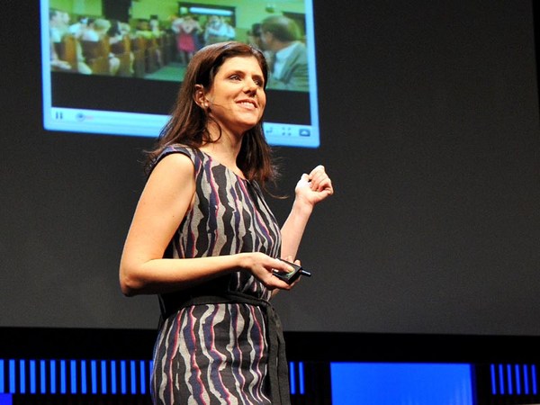
What do you think of when I say the word "design"? You probably think of things like this, finely crafted objects that you can hold in your hand, or maybe logos and posters and maps that visually explain things, classic icons of timeless design. But I'm not here to talk about that kind of design. I want to talk about the kind that you probably use every day and may not give much thought to, designs that change all the time and that live inside your pocket. I'm talking about the design of digital experiences and specifically the design of systems that are so big that their scale can be hard to comprehend. Consider the fact that Google processes over one billion search queries every day, that every minute, over 100 hours of footage are uploaded to YouTube. That's more in a single day than all three major U.S. networks broadcast in the last five years combined. And Facebook transmitting the photos, messages and stories of over 1.23 billion people. That's almost half of the Internet population, and a sixth of humanity.
A cosa pensate quando dico la parola "design"? Probabilmente pensate a cose come oggetti finemente lavorati che potete tenere in mano, o magari loghi, poster o mappe che spiegano le cose visivamente, icone classiche di design senza tempo. Ma non sono qui per parlare di quel design. Voglio parlarvi del tipo di design che probabilmente usate tutti i giorni e a cui non pensate molto, design che cambiano continuamente e che tenete in tasca. Parlo del design delle esperienze digitali e in particolare del design di sistemi così grandi che la loro dimensione è difficile da cogliere. Considerate il fatto che Google elabora più di un miliardo di ricerche al giorno, che ogni minuto, più di 100 ore di filmati vengono caricati su YouTube. In un giorno, è più di quanto abbiano trasmesso le tre più grandi emittenti americani negli ultimi cinque anni messi insieme. E Facebook trasmette foto, messaggi e storie di più di 1,23 miliardi di persone. È quasi la metà della popolazione di Internet, e un sesto dell'umanità.
These are some of the products that I've helped design over the course of my career, and their scale is so massive that they've produced unprecedented design challenges. But what is really hard about designing at scale is this: It's hard in part because it requires a combination of two things, audacity and humility — audacity to believe that the thing that you're making is something that the entire world wants and needs, and humility to understand that as a designer, it's not about you or your portfolio, it's about the people that you're designing for, and how your work just might help them live better lives. Now, unfortunately, there's no school that offers the course Designing for Humanity 101. I and the other designers who work on these kinds of products have had to invent it as we go along, and we are teaching ourselves the emerging best practices of designing at scale, and today I'd like share some of the things that we've learned over the years.
Questi sono alcuni dei prodotti che ho aiutato a progettare durante la mia carriera, e la loro dimensione è tale che hanno messo alla prova il design come mai in precedenza. Ma quello che è veramente difficile nel progettare su larga scala è questo: è difficile in parte perché richiede la combinazione di due cose, audacia e umiltà -- audacia nel credere che quello che si sta facendo è una cosa che tutto il mondo vuole e di cui ha bisogno, e umiltà nel capire che in quanto designer, non si tratta di voi o del vostro portfolio, si tratta delle persone per cui state progettando, e come il vostro lavoro potrebbe aiutarle a vivere una vita migliore. Sfortunatamente, non c'è una scuola che offre il corso di Design per l'Umanità 101. Io e altri designer che lavorano su questo tipo di prodotti abbiamo dovuto inventarlo col tempo, e ci insegnamo le migliori pratiche emergenti del progettare su larga scala, e oggi vorrei condividere con voi alcune cose che abbiamo imparato con gli anni.
Now, the first thing that you need to know about designing at scale is that the little things really matter. Here's a really good example of how a very tiny design element can make a big impact. The team at Facebook that manages the Facebook "Like" button decided that it needed to be redesigned. The button had kind of gotten out of sync with the evolution of our brand and it needed to be modernized. Now you might think, well, it's a tiny little button, it probably is a pretty straightforward, easy design assignment, but it wasn't. Turns out, there were all kinds of constraints for the design of this button. You had to work within specific height and width parameters. You had to be careful to make it work in a bunch of different languages, and be careful about using fancy gradients or borders because it has to degrade gracefully in old web browsers. The truth is, designing this tiny little button was a huge pain in the butt.
La prima cosa che dovete sapere del progettare su larga scala è che le piccole cose sono importanti. Ecco un buon esempio di come un piccolo elemento del design può avere un grande impatto. Il team di Facebook che gestisce il bottone "Mi piace" ha deciso che doveva essere riprogettato. Il bottone era diventato poco in linea con l'evoluzione del nostro marchio e doveva essere modernizzato. Potreste pensare che è un minuscolo bottone, probabilmente è un compito abbastanza chiaro e facile, ma non lo era. C'erano tutta una serie di limiti al design del bottone. Si doveva lavorare entro specifici parametri di altezza e profondità. Si doveva stare attenti a farlo funzionare in tutta una serie di lingue, e stare attenti a usare bordi e inclinazioni eleganti perché deve apparire bene nei vecchi browser. La verità è che progettare quel minuscolo bottone è stato molto fastidioso.
Now, this is the new version of the button, and the designer who led this project estimates that he spent over 280 hours redesigning this button over the course of months. Now, why would we spend so much time on something so small? It's because when you're designing at scale, there's no such thing as a small detail. This innocent little button is seen on average 22 billion times a day and on over 7.5 million websites. It's one of the single most viewed design elements ever created. Now that's a lot of pressure for a little button and the designer behind it, but with these kinds of products, you need to get even the tiny things right.
Questa è la nuova versione del bottone, e il designer che ha gestito questo progetto stima di avere passato 280 ore a riprogettare quel bottone per mesi. Perché passare così tanto tempo su una cosa così piccola? È perché quando si progetta su larga scala, non esistono i piccoli dettagli. Questo piccolo innocente bottone viene visto in media 22 miliardi di volte al giorno e su più di 7,5 milioni di siti. È uno dei singoli elementi di design più visti che sia mai stato creato. È parecchia pressione per un bottoncino e per il designer che vi sta dietro, ma con questo tipo di prodotti, anche le piccole cose vanno fatte bene.
Now, the next thing that you need to understand is how to design with data. Now, when you're working on products like this, you have incredible amounts of information about how people are using your product that you can then use to influence your design decisions, but it's not just as simple as following the numbers. Let me give you an example so that you can understand what I mean. Facebook has had a tool for a long time that allowed people to report photos that may be in violation of our community standards, things like spam and abuse. And there were a ton of photos reported, but as it turns out, only a small percentage were actually in violation of those community standards. Most of them were just your typical party photo. Now, to give you a specific hypothetical example, let's say my friend Laura hypothetically uploads a picture of me from a drunken night of karaoke. This is purely hypothetical, I can assure you. (Laughter) Now, incidentally, you know how some people are kind of worried that their boss or employee is going to discover embarrassing photos of them on Facebook? Do you know how hard that is to avoid when you actually work at Facebook? So anyway, there are lots of these photos being erroneously reported as spam and abuse, and one of the engineers on the team had a hunch. He really thought there was something else going on and he was right, because when he looked through a bunch of the cases, he found that most of them were from people who were requesting the takedown of a photo of themselves. Now this was a scenario that the team never even took into account before. So they added a new feature that allowed people to message their friend to ask them to take the photo down. But it didn't work. Only 20 percent of people sent the message to their friend. So the team went back at it. They consulted with experts in conflict resolution. They even studied the universal principles of polite language, which I didn't even actually know existed until this research happened. And they found something really interesting. They had to go beyond just helping people ask their friend to take the photo down. They had to help people express to their friend how the photo made them feel.
L'altra cosa che dovete capire è come progettare con i dati. Quando si lavora su prodotti come questo, c'è una gran quantità di informazioni su come le persone usano i prodotti che poi potete usare per influenzare le vostre decisioni di design, ma non è semplice come seguire i numeri. Vi faccio un esempio in modo che possiate capire cosa intendo. Facebook ha da tempo uno strumento che permette alle persone di segnalare foto che possano violare gli standard della comunità, cose come spam e abusi. C'erano una gran quantità di foto segnalate, ma in realtà, solo una piccola percentuale violava veramente gli standard della comunità. La maggior parte era tipiche foto di feste. Per farvi un ipotetico esempio specifico, diciamo che la mia amica Laura, ipoteticamente, carichi una foto di me ubriaca a una serata karaoke. È puramente ipotetico, ve lo assicuro. (Risate) Tra l'altro, sapete che alcune persone sono preoccupate che il loro capo o datore di lavoro scopra foto imbarazzanti su Facebook? Sapete com'è difficile evitarlo se lavorate a Facebook? Comunque, ci sono molte di queste foto erroneamente segnalate come spam o abuso, e uno degli ingegneri del team aveva un sospetto. Pensava che ci fosse altro e aveva ragione, perché analizzando una serie di casi, ha scoperto che la maggior parte era di persone che richiedevano l'eliminazione di una loro foto. Era uno scenario che il team non aveva mai preso in considerazione. Quindi hanno aggiunto una nuova funzione che permette alle persone di mandare un messaggio all'amico chiedendo di eliminare la foto. Ma non ha funzionato. Solo il 20 per cento delle persone mandava il messaggio all'amico. Quindi il team ci è ritornato sopra. Si è consultato con esperti di risoluzione di conflitti. Hanno anche studiato i principi universali della comunicazione educata, che non sapevo neanche esistesse prima di questa ricerca. E hanno scoperto una cosa molto interessante. Hanno dovuto spingersi oltre l'aiutare la gente a chiedere all'amico di eliminare la foto. Hanno dovuto aiutare la gente a esprimere all'amico come la foto li faceva sentire.
Here's how the experience works today. So I find this hypothetical photo of myself, and it's not spam, it's not abuse, but I really wish it weren't on the site. So I report it and I say, "I'm in this photo and I don't like it," and then we dig deeper. Why don't you like this photo of yourself? And I select "It's embarrassing." And then I'm encouraged to message my friend, but here's the critical difference. I'm provided specific suggested language that helps me communicate to Laura how the photo makes me feel. Now the team found that this relatively small change had a huge impact. Before, only 20 percent of people were sending the message, and now 60 percent were, and surveys showed that people on both sides of the conversation felt better as a result. That same survey showed that 90 percent of your friends want to know if they've done something to upset you. Now I don't know who the other 10 percent are, but maybe that's where our "Unfriend" feature can come in handy.
Ecco com'è l'esperienza oggi. Trovo questa ipotetica foto di me, non è spam, non è un abuso, ma vorrei veramente che non fosse sul sito. Quindi lo segnalo e dico, "Sono su questa foto e non mi piace," e poi approfondiamo. Perché non ti piace questa foto di te? E seleziono "È imbarazzante." E poi vengo incoraggiata a scrivere al mio amico, ma ecco la differenza importante. Mi viene fornito un linguaggio specifico che mi aiuta a comunicare a Laura come mi fa sentire la foto. Ora il team ha scoperto che questo piccolo cambiamento ha avuto un impatto enorme. Prima, solo il 20 per cento delle persone mandava il messaggio, e ora lo fa il 60 per cento, e le ricerche mostrano che in entrambi i lati della conversazione le persone si sentono meglio. Quella stessa ricerca ha mostrato che il 90 per cento degli amici vuole sapere se ha fatto qualcosa per farvi arrabbiare. Non so chi sia il restante 10 per cento, ma forse è qui che la funzione "Rimuovi dagli amici" si rivela utile.
So as you can see, these decisions are highly nuanced. Of course we use a lot of data to inform our decisions, but we also rely very heavily on iteration, research, testing, intuition, human empathy. It's both art and science. Now, sometimes the designers who work on these products are called "data-driven," which is a term that totally drives us bonkers. The fact is, it would be irresponsible of us not to rigorously test our designs when so many people are counting on us to get it right, but data analytics will never be a substitute for design intuition. Data can help you make a good design great, but it will never made a bad design good.
Come potete vedere, queste decisioni sono molto sottili. Certo, usiamo molto i dati per prendere decisioni, ma ci affidiamo anche molto alle iterazioni, alle ricerche, ai testi, all'intuizione, all'empatia umana. È sia arte che scienza. Talvolta i designer che lavorano su questi prodotti vengono definiti "data-driven", guidati dai dati, che è un termine che ci fa andare fuori di testa. Il fatto è che sarebbe da irresponsabili non testare i nostri design quando tanta gente conta su di noi per farli bene, ma l'analisi dei dati non sostituirà mai l'intuizione del design. I dati possono aiutare a migliorare un buon design, ma non renderà mai buono un pessimo design.
The next thing that you need to understand as a principle is that when you introduce change, you need to do it extraordinarily carefully. Now I often have joked that I spend almost as much time designing the introduction of change as I do the change itself, and I'm sure that we can all relate to that when something that we use a lot changes and then we have to adjust. The fact is, people can become very efficient at using bad design, and so even if the change is good for them in the long run, it's still incredibly frustrating when it happens, and this is particularly true with user-generated content platforms, because people can rightfully claim a sense of ownership. It is, after all, their content.
L'altra cosa che dovete capire come principio è che introducendo un cambiamento, bisogna farlo con estrema attenzione. Spesso scherzo sul fatto che passo tanto tempo a progettare l'introduzione del design quanto quello che passo sul cambiamento stesso, e sono sicura che ci riconosciamo tutti quando una cosa che usiamo molto cambia e dobbiamo adattarci. Il fatto è che la gente può diventare molto efficiente nell'usare un pessimo design, e quindi anche se il cambiamento è buono sul lungo termine, rimane molto frustrante quando si verifica ed è specialmente vero nelle piattaforme di contenuti generati dagli utenti, perché la gente rivendica un senso di proprietà. Dopotutto, il contenuto è loro.
Now, years ago, when I was working at YouTube, we were looking for ways to encourage more people to rate videos, and it was interesting because when we looked into the data, we found that almost everyone was exclusively using the highest five-star rating, a handful of people were using the lowest one-star, and virtually no one was using two, three or four stars. So we decided to simplify into an up-down kind of voting binary model. It's going to be much easier for people to engage with. But people were very attached to the five-star rating system. Video creators really loved their ratings. Millions and millions of people were accustomed to the old design. So in order to help people prepare themselves for change and acclimate to the new design more quickly, we actually published the data graph sharing with the community the rationale for what we were going to do, and it even engaged the larger industry in a conversation, which resulted in my favorite TechCrunch headline of all time: "YouTube Comes to a 5-Star Realization: Its Ratings Are Useless."
Anni fa, quando lavoravo per YouTube, cercavamo modi per incoraggiare la gente a valutare i video, ed era interessante perché analizzando i dati, abbiamo scoperto che quasi tutti usavano esclusivamente le cinque stelle, una manciata di persone usava una stella, e nessuno usava le due, tre o quattro stelle. Così abbiamo deciso di semplificare con un modello di voto binario, buono-cattivo. Per la gente sarà più facile interagire. Ma la gente era molto affezionata al sistema di voto a cinque stelle. I creatori dei video adoravano i loro voti. Milioni e milioni di persone si erano abituate al vecchio design. Quindi per aiutare la gente a prepararsi al cambiamento e abituarsi più rapidamente al nuovo design, abbiamo pubblicato il grafico dei dati condividendo con la comunità i motivi di quello che stavamo facendo, e abbiamo anche coinvolto l'intera industria in una conversazione, che si è conclusa con il mio titolo preferito di TechCrunch di tutti i tempi: "YouTube giunge a una conclusione da 5 stelle: le sue valutazioni sono inutili."
Now, it's impossible to completely avoid change aversion when you're making changes to products that so many people use. Even though we tried to do all the right things, we still received our customary flood of video protests and angry emails and even a package that had to be scanned by security, but we have to remember people care intensely about this stuff, and it's because these products, this work, really, really matters to them.
È impossibile evitare completamente l'avversione al cambiamento quando si fanno cambiamenti a prodotti che tante gente usa. Anche se abbiamo cercato di fare tutte le cose nel modo giusto, abbiamo comunque ricevuto il solito flusso di video protesta ed email inferocite e addirittura un pacco esaminato dalla sicurezza, ma dobbiamo ricordare che alla gente queste cose interessano, ed è perché questi prodotti, questo lavoro, ha una grande importanza per loro.
Now, we know that we have to be careful about paying attention to the details, we have to be cognizant about how we use data in our design process, and we have to introduce change very, very carefully. Now, these things are all really useful. They're good best practices for designing at scale. But they don't mean anything if you don't understand something much more fundamental. You have to understand who you are designing for.
Sappiamo che dobbiamo stare attenti a tutti i dettagli, dobbiamo essere a conoscenza di come usiamo i dati nel design, e dobbiamo introdurre il cambiamento in modo molto prudente. Queste cose sono molto utili. Sono buone pratiche per progettare su larga scala. Ma non vogliono dire niente se non si capisce una cosa ancora più importante. Si deve capire per chi si sta progettando.
Now, when you set a goal to design for the entire human race, and you start to engage in that goal in earnest, at some point you run into the walls of the bubble that you're living in. Now, in San Francisco, we get a little miffed when we hit a dead cell zone because we can't use our phones to navigate to the new hipster coffee shop. But what if you had to drive four hours to charge your phone because you had no reliable source of electricity? What if you had no access to public libraries? What if your country had no free press? What would these products start to mean to you? This is what Google, YouTube and Facebook look like to most of the world, and it's what they'll look like to most of the next five billion people to come online. Designing for low-end cell phones is not glamorous design work, but if you want to design for the whole world, you have to design for where people are, and not where you are.
Fissandosi l'obiettivo di progettare per tutta l'umanità, e cominciando a lavorare per quell'obiettivo in modo coscienzioso, a un certo punto ci si scontra contro le pareti della bolla in cui si vive. A San Francisco, ci irrita il fatto di essere in una zona senza copertura perché non possiamo usare il telefono per arrivare al nuovo bar alla moda. Ma se doveste guidare per quattro ore per caricare il telefono perché non avete una fonte di elettricità affidabile? E se non aveste accesso alle biblioteche pubbliche? E se il vostro paese non avesse la libertà di stampa? Che significato avrebbero per voi questi prodotti? Questo è quello che Google, YouTube e Facebook rappresentano per la maggior parte del mondo, ed è quello che rappresentano per gran parte dei prossimi cinque miliardi persone che arriveranno online. Progettare per telefoni di fascia bassa non è molto affascinante, ma se volete progettare per il mondo intero, dovete progettare per dove sono le persone, e non per dove siete voi.
So how do we keep this big, big picture in mind? We try to travel outside of our bubble to see, hear and understand the people we're designing for. We use our products in non-English languages to make sure that they work just as well. And we try to use one of these phones from time to time to keep in touch with their reality.
Come tenerlo bene a mente? Cerchiamo di viaggiare al di fuori della bolla per vedere, sentire e capire le persone per cui progettiamo. Usiamo i nostri prodotti in lingue diverse dall'Inglese per assicurarci che funzionino altrettanto bene. E cerchiamo di usare uno di questi telefoni di tanto in tanto per restare a contatto con la realtà.
So what does it mean to design at a global scale? It means difficult and sometimes exasperating work to try to improve and evolve products. Finding the audacity and the humility to do right by them can be pretty exhausting, and the humility part, it's a little tough on the design ego. Because these products are always changing, everything that I've designed in my career is pretty much gone, and everything that I will design will fade away. But here's what remains: the never-ending thrill of being a part of something that is so big, you can hardly get your head around it, and the promise that it just might change the world.
Allora cosa significa progettare su scala globale? Significa un lavoro difficile e talvolta esasperante nel cercare di migliorare e far evolvere i prodotti. Trovare l'audacia e l'umiltà per riuscirci può essere estenuante, e la parte dell'umiltà, è un po' difficile per l'ego del designer. Perché questi prodotti sono in continuo cambiamento, tutto quello che ho progettato nella mia carriera è sorpassato, e tutto quello che progetterò svanirà. Ma ecco quello che resta: il brivido senza fine di far parte di qualcosa di così grande, da essere difficilmente afferrabile completamente, e la promessa che potrà cambiare il mondo.
Thank you.
Grazie.
(Applause)
(Applausi)