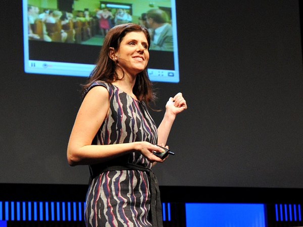
What do you think of when I say the word "design"? You probably think of things like this, finely crafted objects that you can hold in your hand, or maybe logos and posters and maps that visually explain things, classic icons of timeless design. But I'm not here to talk about that kind of design. I want to talk about the kind that you probably use every day and may not give much thought to, designs that change all the time and that live inside your pocket. I'm talking about the design of digital experiences and specifically the design of systems that are so big that their scale can be hard to comprehend. Consider the fact that Google processes over one billion search queries every day, that every minute, over 100 hours of footage are uploaded to YouTube. That's more in a single day than all three major U.S. networks broadcast in the last five years combined. And Facebook transmitting the photos, messages and stories of over 1.23 billion people. That's almost half of the Internet population, and a sixth of humanity.
چی به ذهنتون میاد، وقتی کلمه "طراحی" رو به زبون میارم؟ شاید یه چیزایی مثل این به ذهنتون میاد، اشیاء ظریف دست سازی که می تونید توی دستاتون بگیرید، یا شاید لوگوها، پوسترها و نقشه هایی که بطور بصری چیزها رو شرح می دهند، طراحی جاودان تندیسهای کهن. اما برای بحث درمورد این نوع طراحی اینجا نیومدم. می خواهم درباره انواعی صحبت کنم که شاید هر روز باهاشون سرو کار دارید و ممکنه خیلی بهش توجه نکنید، طرحهایی که همواره تغییر می کنند و اونایی که توی جیباتون جا دارند. دارم در مورد طراحی تجربیات دیجیتال حرف می زنم و بطور خاص، طراحی سیستمهایی که بقدری بزرگند که درک مقیاسشون ممکنه دشوار باشه. این حقیقت رو در نظر بگیرید که گوگل روزانه بیش از یه میلیارد جستار رو پردازش می کنه، که در هر دقیقه، بیش از صد ساعت ویدیو تو یوتیوب آپلود می شه. این مقدار، تنها ظرف یه روز از مجموع تمام آنچه که سه شبکه تلویزیونی اصلی ایالات متحده طی پنج سال گذشته پخش کردن، بیشتره. و فیس بوک، عکسها، پیامها و اخبارِ بیش از ۱/۲۳ میلیارد نفر رو منتشر می کنه. این تعداد تقریباً نیمی از جمعیت کاربران اینترنت و یک ششم جمعیت جهان رو، دربرمی گیره.
These are some of the products that I've helped design over the course of my career, and their scale is so massive that they've produced unprecedented design challenges. But what is really hard about designing at scale is this: It's hard in part because it requires a combination of two things, audacity and humility — audacity to believe that the thing that you're making is something that the entire world wants and needs, and humility to understand that as a designer, it's not about you or your portfolio, it's about the people that you're designing for, and how your work just might help them live better lives. Now, unfortunately, there's no school that offers the course Designing for Humanity 101. I and the other designers who work on these kinds of products have had to invent it as we go along, and we are teaching ourselves the emerging best practices of designing at scale, and today I'd like share some of the things that we've learned over the years.
اینها برخی ازمحصولاتی اند که من طی دوره کاریم، به طراحیشون کمک کردم و مقیاسشون بقدری گستردست که چالشهای بی سابقه طراحی رو به دنبال داشته اند. اما چیزی که واقعاً در مورد طراحی در این مقیاس دشواره، اینه که: این مسئله تاحدودی مشکله چون ترکیب دو چیز رو می خواهد جسارت و تواضع جسارت برای ایمان به اینکه چیزی که توداری طراحی می کنی چیزیه که دنیا خواهانشه و بهش نیاز داره، وتواضع برای درکش بعنوان یه طراح. این در مورد تو یا سهمت نیست، این درباره کساییِ که تو براشون طراحی می کنی و چطور آثارت ممکنه به اونا کمک کنه بهتر زندگی کنند. متاسفانه در حال حاضر دانشکده ای نیست که دوره «مبانی طراحی برای انسانها» رو برگزار کنه. من و طراحان دیگه که روی این نوع محصولات کار می کنیم همینطور که پیش میریم مجبور بوده ایم که بسازیمش و بهترین شیوه های نوظهورِ طراحی در مقیاس بزرگ رو به خودمون آموزش میدیم و امروز می خواهم بعضی ازین چیزایی که طی این سالها یاد گرفتیم رو، دربارش صحبت کنیم.
Now, the first thing that you need to know about designing at scale is that the little things really matter. Here's a really good example of how a very tiny design element can make a big impact. The team at Facebook that manages the Facebook "Like" button decided that it needed to be redesigned. The button had kind of gotten out of sync with the evolution of our brand and it needed to be modernized. Now you might think, well, it's a tiny little button, it probably is a pretty straightforward, easy design assignment, but it wasn't. Turns out, there were all kinds of constraints for the design of this button. You had to work within specific height and width parameters. You had to be careful to make it work in a bunch of different languages, and be careful about using fancy gradients or borders because it has to degrade gracefully in old web browsers. The truth is, designing this tiny little button was a huge pain in the butt.
حالا، اولین چیزی که دونستنش در مورد طراحی در مقیاس بزرگ لازمه اینه که مسائل کوچیک واقعا مهمند. اینجا مثال بسیار خوبی ازینکه چطور یه عنصر طراحی بسیار ناچیز، می تونه تاثیری ژرف داشته باشه، داریم. اون تیمی که تو فیس بوک دکمه "لایک" رو مدیریت می کنه به این نتیجه رسید که لازمه اونو دوباره طراحی کنه. این کلید برخلاف تحول نام تجاریمون متاثر نوعی ناهماهنگی بود و لازم بود که بروزآوری بشه. ممکنه حالا فکر کنین، خُب، اون یه دکمه خیلی کوچیکه که احتمالا کار طراحی خیلی راحت و ساده ای داره، اما اینطور نبود. معلومه، برای طراحی این دکمه همه نوع محدودیت وجود داشت. مجبور بودی مطابق پارامترهای معین ارتفاع و عرض کار کنی. باید مواظب بودی تا کارکردش رو با گروهی از زبانهای مختلف سازگار کنی و درمورد کاربرد حاشیه ها یا زوایای خاص دقت بخرج می دادی چون باید به آسونی با مرورگرهای قدیمی سازگار می شد. حقیقت اینه، طراحی این دکمه کوچیک ناچیز خیلی ستم بود.
Now, this is the new version of the button, and the designer who led this project estimates that he spent over 280 hours redesigning this button over the course of months. Now, why would we spend so much time on something so small? It's because when you're designing at scale, there's no such thing as a small detail. This innocent little button is seen on average 22 billion times a day and on over 7.5 million websites. It's one of the single most viewed design elements ever created. Now that's a lot of pressure for a little button and the designer behind it, but with these kinds of products, you need to get even the tiny things right.
درحال حاضر این نسخه جدیدِ این دکمه هستش و طراحی که این پروژه رو پیش برد، تخمین می زنه که بیشتر از ۲۸۰ ساعت در طول ماه صرف طراحی مجدد این دکمه کرده. حالا ما چرا اینهمه وقت رو صرف چیزی به این کوچیکی کردیم؟ چون وقتی که داری در مقیاس بزرگ طراحی می کنی چیزی بنام جزئی کوچیک وجود نداره. همین دکمه کوچیک ساده با میانگین ۲۲ میلیارد در روز و در بیش از ۷/۵ میلیون وب سایت بهش توجه میشه. این دکمه یکی از عناصر طراحی منفرد با بیشترین بازدیده که تا حالا ساخته شده. برای یه دکمه کوچیک و طراح پشتش، فشار زیادیه ولی با محصولاتی ازین دست لازمه که حتی موارد کوچیک رو درست درک کنی.
Now, the next thing that you need to understand is how to design with data. Now, when you're working on products like this, you have incredible amounts of information about how people are using your product that you can then use to influence your design decisions, but it's not just as simple as following the numbers. Let me give you an example so that you can understand what I mean. Facebook has had a tool for a long time that allowed people to report photos that may be in violation of our community standards, things like spam and abuse. And there were a ton of photos reported, but as it turns out, only a small percentage were actually in violation of those community standards. Most of them were just your typical party photo. Now, to give you a specific hypothetical example, let's say my friend Laura hypothetically uploads a picture of me from a drunken night of karaoke. This is purely hypothetical, I can assure you. (Laughter) Now, incidentally, you know how some people are kind of worried that their boss or employee is going to discover embarrassing photos of them on Facebook? Do you know how hard that is to avoid when you actually work at Facebook? So anyway, there are lots of these photos being erroneously reported as spam and abuse, and one of the engineers on the team had a hunch. He really thought there was something else going on and he was right, because when he looked through a bunch of the cases, he found that most of them were from people who were requesting the takedown of a photo of themselves. Now this was a scenario that the team never even took into account before. So they added a new feature that allowed people to message their friend to ask them to take the photo down. But it didn't work. Only 20 percent of people sent the message to their friend. So the team went back at it. They consulted with experts in conflict resolution. They even studied the universal principles of polite language, which I didn't even actually know existed until this research happened. And they found something really interesting. They had to go beyond just helping people ask their friend to take the photo down. They had to help people express to their friend how the photo made them feel.
خَب، مورد بعدی که درکش لازمه اینه که چطور با داده ها طراحی کنی. وقتی روی این قبیل محصولات کار می کنی حجم باورنکردنی اطلاعات رو درباره اینکه مردم چطور دارن محصولت رو بکار می گیرن داری که بعدش می تونی اونا رو برای تحت تاثیر قرار دادنِ تصمیمات طراحیت بکار ببندی ولی، بسادگی اینکه فقط عددها رو پشت سرهم بذاری نیست. بذارید مثالی براتون بزنم جوریکه بتونید بفهمید منظورم چیه. فیس بوک ابزاری رو خیلی وقته که داره که به کاربراش اجازه میده تصاویری که ممکنه با معیارهای جامعمون در تناقض باشن رو گزارش کنن، چیزایی مثل اسپم(هرزنامه) و سوء استفاده. و خیل کثیری از تصاویر گزارش شده موجود بود اما همینطور که معلومه، فقط درصد کمی حقیقتاً با اون معیارهای جامعه تناقض داشت. بیشترشون درحد تصویر معمولی مهمونیای شما بودن. خب، برای اینکه مثال فرضی خاصی براتون بزنم بیایید به دوستم لورا فرضاً بگیم که یه عکس از منو از شبی که مست آواز خوندم رو آپلود کنه. این که کاملاً فرضیه، بهتون اطمینان می دم. (خنده حضار) حالا، اتفاقاً می دونین چقدر بعضیا یجورایی نگرانن که رییس یا کارمندشون می خواد عکسای مشکل دارشون رو توی فیس بوک پیدا کنه؟ می دونین اجتناب ازش چقدر سخته موقعی که واقعاً توی فیس بوک کار می کنی؟ بهرحال، خیلی ازین تصاویر هست که اشتباهاً بعنوان اسپم و سوء استفاده گزارش میشن، یکی از مهندسهای تیم نظری داشت واقعاً فکر می کرد چیز دیگه ای در جریانه و حق با اون بود، چون وقتی که دسته ای ازموارد رو مرور می کرد فهمید که بیشترشون از افرادی بودن که بازدید یه تصویراز خودشون رو درخواست می کردن. حالا این سناریویی بود که تیم قبلاً هیچوقت بهش اهمیت نمی داد. پس یه ویژگی جدید اضافه کردن که به اشخاص اجازه می داد به دوستاشون پیغام بدن تا ازشون بخوان اون تصویر رو نگاه کنن. اما این ویژگی موثر واقع نشد. فقط بیست درصد مردم به دوستاشون پیغام دادن. پس تیم با جدیت به کارش ادامه داد. اونا با کارشناسان حل منازعه، رایزنی کردن. حتی اصول جهانی زبان مودبانه رو مطالعه کردن، که من حقیفتاً، تا وقتی این تحقیق اتفاق افتاد حتی نمی دونستم وجود داره. و چیزای واقعاً جالبی پیدا کردن. باید از کمک کردن خالی به اشخاصی که از دوستاشون می خواستن تصویرشون رو نگاه کنن، فراتر می رفتن. باید به اونا کمک می کردن تا به دوستاشون بگن که این تصویرچه حسی بهشون میده.
Here's how the experience works today. So I find this hypothetical photo of myself, and it's not spam, it's not abuse, but I really wish it weren't on the site. So I report it and I say, "I'm in this photo and I don't like it," and then we dig deeper. Why don't you like this photo of yourself? And I select "It's embarrassing." And then I'm encouraged to message my friend, but here's the critical difference. I'm provided specific suggested language that helps me communicate to Laura how the photo makes me feel. Now the team found that this relatively small change had a huge impact. Before, only 20 percent of people were sending the message, and now 60 percent were, and surveys showed that people on both sides of the conversation felt better as a result. That same survey showed that 90 percent of your friends want to know if they've done something to upset you. Now I don't know who the other 10 percent are, but maybe that's where our "Unfriend" feature can come in handy.
اینجاست که نشون می ده چطور تجربه، امروز کارگره. به هرحال، این تصویر فرضی از خودمو پیدا کردم و نه اسپمه و نه سوء استفاده، ولی کاشکی این تصویر توی این سایت نبود. پس گزارشش کردم و جواب دادم "من در این تصویر هستم و این را نمی پسندم." و بعدش دقیقتر شدیم. چرا شما این تصویرتان را نمی پسندید؟ و من "این تصویر آزاردهنده است." رو انتخاب کردم. و بعد به من توصیه شد تا به دوستم پیغام بدم ولی فرق تامل برانگیز اینجاست. زبان پیشنهادی خاصی برایم تدارک دیده اند که بِهم کمک میکنه که به لورا بگم که این تصویر چه حسی بهم میده. حالا تیم پی برد که این تغییر نسبتاً کوچیک تاثیر بسیار زیادی داشت. قبلاً، فقط بیست درصد مردم پیغام می فرستادن اما حالا به شصت درصد می رسید و در نتیجه، نظرسنجیها نشان داد که افراد در هر دو طرف گفتگو احساس بهتری داشتن. نظرسنجی مشابهی نشان داد که نود درصد دوستاتون می خوان بدونن که آیا کاری کردن که شمارو ناراحت کرده. حالا من نمی دونم که ده درصد بقیه کیا هستن، ولی شاید موقعیتی باشه که ویژگی «حذف کردن از لیست دوستانِ» ما بتونه یه روزی به درد بخوره.
So as you can see, these decisions are highly nuanced. Of course we use a lot of data to inform our decisions, but we also rely very heavily on iteration, research, testing, intuition, human empathy. It's both art and science. Now, sometimes the designers who work on these products are called "data-driven," which is a term that totally drives us bonkers. The fact is, it would be irresponsible of us not to rigorously test our designs when so many people are counting on us to get it right, but data analytics will never be a substitute for design intuition. Data can help you make a good design great, but it will never made a bad design good.
پس همینطور که میبینید، این تصمیمات خیلی ظریف و دقیقن. مطمئناً نه تنها از داده های زیادی بهره بردیم تا تصمیماتمون روگزارش کنیم بلکه خیلی خیلی به تکرار، تحقیق، آزمایش، بینش و همدلی انسانی تکیه کردیم. این هم هنره و هم علم. اینروزها، گهگاهی طراحانی که روی این محصولات کار می کنن رو "داده محور" می گن، واژه ای که واقاً عصبانیمون می کنه. حقیقت اینه که، این مسئله می تونه بی مسئولیتی ما باشه نه برای آزمایش سختگیرانه طراحیامون وقتی بسیاری از مردم بهمون اعتماد می کنن تا درست انجامش بدیم ولی تجزیه و تحلیل داده ها هیچوقت جای بینش طراحی رو نمی گیره. داده ها می تونن بهتون کمک کنن تا یه طراحی خوب رو به یه طراحی عالی تبدبل کنین ولی هیچوقت یه طراحی بد رو به خوب تبدیل نمی کنن.
The next thing that you need to understand as a principle is that when you introduce change, you need to do it extraordinarily carefully. Now I often have joked that I spend almost as much time designing the introduction of change as I do the change itself, and I'm sure that we can all relate to that when something that we use a lot changes and then we have to adjust. The fact is, people can become very efficient at using bad design, and so even if the change is good for them in the long run, it's still incredibly frustrating when it happens, and this is particularly true with user-generated content platforms, because people can rightfully claim a sense of ownership. It is, after all, their content.
نکته بعدی که لازمه بعنوان یه اصل قبولش کنین اینه که وقتی تغییر رو شروع می کنین باید با نهایت دقت انجامش بدین. من اغلب شوخی گرفتمش تقریباً زمان زیادی رو برای طراحی آغاز تغییر صرف کردم همونطور که من خود تغییر رو ایجاد کردم و مطمئنم که هممون می تونیم اونو درک کنیم موقعی که تغییرات زیادی رو برای چیزی انجام میدیم و بعدش باید اصلاحش کنیم. حقیقت اینه که مردم می تونن در بکارگیری طراحی بد خیلی ماهر بشن و فرضاً حتی اگه این تغییر در درازمدت براشون مفید باشه، وقتی اتفاق میوفته همیشه خیلی آزاردهندس و این بطرز خاصی با پلت فورمهای با محتوای کاربر-محور درسته چون کاربران می تونند بخوبی مفهوم مالکیت رو طلب کنن. جدای همه چیز، محتواشون اینه.
Now, years ago, when I was working at YouTube, we were looking for ways to encourage more people to rate videos, and it was interesting because when we looked into the data, we found that almost everyone was exclusively using the highest five-star rating, a handful of people were using the lowest one-star, and virtually no one was using two, three or four stars. So we decided to simplify into an up-down kind of voting binary model. It's going to be much easier for people to engage with. But people were very attached to the five-star rating system. Video creators really loved their ratings. Millions and millions of people were accustomed to the old design. So in order to help people prepare themselves for change and acclimate to the new design more quickly, we actually published the data graph sharing with the community the rationale for what we were going to do, and it even engaged the larger industry in a conversation, which resulted in my favorite TechCrunch headline of all time: "YouTube Comes to a 5-Star Realization: Its Ratings Are Useless."
چند سال پیش، وقتی توی یوتیوب کار می کردم، بدنبال راههایی بودیم تا کاربران بیشتری رو تشویق کنیم تا به ویدئوها امتیاز بدهند کار جالبی بود چون وقتی به داده ها نگاه می کردیم پی بردیم که تقریباً همه بطور خاص بالاترین امتیاز پنج ستاره رو می دادن، تعداد کمی از ازونا پایینترین امتیاز یک ستاره رو می دادن و در واقع هیچ کس امتیازای دو، سه و چهار ستاره رو استفاده نمی کرد. پس تصمیم گرفتیم تا به نوعی مدل دودوئی رای گیری صفر و یک سادش کنیم. قراره برای کسایی که باهاش سروکار دارن خیلی ساده تر بشه. اما کاربران به سیستم امتیازدهی پنج ستاره خیلی علاقمند بودن. خالقین ویدئوها وافعاً عاشق امتیازدهی کاربران بودن. میلیونها نفر از مردم به طراحی قدیمی خو گرفته بودن. پس برای کمک بهشون خودشون برای تغییر آماده شدن و با سرعت بیشتری به طراحی جدید خو گرفتن، ما عملاً نمودار داده به اشتراک گذاشته شده بوسیله اون اجتماع رو منتشر کردیم پایه و اساسی برای انچه که می خواستیم انجام بدیم و اون حتی صنعت بزرگتری رو توی یه مکالمه درگیر کرد، که سرخط خبر محبوب تمام دوران منو از سایت خبری تک کرانچ باعث شد: "یوتیوب به فرجامی پنج ستاره ای رسیده است امتیازدهی های آن بی فایده اند."
Now, it's impossible to completely avoid change aversion when you're making changes to products that so many people use. Even though we tried to do all the right things, we still received our customary flood of video protests and angry emails and even a package that had to be scanned by security, but we have to remember people care intensely about this stuff, and it's because these products, this work, really, really matters to them.
در حال حاضر، غیرممکن است تا بطور کامل از ناسازگاری تغییر اجتناب کرد وقتی که خودتون تغییرات رو بر محصولاتی که بسیاری از مردم استفاده می کنن ایجاد می کنین. با وجود اینکه تلاش کردیم همه کارهای درست رو انجام بدیم، هنوزهم سیل معمولمون رو از اعتراضات ویدئویی و ایمیلهای تهدیدآمیز دریافت می کردیم و حتی بسته ای که باید بوسیله بخش امنیتی اسکن می شد ولی باید به یاد داشته باشیم که مردم توجه خیلی زیادی به این مسایل دارن و این به این خاطره که این محصولات و این کار به معنای واقعی براشون اهمیت داره.
Now, we know that we have to be careful about paying attention to the details, we have to be cognizant about how we use data in our design process, and we have to introduce change very, very carefully. Now, these things are all really useful. They're good best practices for designing at scale. But they don't mean anything if you don't understand something much more fundamental. You have to understand who you are designing for.
می دونیم که باید در مورد توجه کردنِ به جزئیات مراقب باشیم، لازمه که به نحوه استفاده از داده ها در فرآیند طراحیمون آگاه باشیم باید تغییر رو با دقت بسیار بسیار زیاد بشناسونیم. همه این چیزا واقعاً مفیدند. اونا خوبن، بهترین تکنیکها برای طراحی در مقیاس بزرگ. اما هیچ مفهومی ندارن اگه شما چیزای بسیار اساسی رو نفهمین. باید بفهمین که برای کی طراحی می کنین.
Now, when you set a goal to design for the entire human race, and you start to engage in that goal in earnest, at some point you run into the walls of the bubble that you're living in. Now, in San Francisco, we get a little miffed when we hit a dead cell zone because we can't use our phones to navigate to the new hipster coffee shop. But what if you had to drive four hours to charge your phone because you had no reliable source of electricity? What if you had no access to public libraries? What if your country had no free press? What would these products start to mean to you? This is what Google, YouTube and Facebook look like to most of the world, and it's what they'll look like to most of the next five billion people to come online. Designing for low-end cell phones is not glamorous design work, but if you want to design for the whole world, you have to design for where people are, and not where you are.
وقتی که هدفی رو برای طراحی برای تمام نژاد بشر تعیین می کنین و خودتون رو سخت تو اون هدف درگیر می کنین یکی ازهمین روزا به بن بست حبابی که توش زندگی می کنین، می رسین. توی سانفرانسیسکو، یکم اذیت می شیم وقتی وارد یه منطقه نقطه کور می شیم چون نمی تونیم تلفنهامون رو برای مشخص کردن مسیر کافی شاپ جدید نو هیپستر(نوگرایی) استفاده کنیم. ولی اگه مجبور باشین چهار ساعت رانندگی کنین تا تلفنتون رو شارژ کنین به این خاطر که منبع الکتریکی مطمئنی نداشتین چی میشه ؟ چی میشه اگه به کتابخونه های عمومی دسترسی نداشته باشین؟ اگه تو کشورتون مطبوعات آزاد نبود چی؟ این محسولات چه مفهومی براتون داشتن؟ این چیزیه که گوگل، یوتیوب و فیس بوک برای بیشتر جهان به نظر میان و این چیزیه که اونا برای بیشتر پنج میلیارد مردم دیگه به نظر خواهند اومد تا آنلاین بشن. طراحی برای گوشیهای رده پایین کار طراحی جذابی نیست ولی اگه لازم باشه برای تمام دنیا طراحی کنین باید برای اونجایی که مردم هستند طراحی کنین و نه اونجایی که خودتون هستین.
So how do we keep this big, big picture in mind? We try to travel outside of our bubble to see, hear and understand the people we're designing for. We use our products in non-English languages to make sure that they work just as well. And we try to use one of these phones from time to time to keep in touch with their reality.
پس چطور این تصویر، تصویر بزرگ رو تو ذهنمون نگه داریم؟ سعی می کنیم برای دیدن، شنیدن و درک مردمی که براشون طراحی میکنیم، به خارج از حبابمون سفر کنیم. محصولاتمون رو در زبانهای غیرانگلیسی بکار می گیریم تا مطمئن بشویم که به بهترین نحو عمل می کنن. و هرازگاهی سعی می کنیم تا از یکی ازین گوشیهارو استفاده کنیم تا با واقعیت اونا در ارتباط باشیم.
So what does it mean to design at a global scale? It means difficult and sometimes exasperating work to try to improve and evolve products. Finding the audacity and the humility to do right by them can be pretty exhausting, and the humility part, it's a little tough on the design ego. Because these products are always changing, everything that I've designed in my career is pretty much gone, and everything that I will design will fade away. But here's what remains: the never-ending thrill of being a part of something that is so big, you can hardly get your head around it, and the promise that it just might change the world.
خُب، طراحی کردن در مقیاس جهانی معنیش چیه؟ میشه کار کردن سخت و گاهی وقتا طاقت فرسا جهت تلاش برای ارتقا و بهبود محصولات. پیدا کردن جسارت و تواضع برای انجام کار درست با اونا می تونه خیلی طاقت فرسا باشه و قسمت تواضع، بر نفس طراحی یکمی سخته. چون این محصولات همیشه در حال تغییرن، هر چیزی رو که من توی حرفه ام تا حالا طراحی کردم تقریباً از بین رفته و هرچیزی رو که می خوام طراحی کنم پایانی خواهد داشت. ولی هر چی که می مونه اینجاست: هیجان بی پایان از اینکه بخشی ازچیزی باشی که اینقدر بزرگه که به سختی می تونین درکش کنین و این امکان که تنها اونه که ممکنه جهان رو تغییر بده.
Thank you.
ممنونم.
(Applause)
(تشویق حضار)