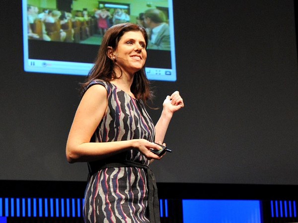
بماذا تفكرون حين أقول كلمة "تصميم"؟ تقريبًا تفكرون في أشياء مثل هذه، المنتجات النهائية التي يمكنكم حملها في يديكم، أو ربما الشعارات والملصقات والخرائط التي توضح الأشياء بصريًا الأيقونات التقليدية في التصميم الثابت. لكني لم آت إلى هنا للحديث عن ذلك النوع من التصميمات. أريد التحدث عن النوع الذي تستخدمونه كل يوم تقريبًا وربما لا تولنه اهتمامًا كبيرًا، التصميمات التي تتغير طوال الوقت وتلك التي تعيش داخل جيبكم. أتحدث عن تصميم التجارب الرقمية وخاصةً تصميم الأنظمة الكبيرة جدًا بحيث قد يكون من الصعب استيعاب نطاقها. بالنظر في حقيقة أن جوجل تتعامل مع أكثر من مليار عملية بحث كل يوم، وأنه في كل دقيقة، أكثر من 100 ساعة من اللقطات ترفع على اليوتيوب. وذلك، في يوم واحد، أكثر من كل ما تم بثه من الثلاث شبكات الأمريكية الرئيسية في الخمس سنوات الماضية مجتمعة. ويرسل الفيسبوك الصور، والرسائل، والقصص من أكثر من 1,23 مليار شخص. ذلك حوالي نصف مستخدمي الإنترنت، وسُدس البشرية.
What do you think of when I say the word "design"? You probably think of things like this, finely crafted objects that you can hold in your hand, or maybe logos and posters and maps that visually explain things, classic icons of timeless design. But I'm not here to talk about that kind of design. I want to talk about the kind that you probably use every day and may not give much thought to, designs that change all the time and that live inside your pocket. I'm talking about the design of digital experiences and specifically the design of systems that are so big that their scale can be hard to comprehend. Consider the fact that Google processes over one billion search queries every day, that every minute, over 100 hours of footage are uploaded to YouTube. That's more in a single day than all three major U.S. networks broadcast in the last five years combined. And Facebook transmitting the photos, messages and stories of over 1.23 billion people. That's almost half of the Internet population, and a sixth of humanity.
هذه بعض المنتجات التي ساعدت في تصميمها على مدار مسيرتي المهنية، ونطاقها هائل جدًا حيث أنتجت تحديات تصميم غير مسبوقة. لكن ما هو صعب حقًا في التصميم على نطاق واسع هو أنه: صعب جزئيًا لأنه يتطلب الجمع بين شيئين الجرأة والتواضع ــــ الجرأة لتؤمن أن الشيء الذي تقوم بصنعه هو الشيء الذي يريده ويحتاجه العالم بأسره، والتواضع لتستوعب كمصمم، أن هذا ليس لنفسك أو لمحفظتك، بل هذا للناس الذين تصمم لهم، وكيف يمكن أن يساعدهم عملك ليعيشوا حياة أفضل. الآن، لسوء الحظ، لا توجد مدرسة توفر دورات مبادئ التصميم للبشرية. أنا والمصممون الآخرون الذين يعملون في مثل هذه المنتجات كان علينا اختراعه ونحن نمضي قدمًا، ونعلم أنفسنا أفضل التطبيقات الناشئة للتصميم على نطاق واسع، واليوم أود أن أشارككم بعضا من الأشياء التي تعلمناها عبر السنين.
These are some of the products that I've helped design over the course of my career, and their scale is so massive that they've produced unprecedented design challenges. But what is really hard about designing at scale is this: It's hard in part because it requires a combination of two things, audacity and humility — audacity to believe that the thing that you're making is something that the entire world wants and needs, and humility to understand that as a designer, it's not about you or your portfolio, it's about the people that you're designing for, and how your work just might help them live better lives. Now, unfortunately, there's no school that offers the course Designing for Humanity 101. I and the other designers who work on these kinds of products have had to invent it as we go along, and we are teaching ourselves the emerging best practices of designing at scale, and today I'd like share some of the things that we've learned over the years.
الآن، أول شيء أنتم بحاجة لمعرفته عن التصميم على نطاق واسع هي الأشياء الصغيرة التي حقًا تهم. هنا مثال جيد فعلًا عن كيف يستطيع عنصر تصميم صغير جدًا أن يُحدث تأثيرا كبيرا. فريق الفيسبوك الذي يدير زر "أعجبني" في الفيسبوك قرروا أنه بحاجة لإعادة التصميم. حدث للزر نوع من الخروج عن التزامن مع التطور لعلامتنا التجارية وهو بحاجة للتحديث. قد تفكرون الآن، أنه زر صغير للغاية، إنه واضح بشدة، مهمة تصميم سهلة، لكنها لم تكن كذلك. تبين، أنه كان هناك كل أنواع القيود لتصميم هذا الزر. عليك أن تعمل في حدود معاملات طول وعرض محددة. عليك الحذر لجعله يعمل في حزمة من اللغات المختلفة، وتوخي الحذر في استخدام التدرجات والحدود الوهمية لأنه يجب أن يتدرج بلطف في متصفحات الويب القديمة. الحقيقة هي، أن تصميم هذا الزر الصغير للغاية كان معاناة كبيرة.
Now, the first thing that you need to know about designing at scale is that the little things really matter. Here's a really good example of how a very tiny design element can make a big impact. The team at Facebook that manages the Facebook "Like" button decided that it needed to be redesigned. The button had kind of gotten out of sync with the evolution of our brand and it needed to be modernized. Now you might think, well, it's a tiny little button, it probably is a pretty straightforward, easy design assignment, but it wasn't. Turns out, there were all kinds of constraints for the design of this button. You had to work within specific height and width parameters. You had to be careful to make it work in a bunch of different languages, and be careful about using fancy gradients or borders because it has to degrade gracefully in old web browsers. The truth is, designing this tiny little button was a huge pain in the butt.
الآن، هذا هو الإصدار الجديد للزر، والمصمم الذي قاد هذا المشروع يقدر أنه قضى أكثر من 280 ساعة ليعيد تصميم هذا الزر على مدى شهور. الآن، لماذا نقضي وقت طويل جدًا في شيء صغير جدًا؟ هذا لأنه حين تصمم على نطاق واسع، ليس هناك شيء كالتفاصيل الصغيرة. هذا الزر الصغير البريء تتم مشاهدته 22 مليار مرة في اليوم وعلى أكثر من 7,5 مليون موقع. إنه أحد العناصر الأكثر مشاهدةً التي تم تصميمها على الإطلاق. الآن هذا كثير من الضغط على الزر الصغير والمصمم الذي خلفه، لكن مع هذه الأنواع من المنتجات، تحتاج لتحصل عليها صحيحة حتى إن كانت صغيرة.
Now, this is the new version of the button, and the designer who led this project estimates that he spent over 280 hours redesigning this button over the course of months. Now, why would we spend so much time on something so small? It's because when you're designing at scale, there's no such thing as a small detail. This innocent little button is seen on average 22 billion times a day and on over 7.5 million websites. It's one of the single most viewed design elements ever created. Now that's a lot of pressure for a little button and the designer behind it, but with these kinds of products, you need to get even the tiny things right.
الآن، الشيء التالي الذي عليك استيعابه هو كيف تصمم مع البيانات. الآن، حين تعمل على منتجات مثل هذه، لديك كم هائل من المعلومات عن مدى استخدام الناس لمنتجك حيث يمكنك من ثم استخدامها للتأثير على قرارات تصميمك، لكنها ليست ببساطة مجرد اتباع الأرقام. دعوني أعطيكم مثالا لتفهموا ما أعنيه. امتلك فيسبوك لوقت طويل أداة تسمح للناس بالإبلاغ عن الصور التي ربما تنتهك معايرنا المجتمعية، أشياء مثل البريد المزعج وسوء الاستخدام. وكان هناك طن من الصور تم الإبلاغ عنها، لكن كما اتضح، فقط نسبة صغيرة كانت فعلا تنتهك معايرهم المجتمعية. معظمهم كان مجرد صور من حفلات عادية. الآن، لأعطيكم مثال افتراضي معين، دعوني أقول صديقتي لورا ترفع افتراضيًا صورة لي سكرانة في حفلة كاريكوكي ليلًا. هذا افتراضي بحت، أستطيع أن أؤكد لكم. (ضحك) الآن، بالمناسبة، هل تعرف كيف أن بعض الناس قلقون من أن رئيسهم أو موظفيهم سوف يكتشفون صورة محرجة لهم على الفيسبوك؟ هل تعرف ما صعوبة تجنب هذا حين تكونون تعملون في فيسبوك فعلًا؟ على أي حال، هناك الكثير من الصور يتم الإبلاغ عنها خطأ كبريد مزعج أو سوء استخدام، وواحد من مهندسي الفريق لديه حدس. اعتقد أن هناك حقًا شيءٌ ما آخر يجري وكان على حق، لأنه حين نظر خلال مجموعة من الحالات، وجد أن معظمها كانوا من الناس الذين قاموا بطلب إزالة صورة لأنفسهم. وكان هذا هو السيناريو الذي لم يوضع حتى في اعتبار الفريق أبدًا من قبل. لذلك وضعوا خاصية جديدة تسمح للناس بمراسلة أصدقائهم ليطلبوا منهم إزالة الصورة. لكن هذا لم يعمل. فقط 20 بالمائة من الناس أرسلوا رسالة لأصدقائهم. لذلك تراجع عنها الفريق. قاموا باستشارة خبراء في حل النزاع. قاموا حتى بدراسة المبادئ العالمية للغة مهذبة، التي لم أكن أعرف عن وجودها فعلًا حتى حدث هذا البحث. ووجدوا شيئا شيقًا حقًا. كان عليهم أن يذهبوا إلى ما وراء مجرد مساعدة الناس ليطلبوا من أصدقائهم إزالة الصورة. كان عليهم مساعدة الناس للتعبير لأصدقئهم كيف جعلتهم الصورة يشعرون.
Now, the next thing that you need to understand is how to design with data. Now, when you're working on products like this, you have incredible amounts of information about how people are using your product that you can then use to influence your design decisions, but it's not just as simple as following the numbers. Let me give you an example so that you can understand what I mean. Facebook has had a tool for a long time that allowed people to report photos that may be in violation of our community standards, things like spam and abuse. And there were a ton of photos reported, but as it turns out, only a small percentage were actually in violation of those community standards. Most of them were just your typical party photo. Now, to give you a specific hypothetical example, let's say my friend Laura hypothetically uploads a picture of me from a drunken night of karaoke. This is purely hypothetical, I can assure you. (Laughter) Now, incidentally, you know how some people are kind of worried that their boss or employee is going to discover embarrassing photos of them on Facebook? Do you know how hard that is to avoid when you actually work at Facebook? So anyway, there are lots of these photos being erroneously reported as spam and abuse, and one of the engineers on the team had a hunch. He really thought there was something else going on and he was right, because when he looked through a bunch of the cases, he found that most of them were from people who were requesting the takedown of a photo of themselves. Now this was a scenario that the team never even took into account before. So they added a new feature that allowed people to message their friend to ask them to take the photo down. But it didn't work. Only 20 percent of people sent the message to their friend. So the team went back at it. They consulted with experts in conflict resolution. They even studied the universal principles of polite language, which I didn't even actually know existed until this research happened. And they found something really interesting. They had to go beyond just helping people ask their friend to take the photo down. They had to help people express to their friend how the photo made them feel.
هنا كيف يشتغل الأمر اليوم. أجد هذه الصورة الافتراضية لنفسي، وهي ليست بريدا مزعجا، وليست سوء استخدام، ولكني أتمنى حقًا لو لم تكن على الموقع. لذلك أبلغت عنها وقلت، "أنا في هذه الصورة وإنها لا تعجبني" ثم بحثنا أعمق. لماذا لا تعجبك صورتك هذه؟ واخترت "إنها تسبب لي الإحراج." ثم تم تحفيزي لأُراسل صديقي، لكن هنا الفرق الحاسم. قُدمت لي لغة مقترحة خاصة تساعدني على التواصل مع لورا كيف تجعلني الصورة أشعر. الآن وجد الفريق أن هذا التغير الصغير نسبيًا أحدث تأثيرًا ضخمًا. من قبل، فقط 20 بالمائة من الناس أرسلوا الرسالة. والآن 60 بالمائة أرسلوا، وقد أظهرت الاستقصاءات أن الناس على جانبي المحادثة شعروا بتحسن نتيجة لذلك. هذا الاستقصاء نفسه أظهر أن 90 بالمائة من أصدقائكم يريدون أن يعرفوا إن كانوا قد قاموا بشيء أزعجكم. الآن لا أعلم من يكون ال 10 بالمائة الآخرين لكن قد ربما قد يكون استخداما جيدا لخاصيتنا في "إلغاء الصداقة".
Here's how the experience works today. So I find this hypothetical photo of myself, and it's not spam, it's not abuse, but I really wish it weren't on the site. So I report it and I say, "I'm in this photo and I don't like it," and then we dig deeper. Why don't you like this photo of yourself? And I select "It's embarrassing." And then I'm encouraged to message my friend, but here's the critical difference. I'm provided specific suggested language that helps me communicate to Laura how the photo makes me feel. Now the team found that this relatively small change had a huge impact. Before, only 20 percent of people were sending the message, and now 60 percent were, and surveys showed that people on both sides of the conversation felt better as a result. That same survey showed that 90 percent of your friends want to know if they've done something to upset you. Now I don't know who the other 10 percent are, but maybe that's where our "Unfriend" feature can come in handy.
إذًا كما ترون الآن، تلك القرارات ذات فوارق دقيقة للغاية. بالطبع نستخدم الكثير من البيانات لنعزز قراراتنا، لكننا أيضًا نعتمد بشدة على التكرار، والبحث والاختبار والبديهة، والتواصل الحسي البشري. إنها كل من الفن والعلم. الآن، المصممون الذين يعملون على هذه المنتجات أحيانًا يطلق عليهم "المدفوعون بالبيانات" المصطلح الذي يدفعنا تمامًا للجنون. الحقيقة هي، يعد الأمر انعدام مسئولية من طرفنا إن لم نختبر تصميماتنا بصرامة حين يعول علينا الكثير جدًا من الناس للحصول عليها بشكل صحيح، لكن تحليلات البيانات لن تكون أبدًا بديلًا عن بديهية التصميم. تستطيع البيانات أن تساعدكم لجعل تصميم جيد عظيمًا، لكنها لن تجعل أبدًا تصميما سيء جيدًا.
So as you can see, these decisions are highly nuanced. Of course we use a lot of data to inform our decisions, but we also rely very heavily on iteration, research, testing, intuition, human empathy. It's both art and science. Now, sometimes the designers who work on these products are called "data-driven," which is a term that totally drives us bonkers. The fact is, it would be irresponsible of us not to rigorously test our designs when so many people are counting on us to get it right, but data analytics will never be a substitute for design intuition. Data can help you make a good design great, but it will never made a bad design good.
الشيء التالي الذي عليك استيعابه كمبدأ هو متى تقوم بإدخال تغيير، أنت بحاجة لتقوم به بشكل غير عادي بعناية. الآن كثيرًا ما أقول مازحة بأنني أقضي وقتا أطول في تصميم مقدمة التغيير مما أفعل في التغيير نفسه، وأنا متأكدة أننا جميعًا يمكن أن نرتبط بذلك حين نستخدم الكثير من التغيرات بشيء ما ومن ثم يجب علينا أن نُعدله. الحقيقة هي، يمكن أن يصبح الناس فعالين جدًا في استخدام تصميم سيء، وكذلك حتى لو كان التغيير جيدا لهم على المدى البعيد، لا يزال هذا محبطًا بصورة لا تصدق حين يحدث، وهذا صحيح بشكل خاص مع منصات المحتوى المقدم من المستخدمين، لأن الناس يستطيعون، ومن حقهم، المطالبة بحق الملكية. هذا هو، بعد كل شيء، محتواهم.
The next thing that you need to understand as a principle is that when you introduce change, you need to do it extraordinarily carefully. Now I often have joked that I spend almost as much time designing the introduction of change as I do the change itself, and I'm sure that we can all relate to that when something that we use a lot changes and then we have to adjust. The fact is, people can become very efficient at using bad design, and so even if the change is good for them in the long run, it's still incredibly frustrating when it happens, and this is particularly true with user-generated content platforms, because people can rightfully claim a sense of ownership. It is, after all, their content.
الآن، منذ سنين، حين كنت أعمل باليوتيوب، كنا نبحث عن طرق لتحفيز ناس أكثر على تقييم الفيديوهات، وكان هذا شيقا لأنه حين تفحصنا البيانات، وجدنا أنه في الغالب كان كل شخص يستخدم بصورة حصرية أعلى تقييم خمس نجوم، وحفنة من الناس كانوا يستخدمون أقل تقييم نجمة واحدة، وتقريبًا ولا واحد كان يستخدم نجمتان أو ثلاث أو أربع نجمات. لذلك قررنا التبسيط لنوع فوق أو تحت في نموذج تصويت ثنائي. سيكون هذا أسهل للناس في التعامل معه. لكن الناس كانوا مرتبطين جدًا بنظام الخمس نجوم للتقييم. أَحَبَ مبدعون الفيديو تقييماتهم حقًا. ملايين وملايين من الناس كانوا معتادون على التصميم القديم. لذلك من أجل مساعدة الناس لتجهيز أنفسهم للتغيير والتأقلم أسرع مع التصميم الحديث، في الواقع نشرنا الرسم البياني للبيانات لنشارك المجتمع الأسباب المنطقية لما نحن بصدد القيام به، شاركوا حتى في الصناعة الأكبر في محادثة، التي أدت إلى عنوان تك كرانش الرئيسي لكل العصور المفضل لدي: "وصل اليوتيوب إلى إدراك برتبة الـ5 نجوم: تقيماته عديمة الفائدة"
Now, years ago, when I was working at YouTube, we were looking for ways to encourage more people to rate videos, and it was interesting because when we looked into the data, we found that almost everyone was exclusively using the highest five-star rating, a handful of people were using the lowest one-star, and virtually no one was using two, three or four stars. So we decided to simplify into an up-down kind of voting binary model. It's going to be much easier for people to engage with. But people were very attached to the five-star rating system. Video creators really loved their ratings. Millions and millions of people were accustomed to the old design. So in order to help people prepare themselves for change and acclimate to the new design more quickly, we actually published the data graph sharing with the community the rationale for what we were going to do, and it even engaged the larger industry in a conversation, which resulted in my favorite TechCrunch headline of all time: "YouTube Comes to a 5-Star Realization: Its Ratings Are Useless."
الآن، من المستحيل أن تتجنب تمامًا النفور من التغيير حين تجري تغييرات لمنتجات يستخدمها كثير جدًا من الناس. على الرغم من أننا حاولنا فعل الأشياء الصحيحة لا نزال نستقبل الفيضان المعتاد من فيديو الاحتجاجات والرسائل الغاضبة. وحتى الحزم التي وجب فحصها من طرف الأمن، لكن علينا أن نتذكر أن الناس مهتمون بشدة بتلك الأشياء، وهذا لأن تلك المنتجات، هذا العمل، مهم حقًا بالنسبة لهم.
Now, it's impossible to completely avoid change aversion when you're making changes to products that so many people use. Even though we tried to do all the right things, we still received our customary flood of video protests and angry emails and even a package that had to be scanned by security, but we have to remember people care intensely about this stuff, and it's because these products, this work, really, really matters to them.
الآن، نحن نعلم أنه يجب علينا توخي الحذر حول الالتفات إلى التفاصيل، يجب علينا أن نكون مدركين لكيفية استخدام البيانات في إجراء تصميمنا، وعلينا أن ندخل التغيير بحذر بالغ. الآن، تلك الأشياء كلها مفيدة حقًا. هذه أجود التطبيقات للتصميم واسع النطاق. لكنها لا تعني شيئًا إن لم تستوعب شيئًا أكثر جوهرية من ذلك. عليك أن تستوعب من الذين تصمم لهم.
Now, we know that we have to be careful about paying attention to the details, we have to be cognizant about how we use data in our design process, and we have to introduce change very, very carefully. Now, these things are all really useful. They're good best practices for designing at scale. But they don't mean anything if you don't understand something much more fundamental. You have to understand who you are designing for.
الآن، حين تضع هدف لتصميم للجنس البشري بأسره، وتبدأ في الدخول في هذا الهدف بشكل جدي، في نقطة ما تواجه جدار الفقاعة التي تعيش داخلها. الآن، في سان فرانسسكو، نغضب قليلًا حين نصادف منطقة خارج التغطية لأننا لا نستطيع استخدام هواتفنا لننتقل إلى محل القهوة الجديد. لكن ماذا لو كان عليك القيادة لأربع ساعات لشحن هاتفك لأنه ليس لديك مصدر معتمد للكهرباء؟ ماذا لو لم تكن تستطيع الولوج للمكتبات العامة؟ ماذا لو أن بلدك ليس لديها صحافة حرة؟ ماذا كانت تلك المنتجات لتعني لك؟ هكذا يبدو جوجل ويوتيوب وفيسبوك لمعظم العالم، وهي ما ستبدوا عليه لمعظم الخمسة مليار شخص الذين سيتصلون بالإنترنيت لاحقا. التصميم للهواتف المحمولة المتدنية ليس بعمل تصميم براق، لكن إن أردت أن تصمم للعالم أجمع، عليك أن تصمم لحيث يكون الناس، وليس لحيث تكون أنت.
Now, when you set a goal to design for the entire human race, and you start to engage in that goal in earnest, at some point you run into the walls of the bubble that you're living in. Now, in San Francisco, we get a little miffed when we hit a dead cell zone because we can't use our phones to navigate to the new hipster coffee shop. But what if you had to drive four hours to charge your phone because you had no reliable source of electricity? What if you had no access to public libraries? What if your country had no free press? What would these products start to mean to you? This is what Google, YouTube and Facebook look like to most of the world, and it's what they'll look like to most of the next five billion people to come online. Designing for low-end cell phones is not glamorous design work, but if you want to design for the whole world, you have to design for where people are, and not where you are.
إذًا كيف نبقي على تلك الصورة الكبيرة في أذهاننا؟ نحاول السفر خارج فقاعتنا لنرى، ونسمع ونفهم الناس الذين نصمم من أجلهم. نستخدم منتجاتنا بلغات غير إنجليزية لنتأكد أنها تعمل جيدًا ونحاول أن نستخدم واحد من تلك الهواتف من حين لآخر لنتواصل مع واقعهم.
So how do we keep this big, big picture in mind? We try to travel outside of our bubble to see, hear and understand the people we're designing for. We use our products in non-English languages to make sure that they work just as well. And we try to use one of these phones from time to time to keep in touch with their reality.
إذًا ماذا يعني التصميم على نطاق عالمي؟ يعني عملا صعبا وأحيانًا مستفزا لتحاول تحسين وتطوير المنتجات. إيجاد الجرأة والتواضع لتقوم بما يصلح. يمكن أن يكون مرهقا جدًا، والتواضع جزء، قاس قليلًا على غرور التصميم. لأن تلك المنتجات تتغير دائمًا، كل شيء قد قمت بتصميمه في حياتي المهنية اختفى إلى حد كبير، وكل شيء سوف أقوم بتصميمه سوف يفنى. لكن ما يبقى: اللذة اللانهائية لكونك جزء من شيء كبير جدًا، يمكن بالكاد أن تلف رأسك من حوله، واحتمال أنه قد يغير العالم حقًا.
So what does it mean to design at a global scale? It means difficult and sometimes exasperating work to try to improve and evolve products. Finding the audacity and the humility to do right by them can be pretty exhausting, and the humility part, it's a little tough on the design ego. Because these products are always changing, everything that I've designed in my career is pretty much gone, and everything that I will design will fade away. But here's what remains: the never-ending thrill of being a part of something that is so big, you can hardly get your head around it, and the promise that it just might change the world.
شكرًا لكم.
Thank you.
(تصفيق)
(Applause)