Last year here at TED I asked you to give me your data, to put your data on the web, on the basis that if people put data onto the web -- government data, scientific data, community data, whatever it is -- it will be used by other people to do wonderful things, in ways that they never could have imagined.
去年的TED我在這裡 請求你們公開你們的數據和資料 把數據資料放到網上,就跟老百姓 把他們的數據資料放到網上一樣 政府數據,科學數據, 社區數據 不管是什麼, 會被人們用來 做精彩的事情,他們使用這些數據的地方 是他們從來都根本無法想像的
So, today I'm back just to show you a few things, to show you, in fact, there is an open data movement afoot, now, around the world. The cry of "Raw data now!" which I made people make in the auditorium, was heard around the world. So, let's roll the video.
所以, 今天我回來給你展示幾個事例 向你展示, 事實上 公開數據資料的運動正在興起 世界各地 都渴望“即時的原始數據資料” 我在禮堂裡的懇請大家做的事情 整個世界都聽到了 所以, 讓我們播放影像
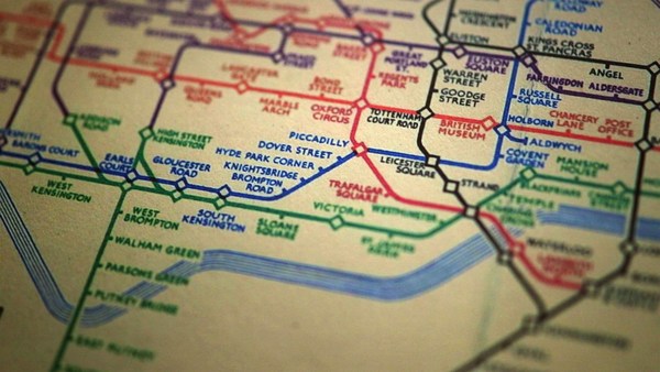
A classic story, the first one which lots of people picked up, was when in March -- on March 10th in fact, soon after TED -- Paul Clarke, in the U.K. government, blogged, "Oh, I've just got some raw data. Here it is, it's about bicycle accidents." Two days it took the Times Online to make a map, a mashable map -- we call these things mash-ups -- a mashed-up user interface that allows you to go in there and have a look and find out whether your bicycle route to work was affected.
經典的故事, 也是很多人首選的故事 是當3月10日, 事實上TED剛剛結束不久 英國政府的Paul Clarke 在博客中說: “啊, 我才找到一些數據 是關於自行車事故的數據。 ” 時代在線用了兩天時間 做了一個地圖, 一個合成的地圖 我們稱之為:合成(把數據融合到地圖上) 經過這種合成,你可以通過用戶界面 搜索和找到你的上班的自行車 路線是否受影響
Here's more data, traffic survey data, again, put out by the U.K. government, and because they put it up using the Linked Data standards, then a user could just make a map, just by clicking.
除此, 網上還很多其他的數據, 交通調查數據等 都是英國政府放上去的 因為他們上傳的數據符合鏈接標準 所以用戶可以使用這些數據做地圖 只要點擊一下就做成了
Does this data affect things? Well, let's get back to 2008. Look at Zanesville, Ohio. Here's a map a lawyer made. He put on it the water plant, and which houses are there, which houses have been connected to the water. And he got, from other data sources, information to show which houses are occupied by white people. Well, there was too much of a correlation, he felt, between which houses were occupied by white people and which houses had water, and the judge was not impressed either. The judge was not impressed to the tune of 10.9 million dollars. That's the power of taking one piece of data, another piece of data, putting it together, and showing the result.
那麼這些數據是否會產生影響?讓我們回到2008 看看曾斯維爾,俄亥俄州 這是一張律師製作的地圖,掛在自來水廠 你可以在圖上看見哪戶人家 誰家連著用水 然後他得到一組其他數據 資料顯示了 哪個房子是白人擁有的 他感到, 兩者之間的連續太緊密了 哪些是白人擁有的房子 哪些房子有自來水,法官看到以後對此也很不滿 法官因此罰了他們1090萬美元 這就是拿了一組數據 和另一組數據放在一起的力量 結果是顯而易見的
Let's look at some data from the U.K. now. This is U.K. government data, a completely independent site, Where Does My Money Go. It allows anybody to go there and burrow down. You can burrow down by a particular type of spending, or you can go through all the different regions and compare them. So, that's happening in the U.K. with U.K. government data.
我們看一組從英國來的數據 這是英國政府的數據, 完全獨立的網站 我的錢花到哪裡去了 這個網站讓任何人在網站上挖掘數據 你可以根據特別的消費種類來查找 也可以找出不同的地區的數據來做比較 英國人正在用英國政府提供的數據資料做這些事情
Yes, certainly you can do it over here. Here's a site which allows you to look at recovery spending in California. Take an arbitrary example, Long Beach, California, you can go and have a look at what recovery money they've been spending on different things such as energy.
是的, 你在這裡也可以做 這個網站讓你查找復甦經費的使用情況 在加州 隨便舉例,加州長灘 你可以看見人們是怎樣使用政府發放的復甦經費的 他們使用在能源上
In fact, this is the graph of the number of data sets in the repositories of data.gov, and data.gov.uk. And I'm delighted to see a great competition between the U.K. in blue, and the U.S. in red.
事實上, 這是幾組數據的圖表 他們存放在data.gov上 和data.gov.uk網上 我真高興看見這種積極的競爭 英國顯示的是藍色, 美國是紅色
How can you use this stuff? Well, for example, if you have lots of data about places you can take, from a postcode -- which is like a zip plus four -- for a specific group of houses, you can make paper, print off a paper which has got very, very specific things about the bus stops, the things specifically near you.
你怎麼用這些東西呢 舉個例子吧, 你有一個地區的大量數據 你可以從一個郵政編碼 就是區碼加4 對一組特別的人家, 你可以製作報紙 打印的報紙會有特別具體 的信息, 比如公車站 包括那些離你很近的事情
On a larger scale, this is a mash-up of the data which was released about the Afghan elections. It allows you to set your own criteria for what sort of things you want to look at. The red circles are polling stations, selected by your criteria. And then you can select also other things on the map to see what other factors, like the threat level. So, that was government data.
從大面相看說, 這是一個 阿富汗選舉數據的與地圖的合成 它允許你設立你自己的標準 你可以查找你想要找的資料 這些紅圈是投票點 是根據你的標準選擇的 你也可以選擇地圖上的其他內容 你可以看見其他數據,比如威脅的程度 那也是政府的數據
I also talked about community-generated data -- in fact I edited some. This is the wiki map, this is the Open Street Map. "Terrace Theater" I actually put on the map because it wasn't on the map before TED last year. I was not the only person editing the open street map. Each flash on this visualization -- put together by ITO World -- shows an edit in 2009 made to the Open Street Map. Let's now spin the world during the same year. Every flash is an edit. Somebody somewhere looking at the Open Street Map, and realizing it could be better. You can see Europe is ablaze with updates. Some places, perhaps not as much as they should be.
我也談過社區製作的, 事實上我也參與編輯的 這是wiki地圖, 這是公開的街道地圖 Terrace 劇院, 是我放到 地圖上去的, 因為去年TED召開的時候地圖上沒有它 我不是唯一編輯公開地圖的人 這裡每個可視的閃亮點 是ITO World放在一起的 顯示了2009年人們每次對 開發地圖做的編輯 讓我們繞著整個世界看一下這一年發生的情況 每個亮點都是一次編輯的記錄。有人在某些地方 看著公開的街道地圖, 發現它可以改進得更好 你看見歐洲的更新非常頻繁 有些地方, 也許還沒什麼其他地方多
Here focusing in on Haiti. The map of Port au-Prince at the end of 2009 was not all it could be, not as good as the map of California. Fortunately, just after the earthquake, GeoEye, a commercial company, released satellite imagery with a license, which allowed the open-source community to use it. This is January, in time lapse, of people editing ... that's the earthquake. After the earthquake, immediately, people all over the world, mappers who wanted to help, and could, looked at that imagery, built the map, quickly building it up.
這裡聚焦的是海地 太子港在地圖在 2009年年底還不是很完整 不如加州的地圖好 幸運的是, 地震以後 GeoEye, 一間商業公司 發布了衛星圖像 它發放授權允許 公開資源的社區使用這些圖像 這是一月的 人們參與了編輯, 然後地震發生了 地震發生後不久 全世界的人們, 地圖製作者們 都想要提供幫助,可以 看著這些圖像, 迅速地建立地圖
We're focusing now on Port-au-Prince. The light blue is refugee camps these volunteers had spotted from the [satellite images]. So, now we have, immediately, a real-time map showing where there are refugee camps -- rapidly became the best map to use if you're doing relief work in Port-au-Prince. Witness the fact that it's here on this Garmin device being used by rescue team in Haiti.
我們現在看到的是太子港 藍色的是哪些自願者在空中發現的難民營 所以現在, 我們可以立刻製作一個實時地圖 顯示難民營在什麼地方 如果你在太子港從事援助工作 那這就是最好的地圖 目睹這一切在Garmin儀器上發生 被救援隊伍運用
There's the map showing, on the left-hand side, that hospital -- actually that's a hospital ship. This is a real-time map that shows blocked roads, damaged buildings, refugee camps -- it shows things that are needed [for rescue and relief work].
海地, 這張地圖 左邊的這張 那個醫院,事實上是一個建在船上的醫院 這是實時地圖現實路障 背毀的建築, 難民營 現實世界哪裡需要東西
So, if you've been involved in that at all, I just wanted to say: Whatever you've been doing, whether you've just been chanting, "Raw data now!" or you've been putting government or scientific data online, I just wanted to take this opportunity to say: Thank you very much, and we have only just started! (Applause)
所以, 如果你參與了 我只想說不管你做了什麼 無論是你在為原始資料製圖 還是將政府或者科學研究的數據放到網上 我只想藉此機會說聲感謝 我們才剛剛開始 謝謝