Last year here at TED I asked you to give me your data, to put your data on the web, on the basis that if people put data onto the web -- government data, scientific data, community data, whatever it is -- it will be used by other people to do wonderful things, in ways that they never could have imagined.
Geçen sene burada TED'de sizlerden bana verilerinizi vermenizi istemiştim web'de verilerinizi paylaşın demiştim, eğer insanlar tüm bu hükümet verilerini, bilimsel verileri, iletişim verilerini, her neyse web'e koydukları takdirde başka insanların bunları kullanacağını ve hayal bile edilemeyecek muhteşem şeyler yapılabileceğini anlatmıştım.
So, today I'm back just to show you a few things, to show you, in fact, there is an open data movement afoot, now, around the world. The cry of "Raw data now!" which I made people make in the auditorium, was heard around the world. So, let's roll the video.
Ve bugün sizlere birkaç şey göstermek için geri geldim, aslında sizlere, açık veri hareketine tüm dünya çevresinde başlandığını göstermek istiyorum. "Şimdi, açık verileriniz" çağırımı konfrerans salonundaki insanlara yapmıştım ve bunu tüm dünya duymuş. Şimdi, videoyu başlatalım.
A classic story, the first one which lots of people picked up, was when in March -- on March 10th in fact, soon after TED -- Paul Clarke, in the U.K. government, blogged, "Oh, I've just got some raw data. Here it is, it's about bicycle accidents." Two days it took the Times Online to make a map, a mashable map -- we call these things mash-ups -- a mashed-up user interface that allows you to go in there and have a look and find out whether your bicycle route to work was affected.
Klasik hikaye, ilki 10 Mart tarihinde TED'den hemen sonra İngiltere hükümetinden Paul Clarke'dan geldi, Blogunda, "Evet, bende bazı işlenmemiş veriler var. İşte buraya ekledim, bisiklet kazaları ile ilgili" yazmıştı. Online Times gazetesinin bir harita karıştırılabilir bir harita yapması sadece 2 gün sürdü, çünkü biz bunlara KARIŞIKLIK diyoruz, KARIŞIKLIK nedir; sizin de içine girip bisiklet rotanızı engelleyecek bir çalışma olup olmadığını kontrol edebildiğiniz bir kullanıcı arayüzüdür.
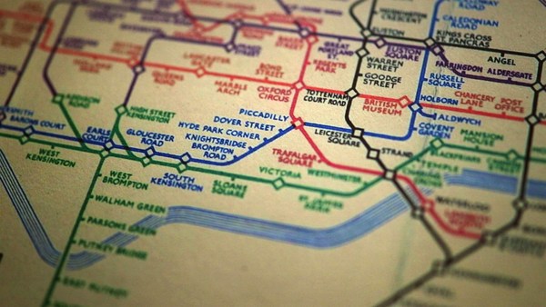
Here's more data, traffic survey data, again, put out by the U.K. government, and because they put it up using the Linked Data standards, then a user could just make a map, just by clicking.
Sonrasında trafik ölçüm verileri de yine UK hükümetince paylaşıldı, ve bağlantılı veri standartlarında paylaştıkları için de kullanıcılar bunların sadece üstlerine tıklayarak harita yapabildiler.
Does this data affect things? Well, let's get back to 2008. Look at Zanesville, Ohio. Here's a map a lawyer made. He put on it the water plant, and which houses are there, which houses have been connected to the water. And he got, from other data sources, information to show which houses are occupied by white people. Well, there was too much of a correlation, he felt, between which houses were occupied by white people and which houses had water, and the judge was not impressed either. The judge was not impressed to the tune of 10.9 million dollars. That's the power of taking one piece of data, another piece of data, putting it together, and showing the result.
Bu verilerin etkisi oldu mu? 2008 yılına geri dönelim. Ohio, Zanesville'e bakın. İşte su işletmesinin yanında kaç ev olduğunu gösteren bir avukatın yapmış olduğu harita, hangi evler suya bağlanmış. Başka veri kaynaklarını kullanarak ayrıca hangi evlerde beyaz insanların oturduklarını da göstermiş. Ve, bunlar arasında çok fazla doğru korelasyon olduğunu hissetmiş, suyu olan beyaz insanların evleri, açıkçası yargıç da bu işten çok fazla hoşlanmamış. Yargıç 10.9 milyon doların getirdiği sesten de etkilenmemiş. İşte bu bir parça veriyi alıp diğer bir parça veri ile bir araya getirmenin ve sonuçları gösterebilmenin gücüdür.
Let's look at some data from the U.K. now. This is U.K. government data, a completely independent site, Where Does My Money Go. It allows anybody to go there and burrow down. You can burrow down by a particular type of spending, or you can go through all the different regions and compare them. So, that's happening in the U.K. with U.K. government data.
Şimdi UK'dan bazı verilere bakalım. Bu UK hükümet verileri, tamamen bağımsız bir site, ismi "Benim Param Nereye Gidiyor" herkes buraya girip aşağıya dek inceleyebiliyor. Belli bir çeşit harcamayı derinlemesine inceleyebiliyorsunuz. veya tüm farklı bölgeleri inceleyip karşılaştırabiliyorsunuz. Yani UK'da, UK hükümet verileri ile bu yapılabiliyor.
Yes, certainly you can do it over here. Here's a site which allows you to look at recovery spending in California. Take an arbitrary example, Long Beach, California, you can go and have a look at what recovery money they've been spending on different things such as energy.
Ve kesinlikle burada da yapılabilir. İşte bu siteden, California'daki iyileştirme giderlerine bakabiliyorsunuz. Keyfi bir örnek ele alalım, Long Beach, California, gidip iyileştirme harcamalarının nerelere yapıldığına bakabiliyorsunuz örneğin enerji konusunda yapılan harcama gibi...
In fact, this is the graph of the number of data sets in the repositories of data.gov, and data.gov.uk. And I'm delighted to see a great competition between the U.K. in blue, and the U.S. in red.
Aslında, bu grafik, data.gov'da ve data.gov.uk'da stoklanmış veri setlerinin numaralandırılmış hali. Ve mavi gözüken U.K ile kırmızı görünen US arasındaki rekabeti görmekten de keyif alıyorum.
How can you use this stuff? Well, for example, if you have lots of data about places you can take, from a postcode -- which is like a zip plus four -- for a specific group of houses, you can make paper, print off a paper which has got very, very specific things about the bus stops, the things specifically near you.
Bunu nasıl kullanabilirsiniz? Örneğin posta kodlarından pek çok veri elde edebilirsiniz, spesifik bir grup ev için örneğin zip kodu gibi bir döküman hazırlayabilirsiniz, örneğin otobüs durakları ile ilgili son derece spesifik bilgi içeren bir döküman alabilirsiniz, size yakın spesifik şeyleri çıkarabilirsiniz.
On a larger scale, this is a mash-up of the data which was released about the Afghan elections. It allows you to set your own criteria for what sort of things you want to look at. The red circles are polling stations, selected by your criteria. And then you can select also other things on the map to see what other factors, like the threat level. So, that was government data.
Büyük skalada ise bu Afganistan Seçimleriyle ilgili olarak yayınlanan bir veri karışımıdır. Bakmak istediğiniz şeylerle ilgili kendi kriterlerinizi oturtmanıza izin verir. Kırmızı yuvarlaklar seçim istasyonları, kriterinize göre seçin. Daha sonra haritada, örneğin tehdit seviyesi gibi faktörlerden de seçim yapıp kıyaslayabilirsiniz. Yani, bu hükümet verisiydi.
I also talked about community-generated data -- in fact I edited some. This is the wiki map, this is the Open Street Map. "Terrace Theater" I actually put on the map because it wasn't on the map before TED last year. I was not the only person editing the open street map. Each flash on this visualization -- put together by ITO World -- shows an edit in 2009 made to the Open Street Map. Let's now spin the world during the same year. Every flash is an edit. Somebody somewhere looking at the Open Street Map, and realizing it could be better. You can see Europe is ablaze with updates. Some places, perhaps not as much as they should be.
Ayrıca toplum tarafından oluşturulan--aslında düzelttim de-- wiki haritasından bahsettim, bu açık sokak haritası. Terrace Theater, özellikle haritaya ekledim çünkü geçen sene TED de konuştuğumda haritada yoktu. Bu açık sokak haritasını düzelten sadece ben değildim. Bu görselde ITO dünya tarafından konulan her bir flash 2009'da açık sokak haritasına yapılmış bir düzeltmeyi gösteriyor. Şimdi aynı sene içinde dünyayı bir döndürelim. Her bir flash bir düzeltme. Birileri bir yerden bakmış ve açık sokak haritasının daha iyi olabileceğini farketmiş. Avrupanın güncellemelerle yanıp durduğunu görebilirsiniz. Bazı yerler de olması gereken kadar çok değil.
Here focusing in on Haiti. The map of Port au-Prince at the end of 2009 was not all it could be, not as good as the map of California. Fortunately, just after the earthquake, GeoEye, a commercial company, released satellite imagery with a license, which allowed the open-source community to use it. This is January, in time lapse, of people editing ... that's the earthquake. After the earthquake, immediately, people all over the world, mappers who wanted to help, and could, looked at that imagery, built the map, quickly building it up.
Burada Haiti'ye odaklanalım. Au-Prince limanının 2009 haritası olabileceği harita gibi değil, yani California haritası gibi değil. Şansımıza, depremden sonra, GeoEye, bir reklam şirketidir, uydu görüntülerini yayınladı ve toplumun kullanımına açacak şekilde de lisanslamasını yaptı. Bu Ocak ayı dönemi, insanlar düzeltiyorlar, işte deprem. Depremden hemen sonrası dünyanın her yerinden insanlar, haritacılar yardımcı olmak isteyip yardım edebilenler bu görüntüye bakarak, hemen haritayı kurgulayıp oturttular.
We're focusing now on Port-au-Prince. The light blue is refugee camps these volunteers had spotted from the [satellite images]. So, now we have, immediately, a real-time map showing where there are refugee camps -- rapidly became the best map to use if you're doing relief work in Port-au-Prince. Witness the fact that it's here on this Garmin device being used by rescue team in Haiti.
Şimdi au-Prince limanına bakıyoruz. Maviler sığınma kampları, gönüllü kişiler havadan tespit etmişler. Şimdi, anında elimize geçen bir eş zamanlı harita var. bu sığınma kamplarının yerlerini gösteriyor, ve eğer au-Prince limanında kurtarma işi için elinizde mükemmel bir harita olmuş oluyor. İşte Gramin aleti içine yerleştirimiş ve kurtarma ekibi tarafından kullanıldığını görüyorsunuz.
There's the map showing, on the left-hand side, that hospital -- actually that's a hospital ship. This is a real-time map that shows blocked roads, damaged buildings, refugee camps -- it shows things that are needed [for rescue and relief work].
Haiti'de sol tarafı gösteren bu haritaya bir göz atın, bu hastane aslında bir hastane gemisi. Bu kapalı yolları gösteren eş zamanlı harita hasarlı binalar, sığınma kampları. İhtiyaç duyulan şeyleri gösteriyor.
So, if you've been involved in that at all, I just wanted to say: Whatever you've been doing, whether you've just been chanting, "Raw data now!" or you've been putting government or scientific data online, I just wanted to take this opportunity to say: Thank you very much, and we have only just started! (Applause)
Eğer bu işe bir şekilde müdahilseniz, şunu söylemek isterim ki, ne yapıyor olursanız olun, işlenmemiş veri olarak neyi çizelgeye ekliyor olursanız olun, veya hükümet veya bilimsel datalarınızı açıyor olun, size teşekkür etme fırsatını buldum demektir, ve henüz yeni başlıyoruz. (alkışlar)