Last year here at TED I asked you to give me your data, to put your data on the web, on the basis that if people put data onto the web -- government data, scientific data, community data, whatever it is -- it will be used by other people to do wonderful things, in ways that they never could have imagined.
Vlani som vás tu na TEDe žiadal o to, aby ste mi dali svoje dáta, aby ste ich uverejnili na internete, pretože ak ľudia uverejnia dáta na internete – vládne dáta, vedecké dáta, dáta samospráv, čokoľvek – využijú ich iní, aby z nich vytvorili úžasné veci tak, ako to nikdy pred tým nebolo predstaviteľné.
So, today I'm back just to show you a few things, to show you, in fact, there is an open data movement afoot, now, around the world. The cry of "Raw data now!" which I made people make in the auditorium, was heard around the world. So, let's roll the video.
Dnes som sa vrátil, aby som vám ukázal, že hnutie za voľne prístupné dáta existuje v skutočnosti celosvetovo a je v pohybe. Zborové zvolanie "Surové dáta okamžite!", ktoré sa mi podarilo dostať od publika minule, bolo počuť po celom svete. Prehrajme si teda video.
A classic story, the first one which lots of people picked up, was when in March -- on March 10th in fact, soon after TED -- Paul Clarke, in the U.K. government, blogged, "Oh, I've just got some raw data. Here it is, it's about bicycle accidents." Two days it took the Times Online to make a map, a mashable map -- we call these things mash-ups -- a mashed-up user interface that allows you to go in there and have a look and find out whether your bicycle route to work was affected.
Klasický príbeh, prvý, ktorého sa mnoho ľudí chytilo, bol 10. marca, vlastne zakrátko po TEDe, keď Paul Clarke z britskej vlády uverejnil v blogu: "Práve som sa dostal k surovým dátam. Sú o nehodách bicyklov." Times Online trvalo iba dva dni, aby vytvorili mapu, kombinovanú mapu – voláme to kombinácie údajov – kombinované používateľské rozhranie, ktoré vám umožňuje pozrieť sa a zistiť, či sa týka vašej cyklotrasy do roboty.
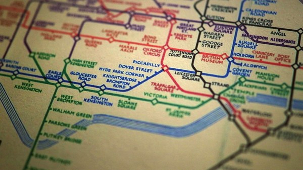
Here's more data, traffic survey data, again, put out by the U.K. government, and because they put it up using the Linked Data standards, then a user could just make a map, just by clicking.
Tu sú ďalšie údaje, dopravný prieskum, opäť ich poskytla britská vláda a keďže ich sprostredkovali pomocou štandardu "Linked Data", tak používateľ dokáže vytvoriť mapu iba klikaním.
Does this data affect things? Well, let's get back to 2008. Look at Zanesville, Ohio. Here's a map a lawyer made. He put on it the water plant, and which houses are there, which houses have been connected to the water. And he got, from other data sources, information to show which houses are occupied by white people. Well, there was too much of a correlation, he felt, between which houses were occupied by white people and which houses had water, and the judge was not impressed either. The judge was not impressed to the tune of 10.9 million dollars. That's the power of taking one piece of data, another piece of data, putting it together, and showing the result.
Dokážu tieto údaje niečo ovplyvniť? Vráťme sa do roku 2008. Pozrite sa na mesto Zanesville, štát Ohio. Tu je mapa, ktorú vytvoril advokát. Vyznačil na nej vodáreň s okolitými domami a označil domy, ktoré boli na ňu napojené. Pomocou ďalších zdrojov informácií mohol zaznačiť, v ktorých domoch bývali belosi. Mal pocit, že je príliš úzky vzťah medzi tým, ktoré domy obývajú belosi, a tým, ktoré domy majú dodávku vody, a to nenadchlo ani sudcu. Nenadchlo ho to až do výšky 10,9 miliónov dolárov. Je v tom moc, ak vezmete nejaké údaje, spojíte ich s inými údajmi a zverejníte výsledok.
Let's look at some data from the U.K. now. This is U.K. government data, a completely independent site, Where Does My Money Go. It allows anybody to go there and burrow down. You can burrow down by a particular type of spending, or you can go through all the different regions and compare them. So, that's happening in the U.K. with U.K. government data.
Pozrime sa teraz na niektoré dáta z Veľkej Británie. Toto sú údaje britskej vlády, z úplne nezávislej stránky "Kam moje peniaze putujú" (Where Does My Money Go). Môže sa v nich vŕtať ktokoľvek. Môžete si zvoliť zobrazenie určitého typu výdavkov, alebo môžete prejsť každým regiónom a porovnať ich. To sa teda deje vo Veľkej Británii s údajmi britskej vlády.
Yes, certainly you can do it over here. Here's a site which allows you to look at recovery spending in California. Take an arbitrary example, Long Beach, California, you can go and have a look at what recovery money they've been spending on different things such as energy.
Samozrejme, môžete to urobiť aj tu, v Amerike. Táto stránka vám umožňuje pozrieť sa na výdavky určené na oživenie Kalifornie. Vezmime si ľubovoľný príklad: Long Beach, Kalifornia. Môžete sa pozrieť, koľko peňazí určených na oživenie rozličných oblastí, napr. na energiu, minuli.
In fact, this is the graph of the number of data sets in the repositories of data.gov, and data.gov.uk. And I'm delighted to see a great competition between the U.K. in blue, and the U.S. in red.
Toto je grafické zobrazenie počtu údajov uložených na americkej stránke "data.gov" a na britskej stránke "data.gov.uk". A s radosťou vidím obrovské súperenie medzi modrou Veľkou Britániou a červenými Spojenými štátmi.
How can you use this stuff? Well, for example, if you have lots of data about places you can take, from a postcode -- which is like a zip plus four -- for a specific group of houses, you can make paper, print off a paper which has got very, very specific things about the bus stops, the things specifically near you.
Ako zužitkovať tieto údaje? Ak máte množstvo údajov o miestach, môžete napríklad z PSČ – ktoré pozostáva z 9 číslic a písmen – vytvoriť a vytlačiť pre konkrétnu skupinu domov noviny, ktoré budú obsahovať veľmi špecifické informácie o autobusových zastávkach a veciach, ktoré sú blízko vás.
On a larger scale, this is a mash-up of the data which was released about the Afghan elections. It allows you to set your own criteria for what sort of things you want to look at. The red circles are polling stations, selected by your criteria. And then you can select also other things on the map to see what other factors, like the threat level. So, that was government data.
Zo širšieho hľadiska, toto je kombinácia údajov uverejnených o voľbách v Afganistane. Umožňuje vymedziť vlastné kritériá podľa toho, na čo sa chcete pozrieť. Červené kruhy sú volebné miestnosti, vybrané podľa vašich kritérií. Potom môžete na mape vybrať aj iné veci, aby sa zobrazili ďalšie faktory ako úroveň bezpečnosti. Toto sú teda vládne údaje.
I also talked about community-generated data -- in fact I edited some. This is the wiki map, this is the Open Street Map. "Terrace Theater" I actually put on the map because it wasn't on the map before TED last year. I was not the only person editing the open street map. Each flash on this visualization -- put together by ITO World -- shows an edit in 2009 made to the Open Street Map. Let's now spin the world during the same year. Every flash is an edit. Somebody somewhere looking at the Open Street Map, and realizing it could be better. You can see Europe is ablaze with updates. Some places, perhaps not as much as they should be.
Hovoril som aj o údajoch vytvorených komunitou – niektoré som zostavoval. Toto je wiki mapa a toto "Open Street Map". "Terrace Theater" – toto divadlo som vyznačil na mape, pretože keď som tu bol naposledy, nebolo vyznačené. Nebol som však jediný, kto upravoval mapu. Každý záblesk na tejto grafike, ktorú vytvorila spoločnosť ITO World, naznačuje úpravu urobenú v roku 2009 na "Open Street Map". Teraz si prezrieme svet v tom istom roku. Každý záblesk je úprava mapy. Niekto sa niekde pozeral na "Open Street Map" a uvedomil si, že by sa dala zlepšiť. Vidieť, že Európa žiari aktualizáciami. Niektoré iné miesta zas menej, ako by mali.
Here focusing in on Haiti. The map of Port au-Prince at the end of 2009 was not all it could be, not as good as the map of California. Fortunately, just after the earthquake, GeoEye, a commercial company, released satellite imagery with a license, which allowed the open-source community to use it. This is January, in time lapse, of people editing ... that's the earthquake. After the earthquake, immediately, people all over the world, mappers who wanted to help, and could, looked at that imagery, built the map, quickly building it up.
Teraz sa zameriame na Haiti. Mapa mesta Port au-Prince nebola na tom v porovnaní s mapou Kalifornie koncom roka 2009 tak dobre. Našťastie, ihneď po zemetrasení komerčná spoločnosť GeoEye uverejnila satelitné zábery s licenciou, ktorá umožnila open source komunite využívať tieto zábery. Toto sa dialo v januári, ľudia upravovali mapu. Tu bolo zemetrasenie. A ihneď po ňom ľudia po celom svete, ktorí chceli a vedeli pomôcť, sa pozreli na zábery, upravovali mapu, a tým ju veľmi rýchlo zostavili.
We're focusing now on Port-au-Prince. The light blue is refugee camps these volunteers had spotted from the [satellite images]. So, now we have, immediately, a real-time map showing where there are refugee camps -- rapidly became the best map to use if you're doing relief work in Port-au-Prince. Witness the fact that it's here on this Garmin device being used by rescue team in Haiti.
Teraz sa pozeráme na Port au-Prince. Utečenecké tábory, ktoré dobrovoľníci rozoznali na záberoch, sú bledomodré. A tak máme ihneď aktuálnu mapu, na ktorej sú zaznačené utečenecké tábory, a táto mapa sa veľmi rýchlo stala najlepšou dostupnou mapou pre záchranné práce v Port au-Prince. Je zobrazená aj na tomto navigačnom prístroji, ktorý používali záchranné tímy v teréne.
There's the map showing, on the left-hand side, that hospital -- actually that's a hospital ship. This is a real-time map that shows blocked roads, damaged buildings, refugee camps -- it shows things that are needed [for rescue and relief work].
Na tejto mape je na ľavej strane nemocnica – vlastne ide o nemocničnú loď. Toto je aktuálna mapa so zaznačenými zablokovanými cestami, poškodenými budovami a utečeneckými tábormi. Zobrazuje veci potrebné pre záchranné práce.
So, if you've been involved in that at all, I just wanted to say: Whatever you've been doing, whether you've just been chanting, "Raw data now!" or you've been putting government or scientific data online, I just wanted to take this opportunity to say: Thank you very much, and we have only just started! (Applause)
Takže ak ste sa do projektu zapojili, chcel som povedať iba toľko: Nech ste už robili čokoľvek, či už ste sa dovolávali "Surových dát okamžite!" alebo ste na internete uverejňovali vládne a vedecké údaje, chcem využiť príležitosť a povedať: Ďakujem vám. Práve sme iba začali! (Potlesk)