Last year here at TED I asked you to give me your data, to put your data on the web, on the basis that if people put data onto the web -- government data, scientific data, community data, whatever it is -- it will be used by other people to do wonderful things, in ways that they never could have imagined.
Anul trecut aici la TED V-am cerut să îmi daţi informaţiile voastre, să puneţi informaţiile pe web, bazându-mă pe faptul că dacă oamenii publică informaţie pe web informaţie guvernamentală, informaţie ştiinţifică, informaţie locală, de orice fel, aceasta va fi folosită de alţi oameni să facă lucruri minunate, în feluri pe care nu şi le-ar fi putut imagina vreodată.
So, today I'm back just to show you a few things, to show you, in fact, there is an open data movement afoot, now, around the world. The cry of "Raw data now!" which I made people make in the auditorium, was heard around the world. So, let's roll the video.
Deci, astăzi mă întorc doar ca să vă arăt câteva lucruri, să vă demonstrez că, de fapt, există o mişcare a informaţiei libere ("open"), acum, în lume. Apelul pentru "Date brute acum!" pe care l-am solicitat din partea celor prezenţi în sală, a fost auzit în jurul lumii. Deci, să derulăm filmul.
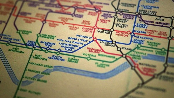
A classic story, the first one which lots of people picked up, was when in March -- on March 10th in fact, soon after TED -- Paul Clarke, in the U.K. government, blogged, "Oh, I've just got some raw data. Here it is, it's about bicycle accidents." Two days it took the Times Online to make a map, a mashable map -- we call these things mash-ups -- a mashed-up user interface that allows you to go in there and have a look and find out whether your bicycle route to work was affected.
O poveste clasică, prima pe care au aflat-o mulţi oameni, a fost în martie, pe 10 martie de fapt, la puţin timp după TED, Paul Clarke, din partea guvernului Marii Britanii publică pe blog, "Ah, am nişte date neprelucrate. Aici, despre accidentele de bicicletă." Le-a luat două zile celor de la Times Online să facă o hartă, o harta compusă -- numim aceste îmbinări de date mash-uri, un mash, o interfaţă care îţi permite accesul, să arunci o privire şi să afli dacă drumul tău către muncă cu bicicleta este afectat.
Here's more data, traffic survey data, again, put out by the U.K. government, and because they put it up using the Linked Data standards, then a user could just make a map, just by clicking.
Există mai multe date, date despre traficul rutier, din nou, publicate de guvernul Marii Britanii, şi pentru că au fost publicate folosind standarde de îmbinare a datelor atunci un utilizator poate crea o hartă, cu doar un click.
Does this data affect things? Well, let's get back to 2008. Look at Zanesville, Ohio. Here's a map a lawyer made. He put on it the water plant, and which houses are there, which houses have been connected to the water. And he got, from other data sources, information to show which houses are occupied by white people. Well, there was too much of a correlation, he felt, between which houses were occupied by white people and which houses had water, and the judge was not impressed either. The judge was not impressed to the tune of 10.9 million dollars. That's the power of taking one piece of data, another piece of data, putting it together, and showing the result.
Are această informaţie rezultate? Păi să ne întoarcem în 2008. Priviţi Zanesville, Ohio. Aceasta este o hartă făcută de un avocat. A pus date de la o staţie de apă, şi ce case sunt acolo, (şi a arătat) care case erau conectate la sistemul de alimentare cu apă. Şi a obţinut, din alte surse, date ce arată care case erau locuite de albi. I s-a părut că există o prea mare corelaţie între casele ocupate de albi şi casele care aveau apă, iar judecătorul i-a împărtăşit părerea. Judecătorul a decis plata despăgubirilor în valoare de 10.9 milioane dolari. Asta se poate face îmbinând o informaţie, cu altă informaţie, punându-le împreună, şi prezentând rezultatul.
Let's look at some data from the U.K. now. This is U.K. government data, a completely independent site, Where Does My Money Go. It allows anybody to go there and burrow down. You can burrow down by a particular type of spending, or you can go through all the different regions and compare them. So, that's happening in the U.K. with U.K. government data.
Să ne uităm la nişte date din Marea Britanie acum. Acestea sunt date ale guvernului U.K., un site complet independent, Where Does My Money Go (Unde Se Duc Banii Mei), permite oricui să afle ce-l interesează. Poţi investiga după un anume fel de cheltuială, sau poţi vizualiza regiuni, comparându-le. Deci, asta se întâmplă în U.K. cu datele guvernului.
Yes, certainly you can do it over here. Here's a site which allows you to look at recovery spending in California. Take an arbitrary example, Long Beach, California, you can go and have a look at what recovery money they've been spending on different things such as energy.
Da, bineînţeles se poate face şi aici. Acesta este un site care îţi permite să vezi cheltuielile în California. Un exemplu aleator, Long Beach, California, poţi vedea câţi bani au cheltuit pe diferite lucruri, ca spre exemplu energie.
In fact, this is the graph of the number of data sets in the repositories of data.gov, and data.gov.uk. And I'm delighted to see a great competition between the U.K. in blue, and the U.S. in red.
De fapt, acesta este un grafic ce compară seturi de date din depozitul de înregistrări al data.gov cu cel al data.gov.uk. Sunt încântat să văd o puternică competiţie între U.K. cu albastru şi U.S. în roşu.
How can you use this stuff? Well, for example, if you have lots of data about places you can take, from a postcode -- which is like a zip plus four -- for a specific group of houses, you can make paper, print off a paper which has got very, very specific things about the bus stops, the things specifically near you.
Cum poţi utiliza aceste lucruri? Păi, spre exemplu, dacă ai multe date despre locuri poţi pleca de la un cod poştal care este ca un cod zip cu încă patru cifre, specific unui grup de case, poţi face un pliant, poţi tipari pe hârtie informaţii foarte, foarte specifice despre staţiile de autobuz, lucruri de interes aflate în apropiere.
On a larger scale, this is a mash-up of the data which was released about the Afghan elections. It allows you to set your own criteria for what sort of things you want to look at. The red circles are polling stations, selected by your criteria. And then you can select also other things on the map to see what other factors, like the threat level. So, that was government data.
Pe o scară mai mare, acesta este un mash-up, o compoziţie de date făcute publice referitoare la alegerile din Afganistan. Îţi permite să-ţi selectezi criteriile în funcţie de ceea ce vrei să vezi. Punctele roşii sunt secţii de votare, afişate după criteriile selectate. De asemenea poţi selecta şi alte opţiuni pe hartă pentru alţi factori cum ar fi nivelul de pericol. Deci, asta a fost informaţie guvernamentală.
I also talked about community-generated data -- in fact I edited some. This is the wiki map, this is the Open Street Map. "Terrace Theater" I actually put on the map because it wasn't on the map before TED last year. I was not the only person editing the open street map. Each flash on this visualization -- put together by ITO World -- shows an edit in 2009 made to the Open Street Map. Let's now spin the world during the same year. Every flash is an edit. Somebody somewhere looking at the Open Street Map, and realizing it could be better. You can see Europe is ablaze with updates. Some places, perhaps not as much as they should be.
Am vorbit şi despre date generate de comunitate - de fapt am editat câteva. Aceasta este harta wiki, aceasta este harta "open" a străzilor, OpenStreetMap. Cinematograful Terrace? Chiar eu l-am adăugat pe hartă deoarece nu era înainte de conferinţa TED de anul trecut. Nu am fost singurul care am editat harta "open" a străzilor. Fiecare sclipire din această vizualizare, încropită de ITO World, reprezintă o editare din 2009 făcută hărţii "open". Haideţi acum să învârtim planeta, în acelaşi an. Fiecare sclipire este o editare. Cineva undeva vizualizând harta şi realizând că poate fi îmbunătăţită. Poţi vedea că Europa străluceşte cu îmbunătăţiri. În unele locuri probabil nu la fel de mult pe cât ar fi trebuit.
Here focusing in on Haiti. The map of Port au-Prince at the end of 2009 was not all it could be, not as good as the map of California. Fortunately, just after the earthquake, GeoEye, a commercial company, released satellite imagery with a license, which allowed the open-source community to use it. This is January, in time lapse, of people editing ... that's the earthquake. After the earthquake, immediately, people all over the world, mappers who wanted to help, and could, looked at that imagery, built the map, quickly building it up.
Aici ne concentrăm pe Haiti. Harta Port au-Prince la sfârşitul lui 2009 nu era ceea ce ar fi putut fi, nu la fel de bună precum harta Californiei. Din fericire, chiar după cutremur, GeoEye, o companie privată, a publicat imagini din satelit sub o licenţă ce a permis comunităţii open-source să le folosească. Aceasta este trecerea timpului în ianuarie, oameni editând, acesta este cutremurul. Imediat după cutremur oameni din diferite colţuri ale lumii, cartografi care vroiau să ajute, şi puteau, au analizat imaginile, au construit harta, foarte rapid.
We're focusing now on Port-au-Prince. The light blue is refugee camps these volunteers had spotted from the [satellite images]. So, now we have, immediately, a real-time map showing where there are refugee camps -- rapidly became the best map to use if you're doing relief work in Port-au-Prince. Witness the fact that it's here on this Garmin device being used by rescue team in Haiti.
Focalizăm acum pe Port au-Prince. Cu albastru sunt tabere de refugiaţi pe care voluntarii le-au localizat din imagini. Deci, acum avem, imediat, o hartă în timp real ce ne arată unde sunt tabere pentru refugiaţi, devenind rapid cea mai bună hartă pe care să o foloseşti dacă oferi ajutor în Port au-Prince. Confirmare este chiar acest dispozitiv Garmin ce este folosit de echipele de salvare.
There's the map showing, on the left-hand side, that hospital -- actually that's a hospital ship. This is a real-time map that shows blocked roads, damaged buildings, refugee camps -- it shows things that are needed [for rescue and relief work].
Aici este harta aratând în partea stângă, acel spital, este de fapt o navă spital. Aceasta este o hartă în timp real ce arată drumurile blocate, clădirile afectate, taberele pentru refugiaţi. Arată lucrurile de care e nevoie (pentru munca de salvare şi ajutorare).
So, if you've been involved in that at all, I just wanted to say: Whatever you've been doing, whether you've just been chanting, "Raw data now!" or you've been putting government or scientific data online, I just wanted to take this opportunity to say: Thank you very much, and we have only just started! (Applause)
Deci, dacă ai fost implicat, vreau doar să spun: indiferent de ce ai făcut, fie că doar ai strigat "Date brute acum!" fie că ai publicat date guvernamentale sau ştiinţifice, vreau doar să mă folosesc de oportunitate să îţi mulţumesc foarte mult, şi ăsta e abia începutul! (Aplauze)