Last year here at TED I asked you to give me your data, to put your data on the web, on the basis that if people put data onto the web -- government data, scientific data, community data, whatever it is -- it will be used by other people to do wonderful things, in ways that they never could have imagined.
Pagājušogad šeit, TED, es lūdzu jūs dot man savus datus, izlikt savus datus tīmeklī, pamatojoties uz to, ka, ja ļaudis izliks datus tīmeklī — valdības datus, zinātniskus datus, sabiedrības datus, lai kas tas arī būtu — šos datus izmantos citi ļaudis, lai paveiktu brīnišķīgas lietas, veidos, kādi jums nekad nebūtu ienākuši prātā.
So, today I'm back just to show you a few things, to show you, in fact, there is an open data movement afoot, now, around the world. The cry of "Raw data now!" which I made people make in the auditorium, was heard around the world. So, let's roll the video.
Un tā, šodien esmu atgriezies, lai parādītu jums dažas lietas, lai parādītu jums, ka patiesībā ir radusies atvērto datu kustība, tagad, visā pasaulē. Sauciens "Dodiet mums neapstrādātus datus!", kuru es liku ļaudīm auditorijā teikt, tika sadzirdēts visā pasaulē. Apskatīsim video.
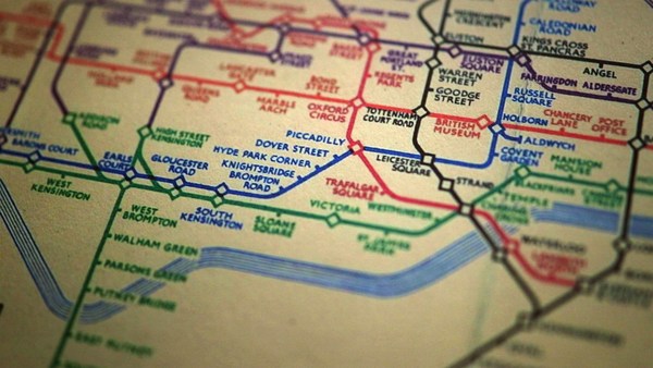
A classic story, the first one which lots of people picked up, was when in March -- on March 10th in fact, soon after TED -- Paul Clarke, in the U.K. government, blogged, "Oh, I've just got some raw data. Here it is, it's about bicycle accidents." Two days it took the Times Online to make a map, a mashable map -- we call these things mash-ups -- a mashed-up user interface that allows you to go in there and have a look and find out whether your bicycle route to work was affected.
Klasisks gadījums, pirmais, kuru daudzi cilvēki pamanīja, bija, kad martā, — patiesībā, 10. martā, drīz pēc TED — Pols Klārks no Lielbritānijas valdības blogoja, "Man ir neapstrādāti dati. Lūk, te tie ir, tie ir par velosipēdu negadījumiem." Times Online vajadzēja divas dienas, lai pagatavotu karti, sastiķētu karti — mēs saucam šīs lietas par sastiķējumiem — sastiķēta lietotāja saskarne, kas ļauj jums to atvērt, un apskatīt, un izpētīt to, vai jūsu ikdienas velosipēdista ceļš līdz darbavietai ir apdraudēts.
Here's more data, traffic survey data, again, put out by the U.K. government, and because they put it up using the Linked Data standards, then a user could just make a map, just by clicking.
Lūk, vēl dati, satiksmes novērojumu dati, kurus arī publicēja Lielbritānijas valdība, un tā kā viņi tos izvietoja saskaņā ar saistīto datu standartiem, tad lietotājs var apskatīt tos kartē, vienkārši uzklikšķinot.
Does this data affect things? Well, let's get back to 2008. Look at Zanesville, Ohio. Here's a map a lawyer made. He put on it the water plant, and which houses are there, which houses have been connected to the water. And he got, from other data sources, information to show which houses are occupied by white people. Well, there was too much of a correlation, he felt, between which houses were occupied by white people and which houses had water, and the judge was not impressed either. The judge was not impressed to the tune of 10.9 million dollars. That's the power of taking one piece of data, another piece of data, putting it together, and showing the result.
Vai šie dati ietekmē notikumus? Labi, atgriezīsimies 2008. gadā. Apskatiet Zeinsvillu Ohaio štatā. Te ir karte, ko pagatavoja kāds advokāts. Viņš tajā ievietoja ūdens sūkņu staciju, un mājas, kas tur atrodas, un kurām no tām ir pieslēgums ūdensvadam. Un no citiem avotiem viņš ieguva informāciju, lai parādītu, kurās no mājām dzīvo baltādainie. Viņš juta, ka ir pārāk liela saistība starp to, kurās mājās dzīvo baltādainie, un kurās ir ūdens, un arī tiesnesis nebija īpaši iepriecināts. Tiesnesis nebija iepriecināts 10,9 miljonu dolāru apmērā. Tas, lūk, ir spēks, ko gūst, ņemot vienus datus, ņemot vēl citus datus, apvienojot tos, un parādot rezultātu.
Let's look at some data from the U.K. now. This is U.K. government data, a completely independent site, Where Does My Money Go. It allows anybody to go there and burrow down. You can burrow down by a particular type of spending, or you can go through all the different regions and compare them. So, that's happening in the U.K. with U.K. government data.
Apskatīsim kādus datus no Lielbritānijas. Šie ir Lielbritānijas valdības dati, pilnīgi neatkarīga mājas lapa, "Kur paliek mana nauda". Tā ļauj ikvienam doties tur un rakties dziļumā. Jūs varat rakties dziļumā pēc konkrēta izdevumu tipa, vai jūs varat iet cauri visiem dažādajiem apgabaliem un salīdzināt tos. Tas, lūk, notiek Lielbritānijā ar valdības datiem.
Yes, certainly you can do it over here. Here's a site which allows you to look at recovery spending in California. Take an arbitrary example, Long Beach, California, you can go and have a look at what recovery money they've been spending on different things such as energy.
Jā, protams, jūs varat tā darboties arī šeit. Lūk, mājas lapa, kas ļauj jums apskatīt ekonomikas atlabšanas izdevumus Kalifornijā. Piemēram, Longbīčā, Kalifornijā, jūs varat apskatīt, kādi atgūšanās tēriņi tur ir izdoti dažādiem mērķiem, piemēram, enerģijai.
In fact, this is the graph of the number of data sets in the repositories of data.gov, and data.gov.uk. And I'm delighted to see a great competition between the U.K. in blue, and the U.S. in red.
Te jūs redzat grafiku, kas attēlo datu kopu skaitu, kas pieejams krātuvēs data.gov un data.gov.uk. Un es esmu iepriecināts redzēt varenu sacensību starp Lielbritāniju (zilā krāsā) un ASV (sarkanā).
How can you use this stuff? Well, for example, if you have lots of data about places you can take, from a postcode -- which is like a zip plus four -- for a specific group of houses, you can make paper, print off a paper which has got very, very specific things about the bus stops, the things specifically near you.
Kā jus varat izmantot šo padarīšanu? Piemēram, ja jums ir daudz specifisku datu par dažādām vietām, jūs varat ņemt pēc pasta koda — tas ir kā pasta indekss un vēl četras zīmes — konkrētai māju grupai, jūs varat uztaisīt avīzi, izdrukāt avīzi, kurā ir ļoti, ļoti specifiskas lietas par autobusu pieturām, lietām tieši jūsu apkaimē.
On a larger scale, this is a mash-up of the data which was released about the Afghan elections. It allows you to set your own criteria for what sort of things you want to look at. The red circles are polling stations, selected by your criteria. And then you can select also other things on the map to see what other factors, like the threat level. So, that was government data.
Plašākā mērogā, te ir sastiķēti dati, kas bija pieejami no vēlēšanām Afganistānā. Te ir iespējams uzstādīt savus nosacījumus, kādas lietas jūs vēlaties apskatīt. Sarkanie apļi ir vēlēšanu iecirkņi, altasīti pēc jūsu nosacījumiem. Un tad jūs varat iezīmēt kartē arī citas lietas, lai apskatītu kādus citus faktorus, kā, piemēram, draudu līmeni. Tie tātad bija valdību dati.
I also talked about community-generated data -- in fact I edited some. This is the wiki map, this is the Open Street Map. "Terrace Theater" I actually put on the map because it wasn't on the map before TED last year. I was not the only person editing the open street map. Each flash on this visualization -- put together by ITO World -- shows an edit in 2009 made to the Open Street Map. Let's now spin the world during the same year. Every flash is an edit. Somebody somewhere looking at the Open Street Map, and realizing it could be better. You can see Europe is ablaze with updates. Some places, perhaps not as much as they should be.
Es arī runāju par sabiedrības ģenerētiem datiem — patiesībā, es dažus no tiem papildināju. Šī ir "Wiki" karte, šī ir OpenStreetMap ielu karte. "Terrace Theater" patiesībā es norādīju kartē, jo tas tur nebija pirms TED pagājušogad. Es nebiju vienīgais, kurš papildināja atvērto ielu karti. Katrs uzplaiksnījums šajā vizualizācijā — ko izveidoja ITO World — parāda papildinājumu 2009. gadā, veiktu OpenStreetMap kartē. Tagad pagriezīsim pasauli šī paša gada laikā. Katrs uzplaiksnījums ir papildinājums. Kāds kaut kur skatījies uz OpenStreetMap karti un sapratis, ka tā var tikt uzlabota. Jūs varat redzēt, ka Eiropa ir papildinājumu liesmās. Dažas vietas varbūt ne tik ļoti, kā tām vajadzētu būt.
Here focusing in on Haiti. The map of Port au-Prince at the end of 2009 was not all it could be, not as good as the map of California. Fortunately, just after the earthquake, GeoEye, a commercial company, released satellite imagery with a license, which allowed the open-source community to use it. This is January, in time lapse, of people editing ... that's the earthquake. After the earthquake, immediately, people all over the world, mappers who wanted to help, and could, looked at that imagery, built the map, quickly building it up.
Pievēršam uzmanību Haiti. Portoprensas karte 2009. gada beigās nebija gluži tas, kas tā varētu būt, nebija tik pilnīga kā Kalifornijas karte. Par laimi, uzreiz pēc zemestrīces, GeoEye, komercuzņēmums, publicēja pavadoņu uzņemtus attēlus ar licenci, kas ļāva atvērtā koda sabiedrībai tos izmantot. Šis ir janvāris, rādot paātrināti, kā ļaudis to papildina … šī ir zemestrīce. Uzreiz pēc zemestrīces cilvēki visā pasaulē, karšu speciālisti, kas vēlējās palīdzēt, un varēja, apskatīja šos attēlus, izveidoja karti, ātri to saliekot kopā.
We're focusing now on Port-au-Prince. The light blue is refugee camps these volunteers had spotted from the [satellite images]. So, now we have, immediately, a real-time map showing where there are refugee camps -- rapidly became the best map to use if you're doing relief work in Port-au-Prince. Witness the fact that it's here on this Garmin device being used by rescue team in Haiti.
Mēs tagad tuvinām Portoprensu. Gaiši zilā krāsā ir bēgļu nometnes, kuras šie brīvprātīgie bija pamanījuši attēlos. Un tā, mums tagad ir reālā laika karte, kas rāda, kur atrodas bēgļu nometnes — tā zibenīgi kļuva par labāko karti, ko lietot, ja tu darbojies palīdzības misijā Portoprensā. Ievērojiet, ka tā ir te, uz šīs Garmin iekārtas, ko izmanto glābēju grupa Haiti.
There's the map showing, on the left-hand side, that hospital -- actually that's a hospital ship. This is a real-time map that shows blocked roads, damaged buildings, refugee camps -- it shows things that are needed [for rescue and relief work].
Lūk, karte, kurā, kreisajā pusē, redzama šī slimnīca — patiesībā, tas ir slimnīcas kuģis. Šī ir reālā laika karte, kur redzami bloķētie ceļi, bojātās ēkas, bēgļu nometnes -- tā rāda lietas, kuras ir nepieciešamas glābšanai un palīdzībai.
So, if you've been involved in that at all, I just wanted to say: Whatever you've been doing, whether you've just been chanting, "Raw data now!" or you've been putting government or scientific data online, I just wanted to take this opportunity to say: Thank you very much, and we have only just started! (Applause)
Tāpēc, ja jūs esat tajā visā kaut kā iesaistīti, es vienkārši gribēju jums pateikt: lai ko jūs būtu darījuši, vai jūs tikai saucāt "Dodiet mums neapstrādātus datus!", vai jūs tīmeklī izvietojāt valsts vai zinātniskos datus, es vienkārši gribēju izmantot šo iespēju, lai pateiktu: Liels jums paldies, un mēs esam tikai tik tikko sākuši! (Aplausi)