Last year here at TED I asked you to give me your data, to put your data on the web, on the basis that if people put data onto the web -- government data, scientific data, community data, whatever it is -- it will be used by other people to do wonderful things, in ways that they never could have imagined.
Praėjusiais metais čia pat, TED, prašiau jūsų pasidalinti savo duomenimis, sukelti savo duomenis į internetą, grįsdamas tuo, kad jeigu žmonės patalpintų duomenis internete -- vyriausybės galioje esančius duomenis, mokslinius duomenis, bendruomenių duomenis, kad ir kas tai bebūtų, -- duomenys galėtų būti naudojami kitų žmonių nuostabiems dalykams kurti, tokiais būdais apie kokius net nebuvo svajota.
So, today I'm back just to show you a few things, to show you, in fact, there is an open data movement afoot, now, around the world. The cry of "Raw data now!" which I made people make in the auditorium, was heard around the world. So, let's roll the video.
Taigi, šiandien aš grįžau norėdamas jums parodyti kelis dalykus, iš tikro parodyti, kad yra rengiamas atvirų duomenų judėjimas, šiuo metu, visame pasaulyje. Šauksmas "Neapdorotų duomenų dabar!", kurį priverčiau žmones sušukti salėje, buvo išgirstas visame pasaulyje. Taigi.., pradėkim vaizdo įrašą.
A classic story, the first one which lots of people picked up, was when in March -- on March 10th in fact, soon after TED -- Paul Clarke, in the U.K. government, blogged, "Oh, I've just got some raw data. Here it is, it's about bicycle accidents." Two days it took the Times Online to make a map, a mashable map -- we call these things mash-ups -- a mashed-up user interface that allows you to go in there and have a look and find out whether your bicycle route to work was affected.
Klasikinė istorija, pirmoji, taip pamėgta daugelio žmonių, nutiko kuomet kovą, tiksliau kovo 10, iš kart po TED, Paul Clarke, esantis J.K. vyriausybėje, brūkštelėjo tinklaraštyje, "Ej, aš tik ką gavau neapdorotų duomenų. Štai jie, jie apie nelaimingus atsitikimus su dviračiu." "Times Online" prireikė dviejų dienų žemėlapiui sukurti, hibridiniam internetiniam žemėlapiui -- mes vadinam juos 'mešapais' -- hibridinei interneto vartotojo sąsajai, kuri leidžia ten patekti ir žvilgtelėti bei atrasti ar tavo kelias dviračiu į darbą buvo sutrikdytas.
Here's more data, traffic survey data, again, put out by the U.K. government, and because they put it up using the Linked Data standards, then a user could just make a map, just by clicking.
Štai, dar daugiau duomenų, eismo tyrimo duomenys, vėlgi, paviešinti J.K. vyriausybės, ir todėl, kad jie patalpino naudodami susietų duomenų standartus, vartotojas gali sukurti žemėlapį tiesiog paspausdamas pelės mygtuką.
Does this data affect things? Well, let's get back to 2008. Look at Zanesville, Ohio. Here's a map a lawyer made. He put on it the water plant, and which houses are there, which houses have been connected to the water. And he got, from other data sources, information to show which houses are occupied by white people. Well, there was too much of a correlation, he felt, between which houses were occupied by white people and which houses had water, and the judge was not impressed either. The judge was not impressed to the tune of 10.9 million dollars. That's the power of taking one piece of data, another piece of data, putting it together, and showing the result.
Ar šie duomenys turi kokios nors įtakos? Na, grįžkime atgal į 2008. Žvilgtelėkim į Zanesvilį, Ohajo. Štai teisininko sukurtas žemėlapis. Jis uždėjo ant jo vandens įrenginį, ir namus, kurie ten yra, [ir pavaizdavo], kurie namai buvo sujungti su tuo vandens įrenginiu. Jis taip pat gavo, iš kitų duomenų šaltinių, informacijos, kuria parodė, kurie namai yra apgyvendinti baltųjų žmonių. Ir štai, koreliacija buvo pernelyg žymi, kaip jam pasirodė, tarp to, kurie namai yra apgyvendinti baltųjų žmonių, ir kurie namai turi vandens tiekimą, ir teisėjas nebuvo sužavėtas. Teisėjas nebuvo sužavėtas įvertinęs tai 10.9 milijonų dolerių ieškiniu. Štai kur galia, imant gabalėlį vienų duomenų, kitų duomenų ir viską sudedant kartu, ir parodant rezultatą.
Let's look at some data from the U.K. now. This is U.K. government data, a completely independent site, Where Does My Money Go. It allows anybody to go there and burrow down. You can burrow down by a particular type of spending, or you can go through all the different regions and compare them. So, that's happening in the U.K. with U.K. government data.
Žvilgtelėkim dabar į duomenis iš J.K.. Štai J.K. vyriausybės duomenys, visiškai nepriklausomas puslapis, "Kur keliauja mano pinigai." Jis leidžia kiekvienam ten patekti ir ieškoti. Galima ieškoti pagal tam tikrą išlaidų tipą, arba galima eiti per skirtingus regionus ir juos lyginti. Taigi, štai taip vyksta J.K. su J.K. vyriausybės duomenimis.
Yes, certainly you can do it over here. Here's a site which allows you to look at recovery spending in California. Take an arbitrary example, Long Beach, California, you can go and have a look at what recovery money they've been spending on different things such as energy.
Taip, žinoma tai galima daryti ir čia. Štai čia yra puslapis leidžiantis pasižiūrėti į kompensacines išlaidas Kalifornijoje. Pateikiant nešališką pavyzdį, Long Byče, Kalifornijoje, galima nueiti ir pasižiūrėti kokius kompensacinius pinigus jie leisdavo įvairiems dalykams, tokiems kaip energija.
In fact, this is the graph of the number of data sets in the repositories of data.gov, and data.gov.uk. And I'm delighted to see a great competition between the U.K. in blue, and the U.S. in red.
Tiesą sakant, tai diagrama kelių duomenų rinkinių duomenų saugykloje data.gov. ir data.gov.uk. Aš esu patenkintas matydamas šią žavią konkurenciją tarp J. K., mėlynųjų, ir J.V., raudonųjų.
How can you use this stuff? Well, for example, if you have lots of data about places you can take, from a postcode -- which is like a zip plus four -- for a specific group of houses, you can make paper, print off a paper which has got very, very specific things about the bus stops, the things specifically near you.
Kaip galima panaudoti tokį dalyką? Na, tarkim, jei turi daug duomenų apie vietoves, tu gali paimti, iš pašto kodo -- kuris kaip pašto indeksas, tik plius keturi -- specifinę namų grupę, ir gali juos sužymėti dokumente, atspausdinti dokumentą kuris turi labai labai specifinius dalykus apie autobusų stoteles, specifinius dalykus esančius greta tavęs.
On a larger scale, this is a mash-up of the data which was released about the Afghan elections. It allows you to set your own criteria for what sort of things you want to look at. The red circles are polling stations, selected by your criteria. And then you can select also other things on the map to see what other factors, like the threat level. So, that was government data.
Plačiu mastu, dabar, štai čia yra 'mešapas' duomenų, kurie paskelbti apie Afganistano rinkimus. Tau leidžiama nustatyti savo kriterijus pagal dalykų tipus, kuriuos nori peržvelgti. Raudoni apskritimai yra rinkimų apylinkės, atrinktos pagal tavo kriterijus. Tada galima pasirinkti ir kitus dalykus žemėlapyje, peržvelgti kitus veiksnius, tokius kaip grėsmės lygis. Taigi, tai buvo vyriausybės duomenys.
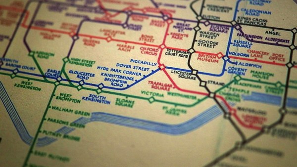
I also talked about community-generated data -- in fact I edited some. This is the wiki map, this is the Open Street Map. "Terrace Theater" I actually put on the map because it wasn't on the map before TED last year. I was not the only person editing the open street map. Each flash on this visualization -- put together by ITO World -- shows an edit in 2009 made to the Open Street Map. Let's now spin the world during the same year. Every flash is an edit. Somebody somewhere looking at the Open Street Map, and realizing it could be better. You can see Europe is ablaze with updates. Some places, perhaps not as much as they should be.
Aš taip pat kalbėjau apie visuomenės-sukurtus duomenis -- iš tikro keletą redagavau ir aš pats. Štai čia yra wiki žemėlapis, "Open street map". "Terrace Theater"? Iš tikro aš jį pažymėjau žemėlapyje, nes jo ten nebuvo prieš TED praėjusiais metais. Aš nebuvau vienintelis redagavęs žemėlapį "Open street map." Kiekvienas žybsnis šioje vizualizacijoje -- kartu sudėtas ITO World organizacijos -- pažymi redagavimą 2009 atliktą "Open street map" žemėlapyje. Nagi, peržvelkime pasaulį per visus metus. Kiekvienas žybsnis yra redagavimas. Kažkas kažkur žiūrintis į "Open Street Map" žemėlapį, ir suvokiantis, kad šis gali būti geresnis. Galite matyti, Europa tiesiog liepsnoja nuo atnaujinimų. Kai kurios vienos, turbūt ne tiek daug, kiek turėtų.
Here focusing in on Haiti. The map of Port au-Prince at the end of 2009 was not all it could be, not as good as the map of California. Fortunately, just after the earthquake, GeoEye, a commercial company, released satellite imagery with a license, which allowed the open-source community to use it. This is January, in time lapse, of people editing ... that's the earthquake. After the earthquake, immediately, people all over the world, mappers who wanted to help, and could, looked at that imagery, built the map, quickly building it up.
Štai, centravimas ties Haičiu. Ir Port au-Prince žemėlapis 2009 pabaigoje, nebuvo toks geras kaip galėtų, ne toks puikus kaip Kalifornijos žemėlapis. Laimei, tik po žemės drebėjimo, "GeoEye", komercinė kompanija, paskelbė satelito nuotraukas su licenzija, kuri leido atviro-kodo bendruomenei jas naudoti. Štai sausis, laiko eigoje, žmonės vis redaguoja... štai žemės drebėjimas. Tik po žemės drebėjimo, iš karto, žmonės iš viso pasaulio, kartografai, kurie norėjo padėti, ir galėjo, naudojo tą satelito nuotrauką ir redagavo žemėlapį, paskubomis jį kurdami.
We're focusing now on Port-au-Prince. The light blue is refugee camps these volunteers had spotted from the [satellite images]. So, now we have, immediately, a real-time map showing where there are refugee camps -- rapidly became the best map to use if you're doing relief work in Port-au-Prince. Witness the fact that it's here on this Garmin device being used by rescue team in Haiti.
Dabar susitelkiame ties Port au-Prince. Šviesiai mėlyna yra pabėgėlių stovyklavietės išžvalgytos savanorių iš minėtų satelito nuotraukų. Ir dabar mes turime, tiesiog, žemėlapį realiuoju laiku, parodantį kur yra pabėgėlių stovyklavietės, kuris greitai tapo geriausias žamėlapis pagalbos darbams atlikti Port au-Prince. Patvirtintas faktu, kad štai jis čia, šiame Garmin prietaise, kuris buvo naudojamas gelbėjimo tarnybų darbo lauke.
There's the map showing, on the left-hand side, that hospital -- actually that's a hospital ship. This is a real-time map that shows blocked roads, damaged buildings, refugee camps -- it shows things that are needed [for rescue and relief work].
Štai žemėlapis, parodantis kairėje pusėje ligoninę -- iš tikro tai ligoninės laivą. Štai realaus laiko žemėlapis parodantis užblokuotus kelius, sugadintus pastatus ir pabėgėlių stovyklavietes. Jis rodo būtiniausius dalykus [gelbėjimo ir pagalbos darbams].
So, if you've been involved in that at all, I just wanted to say: Whatever you've been doing, whether you've just been chanting, "Raw data now!" or you've been putting government or scientific data online, I just wanted to take this opportunity to say: Thank you very much, and we have only just started! (Applause)
Taigi, jei jūs kažkaip buvote įtrauktas į visa šita, aš tik norėjau pasakyti: kad ir ką jūs darėt, jei jūs skandavot "neapdorotų duomenų dabar!" ar jei jūs talpinto vyriausybės ar mokslinius duomenis internete, aš tik norėjau pasinaudoti šia galimybe pasakyti jums labai ačiū, ir tai, kad mes dar tik pradėjom! (Plojimai)