Last year here at TED I asked you to give me your data, to put your data on the web, on the basis that if people put data onto the web -- government data, scientific data, community data, whatever it is -- it will be used by other people to do wonderful things, in ways that they never could have imagined.
작년 TED에서 저는 여러분이 제게 데이터를 주시기를, 여러분의 데이터를 웹에 올려놓으시기를 요청했습니다. 사람들이 데이터를 웹에 올려놓아 준다면, 정부 데이터든 과학 데이터든 커뮤니티 데이터든 뭐든 스스로는 상상도 못했을 놀라운 것들을 다른 사람들이 해낼 수 있다는 그런 이유 때문이었죠.
So, today I'm back just to show you a few things, to show you, in fact, there is an open data movement afoot, now, around the world. The cry of "Raw data now!" which I made people make in the auditorium, was heard around the world. So, let's roll the video.
그래서 오늘 저는 여러분께 몇가지 것들을 보여드리고자 돌아왔습니다. 보여드리고자 하는 것은 사실, 현재 세계적으로 오픈데이터 운동이 벌어지고 있다는 것이죠. "당장 로데이터를" 그렇게 제가 강당에서 청중분들에게 소리치도록 권유한 바는 전세계에 울려퍼졌습니다. 자, 영상을 보시죠.
A classic story, the first one which lots of people picked up, was when in March -- on March 10th in fact, soon after TED -- Paul Clarke, in the U.K. government, blogged, "Oh, I've just got some raw data. Here it is, it's about bicycle accidents." Two days it took the Times Online to make a map, a mashable map -- we call these things mash-ups -- a mashed-up user interface that allows you to go in there and have a look and find out whether your bicycle route to work was affected.
가장 전통적 스토리, 즉 많은 이들이 주목한 첫 시도는 지난 3월 10일, 그러니까 TED행사 직후였습니다. 영국 정부 소속 폴 클라크가 블로그에 이렇게 남겼습니다: "아, 방금 로데이터를 좀 얻었어요. 여기 있습니다. 자전거 사고에 관한 자료죠." 타임즈온라인에서 이 자료로 매시업 가능한 지도를 만들어내기에 이틀이 걸렸습니다. 이런 것들을 매시업이라고 부르죠. 매시업으로 만든 사용자 인터페이스로, 여기 들어가면 둘러보면서 여러분들이 출퇴근하시는 자전거길에 영향이 있는지 찾아볼 수 있습니다.
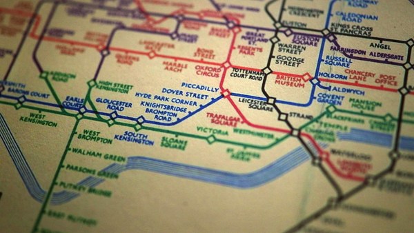
Here's more data, traffic survey data, again, put out by the U.K. government, and because they put it up using the Linked Data standards, then a user could just make a map, just by clicking.
더욱 많은 데이터, 교통 설문 데이터가 있습니다. 이것 역시, 영국 정부가 공개했죠. 연동데이터 표준을 활용하여 올려놓았기 때문에 사용자들이 곧바로 지도를 만들 수 있습니다. 그저 클릭하는 것 만으로 말이죠.
Does this data affect things? Well, let's get back to 2008. Look at Zanesville, Ohio. Here's a map a lawyer made. He put on it the water plant, and which houses are there, which houses have been connected to the water. And he got, from other data sources, information to show which houses are occupied by white people. Well, there was too much of a correlation, he felt, between which houses were occupied by white people and which houses had water, and the judge was not impressed either. The judge was not impressed to the tune of 10.9 million dollars. That's the power of taking one piece of data, another piece of data, putting it together, and showing the result.
이런 데이터가 어떤 영향을 미칠 수 있을까요? 자, 2008년으로 돌아가봅시다. 미국 오하이오주 제인스빌을 보죠. 여기 한 변호사가 만든 지도가 있습니다. 상수처리장을 놓고는 어떤 집들이 있고 어떤 집들에 상수도가 연결되어 있는지 보여주죠. 그리고 다른 데이터 출처를 통해서 어떤 집들에 백인들이 거주하는지 보여주는 정보를 얻었습니다. 그가 보기에는 상수도가 연결된 집들과 백인들이 거주하는 집들 사이의 상관관계가 너무 높아보였고, 재판관 역시 좋은 인상을 받지 못했습니다. 좋지 않은 인상을 받아, 1090만 달러짜리 배상 판결을 선고했죠. 이것이 바로 하나의 데이터를 가져오고 다른 데이터를 가져와서, 합쳐서, 결과를 보여주는 것의 힘입니다.
Let's look at some data from the U.K. now. This is U.K. government data, a completely independent site, Where Does My Money Go. It allows anybody to go there and burrow down. You can burrow down by a particular type of spending, or you can go through all the different regions and compare them. So, that's happening in the U.K. with U.K. government data.
이제 영국 데이터도 몇가지 봅시다. 이것은 영국 정부측 데이터로, 완전한 독립사이트인 "Where Does My Money Go (내 돈은 어디로 갈까)"에서 누구든지 접근하여 탐구해볼 수 있습니다. 특정한 지출 범주에 따라서 파고들어볼 수 있고 모든 지역들을 훑으며 비교할 수도 있습니다. 이런 것이 영국에서 영국 정부 데이터로 이루어지고 있죠.
Yes, certainly you can do it over here. Here's a site which allows you to look at recovery spending in California. Take an arbitrary example, Long Beach, California, you can go and have a look at what recovery money they've been spending on different things such as energy.
예, 이 곳(미국)에서도 할 수 있습니다. 여기는 이곳 캘리포니아의 복구예산 지출 상황을 볼 수 있는 사이트입니다. 그리고 임의의 사례로 롱비치를 선택해보면, 여러가지 것들, 예를 들어 에너지 같은 분야에 지출된 복구 지출 내역을 찾아볼 수 있습니다.
In fact, this is the graph of the number of data sets in the repositories of data.gov, and data.gov.uk. And I'm delighted to see a great competition between the U.K. in blue, and the U.S. in red.
이것이 사이트에 올라온 데이터세트의 갯수를 나타낸 그래프입니다. data.gov (미국)의 경우, 그리고 data.gov.uk (영국) 입니다. 저는 파란색으로 그려진 영국과 붉은색의 미국 사이에 치열한 경쟁이 이루어지고 있어서 기쁩니다.
How can you use this stuff? Well, for example, if you have lots of data about places you can take, from a postcode -- which is like a zip plus four -- for a specific group of houses, you can make paper, print off a paper which has got very, very specific things about the bus stops, the things specifically near you.
이런 것들을 어떻게 활용할까요? 자, 예를 들어 장소에 관한 데이터가 많이 있다면 특정한 집들의 그룹을 나타내는 우편번호를 바탕으로 신문을 제작하여 종이로 뽑을 수 있습니다. 매우 매우 특정한 정보들로 말이죠. 버스정류장에 관한 것이라든지 그런 딱 여러분 주변에 있는 것들에 대해서 말입니다.
On a larger scale, this is a mash-up of the data which was released about the Afghan elections. It allows you to set your own criteria for what sort of things you want to look at. The red circles are polling stations, selected by your criteria. And then you can select also other things on the map to see what other factors, like the threat level. So, that was government data.
더 큰 스케일에서 보자면, 이것이 바로 아프간 선거에 관해 공개된 데이터의 매시업입니다. 보고싶은 것들을 지정하여 자신만의 범주를 설정할 수 있습니다. 빨간 동그라미는 투표소를 나타냅니다. 여러분이 선택한 범주 안에서 말이죠. 그리고 지도상에 있는 다른 것들도 선택 가능합니다. 예를 들어 위험 수준 같은 요소들 말이죠. 자, 지금까지 정부 자료를 봤습니다.
I also talked about community-generated data -- in fact I edited some. This is the wiki map, this is the Open Street Map. "Terrace Theater" I actually put on the map because it wasn't on the map before TED last year. I was not the only person editing the open street map. Each flash on this visualization -- put together by ITO World -- shows an edit in 2009 made to the Open Street Map. Let's now spin the world during the same year. Every flash is an edit. Somebody somewhere looking at the Open Street Map, and realizing it could be better. You can see Europe is ablaze with updates. Some places, perhaps not as much as they should be.
저는 예전에 커뮤니티에 의하여 생성된 데이터도 언급했습니다. 직접 편집도 했죠. 이것이 위키지도이며, 오픈스트리트맵입니다. 테라스극장이죠. 제가 지도에 올려놨습니다. 작년 TED 이전에는 지도에 없었으니까요. 오픈스트리트맵을 편집한 것은 저 뿐만이 아닙니다. ITO World에서 만든 이 시각화자료에서, 한번 반짝이는 것은 2009년에 오픈스트리트맵에 편집작업이 한 번 이루어진 것을 나타냅니다. 그 해에 대해 세계를 한 바퀴 돌아봅시다. 한번의 깜빡임이 하나의 편집작업입니다. 어디에 있는 누군가가 오픈스트리트맵을 보고, 더 나아질 수 있겠다고 깨닫습니다. 보시다시피 유럽은 업데이트로 불타오르죠. 어떤 장소들에서는, 바람직한 수준보다 좀 덜 이루어지고 있죠.
Here focusing in on Haiti. The map of Port au-Prince at the end of 2009 was not all it could be, not as good as the map of California. Fortunately, just after the earthquake, GeoEye, a commercial company, released satellite imagery with a license, which allowed the open-source community to use it. This is January, in time lapse, of people editing ... that's the earthquake. After the earthquake, immediately, people all over the world, mappers who wanted to help, and could, looked at that imagery, built the map, quickly building it up.
아이티에 초점을 맞춰봤습니다. 2009년 말 포르토프랭스의 지도는 그다지 충분하지 못했습니다. 캘리포니아 지도만큼 좋지는 않았죠. 운 좋게도, 지진이 일어난 직후 영리기업인 GeoEye사가 위성사진을 공개하면서 오픈소스 커뮤니티가 그것을 활용할 수 있도록 허용하는 라이센스 권한으로 열어주었죠. 1월중의 경과입니다. 사람들이 편집하고 있죠. 이것이 지진의 순간입니다. 지진 이후, 곧바로 세계 각지의 사람들, 돕고 싶어하고 도울 수 있는 지도제작자들이 그 이미지들을 보고, 지도를 만들어서, 빠르게 축적했습니다.
We're focusing now on Port-au-Prince. The light blue is refugee camps these volunteers had spotted from the [satellite images]. So, now we have, immediately, a real-time map showing where there are refugee camps -- rapidly became the best map to use if you're doing relief work in Port-au-Prince. Witness the fact that it's here on this Garmin device being used by rescue team in Haiti.
이제 포르토프랭스를 보고 있습니다. 파란색은 그 자원봉사자들이 공중에서 보고 발견해낸 피난민 수용소들입니다. 단번에, 우리는 어디에 피난민수용소들이 있는지 보여주는 실시간 지도가 생겼습니다. 이것은 포르토프랭스에서 구호작업을 벌일 때 사용할 수 있는 최고의 지도가 되었죠. 여기 보시다시피, 구호팀이 사용하는 Garmin사의 네비게이션 장치에서 구동되고 있습니다.
There's the map showing, on the left-hand side, that hospital -- actually that's a hospital ship. This is a real-time map that shows blocked roads, damaged buildings, refugee camps -- it shows things that are needed [for rescue and relief work].
그리고 아이티에 관하여, 이 지도는 여기 왼쪽에 병원이 표시되어 있죠. 사실 선상 병원입니다. 이것은 실시간 지도입니다. 막혀버린 도로, 부서진 건물, 피난민수용소들을 보여주죠. 요긴한 것들을 보여주고 있습니다.
So, if you've been involved in that at all, I just wanted to say: Whatever you've been doing, whether you've just been chanting, "Raw data now!" or you've been putting government or scientific data online, I just wanted to take this opportunity to say: Thank you very much, and we have only just started! (Applause)
그래서 만약 여러분이 이런 것에 관심이 있으시면 저는 그저 여러분들께, 여러분이 무엇을 해오셨든 간에 - 즉 로데이터를 차트로 정리하고 계셨든지 간에 혹은 정부나 과학 데이터를 온라인에 올려놓고 계셨든지 간에 그저 이 기회를 빌어서, 여러분께 감사의 말씀을 드리고자 합니다. 그리고 우리는 이제야 막 시작했습니다. (박수)