(Music)
(음악)
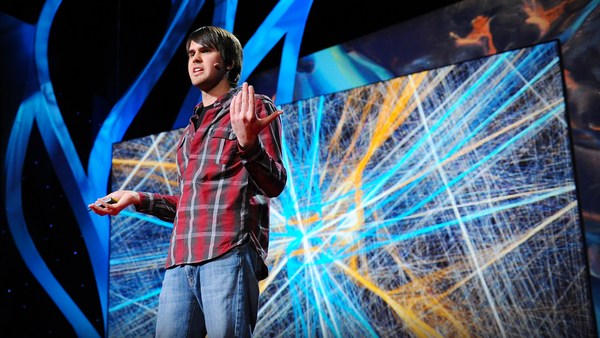
What you just heard are the interactions of barometric pressure, wind and temperature readings that were recorded of Hurricane Noel in 2007. The musicians played off a three-dimensional graph of weather data like this. Every single bead, every single colored band, represents a weather element that can also be read as a musical note. I find weather extremely fascinating. Weather is an amalgam of systems that is inherently invisible to most of us. So I use sculpture and music to make it, not just visible, but also tactile and audible.
방금 들으신 곡은 2007년 폭풍 노엘 당시 측정된 기압, 바람과 기온의 상호 작용을 표현한 것입니다. 연주자들이 여기 있는 3D 기상 정보 그래프를 연주한 것이지요. 이 구슬, 색 끈 하나하나가 기상 정보를 나타내고 있습니다. 원한다면 악보로서도 읽을 수 있지요. 저는 날씨가 굉장히 매력적이다고 생각합니다. 날씨는 선천적으로 볼 수 없는 정보들의 혼합체이지요. 그래서 저는 조각과 음악을 통하여, 이 정보들을 시각적 뿐만이 아닌 촉각적, 그리고 청각적으로 느낄 수 있도록 하고 있습니다.
All of my work begins very simple. I extract information from a specific environment using very low-tech data collecting devices -- generally anything I can find in the hardware store. I then compare my information to the things I find on the Internet -- satellite images, weather data from weather stations as well as offshore buoys. That's both historical as well as real data. And then I compile all of these numbers on these clipboards that you see here. These clipboards are filled with numbers. And from all of these numbers, I start with only two or three variables. That begins my translation process.
제 모든 작업은 간단하게 시작됩니다. 우선, 특정 환경의 정보를 로테크(low-tech) 자료 수집 장비를 이용해 뽑아냅니다 -- 웬만한 상점 어디서든지 찾을 수 있는 물건들로 말이지요. 다음으로는 제 정보를 인터넷에서 찾을 수 있는 것과 비교합니다 -- 위성 사진, 기상 관측소 및 해안가의 부표에서 측정한 기상 정보 등을 말이지요. 이 데이터들은 역사적이며, 사실입니다. 다음으로, 이 모든 숫자를 여기 있는 클립보드 위에 작성합니다. 여기 보시면 숫자들로 가득 차있지요? 초반에는, 이 숫자 중 단 두세 가지 변수로만 작업을 합니다. 이런 식으로 제 변환 작업이 시작됩니다.
My translation medium is a very simple basket. A basket is made up of horizontal and vertical elements. When I assign values to the vertical and horizontal elements, I can use the changes of those data points over time to create the form. I use natural reed, because natural reed has a lot of tension in it that I cannot fully control. That means that it is the numbers that control the form, not me. What I come up with are forms like these. These forms are completely made up of weather data or science data. Every colored bead, every colored string, represents a weather element. And together, these elements, not only construct the form, but they also reveal behavioral relationships that may not come across through a two-dimensional graph.
변환 작업은 이 단순한 바구니로 행해집니다. 바구니는 수평과 수직의 요소로 이루어져 있지요. 제가 이 요소들에 특정 값을 부여하면, 데이터의 변화를 이용하여 구조물을 만들 수 있게 되지요. 저는 주로 갈대를 사용합니다. 왜냐하면, 갈대는 제가 조절할 수 없는 장력을 갖고 있기 때문입니다. 이 구조물을 결정하는 것은 변수이지, 제가 아닙니다. 이 결과물들은 이런 구조물로 나타나게 됩니다. 이 구조물들은 오직 기상 정보와 과학 정보만으로 이루어져 있지요. 모든 색 구슬과 색 끈들은 기상 정보를 나타냅니다. 이 정보들은 단순히 구조만을 결정하지 않고, 2차원 그래프에서 나타낼 수 없는 관계 행동까지 표현합니다.
When you step closer, you actually see that it is indeed all made up of numbers. The vertical elements are assigned a specific hour of the day. So all the way around, you have a 24-hour timeline. But it's also used to assign a temperature range. On that grid, I can then weave the high tide readings, water temperature, air temperature and Moon phases. I also translate weather data into musical scores. And musical notation allows me a more nuanced way of translating information without compromising it.
조금 더 자세히 보면, 모든 것들이 숫자로 이루어져 있다는 것을 알 수 있습니다. 수직으로는 하루의 특정 시간대를 표현합니다. 이렇게 전체적으로는 24시간을 표현할 수 있다는 뜻이지요. 하지만 이 수직선은 온도 범위를 표현하는데도 사용됩니다. 이 격자 위에 만조, 수온, 기온 및 월영 정보를 짜 넣을 수 있습니다. 저는 기상 정보를 악보로 변환하기도 합니다. 기보법은 정보를 왜곡하지 않고 뉘앙스를 살릴 수 있도록 도와줍니다.
So all of these scores are made up of weather data. Every single color, dot, every single line, is a weather element. And together, these variables construct a score. I use these scores to collaborate with musicians. This is the 1913 Trio performing one of my pieces at the Milwaukee Art Museum. Meanwhile, I use these scores as blueprints to translate into sculptural forms like this, that function still in the sense of being a three-dimensional weather visualization, but now they're embedding the visual matrix of the musical score, so it can actually be read as a musical score.
이 모든 악보는 기상 정보로 이루어져 있습니다. 색, 점, 선 하나하나가 모두 기상 정보인 셈입니다. 이 모든 정보가 합쳐져 악보를 이루는 것이지요. 이 악보들은 음악가들과의 공동 작업을 위해 이용됩니다. 이것은 1913 트리오가 밀워키 미술관에서 제 곡 중 하나를 연주하는 장면입니다. 이 악보들은 이렇게 조각으로 변형하는데 청사진으로도 사용되고 있지요. 이 조각들도 여전히 기상 정보를 3차원으로 표현하는데 사용되고 있습니다. 하지만, 이 영상 매트릭스가 실질적인 악보로 구성 되어있다는 차이가 있지요. 정말로 악보로 이용될 수 있습니다.
What I love about this work is that it challenges our assumptions of what kind of visual vocabulary belongs in the world of art, versus science. This piece here is read very differently depending on where you place it. You place it in an art museum, it becomes a sculpture. You place it in a science museum, it becomes a three-dimensional visualization of data. You place it in a music hall, it all of a sudden becomes a musical score. And I really like that, because the viewer is really challenged as to what visual language is part of science versus art versus music.
제가 이 작품을 좋아하는 이유 중 하나는, 어떤 종류의 예술 어휘가 각각 미술 세계와 과학 세계에 포함되는지에 관한 저희의 가정을 반박하기 때문이지요. 이 작품은, 어디에 놓느냐에 따라 굉장히 다른 방법으로 읽힐 수 있습니다. 만약 미술관에 있다면, 이것은 조각상이 됩니다. 만약 과학관에 있다면, 이것은 3D로 표현한 데이터가 됩니다. 만약 뮤직홀에 있다면, 이것은 갑자기 악보로 변신합니다. 굉장히 재미있지요. 관찰자들은 어떤 특정한 예술 어휘가 미술 세계에 속하는지, 과학 세계에 속하는지 헛갈리기 시작할 겁니다.
The other reason why I really like this is because it offers an alternative entry point into the complexity of science. And not everyone has a Ph.D. in science. So for me, that was my way into it.
또 다른 이유는 이것이 과학의 복잡성에 또 다른 접근 방식을 제공한다는 점입니다. 모든 사람이 과학 박사 학위를 갖고 있지는 않지요. 이것은 제 나름대로의 방식이기도 한 것입니다.
Thank you.
감사합니다.
(Applause)
(박수)