'Theme and variations' is one of those forms that require a certain kind of intellectual activity, because you are always comparing the variation with the theme that you hold in your mind. You might say that the theme is nature and everything that follows is a variation on the subject.
"נושא ווריאציות" הוא אחד הדברים הדורשים פעילות מוחית מסויימת, מפני שאתם תמיד משווים את הוריאציה עם הנושא שאתם מחזיקים בראשכם. אתם תגידו אולי שהנושא הוא טבע וכל מה שבא אחריו הוא וריאציה על הנושא.
I was asked, I guess about six years ago, to do a series of paintings that in some way would celebrate the birth of Piero della Francesca. And it was very difficult for me to imagine how to paint pictures that were based on Piero until I realized that I could look at Piero as nature -- that I would have the same attitude towards looking at Piero della Francesca as I would if I were looking out a window at a tree. And that was enormously liberating to me. Perhaps it's not a very insightful observation, but that really started me on a path to be able to do a kind of theme and variations
נתבקשתי, אני מניח לפני שש שנים, לעשות סדרה של ציורים שבדרך מסויימת יחגגו את לידתו של פיירו דלה פרנצ'סקה. וזה היה לי קשה מאוד לדמיין איך לצייר תמונות המבוססות על פיירו עד שהבנתי שאני יכול להביט בפיירו כטבע -- שתהיה לי אותה גישה כלפי הסתכלות בפיירו דלה פרנצ'סקה כמו שאני מביט מחוץ לחלון בעץ. וזה היה מאוד משחרר בשבילי. אולי זו לא אבחנה בעלת תובנה, אבל היא באמת הכניסה אותי למסלול שאיפשר לעשות סוג של נושא ווריאציות
based on a work by Piero, in this case that remarkable painting that's in the Uffizi, "The Duke of Montefeltro," who faces his consort, Battista. Once I realized that I could take some liberties with the subject, I did the following series of drawings. That's the real Piero della Francesca -- one of the greatest portraits in human history. And these, I'll just show these without comment. It's just a series of variations on the head of the Duke of Montefeltro, who's a great, great figure in the Renaissance, and probably the basis for Machiavelli's "The Prince." He apparently lost an eye in battle, which is why he is always shown in profile. And this is Battista.
שמבוסס על עבודה של פיירו, במקרה הזה הציור המדהים שבאופיצי, "הדוכס ממונטפלטרו," שעומד מול חברות בטיסטה. ברגע שהבנתי שאני יכול להרשות לעצמי קצת חרויות עם הנושא, עשיתי את סדרת הציורים הזו. זה פיירו דלה פרנצ'סקה האמיתי -- אחד הפורטרטים הגדולים בהיסטוריה האנושית. ואלה, אני רק אראה אותם בלי הערות. זו רק סדרה של וריאציות על הראש של הדוכס ממונטפלטרו, שהוא דמות ממש גדולה ברנסאנס, ואולי הבסיס ל"הנסיך" של מקיאוולי. מסתבר שהוא איבד עין בקרב, לכן הוא תמיד מופיע בפרופיל. וזה בטיסטה.
And then I decided I could move them around a little bit -- so that for the first time in history, they're facing the same direction. Whoops! Passed each other. And then a visitor from another painting by Piero, this is from "The Resurrection of Christ" -- as though the cast had just gotten of the set to have a chat. And now, four large panels: this is upper left; upper right; lower left; lower right. Incidentally, I've never understood the conflict between abstraction and naturalism. Since all paintings are inherently abstract to begin with there doesn't seem to be an argument there.
ואז החלטתי שאני יכול להזיז אותם קצת -- כך שלראשונה בהיסטוריה, הם פונים לאותו כיוון. אופס! עברו אחד את השני. ואז מבקר מציור אחר של פיירו, זה מ"התחיה של ישו" -- כאילו הצוות רק ירד מהבמה לשוחח קצת. ועכשיו, ארבעה פאנלים גדולים: זה השמאלי העליון; ימני עליון; שמאלי תחתון; ימני תחתון. ד.א., מעולם לא הבנתי את הקונפליקט בין אבסטרקציה לנטורליזם. מאחר וכל הציורים הם אבסטרקטיים מיסודם באופן מהותי לא נראה שיש ויכוח כאן.
On another subject --
בנושא אחר --
(Laughter) --
(צחוק) --
I was driving in the country one day with my wife, and I saw this sign, and I said, "That is a fabulous piece of design." And she said, "What are you talking about?" I said, "Well, it's so persuasive, because the purpose of that sign is to get you into the garage, and since most people are so suspicious of garages, and know that they're going to be ripped off, they use the word 'reliable.' But everybody says they're reliable. But, reliable Dutchman" --
נסעתי בנוף יום אחד עם אשתי, וראיתי את השלט הזה, ואמרתי, "זה עיצוב נפלא." והיא אמרה, "על מה אתה מדבר?" אמרתי, "ובכן, זה כל כך משכנע, מפני שהמטרה של השלט הזה היא להביא אותך למוסך, ומאחר ורוב האנשים חושדים במוסכים, ויודעים שעומדים להונות אותם, הם משתמשים במילה 'אמין.' אבל כולם אומרים שהם אמינים. אבל, איש-הולנדי אמין" --
(Laughter) --
(צחוק)
"Fantastic!" Because as soon as you hear the word Dutchman -- which is an archaic word, nobody calls Dutch people "Dutchmen" anymore -- but as soon as you hear Dutchman, you get this picture of the kid with his finger in the dike, preventing the thing from falling and flooding Holland, and so on. And so the entire issue is detoxified by the use of "Dutchman." Now, if you think I'm exaggerating at all in this, all you have to do is substitute something else, like "Indonesian."
"פנטסטי!" מאחר וברגע שאתם שומעים את המילה איש-הולנדי -- שהיא מילה ארכאית, מפני שאף אחד לא קורא לאנשים מהולנד "איש-הולנדי" יותר -- אבל ברגע ששומעים איש-הולנדי, אתם תראו את התמונה הזו של ילד עם האצבע בסכר, מונע מזה לקרוס ולהציף את הולנד, וכו'. אז כל העניין מנוקה בגלל השימוש במילה "איש הולנדי." עכשיו, אם אתם חושבים שאני מגזים בזה, כל מה שאתם צריכים לעשות זה להחליף למשהו אחר, כמו "אינדונזי."
(Laughter)
(צחוק)
Or even "French."
או אפילו "צרפתי."
(Laughter)
(צחוק)
Now, "Swiss" works, but you know it's going to cost a lot of money.
עכשיו, "שוויצרי" עובד, אבל אתם יודעים שזה יעלה לכם הרבה כסף.
(Laughter)
(צחוק)
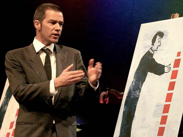
I'm going to take you quickly through the actual process of doing a poster. I do a lot of work for the School of Visual Arts, where I teach, and the director of this school -- a remarkable man named Silas Rhodes -- often gives you a piece of text and he says, "Do something with this." And so he did. And this was the text -- "In words as fashion the same rule will hold/ Alike fantastic if too new or old/ Be not the first by whom the new are tried/ Nor yet the last to lay the old aside." I could make nothing of that. And I really struggled with this one. And the first thing I did, which was sort of in the absence of another idea, was say I'll sort of write it out and make some words big, and I'll have some kind of design on the back somehow, and I was hoping -- as one often does -- to stumble into something. So I took another crack at it -- you've got to keep it moving -- and I Xeroxed some words on pieces of colored paper and I pasted them down on an ugly board. I thought that something would come out of it, like "Words rule fantastic new old first last Pope" because it's by Alexander Pope, but I sort of made a mess out of it, and then I thought I'd repeat it in some way so it was legible. So, it was going nowhere.
אני אקח אתכם בזריזות דרך התהליך עצמו של יצירת פוסטר. אני עושה הרבה עבודה לבית הספר לאמנות ויזואלית, שם אני מלמד, ומנהל בית הספר הזה -- אדם יוצא דופן בשם סילאס רודס -- נותן לך לפעמים קטע טקסט ואומר, "תעשה עם זה משהו." וכך הוא עשה. וזה היה הטקסט -- "במילים, כמו באופנה, פועל אותו החוק/ ישן או חדש מדי הוא פנטסטי באותה המידה/ אל תהיו הראשונים המנסים את החדש / ולא האחרונים המניחים את הישן בצד." לא הבנתי מזה כלום. ובאמת התאמצתי עם זה. והדבר הראשון שעשיתי, בשל מחסור ברעיון אחר, היה לומר שאכתוב את זה ואעשה כמה מילים גדולות, ויהיה לי סוג של עיצוב מאחורה איך שהוא, וקיויתי -- כמו שאנשים לפעמים עושים -- ליפול על משהו. אז עשיתי עוד נסיון עם זה -- צריך לגרום לזה להמשיך לזוז -- וצילמתי כמה מילים על חתיכות של דפים צבעוניים והדבקתי אותם על לוח מכוער. חשבתי שמשהו יצא מזה, כמו "מילים סרגל פנטסטי חדש ישן ראשון אחרון פופ" מפני שזה מפי אלכסנדר פופ, אבל די עשיתי בלאגן מזה, ואז חשבתי שאני אחזור על זה בדרך כלשהי כדי שזה יהיה קריא. אז, זה לא הלך לשום מקום.
Sometimes, in the middle of a resistant problem, I write down things that I know about it. But you can see the beginning of an idea there, because you can see the word "new" emerging from the "old." That's what happens. There's a relationship between the old and the new; the new emerges from the context of the old. And then I did some variations of it, but it still wasn't coalescing graphically at all. I had this other version which had something interesting about it in terms of being able to put it together in your mind from clues. The W was clearly a W, the N was clearly an N, even though they were very fragmentary and there wasn't a lot of information in it. Then I got the words "new" and "old" and now I had regressed back to a point where there seemed to be no return.
לפעמים, באמצע בעיה עקשנית, אני כותב דברים שאני יודע עליה. אבל אתם יכולים לראות את ההתחלה של רעיון שם, מפני שאתם יכולים לראות את המילה "חדש" יוצאת מתוך ה"ישן." זה מה שקורה. יש יחס בין הישן והחדש; החדש יוצא מההקשר של הישן. ואז עשיתי כמה וריאציות של זה, אבל זה עדיין לא התאחד גרפית בכלל. היתה לי את הגרסה האחרת הזו שהיה בה משהו מעניין כי היא מצליחה לאחד את כל הרמזים בראש שלכם. ה W היה W בברור, ה N היה בברור N, למרות שהם היו מאוד מקוטעים ולא היה הרבה מידע בזה. אז קיבלתי את המילים "חדש" ו "ישן" ועכשיו חזרתי אחורה לנקודה ממנה לא נראה שיש דרך חזרה.
(Laughter)
(צחוק)
I was really desperate at this point.
הייתי ממש נואש בנקודה הזו.
And so, I do something I'm truthfully ashamed of, which is that I took two drawings I had made for another purpose and I put them together. It says "dreams" at the top. And I was going to do a thing, I say, "Well, change the copy. Let it say something about dreams, and come to SVA and you'll sort of fulfill your dreams." But, to my credit, I was so embarrassed about doing that that I never submitted this sketch. And, finally, I arrived at the following solution. Now, it doesn't look terribly interesting, but it does have something that distinguishes it from a lot of other posters. For one thing, it transgresses the idea of what a poster's supposed to be, which is to be understood and seen immediately, and not explained. I remember hearing all of you in the graphic arts -- "If you have to explain it, it ain't working." And one day I woke up and I said, "Well, suppose that's not true?"
וכך, אני עושה משהו שאני ממש מתבייש בו, שזה לקחת שני ציורים שעשיתי למטרה אחרת וחיברתי אותם ביחד. זה אומר "חלומות" למעלה. ועמדתי לעשות משהו. אני אומר, "ובכן, שנה את העותק. תגרום לזה להגיד משהו על חלומות, ובוא לבית הספר לאמנויות ויזואליות ותגשים את חלומותיך." אבל, יאמר לזכותי, כל כך התביישתי לעשות את זה שמעולם לא הגשתי את הסקיצה הזו. ולבסוף, הגעתי לפיתרון הבא. עכשיו, זה לא נראה ממש מעניין, אבל יש בזה משהו שמבדיל את זה מהרבה פוסטרים אחרים. ראשית, הפרתי את הרעיון של מה פוסטר צריך להיות, שזה להיות מובן וברור מיידית, ולא מוסבר. אני זוכר ששמעתי את כולכם באמנויות הגרפיות -- "אם צריך להסביר את זה, זה לא עובד." ויום אחד התעוררתי ואמרתי, "ובכן, נניח שזה לא נכון?"
(Laughter)
(צחוק)
So here's what it says in my explanation at the bottom left. It says, "Thoughts: This poem is impossible. Silas usually has a better touch with his choice of quotations. This one generates no imagery at all." I am now exposing myself to my audience, right? Which is something you never want to do professionally. "Maybe the words can make the image without anything else happening. What's the heart of this poem? Don't be trendy if you want to be serious. Is doing the poster this way trendy in itself?
אז הנה מה שנאמר בהסבר שלי משמאל למטה. זה אומר, "מחשבות: השיר הוא בלתי אפשרי. לסילאס יש בדרך כלל יכולת בחירה טובה יותר בציטוטים. זה לא יוצר שום אפקט חזותי." אני עכשיו חושף את עצמי לקהל שלי, כן? שזה משהו שאתה לא רוצה לעשות אף פעם מקצועית. "אולי המילים יכולות ליצור את החזותי בלי ששום דבר אחר יקרה. מה לב השיר הזה? אל תהיה טרנדי אם אתה רוצה להיות רציני. האם ליצור פוסטר בדרך זו היא טרנדית בעצמה?
I guess one could reduce the idea further by suggesting that the new emerges behind and through the old, like this." And then I show you a little drawing -- you see, you remember that old thing I discarded? Well, I found a way to use it. So, there's that little alternative over there, and I say, "Not bad," -- criticizing myself -- "but more didactic than visual. Maybe what wants to be said is that old and the new are locked in a dialectical embrace, a kind of dance where each defines the other." And then more self-questioning -- "Am I being simple-minded? Is this the kind of simple that looks obvious, or the kind that looks profound? There's a significant difference. This could be embarrassing. Actually, I realize fear of embarrassment drives me as much as any ambition. Do you think this sort of thing could really attract a student to the school?"
אני מניח שאפשר לתמצת את הרעיון יותר על ידי הצעה שהחדש נובע מאחור ודרך הישן, ככה." ואז אני מראה לכם איור קטן -- אתם רואים, אתם זוכרים את הדבר הישן ההוא שזרקתי? ובכן, מצאתי דרך להשתמש בו. אז, יש את האלטרנטיבה הקטנה הזו שם, ואני אומר, "לא רע," -- מבקר את עצמי -- "אבל יותר דידקטי מויזואלי. אולי מה שרוצה להאמר זה שהישן והחדש נעולים בחיבוק דיאלקטי, סוג של ריקוד בו כל אחד מגדיר את השני." והשאלה העצמית -- "האם אני פשטני מדי? האם זה סוג הפשטות שנראה ברור מאליו, או מהסוג שנראה עמוק? יש הבדל משמעותי. זה יכול להיות מביש. למעשה, הבנתי שפחד מבושה מניע אותי באותה מידה כמו שאיפה. האם אתם חושבים שדבר זה באמת יכול למשוך סטודנט לבית הספר?"
(Laughter)
(צחוק)
Well, I think there are two fresh things here -- two fresh things. One is the sort of willingness to expose myself to a critical audience, and not to suggest that I am confident about what I'm doing. And as you know, you have to have a front. I mean -- you've got to be confident; if you don't believe in your work, who else is going to believe in it? So that's one thing, to introduce the idea of doubt into graphics. That can be a big contribution. The other thing is to actually give you two solutions for the price of one; you get the big one and if you don't like that, how about the little one?
ובכן, אני חושב שיש שני דברים מרעננים פה -- שני דברים מרעננים. אחד הוא סוג של מוכנות לחשוף את עצמי לקהל ביקורתי, ולא להניח שאני בטוח במה שאני עושה. וכמו שאתם יודעים, צריך שתהיה לכם חזית. אני מתכוון -- אתם חייבים להיות בטוחים; אם אתם לא מאמינים בעבודה שלכם, מי יאמין בה? אז זה דבר אחד, להציג את הרעיון של חוסר ביטחון לעיצוב. זו יכולה להיות תרומה גדולה. הדבר השני הוא למעשה לתת לכם שני פתרונות במחיר אחד; אתם מקבלים את הגדול ואם אתם לא אוהבים אותו, מה בקשר לקטן?
(Laughter)
(צחוק)
And that too is a relatively new idea. And here's just a series of experiments where I ask the question of -- does a poster have to be square? Now, this is a little illusion. That poster is not folded. It's not folded, that's a photograph and it's cut on the diagonal. Same cheap trick in the upper left-hand corner. And here, a very peculiar poster because, simply because of using the isometric perspective in the computer, it won't sit still in the space. At times, it seems to be wider at the back than the front, and then it shifts. And if you sit here long enough, it'll float off the page into the audience. But, we don't have time.
וגם זה הוא רעיון חדש יחסית. והנה רק שורה של ניסויים בהם שאלתי את השאלה של -- האם פוסטר חייב להיות מרובע? עכשיו, זו אשלייה קטנה. הפוסטר לא מקופל. זה לא מקופל, זו תמונה וזה חתוך באלכסון. אותו טריק זול בפינה השמאלית העליונה. וכאן, פוסטר מעניין מאוד מפני, בפשטות בגלל שימוש בפרספקטיבה איזומטרית במחשב, זה לא ישב במנוחה בחלל. לפעמים, זה נראה רחב יותר מאחור מאשר לפנים, ואז זה משתנה. ואם תשבו פה מספיק זמן, זה יצוף מהדף לתוך הקהל. אבל, אין לנו זמן.
(Laughter)
(צחוק)
And then an experiment -- a little bit about the nature of perspective, where the outside shape is determined by the peculiarity of perspective, but the shape of the bottle -- which is identical to the outside shape -- is seen frontally. And another piece for the art directors' club is "Anna Rees" casting long shadows. This is another poster from the School of Visual Arts. There were 10 artists invited to participate in it, and it was one of those things where it was extremely competitive and I didn't want to be embarrassed, so I worked very hard on this. The idea was -- and it was a brilliant idea -- was to have 10 posters distributed throughout the city's subway system so every time you got on the subway you'd be passing a different poster, all of which had a different idea of what art is.
ואז ניסוי -- קצת על הטבע של הפרספקטיבה, שם הצורה החיצונית נקבעת על ידי המוזרות של הפרספקטיבה, אבל צורת הבקבוק -- שזהה לצורה החיצונית -- נראית פרונטלית. ועוד עבודה למועדון הארט דירקטור היא "אנה ריס" שמטילה צללים ארוכים. זה עוד פוסטר מבית הספר לאמנויות ויזואליות. היו 10 אמנים שהוזמנו להשתתף בזה, וזה היה אחד מהדברים שהיה ממש תחרותי ולא רציתי להיות מבוייש, אז עבדתי ממש הרבה על זה. הרעיון היה -- וזה היה רעיון מבריק -- שיהיו 10 פוסטרים מפוזרים בעיר ברכבת התחתית כך שכל פעם שעליתם על הרכבת תעברו דרך פוסטר אחר, ולכולם היה רעיון שונה על מה היא אמנות.
But I was absolutely stuck on the idea of "art is" and trying to determine what art was. But then I gave up and I said, "Well, art is whatever." And as soon as I said that, I discovered that the word "hat" was hidden in the word "whatever," and that led me to the inevitable conclusion. But then again, it's on my list of didactic posters. My intent is to have a literary accompaniment that explains the poster, in case you don't get it.
אבל הייתי תקוע לחלוטין על הרעיון של "אמנות היא" ולנסון לקבוע מה אמנות היתה. אבל אז ויתרתי ואמרתי, "ובכן, אמנות היא מה שלא יהיה." וברגע שאמרתי את זה, גיליתי שהמילה "כובע" מתחבאת במילים "מה שלא יהיה," וזה הוביל אותי למסקנה הבלתי נמנעת. אבל שוב, זה על רשימת הפוסטרים הדידקטיים שלי. המטרה שלי היא שתהיה תוספת מילולית שמסבירה את הפוסטר, אם לא הבנתם את זה.
(Laughter)
(צחוק)
Now this says, "Note to the viewer: I thought I might use a visual cliche of our time -- Magritte's everyman -- to express the idea that art is mystery, continuity and history. I'm also convinced that, in an age of computer manipulation, surrealism has become banal, a shadow of its former self. The phrase 'Art is whatever' expresses the current inclusiveness that surrounds art-making -- a sort of 'it ain't what you do, it's the way that you do it' notion.
עכשיו זה אומר, "הערה לצופה: חשבתי להשתמש בקילשאה ויזואלית של זמננו -- האיש של מגריט -- להביע את הרעיון שאמנות היא מיסתורין, המשכיות והיסטוריה. אני גם משוכנע, שבדור של עיבוד ממוחשב, סוריאליזם הפך לבנאלי, צל של עצמו. הביטוי 'אמנות היא מה שיהיה, מביע את ההכללה הנוכחית שמקיפה את יצירת האמנות -- סוג של 'זה לא מה שאתה עושה, זו הדרך שאתה עושה את זה'.
The shadow of Magritte falls across the central part of the poster a poetic event that occurs as the shadow man isolates the word 'hat,' hidden in the word 'whatever.' The four hats shown in the poster suggests how art might be defined: as a thing itself, the worth of the thing, the shadow of the thing, and the shape of the thing. Whatever."
הצל של מגריט נופל על החלק המרכזי של הפוסטר ארוע פואטי שקורה כשאיש הצל מבודד את המילה 'כובע,' שמוחבאת ב'מה שלא יהיה.' ארבעת הכובעים שנראים בפוסטר מציעים איך אפשר להגדיר אמנות: כדבר עצמו, ערך הדבר, צל הדבר, וצורתו של הדבר. מה שלא יהיה."
(Applause)
(מחיאות כפיים)
OK.
אוקיי.
(Applause)
(מחיאות כפיים)
And the one that I did not submit, which I still like, I wanted to use the same phrase. There were wonderful experiments by Bruno Munari on letterforms some years ago -- sort of, see how far you could go and still be able to read them. And that idea stuck in my head. But then I took the pieces that I had taken off and put them at the bottom. And, of course those are the remains, and they're so labeled. But what really happens is that you read it as: "Art is whatever remains."
וזה שלא הגשתי, שעדיין אני אוהב, רציתי להשתמש באותו הביטוי. אלה היו ניסויים נפלאים של ברונו מונרי על גופנים לפני כמה שנים -- סוג של, לראות כמה רחוק אתם יכולים ללכת ועדיין להיות מסוגלים לקרוא אותן. והרעיון הזה נתקע בראשי. אבל אז לקחתי את החתיכות שהורדתי ושמתי אותן בתחתית. וכמובן, אלה השאריות, וכך הן מתוייגות. אבל מה שבאמת קורה הוא שאתם קוראים את זה: "אמנות היא מה שנשאר."
Thank you.
תודה לכם.
(Applause)
(מחיאות כפיים)