So 24 years ago, I was brought to The New Yorker as art editor to rejuvenate what had by then become a somewhat staid institution and to bring in new artists and to try to bring the magazine from its ivory tower into engaging with its time. And it was just the right thing for me to do because I've always been captivated by how an image can -- a simple drawing -- can cut through the torrent of images that we see every single day. How it can capture a moment, how it can crystallize a social trend or a complex event in a way that a lot of words wouldn't be able to do -- and reduce it to its essence and turn it into a cartoon.
לפני 24 שנים, הביאו אותי לניו יורקר כעורכת אומנות, כדי לרענן את מה שהפך עד אז למוסד די מתון, כדי לגייס אמנים חדשים וכדי לנסות להוריד את המגזין ממגדל השנהב שלו שיוכל להיות יותר עכשווי. וזה היה בדיוק הדבר הכי נכון בשבילי, בגלל שאני תמיד נשביתי באיך שתמונה יכולה -- ציור פשוט -- יכול להתבלט בצורה חותכת דרך מבול המראות שאנו רואים בכל יום. איך הוא יכול לתפוס את הרגע, איך הוא יכול לגבש טרנד או אירוע מאוד מורכב בדרך כזו שהרבה מאוד מילים לא יצליחו לעשות -- ואיך אפשר לצמצם את המהות שלו ולהפוך אותו לקריקטורה.
So I went to the library and I looked at the first cover drawn by Rea Irvin in 1925 -- a dandy looking at a butterfly through his monocle, and we call it Eustace Tilley. And I realized that as the magazine had become known for its in-depth research and long reports, some of the humor had gotten lost along the way, because now often Eustace Tilley was seen as a haughty dandy, but in fact, in 1925, when Rea Irvin first drew this image, he did it as part of a humor magazine to amuse the youth of the era, which was the flappers of the roaring twenties. And in the library, I found the images that really captured the zeitgeist of the Great Depression. And it showed us not just how people dressed or what their cars looked like, but also what made them laugh, what their prejudices were. And you really got a sense of what it felt like to be alive in the '30s.
אז הלכתי לספרייה והסתכלתי בשער הראשון שציירה ריה ארווין בשנת 1925 -- איש גנדרן שמביט בפרפר דרך המשקף שלו, ואנו קוראים לדמות הזו יוסטס טילי. והבנתי שכפי שהמגזין נהיה מוכר בזכות המחקר העמוק שלו והדיווחים הארוכים, חלק מההומור שלו אבד בדרך. בגלל שכיום לעיתים קרובות אנו רואים ביוסטס טילי כגנדרן יהיר, אבל למעשה, בשנת 1925, כאשר ריה ארווין צייר את התמונה, הוא עשה זאת כחלק ממגזין הומוריסטי כדי לשעשע את הצעירים של אותה התקופה, שאלה היו ה"פלפריות" (צעירות תוססות) של שנות ה20 הקולניות. ובספרייה, מצאתי את התמונה שממש תפסה את רוח התקופה של "השפל הגדול". והיא הראתה לנו, לא רק איך אנשים התלבשו או באילו מכוניות הם נסעו, אלא גם מה גרם להם לצחוק, ומה היו הדעות הקדומות שלהם. ואתה ממש יכול לקבל תחושה של איך זה הרגיש להיות בחיים בשנות ה30.
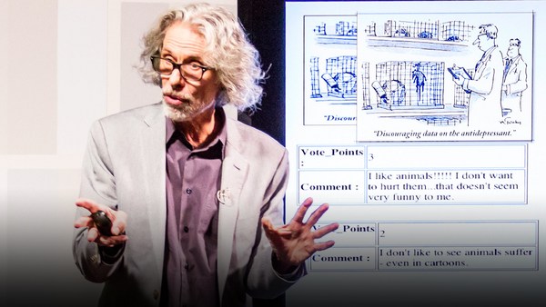
So I called on contemporary artists, such as Adrian Tomine here. I often call on narrative artists -- cartoonists, children's book authors -- and I give them themes such as, you know, what it's like to be in the subway, or Valentine's Day, and they send me sketches. And once the sketches are approved by the editor, David Remnick, it's a go. And I love the way those images are actually not telling you what to think. But they do make you think, because the artist is actually -- it's almost a puzzle; the artist is drawing the dots, and you, the reader, have to complete the picture. So to get this image on the left by Anita Kunz, or the one on right by Tomer Hanuka, you have to play spot the differences. And it is something that ... It's really exciting to see how the engagement with the reader ... how those images really capture -- play with the stereotypes. But when you get it, it rearranges the stereotypes that are in your head.
אז יצרתי קשר עם אמנים מודרנים, כמו אדריאן טומין כאן. לעיתים קרובות הייתי יוצרת קשר עם אמנים סיפוריים -- ציירי קומיקס, אמני ספרי ילדים -- והייתי נותנת להם נושא כללי כגון, איך זה מרגיש להיות ברכבת התחתית, או ביום האוהבים, והם היו שולחים לי סקיצות. וברגע שהסקיצות היו מאושרת ע"י העורך, דיוויד רמניק, יש אישור לרוץ עם זה. ואני אוהבת את הדרך שהתמונות האלה למעשה לא מספרות לך מה אתה חושב, אבל הן כן גורמות לך לחשוב, כי האמן בעצם -- זה קצת כמו פאזל; האמן בעצם רק מצייר נקודות, ואתה, הקורא, חייב לחבר אותן וליצור תמונה. אז כדי להבין את התמונה הזו שבצד שמאל שצויירה ע"י אניטה קונץ, או זו שמצד ימין שצויירה ע"י תומר חנוכה, אתה חייב לשחק "מצא את ההבדלים". וזה משהו ש... זה מאוד מרגש לראות איך ההתעסקות עם הקורא... איך התמונות האלה ממש לוכדות -- שחקו עם הסטריאוטיפים. אבל כשאתם מבינים את זה, זה מסדר מחדש את הסטריאוטיפים שנמצאים בראש שלכם.
But the images don't just have to show people, sometimes it can be a feeling. Right after September 11, I was at a point, like everybody else, where I really didn't know how to deal with what we were going through, and I felt that no image could capture this moment, and I wanted to just do a black cover, like no cover. And I talked to my husband, cartoonist Art Spiegelman, and mentioned to him that I was going to propose that, and he said, "Oh, if you're going to do a black cover, then why don't you do the silhouette of the Twin Towers, black on black?" And I sat down to draw this, and as soon as I saw it, a shiver ran down my spine and I realized that in this refusal to make an image, we had found a way to capture loss and mourning and absence. And it's been a profound thing that I learned in the process -- that sometimes some of the images that say the most do it with the most spare means. And a simple image can speak volumes.
אבל התמונות לא חייבות רק להראות אנשים, לפעמים הן מציגות תחושה. ישר אחרי אירועי ה11 בספטמבר, הייתי בנקודה, בדיוק כמו כל אחד אחר, שממש לא ידעתי איך להתמודד עם כל מה שעבר עלינו, והרגשתי ששום תמונה לא תוכל לתפוס את הרגע הזה, ורק רציתי שהשער יהיה שחור, כאילו אין בכלל שער. ודיברתי עם בעלי, הקריקטוריסט ארט שפיגלמן, והזכרתי בפניו שאני הולכת להציע שער שכזה, והוא אמר "אה, אם את כבר עושה שער שחור, "אז למה שלא תוסיפי צלליות של מגדלי התאומים, בצבע שחור על הרקע השחור?" והתיישבתי כדי לצייר את זה, וברגע שראיתי את זה, קיבלתי צמרמורת בגבי והבנתי שבסירוב הזה לייצר תמונה, מצאנו דרך לתפוס את האובדן ואת האבל ואת החסך. וזה היה דבר מאוד עמוק שלמדתי בתהליך -- שלפעמים התמונות שאומרות הכי הרבה עושות את זה עם האמצעים הכי דלים. ותמונה פשוטה יכולה לדבר בקול רם.
So this is the image that we published by Bob Staake right after the election of Barack Obama, and captured a historic moment. But we can't really plan for this, because in order to do this, we have to let the artist experience the emotions that we all feel when that is happening. So back in November 2016, during the election last year, the only image that we could publish was this, which was on the stand on the week that everybody voted.
זו התמונה שפירסם בוב סטק מיד אחרי שברק אובמה נבחר לנשיא, והוא תפס רגע היסטורי. אבל אנחנו לא באמת יכולים לתכנן לזה, בגלל שכדי לעשות משהו כזה, אנחנו חייבים לתת לאמן להרגיש את הרגשות שכולנו מרגישים בזמן שזה קורה. אז בחזרה לנובמבר 2016, במהלך הבחירות שהתקיימו בשנה שעברה, התמונה היחידה שיכלנו לפרסם הייתה זו, שהייתה בכל דוכן עיתונים במהלך כל השבוע שאנשים הצביעו.
(Laughter)
(הקהל צוחק)
Because we knew somebody would feel this --
בגלל שידענו שמישהו ירגיש את זה --
(Laughter)
(הקהל צוחק)
when the result of the election was announced. And when we found out the result, we really were at a loss, and this is the image that was sent by Bob Staake again, and that really hit a chord. And again, we can't really figure out what's going to come next, but here it felt like we didn't know how to move forward, but we did move forward, and this is the image that we published after Donald Trump's election and at the time of the Women's March all over the US.
כשתוצאות הבחירות הוכרזו. וכשגילינו מה היו תוצאות הבחירות, היינו פשוט אבודים, וזו התמונה ששלח בוב סטק שוב, והיא באמת פגעה בול. ושוב, אנחנו לא באמת יכולים לנחש מה הולך להגיע בעתיד, אבל פה הרגשנו שאנו לא יודעים איך להמשיך ולהתקדם, ובכל זאת התקדמנו, וזו התמונה שפירסמנו אחרי הניצחון של דונאלד טראמפ ובזמן צעדת הנשים בכל ארצות הברית.
So over those 24 years, I have seen over 1,000 images come to life week after week, and I'm often asked which one is my favorite, but I can't pick one because what I'm most proud of is how different every image is, one from the other. And that's due to the talent and the diversity of all of the artists that contribute.
אז במהלך כל אותם 24 השנים, ראיתי מעל ל1,000 תמונות מתעוררות לחיים שבוע אחר שבוע, ולעיתים קרובות נשאלתי "מי האהובה עלי ביותר?", אבל אני לא יכולה לבחור, בגלל שהדבר שאני הכי גאה בו זה איך כל תמונה שונה לחלוטין אחת מהשנייה. וזה בזכות הכישרון והגיוון של כל האמנים שתורמים לעבודה.
And now, well, now, we're owned by Russia, so --
ועכשיו, טוב... עכשיו אנחנו בבעלות רוסיה, אז --
(Laughter)
(הקהל צוחק)
In a rendering by Barry Blitt here, Eustace has become Eustace Vladimirovich Tilley. And the butterfly is none other than a flabbergasted Donald Trump flapping his wings, trying to figure out how to control the butterfly effect, and the famed logo that was drawn by Rae Irvin in 1925 is now in Cyrillic.
בתמונה שרינדר ברי בליט פה, יוסטס הפך, יוסטס ולדימירוביץ' טילי. והפרפר הוא לא אחר מאשר דונאלד טארמפ בפנים נדהמות מנופף בכנפיו, מנסה להבין איך לשלוט באפקט הפרפר, והלוגו המפורסם שצוייר ע"י ריה ארווין בשנת 1925 מופיע כעת באותניות רוסיות.
So, what makes me really excited about this moment is the way that ... You know, free press is essential to our democracy. And we can see from the sublime to the ridiculous that artists can capture what is going on in a way that an artist armed with just India ink and watercolor can capture and enter into the cultural dialogue. It puts those artists at the center of that culture, and that's exactly where I think they should be. Because the main thing we need right now is a good cartoon.
אז מה שהופך אותי לנרגשת ממש בנוגע לרגע הזה זו הדרך שבה... אתם יודעים, העיתונות החופשית היא הכרחית לדמוקרטיה. ואנו יכולים לראות מהנשגב למגוכח, שאמנים יכולים ללכוד את כל שמתרחש בדרך כזו שאמן שחמוש רק בדיו או בצבעי מים מצליחים ללכוד ולהיכנס לדיאלוג התרבותי. וזה שם את אותם אמנים במרכז התרבות הזו, וזה בדיוק איפה שאני חושבת שמקומם. בגלל שהדבר הכי חשוב שאנו צריכים כרגע, זו קריקטורה טובה.
Thank you.
תודה רבה.
(Applause)
(מחיאות כפיים)