In 1969 in July, three Americans launched into space. Now, they went to the surface of the moon, they famously made the great leap for mankind. Buzz Aldrin, Neil Armstrong, they walked on the surface, they planted this flag. It's rightly celebrated as a moment that in America we say is a triumph. We think it was this amazing accomplishment. They didn't just leave behind this flag, though. They also left behind a plaque. This plaque is a beautiful object, and one that I want to talk to you a little bit about. First, you might notice that there's two globes, representing all of earth. And then there's this beautiful statement: "We came in peace for all mankind." Now, at first, this is just nice poetic language, but it's also set in a typeface that's perfect for this moment. It seems industrial, it seems engineered. It also is the best possible name you could come up with for something on the moon: Futura.
1969 年七月, 三位美國人被發射上太空。 他們到了月球的表面, 他們為人類邁出了著名的一大步。 伯茲•艾德林和尼爾•阿姆斯壯 在月球表面上行走, 插上了這面旗子。 在美國,我們很公正地讚頌 這個時刻是勝利的時刻。 我們認為它是一項 很了不起的成就。 但,他們留下的不只是這面旗子。 他們也留下了一塊 很漂亮的紀念牌。 今天我想和大家 談一下這塊紀念牌。 首先,各位可能有注意到, 上面有兩個球形代表整個地球。 還有一句美麗的聲明:「我們 代表所有人類,為和平而來。」 一開始,它只是很有詩意的文字, 但它所使用的字型, 非常適合這個時刻。 它似乎很工業, 似乎是為科學設計的。 這種字型也有個大家 能為月球用途想出來 最棒的名稱:Futura (改自「未來 Future」)。
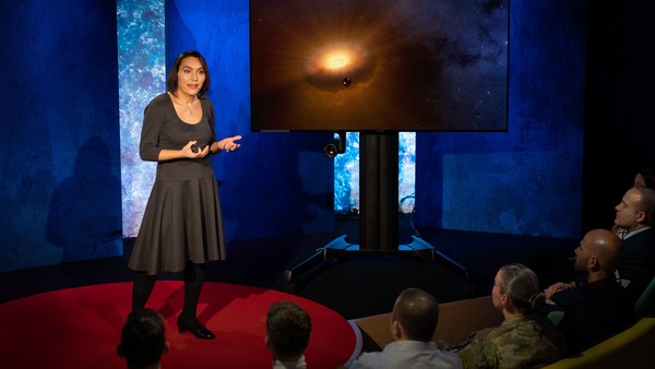
Now, I want to talk to you about fonts, and why this typeface is perfect for this moment. But it's actually more than just ceremonial. Now, when all of you arrived here today, you actually had to think about fonts. You might not realize it, but you're all unconscious experts on typography. Typography is the study of how fonts inhabit our world, they're the visual language of the words we use. Here's the thing that's funny about this, though. I know you're probably not like me, you're not a font nerd, maybe some of you are, but if you're not, that's alright, because I might spend hours every day trying to pick the perfect typeface for the perfect project, or I might spend thousands of dollars every year, trying to get ones with the right features. But all of you actually spend hours every day, evaluating fonts. If you don't believe me, think about how you got here. Each of you had to judge by the signs and maybe even on your phone, which signals to trust and which to ignore. You were evaluating fonts.
我想跟大家談談字體, 及為什麼這種字型 非常適合這個時刻。 它不只是一種儀式。 今天,大家來到這裡時, 其實都需要去思考字體。 你們可能沒有發現,但你們 都是無意識的字型學專家。 字型學是在研究字體 如何存在於我們的世界上, 我們所使用的字詞的 視覺表達方式。 不過,有一點很有趣。 我知道你們可能 不像我是個字體狂, 也許在座有些人是,但, 如果不是,沒關係, 因為我每天可能會花好幾個小時, 為一個完美的專案計畫 挑選完美的字型, 或者,我可能每年會花 數千美元去買適合的字型。 但,其實所有人每天都會 花數小時的時間在評估字體。 如果不信,想想你們 是怎麼到這裡的。 每個人都得要透過標誌, 甚至是用手機, 來判斷要相信哪些訊號、 要忽略哪些訊號。 這就是在評估字體。
Or maybe when you're just buying a new product, you have to think about whether something is expensive or cheap or hard to get or easy to find. And the funny thing about it is, this may not seem extraordinary to you, but the moment you see something out of place, you recognize it right away.
或者,當你要買一樣新產品時, 你得去思考某樣東西是否很昂貴, 或很便宜,或很難取得, 或很容易入手。 這當中很有趣的一點是, 對你來說這可能沒什麼大不了, 但當你一看到有什麼不對勁, 你馬上就會發現。
(Laughter)
(笑聲)
The thing I love about typography, and why I love fonts and why I love Futura, is that, for me, what I study is everywhere. Every street that I walk down, every book that I pick up, every thing that I read is filled with the thing I love. Now, once you understand the history and what happens with typography, you actually have a history of everything before you.
我很喜歡字型學的一點, 也是我喜歡字體, 喜歡 Futura 的原因, 就是,對我來說, 我研究的目標無所不在。 我走的每一條街, 我挑的每一本書, 我讀過的所有文字, 都充滿了我熱愛的字型。 一旦各位了解了字型學的 歷史和發生過的事, 其實眼前看到的就是萬物的歷史。
And this is the typeface Futura. As previously we've discussed, this is modernism in miniature. This is a way in which modernism infiltrated this country and became perhaps the most popular, or promiscuous typeface, of the twentieth century. "Less is more," right, these are the aphorisms of modernism. And in the visual arts, the same thing happened. Let's focus on the essentials, focus on the basic shapes, focus on geometry. So Futura actually holds this to its core. You might notice that the shapes inherent in Futura have circles, squares, triangles. Some of the shapes are all based on circles, like the O, D and C, or others have this pointed apex of the triangle. Others just look like they might have been made with a ruler or a compass. They feel geometric, they feel mathematic, precise. In fact, this whole system carries through with the way that the typeface was designed. To not look like it was made like other typefaces, to be something new. Here it is in the lightweight, the medium weight and the bold weight. The whole family has different things to commend to it.
這是 Futura 字型。 如我們前面討論過的, 它是現代主義的縮影。 這就是現代主義 滲入這個國家的方式, 接著變成是二十世紀 最熱門或最雜亂的字體。 「少就是多」,對的, 這就是現代主義的格言。 在視覺藝術中,也有同樣的狀況。 咱們把焦點放在根本要素上、 基本的形狀上、幾何上。 這其實是 Futura 的核心。 各位可能有注意到 Futura 固有的形狀 是圓形、方形、三角形。 有些形狀完全以圓形 為基礎,如 O、D、C, 也有些形狀含有三角形的尖角。 還有一些形狀像是 用直尺或圓規畫出來的。 它們具有幾何感、數學感,很精確。 這種字型的整個系統都是 用這方式設計出來的。 目的是為了不要看起來 像是其他字型,而是新創的。 這是細體字、中體字,和粗體字。 整組都有不同的優點。
This was a conscious break from the past, something that looked like it was made by a machine, and not by hand. When I say not made by hand, this is what I mean. This is what we think about maybe, when you might create something with a calligraphic brush or a pen. That there's thicks and thins. And even more traditional typefaces, say like a Garamond, holds vestiges of this old system in which you can see the A where it get little bit thinner at the top and thicker down below, because it's trying to look like someone had made it by hand. But Futura, in contrast, is designed to look like no one had touched it at all, that this was made by a machine, for a machine age, for an industrial age.
有意識地和過去做出區別, 看起來像是機器做的, 而不是手寫的。 我說不是手寫的,指的就是這種。 當你用毛筆或是鋼筆來書寫時, 可能會是這個樣子的。 字會有粗有細。 更傳統的字型,比如 Garamond, 就有這種古老系統的痕跡, 各位可以看到,A 的上面比較細, 下面比較粗, 因為希望它看起來像是手寫的。 但相對的,Futura 就設計成像是完全沒有 人工成份,百分百機器製造, 當時是機器時代,工業時代。
There's actually a sleight of hand here that Paul Renner, the designer who made this in 1927, employed. If you look at the way in which the circular shape joins with the vertical shaft, you'll notice that it tapers just every so slightly. And this is one of hundreds of ways in which this typeface was designed to look geometrically perfect, even though it's mathematically not. And this is what typeface designers do all the time to make typefaces work, every day.
它的設計師保羅倫納 在 1927 年設計它的時候, 採用了很巧妙的手法。 請大家看一下, 圓形和直線的接合處, 會發現有稍微變細一點點。 這是讓字型在設計看起來能達到 幾何完美的數百種方式之一, 不過它在數學上就不是完美了。 這是字型設計師要設計出 可用字型的日常慣例。
Now, there were other designers doing this at the same time in Europe and America. These are a few other excellent examples from Europe, trying to create something new for the new age, a new moment in time. These are some other ones in Germany that in some ways look very similar to Futura, maybe with higher waist or lower waist or different proportions. Then why did Futura take over the world? In this case, if you can read the titles there, some of these names don't quite roll off the tongue: Erbar, Kabel Light, Berthold-Grotesk, Elegant-Grotesk. These aren't exactly household names, are they? And so when you compare that to Futura, you realize that this was a really good choice by the marketing team.
在歐洲和美國也有 其他設計師會這麼做。 在歐洲也有幾個很棒的例子, 嘗試為了新時代、新時刻來創新。 在德國,有些其他字型 在某種程度上很類似 Futura, 也許「腰身」的位置 比較高或低,或比例不同。 那麼,為何 Futura 能打贏全世界? 在這個例子中,如果 各位能讀出這些名稱, 有一些不是這麼好唸: Erbar、Kabel Light、 Berthold-Grotesk、 Elegant-Grotesk。 不是我們熟知的名字,對吧? 所以,如果拿來和 Futura 比較, 就會了解,行銷團隊 做出了一個好選擇。
What's amazing about this name -- you know, what's in this name is that this is a name that actually invokes hope and an idea about the future. And this isn't actually the word for future in German, it wasn't a German name, they actually picked something that would speak to a wider, larger audience, a universal audience. And when you compare it to what was being done in America -- these are the typefaces from the same period in the United States in the 1920s, bold, brash, braggadocios. You almost think of this as exactly like what the stock market looked like when they were all going nuts in the 1920s. And you realize that Futura is doing something revolutionary.
這個名字很了不起的一點—— 這個名字的特點在於, 它能喚起希望, 帶出對未來的想法。 它其實並不是德文中的 「未來」,它不是德文, 選名字的時候,考量的是 要能夠和更廣大的客群、 普遍的客群連結。 如果各位把它拿來和美國 同時期的其他字型做比較, 在二○年代時的字型, bold、brash、braggadocios。 幾乎會覺得這和二○年代 股市的瘋狂時期一樣。 可以了解,Futura 是很革命性的。
I want to step back and talk about an example of the typeface in use. So this is a magazine that we all probably know today, "Vanity Fair." This is what it looked like in 1929, in the summer. And in many ways, there's nothing wrong with this design. This is absolutely typical of the 1920s. There's a photograph of an important person, in this case Franklin Roosevelt, then-governor of New York. Everything seems centered, everything seems symmetrical. There's still a little bit of ornamentation, so this is still maybe having some vestiges of the painted lady and not fully modernistic. But everything seems kid of solid. There's even drop caps to help you get into the text.
我想要先退一步, 談談字型使用上的例子。 這是現今大家可能 都知道的雜誌《浮華世界》。 這是它在 1929 年 夏天時的樣子。 在許多層面上, 這個設計沒什麼問題。 這是典型的二○年代設計。 上面有一張重要人物的照片, 在這裡的是羅斯福, 當時的紐約州長。 一切似乎都置中, 一切似乎都對稱。 仍然有一點點裝飾, 所以這仍然也許 有一些彩繪女士的痕跡, 不是完全現代主義的。 但一切似乎都蠻實在。 甚至還把第一個字母 放大來協助讀者閱讀。
But this all changed very quickly and in October of 1929, a Berlin-based designer came and redesigned "Vanity Fair." And this is what it looks like with Futura. Instead of the governor now we have a photograph of an abstract, beautiful setting, in this case, the ocean. Instead of drop caps, there's nothing at all. And replaced with a centered layout is now asymmetry. And it gets even more radical the further you enter the magazine. In this case, even more dramatic asymmetry. In this case, illustrations by Pablo Picasso, moving across the page and breaking the gutter of the two pages. And there's something even more radical. If you look closely at the Futura, you might notice something. You might not pick it up at first, but there are no capital letters in the title or the captions on this page. You might not think that's very radical, but pick up any magazine, any book or go to any website, and I guarantee, you are not going to find it very easily. This is still a radical idea.
但這一切很快就改變了, 在 1929 年十月, 一位來自柏林的設計師 來重新設計了《浮華世界》。 這就是它搭配上了 Futura 之後的樣子。 現在的照片不是州長, 而是一個抽象、美麗的場景, 在這裡是一片海洋。 第一個字母也沒有再被放大。 置中的排版不再, 改用不對稱的排版。 當你越深入這本雜誌, 還會變得更極端。 在這裡則是變得更明顯不對稱。 在這裡,畢卡索的圖會跨越頁面, 穿過兩頁之間的書溝。 還有更極端的。 更近一點看 Futura 就會注意到。 一開始你可能不會發現, 但在這一頁上, 標題都沒有大寫字母。 各位可能不覺得這算是很極端, 但隨便挑一本雜誌、 一本書,或上任何網站, 我保證,你很難找到這種現象。 這仍然是個很極端的點子。
And why is that radical? When we think about what capital letters denote, they denote something important, whether it's our names, or our titles. Or maybe even just the name of our corporations, or maybe our trademarks. Actually, in some ways, America's the home of capitalization. We love putting capitals in everything.
為什麼很極端? 我們可以想想大寫字 代表的意思是什麼, 大寫字表示有重要性, 不論是我們的名字或頭銜。 或者,甚至是我們 所屬公司的名字, 或者是我們的商標。 事實上,在某種程度上,美國 就是大寫(資本化)的國家。 我們喜歡到處放大寫(資本)。
(Laughter)
(笑聲)
But think about how radical this would be to introduce a magazine where you're taking away all the capital letters. This has maybe had the same political force that we now argue over things like pronouns in our society today. In the 1920s, this is just shortly after Soviet Russia had a communist revolution. And for them, this actually represented a socialist infiltration into America. All lowercase letters meant that this was an egalitarian, complete lowering of everything into one equal playing field. Now this is still kind of a radical idea. Think about how often you do capitalize something to have more power or prestige to it. So for them to do this was a way in which Futura was using this idea.
但,想想看,推出一本 完全沒有大寫字母的雜誌, 這是多極端的事。 這背後的政治力, 可能和現今我們在社會上爭論 代名詞議題的政治力是一樣的。 在二○年代, 前蘇俄才剛剛發生共產黨革命。 對他們而言,這其實代表著 社會主義滲入了美國。 全部用小寫字就意味著平等主義, 把一切都降低(變小) 到平等的地位。 這仍然是個很極端的點子。 想想你有多常用大寫 來讓字詞更有力量或威望。 所以,他們這麼做,就是 把 Futura 用在這個點子上。
Now, other designers were doing other things with Futura. Others brought other ideas of modernism with it, whether it was interesting new illustration styles, or interesting new collage types of illustration. Or even just new book covers, whether they were from Europe.
其他設計師則是 用 Futura 做不同的事。 其他人帶進其他現代主義的點子, 不論是有趣的新繪圖風格, 或是有趣的新拼貼式繪圖。 或者甚至只是新的書籍封面, 不論是否來自歐洲。
But here's the funny thing. In the 1920s, if you wanted to use a new typeface, you couldn't just go download it onto your computer. You actually had to have pieces of lead. So for Americans who wanted to adopt this and make it part of their own system, something they could use in everyday typography, whether in ads or anything else, they actually had to have metal type.
但,好玩的來了。 在二○年代,如果 你想要用新的字型, 你不能只是打開電腦下載它。 你必須要真的有鉛板。 所以,美國人如果 想要採用這種字型, 把它變成自己的系統的一部分, 用在每天日常的排印上, 用在廣告或其他地方, 他們都得要真正有活字金屬。
So being good American capitalists, what did we do? We made all sorts of copies. Ones that had nothing to do with the name Futura, but looked identical to it, whether it was Spartan or Tempo. And in fact, by the time that World War II started, American corporations were actually trying to boycott Nazi goods. But they said, "Go ahead and use our copies. Use 20th Century, use Spartan, use Vogue, use Tempo. These are identical to Futura." And in fact, for most people, they didn't even learn the new names, they just still called it all Futura. So America took this typeface in, conquered it and made it its own. So by the time World War II finishes, Americans are using this on everything, whether it be catalogs, or atlases, or encyclopedias or charts and graphs, or calendars, or even political material. And even the logo for a new expansion football team. And in fact, it was used even on some of the most important advertising of the 20th century.
所以,身為優秀的美國 資本主義者,我們怎麼做? 我們做各種複製。 複製成和 Futura 這個名字無關的字型, 但看起來和它一模一樣, 不論是 Spartan 或 Tempo。 事實上,到二次大戰開始時, 美國企業的確嘗試杯葛納粹商品。 但他們說:「儘管用我們的複製品。 用 20th Century,用 Spartan, 用 Vogue,用 Tempo。 它們和 Futura 一樣。」 事實上,大部分人 甚至沒有去記新名字, 他們仍然稱之為 Futura。 所以,美國拿了這種字型, 征服了它,把它據為己有。 到了二次大戰結束時, 美國人到處使用這種字型, 不論是目錄、地圖集、 百科全書、圖表、 日曆,或甚至政治素材。 甚至連足球隊的新擴張 商標也用了這種字型。 事實上,在二十世紀 最重要的廣告上都可以看到它。 在這種情況下,
So it's in this context that when the US government was picking a typeface to use after World War II for new maps and new projects, they picked Futura. It wasn't an astounding choice, it wasn't a radical choice, it didn't have anything to do with communism. But in this case, it was used on some of the most important maps, so this one, an air force map in 1962, or used for the maps in Vietnam in '66.
當美國政府要選一種字型, 於二次大戰後用在 新的地圖和新的專案上, 他們挑了 Futura。 這種選擇並不讓人 意外,也不極端, 這個選擇無關共產主義。 但,在這裡它被用在 一些最重要的地圖上, 這張是 1962 年的空軍地圖, 或者是 1966 年的越南地圖。
And so it wasn't a surprise that when astronauts first started the Mercury program, such as John Glenn orbiting the earth, that charts and maps that he was using were in Futura. And in fact, by the time Mercury morphed into Apollo, it started getting used more and more for more things. So in this case for a safety plan, or even starting to get used on instrument panels, or navigational aids. Or even on diagrams to show how the whole system worked.
所以,理所當然, 當太空人剛開始進行水星計畫, 比如約翰•葛倫繞行地球, 他所使用的圖表和地圖 就使用了 Futura 字型。 事實上,當水星計畫 轉變為阿波羅計畫時, 這種字型被更廣泛用在許多地方。 這是一個安全計畫, 或者開始用在儀器的儀標板上, 或是導航的輔助上。 或甚至用來呈現整個系統 運作狀況的圖形上。
But here's the amazing thing, it didn't just get used for papers that they handed out to people. It started to get used for an interface, for an entire system that helped the astronauts know how to use the machine. NASA wasn't just one big corporation making everything. There was hundreds of contractors -- Boeing, IBM, McDonnell Douglas -- all making different machines. Now imagine if astronauts had to use different typefaces and different systems for each component they had in the space shuttles. This would have been impossible to navigate and there would have been a cognitive overload every time they had to open up a new system. So in this case, Futura being used on the interface helped them navigate complexity and make it more clear. And it wasn't just used on buttons, it was used on labels, and it was used on their food rations, and it was used on their tool kits. It was used on knobs and levers to tell them what to do. In fact, maybe even some of the places where they needed to have things that were complex be more simple to them, instructions were printed entirely in Futura, so that they could know what to do with that one moment. They didn't have to remember everything in their head, they could have it out there in the world to see and refer to. In this case, Futura helped make that system, which was already a very difficult and complex system, a little less complex. In fact, the very first or last thing an astronaut might have seen when they were entering or exiting the spacecraft would have been in Futura.
但,很驚人的是, 這種字型不只用在 他們交給別人的文件上, 也開始用在介面上, 用在協助太空人了解 如何使用機器的整個系統上。 美國太空總署並不是 一間大公司包辦一切。 還有數百間包商—— 波音、IBM、麥克唐納 道格拉斯公司—— 都在做不同的機器。 想想看,太空人用到 太空船上不同的元件時 就會碰到不同的字型和系統。 這樣根本無法找到要的東西, 且每當他們開啟一個新的系統, 就會造成認知超載。 這裡,Futura 被用在介面上, 協助讓複雜的介面變得更清楚, 容易找到需要的功能。 它不只被用在按鈕上, 也用在標籤上, 還用在他們的食物口糧上, 用在他們的工具組上。 它被用在手把和控制桿上, 告訴他們該怎麼操作。 事實上,甚至還會用在 需要降低複雜度的地方, 指示就完全用 Futura 來列印, 讓他們在那一刻知道該怎麼做。 他們不用把一切都記在腦中, 可以放出來,讓大家看見、參考。 這裡,Futura 協助 將一個本來很難用且很複雜的系統 變得沒那麼複雜。 事實上,當太空人 進入或離開太空船時, 最先或最後會看見的東西, 上面都有 Futura 字型。
One of my favorite examples of how Futura worked in this way is actually this camera. This is a Hasselblad that was made by the Swedish company. It's a perfectly good camera, some of you might have used one, it's prized by photographers as a really great camera. And you might notice, if you know anything about cameras, that there's some modifications made to it. In this case, there are stickers placed all over the film canisters, or other parts of the camera here. What this enabled NASA to do, was make something really great out of the astronauts. They're not photographers, they're not experts in art. But they could ensure that they would know how to use this camera because of the labels placed there in Futura.
若要說明 Futura 怎麼運作, 我最喜歡的例子之一, 就是這台照相機。 這是一台由瑞典公司 哈蘇製造的照相機。 它是非常好的相機, 在座可能有人用過, 攝影師給它的評價非常高。 各位如果了解照相機, 可能有注意到, 它被做了一點改變。 在它的膠片盒上面貼滿了貼紙, 相機的其他部分也有。 這麼做就能讓美國太空總署 透過太空人得到很棒的東西。 太空人不是攝影師, 他們不是藝術專家。 但這樣就能確保他們知道 如何使用這台照相機, 因為上面的標籤 用的是 Futura 字型。
So in this case, Futura acquired and made sure that they had legitimacy with the things they were using. In this case to not take off the film before it would expose. Which, in this case, we would have never had some of the amazing photos we had without this label. When we see something as decorative as this, a ceremonial patch, or something like this plaque on the moon, we realize that Futura was more than just something ceremonial, something more than something that had just been picked for its design. In fact, Futura had authority, had legitimacy and had power because of this choice.
這裡,Futura 確保他們能夠 正當使用他們在使用的東西。 在這裡,就是不要 在曝光之前把底片拿出來。 若沒有這些標籤,我們就不會 看到那些驚人的照片了。 當我們看到像這種裝飾用的東西, 儀式性的徽章, 或像這種月球上的紀念牌, 我們就了解到, Futura 不只是儀式性的, 不只是因為設計而被選中的字型。 事實上,因為這個選擇, Futura 有權威、 有正當性、有力量。
There's one other thing I want to talk about in closing. And that is that Futura tells a story. And this is what I love about typefaces, is that all of them tell stories. And in this case, this typeface tells a very powerful story about assimilation, about something being taken into America and being made part of its culture. And that's one of the best and worst things America does, is we take things into our culture and we spit them out back again and claim them our own. And in this case, Futura mirrors exactly what happened with the technology undergirding the whole system. Futura was a German typeface, taken in, made into an American commodity. And so were the technologies: the rockets, the scientists all came from Germany as well. So in some ways, this German typeface on an American plaque perfectly mirrors what happened with the technology. And in this case, when you think about this story, you realize that typography on the moon represents legitimacy, represents authority, and this gave them, the astronauts, the power to get to the moon.
最後結尾我還想要談一件事。 那就是,Futura 訴說著一個故事。 我很愛字型的原因之一, 就是因為它們都會說故事。 這裡,這種字型訴說的 是個非常強大的故事, 講的是同化作用, 某樣東西進入了美國, 成了美國文化的一部分。 美國所做的事情當中, 最棒的同時也最糟的 就是我們把某些東西放進 我們的文化,再吐出來, 還宣稱是我們的。 這裡,Futura 就正好反映出 這整個系統背後的科技 所遇到的狀況。 Futura 是德國的字型, 被拿進來,放進美國的商品中。 科技也是同樣的命運:火箭、 科學家都是來自德國。 所以,在某些層面上, 在美國紀念牌上用德國字型 正好反映出了科技遇到的狀況。 在這個例子中, 想想這個故事,就會 了解到月球上的字型學 代表了正當性,代表了權威, 這讓太空人有力量可以登上月球。
Thank you.
謝謝。
(Applause)
(掌聲)