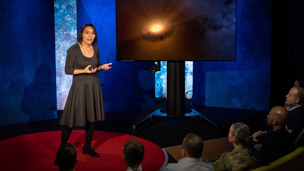
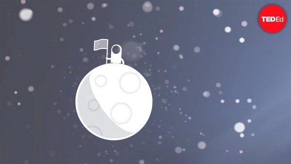
In 1969 in July, three Americans launched into space. Now, they went to the surface of the moon, they famously made the great leap for mankind. Buzz Aldrin, Neil Armstrong, they walked on the surface, they planted this flag. It's rightly celebrated as a moment that in America we say is a triumph. We think it was this amazing accomplishment. They didn't just leave behind this flag, though. They also left behind a plaque. This plaque is a beautiful object, and one that I want to talk to you a little bit about. First, you might notice that there's two globes, representing all of earth. And then there's this beautiful statement: "We came in peace for all mankind." Now, at first, this is just nice poetic language, but it's also set in a typeface that's perfect for this moment. It seems industrial, it seems engineered. It also is the best possible name you could come up with for something on the moon: Futura.
1969 yılının Temmuz ayında, 3 Amerikalı uzaya gönderildi. Onlar Ay'ın yüzeyine indiler ve herkesçe bilinen bir şekilde insanlık için çok büyük bir adım attılar. Buzz Aldrin, Neil Armstrong Ay'ın yüzeyinde yürüdüler ve bu bayrağı diktiler. Biz bu anı haklı olarak Amerika’da zafer havasında kutlarız. Bunun inanılmaz bir başarı olduğunu düşünürüz. Gerçi onlar geride sadece bu bayrağı bırakmadılar. Ayrıca bu levhayı da bıraktılar. Bu levha öyle güzel bir obje ki size bundan biraz bahsetmek istiyorum. İlk olarak, orada Dünya'nın tamamını temsil eden iki küre olduğunu fark edebilirsiniz ve karşımıza şu güzel ifade çıkar: "İnsanlık adına barış içinde geldik." İlk bakışta bu yalnızca hoş bir şiir dili gibi görünür ama aynı zamanda bu an için mükemmel olan bir "harf karakteriyle" yazılmıştır. Bu karakter endüstriyel ve tasarlanmış görünür. Ayrıca aydaki bir şey için seçebileceğiniz en iyi yazı tipi ismidir: "Futura."
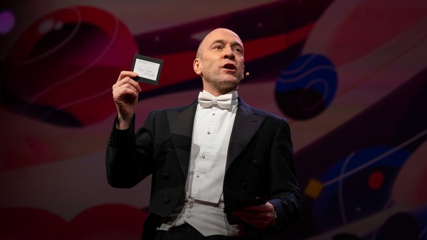
Now, I want to talk to you about fonts, and why this typeface is perfect for this moment. But it's actually more than just ceremonial. Now, when all of you arrived here today, you actually had to think about fonts. You might not realize it, but you're all unconscious experts on typography. Typography is the study of how fonts inhabit our world, they're the visual language of the words we use. Here's the thing that's funny about this, though. I know you're probably not like me, you're not a font nerd, maybe some of you are, but if you're not, that's alright, because I might spend hours every day trying to pick the perfect typeface for the perfect project, or I might spend thousands of dollars every year, trying to get ones with the right features. But all of you actually spend hours every day, evaluating fonts. If you don't believe me, think about how you got here. Each of you had to judge by the signs and maybe even on your phone, which signals to trust and which to ignore. You were evaluating fonts.
Sizinle, yazı tipleri ve bu yazı tipinin neden an için mükemmel olduğu hakkında konuşmak istiyorum. Aslında bu sadece törensel olmaktan daha fazlasıdır. Hepiniz bugün buraya geldiğinizde yazı tipleri hakkında düşünmek zorunda kaldınız. Belki fark etmemiş olabilirsiniz ama hepiniz tipografi konusunda "bilinçsiz" uzmanlarsınız. Tipografi, yazı tiplerinin dünyamıza nasıl yerleştiğini inceleyen bir bilim dalıdır, onlar kullandığımız kelimelerin görsel dilidir. İşte bu konuda komik olan şey de budur aslında. Muhtemelen benim gibi bir "yazı tipi delisi" değilsinizdir, belki bazılarınız öyle ama değilseniz sorun değil çünkü ben her gün, en uygun yazı tipini en uygun proje için seçmeye çalışarak saatlerimi geçirebilirim ya da doğru özelliğe sahip olanı bulmaya çalışırken yılda binlerce dolar harcayabilirim. Ama aslında hepiniz her gün yazı tiplerini değerlendirerek saatler geçiriyorsunuz. Bana inanmıyorsanız buraya nasıl geldiğinizi düşünün. Her biriniz işaretlere dayanarak karar vermek zorundaydınız ve hatta telefonunuzdaki güvenilecek ve göz ardı edilecek sinyallere bile karar verdiniz. Yazı tiplerini değerlendiriyordunuz.
Or maybe when you're just buying a new product, you have to think about whether something is expensive or cheap or hard to get or easy to find. And the funny thing about it is, this may not seem extraordinary to you, but the moment you see something out of place, you recognize it right away.
Veya belki sadece yeni bir ürün satın alırken bile bir şeyin pahalı veya ucuz olduğunu ya da bulunması zor veya kolay olduğunu düşünmeniz gerekir. Komik olan şey şu ki bu size sıra dışı görünmeyebilir ama birşeylerin yerinde olmadığını gördüğünüz anda onu anında fark edersiniz.
(Laughter)
(Kahkahalar)
The thing I love about typography, and why I love fonts and why I love Futura, is that, for me, what I study is everywhere. Every street that I walk down, every book that I pick up, every thing that I read is filled with the thing I love. Now, once you understand the history and what happens with typography, you actually have a history of everything before you.
Tipografi hakkında sevdiğim şey, yazı tiplerini ve Futura'yı sevmemin benim için sebebi; çalıştığım şeyin her yerde olması. Yürüdüğüm her sokak, aldığım her kitap, okuduğum her şey sevdiğim şeyle dolu. Tarih ve tipografi ile ne olduğunu bir kez anladığınızda aslında sizden önceki her şeyin tarihine sahip olursunuz.
And this is the typeface Futura. As previously we've discussed, this is modernism in miniature. This is a way in which modernism infiltrated this country and became perhaps the most popular, or promiscuous typeface, of the twentieth century. "Less is more," right, these are the aphorisms of modernism. And in the visual arts, the same thing happened. Let's focus on the essentials, focus on the basic shapes, focus on geometry. So Futura actually holds this to its core. You might notice that the shapes inherent in Futura have circles, squares, triangles. Some of the shapes are all based on circles, like the O, D and C, or others have this pointed apex of the triangle. Others just look like they might have been made with a ruler or a compass. They feel geometric, they feel mathematic, precise. In fact, this whole system carries through with the way that the typeface was designed. To not look like it was made like other typefaces, to be something new. Here it is in the lightweight, the medium weight and the bold weight. The whole family has different things to commend to it.
Ve bu Futura yazı tipidir. Daha önce de tartıştığımız gibi, bu minyatürün modernizmidir. Bu, modernizmin bu ülkeye sızmasının ve yirminci yüzyılın belki de en popüler veya karışık yazı tipi haline gelmesinin yoludur. "Az ama öz," bunlar modernizmin vecizesidir. Görsel sanatlarda da aynı şey oldu. Şimdi ana hatlara, temel şekillere, geometriye odaklanalım. Aslında Futura özünde bunu barındırır. Futura'da özgün şekillerin olduğunu fark edebilirsiniz. Bunlar daire, kare ve üçgen gibi şekiller. Şekillerin bazıları O, D ve C gibi dairelere dayanmaktadır veya diğerleri üçgenin sivri tepesine sahiptir. Diğerleri sadece bir cetvel veya pergel ile yapılmış gibi görünür. Geometrik, matematiksel, kusursuz hissedilirler. Aslında, tüm bu sistem harf karakterlerinin tasarlanmasıyla başarılır. Diğer harf karakterleri gibi değil de, yeni bir şey olması için tasarlandı. İşte burada hafif, orta ve kalın ağırlıkta. Tüm türleri, takdire değer farklı öğelere sahiptir.
This was a conscious break from the past, something that looked like it was made by a machine, and not by hand. When I say not made by hand, this is what I mean. This is what we think about maybe, when you might create something with a calligraphic brush or a pen. That there's thicks and thins. And even more traditional typefaces, say like a Garamond, holds vestiges of this old system in which you can see the A where it get little bit thinner at the top and thicker down below, because it's trying to look like someone had made it by hand. But Futura, in contrast, is designed to look like no one had touched it at all, that this was made by a machine, for a machine age, for an industrial age.
Bu, insan ürünü değil de, bir makine tarafından yapılmış gibi görünen şey, geçmişten bilinçli bir kopuştu. İnsan yapımı olmadığını söylediğimde bunu kastediyorum. Bu, biz kaligrafik bir fırça veya bir kalemle birşeyler yaratabileceğimiz zaman, olabilecekler hakkında düşündüğümüz şeydir. Kalınlar ve inceler oluşur. Hatta 'Garamond' gibi daha geleneksel yazı tipleri bile, bu eski sistemin izlerini barındırır, ki bu eski sistemde siz A'nın yukarıda biraz daha inceldiğini ve aşağıda kalınlaştığını görürsünüz çünkü o biri tarafından elle yazılmış gibi gösterilmeye çalışılır. Ancak tersine, Futura hiçbir şekilde el değmemiş gibi, bir makine tarafından, bir makine çağı ve endüstriyel çağ için üretilmiş gibi görünecek şekilde tasarlanmıştır.
There's actually a sleight of hand here that Paul Renner, the designer who made this in 1927, employed. If you look at the way in which the circular shape joins with the vertical shaft, you'll notice that it tapers just every so slightly. And this is one of hundreds of ways in which this typeface was designed to look geometrically perfect, even though it's mathematically not. And this is what typeface designers do all the time to make typefaces work, every day.
Aslında burada, 1927'de bunu yapan tasarımcı Paul Renner'ın kullandığı bir el kurnazlığı vardır. Dairesel şeklin dikey gövdeyle birleşme şekline bakarsanız hafifçe daraldığını fark edeceksiniz. Bu, yazı tipinin matematiksel olarak olmasa da geometrik olarak mükemmel görünmesi için kullanılan yüzlerce tasarım şeklinden biridir. Bu, tasarımcıların yazı tiplerinin gündelik hayatta çalışması için her zaman yaptıkları bir şeydir.
Now, there were other designers doing this at the same time in Europe and America. These are a few other excellent examples from Europe, trying to create something new for the new age, a new moment in time. These are some other ones in Germany that in some ways look very similar to Futura, maybe with higher waist or lower waist or different proportions. Then why did Futura take over the world? In this case, if you can read the titles there, some of these names don't quite roll off the tongue: Erbar, Kabel Light, Berthold-Grotesk, Elegant-Grotesk. These aren't exactly household names, are they? And so when you compare that to Futura, you realize that this was a really good choice by the marketing team.
Bunu Avrupa ve Amerika'da aynı anda yapan başka tasarımcılar vardı. Avrupa'da geliştirilmiş, yeni çağ ve günümüz için yeni bir şeyler yaratmaya çalışan bazı diğer mükemmel örnekler vardır. Bunların diğerleri Almanya'dadır, bazı yönleriyle Futura'ya çok benzerler, belki daha yüksek veya alçak belli, veya farklı oranlardadırlar. Öyleyse neden "Futura" dünyayı ele geçirdi? Bu durumda, oradaki başlıkları okuyabiliyorsanız bu adlardan bazılarına kolayca diliniz dönmez: "Erbar, Kabel Light, Berthold-Grotesk, Elegant-Grotesk." Bunlar her gün kullanılan isimler değiller, bunu Futura ile karşılaştırdığınızda bunun pazarlama ekibi tarafından yapılmış iyi bir seçim olduğunu anlıyorsunuz.
What's amazing about this name -- you know, what's in this name is that this is a name that actually invokes hope and an idea about the future. And this isn't actually the word for future in German, it wasn't a German name, they actually picked something that would speak to a wider, larger audience, a universal audience. And when you compare it to what was being done in America -- these are the typefaces from the same period in the United States in the 1920s, bold, brash, braggadocios. You almost think of this as exactly like what the stock market looked like when they were all going nuts in the 1920s. And you realize that Futura is doing something revolutionary.
Bu isimde harika olan şey ise -- Bu ismin özelliği, aslında "umut ve gelecek hakkında fikir uyandıran" bir isim olmasıdır ve bu aslında Almanca'daki "gelecek" kelimesi ve Almanca bir isim değil, aslında daha geniş, daha büyük, evrensel bir kitleye hitap edecek bir şey seçtiler. Bunu Amerika'da yapılanlarla karşılaştırdığınızda -- bunlar 1920'lerde ABD'deki aynı döneme ait harf karakterleri olan "bold, brash, braggadocios"tur. Bunun 1920'lerde borsanın kötüye gittiği zamanki haline nasıl benzediğini hatırlayın. Böylece Futura'nın devrimci bir şey yaptığını anlarsınız.
I want to step back and talk about an example of the typeface in use. So this is a magazine that we all probably know today, "Vanity Fair." This is what it looked like in 1929, in the summer. And in many ways, there's nothing wrong with this design. This is absolutely typical of the 1920s. There's a photograph of an important person, in this case Franklin Roosevelt, then-governor of New York. Everything seems centered, everything seems symmetrical. There's still a little bit of ornamentation, so this is still maybe having some vestiges of the painted lady and not fully modernistic. But everything seems kid of solid. There's even drop caps to help you get into the text.
Geri adım atıp harf karakterlerinin kullanım örneklerinden bahsetmek istiyorum. Bugün muhtemelen hepimizin bildiği bir dergi var, "Vanity Fair." 1929'un yazında böyle görünüyordu ve birçok açıdan bu tasarımda yanlış bir şey yok. Bu 1920'lerde kesinlikle tipik bir durum. Önemli bir kişinin fotoğrafı var, bu durumda New York valisi Franklin Roosevelt. Her şey ortalanmış ve simetrik görünüyor. Hâlâ biraz süs var, hâlâ ressam kadının fırçasının bazı izleri var ve tamamen modernist değil. Ama her şey sağlam görünüyor. Metne girmenize yardımcı olacak büyük ilk harfler bile var.
But this all changed very quickly and in October of 1929, a Berlin-based designer came and redesigned "Vanity Fair." And this is what it looks like with Futura. Instead of the governor now we have a photograph of an abstract, beautiful setting, in this case, the ocean. Instead of drop caps, there's nothing at all. And replaced with a centered layout is now asymmetry. And it gets even more radical the further you enter the magazine. In this case, even more dramatic asymmetry. In this case, illustrations by Pablo Picasso, moving across the page and breaking the gutter of the two pages. And there's something even more radical. If you look closely at the Futura, you might notice something. You might not pick it up at first, but there are no capital letters in the title or the captions on this page. You might not think that's very radical, but pick up any magazine, any book or go to any website, and I guarantee, you are not going to find it very easily. This is still a radical idea.
Ancak bunların hepsi çok hızlı değişti ve Ekim 1929'da Berlinli bir tasarımcı geldi ve "Vanity Fair"i yeniden tasarladı. İşte Futura ile de böyle görünüyor. Şimdi vali yerine soyut, güzel bir ortamın fotoğrafına sahibiz, bir okyanusun bir resmi var. Büyük ilk harfler dışında hiçbir şey yok ve ortalanmış bir düzen yerine şimdi asimetri konmuş. Dergiye girdikçe daha da radikalleşiyor. Bu durum, daha da çarpıcı bir asimetri. Burada, Pablo Picasso'nun çizimleri, sayfa boyunca hareket ediyor ve iki sayfanın oluğunu aşıyor ve daha radikal bir şey daha var. Futura'ya yakından bakarsanız fark edebileceğiniz bir şey var: İlk başta anlamayabilirsiniz ancak sayfadaki başlıklarda veya alt başlıklarda büyük harfler yok. Bunun çok radikal olduğunu düşünmeyebilirsiniz, herhangi bir dergiyi, kitabı alın veya bir web sitesine gidin, size garanti ederim, bunu çok kolay bulamayacaksınız. Bu hâlâ radikal bir fikir.
And why is that radical? When we think about what capital letters denote, they denote something important, whether it's our names, or our titles. Or maybe even just the name of our corporations, or maybe our trademarks. Actually, in some ways, America's the home of capitalization. We love putting capitals in everything.
Peki bu neden radikal? Büyük harflerin neyi ifade ettiğini düşündüğümüzde ister ismimiz isterse başlığımız olsun onlar önemli bir şeyi belirtirler. Hatta belki sadece şirketlerimizin adı veya ticari markalarımız olabilir. Aslında bazı açılardan, Amerika bir "büyük harf kullanma ülkesi." Büyük harfleri her şeye koymayı seviyoruz.
(Laughter)
(Kahkahalar)
But think about how radical this would be to introduce a magazine where you're taking away all the capital letters. This has maybe had the same political force that we now argue over things like pronouns in our society today. In the 1920s, this is just shortly after Soviet Russia had a communist revolution. And for them, this actually represented a socialist infiltration into America. All lowercase letters meant that this was an egalitarian, complete lowering of everything into one equal playing field. Now this is still kind of a radical idea. Think about how often you do capitalize something to have more power or prestige to it. So for them to do this was a way in which Futura was using this idea.
Ancak içinden bütün büyük harfleri çıkarttığınız bir dergiyi tanıtmanın ne kadar radikal olacağını düşünün. Bu belki de, bugün zamirler üzerine olduğu gibi toplumumuzda üzerine tartıştığımız şeylerle aynı siyasi güce sahiptir. 1920'lerde, ki bu Sovyet Rusya'nın komünist devriminden kısa bir süre sonraydı, onlar için, bu aslında Amerika'ya sosyalist bir sızıntıyı temsil ediyordu. Tamamen küçük harflerin kullanılması, bunun "eşitlikçi" olduğu ve her şeyin eşit şartlı bir rekabet alanına indirilmesi anlamına geliyordu. Bu hâlâ radikal bir fikir. Bir şeyin daha güçlü veya prestijli olması için ne sıklıkla büyük harf kullandığınızı düşünün. Yani onlar, bunu yaparak Futura'nın kullandığı bu fikirden faydalandılar.
Now, other designers were doing other things with Futura. Others brought other ideas of modernism with it, whether it was interesting new illustration styles, or interesting new collage types of illustration. Or even just new book covers, whether they were from Europe.
Diğer tasarımcılar Futura ile başka şeyler yapıyorlardı. Diğerleri, ilginç yeni çizim stilleri veya ilginç yeni kolaj türleri olsun, başka modernizm fikirleri de getirdiler. Hatta Avrupa'dan gelsin ya da gelmesin yeni kitap kapaklarını bile getirdiler.
But here's the funny thing. In the 1920s, if you wanted to use a new typeface, you couldn't just go download it onto your computer. You actually had to have pieces of lead. So for Americans who wanted to adopt this and make it part of their own system, something they could use in everyday typography, whether in ads or anything else, they actually had to have metal type.
Ama işin komik tarafı şu: 1920'lerde, yeni bir harf karakteri kullanmak istediğinizde öylece bilgisayarınıza indiremezdiniz. Aslında "kurşun parçalarına" ihtiyacınız vardı. Dolayısıyla, bunu benimsemek ve kendi sisteminin bir parçası yapmak isteyen Amerikalılar, yani günlük tipografide, reklamlarda veya başka bir şekilde kullanabilecekleri bir şey haline getirmek isteyenlerin metal harflere sahip olması gerekiyordu.
So being good American capitalists, what did we do? We made all sorts of copies. Ones that had nothing to do with the name Futura, but looked identical to it, whether it was Spartan or Tempo. And in fact, by the time that World War II started, American corporations were actually trying to boycott Nazi goods. But they said, "Go ahead and use our copies. Use 20th Century, use Spartan, use Vogue, use Tempo. These are identical to Futura." And in fact, for most people, they didn't even learn the new names, they just still called it all Futura. So America took this typeface in, conquered it and made it its own. So by the time World War II finishes, Americans are using this on everything, whether it be catalogs, or atlases, or encyclopedias or charts and graphs, or calendars, or even political material. And even the logo for a new expansion football team. And in fact, it was used even on some of the most important advertising of the 20th century.
Peki iyi Amerikan "büyük harfçi"leri olarak biz ne yaptık? Her türlü kopyayı ürettik. Futura adıyla hiçbir ilgisi olmayan, "Spartan" veya "Tempo" olsun ama onunla aynı görünenleri ürettik. Öyle ki İkinci Dünya Savaşı başladığında Amerikan şirketleri Nazi mallarını boykot etmeye çalışıyorlardı ama buna rağmen "Devam edin ve kopyalarımızı kullanın" dediler. 20. yüzyıl Spartan, Vogue, Tempo kullanın. Bunlar Futura ile aynı," dediler. Hatta, çoğu insanlar yeni isimleri öğrenmediler bile, hepsine "Futura" adını verdiler. Böylece Amerika bu harf karakterlerini aldı, sahiplendi ve kendi malı haline getirdi. Böylece, İkinci Dünya Savaşı bittiğinde Amerikalılar bunu kataloglarda, atlaslarda, ansiklopedilerde, çizelgelerde, grafiklerde, takvimlerde, hatta siyasi materyal dahi olsun, her şeyde kullanıyorlardı. Hatta bir üst lige çıkan futbol takımı için logo olarak bile kullandılar. Öyle ki 20. yüzyılın en önemli reklamlarında bile bu kullanıldı. Bu şekilde,
So it's in this context that when the US government was picking a typeface to use after World War II for new maps and new projects, they picked Futura. It wasn't an astounding choice, it wasn't a radical choice, it didn't have anything to do with communism. But in this case, it was used on some of the most important maps, so this one, an air force map in 1962, or used for the maps in Vietnam in '66.
ABD Hükümeti, II. Dünya Savaşı'ndan sonra haritalar ve projelerde kullanmak için harf karaketleri belirledi ve Futura'yı seçtiler. Bu şaşırtıcı bir seçim değildi, radikal bir seçim de değildi. Bunun komünizmle hiçbir ilgisi yoktu. Ancak bu durumda, bazı çok önemli haritalarda kullanıldı, ki bunlardan biri 1962'de hava kuvvetleri haritasıydı veya 1966'daki Vietnam haritasında kullanılmıştı.
And so it wasn't a surprise that when astronauts first started the Mercury program, such as John Glenn orbiting the earth, that charts and maps that he was using were in Futura. And in fact, by the time Mercury morphed into Apollo, it started getting used more and more for more things. So in this case for a safety plan, or even starting to get used on instrument panels, or navigational aids. Or even on diagrams to show how the whole system worked.
Bu durum astronotlar için Merkür programına ilk başladıklarında da bir sürpriz değildi. Mesela John Glenn dünyanın yörüngesine yerleşirken, onun kullandığı tablolar ve haritalar Futura'yla yazılmıştı. Böylece, Merkür Apollo'ya dönüştüğünde daha fazla şey için daha da fazla kullanılmaya başlandı. Bu durumda bir güvenlik planı için hatta gösterge panellerinde, veya yardımcı seyir ekipmanında bile kullanılmaya başlandı. Sistemin nasıl çalıştığını gösteren diyagramlarda dahi kullandılar
But here's the amazing thing, it didn't just get used for papers that they handed out to people. It started to get used for an interface, for an entire system that helped the astronauts know how to use the machine. NASA wasn't just one big corporation making everything. There was hundreds of contractors -- Boeing, IBM, McDonnell Douglas -- all making different machines. Now imagine if astronauts had to use different typefaces and different systems for each component they had in the space shuttles. This would have been impossible to navigate and there would have been a cognitive overload every time they had to open up a new system. So in this case, Futura being used on the interface helped them navigate complexity and make it more clear. And it wasn't just used on buttons, it was used on labels, and it was used on their food rations, and it was used on their tool kits. It was used on knobs and levers to tell them what to do. In fact, maybe even some of the places where they needed to have things that were complex be more simple to them, instructions were printed entirely in Futura, so that they could know what to do with that one moment. They didn't have to remember everything in their head, they could have it out there in the world to see and refer to. In this case, Futura helped make that system, which was already a very difficult and complex system, a little less complex. In fact, the very first or last thing an astronaut might have seen when they were entering or exiting the spacecraft would have been in Futura.
ancak inanılmaz olan şey şu ki o sadece insanlara dağıttıkları kağıtlar için kullanılmadı. Astronotlara arayüzlerde, aracın nasıl kullanıldığını öğrenmelerine yardımcı olan tüm sistemde kullanılmaya başlandı. NASA herşeyi yapan tek büyük şirket değil. yüzlerce yüklenici var. Boeing, IBM, McDonnell Douglas -- hepsi farklı makineler yapıyorlar. Astronotların uzay araçlarında kullandıkları her bileşen için farklı harf karakterleri ve sistemler kullandıklarını hayal edin. Yönlendirmek imkânsız olurdu ve her seferinde yeni bir sistem açtıklarında bilişsel bir aşırı yüklenme meydana gelirdi. Bu durumda, ara yüzeylerde Futura'nın kullanılması onların kavramsal kargaşayı yönlendirmelerini kolaylaştırmaya ve bunu daha da belirginleştirmeye yardımcı oldu. Bu sadece düğmelerde değil, levhalarda ve gıda tayınlarında ve araç kitlerinde kullanıldı. Onlara ne yapacaklarını söyleyen topuz ve kollarda kullanıldı. Öyle ki karmaşık olan şeylerin onlar için daha basit olması gereken yerlerde bile, yönergeler tamamen Futura olarak basıldı. Böylece astronotlar anında ne yapacaklarını biliyorlardı. Onlar kafalarındaki her şeyi hatırlamak zorunda değillerdi, onu dünyanın herhangi bir yerinde görebilir ve bahsedebilirlerdi. Bu durumda, Futura zaten çok zor ve karmaşık olan bu sistemin daha az karmaşık hale gelmesine yardımcı oldu. Öyle ki, bir astronotun gemiye girerken veya çıkarken gördüğü ilk ve son şey Futura ile oluyordu.
One of my favorite examples of how Futura worked in this way is actually this camera. This is a Hasselblad that was made by the Swedish company. It's a perfectly good camera, some of you might have used one, it's prized by photographers as a really great camera. And you might notice, if you know anything about cameras, that there's some modifications made to it. In this case, there are stickers placed all over the film canisters, or other parts of the camera here. What this enabled NASA to do, was make something really great out of the astronauts. They're not photographers, they're not experts in art. But they could ensure that they would know how to use this camera because of the labels placed there in Futura.
Futura'nın bu şekilde nasıl çalıştığını gösteren en favori örneklerimden biri işte bu kamera. Bu İsveç şirketi yapımı bir Hasselblad. Bu bazılarınızın kullanmış olabileceği, mükemmel bir kamera, fotoğrafçılar tarafından "harika bir kamera" olarak ödüllendirildi. Eğer kameralar hakkında bir şeyler biliyorsanız fark etmiş olmalısınız ki bunun üstünde bazı modifikasyonlar yapılmış. Burada, film kaplarının ve kameranın diğer parçalarının üzerine yapıştırılmış etiketler var. Bu, NASA'nın astronotlardan harika bir iş çıkarmasını sağlayan şeydi. Onlar fotoğrafçı ve sanat uzmanları değiller. Ancak onlar emin olmalıydılar ki astronotlar Futura ile yazılmış etiketler yerleştirilen
So in this case, Futura acquired and made sure that they had legitimacy with the things they were using. In this case to not take off the film before it would expose. Which, in this case, we would have never had some of the amazing photos we had without this label. When we see something as decorative as this, a ceremonial patch, or something like this plaque on the moon, we realize that Futura was more than just something ceremonial, something more than something that had just been picked for its design. In fact, Futura had authority, had legitimacy and had power because of this choice.
bu kamerayı nasıl kullanacaklarını bileceklerdi. Bu durumda, Futura kazanmıştı ve onların kullandıkları şeylerde meşruiyeti olduğuna emin olmuştu. Bu durumda, filmi ışığa tutmadan çıkartmamalı. Burada bu etiket olmadan sahip olduğumuz muhteşem fotoğraflardan hiçbirine sahip olamazdık. Bunun gibi dekoratif bir şey gördüğümüzde bir tören amblemi ya da ayda bu plak gibi bir şey gördüğümüzde Futura'nın sadece törensel bir şey olmaktan, yalnızca tasarımı için seçilen bir şey olmaktan daha fazlası olduğunu fark ederiz Hatta, bu seçimden dolayı Futura, bir otoriteye, meşruiyete ve güce sahiptir.
There's one other thing I want to talk about in closing. And that is that Futura tells a story. And this is what I love about typefaces, is that all of them tell stories. And in this case, this typeface tells a very powerful story about assimilation, about something being taken into America and being made part of its culture. And that's one of the best and worst things America does, is we take things into our culture and we spit them out back again and claim them our own. And in this case, Futura mirrors exactly what happened with the technology undergirding the whole system. Futura was a German typeface, taken in, made into an American commodity. And so were the technologies: the rockets, the scientists all came from Germany as well. So in some ways, this German typeface on an American plaque perfectly mirrors what happened with the technology. And in this case, when you think about this story, you realize that typography on the moon represents legitimacy, represents authority, and this gave them, the astronauts, the power to get to the moon.
Bitirmeden önce söylemek istediğim bi diğer şey ise şudur: Futura bir hikâye anlatır. Benim harf karakteri hakkında sevdiğim şey onların hepsinin hikâye anlatmasıdır. Bu durumda, bu harf karakteri çok güçlü bir hikaye anlatır; bu asimilasyon hakkındadır, bir şeyin Amerika'ya sokulup onun kültürünün parçası yapılması hakkındadır. Amerika'nın yaptığı en iyi ve en kötü şeylerden biri şudur ki bir şeyleri kültürümüze alır ve tekrar ortaya çıkarır ve kendimize mal ederiz. İşte bu durumda, Futura tüm sistemi çürüten teknolojinin tam olarak ne yaptığını yansıtmaktadır. Futura, alınıp Amerika'ya mal edilen bir Alman harf karakteridir. Teknolojiler de öyle, roketler, bilim adamları hepsi de Almanya'dan geldi. Bazı yönlerden, Amerikan tabelası üzerindeki bu Alman harf karakteri, teknolojide olanları mükemmel bir şekilde yansıtıyor. Bu durumda, bu hikâye hakkında düşündüğünüz zaman, aydaki levhanın meşuriyeti ve otoriteyi gösterdiğini fark edersiniz ve bu, astronotlara aya ulaşma gücü veren şeydi.
Thank you.
Teşekkür ederim.
(Applause)
(Alkışlar)