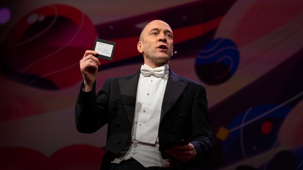
In 1969 in July, three Americans launched into space. Now, they went to the surface of the moon, they famously made the great leap for mankind. Buzz Aldrin, Neil Armstrong, they walked on the surface, they planted this flag. It's rightly celebrated as a moment that in America we say is a triumph. We think it was this amazing accomplishment. They didn't just leave behind this flag, though. They also left behind a plaque. This plaque is a beautiful object, and one that I want to talk to you a little bit about. First, you might notice that there's two globes, representing all of earth. And then there's this beautiful statement: "We came in peace for all mankind." Now, at first, this is just nice poetic language, but it's also set in a typeface that's perfect for this moment. It seems industrial, it seems engineered. It also is the best possible name you could come up with for something on the moon: Futura.
В июле 1969 года трое американцев отправились в космос. Они ступили на поверхность Луны и совершили всемирно известный гигантский скачок для человечества. Базз Олдрин, Нил Армстронг прошлись по её поверхности и водрузили флаг. Этот момент мы, американцы, справедливо называем триумфом. Мы считаем его великим достижением. Они оставили на Луне не только флаг, но и металлическую пластину. Эта пластина великолепна, и именно о ней я хотел бы вам рассказать. На ней изображены два полушария с картой Земли. А ниже красивая фраза: «Мы пришли с миром от всего человечества». Она написана не только красивым поэтическим языком, но и идеально подходящим для этого момента шрифтом. Он кажется фабричным, созданным для промышленности. Ещё у него идеальное название для полётов на Луну: Futura.
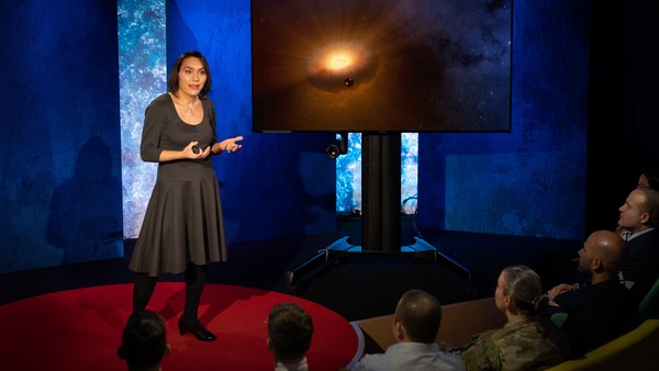
Now, I want to talk to you about fonts, and why this typeface is perfect for this moment. But it's actually more than just ceremonial. Now, when all of you arrived here today, you actually had to think about fonts. You might not realize it, but you're all unconscious experts on typography. Typography is the study of how fonts inhabit our world, they're the visual language of the words we use. Here's the thing that's funny about this, though. I know you're probably not like me, you're not a font nerd, maybe some of you are, but if you're not, that's alright, because I might spend hours every day trying to pick the perfect typeface for the perfect project, or I might spend thousands of dollars every year, trying to get ones with the right features. But all of you actually spend hours every day, evaluating fonts. If you don't believe me, think about how you got here. Each of you had to judge by the signs and maybe even on your phone, which signals to trust and which to ignore. You were evaluating fonts.
Я расскажу вам о шрифтах и о том, почему Futura оптимален для этого случая. И не только из-за своего символического названия. Каждый из пришедших сюда гостей когда-либо думал о шрифтах. Вы этого не осознаёте, но вы все интуитивные специалисты в типографии. Типография — это наука о том, как шрифты сосуществуют с нами, являясь визуальным языком, на котором мы говорим. Но вот что забавно: скорее всего, вы не фанатеете от шрифтов так же, как я, ну, может быть, единицы, и это нормально, потому что я ежедневно могу часами подбирать подходящий шрифт для конкретного проекта или ежегодно тратить тысячи долларов на шрифты с нужными характеристиками. Однако вы все ежедневно часами оцениваете шрифты. Если не верите, подумайте о том, что вас сюда привело. Каждый из вас ориентируется по знакам, возможно, даже в телефоне, и по ним понимает, чему можно доверять, а чему нет. Вы оценивали шрифты.
Or maybe when you're just buying a new product, you have to think about whether something is expensive or cheap or hard to get or easy to find. And the funny thing about it is, this may not seem extraordinary to you, but the moment you see something out of place, you recognize it right away.
При покупке нового товара вы задумывались о том, дорогой он или дешёвый, трудно или легко будет его найти. И самое забавное — для вас это обычное дело, но когда вы видите что-то непривычное, то сразу на это реагируете.
(Laughter)
(Смех)
The thing I love about typography, and why I love fonts and why I love Futura, is that, for me, what I study is everywhere. Every street that I walk down, every book that I pick up, every thing that I read is filled with the thing I love. Now, once you understand the history and what happens with typography, you actually have a history of everything before you.
Что мне нравится в типографии, в шрифтах вообще и в шрифте Futura в частности, так это то, что объект моего изучения находится повсюду. На каждой улице, по которой я иду, в каждой книге, которую читаю, встречается предмет моего обожания. Однажды познакомившись с историей типографии и поняв её, вы поймёте историю всего окружающего вас мира.
And this is the typeface Futura. As previously we've discussed, this is modernism in miniature. This is a way in which modernism infiltrated this country and became perhaps the most popular, or promiscuous typeface, of the twentieth century. "Less is more," right, these are the aphorisms of modernism. And in the visual arts, the same thing happened. Let's focus on the essentials, focus on the basic shapes, focus on geometry. So Futura actually holds this to its core. You might notice that the shapes inherent in Futura have circles, squares, triangles. Some of the shapes are all based on circles, like the O, D and C, or others have this pointed apex of the triangle. Others just look like they might have been made with a ruler or a compass. They feel geometric, they feel mathematic, precise. In fact, this whole system carries through with the way that the typeface was designed. To not look like it was made like other typefaces, to be something new. Here it is in the lightweight, the medium weight and the bold weight. The whole family has different things to commend to it.
Это шрифт Futura. Как я уже упоминал, это модернизм в миниатюре. С его помощью модернизм проник в нашу страну и сделал этот шрифт универсальным и самым популярным в XX веке. «Чем меньше, тем лучше» — лейтмотив модернизма. Это относится и к визуальным видам искусства. Давайте обратим внимание на его основные формы, на геометрию. Это основа шрифта Futura. Вы можете заметить, что основные формы Futura — это круги, квадраты и треугольники. Некоторые формы состоят лишь из окружностей, например, буквы O, D и C, другие похожи на вершину треугольника, а некоторые выглядят так, словно их чертили с линейкой и компасом. Шрифт геометричен и математически точен. Очевидно, что дизайн всего шрифта был тщательно продуман с целью сделать его уникальным и оригинальным. Вот его начертания: обычное, полужирное и жирное. Целая система предусмотрена для разных целей.
This was a conscious break from the past, something that looked like it was made by a machine, and not by hand. When I say not made by hand, this is what I mean. This is what we think about maybe, when you might create something with a calligraphic brush or a pen. That there's thicks and thins. And even more traditional typefaces, say like a Garamond, holds vestiges of this old system in which you can see the A where it get little bit thinner at the top and thicker down below, because it's trying to look like someone had made it by hand. But Futura, in contrast, is designed to look like no one had touched it at all, that this was made by a machine, for a machine age, for an industrial age.
Такой сознательный разрыв с прошлым. Нечто, созданное машиной, а не рукой. Говоря «созданное не рукой», я имею в виду это. Примерно об этом мы думаем, когда создаём что-либо каллиграфическим пером или ручкой. Тонкие линии, толстые линии. И даже более традиционные шрифты, например Garamond, содержат пережитки старой системы, в которой буква А сужается кверху и расширяется у основания, так как нужно было создать видимость, что она написана рукой. А Futura, напротив, создаёт впечатление, будто он не рукотворный, а создан машиной для промышленной эпохи, эпохи машин.
There's actually a sleight of hand here that Paul Renner, the designer who made this in 1927, employed. If you look at the way in which the circular shape joins with the vertical shaft, you'll notice that it tapers just every so slightly. And this is one of hundreds of ways in which this typeface was designed to look geometrically perfect, even though it's mathematically not. And this is what typeface designers do all the time to make typefaces work, every day.
Здесь видна ловкость рук Пауля Реннера, дизайнера, создавшего этот шрифт в 1927 году. Если посмотреть на то, как окружность соединяется с вертикальным валом, можно заметить, что она немного сужается. Это один из сотен способов создания шрифта с целью сделать его геометрически совершенным, хотя математически он неидеален. Именно этим ежедневно занимаются дизайнеры, чтобы их шрифты пользовались спросом.
Now, there were other designers doing this at the same time in Europe and America. These are a few other excellent examples from Europe, trying to create something new for the new age, a new moment in time. These are some other ones in Germany that in some ways look very similar to Futura, maybe with higher waist or lower waist or different proportions. Then why did Futura take over the world? In this case, if you can read the titles there, some of these names don't quite roll off the tongue: Erbar, Kabel Light, Berthold-Grotesk, Elegant-Grotesk. These aren't exactly household names, are they? And so when you compare that to Futura, you realize that this was a really good choice by the marketing team.
Другие дизайнеры из Европы и Америки тоже пытались создать новый шрифт в то время. Вот несколько замечательных шрифтов из Европы, символизирующих создание нового, для новой эпохи. Появляются новые шрифты в Германии, во многом похожие на Futura, отличающиеся лишь пропорциями или смещённой центральной частью. Так почему же Futura захватил весь мир? Если сможете, прочтите эти названия, некоторые из них довольно сложно произнести: Erbar, Kabel Light, Berthold-Grotesk, Elegant-Grotesk. Не похоже на торговые марки, правда? И сравнивая их с Futura, становится очевидным, что команда маркетологов сделала правильный выбор.
What's amazing about this name -- you know, what's in this name is that this is a name that actually invokes hope and an idea about the future. And this isn't actually the word for future in German, it wasn't a German name, they actually picked something that would speak to a wider, larger audience, a universal audience. And when you compare it to what was being done in America -- these are the typefaces from the same period in the United States in the 1920s, bold, brash, braggadocios. You almost think of this as exactly like what the stock market looked like when they were all going nuts in the 1920s. And you realize that Futura is doing something revolutionary.
И самое забавное в его названии — оно само фактически порождает надежду и заставляет задуматься о будущем. Хотя на немецком это слово не означает будущее. Оно не немецкое. Это универсальное слово, понятное большой аудитории. И если сравнить его с тем, что делали в Америке, — вот шрифты того времени из США 1920-х годов — жирные, резкие, вычурные. Сразу же приходит на ум фондовый рынок, где все в 1920-е годы сходили с ума. И вы понимаете, что Futura совершает революцию.
I want to step back and talk about an example of the typeface in use. So this is a magazine that we all probably know today, "Vanity Fair." This is what it looked like in 1929, in the summer. And in many ways, there's nothing wrong with this design. This is absolutely typical of the 1920s. There's a photograph of an important person, in this case Franklin Roosevelt, then-governor of New York. Everything seems centered, everything seems symmetrical. There's still a little bit of ornamentation, so this is still maybe having some vestiges of the painted lady and not fully modernistic. But everything seems kid of solid. There's even drop caps to help you get into the text.
Хочу вернуться назад и рассказать о примерах использования этого шрифта. Вот всем известный журнал Vanity Fair. Вот как он выглядел летом 1929 года. По большому счёту вполне неплохой дизайн, довольно характерный для 1920-х годов. Здесь есть фотография известной личности: Франклина Рузвельта, тогда он был губернатором Нью Йорка. Всё центрировано и симметрично. Присутствует лёгкий орнамент, в стиле заметно веяние викторианской эпохи наравне с модерном. Однако всё выглядит солидно. Есть даже буквицы для лучшего понимания текста.
But this all changed very quickly and in October of 1929, a Berlin-based designer came and redesigned "Vanity Fair." And this is what it looks like with Futura. Instead of the governor now we have a photograph of an abstract, beautiful setting, in this case, the ocean. Instead of drop caps, there's nothing at all. And replaced with a centered layout is now asymmetry. And it gets even more radical the further you enter the magazine. In this case, even more dramatic asymmetry. In this case, illustrations by Pablo Picasso, moving across the page and breaking the gutter of the two pages. And there's something even more radical. If you look closely at the Futura, you might notice something. You might not pick it up at first, but there are no capital letters in the title or the captions on this page. You might not think that's very radical, but pick up any magazine, any book or go to any website, and I guarantee, you are not going to find it very easily. This is still a radical idea.
Но ситуация резко изменилась, когда в октябре 1929 года новый дизайнер из Берлина полностью изменил Vanity Fair. И вот как он стал выглядеть с Futura. Вместо губернатора на обложке просто красивый пейзаж, в данном случае океан. Полный отказ от буквиц. Вместо симметричного макета теперь асимметрия. И чем дальше вы листаете журнал, тем более она выражена. Здесь асимметрия видна ещё ярче. Иллюстрации Пабло Пикассо переходят с одной страницы на другую, ломая пространство между полосами на двух страницах. Есть ещё кое-что, бросающееся в глаза. Если присмотреться к Futura, можно кое-что заметить. С первого взгляда это незаметно, но ни в заголовке, ни в подписях на этой странице нет заглавных букв. Можно подумать, что это не оригинально, но откройте любой журнал, книгу или сайт: я гарантирую, вы вряд ли найдёте подобное. Даже сейчас это оригинальная идея.
And why is that radical? When we think about what capital letters denote, they denote something important, whether it's our names, or our titles. Or maybe even just the name of our corporations, or maybe our trademarks. Actually, in some ways, America's the home of capitalization. We love putting capitals in everything.
В чём её оригинальность? В нашем представлении заглавные буквы указывают на что-то важное: имена или титулы людей, названия организаций или торговых марок. В некотором смысле Америка — родина заглавных букв. Мы ставим их везде где только можно!
(Laughter)
(Смех)
But think about how radical this would be to introduce a magazine where you're taking away all the capital letters. This has maybe had the same political force that we now argue over things like pronouns in our society today. In the 1920s, this is just shortly after Soviet Russia had a communist revolution. And for them, this actually represented a socialist infiltration into America. All lowercase letters meant that this was an egalitarian, complete lowering of everything into one equal playing field. Now this is still kind of a radical idea. Think about how often you do capitalize something to have more power or prestige to it. So for them to do this was a way in which Futura was using this idea.
Задумайтесь, насколько смелое решение, — представить журнал, в котором отсутствуют заглавные буквы. Оно так же сильно повлияло на политику, как современные споры о местоимениях. Это случилось в 1920-е годы, вскоре после того, как в советской России произошла коммунистическая революция. И фактически это олицетворяло собой проникновение социализма в Америку. А написание слов только строчными буквами олицетворяло равноправие, полное уравнивание всех и вся. Это по-прежнему смелая идея. Вспомните, как часто вы пишете заглавные буквы ради власти или престижа. Так что для них Futura служила именно этой цели.
Now, other designers were doing other things with Futura. Others brought other ideas of modernism with it, whether it was interesting new illustration styles, or interesting new collage types of illustration. Or even just new book covers, whether they were from Europe.
Но другие дизайнеры использовали Futura для другого. Они воплощали другие идеи модернизма: у одних это были новые интересные стили рисунков, у других — новые виды коллажей или просто новые обложки книг, похожие на европейские.
But here's the funny thing. In the 1920s, if you wanted to use a new typeface, you couldn't just go download it onto your computer. You actually had to have pieces of lead. So for Americans who wanted to adopt this and make it part of their own system, something they could use in everyday typography, whether in ads or anything else, they actually had to have metal type.
Тут есть кое-что забавное. В 1920-е годы, если был нужен новый шрифт, нельзя было просто скачать его на свой компьютер. Нужно было иметь свинец. Поэтому американцам, которые хотели внедрить новый шрифт в свою работу, ежедневно использовать его в типографском деле, в рекламе или других сферах необходимо было иметь металлические литеры.
So being good American capitalists, what did we do? We made all sorts of copies. Ones that had nothing to do with the name Futura, but looked identical to it, whether it was Spartan or Tempo. And in fact, by the time that World War II started, American corporations were actually trying to boycott Nazi goods. But they said, "Go ahead and use our copies. Use 20th Century, use Spartan, use Vogue, use Tempo. These are identical to Futura." And in fact, for most people, they didn't even learn the new names, they just still called it all Futura. So America took this typeface in, conquered it and made it its own. So by the time World War II finishes, Americans are using this on everything, whether it be catalogs, or atlases, or encyclopedias or charts and graphs, or calendars, or even political material. And even the logo for a new expansion football team. And in fact, it was used even on some of the most important advertising of the 20th century.
Что сделали мы — честные американские капиталисты? Мы создали множество копий. Шрифты, никак не связанные с Futura, но внешне очень похожие на него, например Spartan или Tempo. Фактически к началу Второй мировой войны американские корпорации пытались бойкотировать нацистские товары. Они говорили: «Продолжайте использовать наши копии. Пользуйтесь шрифтами 20th Century, Spartan, Vogue, Tempo. Они идентичны Futura». И большинство не утруждало себя выучить новые названия, все шрифты они называли Futura. Так Америка приняла этот шрифт, захватила и сделала его своим. И уже к окончанию Второй мировой войны американцы используют его везде: в каталогах, атласах, энциклопедиях, схемах и графиках, календарях и даже политических материалах. Даже в логотипе новой сборной по футболу. Его используют даже в одной из важнейших рекламных кампаний XX века.
So it's in this context that when the US government was picking a typeface to use after World War II for new maps and new projects, they picked Futura. It wasn't an astounding choice, it wasn't a radical choice, it didn't have anything to do with communism. But in this case, it was used on some of the most important maps, so this one, an air force map in 1962, or used for the maps in Vietnam in '66.
В сложившейся ситуации, когда власти США после Второй мировой войны выбирали шрифт для новых карт и проектов, выбор пал на Futura. Это не был потрясающий или оригинальный выбор, он не имел ничего общего с коммунизмом. Но тогда его использовали на некоторых важнейших картах, например на карте ВВС в 1962 году, а также на картах во Вьетнаме в 1966 году.
And so it wasn't a surprise that when astronauts first started the Mercury program, such as John Glenn orbiting the earth, that charts and maps that he was using were in Futura. And in fact, by the time Mercury morphed into Apollo, it started getting used more and more for more things. So in this case for a safety plan, or even starting to get used on instrument panels, or navigational aids. Or even on diagrams to show how the whole system worked.
Поэтому неудивительно, что когда астронавты запустили космическую программу «Меркурий» и Джон Гленн вышел на орбиту Земли, все его схемы и карты были напечатаны шрифтом Futura. И к моменту, когда «Меркурий» был заменён «Аполлоном», к шрифту уже привыкли и использовали его повсеместно: и в плане по обеспечению безопасности, и на приборных панелях, и в средствах для навигации. Даже на диаграммах, отражающих функционирование всей системы.
But here's the amazing thing, it didn't just get used for papers that they handed out to people. It started to get used for an interface, for an entire system that helped the astronauts know how to use the machine. NASA wasn't just one big corporation making everything. There was hundreds of contractors -- Boeing, IBM, McDonnell Douglas -- all making different machines. Now imagine if astronauts had to use different typefaces and different systems for each component they had in the space shuttles. This would have been impossible to navigate and there would have been a cognitive overload every time they had to open up a new system. So in this case, Futura being used on the interface helped them navigate complexity and make it more clear. And it wasn't just used on buttons, it was used on labels, and it was used on their food rations, and it was used on their tool kits. It was used on knobs and levers to tell them what to do. In fact, maybe even some of the places where they needed to have things that were complex be more simple to them, instructions were printed entirely in Futura, so that they could know what to do with that one moment. They didn't have to remember everything in their head, they could have it out there in the world to see and refer to. In this case, Futura helped make that system, which was already a very difficult and complex system, a little less complex. In fact, the very first or last thing an astronaut might have seen when they were entering or exiting the spacecraft would have been in Futura.
Но самое интересное, в газетах его стали использовать не сразу. Сначала его применили в интерфейсе всей системы, которая помогала астронавтам обучиться управлять техникой. НАСА не была одной большой корпорацией, способной всё создавать сама. Были сотни подрядчиков: Boeing, IBM, McDonnell Douglas — все делали различную технику. Если бы астронавты использовали разные шрифты и системы для каждой детали и устройства в космических челноках, было бы невозможно ориентироваться. У астронавтов просто «вскипал» бы мозг каждый раз при освоении новой системы. Поэтому использование Futura в интерфейсе помогло им управлять кораблём и облегчило работу. Шрифт использовался на кнопках, на маркировке приборов, на упаковках с продуктовым пайком и в наборах инструментов. Он использовался на ручках и рычагах, помогая понять, как ими управлять. Возможно, даже в тех местах, где нужно было упростить что-то сложное для понимания. Все инструкции были напечатаны на Futura, чтобы с первого взгляда было легко понять, что делать. Астронавтам не нужно было всё запоминать — достаточно было просто прочитать необходимую инструкцию. И Futura помог им сделать эту систему, которая изначально была очень сложной, более простой для понимания. По сути, всё, что встречалось астронавтам со входа на корабль и до момента выхода из него, было написано на Futura.
One of my favorite examples of how Futura worked in this way is actually this camera. This is a Hasselblad that was made by the Swedish company. It's a perfectly good camera, some of you might have used one, it's prized by photographers as a really great camera. And you might notice, if you know anything about cameras, that there's some modifications made to it. In this case, there are stickers placed all over the film canisters, or other parts of the camera here. What this enabled NASA to do, was make something really great out of the astronauts. They're not photographers, they're not experts in art. But they could ensure that they would know how to use this camera because of the labels placed there in Futura.
Мой любимый пример того, как Futura справилась со своей задачей, — этот фотоаппарат. Это Hasselblad, производитель — шведская компания. Это отличный фотоаппарат, может, у кого-то из вас был такой: фотографы считают его чудом техники. Если вы разбираетесь в фотоаппаратах, то можете заметить, что этот немного модифицирован. Здесь повсюду приклеены стикеры, в том числе на кассетах для плёнки. НАСА поступило таким образом, чтобы помочь астронавтам раскрыть свой потенциал. Они не профессиональные фотографы и не знатоки искусства, но они быстро научились пользоваться этим фотоаппаратом благодаря стикерам с текстом на Futura.
So in this case, Futura acquired and made sure that they had legitimacy with the things they were using. In this case to not take off the film before it would expose. Which, in this case, we would have never had some of the amazing photos we had without this label. When we see something as decorative as this, a ceremonial patch, or something like this plaque on the moon, we realize that Futura was more than just something ceremonial, something more than something that had just been picked for its design. In fact, Futura had authority, had legitimacy and had power because of this choice.
В данном случае Futura помог астронавтам понять, как правильно использовать новые предметы. Например, не вытащить плёнку раньше времени, чтобы не засветить. Без этого стикера мы никогда не получили бы те великолепные фотографии. Когда мы видим что-то декоративное, например, эту почётную нашивку, или эту пластину на Луне, становится очевидно, что Futura — это не просто символический шрифт. Его выбрали за удобный дизайн, но он приобрёл большую значимость. По сути, благодаря этому выбору, Futura завоевал авторитет, законность и власть.
There's one other thing I want to talk about in closing. And that is that Futura tells a story. And this is what I love about typefaces, is that all of them tell stories. And in this case, this typeface tells a very powerful story about assimilation, about something being taken into America and being made part of its culture. And that's one of the best and worst things America does, is we take things into our culture and we spit them out back again and claim them our own. And in this case, Futura mirrors exactly what happened with the technology undergirding the whole system. Futura was a German typeface, taken in, made into an American commodity. And so were the technologies: the rockets, the scientists all came from Germany as well. So in some ways, this German typeface on an American plaque perfectly mirrors what happened with the technology. And in this case, when you think about this story, you realize that typography on the moon represents legitimacy, represents authority, and this gave them, the astronauts, the power to get to the moon.
В заключение я хочу сказать ещё вот о чём: Futura рассказывает нам историю. Именно за это я и ценю шрифты, они все рассказывают истории. В данном случае шрифт рассказывает очень важную историю ассимиляции, о том, как что-то чужое попало в Америку и стало частью её культуры. Это и плюс, и минус Америки: мы заимствуем нечто из чужой культуры, переделываем на нужный лад, а затем объявляем своим. И Futura в точности отражает то, что произошло с технологией, ставшей основой всей системы. Futura придумали в Германии, а затем превратили в американский товар. То же было и с технологиями: ракеты, учёные, всё пришло из Германии. Отчасти этот немецкий шрифт на американской пластине отражает то, что случилось с технологией. В этом случае, размышляя об этой истории, вы понимаете, что шрифт, оказавшийся на Луне, воплощает законность, воплощает власть, и именно он дал астронавтам полномочия высадиться на Луну.
Thank you.
Спасибо.
(Applause)
(Аплодисменты)