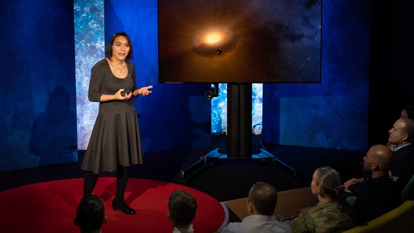
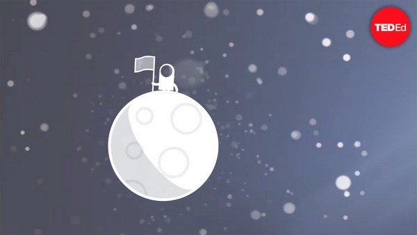
In 1969 in July, three Americans launched into space. Now, they went to the surface of the moon, they famously made the great leap for mankind. Buzz Aldrin, Neil Armstrong, they walked on the surface, they planted this flag. It's rightly celebrated as a moment that in America we say is a triumph. We think it was this amazing accomplishment. They didn't just leave behind this flag, though. They also left behind a plaque. This plaque is a beautiful object, and one that I want to talk to you a little bit about. First, you might notice that there's two globes, representing all of earth. And then there's this beautiful statement: "We came in peace for all mankind." Now, at first, this is just nice poetic language, but it's also set in a typeface that's perfect for this moment. It seems industrial, it seems engineered. It also is the best possible name you could come up with for something on the moon: Futura.
Em julho de 1969, três norte-americanos foram ao espaço. Eles foram à superfície da Lua, e celebremente deram o grande salto da humanidade. Buzz Aldrin e Neil Armstrong andaram na superfície e plantaram essa bandeira. É celebrado como um momento triunfante nos Estados Unidos. Nós acreditamos que é uma conquista magnífica. Mas eles não deixaram apenas a bandeira. Eles também deixaram uma placa. Essa placa é um objeto lindo, e sobre o qual quero falar com você. Primeiro, você deve ter notado os dois globos, representando a Terra. E tem essa frase linda: "Viemos em paz por toda a humanidade". À primeira vista, é apenas linguagem poética, mas ela está escrita numa família tipográfica perfeita para o momento. Parece industrial, projetada. Ela também tem o melhor nome que você pode inventar para algo na Lua: Futura.
Now, I want to talk to you about fonts, and why this typeface is perfect for this moment. But it's actually more than just ceremonial. Now, when all of you arrived here today, you actually had to think about fonts. You might not realize it, but you're all unconscious experts on typography. Typography is the study of how fonts inhabit our world, they're the visual language of the words we use. Here's the thing that's funny about this, though. I know you're probably not like me, you're not a font nerd, maybe some of you are, but if you're not, that's alright, because I might spend hours every day trying to pick the perfect typeface for the perfect project, or I might spend thousands of dollars every year, trying to get ones with the right features. But all of you actually spend hours every day, evaluating fonts. If you don't believe me, think about how you got here. Each of you had to judge by the signs and maybe even on your phone, which signals to trust and which to ignore. You were evaluating fonts.
Eu quero falar sobre fontes, e por que essa família é perfeita para este momento. Mas ela é muito mais do que algo cerimonial. Quando você chegou aqui hoje, você parou para pensar em fontes. Você não percebeu, mas você é especialista inconsciente em tipografia. A tipografia é o estudo das fontes do nosso mundo, elas são a linguagem visual das palavras que usamos. Mas a parte engraçada é essa: sei que você não é um nerd de fontes como eu, talvez alguém seja, mas tudo bem se não for, porque eu consigo gastar horas escolhendo a família perfeita para um projeto ou gastar milhares de dólares para comprar uma que seja perfeita, mas você diariamente também gasta horas avaliando fontes. Se não acredita, pense em como você chegou aqui. Você precisou julgar os sinais, talvez até no seu celular, e decidir em qual confiar e qual ignorar. Você avaliou as fontes.
Or maybe when you're just buying a new product, you have to think about whether something is expensive or cheap or hard to get or easy to find. And the funny thing about it is, this may not seem extraordinary to you, but the moment you see something out of place, you recognize it right away.
Ou quando você compra um produto novo, você precisa pensar se é algo caro, barato, difícil ou fácil de encontrar. E o engraçado é que talvez isso não seja extraordinário para você, mas no momento que você vê algo fora do lugar, você percebe na hora.
(Laughter)
(Risos)
The thing I love about typography, and why I love fonts and why I love Futura, is that, for me, what I study is everywhere. Every street that I walk down, every book that I pick up, every thing that I read is filled with the thing I love. Now, once you understand the history and what happens with typography, you actually have a history of everything before you.
O que eu adoro na tipografia, e por que eu amo fontes e por que eu amo Futura, é que o que eu estudo está em todos os lugares. Em cada rua que ando, em cada livro que abro, qualquer coisa que eu leia está repleta de coisas que amo. Uma vez que você entende a história e o que acontece com a tipografia, você tem a história de tudo na sua frente.
And this is the typeface Futura. As previously we've discussed, this is modernism in miniature. This is a way in which modernism infiltrated this country and became perhaps the most popular, or promiscuous typeface, of the twentieth century. "Less is more," right, these are the aphorisms of modernism. And in the visual arts, the same thing happened. Let's focus on the essentials, focus on the basic shapes, focus on geometry. So Futura actually holds this to its core. You might notice that the shapes inherent in Futura have circles, squares, triangles. Some of the shapes are all based on circles, like the O, D and C, or others have this pointed apex of the triangle. Others just look like they might have been made with a ruler or a compass. They feel geometric, they feel mathematic, precise. In fact, this whole system carries through with the way that the typeface was designed. To not look like it was made like other typefaces, to be something new. Here it is in the lightweight, the medium weight and the bold weight. The whole family has different things to commend to it.
Essa é a família da Futura. Como falei antes, isso é o modernismo em miniatura. É um dos meios como o modernismo se infiltrou nesse país, tornando-se, talvez, a família mais popular ou promíscua do século 20. "Menos é mais", esses são os aforismos do modernismo. Na arte visual, aconteceu a mesma coisa. Vamos focar no essencial, focar nas formas básicas, focar na geometria. Essa é a essência da Futura. Você deve ter notado que a Futura tem formatos circulares, quadrados e triangulares. Alguns se baseiam em círculos, como O, D e C, outros têm o vértice pontudo do triângulo. Outros parecem ter sido feitos com uma régua ou um compasso. Eles são geométricos, matemáticos, precisos. Na verdade, o sistema todo parece ter sido projetado. Para que não se parecesse com outras famílias e fosse algo novo. Estes são os pesos leve, médio e negrito. Toda a família tem algo para ser elogiado.
This was a conscious break from the past, something that looked like it was made by a machine, and not by hand. When I say not made by hand, this is what I mean. This is what we think about maybe, when you might create something with a calligraphic brush or a pen. That there's thicks and thins. And even more traditional typefaces, say like a Garamond, holds vestiges of this old system in which you can see the A where it get little bit thinner at the top and thicker down below, because it's trying to look like someone had made it by hand. But Futura, in contrast, is designed to look like no one had touched it at all, that this was made by a machine, for a machine age, for an industrial age.
Foi uma ruptura com o passado, algo que parecia ter sido feito por uma máquina e não à mão. E por "à mão", é isto que quero dizer: é nisto que pensamos quando imaginamos algo criado por uma caneta ou pincel de caligrafia. Com traços grossos e finos. E até mesmo famílias tradicionais, como a Garamond, têm vestígios desse sistema antigo, você pode ver que o A fica mais fino no topo e mais grosso na base, porque é para parecer que alguém escreveu à mão. Mas a Futura, por outro lado, parece que ninguém tocou nela, que foi feita por uma máquina para a era das máquinas, a era industrial.
There's actually a sleight of hand here that Paul Renner, the designer who made this in 1927, employed. If you look at the way in which the circular shape joins with the vertical shaft, you'll notice that it tapers just every so slightly. And this is one of hundreds of ways in which this typeface was designed to look geometrically perfect, even though it's mathematically not. And this is what typeface designers do all the time to make typefaces work, every day.
Na verdade, há um toque humano feito pelo seu designer Paul Renner, em 1927. Se você olhar o modo como o formato circular se encontra com o eixo vertical, você notará que ele se afunila suavemente. Essa é uma das peculiaridades que a faz parecer geometricamente perfeita, embora matematicamente não seja. E é isso que os designers fazem para que essas famílias deem certo. Havia outros designers fazendo isso na Europa e nos Estados Unidos.
Now, there were other designers doing this at the same time in Europe and America. These are a few other excellent examples from Europe, trying to create something new for the new age, a new moment in time. These are some other ones in Germany that in some ways look very similar to Futura, maybe with higher waist or lower waist or different proportions. Then why did Futura take over the world? In this case, if you can read the titles there, some of these names don't quite roll off the tongue: Erbar, Kabel Light, Berthold-Grotesk, Elegant-Grotesk. These aren't exactly household names, are they? And so when you compare that to Futura, you realize that this was a really good choice by the marketing team.
Estes são alguns ótimos exemplos da Europa tentando criar algo novo para uma nova era, um novo momento. Estes da Alemanha são similares em certos aspectos à Futura, podendo ser mais largos ou estreitos, com proporções diferentes. Então, por que a Futura dominou o mundo? Nesse caso, se você ler os títulos, alguns deles não são fáceis de se pronunciar: Erbar, Kabel Light, Berthold-Grotesk e Elegant-Grotesk. Eles não são tão conhecidos. Quando você os compara à Futura, você percebe que a equipe de marketing acertou na escolha.
What's amazing about this name -- you know, what's in this name is that this is a name that actually invokes hope and an idea about the future. And this isn't actually the word for future in German, it wasn't a German name, they actually picked something that would speak to a wider, larger audience, a universal audience. And when you compare it to what was being done in America -- these are the typefaces from the same period in the United States in the 1920s, bold, brash, braggadocios. You almost think of this as exactly like what the stock market looked like when they were all going nuts in the 1920s. And you realize that Futura is doing something revolutionary.
O mais incrível nesse nome, o que esse nome tem é que ele realmente invoca esperança e uma ideia sobre o futuro. E essa não é palavra alemã para "futuro", nem um nome alemão, eles escolheram algo que falaria com um público maior e universal. Comparado com o que estava sendo feito, estas são famílias do mesmo período nos Estados Unidos dos anos 20, robustas, arrojadas e pretensiosas. Você poderia pensar nisso como o mercado de ações quando eles enlouquecerem nos anos 20. E daí tem a Futura, fazendo algo revolucionário.
I want to step back and talk about an example of the typeface in use. So this is a magazine that we all probably know today, "Vanity Fair." This is what it looked like in 1929, in the summer. And in many ways, there's nothing wrong with this design. This is absolutely typical of the 1920s. There's a photograph of an important person, in this case Franklin Roosevelt, then-governor of New York. Everything seems centered, everything seems symmetrical. There's still a little bit of ornamentation, so this is still maybe having some vestiges of the painted lady and not fully modernistic. But everything seems kid of solid. There's even drop caps to help you get into the text.
Agora vou dar um exemplo de uma família tipográfica em uso. Esta é uma revista que todos nós conhecemos hoje, a Vanity Fair. Esse era o visual dela no verão de 1929. De certa forma, não há nada de errado com esse design. É algo típico dos anos 20. Com a foto de alguém importante, Franklin Roosevelt, que era o governador de Nova York. Tudo parecia centralizado e simétrico. Ainda há algumas vinhetas, isso pode ser algum vestígio excêntrico não sendo totalmente modernista. Parece um tanto sólido. O texto tem até letras capitulares.
But this all changed very quickly and in October of 1929, a Berlin-based designer came and redesigned "Vanity Fair." And this is what it looks like with Futura. Instead of the governor now we have a photograph of an abstract, beautiful setting, in this case, the ocean. Instead of drop caps, there's nothing at all. And replaced with a centered layout is now asymmetry. And it gets even more radical the further you enter the magazine. In this case, even more dramatic asymmetry. In this case, illustrations by Pablo Picasso, moving across the page and breaking the gutter of the two pages. And there's something even more radical. If you look closely at the Futura, you might notice something. You might not pick it up at first, but there are no capital letters in the title or the captions on this page. You might not think that's very radical, but pick up any magazine, any book or go to any website, and I guarantee, you are not going to find it very easily. This is still a radical idea.
Mas tudo isso mudou em outubro de 1929, quando um designer alemão reestruturou a Vanity Fair. E foi assim que ela ficou com a Futura. Em vez do governador, agora temos uma paisagem bela e abstrata, nesse caso, um oceano. Não há letras capitulares. No lugar da estrutura centralizada, há uma assimétrica. Ficando ainda mais radical conforme folheamos a revista. Uma assimetria mais dramática. Com ilustrações de Pablo Picasso se movendo pela página e avançando pela lombada entre as páginas. Há algo ainda mais radical. Se você observar atentamente, vai perceber algo. Talvez você não tenha percebido, mas não há letras maiúsculas. Você pode achar que isso não é radical, mas abra qualquer revista, livro ou website, e garanto que não encontrará isso tão facilmente. Isso ainda é uma ideia radical.
And why is that radical? When we think about what capital letters denote, they denote something important, whether it's our names, or our titles. Or maybe even just the name of our corporations, or maybe our trademarks. Actually, in some ways, America's the home of capitalization. We love putting capitals in everything.
E por que ela é radical? Quando pensamos no propósito das letras maiúsculas, elas indicam algo importante, como nomes ou títulos. Até mesmo nomes de corporações ou marcas. Em certos aspectos, os Estados Unidos é o país da capitalização. Nós amamos capitalizar tudo.
(Laughter)
(Risos)
But think about how radical this would be to introduce a magazine where you're taking away all the capital letters. This has maybe had the same political force that we now argue over things like pronouns in our society today. In the 1920s, this is just shortly after Soviet Russia had a communist revolution. And for them, this actually represented a socialist infiltration into America. All lowercase letters meant that this was an egalitarian, complete lowering of everything into one equal playing field. Now this is still kind of a radical idea. Think about how often you do capitalize something to have more power or prestige to it. So for them to do this was a way in which Futura was using this idea.
Mas pense em quão radical seria fazer uma revista sem letras maiúsculas. Isso talvez tenha a mesma força política das nossas discussões sobre substantivos na nossa sociedade de hoje. Nos anos 20, isso aconteceu logo depois da Revolução Russa. Foi um sinal da infiltração socialista nos Estados Unidos. As letras minúsculas significavam que isso era algo igualitário, um completo nivelamento de tudo onde todos jogam pela mesma regra. Isso ainda é uma ideia radical. Pense quantas vezes você capitaliza algo para lhe dar mais poder ou prestígio. Isso era um jeito de usar a Futura.
Now, other designers were doing other things with Futura. Others brought other ideas of modernism with it, whether it was interesting new illustration styles, or interesting new collage types of illustration. Or even just new book covers, whether they were from Europe.
Outros designers usavam a Futura de outro modo. Outros incorporavam ideias do modernismo, com novos estilos de ilustrações, ou novos tipos de colagens ilustrativas. Ou novas capas de livros, se elas fossem da Europa.
But here's the funny thing. In the 1920s, if you wanted to use a new typeface, you couldn't just go download it onto your computer. You actually had to have pieces of lead. So for Americans who wanted to adopt this and make it part of their own system, something they could use in everyday typography, whether in ads or anything else, they actually had to have metal type.
Mas a parte engraçada é esta: nos anos 20, quem quisesse usar uma nova família não podia simplesmente baixá-la no seu computador. Você precisava ter pedaços de chumbo. Os norte-americanos que queriam adotar isso e torná-lo parte de seu sistema, para que fosse usado na tipografia do dia a dia, em publicidade ou outras coisas, precisavam ter esse tipo de metal.
So being good American capitalists, what did we do? We made all sorts of copies. Ones that had nothing to do with the name Futura, but looked identical to it, whether it was Spartan or Tempo. And in fact, by the time that World War II started, American corporations were actually trying to boycott Nazi goods. But they said, "Go ahead and use our copies. Use 20th Century, use Spartan, use Vogue, use Tempo. These are identical to Futura." And in fact, for most people, they didn't even learn the new names, they just still called it all Futura. So America took this typeface in, conquered it and made it its own. So by the time World War II finishes, Americans are using this on everything, whether it be catalogs, or atlases, or encyclopedias or charts and graphs, or calendars, or even political material. And even the logo for a new expansion football team. And in fact, it was used even on some of the most important advertising of the 20th century.
Como bons norte-americanos, o que fizemos? Fizemos todo tipo de cópias. Algumas que não tinham nada a ver com a Futura, mas que eram parecidas, como a Spartan ou a Tempo. Quando a Segunda Guerra Mundial começou, as corporações norte-americanas queriam boicotar os produtos nazistas. Mas eles diziam: "Vamos, use as nossas cópias. Use a 20th Century, a Spartan, a Vogue, a Tempo. Elas são idênticas à Futura". E aconteceu que muitas pessoas não aprenderam seus nomes, elas chamavam todas de Futura. Os Estados Unidos pegou essa família, conquistou-a e tornou-a sua. Quando a Segunda Guerra Mundial terminou, elas eram usadas em tudo: catálogos, atlas, enciclopédias, diagramas e gráficos, calendários e até mesmo material político. Até no logo para um novo time de futebol americano. Ela estava sendo usada nas propagandas mais importantes do século 20.
So it's in this context that when the US government was picking a typeface to use after World War II for new maps and new projects, they picked Futura. It wasn't an astounding choice, it wasn't a radical choice, it didn't have anything to do with communism. But in this case, it was used on some of the most important maps, so this one, an air force map in 1962, or used for the maps in Vietnam in '66.
É dentro desse contexto que o governo norte-americano, ao escolher uma nova família para usar em novos mapas e novos projetos, ele escolheu a Futura. Não foi uma escolha surpreendente nem radical, não teve nada a ver com o comunismo. Ela foi usada em alguns dos mapas mais importantes, como nesse da força aérea em 1962, ou nos mapas do Vietnã em 1966.
And so it wasn't a surprise that when astronauts first started the Mercury program, such as John Glenn orbiting the earth, that charts and maps that he was using were in Futura. And in fact, by the time Mercury morphed into Apollo, it started getting used more and more for more things. So in this case for a safety plan, or even starting to get used on instrument panels, or navigational aids. Or even on diagrams to show how the whole system worked.
Então, não foi uma surpresa que, quando os astronautas começaram o projeto Mercury, e John Glenn orbitou a Terra, os seus diagramas e seus mapas estavam formatados em Futura. Quando o projeto Mercury se transformou no projeto Apollo, ela começou a ser usada em muitas outras ocasiões. Nesse caso, em um plano de segurança, ou em painéis de instrumentos, em suportes de navegação. Ou em diagramas que mostravam como um sistema inteiro operava.
But here's the amazing thing, it didn't just get used for papers that they handed out to people. It started to get used for an interface, for an entire system that helped the astronauts know how to use the machine. NASA wasn't just one big corporation making everything. There was hundreds of contractors -- Boeing, IBM, McDonnell Douglas -- all making different machines. Now imagine if astronauts had to use different typefaces and different systems for each component they had in the space shuttles. This would have been impossible to navigate and there would have been a cognitive overload every time they had to open up a new system. So in this case, Futura being used on the interface helped them navigate complexity and make it more clear. And it wasn't just used on buttons, it was used on labels, and it was used on their food rations, and it was used on their tool kits. It was used on knobs and levers to tell them what to do. In fact, maybe even some of the places where they needed to have things that were complex be more simple to them, instructions were printed entirely in Futura, so that they could know what to do with that one moment. They didn't have to remember everything in their head, they could have it out there in the world to see and refer to. In this case, Futura helped make that system, which was already a very difficult and complex system, a little less complex. In fact, the very first or last thing an astronaut might have seen when they were entering or exiting the spacecraft would have been in Futura.
Mas o mais incrível é que ela não era usada somente em papéis. Ela passou a ser usada em interfaces, em todo um sistema para ajudar os astronautas a operar as máquinas. A NASA não era a única grande corporação fazendo tudo. Havia centenas de terceiros: Boeing, IBM, McDonnell Douglas, todos fazendo máquinas diferentes. Agora imagine os astronautas usando famílias diferentes e sistemas diferentes para cada componente dos ônibus espaciais. Seria impossível navegar e haveria uma sobrecarga cognitiva toda vez que iniciassem um novo sistema. Então, o uso da Futura na interface os ajudou a navegar através das complexidades e torná-las mais claras. E ela não era usada apenas em botões, ela era usada em rótulos, nas refeições, na caixa de ferramenta, em puxadores e alavancas, para lhes dizer o que fazer. Talvez em até alguns lugares onde eles precisavam que as coisas mais complexas fossem mais simples, as instruções eram impressas em Futura, para que eles pudessem saber o que fazer. Eles não precisariam se lembrar de tudo, eles podiam ter todas estas coisas como referência. A Futura ajudou a tornar esse sistema, que já era difícil e complexo, um pouco menos complexo. A primeira ou a última coisa que um astronauta veria, ao entrar ou sair da espaçonave, estaria em Futura.
One of my favorite examples of how Futura worked in this way is actually this camera. This is a Hasselblad that was made by the Swedish company. It's a perfectly good camera, some of you might have used one, it's prized by photographers as a really great camera. And you might notice, if you know anything about cameras, that there's some modifications made to it. In this case, there are stickers placed all over the film canisters, or other parts of the camera here. What this enabled NASA to do, was make something really great out of the astronauts. They're not photographers, they're not experts in art. But they could ensure that they would know how to use this camera because of the labels placed there in Futura.
Um dos meus exemplos favoritos de como a Futura funcionou é com essa câmera. Ela é uma Hasselblad que foi produzida por uma empresa sueca. É uma ótima câmera, talvez alguns aqui tenham usado, ela é elogiada pelos fotógrafos como uma excelente câmera. Você pode ter notado, se você entende de câmeras, que algumas modificações foram feitas. Esses adesivos estão colados sobre os rolos de filme ou em outras partes da câmera. Isso permitiu à NASA fazer algo extraordinário com os astronautas. Eles não são fotógrafos, nem especialistas em arte. Mas os astronautas sabiam usar as câmeras por causa dos rótulos em Futura.
So in this case, Futura acquired and made sure that they had legitimacy with the things they were using. In this case to not take off the film before it would expose. Which, in this case, we would have never had some of the amazing photos we had without this label. When we see something as decorative as this, a ceremonial patch, or something like this plaque on the moon, we realize that Futura was more than just something ceremonial, something more than something that had just been picked for its design. In fact, Futura had authority, had legitimacy and had power because of this choice.
A Futura garantiu que eles tivessem a confiança com o que fosse usado. Nesse caso, não tirar o filme antes que ele fosse exposto. Nunca teríamos tido aquelas fotos incríveis sem esses rótulos. Quando vemos algo decorativo como essa flâmula ou algo como essa placa na Lua, nós percebemos que a Futura não era algo apenas cerimonial, não era algo escolhido apenas pelo seu design. A Futura tinha a autoridade, a legitimidade e o poder por causa dessa escolha.
There's one other thing I want to talk about in closing. And that is that Futura tells a story. And this is what I love about typefaces, is that all of them tell stories. And in this case, this typeface tells a very powerful story about assimilation, about something being taken into America and being made part of its culture. And that's one of the best and worst things America does, is we take things into our culture and we spit them out back again and claim them our own. And in this case, Futura mirrors exactly what happened with the technology undergirding the whole system. Futura was a German typeface, taken in, made into an American commodity. And so were the technologies: the rockets, the scientists all came from Germany as well. So in some ways, this German typeface on an American plaque perfectly mirrors what happened with the technology. And in this case, when you think about this story, you realize that typography on the moon represents legitimacy, represents authority, and this gave them, the astronauts, the power to get to the moon.
Quero falar mais uma coisa antes de encerrar. É que a Futura conta uma história. É por isso que amo famílias tipográficas, todas elas contam histórias. Essa família conta uma história poderosa de assimilação, de algo sendo trazido aos Estados Unidos para se tornar parte da sua cultura. É uma das melhores e piores coisas desse país, tomamos coisas para nossa cultura e quando as expomos ao mundo falamos que é nosso. A Futura reflete exatamente o que aconteceu com a tecnologia alicerçando todo esse sistema. A Futura era uma família tipográfica alemã que se tornou um produto norte-americano. Assim como os foguetes e os cientistas que também vieram da Alemanha. De certo modo, essa família alemã numa placa norte-americana reflete o que aconteceu com a tecnologia. Nesse caso, quando você pensa nessa história, você percebe que a tipografia na Lua simboliza a legitimidade, simboliza a autoridade, e dá aos astronautas, o poder de ir à Lua.
Thank you.
Obrigado.
(Applause)
(Aplausos)