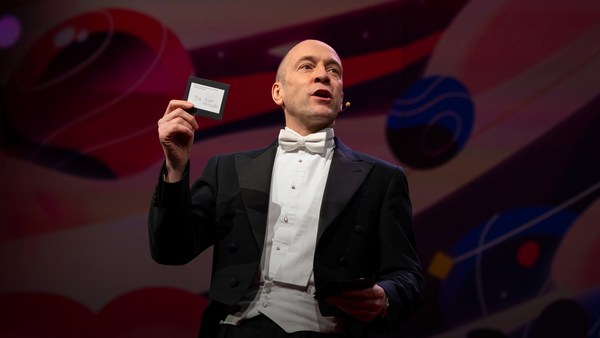
In 1969 in July, three Americans launched into space. Now, they went to the surface of the moon, they famously made the great leap for mankind. Buzz Aldrin, Neil Armstrong, they walked on the surface, they planted this flag. It's rightly celebrated as a moment that in America we say is a triumph. We think it was this amazing accomplishment. They didn't just leave behind this flag, though. They also left behind a plaque. This plaque is a beautiful object, and one that I want to talk to you a little bit about. First, you might notice that there's two globes, representing all of earth. And then there's this beautiful statement: "We came in peace for all mankind." Now, at first, this is just nice poetic language, but it's also set in a typeface that's perfect for this moment. It seems industrial, it seems engineered. It also is the best possible name you could come up with for something on the moon: Futura.
In juli 1969 werden drie Amerikanen de ruimte in geschoten. Ze gingen naar het maanoppervlakte en waagden de bekende grote sprong voor de mensheid. Buzz Aldrin en Neil Armstrong zetten voet op de oppervlakte, ze plantten deze vlag. Het wordt in Amerika terecht gezien als een triomfantelijk moment. We vinden het een geweldige prestatie. Ze lieten trouwens niet alleen deze vlag achter, maar ook een gedenkplaat. Dit is een prachtig object en daar wil ik het met jullie over hebben. Ten eerste zie je twee wereldbollen die de aarde voorstellen. Dan staat er deze mooie verklaring: "We kwamen in vrede voor de hele mensheid". Dit lijkt gewoon mooie poëtische taal, maar het is ook gezet in een lettersoort die perfect is voor dit moment. Het lijkt industrieel en geconstrueerd. Het is ook de best mogelijke naam die je kunt verzinnen voor iets op de maan: Futura.
Now, I want to talk to you about fonts, and why this typeface is perfect for this moment. But it's actually more than just ceremonial. Now, when all of you arrived here today, you actually had to think about fonts. You might not realize it, but you're all unconscious experts on typography. Typography is the study of how fonts inhabit our world, they're the visual language of the words we use. Here's the thing that's funny about this, though. I know you're probably not like me, you're not a font nerd, maybe some of you are, but if you're not, that's alright, because I might spend hours every day trying to pick the perfect typeface for the perfect project, or I might spend thousands of dollars every year, trying to get ones with the right features. But all of you actually spend hours every day, evaluating fonts. If you don't believe me, think about how you got here. Each of you had to judge by the signs and maybe even on your phone, which signals to trust and which to ignore. You were evaluating fonts.
Ik wil het hebben over lettertypes en waarom deze soort perfect is voor dit moment. Het is niet alleen maar ceremonieel. Toen jullie hier vandaag aankwamen, moesten jullie zowaar nadenken over lettertypes. Je beseft het wellicht niet, maar jullie zijn onbewust allemaal typografie-experts. Typografie is de leer van hoe lettertypes op onze wereld voorkomen. Ze zijn de visuele taal van de woorden die we gebruiken. Maar dit is het grappige: ik weet dat jullie niet zulke fontnerds zijn als ik, een paar misschien, maar zo niet, ook goed, want ik ben dagelijks uren bezig met het kiezen van de juiste lettersoort voor het juiste project, geef duizenden dollars per jaar uit aan soorten met de juiste kenmerken. Maar jullie besteden ook uren per dag aan het keuren van lettertypes. Denk er maar eens aan hoe je hier bent gekomen. Jullie hebben via verkeersborden, misschien op je telefoon, moeten bepalen welke tekens je vertrouwt en welke je negeert. Je beoordeelde lettertypes.
Or maybe when you're just buying a new product, you have to think about whether something is expensive or cheap or hard to get or easy to find. And the funny thing about it is, this may not seem extraordinary to you, but the moment you see something out of place, you recognize it right away.
Of toen je iets nieuws kocht en je erover moest nadenken of iets duur of goedkoop was, of het makkelijk of moeilijk te vinden was. En het grappige is ... Dit lijkt misschien onbeduidend, maar zodra je iets geks ziet, herken je het direct.
(Laughter)
(Gelach)
The thing I love about typography, and why I love fonts and why I love Futura, is that, for me, what I study is everywhere. Every street that I walk down, every book that I pick up, every thing that I read is filled with the thing I love. Now, once you understand the history and what happens with typography, you actually have a history of everything before you.
Waar ik zo van hou bij typografie, waarom ik van lettertypes en van Futura hou, is dat wat ik bestudeer overal is. Iedere straat waar ik loop, elk boek dat ik oppak, alles wat ik lees, staat vol met dat waar ik zo van hou. Als je eenmaal de geschiedenis begrijpt en snapt wat er met typografie gebeurt, heb je eigenlijk de geschiedenis van alles voor je.
And this is the typeface Futura. As previously we've discussed, this is modernism in miniature. This is a way in which modernism infiltrated this country and became perhaps the most popular, or promiscuous typeface, of the twentieth century. "Less is more," right, these are the aphorisms of modernism. And in the visual arts, the same thing happened. Let's focus on the essentials, focus on the basic shapes, focus on geometry. So Futura actually holds this to its core. You might notice that the shapes inherent in Futura have circles, squares, triangles. Some of the shapes are all based on circles, like the O, D and C, or others have this pointed apex of the triangle. Others just look like they might have been made with a ruler or a compass. They feel geometric, they feel mathematic, precise. In fact, this whole system carries through with the way that the typeface was designed. To not look like it was made like other typefaces, to be something new. Here it is in the lightweight, the medium weight and the bold weight. The whole family has different things to commend to it.
Dit is de lettersoort Futura. Zoals we al eerder bespraken, is dit modernisme in het klein. Dit is de manier waarop modernisme ons land binnenkwam en misschien wel het meest gebruikte, meest promiscue lettersoort van de twintigste eeuw is geworden. 'Minder is meer', dat is het aforisme van het modernisme. In de beeldende kunst gebeurde hetzelfde. Laten we ons richten op de essentie, op de basisvormen, op geometrie. Dat is waar het bij Futura in de kern om gaat. Het valt misschien op dat Futura's basisvormen cirkels, vierkanten en driehoeken zijn. Sommige zijn gebaseerd op cirkels, zoals de O, D en C. Anderen hebben de puntige uitloper van een driehoek. Anderen zien eruit alsof ze zijn gemaakt met een lineaal of kompas. Ze voelen geometrisch, wiskundig, exact aan. En dit hele stelsel laat zien dat deze lettersoort is ontworpen om er niet uit te zien zoals anderen, om iets nieuws te zijn. Hier zijn de magere, normale en vetgedrukte varianten. De hele familie heeft prijzenswaardige eigenschappen.
This was a conscious break from the past, something that looked like it was made by a machine, and not by hand. When I say not made by hand, this is what I mean. This is what we think about maybe, when you might create something with a calligraphic brush or a pen. That there's thicks and thins. And even more traditional typefaces, say like a Garamond, holds vestiges of this old system in which you can see the A where it get little bit thinner at the top and thicker down below, because it's trying to look like someone had made it by hand. But Futura, in contrast, is designed to look like no one had touched it at all, that this was made by a machine, for a machine age, for an industrial age.
Dit was een bewuste breuk met vroeger. Iets wat er machinaal uitzag en niet als met de hand gemaakt. En dit bedoel ik met niet met de hand gemaakt: hier denken we misschien aan als we iets met een kalligrafiekwast of met een pen maken. Er zijn dikke en dunne lijnen. Zelfs meer traditionele lettersoorten, zoals Garamond, vertonen tekenen van dat oude systeem, waarbij je ziet dat de A bovenin wat dunner is en onderin wat dikker, zodat het lijkt alsof het met de hand gemaakt is. Futura is daarentegen ontworpen om eruit te zien alsof het door een machine gemaakt is voor een machinaal of industrieel tijdperk. Het bevat eigenlijk een trucje,
There's actually a sleight of hand here that Paul Renner, the designer who made this in 1927, employed. If you look at the way in which the circular shape joins with the vertical shaft, you'll notice that it tapers just every so slightly. And this is one of hundreds of ways in which this typeface was designed to look geometrically perfect, even though it's mathematically not. And this is what typeface designers do all the time to make typefaces work, every day.
ingezet door Paul Renner, die dit in 1927 ontwierp. Als je kijkt naar hoe de cirkelvorm met de verticale steel samenkomt, zul je zien dat het licht taps toeloopt. Dit is een van de vele manieren waarop het werd ontworpen om er geometrisch perfect uit te zien, ook al is het dat wiskundig gezien niet. Dit doen lettersoortontwerpers constant, zodat lettersoorten iedere dag werken, Tegelijk waren er in Europa en Amerika andere ontwerpers mee bezig.
Now, there were other designers doing this at the same time in Europe and America. These are a few other excellent examples from Europe, trying to create something new for the new age, a new moment in time. These are some other ones in Germany that in some ways look very similar to Futura, maybe with higher waist or lower waist or different proportions. Then why did Futura take over the world? In this case, if you can read the titles there, some of these names don't quite roll off the tongue: Erbar, Kabel Light, Berthold-Grotesk, Elegant-Grotesk. These aren't exactly household names, are they? And so when you compare that to Futura, you realize that this was a really good choice by the marketing team.
Dit zijn een aantal geweldige voorbeelden uit Europa, waar werd getracht iets nieuws te maken voor het nieuwe tijdperk. Nog een aantal uit Duitsland, die ergens nogal op Futura lijken, misschien met meer of minder versmalling of andere verhoudingen. Maar waarom veroverde Futura de wereld? In dit geval -- als je de titels kunt lezen -- rollen enkele van deze namen niet zo lekker van de tong: Erbar, Kabel Light, Berthold-Grotesk, Elegant-Grotesk. Dit zijn niet echt alledaagse namen, toch? Wanneer je ze vergelijkt met Futura, weet je dat dit een heel goede keuze van het marketingteam was.
What's amazing about this name -- you know, what's in this name is that this is a name that actually invokes hope and an idea about the future. And this isn't actually the word for future in German, it wasn't a German name, they actually picked something that would speak to a wider, larger audience, a universal audience. And when you compare it to what was being done in America -- these are the typefaces from the same period in the United States in the 1920s, bold, brash, braggadocios. You almost think of this as exactly like what the stock market looked like when they were all going nuts in the 1920s. And you realize that Futura is doing something revolutionary.
Wat zo geweldig is aan deze naam ... Wat deze naam in zich draagt, is dat het een naam is die hoop oproept en een idee over de toekomst. En dit is niet eens het Duitse woord voor toekomst, het was geen Duitse naam, maar ze kozen iets wat een breder en groter, universeel publiek zou aanspreken. Kijk je naar wat er in Amerika gebeurde, dit zijn lettersoorten uit dezelfde periode in de VS, de jaren twintig; gewaagd, brutaal, opschepperig. Het doet bijna denken aan de effectenbeurs van die tijd, de grote gekte van de jaren twintig. Dat doet beseffen dat Futura iets revolutionairs deed. Ik wil even terug
I want to step back and talk about an example of the typeface in use. So this is a magazine that we all probably know today, "Vanity Fair." This is what it looked like in 1929, in the summer. And in many ways, there's nothing wrong with this design. This is absolutely typical of the 1920s. There's a photograph of an important person, in this case Franklin Roosevelt, then-governor of New York. Everything seems centered, everything seems symmetrical. There's still a little bit of ornamentation, so this is still maybe having some vestiges of the painted lady and not fully modernistic. But everything seems kid of solid. There's even drop caps to help you get into the text.
en het hebben over een voorbeeld van deze lettersoort in gebruik. Dit tijdschrift kennen we tegenwoordig allemaal wel, Vanity Fair. Zo zag het eruit in de zomer van 1929. Op veel manieren is er niets mis met dit ontwerp. Dit is echt typisch jaren twintig. Met een foto van een belangrijk iemand, hier Franklin Roosevelt, destijds gouverneur van New York. Alles lijkt gecentreerd en symmetrisch. Er is nog wel wat versiering, misschien nog wat overblijfselen van de 'painted lady', niet geheel modernistisch. Maar het ziet er gedegen uit. Er zijn sierinitialen om je aandacht te trekken.
But this all changed very quickly and in October of 1929, a Berlin-based designer came and redesigned "Vanity Fair." And this is what it looks like with Futura. Instead of the governor now we have a photograph of an abstract, beautiful setting, in this case, the ocean. Instead of drop caps, there's nothing at all. And replaced with a centered layout is now asymmetry. And it gets even more radical the further you enter the magazine. In this case, even more dramatic asymmetry. In this case, illustrations by Pablo Picasso, moving across the page and breaking the gutter of the two pages. And there's something even more radical. If you look closely at the Futura, you might notice something. You might not pick it up at first, but there are no capital letters in the title or the captions on this page. You might not think that's very radical, but pick up any magazine, any book or go to any website, and I guarantee, you are not going to find it very easily. This is still a radical idea.
Maar dit veranderde rap. In oktober 1929 kwam er een Berlijnse ontwerper om Vanity Fair te restylen. En zo ziet het eruit met Futura. In plaats van de gouverneur hebben we nu een foto van een abstracte, prachtige setting, in dit geval de oceaan. In plaats van sierletters is er helemaal niets. En de gecentreerde layout is nu vervangen door asymmetrie. En hoe verder je in het blad komt, hoe radicaler het wordt. In dit geval nog dramatischere asymmetrie. Hier illustraties van Pablo Picasso, die over de pagina bewegen en over de rugmarge vallen. Er is zelfs nog iets radicalers. Als je goed naar Futura kijkt, valt je wellicht iets op. Je ziet het wellicht niet direct, maar er zitten geen hoofdletters in de titel en de bijschriften. Misschien vind je het niet heel radicaal, maar neem een tijdschrift, een boek of ga naar een website en ik verzeker je dat je zoiets niet snel vindt. Dit is nog steeds een radicaal idee.
And why is that radical? When we think about what capital letters denote, they denote something important, whether it's our names, or our titles. Or maybe even just the name of our corporations, or maybe our trademarks. Actually, in some ways, America's the home of capitalization. We love putting capitals in everything.
En waarom is het radicaal? Bedenk eens waar hoofdletters op duiden. Ze duiden op iets belangrijks, of het nou onze naam of titel is, of misschien de naam van ons bedrijf, of misschien onze merken. Amerika loopt in bepaald opzicht voorop wat betreft hoofdlettergebruik. We maken graag overal hoofdletters van.
(Laughter)
(Gelach)
But think about how radical this would be to introduce a magazine where you're taking away all the capital letters. This has maybe had the same political force that we now argue over things like pronouns in our society today. In the 1920s, this is just shortly after Soviet Russia had a communist revolution. And for them, this actually represented a socialist infiltration into America. All lowercase letters meant that this was an egalitarian, complete lowering of everything into one equal playing field. Now this is still kind of a radical idea. Think about how often you do capitalize something to have more power or prestige to it. So for them to do this was a way in which Futura was using this idea.
Maar hoe radicaal zou het zijn om een tijdschrift zonder hoofdletters te introduceren? Het had wellicht dezelfde politieke impact als onze maatschappelijke discussie over persoonlijke voornaamwoorden. In de jaren twintig ... Dit was net nadat in de Sovjet Unie de communistische revolutie plaatsvond. Voor hen representeerde dit de socialistische infiltratie van Amerika. Alles in kleine letters was een egalitaire, volledige verlaging van alles tot een gelijkwaardig speelveld. Nog steeds tamelijk radicaal. Bedenk hoe vaak je hoofdletters gebruikt om iets meer kracht of status te geven. Voor hen was Futura een middel om dit idee over te brengen. Andere ontwerpers deden weer andere dingen met Futura
Now, other designers were doing other things with Futura. Others brought other ideas of modernism with it, whether it was interesting new illustration styles, or interesting new collage types of illustration. Or even just new book covers, whether they were from Europe.
en voegden andere ideeën uit het modernisme toe, of dat nu nieuwe illustratiestijlen waren, of collage-achtige illustraties, of alleen nieuwe boekomslagen uit Europa. Maar dit is het grappige:
But here's the funny thing. In the 1920s, if you wanted to use a new typeface, you couldn't just go download it onto your computer. You actually had to have pieces of lead. So for Americans who wanted to adopt this and make it part of their own system, something they could use in everyday typography, whether in ads or anything else, they actually had to have metal type.
in de jaren twintig kon je niet gewoon even een nieuwe lettersoort downloaden. Je moest echt stukjes lood hebben. Dus Amerikanen die dit wilden gebruiken en het in hun eigen systeem wilden opnemen -- iets wat in de alledaagse typografie gebruikt kon worden, in advertenties of wat dan ook -- hadden echt de metalen drukletters nodig.
So being good American capitalists, what did we do? We made all sorts of copies. Ones that had nothing to do with the name Futura, but looked identical to it, whether it was Spartan or Tempo. And in fact, by the time that World War II started, American corporations were actually trying to boycott Nazi goods. But they said, "Go ahead and use our copies. Use 20th Century, use Spartan, use Vogue, use Tempo. These are identical to Futura." And in fact, for most people, they didn't even learn the new names, they just still called it all Futura. So America took this typeface in, conquered it and made it its own. So by the time World War II finishes, Americans are using this on everything, whether it be catalogs, or atlases, or encyclopedias or charts and graphs, or calendars, or even political material. And even the logo for a new expansion football team. And in fact, it was used even on some of the most important advertising of the 20th century.
Dus wat deden we als goede Amerikaanse kapitalisten? We maakten allerlei kopieën die niets te maken hadden met de naam Futura, maar die er precies op leken. Of het nou Spartan of Tempo was. Rond het begin van de Tweede Wereldoorlog probeerden Amerikaanse bedrijven Nazi-goederen eigenlijk te boycotten. Maar ze zeiden: 'Toe maar, gebruik onze kopieën. Gebruik 20th Century, Spartan, Vogue en Tempo. Ze zijn precies gelijk aan Futura.' De meeste mensen leerden niet eens de nieuwe namen, ze bleven het gewoon Futura noemen. Dus Amerika haalde deze lettersoort binnen, veroverde haar en eigende zich haar toe. Tegen het eind van de Tweede Wereldoorlog gebruikten Amerikanen het overal voor. Of het nou catalogi of atlassen waren, encyclopedieën, tabellen en grafieken, of kalenders, zelfs politiek materiaal. Zowaar in het logo van een nieuw American-footballteam en zelfs in de invloedrijkste advertenties van de twintigste eeuw. Dus toen de Amerikaanse overheid een nieuwe lettersoort zocht
So it's in this context that when the US government was picking a typeface to use after World War II for new maps and new projects, they picked Futura. It wasn't an astounding choice, it wasn't a radical choice, it didn't have anything to do with communism. But in this case, it was used on some of the most important maps, so this one, an air force map in 1962, or used for the maps in Vietnam in '66.
om na de Tweede Wereldoorlog voor kaarten en projecten te gebruiken, kwam ze zo bij Futura uit. Het was geen verbazingwekkende of radicale keuze ... en had niets met communisme te maken. Het werd gebruikt op belangrijke kaarten, zoals deze luchtmachtkaart uit 1962, en op de kaarten die in 1966 in Vietnam werden gebruikt.
And so it wasn't a surprise that when astronauts first started the Mercury program, such as John Glenn orbiting the earth, that charts and maps that he was using were in Futura. And in fact, by the time Mercury morphed into Apollo, it started getting used more and more for more things. So in this case for a safety plan, or even starting to get used on instrument panels, or navigational aids. Or even on diagrams to show how the whole system worked.
Het was ook geen verrassing dat toen astronauten begonnen met het Mercury-programma, zoals John Glenns baan om de aarde, de gebruikte tabellen en kaarten Futura bevatten. Tegen de tijd dat Mercury overging in Apollo werd het voor steeds meer dingen gebruikt. In dit geval voor een veiligheidsplan en het werd ook gebruikt op instrumentpanelen en navigatiehulpmiddelen. Zelfs op diagrammen die lieten zien hoe het hele systeem werkte.
But here's the amazing thing, it didn't just get used for papers that they handed out to people. It started to get used for an interface, for an entire system that helped the astronauts know how to use the machine. NASA wasn't just one big corporation making everything. There was hundreds of contractors -- Boeing, IBM, McDonnell Douglas -- all making different machines. Now imagine if astronauts had to use different typefaces and different systems for each component they had in the space shuttles. This would have been impossible to navigate and there would have been a cognitive overload every time they had to open up a new system. So in this case, Futura being used on the interface helped them navigate complexity and make it more clear. And it wasn't just used on buttons, it was used on labels, and it was used on their food rations, and it was used on their tool kits. It was used on knobs and levers to tell them what to do. In fact, maybe even some of the places where they needed to have things that were complex be more simple to them, instructions were printed entirely in Futura, so that they could know what to do with that one moment. They didn't have to remember everything in their head, they could have it out there in the world to see and refer to. In this case, Futura helped make that system, which was already a very difficult and complex system, a little less complex. In fact, the very first or last thing an astronaut might have seen when they were entering or exiting the spacecraft would have been in Futura.
Maar het bijzondere is: het werd niet alleen gebruikt op papieren die werden uitgedeeld, het werd ook gebruikt voor een interface voor een heel systeem dat de astronauten leerde omgaan met de machine. NASA was niet één groot bedrijf dat alles maakte. Er waren honderden onderaannemers -- Boeing, IBM, Mc Donnell Douglas -- die allerlei machines maakten. Stel dat astronauten gebruik moesten maken van diverse lettersoorten en systemen voor elk onderdeel van de spaceshuttle. Navigeren zou ondoenlijk zijn en het opstarten van een nieuw systeem zou tot cognitieve overbelasting leiden. Het feit dat Futura werd gebruikt voor de interface was een hulpmiddel om alles duidelijker te maken. Het werd niet alleen op knoppen gebruikt, maar ook op labels, voedselrantsoenen en gereedschapskits. Het werd gebruikt op knoppen en hendels om hun te vertellen wat te doen. Misschien zelfs op enkele plekken waar ingewikkelde dingen makkelijker moesten worden gemaakt, werden instructies volledig in Futura gedrukt, zodat ze op dat ene moment juist konden handelen. Ze hoefden niet alles te onthouden; ze hadden dit om er zo nodig gebruik van te maken. In dit geval hielp Futura om het systeem, dat toch al erg lastig en complex was, iets minder lastig te maken. Het allereerste of allerlaatste wat astronauten zagen wanneer ze het ruimteschip in- of uitgingen, was in Futura.
One of my favorite examples of how Futura worked in this way is actually this camera. This is a Hasselblad that was made by the Swedish company. It's a perfectly good camera, some of you might have used one, it's prized by photographers as a really great camera. And you might notice, if you know anything about cameras, that there's some modifications made to it. In this case, there are stickers placed all over the film canisters, or other parts of the camera here. What this enabled NASA to do, was make something really great out of the astronauts. They're not photographers, they're not experts in art. But they could ensure that they would know how to use this camera because of the labels placed there in Futura.
Een van mijn favoriete voorbeelden van Futura's functionaliteit is dit fototoestel. Dit is een Hasselblad, gemaakt door een Zweeds bedrijf. Prima toestel, misschien hebben jullie het wel eens gebruikt, het wordt door fotografen geprezen als een heel goed toestel. Als je er wat verstand van hebt dan valt je misschien op dat er wat aanpassingen aan zijn gedaan. In dit geval zitten er stickers op de filmkokers en op andere delen van de camera. Dit stelde NASA in staat om via de astronauten iets geweldigs te bewerkstelligen. Ze zijn geen fotografen of kunstexperts, maar men kon zorgen dat ze de camera konden bedienen, vanwege de labels met Futura erop.
So in this case, Futura acquired and made sure that they had legitimacy with the things they were using. In this case to not take off the film before it would expose. Which, in this case, we would have never had some of the amazing photos we had without this label. When we see something as decorative as this, a ceremonial patch, or something like this plaque on the moon, we realize that Futura was more than just something ceremonial, something more than something that had just been picked for its design. In fact, Futura had authority, had legitimacy and had power because of this choice.
In dit geval verkreeg Futura bestaansrecht via de dingen die gebruikt werden. Bijvoorbeeld dat men de fotocassette niet te vroeg zou belichten. We zouden een aantal geweldige foto's zonder dit label nooit gehad hebben. Wanneer we iets decoratiefs zoals deze ceremoniële insigne zien, of iets als deze gedenkplaat op de maan, realiseren we ons dat Futura meer was dan iets ceremonieels. Meer dan alleen maar iets dat was gekozen vanwege het ontwerp. Futura had in feite autoriteit, bestaansrecht en kracht vanwege deze keuze.
There's one other thing I want to talk about in closing. And that is that Futura tells a story. And this is what I love about typefaces, is that all of them tell stories. And in this case, this typeface tells a very powerful story about assimilation, about something being taken into America and being made part of its culture. And that's one of the best and worst things America does, is we take things into our culture and we spit them out back again and claim them our own. And in this case, Futura mirrors exactly what happened with the technology undergirding the whole system. Futura was a German typeface, taken in, made into an American commodity. And so were the technologies: the rockets, the scientists all came from Germany as well. So in some ways, this German typeface on an American plaque perfectly mirrors what happened with the technology. And in this case, when you think about this story, you realize that typography on the moon represents legitimacy, represents authority, and this gave them, the astronauts, the power to get to the moon.
Tot slot wil ik het nog over een ding hebben. En dat is dat Futura een verhaal vertelt. Ik hou ervan dat lettersoorten allemaal een verhaal vertellen. In dit geval vertelt het een krachtig verhaal over assimilatie, over iets wat meegenomen is naar Amerika en onderdeel werd van de cultuur. Dat is een van Amerika's beste en slechtste eigenschappen: we nemen iets op in onze cultuur en spuwen het weer uit met de claim dat het van ons is. In dit geval weerspiegelt Futura precies wat er met de technologie gebeurde die het hele systeem ondersteunde. Futura was een Duitse lettersoort die tot Amerikaans product gemaakt werd. Net als de technologieën: de raketten en wetenschappers, kwamen ook uit Duitsland. Dus deze Duitse lettersoort op een Amerikaanse gedenkplaat weerspiegelt exact wat deze technologie overkwam. In dit geval ... Wanneer je aan dit verhaal denkt, zul je beseffen dat typografie op de maan voor bestaansrecht staat, voor autoriteit staat, en dat dit hun, de astronauten, de kracht gaf om naar de maan te gaan.
Thank you.
Dank jullie wel.
(Applause)
(Applaus)