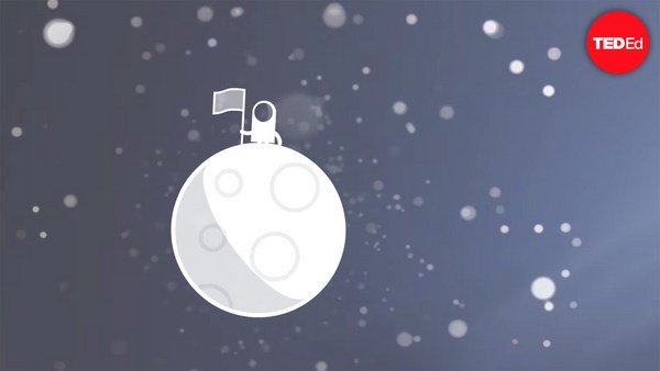
In 1969 in July, three Americans launched into space. Now, they went to the surface of the moon, they famously made the great leap for mankind. Buzz Aldrin, Neil Armstrong, they walked on the surface, they planted this flag. It's rightly celebrated as a moment that in America we say is a triumph. We think it was this amazing accomplishment. They didn't just leave behind this flag, though. They also left behind a plaque. This plaque is a beautiful object, and one that I want to talk to you a little bit about. First, you might notice that there's two globes, representing all of earth. And then there's this beautiful statement: "We came in peace for all mankind." Now, at first, this is just nice poetic language, but it's also set in a typeface that's perfect for this moment. It seems industrial, it seems engineered. It also is the best possible name you could come up with for something on the moon: Futura.
1969년 7월 미국인 세 명이 우주로 출발했습니다. 그들은 달 표면에 도착해 익히 알려진, 인류의 위대한 도약을 해냈습니다. 버즈 올드린과 닐 암스트롱이 달 표면에 내려서 깃발을 세웠습니다. 당연히 미국은 그 순간을 커다란 승리로 기념했습니다. 모두가 놀라운 업적이라 생각합니다. 하지만 달에 남기고 온 건 깃발만이 아닙니다. 기념패도 하나 남겼습니다. 이 아름다운 기념패에 대해 여러분께 말씀드리려고 합니다. 먼저 여기, 지구 전역을 나타낸 지구본 그림 두 개가 보입니다. 여기 아름다운 구절이 새겨져 있습니다. “인류에 평화를 전하러 왔습니다.” 일단, 이 구절은 시적으로 아름다울 뿐만 아니라 처음 달에 도착한 순간을 전하기 위해 가장 적절한 글꼴로 쓰였습니다. 이 글꼴은 산업 예술적이며 공학적인 느낌이 듭니다. 또한 달에 존재하는 것을 위한 가장 멋진 이름을 가지고 있죠. 푸투라(미래).
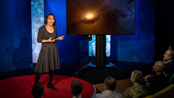
Now, I want to talk to you about fonts, and why this typeface is perfect for this moment. But it's actually more than just ceremonial. Now, when all of you arrived here today, you actually had to think about fonts. You might not realize it, but you're all unconscious experts on typography. Typography is the study of how fonts inhabit our world, they're the visual language of the words we use. Here's the thing that's funny about this, though. I know you're probably not like me, you're not a font nerd, maybe some of you are, but if you're not, that's alright, because I might spend hours every day trying to pick the perfect typeface for the perfect project, or I might spend thousands of dollars every year, trying to get ones with the right features. But all of you actually spend hours every day, evaluating fonts. If you don't believe me, think about how you got here. Each of you had to judge by the signs and maybe even on your phone, which signals to trust and which to ignore. You were evaluating fonts.
지금부터 글꼴에 대해 소개하고, 왜 이 글꼴이 달 착륙에 적절한지 말씀드리죠. 그건 단순히 의례적으로 사용한게 아녔어요. 사실 여러분 모두 오늘 이 장소에 오셨을 때 글꼴에 대해 생각하셨을 겁니다. 비록 의식하지 않았더라도 여러분 모두 무의식적으로 타이포그래피 전문가입니다. 타이포그래피는 글꼴이 세상에 어떻게 사용되는지 연구하는 학문이고, 글꼴은 세계 모든 사람이 사용하는 시각언어입니다. 여기 재미있는 점이 있습니다. 여러분은 저처럼 글꼴에 집착하는 사람이 아닐 겁니다. 물론 예외도 있을 수 있지만, 아니더라도 괜찮습니다. 저는 프로젝트에 적합한 글꼴을 찾기 위해 매일 몇 시간을 쓸 때도 있고 적절한 특징이 있는 글꼴을 얻기 위해 매년 수천 달러를 쓰기도 하죠. 하지만 여러분도 일상적으로 글꼴을 평가합니다. 믿기 힘드시다면, 여기 어떻게 오셨는지 생각해보세요. 도로 표지판을 보며 길을 찾았고 심지어 휴대폰에서도 어떤 신호는 신뢰하고 어떤 신호는 무시할지 고민합니다. 글꼴을 평가하면서요.
Or maybe when you're just buying a new product, you have to think about whether something is expensive or cheap or hard to get or easy to find. And the funny thing about it is, this may not seem extraordinary to you, but the moment you see something out of place, you recognize it right away.
또 새로운 물건을 살 때 어떤 물건이 비싸거나 저렴한지 혹은 구하기 어렵거나 쉽게 구할 수 있는지 고민해야 합니다. 재미있는 점은 대단해 보이지 않을 수도 있지만 뭔가 어색하게 사용된 글꼴을 보면 바로 눈치챈다는 사실이죠.
(Laughter)
(웃음)
The thing I love about typography, and why I love fonts and why I love Futura, is that, for me, what I study is everywhere. Every street that I walk down, every book that I pick up, every thing that I read is filled with the thing I love. Now, once you understand the history and what happens with typography, you actually have a history of everything before you.
제가 타이포그래피를 사랑하고 글꼴과 푸투라를 사랑하는 이유는 글꼴을 제가 모든 영역에서 연구하기 때문입니다. 발걸음이 닿는 길거리와 손에 닿는 모든 책을 더불어 읽을 수 있는 모든 것이 사랑하는 글꼴로 가득 차 있습니다. 이제, 타이포그래피의 역사와 여기에 일어난 사건을 이해한다면 이전에 일어난 모든 것들의 역사를 간직하게 될 것입니다.
And this is the typeface Futura. As previously we've discussed, this is modernism in miniature. This is a way in which modernism infiltrated this country and became perhaps the most popular, or promiscuous typeface, of the twentieth century. "Less is more," right, these are the aphorisms of modernism. And in the visual arts, the same thing happened. Let's focus on the essentials, focus on the basic shapes, focus on geometry. So Futura actually holds this to its core. You might notice that the shapes inherent in Futura have circles, squares, triangles. Some of the shapes are all based on circles, like the O, D and C, or others have this pointed apex of the triangle. Others just look like they might have been made with a ruler or a compass. They feel geometric, they feel mathematic, precise. In fact, this whole system carries through with the way that the typeface was designed. To not look like it was made like other typefaces, to be something new. Here it is in the lightweight, the medium weight and the bold weight. The whole family has different things to commend to it.
이것이 푸투라 체 입니다. 앞서 이야기 한 바와 같이, 이 글꼴은 축소판 모더니즘입니다. 이 글꼴을 통해 모더니즘이 미국으로 스며들었으며, 푸투라는 20세기 들어 가장 많이 쓰였거나 가장 많은 종류의 글꼴로 파생되었죠. “적을수록 좋다,” 이는 모더니즘의 경구입니다. 시각예술에서 같은 일이 벌어졌습니다. 본질과 기본 형태에 집중하고 기하학적 구조에 주목하자. 푸투라는 이러한 요소를 핵심으로 생각합니다. 눈치채셨겠지만, 푸투라의 형태는 동그라미, 네모, 세모를 내부에 간직합니다. 글자 몇 개는 모두 동그라미에 기반합니다. O와 D 그리고 C가 그렇고 다른 글자는 세모처럼 꼭짓점을 가집니다. 다른 글자들은 마치 자나 컴퍼스로 그린 것처럼 생겼습니다. 기하학적이고, 수학적이며, 정교한 느낌을 줍니다. 사실 이 모든 체계가 글꼴을 디자인하는 방식에 일관적으로 적용됩니다. 한 글자를 어떤 글자와 다른 모습으로, 뭔가 새롭게 만들려면 이처럼 얇은 형태, 중간 형태, 두꺼운 형태가 있습니다. 글꼴 전체가 서로 다른 매력을 가지고 있습니다.
This was a conscious break from the past, something that looked like it was made by a machine, and not by hand. When I say not made by hand, this is what I mean. This is what we think about maybe, when you might create something with a calligraphic brush or a pen. That there's thicks and thins. And even more traditional typefaces, say like a Garamond, holds vestiges of this old system in which you can see the A where it get little bit thinner at the top and thicker down below, because it's trying to look like someone had made it by hand. But Futura, in contrast, is designed to look like no one had touched it at all, that this was made by a machine, for a machine age, for an industrial age.
이는 과거와 분리되려는 의식적인 경향으로 손으로 쓴 게 아니라 기계로 만든 듯한 느낌을 줍니다. 손으로 쓴 글꼴은 이렇게 생겼습니다. 이 글꼴은 사람들에게 서예용 붓이나 펜으로 쓴 것 같다는 느낌을 줍니다. 선의 두께가 다릅니다. 가라몬드처럼 더 전통적인 글꼴은 오래된 시스템의 영향을 간직하여 이처럼 A의 꼭대기에서 더 가늘어지고 아래로 갈수록 두꺼워지죠. 이 글꼴은 손으로 쓴 느낌을 주려고 하기 때문입니다. 대조적으로, 푸투라는 사람이 손으로 쓴 느낌을 주지 않도록 디자인되었고 기계가 만들어서 기계 문명과 산업 시대에 더 적합한 느낌을 주죠.
There's actually a sleight of hand here that Paul Renner, the designer who made this in 1927, employed. If you look at the way in which the circular shape joins with the vertical shaft, you'll notice that it tapers just every so slightly. And this is one of hundreds of ways in which this typeface was designed to look geometrically perfect, even though it's mathematically not. And this is what typeface designers do all the time to make typefaces work, every day.
이 글꼴에서 1927년 푸투라를 개발한 파울 레너(Paul Renner)가 도입한 기교를 볼 수 있습니다. 여러분이 자세히 보신다면 동그라미 모양이 수직축과 만나는 형태가 조금씩 가늘어지는 모습을 발견할 것입니다. 이 방법은 글꼴이 기하학적으로 완벽해 보이도록 디자인하는 수백 가지 방법 중 하나입니다. 비록 수학적으로는 완벽하지 않지만요. 이러한 작업은 글꼴 디자이너들이 적절한 글꼴을 개발하기 위해 매일 하는 노력입니다.
Now, there were other designers doing this at the same time in Europe and America. These are a few other excellent examples from Europe, trying to create something new for the new age, a new moment in time. These are some other ones in Germany that in some ways look very similar to Futura, maybe with higher waist or lower waist or different proportions. Then why did Futura take over the world? In this case, if you can read the titles there, some of these names don't quite roll off the tongue: Erbar, Kabel Light, Berthold-Grotesk, Elegant-Grotesk. These aren't exactly household names, are they? And so when you compare that to Futura, you realize that this was a really good choice by the marketing team.
같은 시기 유럽과 미국의 디자이너들이 비슷한 시도를 했습니다. 유럽에서 건너온 몇 가지 훌륭한 사례가 있습니다. 새로운 시대에 맞는 새로운 글꼴을 만들고자 했습니다. 독일에서 나온 이 글꼴들은 푸투라와 몇 가지 측면에서 매우 유사한데 높낮이나 비율은 다를 것입니다. 그런데 왜 푸투라가 세계를 지배했을까요? 이 화면에 나온 글꼴의 이름을 보시면 몇몇 이름은 발음하기 무척 까다롭습니다. 에르바, 카벨 라이트, 벨톨트 그로테스크, 엘레강트 그로테스크 누구에게나 익숙한 이름은 아닙니다. 그렇죠? 이 이름을 푸투라와 비교해보시면 홍보 부서에서 이름을 정말 잘 골랐다는 것을 알 수 있습니다.
What's amazing about this name -- you know, what's in this name is that this is a name that actually invokes hope and an idea about the future. And this isn't actually the word for future in German, it wasn't a German name, they actually picked something that would speak to a wider, larger audience, a universal audience. And when you compare it to what was being done in America -- these are the typefaces from the same period in the United States in the 1920s, bold, brash, braggadocios. You almost think of this as exactly like what the stock market looked like when they were all going nuts in the 1920s. And you realize that Futura is doing something revolutionary.
이 이름이 놀라운 점은, 아시다시피, 이 이름에 들어 있는 의미가 실제로 미래에 대한 희망과 발상을 일깨운다는 사실입니다. 이 이름은 독일에서 미래를 의미하지 않습니다. 독일어가 아니거든요. 더 넓고 커다란 영역에서 일반적인 사람들이 사용하는 낱말에서 따온 이름입니다. 이 이름을 미국에서 사용하던 이름과 비교해봅시다. 이는 1920년 같은 시기 미국에서 나온 글꼴이 볼드, 브래쉬, 브래거도시오스입니다. 이 이름들은 1920년 대공황이 닥쳐 혼란에 빠졌을 때 주식시장에서 사람들이 짓던 표정을 연상하게 합니다. 푸투라라는 이름이 뭔가 혁신적이라는 생각이 들죠.
I want to step back and talk about an example of the typeface in use. So this is a magazine that we all probably know today, "Vanity Fair." This is what it looked like in 1929, in the summer. And in many ways, there's nothing wrong with this design. This is absolutely typical of the 1920s. There's a photograph of an important person, in this case Franklin Roosevelt, then-governor of New York. Everything seems centered, everything seems symmetrical. There's still a little bit of ornamentation, so this is still maybe having some vestiges of the painted lady and not fully modernistic. But everything seems kid of solid. There's even drop caps to help you get into the text.
이제 한 걸음 물러나 글꼴이 사용되는 사례를 보여드리겠습니다. 이 잡지는 오늘날 대부분이 알고있는 “베니티 페어”입니다. 1929년 여름 판의 모습입니다. 여러 측면에서 디자인적인 문제가 없습니다. 이 잡지는 1920년대의 가장 전형적인 구성입니다. 중요 인물의 사진이 있습니다. 당시 뉴욕 상원의원이던 프랭클린 루스벨트의 사진입니다. 모든 요소가 중앙을 기준으로 대칭을 이룹니다. 여전히 장식적 요소가 약간 남아 있는데 이는 빅토리아 양식의 흔적이 약간 남아있는 것으로 완전히 현대적이지는 않죠. 하지만 모든게 견고하게 보이죠. 심지어 첫 글자를 강조하여 읽기 쉽게 도와줍니다.
But this all changed very quickly and in October of 1929, a Berlin-based designer came and redesigned "Vanity Fair." And this is what it looks like with Futura. Instead of the governor now we have a photograph of an abstract, beautiful setting, in this case, the ocean. Instead of drop caps, there's nothing at all. And replaced with a centered layout is now asymmetry. And it gets even more radical the further you enter the magazine. In this case, even more dramatic asymmetry. In this case, illustrations by Pablo Picasso, moving across the page and breaking the gutter of the two pages. And there's something even more radical. If you look closely at the Futura, you might notice something. You might not pick it up at first, but there are no capital letters in the title or the captions on this page. You might not think that's very radical, but pick up any magazine, any book or go to any website, and I guarantee, you are not going to find it very easily. This is still a radical idea.
하지만 이 모든 게 빠르게 바뀌었는데 1929년 10월 베를린 출신 디자이너가 “베니티 페어”를 새로 디자인했거든요. 이게 푸투라를 사용한 모습입니다. 상원의원 대신 추상적이고 아름다운 배경 사진이 자리 잡았습니다. 여기에서는 바다입니다. 첫 글자를 강조하는 대신 아무것도 없습니다. 가운데로 집중하던 레이아웃은 이제 비대칭 구조로 바뀌었습니다. 잡지를 들여다볼수록 점점 더 급진적인 형태를 띱니다. 이는 더 극적인 비대칭입니다. 여기서는 파블로 피카소의 일러스트가 책 사이의 공간을 뚫고 페이지를 가로질러 움직입니다. 여기 심지어 더 급진적인 요소가 있어요. 푸투라를 자세히 살펴보면 무언가 눈에 띌 것입니다. 첫 눈에 보기는 어렵겠지만 이 페이지의 제목과 캡션에는 대문자가 단 하나도 없습니다. 급진적이라 생각하지 않으실 수 있지만 어떤 잡지와 책에서도, 어떤 웹사이트를 들어가 봐도 제가 보장해요. 대문자를 쓰지 않는 경우는 찾기 어렵죠. 이는 지금도 여전히 급진적인 발상입니다.
And why is that radical? When we think about what capital letters denote, they denote something important, whether it's our names, or our titles. Or maybe even just the name of our corporations, or maybe our trademarks. Actually, in some ways, America's the home of capitalization. We love putting capitals in everything.
이게 왜 급진적일까요? 사람들은 대문자가 뭔가 중요한 것을 나타낸다고 생각합니다. 이름이나 직함, 그저 기업명을 나타내거나, 혹은 상표를 말이죠. 사실 여러 면에서 미국은 대문자 사용의 고향입니다. 모든 곳에 대문자 넣기를 좋아합니다.
(Laughter)
(웃음)
But think about how radical this would be to introduce a magazine where you're taking away all the capital letters. This has maybe had the same political force that we now argue over things like pronouns in our society today. In the 1920s, this is just shortly after Soviet Russia had a communist revolution. And for them, this actually represented a socialist infiltration into America. All lowercase letters meant that this was an egalitarian, complete lowering of everything into one equal playing field. Now this is still kind of a radical idea. Think about how often you do capitalize something to have more power or prestige to it. So for them to do this was a way in which Futura was using this idea.
그러니 잡지에서 대문자를 빼자는 생각을 도입하는 것이 얼마나 급진적이었을지 생각해보세요. 마치 지금 우리 사회에서 성별을 지칭하는 대명사를 두고 논쟁하는 것과 같은 정치적 힘을 가졌을 것입니다. 1920년대에, 구소련이 공산주의 혁명을 일으킨 지 얼마 지나지 않은 시점이었습니다. 대문자를 미사용은 사회주의 사상이 미국으로 침범함을 의미했습니다. 따라서 모든 소문자는 평등주의, 모든 것을 낮추어 공평한 경쟁의 장을 이루는 사상을 의미했습니다. 이는 여전히 급진적인 발상입니다. 얼마나 자주 대문자를 사용하여 더 많은 힘과 위신을 부여하는지 생각해보세요. 따라서 이는 푸투라를 사용하여 사상을 나타내는 방식이었습니다.
Now, other designers were doing other things with Futura. Others brought other ideas of modernism with it, whether it was interesting new illustration styles, or interesting new collage types of illustration. Or even just new book covers, whether they were from Europe.
다른 디자이너들은 푸투라를 사용해 다른 일을 했습니다. 모더니즘이 들어있는 색다른 발상을 도입했는데 여기에는 흥미롭고 새로운 일러스트 스타일과 콜라주 종류의 일러스트가 있고 혹은 그저 유럽에서 건너온 새로운 책 표지도 있었습니다.
But here's the funny thing. In the 1920s, if you wanted to use a new typeface, you couldn't just go download it onto your computer. You actually had to have pieces of lead. So for Americans who wanted to adopt this and make it part of their own system, something they could use in everyday typography, whether in ads or anything else, they actually had to have metal type.
하지만 여기 재미있는 점이 있습니다. 1920년대에는 새로운 글꼴을 사용하고 싶어도 단순히 컴퓨터를 이용해 다운로드할 수 없었죠. 납으로 만든 활판 조각이 필요했습니다. 미국인들은 이 글꼴을 도입해 그들 고유의 시스템으로 편입시켜 일상의 타이포그래피로 광고나 다른 용도에 사용하고 싶었기 때문에 금속활자를 확보해야 했습니다.
So being good American capitalists, what did we do? We made all sorts of copies. Ones that had nothing to do with the name Futura, but looked identical to it, whether it was Spartan or Tempo. And in fact, by the time that World War II started, American corporations were actually trying to boycott Nazi goods. But they said, "Go ahead and use our copies. Use 20th Century, use Spartan, use Vogue, use Tempo. These are identical to Futura." And in fact, for most people, they didn't even learn the new names, they just still called it all Futura. So America took this typeface in, conquered it and made it its own. So by the time World War II finishes, Americans are using this on everything, whether it be catalogs, or atlases, or encyclopedias or charts and graphs, or calendars, or even political material. And even the logo for a new expansion football team. And in fact, it was used even on some of the most important advertising of the 20th century.
유능한 자본주의자 미국인들이 뭘 했을까요? 모든 종류의 모조 글꼴을 만들죠. 푸투라와 전혀 상관없는 이름이지만 생김새는 똑같은 스파르탄이나 템포 같은 글꼴이 탄생했습니다. 사실 2차 세계대전이 발발한 무렵 미국 기업들은 나치에서 만든 상품을 보이콧하려 했습니다. 그들은 말했죠. “그냥 우리 모조품을 사용하세요. 20세기, 스파르탄, 보그, 템포를 쓰세요. 이 글꼴은 푸투라와 똑같습니다.” 사실 사용자 대부분은 새로운 이름을 기억하지도 않았고 그냥 모두 푸투라라고 불렀습니다. 따라서 미국은 푸투라를 들여와 그걸 정복한 뒤 미국 고유의 것으로 만들었습니다. 2차 세계대전이 끝날 무렵 미국인들은 모조 글꼴을 모든 분야, 카탈로그와 지도책 백과사전과 표와 그래프 달력과 심지어 정치 선전물에도 사용했으며 신흥 미식축구팀 로고에도 사용했습니다. 사실 이 글꼴들은 20세기의 가장 중요한 광고 대부분에도 쓰였어요.
So it's in this context that when the US government was picking a typeface to use after World War II for new maps and new projects, they picked Futura. It wasn't an astounding choice, it wasn't a radical choice, it didn't have anything to do with communism. But in this case, it was used on some of the most important maps, so this one, an air force map in 1962, or used for the maps in Vietnam in '66.
이러한 맥락을 따라 미국 정부는 2차 세계대전 이후 새로운 지도와 새로운 프로젝트에 사용할 글꼴로 푸투라를 골랐습니다. 놀랄만한 선택은 아니었으며, 급진적인 선택도 아니었고, 공산주의와도 아무런 상관이 없었습니다. 하지만 여기서 푸투라는 가장 중요한 지도 가령, 1962년 공군 지도와 1966년 베트남 전쟁에서 사용한 지도에 쓰였죠.
And so it wasn't a surprise that when astronauts first started the Mercury program, such as John Glenn orbiting the earth, that charts and maps that he was using were in Futura. And in fact, by the time Mercury morphed into Apollo, it started getting used more and more for more things. So in this case for a safety plan, or even starting to get used on instrument panels, or navigational aids. Or even on diagrams to show how the whole system worked.
따라서 우주 비행사들이 머큐리 계획을 처음 시작할 당시 존 글렌이 지구 궤도를 돌며 사용한 지도와 도표도 모두 푸투라로 되어있었던 건 놀라운 일이 아니죠. 사실, 머큐리 계획이 아폴로 계획으로 바뀔 무렵 푸투라는 점점 더 다양한 영역에서 사용되기 시작하죠. 안전 계획서에 사용되었고 계기판에도 사용되었으며 운항 보조 장비에도 사용되었어요. 심지어 전체 시스템이 작동하는지 보여주는 도표에도 사용되었죠.
But here's the amazing thing, it didn't just get used for papers that they handed out to people. It started to get used for an interface, for an entire system that helped the astronauts know how to use the machine. NASA wasn't just one big corporation making everything. There was hundreds of contractors -- Boeing, IBM, McDonnell Douglas -- all making different machines. Now imagine if astronauts had to use different typefaces and different systems for each component they had in the space shuttles. This would have been impossible to navigate and there would have been a cognitive overload every time they had to open up a new system. So in this case, Futura being used on the interface helped them navigate complexity and make it more clear. And it wasn't just used on buttons, it was used on labels, and it was used on their food rations, and it was used on their tool kits. It was used on knobs and levers to tell them what to do. In fact, maybe even some of the places where they needed to have things that were complex be more simple to them, instructions were printed entirely in Futura, so that they could know what to do with that one moment. They didn't have to remember everything in their head, they could have it out there in the world to see and refer to. In this case, Futura helped make that system, which was already a very difficult and complex system, a little less complex. In fact, the very first or last thing an astronaut might have seen when they were entering or exiting the spacecraft would have been in Futura.
하지만 놀라운 사실은, 푸투라는 단지 사람에게 나눠주는 설명서에만 사용된게 아니에요. 인터페이스 전반에 사용되기 시작하여 우주비행사가 장치 다루는 법을 알려주는 시스템 전체에 사용되었습니다. NASA는 모든 장치를 스스로 제작하는 거대 기업이 아니었습니다. 수백에 이르는 계약 업체, 보잉, IBM, 맥도널 더글러스, 모두 다른 장치를 만들었죠. 상상해봅시다. 만약 우주 비행사가 우주선 안에 장착된 서로 다른 부품을 이질적인 시스템에서 각자 다른 글꼴로 봐야하면 무슨 일이 일어날까요. 우주 항해가 불가능했을 것입니다. 새로운 시스템을 사용하려 할 때마다 인지 과부하가 올 것입니다. 따라서 인터페이스에 푸투라를 사용하여 복잡한 구조를 살필 수 있게 돕고 더 선명하게 만들었습니다. 단지 버튼 뿐 아니라 라벨에도 사용했으며 간이 식량과 공구 키트에도 사용했습니다. 손잡이와 레버가 어떤 용도인지 알려주는 데에도 사용했습니다. 사실 좀 더 단순하게 만들어야 했던 너무 복잡한 몇몇 장치도 지침은 모두 푸투라로 인쇄했기 때문에 바로 무엇을 해야 할지 알 수 있었습니다. 모든 것을 머릿속에 기억할 필요 없이 바깥으로 꺼내서 보고 지시에 따르면 되었습니다. 여기서 푸투라는 매우 어렵고 복잡한 시스템을 조금 더 알아보기 쉽게 만드는 데 기여했습니다. 사실 비행사들이 우주선에 들어가고 나오며 처음이자 마지막으로 보는 것도 푸투라였을 겁니다.
One of my favorite examples of how Futura worked in this way is actually this camera. This is a Hasselblad that was made by the Swedish company. It's a perfectly good camera, some of you might have used one, it's prized by photographers as a really great camera. And you might notice, if you know anything about cameras, that there's some modifications made to it. In this case, there are stickers placed all over the film canisters, or other parts of the camera here. What this enabled NASA to do, was make something really great out of the astronauts. They're not photographers, they're not experts in art. But they could ensure that they would know how to use this camera because of the labels placed there in Futura.
푸투라가 사용된 사례 중 제가 가장 좋아하는 것 하나는 바로 이 카메라입니다. 이는 스웨덴 회사에서 만든 핫셀블라드라는 카메라입니다. 굉장히 좋은 카메라로, 사용해보신 분이 있을 겁니다. 사진작가들에게 굉장히 훌륭한 카메라로 인정받습니다. 카메라에 대해 알고 계신다면 눈치채셨겠지만 이 카메라는 약간 개조되었습니다. 이 카메라는 필름 통 전면과 다른 부품에 스티커가 붙어있습니다. 이 스티커들은 NASA의 우주 비행사들이 정말로 근사한 사진을 찍게 해줬습니다. 우주 비행사들은 사진작가도 사진 예술 전문가도 아니지만 푸투라로 작성된 라벨을 보고 어떻게 이 카메라를 사용하는지 알 수 있었습니다.
So in this case, Futura acquired and made sure that they had legitimacy with the things they were using. In this case to not take off the film before it would expose. Which, in this case, we would have never had some of the amazing photos we had without this label. When we see something as decorative as this, a ceremonial patch, or something like this plaque on the moon, we realize that Futura was more than just something ceremonial, something more than something that had just been picked for its design. In fact, Futura had authority, had legitimacy and had power because of this choice.
이 경우에, 푸투라는 우주 비행사들이 적절하게 그들이 사용하는 장비를 다룰 수 있게 해줬습니다. 여기서는 노출되기 전에 필름을 벗기지 말라고 합니다. 이 라벨이 없었더라면 그 놀라운 사진들을 볼 수 없었을 것입니다. 장식용품을 볼 때도, 이런 기념 견장이나 달에 있는 기념패 같은 것은 푸투라가 그저 기념 이상의, 디자인을 위해 선정된 것 이상의 역할을 한다는 것을 알 수 있습니다. 사실 푸투라는 그 선택으로 인해 권위와 타당성, 힘을 가집니다.
There's one other thing I want to talk about in closing. And that is that Futura tells a story. And this is what I love about typefaces, is that all of them tell stories. And in this case, this typeface tells a very powerful story about assimilation, about something being taken into America and being made part of its culture. And that's one of the best and worst things America does, is we take things into our culture and we spit them out back again and claim them our own. And in this case, Futura mirrors exactly what happened with the technology undergirding the whole system. Futura was a German typeface, taken in, made into an American commodity. And so were the technologies: the rockets, the scientists all came from Germany as well. So in some ways, this German typeface on an American plaque perfectly mirrors what happened with the technology. And in this case, when you think about this story, you realize that typography on the moon represents legitimacy, represents authority, and this gave them, the astronauts, the power to get to the moon.
이 강연을 마치며 한 가지 더 말하고 싶은 것이 있습니다. 역시 푸투라가 들려주는 이야기입니다. 제가 글꼴을 사랑하는 것은 모든 글꼴이 이야기를 해주기 때문입니다. 푸투라는 매우 강력한 이야기를 전해줍니다. 이는 문화적 동화작용으로, 무언가를 미국에서 도입한 뒤 미국 문화의 일부분으로 만들어내는 현상이죠. 미국이 하는 최고이자 최악의 행동 중 하나로, 미국의 문화로 다른 것을 도입한 뒤 다시 뱉어내어 그게 미국의 것이라 주장합니다. 여기서 푸투라는 시스템 전체를 단단하게 뒷받침하는 기술에 어떤 일이 있었는지 보여줍니다. 푸투라는 원래 독일의 글꼴이었지만 미국으로 들어와 미국 상품이 되었죠. 기술도 마찬가지입니다. 독일에서 건너온 로켓과 과학자들도 미국의 기술이 되었죠. 즉, 어떤 면에서는 미국의 기념패 위에 사용한 독일 글꼴이 기술계에 일어나는 현상을 정확하게 반영한 거죠. 그리고 여기서 이러한 이야기를 생각해보면, 달에 있는 타이포그래피가 타당성과 권위를 반영하며 우주 비행사들이 달에 가기 위한 힘을 주었음을 알 수 있습니다.
Thank you.
감사합니다.
(Applause)
(박수)