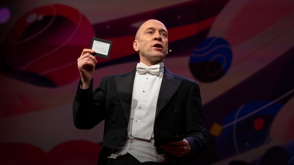
In 1969 in July, three Americans launched into space. Now, they went to the surface of the moon, they famously made the great leap for mankind. Buzz Aldrin, Neil Armstrong, they walked on the surface, they planted this flag. It's rightly celebrated as a moment that in America we say is a triumph. We think it was this amazing accomplishment. They didn't just leave behind this flag, though. They also left behind a plaque. This plaque is a beautiful object, and one that I want to talk to you a little bit about. First, you might notice that there's two globes, representing all of earth. And then there's this beautiful statement: "We came in peace for all mankind." Now, at first, this is just nice poetic language, but it's also set in a typeface that's perfect for this moment. It seems industrial, it seems engineered. It also is the best possible name you could come up with for something on the moon: Futura.
1969年7月に 3人のアメリカ人が 宇宙へ飛び立ちました 彼らは月面着陸を成し遂げ 名高く知られている 人類にとっての飛躍を果たしました バズ・オルドリンや ニール・アームストロングは月面を歩き 星条旗を立てました 偉大な功績としてアメリカで 大いに称えられました ものすごい偉業だと 考えられています でも 彼らが置いてきたのは 星条旗だけではなく 記念の銘板も残しました この銘板はとても美しいもので これについて少し お話ししたいと思います まず 地球が2つあることに お気づきでしょう 地球全体を表すためです 素晴らしい文章も 添えられています 「全人類を代表して 平和のうちに来たれり」 一見すると 詩的でいい言葉だと いうだけですが まさにこの瞬間にぴったりな書体で 刻まれています 産業を思わせる形をしていて 巧みに設計されています 月面に残すものとして これ以上ない名前を与えられています Futura(フーツラ)と言います
Now, I want to talk to you about fonts, and why this typeface is perfect for this moment. But it's actually more than just ceremonial. Now, when all of you arrived here today, you actually had to think about fonts. You might not realize it, but you're all unconscious experts on typography. Typography is the study of how fonts inhabit our world, they're the visual language of the words we use. Here's the thing that's funny about this, though. I know you're probably not like me, you're not a font nerd, maybe some of you are, but if you're not, that's alright, because I might spend hours every day trying to pick the perfect typeface for the perfect project, or I might spend thousands of dollars every year, trying to get ones with the right features. But all of you actually spend hours every day, evaluating fonts. If you don't believe me, think about how you got here. Each of you had to judge by the signs and maybe even on your phone, which signals to trust and which to ignore. You were evaluating fonts.
これからフォントについて そしてこの書体が ぴったりだった理由をお話しします 儀礼上の理由だけではないのです 皆さんが今日 ここまで来る途中で フォントのことを たくさん考えたはずです お気づきでなくても 無意識のうちに 皆さんは 字体研究のプロになっているんです 字体研究というのは フォントの用いられ方の研究です 私たちが用いる言葉の 視覚的な側面ですね ちょっと面白いことがあります 皆さんは 私みたいに フォントおたくではないでしょう 何人かはそうかもしれませんが 違っていてもいいんです 私は毎日何時間もかけて プロジェクトに ぴったり合う書体を選びますし 毎年何千ドルも払って 探し求めている書体を 購入しようとします でも皆さんも 実は毎日何時間も フォントを精査しているんです 信じられないなら ここまでの道のりを考えてください 皆 標識を見たでしょうし 携帯電話の画面でも どの表示を信頼して どれを無視するか判断したでしょう 書体を評価していたんです
Or maybe when you're just buying a new product, you have to think about whether something is expensive or cheap or hard to get or easy to find. And the funny thing about it is, this may not seem extraordinary to you, but the moment you see something out of place, you recognize it right away.
新しい製品を買うときだって その品物が高いのか 安いのか 珍しいのか よくあるのか 考えるはずです ここで面白いのは 特別なことには 思えなくても 何かが違っていると すぐに気づくんです
(Laughter)
(笑)
The thing I love about typography, and why I love fonts and why I love Futura, is that, for me, what I study is everywhere. Every street that I walk down, every book that I pick up, every thing that I read is filled with the thing I love. Now, once you understand the history and what happens with typography, you actually have a history of everything before you.
私が字体研究が好きで 書体やFuturaが好きな理由は 研究対象がそこら中に あるからです どの道を歩いても どの本を手に取っても 読むことのできるものが 好きなもので溢れています 字体研究の歴史と これまでの変遷を理解すれば 歴史が目の前に広がっていると 分かるはずです
And this is the typeface Futura. As previously we've discussed, this is modernism in miniature. This is a way in which modernism infiltrated this country and became perhaps the most popular, or promiscuous typeface, of the twentieth century. "Less is more," right, these are the aphorisms of modernism. And in the visual arts, the same thing happened. Let's focus on the essentials, focus on the basic shapes, focus on geometry. So Futura actually holds this to its core. You might notice that the shapes inherent in Futura have circles, squares, triangles. Some of the shapes are all based on circles, like the O, D and C, or others have this pointed apex of the triangle. Others just look like they might have been made with a ruler or a compass. They feel geometric, they feel mathematic, precise. In fact, this whole system carries through with the way that the typeface was designed. To not look like it was made like other typefaces, to be something new. Here it is in the lightweight, the medium weight and the bold weight. The whole family has different things to commend to it.
これが Futura書体です 既に述べたように モダニズムの精髄です これによってモダニズムが この国を席巻し おそらく20世紀に最もよく使われ 場所を選ばず 見かける書体になったのです 「より少ないことこそ 豊かさである」 というのがモダニズムの箴言です ビジュアルアートでも 同じことが起こりました 物事の本質や基本的な形が注目され 幾何学に焦点が置かれました Futuraは まさにこれを 体現しています Futuraに見られる形に 含まれている― 円や四角形 三角形に 気づくでしょう 円に基づいている形もあります OやDやCはそうです 三角形のとがった頂点が ある形もあります 他の文字は定規とコンパスで 描かれたように見えます 幾何学的で数学的 正確に思えます 実際 この手法は この書体のデザインに 一貫してみられます 他の書体のように 新しさを求めて デザインされていないのです こちらが細字 中字 そして太字です 同種の書体はどれも 様々な用途に適しています
This was a conscious break from the past, something that looked like it was made by a machine, and not by hand. When I say not made by hand, this is what I mean. This is what we think about maybe, when you might create something with a calligraphic brush or a pen. That there's thicks and thins. And even more traditional typefaces, say like a Garamond, holds vestiges of this old system in which you can see the A where it get little bit thinner at the top and thicker down below, because it's trying to look like someone had made it by hand. But Futura, in contrast, is designed to look like no one had touched it at all, that this was made by a machine, for a machine age, for an industrial age.
これは意識的な 過去との決別でした 手書きではなく 機械で作られたように 見える書体を目指しました 「手書き」と言ったのは こういう文字のことです カリグラフィの筆やペンで 書かれた文字と言えば こういうのを思い浮かべるでしょう 太い箇所と細い箇所があります Garamondのような 伝統的な書体には 昔のやり方の名残があり 小文字のaは 上が細くなっていて 下の方は太いですね 誰かによる手書きを 模しているからです でも Futuraは対照的に 誰の手も入っていないように デザインされています 機械や産業の時代に 機械で作られたかのようです
There's actually a sleight of hand here that Paul Renner, the designer who made this in 1927, employed. If you look at the way in which the circular shape joins with the vertical shaft, you'll notice that it tapers just every so slightly. And this is one of hundreds of ways in which this typeface was designed to look geometrically perfect, even though it's mathematically not. And this is what typeface designers do all the time to make typefaces work, every day.
実は 1927年に この書体を作った― デザイナーのポール・レナーの 巧みな技が隠されています 曲線部分が直線部分に 交わっているところを見ると ほんの少しだけ 細くなっていることに気づきます これを含め たくさんの方法を使って この書体が数学的に不完全でも 幾何学的には完璧にデザインされたのです 書体デザイナーは 書体をうまく機能させるために 日々このようなことをしています
Now, there were other designers doing this at the same time in Europe and America. These are a few other excellent examples from Europe, trying to create something new for the new age, a new moment in time. These are some other ones in Germany that in some ways look very similar to Futura, maybe with higher waist or lower waist or different proportions. Then why did Futura take over the world? In this case, if you can read the titles there, some of these names don't quite roll off the tongue: Erbar, Kabel Light, Berthold-Grotesk, Elegant-Grotesk. These aren't exactly household names, are they? And so when you compare that to Futura, you realize that this was a really good choice by the marketing team.
ヨーロッパやアメリカで同時に 取り組んでいる他のデザイナーもいました ヨーロッパ発の好例も いくつかあり 新しい時代や新たな瞬間のために 新しいものを作ろうとしていました これらはドイツの例ですが Futuraに似ているかもしれません 中心線の高さやバランスが 異なってはいますね ではなぜFuturaが 席巻したのか? ここに挙げた書体名を 読もうとしてみると どう発音するか よく分からないものもあると思います エルバー ケーベル・ライト ベルトールド・グロテスク エレガント・グロテスク よく見る名前ではありませんね Futuraをこれらと比べてみると マーケティング上 賢明な判断だったと分かります
What's amazing about this name -- you know, what's in this name is that this is a name that actually invokes hope and an idea about the future. And this isn't actually the word for future in German, it wasn't a German name, they actually picked something that would speak to a wider, larger audience, a universal audience. And when you compare it to what was being done in America -- these are the typefaces from the same period in the United States in the 1920s, bold, brash, braggadocios. You almost think of this as exactly like what the stock market looked like when they were all going nuts in the 1920s. And you realize that Futura is doing something revolutionary.
この名前が素晴らしいのは― この名前が特別なのは これが希望を思わせ 未来を彷彿とさせるからです これはドイツ語の 「未来」という言葉ではなく ドイツ語ではありません より多くの世界の人々に 響くような名前を選んだのです アメリカの様子と比べてみると― これらは同時代の 1920年代 アメリカの書体ですが ボールド、ブラッシュ ブラガドーシャスなどです 20年代に株式市場が 大混乱に陥った時を まさしく表現しているように 思いませんか? Futuraがいかに革新的であるかが 分かるはずです
I want to step back and talk about an example of the typeface in use. So this is a magazine that we all probably know today, "Vanity Fair." This is what it looked like in 1929, in the summer. And in many ways, there's nothing wrong with this design. This is absolutely typical of the 1920s. There's a photograph of an important person, in this case Franklin Roosevelt, then-governor of New York. Everything seems centered, everything seems symmetrical. There's still a little bit of ornamentation, so this is still maybe having some vestiges of the painted lady and not fully modernistic. But everything seems kid of solid. There's even drop caps to help you get into the text.
少し立ち戻って 実際にFuturaが 利用された例をお話ししましょう これは皆さんご存じの雑誌 『ヴァニティ・フェア』です 1929年の夏の号は こんな感じです 色々な意味で デザインに問題はありません 1920年代の典型的な印刷です 重要な人物の写真が掲載され ここでは 当時のNY市長 フランクリン・ルーズベルトです すべて中央寄せがされ 左右対称ですね 少し装飾的ですから 肖像画の名残が感じられ あまり現代的ではありません 全体的に均質です 文章に誘導する ドロップキャップも見られます
But this all changed very quickly and in October of 1929, a Berlin-based designer came and redesigned "Vanity Fair." And this is what it looks like with Futura. Instead of the governor now we have a photograph of an abstract, beautiful setting, in this case, the ocean. Instead of drop caps, there's nothing at all. And replaced with a centered layout is now asymmetry. And it gets even more radical the further you enter the magazine. In this case, even more dramatic asymmetry. In this case, illustrations by Pablo Picasso, moving across the page and breaking the gutter of the two pages. And there's something even more radical. If you look closely at the Futura, you might notice something. You might not pick it up at first, but there are no capital letters in the title or the captions on this page. You might not think that's very radical, but pick up any magazine, any book or go to any website, and I guarantee, you are not going to find it very easily. This is still a radical idea.
まもなく 1929年の10月に これが一変します ベルリン在住のデザイナーが 『ヴァニティ・フェア』を一新しました Futuraでデザインされたものが これです 市長の写真の代わりに 抽象的で美しい風景写真が掲載され この場合は 海です ドロップキャップは なくなりました 中央寄せに代わって 左右非対称になりました さらにページをめくると もっと新しさが見られます ここでは さらに大胆な 左右非対称ですね パブロ・ピカソのイラストが ページを動き回り 中央の綴じ部分をまたいでいます もっと革新的なことも見られます Futuraをよく見てみると 気づくかもしれません すぐには分からなくても このページのタイトルや説明文には 大文字がひとつもないんです さして革新的には思えないなら 雑誌や本やウェブサイトを 見てみてください こういった例は あまり見つからないでしょう いまだに革新的なことなのです
And why is that radical? When we think about what capital letters denote, they denote something important, whether it's our names, or our titles. Or maybe even just the name of our corporations, or maybe our trademarks. Actually, in some ways, America's the home of capitalization. We love putting capitals in everything.
なぜ革新的なのか? 大文字がどんな意味を 持つかを考えてみると 何か重要なものを示していますね 名前や敬称などです 企業の名前ということもあれば 商標を示すこともあるでしょう ある意味では 実はアメリカは 大文字文化の本場です 何にでも大文字を付けたがります
(Laughter)
(笑)
But think about how radical this would be to introduce a magazine where you're taking away all the capital letters. This has maybe had the same political force that we now argue over things like pronouns in our society today. In the 1920s, this is just shortly after Soviet Russia had a communist revolution. And for them, this actually represented a socialist infiltration into America. All lowercase letters meant that this was an egalitarian, complete lowering of everything into one equal playing field. Now this is still kind of a radical idea. Think about how often you do capitalize something to have more power or prestige to it. So for them to do this was a way in which Futura was using this idea.
でも 大文字の入っていない雑誌を 導入することがいかに革新的かを 考えてみてください もしかすると 代名詞について 現在私たちが議論しているような 政治的な力があったかもしれません 1920年代は ソ連が共産革命を経験した直後です このことは 彼らにとっては 社会主義のアメリカへの到達を意味しました すべてが小文字であることは 平等主義に基づいて すべてを公平な地平に 引き下げるということだからです これはいまだに 革新的な考えです 何かに力や威信を持たせるために いかに頻繁に 大文字を使うか 考えてみてください こうすることで Futuraの持つ理念を表したのです
Now, other designers were doing other things with Futura. Others brought other ideas of modernism with it, whether it was interesting new illustration styles, or interesting new collage types of illustration. Or even just new book covers, whether they were from Europe.
他のデザイナーもFuturaを 様々に使いました 違ったモダニズムの表現をした者もいました 新しいイラストのスタイルや コラージュのようなイラストも 生まれました 新しい本の装丁もありましたし ヨーロッパ発のものもありました
But here's the funny thing. In the 1920s, if you wanted to use a new typeface, you couldn't just go download it onto your computer. You actually had to have pieces of lead. So for Americans who wanted to adopt this and make it part of their own system, something they could use in everyday typography, whether in ads or anything else, they actually had to have metal type.
ここで興味深いことがあります 1920年代には 新しい書体を使いたくても コンピュータで ダウンロードするわけにはいきません 実際に鉛の活字が必要だったんです ですから この書体を 日頃の実践に取り入れて 日常使いしたいと思ったアメリカ人は 目的が広告であれ何であれ 金属の活字が必要でした
So being good American capitalists, what did we do? We made all sorts of copies. Ones that had nothing to do with the name Futura, but looked identical to it, whether it was Spartan or Tempo. And in fact, by the time that World War II started, American corporations were actually trying to boycott Nazi goods. But they said, "Go ahead and use our copies. Use 20th Century, use Spartan, use Vogue, use Tempo. These are identical to Futura." And in fact, for most people, they didn't even learn the new names, they just still called it all Futura. So America took this typeface in, conquered it and made it its own. So by the time World War II finishes, Americans are using this on everything, whether it be catalogs, or atlases, or encyclopedias or charts and graphs, or calendars, or even political material. And even the logo for a new expansion football team. And in fact, it was used even on some of the most important advertising of the 20th century.
アメリカの資本家はどうしたか? 模倣品をたくさん作ったんです Futuraという名前ではないのに 瓜二つの書体が生まれました SpartanやTempoです 実際に 第二次世界大戦が 始まる頃までには アメリカの企業はナチス製品を ボイコットしようとしていました でも「当社の模倣品を使ってください 20th Centuryや Spartanや Vogueや Tempoを使ってください Futura そっくりですよ」 と言ったのです ほとんどの人は 新しい名称は覚えることもせずに Futuraと呼び続けました アメリカはこの書体を受容し 自分のものにしたのです 第二次世界大戦が終わるまでには アメリカではこの書体が すべてに使われていました カタログや地図 百科事典や図やグラフ カレンダーや 政治的な資料にも使われました リーグ拡張で生まれた フットボールチームのロゴもそうです 実は20世紀の最も重要な広告にも 用いられました このような文脈の中で
So it's in this context that when the US government was picking a typeface to use after World War II for new maps and new projects, they picked Futura. It wasn't an astounding choice, it wasn't a radical choice, it didn't have anything to do with communism. But in this case, it was used on some of the most important maps, so this one, an air force map in 1962, or used for the maps in Vietnam in '66.
アメリカ政府が 第二次世界大戦後に 新しい地図やプロジェクトに 用いる書体として Futuraを選んだのでした 驚くにあたることでもなければ 過激な選択でもなく 共産主義とは 特に関係もありませんでした しかし 最も重要な地図の いくつかに用いられました この1962年の 空軍の軍用地図や 1966年のベトナムの地図などです
And so it wasn't a surprise that when astronauts first started the Mercury program, such as John Glenn orbiting the earth, that charts and maps that he was using were in Futura. And in fact, by the time Mercury morphed into Apollo, it started getting used more and more for more things. So in this case for a safety plan, or even starting to get used on instrument panels, or navigational aids. Or even on diagrams to show how the whole system worked.
ですから 宇宙飛行士たちが ジョン・グレンの有人地球周回を含む マーキュリー計画に取り組み始めたときに 図や地図にFuturaが使われたことは 驚くにあたりませんでした マーキュリー計画が アポロ計画に移り変わった頃には さらに多くの事柄に この書体が使われるようになりました これはセーフティープランですし 機器パネルにも使われましたし 航行援助機器にも使われました システムの仕組みを解説する図にも 用いられました
But here's the amazing thing, it didn't just get used for papers that they handed out to people. It started to get used for an interface, for an entire system that helped the astronauts know how to use the machine. NASA wasn't just one big corporation making everything. There was hundreds of contractors -- Boeing, IBM, McDonnell Douglas -- all making different machines. Now imagine if astronauts had to use different typefaces and different systems for each component they had in the space shuttles. This would have been impossible to navigate and there would have been a cognitive overload every time they had to open up a new system. So in this case, Futura being used on the interface helped them navigate complexity and make it more clear. And it wasn't just used on buttons, it was used on labels, and it was used on their food rations, and it was used on their tool kits. It was used on knobs and levers to tell them what to do. In fact, maybe even some of the places where they needed to have things that were complex be more simple to them, instructions were printed entirely in Futura, so that they could know what to do with that one moment. They didn't have to remember everything in their head, they could have it out there in the world to see and refer to. In this case, Futura helped make that system, which was already a very difficult and complex system, a little less complex. In fact, the very first or last thing an astronaut might have seen when they were entering or exiting the spacecraft would have been in Futura.
ここで素晴らしいのは 配布される紙の資料に とどまらなかったことです インターフェースにも使われ始め 機械の使用方法を 宇宙飛行士が知るための システム全体にも使われたのです NASAが 一手にすべてを 生み出すわけではありません 何百もの下請け企業があります ボーイングやIBM マクドネル・ダグラスなどが 様々な機械を作っていました スペースシャトルの中にある 様々なシステムごとに 宇宙飛行士が異なる書体を 使わねばならないとしたらどうでしょう これではうまく使えませんし 新しいシステムを開くときの 認知的負荷が大きすぎます Futuraがインターフェースに 用いられることで 複雑な作業を行えるようになり より明確になったのです 操作ボタンだけでなくラベルや 宇宙食の袋や 工具セットにも使われました ノブやレバーの使用方法表示にも 使われました 実際に 複雑な事柄を よりシンプルに表す必要が あるような場合に 手順がすべてFuturaで 印刷されました すぐに理解できるようにするためです すべてを頭で覚えておく必要はなく 参照できるものを 用意しておくことができました ですから Futuraのおかげで 体系化でき すでに非常に難解で 複雑なシステムが 少し理解しやすくなりました 宇宙飛行士が宇宙船に 出入りする際に目にする― 最初のものであり 最後のものであったものも Futuraで書かれました
One of my favorite examples of how Futura worked in this way is actually this camera. This is a Hasselblad that was made by the Swedish company. It's a perfectly good camera, some of you might have used one, it's prized by photographers as a really great camera. And you might notice, if you know anything about cameras, that there's some modifications made to it. In this case, there are stickers placed all over the film canisters, or other parts of the camera here. What this enabled NASA to do, was make something really great out of the astronauts. They're not photographers, they're not experts in art. But they could ensure that they would know how to use this camera because of the labels placed there in Futura.
Futuraの使われ方で 私が気に入っているのは このカメラです スウェーデンの企業が作った ハッセルブラッドというカメラです 素晴らしく機能的なカメラで 使ったことのある人もいるでしょう 写真家たちに優秀なカメラだと 称えられています カメラについて少しでも ご存じであれば 改造されていることに お気づきでしょう フィルム用キャニスターをはじめ 様々な場所に ステッカーが貼られています このおかげで NASAは 宇宙飛行士を有効に活用できたのです 彼らは写真家でもなければ 芸術の専門家でもありません それでもこのカメラの使い方を 伝えられたのは Futuraで書かれた ラベルがあったからです
So in this case, Futura acquired and made sure that they had legitimacy with the things they were using. In this case to not take off the film before it would expose. Which, in this case, we would have never had some of the amazing photos we had without this label. When we see something as decorative as this, a ceremonial patch, or something like this plaque on the moon, we realize that Futura was more than just something ceremonial, something more than something that had just been picked for its design. In fact, Futura had authority, had legitimacy and had power because of this choice.
この場合では Futuraのおかげで 使用している機器を 正しく使えるようにしたのです 露光する前にフィルムを 取り出してはならないと書いてあります このラベルがなかったら 素晴らしい写真が 生まれなかったかもしれません この公式マークや 月に残された銘板のように 装飾的なものを目にすると Futuraが 単に儀礼上の理由や デザインのためだけに 選ばれたわけでないことが分かります Futuraが選ばれたのには 認められるだけの理由と 正当性と力があったのです
There's one other thing I want to talk about in closing. And that is that Futura tells a story. And this is what I love about typefaces, is that all of them tell stories. And in this case, this typeface tells a very powerful story about assimilation, about something being taken into America and being made part of its culture. And that's one of the best and worst things America does, is we take things into our culture and we spit them out back again and claim them our own. And in this case, Futura mirrors exactly what happened with the technology undergirding the whole system. Futura was a German typeface, taken in, made into an American commodity. And so were the technologies: the rockets, the scientists all came from Germany as well. So in some ways, this German typeface on an American plaque perfectly mirrors what happened with the technology. And in this case, when you think about this story, you realize that typography on the moon represents legitimacy, represents authority, and this gave them, the astronauts, the power to get to the moon.
最後にもうひとつ お話ししたいことがあります Futuraは物語を 語っているということです 書体はどれも物語を持っているからこそ 私は愛してやまないのです Futura の語る力強い物語は 同化の物語であり アメリカに何かが取り入れられ 文化の一部になる物語です これはアメリカの光であり 闇でもあります 何かを文化の内に取り入れて 消化してできた産物を 自国産だと言い張るのです Futuraはシステム全体を 支えていたテクノロジーの 辿った経緯そのものです ドイツの書体であったFuturaは アメリカのものになりました テクノロジーもそうでした ロケットや科学者も 皆ドイツから来たのです アメリカの銘板に刻まれた ドイツの書体は ある意味では テクノロジーの辿った顛末を 完全に表しているんです この話を考えてみると 月面に到達した書体は 正当性や権威を表し それらを 宇宙飛行士らは 月へと行く原動力としたのです
Thank you.
ありがとうございました
(Applause)
(拍手)