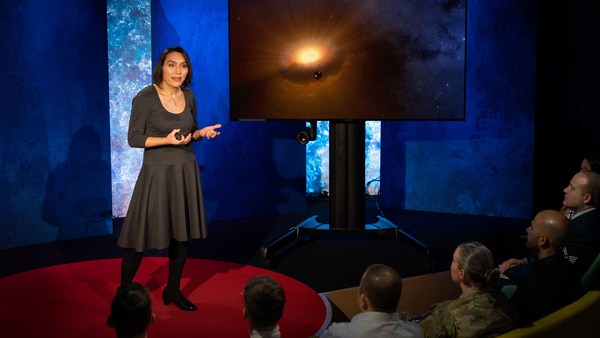
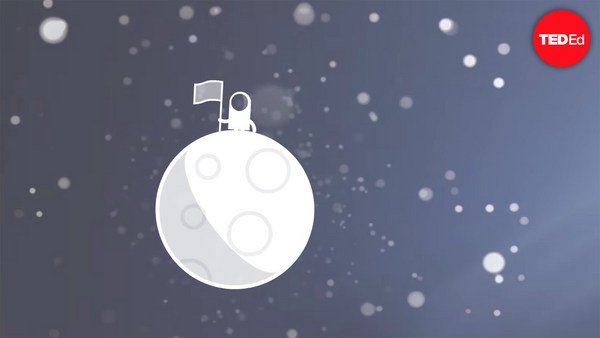
In 1969 in July, three Americans launched into space. Now, they went to the surface of the moon, they famously made the great leap for mankind. Buzz Aldrin, Neil Armstrong, they walked on the surface, they planted this flag. It's rightly celebrated as a moment that in America we say is a triumph. We think it was this amazing accomplishment. They didn't just leave behind this flag, though. They also left behind a plaque. This plaque is a beautiful object, and one that I want to talk to you a little bit about. First, you might notice that there's two globes, representing all of earth. And then there's this beautiful statement: "We came in peace for all mankind." Now, at first, this is just nice poetic language, but it's also set in a typeface that's perfect for this moment. It seems industrial, it seems engineered. It also is the best possible name you could come up with for something on the moon: Futura.
Nel luglio del 1969, tre americani furono lanciati nello spazio. Raggiunsero la superficie lunare, dove compirono il famoso grande passo per l'umanità. Buzz Aldrin e Neil Armstrong camminarono sulla superficie e piantarono questa bandiera. È un momento che in America viene giustamente celebrato come un trionfo. Lo consideriamo un traguardo incredibile. Ma la bandiera non fu l'unico oggetto che lasciarono; lasciarono anche una targa. Questa targa è un bellissimo oggetto di cui vorrei parlarvi un po'. Innanzitutto, come potete notare, ci sono due globi che rappresentano la Terra. Poi, c'è questa bellissima frase: "Veniamo in pace a nome di tutta l'umanità". A prima vista, potrebbe sembrare solo un bel linguaggio poetico, ma è anche stata scritta in un carattere che è perfetto per questo momento. Sembra industriale, sembra progettato appositamente. Ha anche il nome migliore che si potesse dare a qualcosa da lasciare sulla Luna: Futura. Voglio parlarvi di caratteri tipografici
Now, I want to talk to you about fonts, and why this typeface is perfect for this moment. But it's actually more than just ceremonial. Now, when all of you arrived here today, you actually had to think about fonts. You might not realize it, but you're all unconscious experts on typography. Typography is the study of how fonts inhabit our world, they're the visual language of the words we use. Here's the thing that's funny about this, though. I know you're probably not like me, you're not a font nerd, maybe some of you are, but if you're not, that's alright, because I might spend hours every day trying to pick the perfect typeface for the perfect project, or I might spend thousands of dollars every year, trying to get ones with the right features. But all of you actually spend hours every day, evaluating fonts. If you don't believe me, think about how you got here. Each of you had to judge by the signs and maybe even on your phone, which signals to trust and which to ignore. You were evaluating fonts.
e del perché Futura è perfetto per questo momento. Non è soltanto perché è solenne. Quando siete arrivati qui oggi, avete dovuto pensare ai caratteri. Forse non lo sapete, ma siete tutti degli esperti inconsapevoli di tipografia. La tipografia è lo studio di come i caratteri popolano il nostro mondo. Sono il linguaggio visivo delle parole che usiamo. Ma c'è una cosa bizzarra in tutto questo. So che probabilmente non siete dei nerd dei caratteri come me, forse qualcuno di voi sì, ma se non lo siete, non vi preoccupate, perché io potrei passare ore a scegliere il carattere perfetto per un progetto o potrei spendere migliaia di dollari ogni anno per crearne uno con le caratteristiche giuste. Ma tutti voi passate ore ogni giorno a valutare i caratteri. Pensate a come siete arrivati qui. Avete dovuto giudicare i segnali, magari anche sul vostro cellulare, e decidere di quali fidarvi e quali, invece, ignorare. Avete valutato dei caratteri. Oppure quando state comprando un nuovo prodotto
Or maybe when you're just buying a new product, you have to think about whether something is expensive or cheap or hard to get or easy to find. And the funny thing about it is, this may not seem extraordinary to you, but the moment you see something out of place, you recognize it right away.
e dovete chiedervi se è caro o a buon mercato oppure facile o difficile da reperire. E la cosa bizzarra, che magari a voi non sembra niente di straordinario, è che non appena vedete qualcosa fuori posto, ve ne accorgete immediatamente. (Risate)
(Laughter)
La cosa che amo della tipografia
The thing I love about typography, and why I love fonts and why I love Futura, is that, for me, what I study is everywhere. Every street that I walk down, every book that I pick up, every thing that I read is filled with the thing I love. Now, once you understand the history and what happens with typography, you actually have a history of everything before you.
e il motivo per cui amo i caratteri e Futura è che quello che studio è ovunque: in ogni strada che percorro, in ogni libro che apro, ogni cosa che leggo è ricca della cosa che amo. Una volta compresa la storia e quello che succede con la tipografia, abbiamo davanti a noi la storia di tutto ciò che è accaduto prima di noi. Questo è il carattere Futura.
And this is the typeface Futura. As previously we've discussed, this is modernism in miniature. This is a way in which modernism infiltrated this country and became perhaps the most popular, or promiscuous typeface, of the twentieth century. "Less is more," right, these are the aphorisms of modernism. And in the visual arts, the same thing happened. Let's focus on the essentials, focus on the basic shapes, focus on geometry. So Futura actually holds this to its core. You might notice that the shapes inherent in Futura have circles, squares, triangles. Some of the shapes are all based on circles, like the O, D and C, or others have this pointed apex of the triangle. Others just look like they might have been made with a ruler or a compass. They feel geometric, they feel mathematic, precise. In fact, this whole system carries through with the way that the typeface was designed. To not look like it was made like other typefaces, to be something new. Here it is in the lightweight, the medium weight and the bold weight. The whole family has different things to commend to it.
Come vi dicevo prima, è modernismo in miniatura. È anche grazie ad esso che il modernismo si è infiltrato nel nostro Paese ed è diventato forse il carattere più popolare o più promiscuo del XX secolo. Uno degli aforismi del modernismo è "meno è meglio". Questo accadde anche nelle arti visive. Guardate l'essenzialità, le forme basilari, la geometria. Questi sono gli elementi fondamentali di Futura. Come potete vedere, le forme intrinseche di Futura sono cerchi, quadrati e triangoli. Alcune lettere si basano su cerchi, come la O, la D e la C, mentre altre hanno l'apice appuntito del triangolo. Altre sembrano tracciate con un righello o con un compasso. Sembrano geometriche, matematiche, precise. Infatti, l'intero sistema mette in pratica l'idea con cui il carattere è stato concepito, cioè non essere come gli altri caratteri, essere qualcosa di nuovo. Ecco il carattere in versione leggera, in versione normale e in grassetto. La famiglia si compone di vari elementi. C'è una rottura consapevole con il passato;
This was a conscious break from the past, something that looked like it was made by a machine, and not by hand. When I say not made by hand, this is what I mean. This is what we think about maybe, when you might create something with a calligraphic brush or a pen. That there's thicks and thins. And even more traditional typefaces, say like a Garamond, holds vestiges of this old system in which you can see the A where it get little bit thinner at the top and thicker down below, because it's trying to look like someone had made it by hand. But Futura, in contrast, is designed to look like no one had touched it at all, that this was made by a machine, for a machine age, for an industrial age.
infatti, sembra fatto a macchina anziché a mano. E quando dico "non fatto a mano", intendo questo. Probabilmente quello che immaginiamo quando pensiamo a qualcosa che è stato realizzato con una penna o con un pennello calligrafico è che lo spessore della linea sia variabile. Persino i caratteri più tradizionali, come Garamond, conservano tracce di questo vecchio sistema, in cui possiamo vedere la A assottigliarsi all'apice e ispessirsi alla base in un tentativo di sembrare fatta a mano. Futura, al contrario, è progettato per sembrare qualcosa di intoccato, qualcosa creato da una macchina per un'era industriale delle macchine.
There's actually a sleight of hand here that Paul Renner, the designer who made this in 1927, employed. If you look at the way in which the circular shape joins with the vertical shaft, you'll notice that it tapers just every so slightly. And this is one of hundreds of ways in which this typeface was designed to look geometrically perfect, even though it's mathematically not. And this is what typeface designers do all the time to make typefaces work, every day.
Tuttavia, c'è un espediente impiegato da Paul Renner, il designer che lo creò nel 1927. Se osservate il modo in cui il cerchio si unisce all'asse verticale, noterete un leggero assottigliamento. Questo è uno delle centinaia di modi in cui questo carattere è stato progettato per sembrare geometricamente perfetto sebbene non lo sia matematicamente. Questa è una cosa che i designer fanno sempre per far funzionare i loro caratteri.
Now, there were other designers doing this at the same time in Europe and America. These are a few other excellent examples from Europe, trying to create something new for the new age, a new moment in time. These are some other ones in Germany that in some ways look very similar to Futura, maybe with higher waist or lower waist or different proportions. Then why did Futura take over the world? In this case, if you can read the titles there, some of these names don't quite roll off the tongue: Erbar, Kabel Light, Berthold-Grotesk, Elegant-Grotesk. These aren't exactly household names, are they? And so when you compare that to Futura, you realize that this was a really good choice by the marketing team.
Altri designer lo fecero contemporaneamente in Europa e negli USA. Ecco qui alcuni esempi eccellenti dall'Europa di come si cercò di creare qualcosa di nuovo per una nuova epoca. Questi sono alcuni esempi dalla Germania molto simili a Futura, ma che hanno una diversa circonferenza e diverse proporzioni. Ma allora perché è stato Futura a conquistare il mondo? Se provate a leggere questi nomi, vi accorgerete che non sono facilissimi da pronunciare: Erbar, Kabel Light, Berthold-Grotesk, Elegant-Grotesk. Non sono proprio nomi famigliari, vero? Se li confrontate con il nome "Futura", vi accorgerete che il team del marketing ha fatto un'ottima scelta. La cosa straordinaria di questo nome
What's amazing about this name -- you know, what's in this name is that this is a name that actually invokes hope and an idea about the future. And this isn't actually the word for future in German, it wasn't a German name, they actually picked something that would speak to a wider, larger audience, a universal audience. And when you compare it to what was being done in America -- these are the typefaces from the same period in the United States in the 1920s, bold, brash, braggadocios. You almost think of this as exactly like what the stock market looked like when they were all going nuts in the 1920s. And you realize that Futura is doing something revolutionary.
è che invoca speranza e contiene un'idea di come sarà il futuro. Non è la parola tedesca che indica il futuro, non è un nome tedesco; è stato scelto per rivolgersi a un pubblico più vasto e universale. Confrontatelo con quello che è stato fatto negli USA. Questi sono i caratteri in uso negli Stati Uniti negli anni Venti: marcati, vistosi e arroganti; ricordano le fluttuazioni erratiche del mercato azionario negli anni Venti. Ora capite quanto Futura sia stato rivoluzionario. Voglio fare un passo indietro e farvi un esempio di uso del carattere.
I want to step back and talk about an example of the typeface in use. So this is a magazine that we all probably know today, "Vanity Fair." This is what it looked like in 1929, in the summer. And in many ways, there's nothing wrong with this design. This is absolutely typical of the 1920s. There's a photograph of an important person, in this case Franklin Roosevelt, then-governor of New York. Everything seems centered, everything seems symmetrical. There's still a little bit of ornamentation, so this is still maybe having some vestiges of the painted lady and not fully modernistic. But everything seems kid of solid. There's even drop caps to help you get into the text.
Questa è una rivista che conosciamo tutti: "Vanity Fair". Ecco che aspetto aveva nell'estate del 1929. Per molti versi, non c'è niente di sbagliato nell'impaginazione. È un'impaginazione tipica degli anni Venti. C'è la fotografia di una persona importante, in questo caso di Franklin Roosevelt, l'allora governatore di New York. Tutto sembra centrato, simmetrico. C'è qualche decorazione, quindi conserva ancora qualche residuo dell'epoca vittoriana e lo stile non è completamente modernista. Ma tutto sembra compatto. Ci sono persino dei capilettera che guidano il lettore.
But this all changed very quickly and in October of 1929, a Berlin-based designer came and redesigned "Vanity Fair." And this is what it looks like with Futura. Instead of the governor now we have a photograph of an abstract, beautiful setting, in this case, the ocean. Instead of drop caps, there's nothing at all. And replaced with a centered layout is now asymmetry. And it gets even more radical the further you enter the magazine. In this case, even more dramatic asymmetry. In this case, illustrations by Pablo Picasso, moving across the page and breaking the gutter of the two pages. And there's something even more radical. If you look closely at the Futura, you might notice something. You might not pick it up at first, but there are no capital letters in the title or the captions on this page. You might not think that's very radical, but pick up any magazine, any book or go to any website, and I guarantee, you are not going to find it very easily. This is still a radical idea.
Ma tutto questo cambiò quando, nell'ottobre del 1929, un designer di Berlino riprogettò "Vanity Fair". Ecco come appare con Futura. Al posto del governatore, ora c'è la fotografia di un bellissimo paesaggio astratto, in questo caso, l'oceano. I capilettera sono scomparsi e l'impaginazione centrata è ora diventata asimmetrica. E più si sfoglia la rivista, più diventa radicale. In questo caso, l'asimmetria è ancora più accentuata e le illustrazioni di Pablo Picasso si muovono nella pagina, ignorando la divisione tra le due pagine. Ma c'è qualcosa di ancora più radicale. Se guardate Futura da vicino, potreste notare qualcosa. Magari a prima vista non si nota, ma non ci sono lettere maiuscole nel titolo o nelle didascalie. Potreste pensare che non sia una cosa molto radicale, ma prendete qualsiasi rivista, libro o sito su Internet e vi assicuro che difficilmente non troverete lettere maiuscole. Questa è ancora un'idea radicale.
And why is that radical? When we think about what capital letters denote, they denote something important, whether it's our names, or our titles. Or maybe even just the name of our corporations, or maybe our trademarks. Actually, in some ways, America's the home of capitalization. We love putting capitals in everything.
Ma perché è radicale? Pensate a cosa denota una lettera maiuscola: denota qualcosa di importante, che siano i nostri nomi o i nostri titoli, oppure, magari, il nome delle nostre aziende o dei nostri marchi. In un certo senso, l'America è la patria delle lettere maiuscole. Amiamo mettere lettere maiuscole ovunque.
(Laughter)
(Risate)
But think about how radical this would be to introduce a magazine where you're taking away all the capital letters. This has maybe had the same political force that we now argue over things like pronouns in our society today. In the 1920s, this is just shortly after Soviet Russia had a communist revolution. And for them, this actually represented a socialist infiltration into America. All lowercase letters meant that this was an egalitarian, complete lowering of everything into one equal playing field. Now this is still kind of a radical idea. Think about how often you do capitalize something to have more power or prestige to it. So for them to do this was a way in which Futura was using this idea.
Ma pensate a quanto sarebbe radicale creare una rivista in cui non ci siano lettere maiuscole. Probabilmente ha avuto la stessa forza politica del nostro attuale dibattito sui pronomi. Negli anni Venti, nella Russia sovietica si era appena conclusa la rivoluzione comunista. Per loro, questo rappresentava un'infiltrazione socialista in America. Le lettere minuscole erano un simbolo di uguaglianza, mettevano tutto sullo stesso livello. Questa è ancora un'idea radicale. Pensate a quanto spesso usiamo le lettere maiuscole per conferire maggiore potere o prestigio a una parola. Per loro, Futura era un mezzo per veicolare quest'idea.
Now, other designers were doing other things with Futura. Others brought other ideas of modernism with it, whether it was interesting new illustration styles, or interesting new collage types of illustration. Or even just new book covers, whether they were from Europe.
Altri designer fecero altre cose con Futura: lo incorporarono in altre idee moderniste come nuovi stili di illustrazioni, nuovi tipi di collage di illustrazioni o nuove copertine di libri provenienti dall'Europa.
But here's the funny thing. In the 1920s, if you wanted to use a new typeface, you couldn't just go download it onto your computer. You actually had to have pieces of lead. So for Americans who wanted to adopt this and make it part of their own system, something they could use in everyday typography, whether in ads or anything else, they actually had to have metal type.
Ma ecco la cosa divertente: negli anni Venti, se volevi usare un nuovo carattere, non potevi semplicemente scaricarlo sul tuo computer. Dovevi avere un pezzo di piombo. Quindi, gli americani che volevano adottarlo e renderlo parte del loro sistema come carattere tipografico ordinario da usare, ad esempio, nelle pubblicità, dovevano avere una lega tipografica. Noi americani, da bravi capitalisti, cosa abbiamo fatto?
So being good American capitalists, what did we do? We made all sorts of copies. Ones that had nothing to do with the name Futura, but looked identical to it, whether it was Spartan or Tempo. And in fact, by the time that World War II started, American corporations were actually trying to boycott Nazi goods. But they said, "Go ahead and use our copies. Use 20th Century, use Spartan, use Vogue, use Tempo. These are identical to Futura." And in fact, for most people, they didn't even learn the new names, they just still called it all Futura. So America took this typeface in, conquered it and made it its own. So by the time World War II finishes, Americans are using this on everything, whether it be catalogs, or atlases, or encyclopedias or charts and graphs, or calendars, or even political material. And even the logo for a new expansion football team. And in fact, it was used even on some of the most important advertising of the 20th century.
Abbiamo fatto delle copie che non avevano niente a che fare con il nome Futura, ma che erano identiche ad esso, come Spartan o Tempo. Quando iniziò la Seconda Guerra Mondiale, le imprese americane cercarono di boicottare i prodotti nazisti. Dicevano: "Usate le nostre copie. Usate 20th Century, usate Spartan, usate Vogue, usate Tempo. Sono identici a Futura". E infatti, la maggior parte della gente non imparò questi nuovi nomi e li continuò a chiamare Futura. L'America adottò questo carattere, lo conquistò e lo rese proprio. Alla fine della Seconda Guerra Mondiale, gli americani lo usavano ovunque: nei cataloghi, negli atlanti, nelle enciclopedie, nelle tabelle, nei grafici, nei calendari e persino nei materiali politici e nel logo di una nuova squadra di football. Venne usato anche in alcune delle pubblicità più importanti del XX secolo.
So it's in this context that when the US government was picking a typeface to use after World War II for new maps and new projects, they picked Futura. It wasn't an astounding choice, it wasn't a radical choice, it didn't have anything to do with communism. But in this case, it was used on some of the most important maps, so this one, an air force map in 1962, or used for the maps in Vietnam in '66.
Fu in questo contesto che quando il governo americano dovette scegliere un nuovo carattere da usare in cartine e progetti del dopoguerra, scelse Futura. Non fu una scelta sorprendente o radicale, non ebbe niente a che fare con il comunismo. Venne usato per alcune delle cartine più importanti, come questa cartina dell'aeronautica militare del 1962 o questa cartina del Vietnam del 1966.
And so it wasn't a surprise that when astronauts first started the Mercury program, such as John Glenn orbiting the earth, that charts and maps that he was using were in Futura. And in fact, by the time Mercury morphed into Apollo, it started getting used more and more for more things. So in this case for a safety plan, or even starting to get used on instrument panels, or navigational aids. Or even on diagrams to show how the whole system worked.
Quindi, non deve sorprendere che quando gli astronauti diedero inizio al programma Mercury lanciando John Glenn in orbita attorno alla Terra, le tabelle e le mappe che usò erano stampate in Futura. E quando il programma Mercury divenne il programma Apollo, venne usato per nuovi elementi, ad esempio, nel piano d'emergenza, nel pannello dei comandi, negli strumenti d'ausilio alla navigazione e persino nei diagrammi che mostravano il funzionamento del sistema.
But here's the amazing thing, it didn't just get used for papers that they handed out to people. It started to get used for an interface, for an entire system that helped the astronauts know how to use the machine. NASA wasn't just one big corporation making everything. There was hundreds of contractors -- Boeing, IBM, McDonnell Douglas -- all making different machines. Now imagine if astronauts had to use different typefaces and different systems for each component they had in the space shuttles. This would have been impossible to navigate and there would have been a cognitive overload every time they had to open up a new system. So in this case, Futura being used on the interface helped them navigate complexity and make it more clear. And it wasn't just used on buttons, it was used on labels, and it was used on their food rations, and it was used on their tool kits. It was used on knobs and levers to tell them what to do. In fact, maybe even some of the places where they needed to have things that were complex be more simple to them, instructions were printed entirely in Futura, so that they could know what to do with that one moment. They didn't have to remember everything in their head, they could have it out there in the world to see and refer to. In this case, Futura helped make that system, which was already a very difficult and complex system, a little less complex. In fact, the very first or last thing an astronaut might have seen when they were entering or exiting the spacecraft would have been in Futura.
La cosa incredibile è che non venne usato solo nei documenti, ma iniziò a venire usato anche nell'interfaccia di un intero sistema che aiutava gli astronauti a capire come usare la macchina. Ma la NASA non produceva tutto l'equipaggiamento. C'erano centinaia di appaltatori, come Boeing, IBM, McDonnell Douglas, che fabbricavano componenti diversi. Immaginate se gli astronauti avessero dovuto usare caratteri e sistemi diversi per ciascun componente della navicella. Sarebbe stato impossibile navigare e ci sarebbe stato un sovraccarico cognitivo ogni volta che dovevano usare un nuovo sistema. Quindi, in questo caso, l'utilizzo di Futura nell'interfaccia li aiutò a gestire le complessità rendendo più chiaro il funzionamento. Non venne usato soltanto sui pulsanti, ma anche sulle etichette, sulle razioni di cibo e sui kit degli strumenti. Venne usato sulle manopole e sulle leve per indicare loro cosa fare. Anche in alcuni dei luoghi in cui occorreva che le cose più complesse venissero semplificate, le istruzioni erano stampate integralmente in Futura, così che sapessero cosa fare in quel preciso momento. Non dovettero memorizzare le istruzioni, perché erano in bella vista e potevano farvi riferimento. In questo caso, Futura aiutò a trasformare un sistema che era già difficile e complesso in un sistema un po' meno complesso. La prima e l'ultima cosa che gli astronauti vedevano entrando e uscendo dalla navicella era sicuramente scritta in Futura.
One of my favorite examples of how Futura worked in this way is actually this camera. This is a Hasselblad that was made by the Swedish company. It's a perfectly good camera, some of you might have used one, it's prized by photographers as a really great camera. And you might notice, if you know anything about cameras, that there's some modifications made to it. In this case, there are stickers placed all over the film canisters, or other parts of the camera here. What this enabled NASA to do, was make something really great out of the astronauts. They're not photographers, they're not experts in art. But they could ensure that they would know how to use this camera because of the labels placed there in Futura.
Uno dei miei esempi preferiti di quest'utilizzo di Futura è questa fotocamera. È una Hasselblad che è stata prodotta da un'azienda svedese. È una fotocamera davvero buona, magari alcuni di voi l'hanno usata. È molto apprezzata dai fotografi perché è un'ottima fotocamera. Se vi intendete di fotocamere, noterete che le sono state apportate delle modifiche: sono stati attaccati degli adesivi sul contenitore dei rullini e su altre parti della fotocamera. Questo ha permesso alla NASA di far sì che i suoi astronauti facessero qualcosa di grande. Non sono fotografi, non sono esperti d'arte, eppure, si sono assicurati che sapessero come usare questa fotocamera grazie alle etichette stampate in Futura.
So in this case, Futura acquired and made sure that they had legitimacy with the things they were using. In this case to not take off the film before it would expose. Which, in this case, we would have never had some of the amazing photos we had without this label. When we see something as decorative as this, a ceremonial patch, or something like this plaque on the moon, we realize that Futura was more than just something ceremonial, something more than something that had just been picked for its design. In fact, Futura had authority, had legitimacy and had power because of this choice.
In questo caso, Futura ha fatto in modo che fossero in grado di usare gli oggetti di cui disponevano, segnalando di non rimuovere la pellicola prima dell'esposizione. Non avremmo mai avuto alcune delle incredibili foto che abbiamo senza questa etichetta. Quando vediamo qualcosa di ornamentale, come questa toppa celebrativa, o qualcosa come questa targa sulla Luna, ci rendiamo conto che Futura è più di qualcosa di solenne, è più di un carattere che è stato scelto solo per il suo design. Futura ebbe, infatti, l'autorità, la legittimità e il potere grazie a questa scelta.
There's one other thing I want to talk about in closing. And that is that Futura tells a story. And this is what I love about typefaces, is that all of them tell stories. And in this case, this typeface tells a very powerful story about assimilation, about something being taken into America and being made part of its culture. And that's one of the best and worst things America does, is we take things into our culture and we spit them out back again and claim them our own. And in this case, Futura mirrors exactly what happened with the technology undergirding the whole system. Futura was a German typeface, taken in, made into an American commodity. And so were the technologies: the rockets, the scientists all came from Germany as well. So in some ways, this German typeface on an American plaque perfectly mirrors what happened with the technology. And in this case, when you think about this story, you realize that typography on the moon represents legitimacy, represents authority, and this gave them, the astronauts, the power to get to the moon.
Per concludere, c'è un'altra cosa di cui voglio parlarvi. Futura racconta una storia. È questo che amo dei caratteri: il fatto che tutti raccontino delle storie. Questo carattere racconta una storia molto intensa sull'assimilazione, su qualcosa che è stato importato in America ed è diventato parte della nostra cultura. Una delle cose migliori e peggiori che facciamo in America è importare cose nella nostra cultura, rimetterle in circolo e poi rivendicarle come nostre. Futura rispecchia esattamente quello che è accaduto con la tecnologia che era alla base dell'intero sistema. Futura era un carattere tedesco che è stato adottato e trasformato in un prodotto americano, così com'è accaduto con la tecnologia: i razzi, gli scienziati venivano tutti dalla Germania. Quindi, questo carattere tedesco su una targa americana rispecchia perfettamente quello che è accaduto con la tecnologia. Quando pensiamo a questa storia, ci rendiamo conto che la tipografia sulla Luna rappresenta la legittimazione e rappresenta l'autorità, e conferisce agli astronauti il potere di andare sulla Luna.
Thank you.
Grazie.
(Applause)
(Applausi)