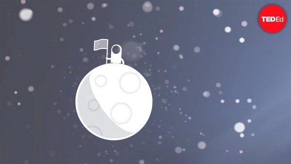
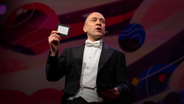
In 1969 in July, three Americans launched into space. Now, they went to the surface of the moon, they famously made the great leap for mankind. Buzz Aldrin, Neil Armstrong, they walked on the surface, they planted this flag. It's rightly celebrated as a moment that in America we say is a triumph. We think it was this amazing accomplishment. They didn't just leave behind this flag, though. They also left behind a plaque. This plaque is a beautiful object, and one that I want to talk to you a little bit about. First, you might notice that there's two globes, representing all of earth. And then there's this beautiful statement: "We came in peace for all mankind." Now, at first, this is just nice poetic language, but it's also set in a typeface that's perfect for this moment. It seems industrial, it seems engineered. It also is the best possible name you could come up with for something on the moon: Futura.
1969. júliusában három amerikait lőttek fel az űrbe. A Hold felszínén landoltak, megtették az emberiség nagy lépését. Buzz Aldrin és Neil Armstrong a Hold felszínén sétáltak, kitűzték ezt a zászlót. Joggal ünnepeljük ezt a pillanatot – ahogy Amerikában mondjuk – diadalként. Nagyszerű teljesítményként tartjuk számon. Ám az űrhajósok mást is hátrahagytak. Ott hagytak egy emléktáblát is. Ez a gyönyörű plakett az, amiről mesélni szeretnék önöknek egy kicsit. Először is, talán észrevették a két földgömböt, ami a Földet jelképezi. Itt egy csodás nyilatkozat is: "Békével jöttünk, az emberiség nevében." Elsőre ez csupán egy szép költői fordulat, ám a használt betűtípus is tökéletesen illik a pillanathoz. Formailag és műszakilag is jól megtervezettnek tűnik. A neve is olyasvalami, ami találó javaslat lehet valamire a Holdon: Futura.
Now, I want to talk to you about fonts, and why this typeface is perfect for this moment. But it's actually more than just ceremonial. Now, when all of you arrived here today, you actually had to think about fonts. You might not realize it, but you're all unconscious experts on typography. Typography is the study of how fonts inhabit our world, they're the visual language of the words we use. Here's the thing that's funny about this, though. I know you're probably not like me, you're not a font nerd, maybe some of you are, but if you're not, that's alright, because I might spend hours every day trying to pick the perfect typeface for the perfect project, or I might spend thousands of dollars every year, trying to get ones with the right features. But all of you actually spend hours every day, evaluating fonts. If you don't believe me, think about how you got here. Each of you had to judge by the signs and maybe even on your phone, which signals to trust and which to ignore. You were evaluating fonts.
Na most, én a betűkről szólnék, és arról, miért méltó ez a betűtípus a pillanathoz. Tulajdonképpen több mint egyszerűen ünnepélyes. Ma, amikor eljöttek ide, betűtípusokról gondolkodtak. Lehet, hogy nem tudják, de önök mind öntudatlan szakértői a tipográfiának. A tipográfia azt tanulmányozza, hogyan uralják világunkat a betűtípusok, amelyek az általunk használt szavak képi megjelenései. Van ám ezzel kapcsolatban valami vicces. Tudom, velem ellentétben önök nem a betűtípusok bolondjai, esetleg néhányan igen, de ha nem, az is rendben van, mert én naponta órákon át próbálom megtalálni a tökéletes projekthez illő tökéletes betűtípust, vagy dollárok ezreit költöm arra, hogy szerezzek egyet megfelelő vonásokkal. Ám valójában önök is naponta órákon át értékelnek betűtípusokat. Ha nem hiszik, gondolják át, hogyan jutottak ide. Mind jelzések alapján következtettek, akár még a telefonjukon is, mely jeleknek higgyenek, melyeket hagyják figyelmen kívül. Betűtípusokat értékeltek.
Or maybe when you're just buying a new product, you have to think about whether something is expensive or cheap or hard to get or easy to find. And the funny thing about it is, this may not seem extraordinary to you, but the moment you see something out of place, you recognize it right away.
Vagy amikor épp csak egy új terméket vesznek, át kell gondolniuk, hogy valami drága-e vagy olcsó, nehezen vagy könnyen beszerezhető-e. Ami vicces, hogy ez önöknek valószínű fel sem tűnik, ám ha valami nem helyénvalót látnak, azonnal kiszúrják.
(Laughter)
(Nevetés)
The thing I love about typography, and why I love fonts and why I love Futura, is that, for me, what I study is everywhere. Every street that I walk down, every book that I pick up, every thing that I read is filled with the thing I love. Now, once you understand the history and what happens with typography, you actually have a history of everything before you.
Amit szeretek a tipográfiában, amiért szeretem a Futurát és a betűtípusokat, hogy amit tanulmányozok, mindenütt ott van. Az utcák, ahol járok, minden könyv, amelyet kézbe veszek, mindenben, amit elolvasok, ott van, amit szeretek. Ha megértik, hogyan változott a történelem és vele a tipográfia, mindennek megértik a történelmét.
And this is the typeface Futura. As previously we've discussed, this is modernism in miniature. This is a way in which modernism infiltrated this country and became perhaps the most popular, or promiscuous typeface, of the twentieth century. "Less is more," right, these are the aphorisms of modernism. And in the visual arts, the same thing happened. Let's focus on the essentials, focus on the basic shapes, focus on geometry. So Futura actually holds this to its core. You might notice that the shapes inherent in Futura have circles, squares, triangles. Some of the shapes are all based on circles, like the O, D and C, or others have this pointed apex of the triangle. Others just look like they might have been made with a ruler or a compass. They feel geometric, they feel mathematic, precise. In fact, this whole system carries through with the way that the typeface was designed. To not look like it was made like other typefaces, to be something new. Here it is in the lightweight, the medium weight and the bold weight. The whole family has different things to commend to it.
Íme, a Futura betűképe. Már beszéltünk róla korábban, hogy ez a modernizmus kicsiben. Így szivárgott be az országba a modernizmus, s vált a huszadik század talán legnépszerűbb vagy legszabálytalanabb betűképévé. "A kevesebb több", tartja a modernizmus életbölcsessége. Ez valósult meg a képzőművészetben is. Figyeljük meg az alapokat, az alapvető formákat, a geometriát. Nos, a Futura valójában ennek a legjava. Biztosan felfigyeltek a Futura alakzataira: körök, négyszögek, háromszögek. Az alakzatok egy része körökön alapul, mint például az O, D és C, vagy másoknál a háromszögnek ez a hegyes csúcsa jelenik meg. Másokat mintha vonalzóval vagy körzővel rajzoltak volna. Matematika, mértan, pontosság sugárzik róluk. Tulajdonképpen ez az egész rendszer úgy készült, ahogy a betűtípust tervezték. Úgy, hogy ne hasonítson más betűtípusokra, valami új legyen. Benne van a vékony, a közepes, a félkövér betűtípusban is. A betűcsalád tagjai más-más szerepet töltenek be.
This was a conscious break from the past, something that looked like it was made by a machine, and not by hand. When I say not made by hand, this is what I mean. This is what we think about maybe, when you might create something with a calligraphic brush or a pen. That there's thicks and thins. And even more traditional typefaces, say like a Garamond, holds vestiges of this old system in which you can see the A where it get little bit thinner at the top and thicker down below, because it's trying to look like someone had made it by hand. But Futura, in contrast, is designed to look like no one had touched it at all, that this was made by a machine, for a machine age, for an industrial age.
Tudatos szakítás volt ez a múlttal, olyan, amit látszólag gép, nem pedig emberkéz alkotott. Hogy értem azt, hogy nem emberkéz alkotta? Valahogy így nézhet ki, amikor valamit kalligráfiai ecsettel vagy tollal írnak. Vékonyabb, vastagabb vonalak. Még a hagyományosabb betűtípusok esetében is, mint például a Garamond, felfedezhetők a régi rendszer nyomai, amelyben, ahogy látják, az A kissé elvékonyodik a tetején, alul pedig megvastagszik, mert próbálja azt mímelni, mintha kézzel írták volna. A Futura viszont olyan, mintha emberkéz sosem érintette volna, mintha gép alkotta volna a gépek kora, az ipari kor számára.
There's actually a sleight of hand here that Paul Renner, the designer who made this in 1927, employed. If you look at the way in which the circular shape joins with the vertical shaft, you'll notice that it tapers just every so slightly. And this is one of hundreds of ways in which this typeface was designed to look geometrically perfect, even though it's mathematically not. And this is what typeface designers do all the time to make typefaces work, every day.
Van itt egy kis trükk, amelyet Paul Renner, aki 1927-ben tervezte a betűtípust, alkalmazott. Ha megfigyelik, hogyan csatlakozik a köríves forma a függőleges egyeneshez, észrevehetik, hogy kissé elvékonyodik. Ez csak egy a száz megoldás közül, amelyek révén megalkották a mértani tökéletesség látszatát, még ha matematikailag nem is az. A betűtípus-tervezők folyton ezzel foglalkoznak: minden nap elérik, hogy a betűtípusok tegyék a dolgukat.
Now, there were other designers doing this at the same time in Europe and America. These are a few other excellent examples from Europe, trying to create something new for the new age, a new moment in time. These are some other ones in Germany that in some ways look very similar to Futura, maybe with higher waist or lower waist or different proportions. Then why did Futura take over the world? In this case, if you can read the titles there, some of these names don't quite roll off the tongue: Erbar, Kabel Light, Berthold-Grotesk, Elegant-Grotesk. These aren't exactly household names, are they? And so when you compare that to Futura, you realize that this was a really good choice by the marketing team.
Ezzel más európai és amerikai tervezők is foglalkoztak ugyanabban az időben. Íme, néhány kiváló példa Európából, melyek valami újat akartak adni az új kor, az új idők számára. További példák Németországból, amelyek egy s másban hasonlítanak a Futurára, talán eltér az x-magasságuk, vagy más a vastagságuk. Akkor miért a Futura terjedt el? Ez esetben, ha elolvassák ezeket az elnevezéseket, néhányat közülük nem túl könnyű kimondani: Erbar, Kabel Light, Berthol- Grotesk, Elegant-Grotesk. Nem igazán bejáratott nevek, ugye? Ha összehasonlítják a Futurával, láthatják, hogy a marketing csapat igazán jól választott.
What's amazing about this name -- you know, what's in this name is that this is a name that actually invokes hope and an idea about the future. And this isn't actually the word for future in German, it wasn't a German name, they actually picked something that would speak to a wider, larger audience, a universal audience. And when you compare it to what was being done in America -- these are the typefaces from the same period in the United States in the 1920s, bold, brash, braggadocios. You almost think of this as exactly like what the stock market looked like when they were all going nuts in the 1920s. And you realize that Futura is doing something revolutionary.
Ami csodás a névvel kapcsolatban – tudják, ez egy olyan név, ami tényleg a reményre és a jövőről alkotott elképzelésre utal. Nem így mondják a jövő szót németül, ez nem német név, fogtak valamit, amely szélesebb, egyetemes hallgatóságot képes megszólítani. Összehasonlítva azokkal, amiket Amerikában alkottak – ezek azok a betűtípusok, amelyeket akkor, a húszas években csináltak ott, félkövérek, pimaszok, hetvenkedők. Majdnem még azt is gondolhatják, pont így nézett ki a tőzsde, amikor minden gajra ment a húszas években. Ekkor jönnek rá, hogy a Futura valami forradalmit alkotott.
I want to step back and talk about an example of the typeface in use. So this is a magazine that we all probably know today, "Vanity Fair." This is what it looked like in 1929, in the summer. And in many ways, there's nothing wrong with this design. This is absolutely typical of the 1920s. There's a photograph of an important person, in this case Franklin Roosevelt, then-governor of New York. Everything seems centered, everything seems symmetrical. There's still a little bit of ornamentation, so this is still maybe having some vestiges of the painted lady and not fully modernistic. But everything seems kid of solid. There's even drop caps to help you get into the text.
Egy kicsit más: megmutatom önöknek, hogyan alkalmazzák a betűtípust. Valószínűleg mind ismerjük ma ezt a magazint, ez a "Vanity Fair". Így nézett ki 1929 nyarán. Sok értelemben nincs semmi gond a dizájnjával. Ez nagyon jellemző a huszas évekre. A címlapon egy fontos személy fotója, nevezetesen Franklin Roosevelté, New York akkori kormányzójáé. Minden központosítottnak, minden szimmetrikusnak tűnik. Van még egy kis díszítés, talán maradvány a Painted Lady betűtípusból, nem teljesen modernizált. Egyfajta szilárdságot sugároz. Van iniciálé is, hogy segítsen elkezdeni az olvasást.
But this all changed very quickly and in October of 1929, a Berlin-based designer came and redesigned "Vanity Fair." And this is what it looks like with Futura. Instead of the governor now we have a photograph of an abstract, beautiful setting, in this case, the ocean. Instead of drop caps, there's nothing at all. And replaced with a centered layout is now asymmetry. And it gets even more radical the further you enter the magazine. In this case, even more dramatic asymmetry. In this case, illustrations by Pablo Picasso, moving across the page and breaking the gutter of the two pages. And there's something even more radical. If you look closely at the Futura, you might notice something. You might not pick it up at first, but there are no capital letters in the title or the captions on this page. You might not think that's very radical, but pick up any magazine, any book or go to any website, and I guarantee, you are not going to find it very easily. This is still a radical idea.
Ám ez gyorsan változott, és 1929. októberében egy berlini székhelyű tervező előállt egy új "Vanity Fair"-rel. Így néz ki a Futurával. A kormányzó helyett egy csodás, absztrakt fotó látható a címlapon, itt éppen az óceánról. Az iniciálék eltűntek. A központosított elhelyezés helyett: aszimmetria. Ahogy belelapoznak a magazinba, a változás még szembeötlőbb. Ekkor még drámaibb az aszimmetria. Itt Pablo Picasso illusztrációi láthatók, végig az egész oldalon, megtörve a két oldal kötésmargóját. Íme egy még jelentősebb változás. Ha közelről megnézik a Futurát, észrevehetnek valamit. Talán nem elsőre, de nincsenek nagybetűk az oldalon látható címekben és képaláírásokban. Lehet, önök szerint ez nem újítás, de nézzenek meg egy újságot, könyvet vagy weboldalt, és garantálom önöknek: nem könnyen találnak hasonlót. Még ma is kirívó megoldás.
And why is that radical? When we think about what capital letters denote, they denote something important, whether it's our names, or our titles. Or maybe even just the name of our corporations, or maybe our trademarks. Actually, in some ways, America's the home of capitalization. We love putting capitals in everything.
Miért gyökeres változás? Ha a nagybetűk jelentésére gondolunk, valami fontosra utalnak, legyen az a nevünk vagy címünk, vagy talán csak a cégünk vagy márkánk neve. Tulajdonképpen bizonyos szempontból Amerika a nagybetűk országa. Imádunk nagybetűket használni mindenhol.
(Laughter)
(Nevetés)
But think about how radical this would be to introduce a magazine where you're taking away all the capital letters. This has maybe had the same political force that we now argue over things like pronouns in our society today. In the 1920s, this is just shortly after Soviet Russia had a communist revolution. And for them, this actually represented a socialist infiltration into America. All lowercase letters meant that this was an egalitarian, complete lowering of everything into one equal playing field. Now this is still kind of a radical idea. Think about how often you do capitalize something to have more power or prestige to it. So for them to do this was a way in which Futura was using this idea.
Gondolják csak el, milyen radikális lenne egy olyan magazint bemutatni, amelyből minden nagybetű hiányzik. Talán ugyanolyan politikai erővel bírna, mint ma a kultúránkban a névmásokról folyó vitáknak. A húszas években nem sokkal jártunk az orosz kommunista forradalom után. Az embereknek ez a szocializmus beszivárgását jelentette Amerikába. A kisbetűk az egyenlőségre törekvést, mindennek az egy szintre való lesüllyesztését jelentették. Ez még ma is radikális elgondolás. Gondolják át, önök hányszor írnak nagybetűvel, hogy hatalmat, presztízst mutassanak. Számukra tehát a Futura így használta fel ezt az ötletet.
Now, other designers were doing other things with Futura. Others brought other ideas of modernism with it, whether it was interesting new illustration styles, or interesting new collage types of illustration. Or even just new book covers, whether they were from Europe.
Más tervezők máshogy használták a Futurát, a modernizmus más ötleteit mutatták be általa: ábrázolási stílusokkal, vagy illusztrációkból összeállított kollázs révén, vagy csak új könyvborítókon, ha Európából valók voltak.
But here's the funny thing. In the 1920s, if you wanted to use a new typeface, you couldn't just go download it onto your computer. You actually had to have pieces of lead. So for Americans who wanted to adopt this and make it part of their own system, something they could use in everyday typography, whether in ads or anything else, they actually had to have metal type.
Ám ami vicces, hogy a huszas években, ha új betűtípust akartak, nem tölthették le csak úgy a számítógépükre. Meg kellett szerezniük őket ólomból. Így az amerikaiaknak, akik használni akarták, beépíteni a saját rendszerükbe, hogy aztán napi szinten használhassák nyomtatásban, hirdetésekben vagy máshol, szükségük volt betűfémre.
So being good American capitalists, what did we do? We made all sorts of copies. Ones that had nothing to do with the name Futura, but looked identical to it, whether it was Spartan or Tempo. And in fact, by the time that World War II started, American corporations were actually trying to boycott Nazi goods. But they said, "Go ahead and use our copies. Use 20th Century, use Spartan, use Vogue, use Tempo. These are identical to Futura." And in fact, for most people, they didn't even learn the new names, they just still called it all Futura. So America took this typeface in, conquered it and made it its own. So by the time World War II finishes, Americans are using this on everything, whether it be catalogs, or atlases, or encyclopedias or charts and graphs, or calendars, or even political material. And even the logo for a new expansion football team. And in fact, it was used even on some of the most important advertising of the 20th century.
És jó, amerikai kapitalista módjára mit tettünk? Másolatokat csináltunk. Ezeknek semmi közük nem volt a Futurához, de hasonlítottak rá, mint a Spartan vagy a Tempo. Tulajdonképpen, mire kitört a II. Világháború, az amerikai cégek igyekeztek a náci termékeket bojkottálni. De azt mondták: "Gyerünk, használjátok a másolatainkat: a 20th Century-t, a Spartant, a Vogue-t, a Tempot. Ezek olyanok, mint a Futura." Tulajdonképpen a legtöbben meg sem tanulták az új neveket, továbbra is mindet Futurának hívták. Amerika tehát elfogadta ezt a betűtípust, elhódította és sajátjává tette. Mire véget ért a II. Világháború, az amerikaiak mindenütt alkalmazták, legyen az katalógus, atlasz, enciklopédia, táblázat, grafikon, naptár vagy akár politikai anyag, sőt egy újonnan alapított focicsapat logója is akár. Valójában a 20. század néhány igen fontos hirdetésén is alkalmazták.
So it's in this context that when the US government was picking a typeface to use after World War II for new maps and new projects, they picked Futura. It wasn't an astounding choice, it wasn't a radical choice, it didn't have anything to do with communism. But in this case, it was used on some of the most important maps, so this one, an air force map in 1962, or used for the maps in Vietnam in '66.
Ebben a tekintetben tehát mikor az amerikai kormány döntött a világháború utáni térképeken, projektekben használatos betűtípusról, a Futurát választották. Nem volt sem meglepő, sem forradalmi döntés. Semmi köze nem volt a kommunizmushoz. Ám ezúttal felhasználásra került néhány igen fontos térképen, például a légierő 1962-es térképén, vagy '66-ban a vietnámi térképeken.
And so it wasn't a surprise that when astronauts first started the Mercury program, such as John Glenn orbiting the earth, that charts and maps that he was using were in Futura. And in fact, by the time Mercury morphed into Apollo, it started getting used more and more for more things. So in this case for a safety plan, or even starting to get used on instrument panels, or navigational aids. Or even on diagrams to show how the whole system worked.
Így az sem volt meglepő, hogy amikor az amerikaiak belevágtak a Mercury programba, például John Glenn megkerülte a Földet, az ő táblázatai, térképei is Futurával íródtak. Valójában mire a Mercury átfordult az Apollo programba, egyre többet használták a Futurát. Egy biztonsági tervben például, ám feltűnt műszerfalakon vagy navigációs segédletekben is. Sőt, grafikonokon, amik az egész rendszer működését mutatták be.
But here's the amazing thing, it didn't just get used for papers that they handed out to people. It started to get used for an interface, for an entire system that helped the astronauts know how to use the machine. NASA wasn't just one big corporation making everything. There was hundreds of contractors -- Boeing, IBM, McDonnell Douglas -- all making different machines. Now imagine if astronauts had to use different typefaces and different systems for each component they had in the space shuttles. This would have been impossible to navigate and there would have been a cognitive overload every time they had to open up a new system. So in this case, Futura being used on the interface helped them navigate complexity and make it more clear. And it wasn't just used on buttons, it was used on labels, and it was used on their food rations, and it was used on their tool kits. It was used on knobs and levers to tell them what to do. In fact, maybe even some of the places where they needed to have things that were complex be more simple to them, instructions were printed entirely in Futura, so that they could know what to do with that one moment. They didn't have to remember everything in their head, they could have it out there in the world to see and refer to. In this case, Futura helped make that system, which was already a very difficult and complex system, a little less complex. In fact, the very first or last thing an astronaut might have seen when they were entering or exiting the spacecraft would have been in Futura.
Ám ami csodálatos, hogy nemcsak az embereknek kiadott dokumentumokban használták. Feltűnt egy felhasználói felületen is, egy rendszeren, amely az űrhajósokat segítette, hogyan kezeljék a gépet. A NASA nem foglalkozott mindennel. Alvállalkozók százai álltak mögötte – Boeing, IBM, McDonnell Douglas –, mind más gépeket gyártottak. Most képzeljék el, ha az űrhajósoknak az űrhajó minden elemén más-más betűtípust és eltérő rendszereket kellett volna használniuk. Lehetetlen lett volna irányítani, és minden új rendszer megnyitásánál túl nagy kognitív terhet jelentett volna. Így tehát a felhasználói felületen használt Futura segített átlátni és érthetőbbé tenni egy összetett dolgot. Nemcsak gombokon tűnt fel, hanem címkéken is, használták az ételadagjaikon, a szerszámkészleteiken. Fogantyúkon, karokon utasították az űrhajósokat a teendőkről. Tulajdonképpen pár helyen, ahol valami összetett dolog egyszerűsítésére volt szükség, az utasításokat teljes egészében Futurával szedték, hogy egy pillanat alatt tudják, mi a teendő. Nem kellett mindent kívülről tudniuk, láthatták kinyomtatva, támaszkodhattak rá. Vagyis a Futura segített a már egyébként is nehéz és bonyolult rendszert egyszerűbbé tenni. Sőt, amikor egy űrhajós belépett az űrhajóba, vagy elhagyta azt, sokszor az első vagy utolsó, amit látott, a Futura volt.
One of my favorite examples of how Futura worked in this way is actually this camera. This is a Hasselblad that was made by the Swedish company. It's a perfectly good camera, some of you might have used one, it's prized by photographers as a really great camera. And you might notice, if you know anything about cameras, that there's some modifications made to it. In this case, there are stickers placed all over the film canisters, or other parts of the camera here. What this enabled NASA to do, was make something really great out of the astronauts. They're not photographers, they're not experts in art. But they could ensure that they would know how to use this camera because of the labels placed there in Futura.
Az egyik kedvenc példám a Futura ilyesfajta működését bizonyítandó, ez a fényképezőgép. Ez egy Hasselblad, egy svéd cég gyártmánya. Tökéletes fényképezőgép, páran talán használták is önök közül, a fotósok kiváló gépként értékelik. S maguk is látják, ha tudnak valamit a fényképezőgépekről, hogy átalakították. Ez esetben a filmdobozokat összevissza címkézték, ahogy a fényképezőgép más részeit is. Így a NASA igazán nagyszerűt alkothatott az űrhajósok számára. Az űrhajósok nem fotósok, nem jártasak a művészetben. Így viszont a Futurával szedett címkék révén egyértelműen tudták, hogyan használják a fényképezőgépet.
So in this case, Futura acquired and made sure that they had legitimacy with the things they were using. In this case to not take off the film before it would expose. Which, in this case, we would have never had some of the amazing photos we had without this label. When we see something as decorative as this, a ceremonial patch, or something like this plaque on the moon, we realize that Futura was more than just something ceremonial, something more than something that had just been picked for its design. In fact, Futura had authority, had legitimacy and had power because of this choice.
Így tehát a Futura biztosította, hogy szabályszerűen használjanak dolgokat. Ebben az esetben azt, hogy ne vegyék ki a filmet exponálás előtt. Enélkül a címke nélkül néhányat sosem láttunk volna a csodás fotókból, amelyek készültek. Ha valami olyan dekoratívat látunk, mint például ez az ünnepi jelvény, vagy például a plakett a Holdon, akkor jövünk rá, hogy a Futura több volt, mint ünnepélyes, hogy nemcsak a kinézete miatt választották ki. A Futura e választás révén elismerést, elfogadottságot és hatalmat nyert.
There's one other thing I want to talk about in closing. And that is that Futura tells a story. And this is what I love about typefaces, is that all of them tell stories. And in this case, this typeface tells a very powerful story about assimilation, about something being taken into America and being made part of its culture. And that's one of the best and worst things America does, is we take things into our culture and we spit them out back again and claim them our own. And in this case, Futura mirrors exactly what happened with the technology undergirding the whole system. Futura was a German typeface, taken in, made into an American commodity. And so were the technologies: the rockets, the scientists all came from Germany as well. So in some ways, this German typeface on an American plaque perfectly mirrors what happened with the technology. And in this case, when you think about this story, you realize that typography on the moon represents legitimacy, represents authority, and this gave them, the astronauts, the power to get to the moon.
Zárásképp egyvalamiről szeretnék még beszélni. Arról, hogy a Futura miről mesél. Ez az, amit imádok a betűtípusokban: mindnek van mondanivalója. Ez a betűtípus nagyszerűen beszél a beolvadásról: valami Amerikába került, s a kultúrája részévé vált. Ez pedig az egyik legjobb és legrosszabb dolog is, amit Amerika tesz: befogadunk valamit a kultúránkba, kivetjük, majd sajátunknak kiáltjuk ki. A Futura itt pontosan tükrözi, mi történt a technológiával, amelyen az egész rendszer alapul. A Futura német betűtípus, amely Amerika sajátjává vált. Ahogy a technológiák is: a rakéták, a tudósok, mind Németországból érkeztek. Így hát egy német betűtípus egy amerikai plaketten tökéletesen tükrözi, mi történet a technológiával. Ebben az esetben, ha átgondolják ezt a történetet, rájönnek, hogy a betűtípus a Holdon legitimitást és hatalmat jelképez, és ez adta az erőt az űrhajósoknak, hogy a Holdra jussanak.
Thank you.
Köszönöm.
(Applause)
(Taps)