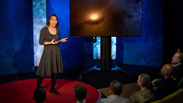
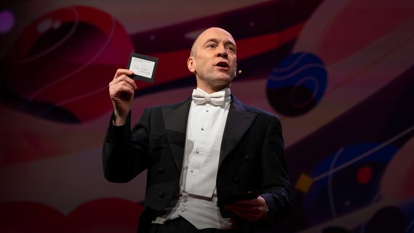
In 1969 in July, three Americans launched into space. Now, they went to the surface of the moon, they famously made the great leap for mankind. Buzz Aldrin, Neil Armstrong, they walked on the surface, they planted this flag. It's rightly celebrated as a moment that in America we say is a triumph. We think it was this amazing accomplishment. They didn't just leave behind this flag, though. They also left behind a plaque. This plaque is a beautiful object, and one that I want to talk to you a little bit about. First, you might notice that there's two globes, representing all of earth. And then there's this beautiful statement: "We came in peace for all mankind." Now, at first, this is just nice poetic language, but it's also set in a typeface that's perfect for this moment. It seems industrial, it seems engineered. It also is the best possible name you could come up with for something on the moon: Futura.
ביולי 1969, שלושה אמריקאים טסו לחלל. עכשיו, הם נחתו על פני הירח, הם עשו את הקפיצה הגדולה לאנושות המפורסמת. באז אולדרין, ניל אמסטרונג, הם הלכו על פני השטח, הם הציבו את הדגל הזה. זהו רגע שנחגג בצדק כמאורע שבאמריקה נחשב לניצחון. אנחנו חושבים שזה היה הישג מדהים. אבל הם לא רק הותירו אחריהם את הדגל הזה. הם גם השאירו מאחוריהם שלט. השלט הזה הוא חפץ יפה, וכזה שאני רוצה לספר לכם קצת עליו. ראשית, אולי שמתם לב שיש עליו שני גלובוסים, המייצגים את כל כדור הארץ. ואז יש את ההצהרה היפה: "באנו בשלום בשם כל האנושות". עכשיו, במבט ראשון, זוהי פשוט שפה פואטית נחמדה, אבל היא גם כתובה בגופן שמושלם לאירוע הזה. הוא נראה תעשייתי, הוא נראה מהונדס. יש לו גם את השם הטוב ביותר שאפשר להמציא למשהו שמוצב על הירח: Futura (פוטורה).
Now, I want to talk to you about fonts, and why this typeface is perfect for this moment. But it's actually more than just ceremonial. Now, when all of you arrived here today, you actually had to think about fonts. You might not realize it, but you're all unconscious experts on typography. Typography is the study of how fonts inhabit our world, they're the visual language of the words we use. Here's the thing that's funny about this, though. I know you're probably not like me, you're not a font nerd, maybe some of you are, but if you're not, that's alright, because I might spend hours every day trying to pick the perfect typeface for the perfect project, or I might spend thousands of dollars every year, trying to get ones with the right features. But all of you actually spend hours every day, evaluating fonts. If you don't believe me, think about how you got here. Each of you had to judge by the signs and maybe even on your phone, which signals to trust and which to ignore. You were evaluating fonts.
אני רוצה לספר לכם על גופנים, ולמה הגופן הזה מושלם למאורע הזה. אבל זה למעשה יותר מסתם עניין טקסי. כשכולכם הגעתם לכאן היום, הייתם בעצם צריכים לחשוב על גופנים, אולי לא ידעתם את זה, אבל באופן בלתי מודע, כולכם מומחים לטיפוגרפיה. טיפוגרפיה היא מדע שחוקר איך גופנים מתקיימים בעולם שלנו, הם השפה הויזואלית של המילים בהן אנחנו משתמשים. והנה מה שמצחיק כאן, אני יודע שבשונה ממני, אתם לא חנונים של גופנים, אולי חלק מכם כן, אבל גם אם אתם לא, זה בסדר. כי אני יכול לבלות שעות כל יום בניסיון לבחור את הגופן המושלם לפרויקט המושלם. או שאני יכול להוציא אלפי דולרים בכל שנה, בניסיון להשיג כאלה עם המאפיינים המתאימים. אבל כולכם בעצם מבלים שעות כל יום בהערכת גופנים. אם אתם לא מאמינים לי, תחשבו על איך הגעתם הנה. כל אחד מכם היה צריך לשפוט לפי הסימנים ואולי אפילו בפלאפון שלכם, באיזה אותות לבטוח ומאיזה להתעלם. אתם הערכתם גופנים.
Or maybe when you're just buying a new product, you have to think about whether something is expensive or cheap or hard to get or easy to find. And the funny thing about it is, this may not seem extraordinary to you, but the moment you see something out of place, you recognize it right away.
או אולי כשאתם קונים מוצר חדש, אתם צריכים לחשוב על האם משהו הוא יקר או זול או קשה להשגה או קל למציאה. והמצחיק כאן הוא שזה אולי לא נראה מדהים עבורכם, אבל ברגע שאתם רואים משהו שלא במקומו, אתם מזהים אותו מייד.
(Laughter)
(צחוק)
The thing I love about typography, and why I love fonts and why I love Futura, is that, for me, what I study is everywhere. Every street that I walk down, every book that I pick up, every thing that I read is filled with the thing I love. Now, once you understand the history and what happens with typography, you actually have a history of everything before you.
מה שאני אוהב בטיפוגרפיה, והסיבה שאני אוהב גופנים, והסיבה שאני אוהב את Futura, היא שעבורי, מה שאני חוקר נמצא בכל מקום. בכל רחוב שאני הולך בו, בכל ספר שאני קורא, כל מה שאני קורא מלא בדבר שאני אוהב. ברגע שאתם מבינים את ההיסטוריה ומה קרה בטיפוגרפיה, אתם בעצם מקבלים את ההיסטוריה של כל מה שקרה לפניכם.
And this is the typeface Futura. As previously we've discussed, this is modernism in miniature. This is a way in which modernism infiltrated this country and became perhaps the most popular, or promiscuous typeface, of the twentieth century. "Less is more," right, these are the aphorisms of modernism. And in the visual arts, the same thing happened. Let's focus on the essentials, focus on the basic shapes, focus on geometry. So Futura actually holds this to its core. You might notice that the shapes inherent in Futura have circles, squares, triangles. Some of the shapes are all based on circles, like the O, D and C, or others have this pointed apex of the triangle. Others just look like they might have been made with a ruler or a compass. They feel geometric, they feel mathematic, precise. In fact, this whole system carries through with the way that the typeface was designed. To not look like it was made like other typefaces, to be something new. Here it is in the lightweight, the medium weight and the bold weight. The whole family has different things to commend to it.
וזה הגופן Futura. כפי שאמרנו קודם, זהו מודרניזם בקטנה. זאת הדרך בה מודרניזם חדר למדינה הזאת והפך אולי לגופן הפופולרי או הרווח ביותר במאה העשרים. "פחות הוא יותר", נכון, אלה הן הססמאות של המודרניזם. ובתחום האומנות הויזואלית, התרחש תהליך דומה. בואו נתמקד ברובד הראשוני, נתמקד בצורות הבסיסיות, נתמקד על גיאומטריה. אז Futura למעשה מגלם את זה. אולי שמתם לב שבצורות המופיעות בFutura יש מעגלים, מרובעים, משולשים. חלק מהצורות כולן מבוססות על מעגלים, כמו האות O, D ו-C, ולאחרות יש את הקודקוד המחודד של המשולש. אחרות פשוט נראות כאילו הן עוצבו בעזרת סרגל או מצפן. הן מעבירות תחושה גיאומטרית, מתמטית, מדויקת. למעשה, כל המערכת הזו מגלמת את הדרך בה גופן זה עוצב. על מנת שלא יראה כמו גופנים אחרים, שיהיה משהו חדש. כאן הוא מופיע בעובי דק, בינוני ועבה. לכל המשפחה יש דברים שונים שאפשר להבליט בה.
This was a conscious break from the past, something that looked like it was made by a machine, and not by hand. When I say not made by hand, this is what I mean. This is what we think about maybe, when you might create something with a calligraphic brush or a pen. That there's thicks and thins. And even more traditional typefaces, say like a Garamond, holds vestiges of this old system in which you can see the A where it get little bit thinner at the top and thicker down below, because it's trying to look like someone had made it by hand. But Futura, in contrast, is designed to look like no one had touched it at all, that this was made by a machine, for a machine age, for an industrial age.
זה היה שינוי מכוון מהעבר, משהו שנראה כאילו הוא עוצב בידי מכונה, ולא בידי אדם. כשאני אומר לא בידי אדם, זה מה שאני מתכוון. זה מה שאנחנו אולי מדמיינים, כשאנחנו מעצבים משהו בעזרת מכחול או עט קליגרפי. שישנם חלקים עבים ודקים. ואפילו גופנים יותר מסורתיים כמו למשל Garamond, יש בהם מאפיינים של המערכת הישנה הזו בה אתם יכולים לראות את האות A בה החלק העליון נהיה יותר דק, ועבה יותר לכיוון מטה, כי הוא מנסה להיראות כאילו הוא עוצב בידי אדם. אבל Futura, בניגוד לכך, עוצב כך שיראה כאילו לא נגעה בו יד אדם, כאילו עוצב בידי מכונה, עבור עידן המכונה, העידן התעשייתי.
There's actually a sleight of hand here that Paul Renner, the designer who made this in 1927, employed. If you look at the way in which the circular shape joins with the vertical shaft, you'll notice that it tapers just every so slightly. And this is one of hundreds of ways in which this typeface was designed to look geometrically perfect, even though it's mathematically not. And this is what typeface designers do all the time to make typefaces work, every day.
יש כאן בעצם מניפולציה שפול רנר, המעצב שעיצב את זה ב-1927 השתמש. אם תסתכלו על האופן בו הצורה המעגלית מתחברת לצלע האופקית, תראו שהיא מתחדדת מעט. וזאת אחת ממאות הדרכים בה גופן זה עוצב כך שיראה מושלם מבחינה גיאומטרית, למרות שהיא לא מושלמת מתמטית. וזה מה שמעצבי גופנים עושים כל הזמן כדי לעצב גופנים, בכל יום.
Now, there were other designers doing this at the same time in Europe and America. These are a few other excellent examples from Europe, trying to create something new for the new age, a new moment in time. These are some other ones in Germany that in some ways look very similar to Futura, maybe with higher waist or lower waist or different proportions. Then why did Futura take over the world? In this case, if you can read the titles there, some of these names don't quite roll off the tongue: Erbar, Kabel Light, Berthold-Grotesk, Elegant-Grotesk. These aren't exactly household names, are they? And so when you compare that to Futura, you realize that this was a really good choice by the marketing team.
היו גם מעצבים אחרים שעשו דברים דומים באותו הזמן באירופה ובאמריקה. אלה הן כמה דוגמאות אחרות מצוינות מאירופה, שמנסות ליצור משהו חדש עבור העידן החדש, רגע חדש בזמן. אלה הן כמה אחרות מגרמניה שבדרכים מסוימות נראות דומות מאוד לFutura, בחלקן המותן גבוהה יותר או נמוכה יותר או שהן בעלות פרופורציות אחרות. אז למה Futura כבשה את העולם? במקרה הזה, אם אתם יכולים לקרוא את הכותרות כאן, חלק מהשמות האלה לא ממש מתגלגלות על הלשון: Erbar, Kabel Light, Berthold-Grotesk, Elegant-Grotesk. אלה אינם בדיוק שמות מוכרים, נכון? אז כשאתה משווה אותם לFutura, אתה מבין שזאת היתה בחירה ממש טובה של צוות השיווק.
What's amazing about this name -- you know, what's in this name is that this is a name that actually invokes hope and an idea about the future. And this isn't actually the word for future in German, it wasn't a German name, they actually picked something that would speak to a wider, larger audience, a universal audience. And when you compare it to what was being done in America -- these are the typefaces from the same period in the United States in the 1920s, bold, brash, braggadocios. You almost think of this as exactly like what the stock market looked like when they were all going nuts in the 1920s. And you realize that Futura is doing something revolutionary.
מה שמדהים לגבי השם הזה -- אתם יודעים, מה יש בשם הזה הוא שזהו שם שלמעשה מעורר תקווה, ומושג לגבי העתיד. וזאת בעצם לא המילה לעתיד (Future) בגרמנית, זה לא היה שם גרמני, הם למעשה בחרו משהו שיפנה לקהל הרבה יותר רחב, קהל אוניברסלי. וכשאתם משווים אותו למה שנעשה באמריקה -- אלה הם הגופנים מאותה התקופה בארצות הברית של שנות ה-20, עזים, חצופים, מתרברבים. כמעט אפשר לחשוב על זה כמעט כמו התנהגות שוק המניות כשכולם השתגעו בשנות ה-20. ומכאן אפשר להבין שFurura עשה משהו מהפכני.
I want to step back and talk about an example of the typeface in use. So this is a magazine that we all probably know today, "Vanity Fair." This is what it looked like in 1929, in the summer. And in many ways, there's nothing wrong with this design. This is absolutely typical of the 1920s. There's a photograph of an important person, in this case Franklin Roosevelt, then-governor of New York. Everything seems centered, everything seems symmetrical. There's still a little bit of ornamentation, so this is still maybe having some vestiges of the painted lady and not fully modernistic. But everything seems kid of solid. There's even drop caps to help you get into the text.
אני רוצה לקחת צעד אחורה ולדבר על דוגמה לגופן שאנחנו משתמשים בו. אז זהו השער למגזין שכולם בטח מכירים היום "ואניטי פייר". ככה הוא נראה ב1929, בקיץ. ובאופנים רבים, אין שום פסול בעיצוב הזה. הוא טיפוסי לחלוטין לשנות ה-20. ישנו תצלום של אדם חשוב, במקרה הזה פרנקלין רוזוולט, שהיה אז מושל ניו יורק. הכל נראה ממורכז, הכל נראה סימטרי. עדיין יש קצת קישוטיות, אז אולי יש כאן עדיין כמה שרידים מ״האישה הצבועה״ (סרט פופופלרי משנות ה-20) ולא מודרני באופן מלא. אבל הכל נראה די מגובש. יש אפילו אותיות גדולות שיעזרו לך להיכנס אל הטקסט.
But this all changed very quickly and in October of 1929, a Berlin-based designer came and redesigned "Vanity Fair." And this is what it looks like with Futura. Instead of the governor now we have a photograph of an abstract, beautiful setting, in this case, the ocean. Instead of drop caps, there's nothing at all. And replaced with a centered layout is now asymmetry. And it gets even more radical the further you enter the magazine. In this case, even more dramatic asymmetry. In this case, illustrations by Pablo Picasso, moving across the page and breaking the gutter of the two pages. And there's something even more radical. If you look closely at the Futura, you might notice something. You might not pick it up at first, but there are no capital letters in the title or the captions on this page. You might not think that's very radical, but pick up any magazine, any book or go to any website, and I guarantee, you are not going to find it very easily. This is still a radical idea.
אבל כל זה השתנה מהר מאוד ובאוקטובר 1929 מעצב בן העיר ברלין בא ועיצב מחדש את "ואניטי פייר". וככה זה נראה עם Futura. במקום המושל עכשיו יש לנו תצלום של תמונת נוף אבסטרקטית ויפה, במקרה הזה, האוקיינוס. במקום אותיות גדולות, אין כלום. ותבנית א-סימטרית מחליפה את זו הממורכזת. וזה מקצין עוד יותר ככל שנעמיק יותר במגזין. במקרה הזה, א-סימטריות יותר דרמטית. במקרה הזה, איורים של פבלו פיקאסו, הנעים על פני הדף ושוברים את ההפסק שבין שני הדפים. וישנו משהו אפילו יותר רדיקלי. אם תסתכלו מקרוב על Futura תוכלו לשים לב למשהו. אולי לא תראו אותו בהתחלה, אבל אין שום אותיות גדולות בכותרת או בתחילת המשפטים בדף. אולי אתם חושבים שזה לא כזה קיצוני, אבל אם תיקחו כל מגזין או ספר או תפתחו כל אתר אינטרנט, אני מבטיח לכם, לא תמצאו בקלות מקבילה לכך. זהו עדיין רעיון מהפכני.
And why is that radical? When we think about what capital letters denote, they denote something important, whether it's our names, or our titles. Or maybe even just the name of our corporations, or maybe our trademarks. Actually, in some ways, America's the home of capitalization. We love putting capitals in everything.
ולמה הוא כל כך מהפכני? כשאנחנו חושבים על מה המשמעות של אותיות גדולות, הן מבטאות משהו חשוב, בין אם זה השם שלנו, התואר שלנו, או אולי פשוט שם החברה שלנו, או הלוגו שלנו. למעשה, אפשר לומר שאמריקה היא מולדת האותיות הגדולות. אנחנו אוהבים לשים אותן בכל דבר.
(Laughter)
(צחוק)
But think about how radical this would be to introduce a magazine where you're taking away all the capital letters. This has maybe had the same political force that we now argue over things like pronouns in our society today. In the 1920s, this is just shortly after Soviet Russia had a communist revolution. And for them, this actually represented a socialist infiltration into America. All lowercase letters meant that this was an egalitarian, complete lowering of everything into one equal playing field. Now this is still kind of a radical idea. Think about how often you do capitalize something to have more power or prestige to it. So for them to do this was a way in which Futura was using this idea.
אבל תחשבו כמה מהפכני זה יהיה אם היינו מציגים מגזין בו העלמנו את כל האותיות הגדולות. אולי היה לזה את אותה ההשפעה של כוח פוליטי של הדיון סביב שמות תואר כיום בחברה. בשנות ה-20, מספר שנים לאחר המהפכה הקומוניסטית ברוסיה הסובייטית. ועבורם, זה למעשה ייצג חדירה סוציאליסטית לתוך אמריקה. שימוש רק באותיות רגילות הוא אקט של שוויוניות, הנמכה של הכל לשדה פעולה אחד שוויוני. זה עדיין רעיון די מהפכני. תחשבו כמה פעמים אתם שמים אותיות גדולות על משהו כדי שיהיה לו יותר כוח או יוקרה. אז עבורם לעשות דבר שכזה היה הדרך שבה Futura מגלם את הרעיון הזה.
Now, other designers were doing other things with Futura. Others brought other ideas of modernism with it, whether it was interesting new illustration styles, or interesting new collage types of illustration. Or even just new book covers, whether they were from Europe.
מעצבים אחרים עשו דברים אחרים עם Futura. אחרים הביאו רעיונות אחרים של מודרניזם, בין אם היו אלה סגנונות איור חדשים ומעניינים, או סגנונות קולאז' חדשים ומעניינים לעיצוב. או אפילו פשוט כריכות ספרים חדשות, בין אם הם באו מאירופה.
But here's the funny thing. In the 1920s, if you wanted to use a new typeface, you couldn't just go download it onto your computer. You actually had to have pieces of lead. So for Americans who wanted to adopt this and make it part of their own system, something they could use in everyday typography, whether in ads or anything else, they actually had to have metal type.
אבל הנה מה שמצחיק כאן. בשנות ה-20, אם רצית להשתמש בגופן חדש, לא יכולת פשוט להוריד אותו למחשב שלך. היית צריך להשיג את חתיכות המתכת עצמן. אז אמריקאים שרצו לאמץ את זה ולהפוך אותו לחלק מהמערכת שלהם, משהו שיוכלו להשתמש בו בטיפוגרפיה יומיומית, בין אם במודעות או בכל דבר אחר, הם היו צריכים להשיג את גופני המתכת.
So being good American capitalists, what did we do? We made all sorts of copies. Ones that had nothing to do with the name Futura, but looked identical to it, whether it was Spartan or Tempo. And in fact, by the time that World War II started, American corporations were actually trying to boycott Nazi goods. But they said, "Go ahead and use our copies. Use 20th Century, use Spartan, use Vogue, use Tempo. These are identical to Futura." And in fact, for most people, they didn't even learn the new names, they just still called it all Futura. So America took this typeface in, conquered it and made it its own. So by the time World War II finishes, Americans are using this on everything, whether it be catalogs, or atlases, or encyclopedias or charts and graphs, or calendars, or even political material. And even the logo for a new expansion football team. And in fact, it was used even on some of the most important advertising of the 20th century.
אז כאמריקאים קפיטליסטים טובים, מה עשינו? הכנו כל מיני עותקים. כאלה שלא היה להם שום קשר לשם Futura, אבל נראו דומים לו, בין אם זה Spartan או Tempo. ולמעשה, עד תחילת מלחמת העולם השניה, התאגידים האמריקאים ניסו להחרים מוצרים נאציים. אבל הם אמרו, "תשתמשו בעותקים שלנו. תשתמשו ב20th Century, ב-Spartan, תשתמשו ב-Vogue, ב-Tempo. אלה כולם זהים לFutura". ולמעשה, רוב האנשים אפילו לא טרחו ללמוד את השמות החדשים, הם פשוט קראו לכולם Futura. אז אמריקה אימצה את הגופן הזה, כבשה אותו והפכה אותו לשלה. אז עד לסוף מלחמת העולם השניה, האמריקאים השתמשו בו להכל, בין אם מדובר בקטלוגים, באטלסים, אנציקלופדיות, טבלאות או גרפים, לוחות שנה או אפילו חומרי פרסום פוליטיים. ואפילו בלוגו של קבוצת פוטבול חדשה. השתמשו בגופן הזה בחלק מהפרסומים החשובים ביותר של המאה ה-20. אז במציאות הזאת
So it's in this context that when the US government was picking a typeface to use after World War II for new maps and new projects, they picked Futura. It wasn't an astounding choice, it wasn't a radical choice, it didn't have anything to do with communism. But in this case, it was used on some of the most important maps, so this one, an air force map in 1962, or used for the maps in Vietnam in '66.
כשהממשלה האמריקאית בחרה בגופן להשתמש בו אחרי מלחמת העולם השניה למפות ופרוייקטים חדשים, הם בחרו בFutura. זו לא הייתה בחירה מדהימה, זו לא הייתה בחירה רדיקלית, לא היה לזה שום קשר לקומוניזם. אבל במקרה הזה, השתמשו בגופן הזה לחלק מהמפות החשובות ביותר, אז המפה הזו, מפת חיל האוויר ב-1962, או המפות בהן השתמשו בויאטנם ב-1966.
And so it wasn't a surprise that when astronauts first started the Mercury program, such as John Glenn orbiting the earth, that charts and maps that he was using were in Futura. And in fact, by the time Mercury morphed into Apollo, it started getting used more and more for more things. So in this case for a safety plan, or even starting to get used on instrument panels, or navigational aids. Or even on diagrams to show how the whole system worked.
כך שזו לא היתה הפתעה כשהאסטרונאוטים התחילו את תכנית מרקורי, כשג'ון גלן הקיף את כדור הארץ, שהטבלאות והמפות בהן הוא השתמש היו כתובות ב-Futura. ולמעשה, כשתכנית מרקורי התחלפה בתכנית אפולו, הם התחילו להשתמש בגופן ליותר ויותר דברים. במקרה הזה זאת היא תכנית בטיחות. או אפילו בפאנלים של המכשירים, או בעזרי הניווט. או אפילו בתרשימים שהראו איך המערכת כולה פועלת.
But here's the amazing thing, it didn't just get used for papers that they handed out to people. It started to get used for an interface, for an entire system that helped the astronauts know how to use the machine. NASA wasn't just one big corporation making everything. There was hundreds of contractors -- Boeing, IBM, McDonnell Douglas -- all making different machines. Now imagine if astronauts had to use different typefaces and different systems for each component they had in the space shuttles. This would have been impossible to navigate and there would have been a cognitive overload every time they had to open up a new system. So in this case, Futura being used on the interface helped them navigate complexity and make it more clear. And it wasn't just used on buttons, it was used on labels, and it was used on their food rations, and it was used on their tool kits. It was used on knobs and levers to tell them what to do. In fact, maybe even some of the places where they needed to have things that were complex be more simple to them, instructions were printed entirely in Futura, so that they could know what to do with that one moment. They didn't have to remember everything in their head, they could have it out there in the world to see and refer to. In this case, Futura helped make that system, which was already a very difficult and complex system, a little less complex. In fact, the very first or last thing an astronaut might have seen when they were entering or exiting the spacecraft would have been in Futura.
אבל הנה מה שמדהים. לא השתמשו בגופן רק לניירות שחילקו לאנשים. השתמשו בגופן גם לצרכי ממשק, עבור כל מערכת שעזרה לאסטרונאוטים ללמוד איך לתפעל את המכשיר. נאסא אינו תאגיד אחד גדול שמייצר הכל. היו להם מאות על גבי מאות של קבלני משנה -- בואינג, IBM, מקדונל דגלאס -- כולם ייצרו מכונות שונות. דמיינו מה היה קורה אם האסטרונאוטים היו צריכים להשתמש בגופן שונה ומערכות שונות עבור כל רכיב בו הם נעזרו בחללית. זה היה יוצר מצב בלתי אפשרי לניווט והיה נוצר עומס קוגניטיבי בכל פעם שהם היו צריכים לפתוח מערכת חדשה. אז במקרה הזה , Futura שימשה כממשק שסייע לנווט את המורכבות ולהקל על התהליכים. והוא לא הופיע רק על גבי כפתורים, אלא גם על גבי תגיות, על גבי מנות המזון, ועל גבי ערכות הכלים שלהם. השתמשו בו על ידיות שהורו להם מה לעשות. למעשה, אולי אפילו בחלק מהממצבים בהם הם נזקקו לפישוט של תהליכים מורכבים, ההוראות הודפסו כולן בFutura, כך שיוכלו לדעת מה לעשות באותו המצב. הם לא היו צריכים לזכור הכל בראש, הידע היה מודפס וזמין להם להתייעצות. במקרה הזה, Futura סייע להם להפוך את המערכת הזאת, שכבר היתה מערכת מאוד קשה ומאוד מורכבת, לקצת פחות מורכבת. למעשה, הדבר הראשון או האחרון שאסטרונאוט היה רואה כשהיה נכנס או יוצא מהחללית היה כתוב בFutura.
One of my favorite examples of how Futura worked in this way is actually this camera. This is a Hasselblad that was made by the Swedish company. It's a perfectly good camera, some of you might have used one, it's prized by photographers as a really great camera. And you might notice, if you know anything about cameras, that there's some modifications made to it. In this case, there are stickers placed all over the film canisters, or other parts of the camera here. What this enabled NASA to do, was make something really great out of the astronauts. They're not photographers, they're not experts in art. But they could ensure that they would know how to use this camera because of the labels placed there in Futura.
אחת הדוגמאות הכי אהובות עלי לאיך futura מופיע כך היא למעשה המצלמה הזאת. זאת היא מצלמת Husselblad שיוצרה על ידי חברה שוודית. היא מצלמה טובה, חלקכם אולי השתמשתם במצלמה כזו, היא נחשבת בעיני צלמים מקצועיים כמצלמה ממש טובה. ואולי תשימו לב, אם אתם מבינים במצלמות, שנעשו במצלמה הזאת כמה שינויים. במקרה הזה, מודבקות מדברות על כל מיכלי סרט הצילום, או על חלקים אחרים של המצלמה, כמו כאן. מה שזה אפשר לנאסא לעשות, זה לשכלל את יכולותיהם של האסטרונאוטים. הם לא היו צלמים מקצועיים, או מומחי אומנות. אבל הם יכלו לוודא שהם ידעו איך להשתמש במצלמה הזאת בגלל המדבקות שמודבקות שם בגופן Futura.
So in this case, Futura acquired and made sure that they had legitimacy with the things they were using. In this case to not take off the film before it would expose. Which, in this case, we would have never had some of the amazing photos we had without this label. When we see something as decorative as this, a ceremonial patch, or something like this plaque on the moon, we realize that Futura was more than just something ceremonial, something more than something that had just been picked for its design. In fact, Futura had authority, had legitimacy and had power because of this choice.
אז במקרה הזה, Futura אימצה ואפשרה להם לקבל לגיטימציה בדברים בהם הם השתמשו. במקרה הזה לא להוציא את סרט הצילום לפני תהליך החשיפה. שבמקרה הזה, היינו מפסידים חלק מהתמונות המדהימות שיש לנו ללא המדבקה הזו. כשאנחנו רואים משהו קישוטי כמו זה, מדבקה טקסית, או משהו כמו השלט הזה על הירח, אנחנו מבינים שFutura היא יותר ממשהו טקסי. משהו יותר מאשר דבר שפשוט נבחר בגלל העיצוב שלו. למעשה, לFutura היתה סמכות, היתה לו לגיטימציה וכוח שנבעו מהבחירה הזו.
There's one other thing I want to talk about in closing. And that is that Futura tells a story. And this is what I love about typefaces, is that all of them tell stories. And in this case, this typeface tells a very powerful story about assimilation, about something being taken into America and being made part of its culture. And that's one of the best and worst things America does, is we take things into our culture and we spit them out back again and claim them our own. And in this case, Futura mirrors exactly what happened with the technology undergirding the whole system. Futura was a German typeface, taken in, made into an American commodity. And so were the technologies: the rockets, the scientists all came from Germany as well. So in some ways, this German typeface on an American plaque perfectly mirrors what happened with the technology. And in this case, when you think about this story, you realize that typography on the moon represents legitimacy, represents authority, and this gave them, the astronauts, the power to get to the moon.
יש עוד דבר אחד שאני רוצה להעלות לקראת סיום. וזה שFutura מספר לנו סיפור. וזה מה שאני אוהב בגופנים, שהם כולם מספרים סיפורים. ובמקרה הזה, הגופן הזה מספר סיפור עוצמתי מאוד על הטמעה, על משהו שאומץ באמריקה והפך לחלק מהתרבות שלה. וזה אחד הדברים הטובים והגרועים ביותר שאמריקה עושה, שאנחנו מאמצים דברים לתוך התרבות שלנו ואז מקיאים אותם שוב וטוענים שהם שלנו. ובמקרה הזה, Futura משקפת בדיוק מה שקרה עם הטכנולוגיה בבסיס כל המערכת. Futura היה גופן גרמני שאומץ והפך למוצר אמריקאי. וכך גם הטכנולוגיות: הטילים, המדענים, כולם באו גם הם מגרמניה. אז במידה מסוימת, הגופן הגרמני הזה כתוב על שלט אמריקאי משקף בצורה מושלמת מה שקרה עם הטכנולוגיה. ובמקרה הזה, כשאתם חושבים על הסיפור הזה אתם מבינים שהטיפוגרפיה על הירח מייצגת לגיטימציה, מייצגת סמכות, וזה נתן להם, לאסטרונאוטים, את הכוח להגיע לירח.
Thank you.
תודה רבה.
(Applause)
(מחיאות כפיים)