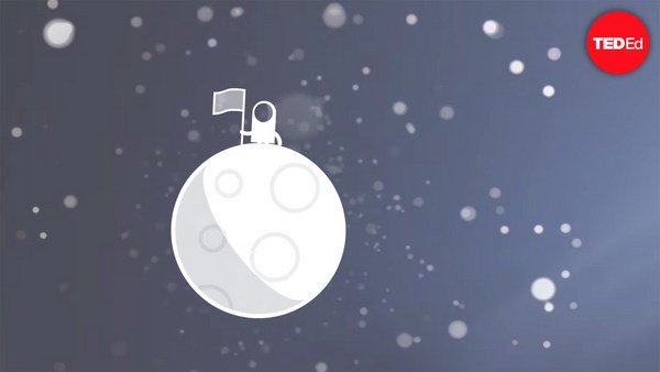
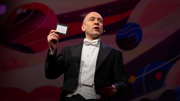
In 1969 in July, three Americans launched into space. Now, they went to the surface of the moon, they famously made the great leap for mankind. Buzz Aldrin, Neil Armstrong, they walked on the surface, they planted this flag. It's rightly celebrated as a moment that in America we say is a triumph. We think it was this amazing accomplishment. They didn't just leave behind this flag, though. They also left behind a plaque. This plaque is a beautiful object, and one that I want to talk to you a little bit about. First, you might notice that there's two globes, representing all of earth. And then there's this beautiful statement: "We came in peace for all mankind." Now, at first, this is just nice poetic language, but it's also set in a typeface that's perfect for this moment. It seems industrial, it seems engineered. It also is the best possible name you could come up with for something on the moon: Futura.
En juillet 1969, trois Américains sont partis dans l'espace. Ils ont marché sur la surface de la Lune, leurs pas faisant un bond de géant pour l'humanité. Buzz Aldrin, Neil Armstrong ont marché sur la Lune et planté ce drapeau. Cet instant est légitimement célébré comme un triomphe aux États-Unis. Nous pensons qu'il s'agit là d'un accomplissement extraordinaire. Ils y ont abandonné plus qu'un drapeau : une plaque. Cette plaque est un objet magnifique que j'aimerais vous décrire. Vous remarquerez d'abord les deux globes qui représentent la Terre. Et il y a cette magnifique déclaration : « Nous sommes venus en paix, au nom de toute l'humanité. » Au premier abord, c'est un joli langage poétique. Mais c'est écrit dans une police de caractères parfaite pour ce moment. Elle semble industrielle, pensée par des ingénieurs. Elle porte aussi le nom le plus approprié pour un objet déposé sur la Lune : Futura.
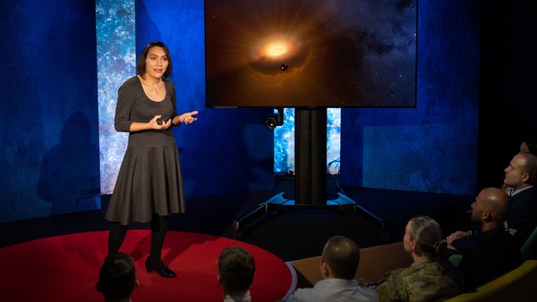
Now, I want to talk to you about fonts, and why this typeface is perfect for this moment. But it's actually more than just ceremonial. Now, when all of you arrived here today, you actually had to think about fonts. You might not realize it, but you're all unconscious experts on typography. Typography is the study of how fonts inhabit our world, they're the visual language of the words we use. Here's the thing that's funny about this, though. I know you're probably not like me, you're not a font nerd, maybe some of you are, but if you're not, that's alright, because I might spend hours every day trying to pick the perfect typeface for the perfect project, or I might spend thousands of dollars every year, trying to get ones with the right features. But all of you actually spend hours every day, evaluating fonts. If you don't believe me, think about how you got here. Each of you had to judge by the signs and maybe even on your phone, which signals to trust and which to ignore. You were evaluating fonts.
Je vais vous parler de polices et de ce qui rend celle-ci parfaite pour ce moment-là. Ça va au-delà du cérémonial. À votre arrivée aujourd'hui, vous avez dû penser aux polices de caractères. Sans en être conscient, vous êtes tous experts en typographie. La typographie est l'étude de la place des polices dans notre univers. Elles sont le langage visuel des mots que nous utilisons. Un de leurs aspects est vraiment curieux. Je sais que vous n'êtes pas fana de polices comme moi. Certains peut-être, mais rien de grave à ne pas l'être. Je peux passer des heures chaque jour à choisir le caractère parfait pour un projet. Je peux dépenser des sommes énormes tous les ans pour trouver la bonne. Vous aussi, vous passez des heures à analyser les polices. Comment êtes-vous arrivés ici ? Les signes vous ont conduit à évaluer, sans doute sur votre téléphone, et déterminer quels signaux suivre et lesquels ignorer. Vous analysiez les polices.
Or maybe when you're just buying a new product, you have to think about whether something is expensive or cheap or hard to get or easy to find. And the funny thing about it is, this may not seem extraordinary to you, but the moment you see something out of place, you recognize it right away.
Quand vous achetez un nouveau produit, vous réfléchissez si c'est cher, ou bon marché, facile à acheter, ou pas. Ce qui est curieux, et ça pourrait ne pas vous paraître insolite, mais à l'instant où une chose semble étrange, vous la détectez immédiatement.
(Laughter)
(Rires)
The thing I love about typography, and why I love fonts and why I love Futura, is that, for me, what I study is everywhere. Every street that I walk down, every book that I pick up, every thing that I read is filled with the thing I love. Now, once you understand the history and what happens with typography, you actually have a history of everything before you.
J'aime la typographie, et les polices, et Futura, parce que l'objet de mon étude est présent partout. Les rues que je parcours, les livres que je touche, tout ce que je lis est imprégné de l'objet de ma passion. Dès qu'on a la compréhension de l'histoire et de ce qui arrive avec les typographies, on a sous les yeux l'histoire de tout.
And this is the typeface Futura. As previously we've discussed, this is modernism in miniature. This is a way in which modernism infiltrated this country and became perhaps the most popular, or promiscuous typeface, of the twentieth century. "Less is more," right, these are the aphorisms of modernism. And in the visual arts, the same thing happened. Let's focus on the essentials, focus on the basic shapes, focus on geometry. So Futura actually holds this to its core. You might notice that the shapes inherent in Futura have circles, squares, triangles. Some of the shapes are all based on circles, like the O, D and C, or others have this pointed apex of the triangle. Others just look like they might have been made with a ruler or a compass. They feel geometric, they feel mathematic, precise. In fact, this whole system carries through with the way that the typeface was designed. To not look like it was made like other typefaces, to be something new. Here it is in the lightweight, the medium weight and the bold weight. The whole family has different things to commend to it.
Voici la police Futura. Comme je vous l'ai dit, c'est du modernisme minimaliste. Elle a catalysé la diffusion du modernisme dans notre pays et est devenue la police la plus populaire et la plus omniprésente du XXe siècle. « Moins, c'est mieux, » une des maximes du modernisme. Le même phénomène est apparu dans les arts visuels. Observons les basiques, les formes de base, la géométrie. Futura y est très attachée. Vous remarquerez que les formes inhérentes de Futura sont des cercles, des carrés, des triangles. Certaines formes sont basées sur le cercle, le O, le D ou le C, et d'autres ont la pointe du triangle. D'autres encore semblent avoir été conçues avec une règle et un compas. Elles paraissent géométriques, mathématiques et précises. En fait, ce système est prégnant dans la conception de la police. Pour ne pas ressembler à une autre police et être totalement neuve. La voici avec des graisses légères, moyennes et grasses. La famille de police est composée de différents éléments.
This was a conscious break from the past, something that looked like it was made by a machine, and not by hand. When I say not made by hand, this is what I mean. This is what we think about maybe, when you might create something with a calligraphic brush or a pen. That there's thicks and thins. And even more traditional typefaces, say like a Garamond, holds vestiges of this old system in which you can see the A where it get little bit thinner at the top and thicker down below, because it's trying to look like someone had made it by hand. But Futura, in contrast, is designed to look like no one had touched it at all, that this was made by a machine, for a machine age, for an industrial age.
C'est en rupture consciente avec le passé car elle semble avoir été conçue par une machine, et non à la main. À la main signifie ceci. C'est ce que nous imaginons souvent quand on pense à une police calligraphiée au pinceau ou au stylo : l'épaisseur des traits varie. Des polices plus traditionnelles, comme Garamond, conservent ces vestiges du passé où le sommet du A est légèrement plus fin et sa base est plus épaisse, pour ressembler à une forme manuscrite. Mais Futura a été conçue pour donner l'impression qu'aucun homme n'y a touché, qu'une machine l'a conçue, pour une ère industrielle de la machine.
There's actually a sleight of hand here that Paul Renner, the designer who made this in 1927, employed. If you look at the way in which the circular shape joins with the vertical shaft, you'll notice that it tapers just every so slightly. And this is one of hundreds of ways in which this typeface was designed to look geometrically perfect, even though it's mathematically not. And this is what typeface designers do all the time to make typefaces work, every day.
La dextérité de la main y est toutefois présente. Paul Renner, le graphiste qui a conçu Futura en 1927, y a veillé. Quand on observe comment la forme circulaire rejoint le fut vertical, on constate un léger biseautage. C'est une des centaines de manières qui donnent aux polices une apparence géométrique parfaite, mais pas mathématiquement parfaite. C'est ce que font les graphistes tout le temps pour réussir leurs polices.
Now, there were other designers doing this at the same time in Europe and America. These are a few other excellent examples from Europe, trying to create something new for the new age, a new moment in time. These are some other ones in Germany that in some ways look very similar to Futura, maybe with higher waist or lower waist or different proportions. Then why did Futura take over the world? In this case, if you can read the titles there, some of these names don't quite roll off the tongue: Erbar, Kabel Light, Berthold-Grotesk, Elegant-Grotesk. These aren't exactly household names, are they? And so when you compare that to Futura, you realize that this was a really good choice by the marketing team.
D'autres graphistes y ont aussi réfléchi en Europe et en Amérique. Il y a eu quelques très bons exemples en Europe de tentatives pour créer des choses neuves pour une ère nouvelle. On en trouve en Allemagne, d'une certaine manière, semblables à Futura, mais avec un centre de gravité et des proportions différents. Pourquoi Futura a-t-elle conquis le monde ? Dans ce cas-ci, le nom des polices est parfois difficile à prononcer : Erbar, Kabel Light, Berthold-Grotesk, Elegant-Grotesk. Ce ne sont pas des mots courants. En comparaison, Futura, on constate que l'équipe marketing a fait un choix judicieux.
What's amazing about this name -- you know, what's in this name is that this is a name that actually invokes hope and an idea about the future. And this isn't actually the word for future in German, it wasn't a German name, they actually picked something that would speak to a wider, larger audience, a universal audience. And when you compare it to what was being done in America -- these are the typefaces from the same period in the United States in the 1920s, bold, brash, braggadocios. You almost think of this as exactly like what the stock market looked like when they were all going nuts in the 1920s. And you realize that Futura is doing something revolutionary.
Ce qui est incroyable avec ce nom, tout ce que contient le nom, c'est l'évocation de l'espoir et d'une idée de ce que sera l'avenir. Ce n'est même pas le mot allemand pour avenir. Ce n'est pas un mot en allemand, ils ont choisi un terme qui ferait écho chez un public plus large et universel. Comparons-la à ce qui se faisait aux États-Unis. Voici des polices étasunienne de la même époque, les années 20, Bold, Brash, Braggadocios. Elles évoquent les fluctuations erratiques des marchés financiers dans les années 20. La comparaison met en avant le côté révolutionnaire de Futura.
I want to step back and talk about an example of the typeface in use. So this is a magazine that we all probably know today, "Vanity Fair." This is what it looked like in 1929, in the summer. And in many ways, there's nothing wrong with this design. This is absolutely typical of the 1920s. There's a photograph of an important person, in this case Franklin Roosevelt, then-governor of New York. Everything seems centered, everything seems symmetrical. There's still a little bit of ornamentation, so this is still maybe having some vestiges of the painted lady and not fully modernistic. But everything seems kid of solid. There's even drop caps to help you get into the text.
J'aimerais prendre du recul et montrer l'usage d'une police. Nous connaissons tous ce magazine : « Vanity Fair ». Voici sa mise en page, à l'été 1929. Il n'y a rien hors du commun dans son graphisme. C'est très typique des années 20. Il y a la photo d'un homme important, Franklin Roosevelt ici, alors gouverneur de New York. Tout est centré et symétrique. Il reste quelques ornements, sans doute les vestiges de l'époque victorienne, pas encore totalement moderne. Mais tout paraît robuste. Il y a même des lettrines, pour guider le lecteur.
But this all changed very quickly and in October of 1929, a Berlin-based designer came and redesigned "Vanity Fair." And this is what it looks like with Futura. Instead of the governor now we have a photograph of an abstract, beautiful setting, in this case, the ocean. Instead of drop caps, there's nothing at all. And replaced with a centered layout is now asymmetry. And it gets even more radical the further you enter the magazine. In this case, even more dramatic asymmetry. In this case, illustrations by Pablo Picasso, moving across the page and breaking the gutter of the two pages. And there's something even more radical. If you look closely at the Futura, you might notice something. You might not pick it up at first, but there are no capital letters in the title or the captions on this page. You might not think that's very radical, but pick up any magazine, any book or go to any website, and I guarantee, you are not going to find it very easily. This is still a radical idea.
Mais tout ça a changé brusquement en octobre 1929. Un graphiste de Berlin a redessiné « Vanity Fair ». Voici sa mise en page avec Futura. Pour remplacer le gouverneur, on a une photo abstraite et magnifique, l'océan, ici. Les lettrines ont disparu. L'asymétrie remplace la pagination centrée. Plus on lit, plus le graphisme devient radical, Ici, avec l'asymétrie. Les illustrations de Pablo Picasso se meuvent dans la page, ignorant la gouttière entre les deux pages. Il y a plus radical encore. En observant attentivement, on constate une chose : c'est presque imperceptible, mais il n'y a pas de majuscules dans les titres et les chapeaux. Ça peut vous sembler peu remarquable, mais quel que soit le magazine ou le site Internet, vous n'en trouverez pas facilement sans de lettre capitale. C'est une idée révolutionnaire.
And why is that radical? When we think about what capital letters denote, they denote something important, whether it's our names, or our titles. Or maybe even just the name of our corporations, or maybe our trademarks. Actually, in some ways, America's the home of capitalization. We love putting capitals in everything.
Pourquoi ? Car le sens véhiculé par les lettres capitales dénote quelque chose d'important, qu'il s'agisse de notre nom ou de nos titres. Ou du nom de nos entreprises, voire des marques. D'une certaine manière, l'Amérique est la patrie de la lettre capitale. On adore utiliser des capitales partout.
(Laughter)
(Rires)
But think about how radical this would be to introduce a magazine where you're taking away all the capital letters. This has maybe had the same political force that we now argue over things like pronouns in our society today. In the 1920s, this is just shortly after Soviet Russia had a communist revolution. And for them, this actually represented a socialist infiltration into America. All lowercase letters meant that this was an egalitarian, complete lowering of everything into one equal playing field. Now this is still kind of a radical idea. Think about how often you do capitalize something to have more power or prestige to it. So for them to do this was a way in which Futura was using this idea.
Imaginez combien il est révolutionnaire de diffuser un magazine qui a retiré toutes les lettres capitales. Ça a dû avoir le même impact politique que nous octroyons aujourd'hui à des éléments comme le genre des pronoms. Les années 20, ce sont les années qui suivent la révolution communiste en Russie. Ce graphisme représente l'infiltration du socialisme aux États-Unis. Les minuscules signifient l'égalitarisme, l'abaissement complet de tout sur ce terrain d'égalitarisme. C'est là qu'est l'idée révolutionnaire. Pensez à comment les lettres capitales confèrent du pouvoir, du prestige aux choses. Pour ces gens, Futura véhiculait cette idée à travers ce moyen.
Now, other designers were doing other things with Futura. Others brought other ideas of modernism with it, whether it was interesting new illustration styles, or interesting new collage types of illustration. Or even just new book covers, whether they were from Europe.
D'autres graphistes ont utilisé Futura autrement, et lui ont attaché d'autres idées du modernisme, que ce soit avec des nouveaux styles d'illustration, ou des illustrations donnant l'illusion de collage. Ou des nouvelles couvertures de livres provenant d'Europe.
But here's the funny thing. In the 1920s, if you wanted to use a new typeface, you couldn't just go download it onto your computer. You actually had to have pieces of lead. So for Americans who wanted to adopt this and make it part of their own system, something they could use in everyday typography, whether in ads or anything else, they actually had to have metal type.
Le sel de la typographie dans les années 20, c'est que pour utiliser une nouvelle police, on ne pouvait évidemment pas la télécharger. On avait besoin de pièces en plomb. Les Américains qui voulaient l'adopter et l'intégrer dans leur propre système, en tant qu'élément typographique ordinaire, dans des publicités ou tout autre support, devaient posséder des poinçons.
So being good American capitalists, what did we do? We made all sorts of copies. Ones that had nothing to do with the name Futura, but looked identical to it, whether it was Spartan or Tempo. And in fact, by the time that World War II started, American corporations were actually trying to boycott Nazi goods. But they said, "Go ahead and use our copies. Use 20th Century, use Spartan, use Vogue, use Tempo. These are identical to Futura." And in fact, for most people, they didn't even learn the new names, they just still called it all Futura. So America took this typeface in, conquered it and made it its own. So by the time World War II finishes, Americans are using this on everything, whether it be catalogs, or atlases, or encyclopedias or charts and graphs, or calendars, or even political material. And even the logo for a new expansion football team. And in fact, it was used even on some of the most important advertising of the 20th century.
En tant que parfaits capitalistes, qu'ont fait les Américains ? On a fait plein de copies. Des copies sans rien à voir avec le nom Futura mais qui lui étaient identiques, que ce soit Spartan ou Tempo. Quand la Deuxième Guerre mondiale a commencé, les entreprises américaines essayaient de boycotter les produits nazis. Elles ont proposé d'utiliser les copies américaines : « Utilisez 20th Century, Spartan, Vogue ou Tempo. Elles sont identiques à Futura. » On ne prenait même pas la peine d'utiliser le nouveau nom. On continuait de les appeler Futura. Bref, les Américains ont adopté cette police, ils l'ont conquise et se la sont appropriée. À la fin de la guerre, les Américains l'utilisaient partout, dans les catalogues, les atlas, les encyclopédies, dans des tableaux, des graphiques, des calendriers, des tracts politiques, pour les logos des nouvelles équipes de football et même pour certaines des publicités les plus influentes du XXe siècle. C'est dans ce contexte d'après-guerre que le gouvernement américain,
So it's in this context that when the US government was picking a typeface to use after World War II for new maps and new projects, they picked Futura. It wasn't an astounding choice, it wasn't a radical choice, it didn't have anything to do with communism. But in this case, it was used on some of the most important maps, so this one, an air force map in 1962, or used for the maps in Vietnam in '66.
au moment de choisir une police pour ses cartes et ses projets, a choisi Futura. Ce n'était pas un choix étonnant ou radical. Ça n'avait rien à voir avec le communisme. Mais on l'a utilisée sur les cartes les plus importantes, comme cette carte de l'armée de l'air en 1962, ou ces cartes utilisées au Vietnam en 66.
And so it wasn't a surprise that when astronauts first started the Mercury program, such as John Glenn orbiting the earth, that charts and maps that he was using were in Futura. And in fact, by the time Mercury morphed into Apollo, it started getting used more and more for more things. So in this case for a safety plan, or even starting to get used on instrument panels, or navigational aids. Or even on diagrams to show how the whole system worked.
Ce n'est donc pas surprenant qu'au moment où les astronautes ont initié le programme Mercury, lançant John Glenn en orbite autour de la Terre, Futura soit sur les tableaux et cartes. Quand Mercury est devenu Apollo, le projet intégrait de plus en plus de ses éléments. Ici, par exemple, le plan de sécurité, les tableaux de bord, les aides à la navigation. Même les diagrammes représentant le fonctionnement du système.
But here's the amazing thing, it didn't just get used for papers that they handed out to people. It started to get used for an interface, for an entire system that helped the astronauts know how to use the machine. NASA wasn't just one big corporation making everything. There was hundreds of contractors -- Boeing, IBM, McDonnell Douglas -- all making different machines. Now imagine if astronauts had to use different typefaces and different systems for each component they had in the space shuttles. This would have been impossible to navigate and there would have been a cognitive overload every time they had to open up a new system. So in this case, Futura being used on the interface helped them navigate complexity and make it more clear. And it wasn't just used on buttons, it was used on labels, and it was used on their food rations, and it was used on their tool kits. It was used on knobs and levers to tell them what to do. In fact, maybe even some of the places where they needed to have things that were complex be more simple to them, instructions were printed entirely in Futura, so that they could know what to do with that one moment. They didn't have to remember everything in their head, they could have it out there in the world to see and refer to. In this case, Futura helped make that system, which was already a very difficult and complex system, a little less complex. In fact, the very first or last thing an astronaut might have seen when they were entering or exiting the spacecraft would have been in Futura.
Ce qui est encore plus incroyable, c'est que Futura n'a pas uniquement envahi les documents. On a commencé à l'utiliser comme interface d'un système qui aidait les astronautes à manipuler les instruments. La NASA n'était pas une grande entreprise produisant tout en interne. Il y avait des centaines de sous-traitants, Boeing, IBM, McDonnell Douglas, qui fabriquaient des équipements. Que se serait-il passé si les astronautes avaient dû user des polices différentes pour chaque composant de leur navette ? Ça aurait été impossible de naviguer et ils auraient eu une surcharge cognitive chaque fois qu'ils utilisaient un nouveau système. Dès lors, Futura, en devenant leur interface, les a aidés à gérer la complexité en la clarifiant. Futura était sur les boutons, les étiquettes, les rations alimentaires, et les boîtes à outils. Elle expliquait comment utiliser les manettes et les leviers de commande. Dans des endroits où des choses complexes devaient apparaître simplement, les instructions étaient imprimées en Futura, pour leur permettre de savoir quoi faire à ce moment précis. Inutile de tout mémoriser, tout était apparent, écrit et lisible pour tous. Futura a contribué à mettre sur pied ce système, à rendre ce système très complexe et difficile à naviguer, un peu moins complexe. D'ailleurs, la première et dernière chose qu'un astronaute voyait au moment d'entrer ou de sortir de sa navette était sans doute du Futura.
One of my favorite examples of how Futura worked in this way is actually this camera. This is a Hasselblad that was made by the Swedish company. It's a perfectly good camera, some of you might have used one, it's prized by photographers as a really great camera. And you might notice, if you know anything about cameras, that there's some modifications made to it. In this case, there are stickers placed all over the film canisters, or other parts of the camera here. What this enabled NASA to do, was make something really great out of the astronauts. They're not photographers, they're not experts in art. But they could ensure that they would know how to use this camera because of the labels placed there in Futura.
Un de mes exemples favoris sur l'impact de Futura est cet appareil photo. C'est un Hasselblad conçu par une entreprise suédoise. C'est un très bon boîtier que vous avez peut-être utilisé vous-même. C'est un objet de qualité très apprécié des photographes. Si vous vous y connaissez un peu en appareil photo, vous aurez remarqué quelques modifications : Les étiquettes sur les boîtiers des films et sur d'autres parties du boîtier. Ça a permis à la NASA de tirer le meilleur, l'extraordinaire, de ses astronautes. Les astronautes ne sont ni photographes, ni artistes. Ils voulaient que les astronautes utilisent correctement l'appareil photo guidés par des notices en Futura.
So in this case, Futura acquired and made sure that they had legitimacy with the things they were using. In this case to not take off the film before it would expose. Which, in this case, we would have never had some of the amazing photos we had without this label. When we see something as decorative as this, a ceremonial patch, or something like this plaque on the moon, we realize that Futura was more than just something ceremonial, something more than something that had just been picked for its design. In fact, Futura had authority, had legitimacy and had power because of this choice.
Dans ce cas précis, Futura leur a permis de gagner la légitimité pour manipuler les objets qui leur avaient été confiés. Par exemple, éviter de retirer le film avant son exposition. Sans cela, nous n'aurions jamais obtenu certaines de leurs photos incroyables. En observant un objet décoratif, comme cet écusson commémoratif, ou cette plaque laissée sur la Lune, on comprend que Futura transcendait le cérémonial, que c'était davantage qu'un simple graphisme. Futura avait en fait autorité, légitimité et pouvoir, puisqu'elle avait été choisie.
There's one other thing I want to talk about in closing. And that is that Futura tells a story. And this is what I love about typefaces, is that all of them tell stories. And in this case, this typeface tells a very powerful story about assimilation, about something being taken into America and being made part of its culture. And that's one of the best and worst things America does, is we take things into our culture and we spit them out back again and claim them our own. And in this case, Futura mirrors exactly what happened with the technology undergirding the whole system. Futura was a German typeface, taken in, made into an American commodity. And so were the technologies: the rockets, the scientists all came from Germany as well. So in some ways, this German typeface on an American plaque perfectly mirrors what happened with the technology. And in this case, when you think about this story, you realize that typography on the moon represents legitimacy, represents authority, and this gave them, the astronauts, the power to get to the moon.
J'aimerais conclure avec ceci : Futura nous raconte une histoire. C'est ça qui me passionne, toutes les polices relatent un récit. Futura relate l'histoire particulièrement marquante de l'assimilation d'un élément importé aux États-Unis et qui est devenu une partie intégrante de sa culture. C'est là où l'Amérique excelle, pour le meilleur et pour le pire : nous assimilons des choses à notre culture puis nous les recrachons tout en les revendiquant. Futura reflète ce qui s'est passé avec cette technologie soutenant un système entier. Futura est une police allemande que nous avons assimilée avant d'en faire un produit de base. D'autres technologies aussi : les fusées et les scientifiques venaient tous d'Allemagne. Une police allemande sur une plaque américaine reflète parfaitement le sort de cette technologie. Dans ce cas, l'histoire nous permet de prendre conscience que la police sur la Lune représente la légitimité et l'autorité et que cela leur a offert le pouvoir d'aller sur la Lune.
Thank you.
Merci.
(Applause)
(Applaudissements)