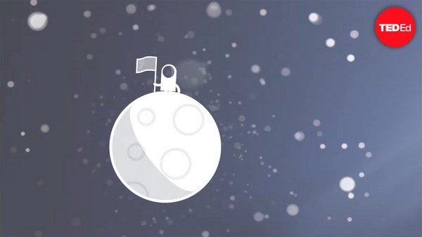
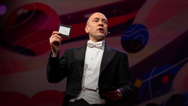
In 1969 in July, three Americans launched into space. Now, they went to the surface of the moon, they famously made the great leap for mankind. Buzz Aldrin, Neil Armstrong, they walked on the surface, they planted this flag. It's rightly celebrated as a moment that in America we say is a triumph. We think it was this amazing accomplishment. They didn't just leave behind this flag, though. They also left behind a plaque. This plaque is a beautiful object, and one that I want to talk to you a little bit about. First, you might notice that there's two globes, representing all of earth. And then there's this beautiful statement: "We came in peace for all mankind." Now, at first, this is just nice poetic language, but it's also set in a typeface that's perfect for this moment. It seems industrial, it seems engineered. It also is the best possible name you could come up with for something on the moon: Futura.
En julio de 1969, tres estadounidenses volaron al espacio. Viajaron a la superficie de la luna, dieron el famoso gran salto para la humanidad. Buzz Aldrin y Neil Armstrong caminaron sobre la superficie, plantaron esta bandera. Se celebra, con razón, como momento triunfante en EE.UU. Pensamos que fue un logro maravilloso. Sin embargo, no solo dejaron esta bandera, también dejaron una placa. Esta placa es un hermoso objeto, del cual me gustaría hablarles un poco. Primero, podrían notar que hay dos globos, que representan toda la Tierra. También está esta hermosa declaración: "Vinimos en son de paz en nombre de toda la humanidad". A primera vista, parece un bello lenguaje poético, pero está escrito con un tipo de letra perfecto para este momento. Parece industrial, parece diseñado. Tiene el nombre más adecuado que se le podría ocurrir para un objeto en la luna: Futura.
Now, I want to talk to you about fonts, and why this typeface is perfect for this moment. But it's actually more than just ceremonial. Now, when all of you arrived here today, you actually had to think about fonts. You might not realize it, but you're all unconscious experts on typography. Typography is the study of how fonts inhabit our world, they're the visual language of the words we use. Here's the thing that's funny about this, though. I know you're probably not like me, you're not a font nerd, maybe some of you are, but if you're not, that's alright, because I might spend hours every day trying to pick the perfect typeface for the perfect project, or I might spend thousands of dollars every year, trying to get ones with the right features. But all of you actually spend hours every day, evaluating fonts. If you don't believe me, think about how you got here. Each of you had to judge by the signs and maybe even on your phone, which signals to trust and which to ignore. You were evaluating fonts.
Deseo hablarles de tipos de letra, y por qué es perfecta para este momento. pero en realidad es más que algo ceremonial. Cuando todos Uds. llegaron aquí hoy, tuvieron que pensar en tipos de letra. Puede que no lo sepan, pero todos Uds. son expertos inconscientes en la tipografía. La tipografía es el estudio de cómo los tipos de letra llenan nuestro mundo, son el lenguaje visual de las palabras que usamos. Sin embargo, hay algo gracioso en esto. Probablemente no sean como yo, nerd de la tipografía, tal vez algunos lo son, pero no importa si no lo son, porque yo podría pasar horas cada día escogiendo la tipografía perfecta para el proyecto perfecto, o gastar miles de dólares cada año buscando unas con las características adecuadas. Pero Uds. pasan horas cada día analizando tipos de letra. Si no me creen, piensen en cómo llegaron aquí. Cada uno juzgó por las señales, y quizás utilizando su móvil, qué señales seguir y cuáles ignorar. Analizaban tipos de letra.
Or maybe when you're just buying a new product, you have to think about whether something is expensive or cheap or hard to get or easy to find. And the funny thing about it is, this may not seem extraordinary to you, but the moment you see something out of place, you recognize it right away.
Quizás al comprar un nuevo producto, reflexionan sobre si es costoso, barato, difícil de conseguir, o fácil de encontrar. Lo curioso es que, si bien podría parecerles ordinario, pero en en el momento que ven algo fuera de lugar lo reconocen de inmediato.
(Laughter)
(Risas)
The thing I love about typography, and why I love fonts and why I love Futura, is that, for me, what I study is everywhere. Every street that I walk down, every book that I pick up, every thing that I read is filled with the thing I love. Now, once you understand the history and what happens with typography, you actually have a history of everything before you.
Lo que amo de la tipografía y lo que amo de los tipos de letra y de Futura es que, para mí, lo que estudio se encuentra en todas partes. Cada calle que recorro, cada libro que tomo, cada cosa que leo está llena con lo que amo. Una vez entendida la historia de lo que pasa con la tipografía, se tiene una historia de todo lo que tienen delante de Uds.
And this is the typeface Futura. As previously we've discussed, this is modernism in miniature. This is a way in which modernism infiltrated this country and became perhaps the most popular, or promiscuous typeface, of the twentieth century. "Less is more," right, these are the aphorisms of modernism. And in the visual arts, the same thing happened. Let's focus on the essentials, focus on the basic shapes, focus on geometry. So Futura actually holds this to its core. You might notice that the shapes inherent in Futura have circles, squares, triangles. Some of the shapes are all based on circles, like the O, D and C, or others have this pointed apex of the triangle. Others just look like they might have been made with a ruler or a compass. They feel geometric, they feel mathematic, precise. In fact, this whole system carries through with the way that the typeface was designed. To not look like it was made like other typefaces, to be something new. Here it is in the lightweight, the medium weight and the bold weight. The whole family has different things to commend to it.
Aquí tienen la tipografía Futura. Como ya les he dicho, este es el modernismo en miniatura. Esta es la manera en que el modernismo impregnó este país y se convirtió en la tipografía más popular y más omnipresente del siglo XX. "Menos es más", ¿no? Estos son los aforismos del modernismo. El mismo fenómeno ocurrió en las artes visuales. Concetrémosnos en lo esencial, en las formas básicas, en la geometría. Esto forma parte intrínseca de Futura. Podrían notar que las formas inherentes a Futura son círculos, cuadros y triángulos. Algunas formas se basan en un círculo, como el O, el D y el C, y otras tienen el vértice puntiagudo de un triángulo. Otras parecen haber sido diseñadas con una regla o un compás. Parecen geométricas, matemáticas y precisas. De hecho, este sistema es significativo en el diseño de la tipografía, para no parecerse a otras tipografías y para ser nueva. Aquí la tienen en tamaño normal, en tamaño mediano y en letra negrita. La familia de tipografía se compone de diferentes elementos.
This was a conscious break from the past, something that looked like it was made by a machine, and not by hand. When I say not made by hand, this is what I mean. This is what we think about maybe, when you might create something with a calligraphic brush or a pen. That there's thicks and thins. And even more traditional typefaces, say like a Garamond, holds vestiges of this old system in which you can see the A where it get little bit thinner at the top and thicker down below, because it's trying to look like someone had made it by hand. But Futura, in contrast, is designed to look like no one had touched it at all, that this was made by a machine, for a machine age, for an industrial age.
Fue una ruptura consciente con el pasado algo que parece hecho por una máquina, no a mano. Cuando digo no hecha a mano, esto es a lo que me refiero. Esto es en lo que quizás piensan cuando se escribe una letra con un pincel o un lápiz caligráficos. Varía el grosor de las líneas. Incluso las tipografías más tradicionales, como Garamond, conservan los vestigios del pasado, donde lo alto del A es bastante fino y más gruesa abajo, para dar la impresión de que había sido escrito a mano. Futura, por el contrario, está diseñada para parecer algo que no se ha tocado, como algo creado por máquinas, para una era de máquinas, industrial.
There's actually a sleight of hand here that Paul Renner, the designer who made this in 1927, employed. If you look at the way in which the circular shape joins with the vertical shaft, you'll notice that it tapers just every so slightly. And this is one of hundreds of ways in which this typeface was designed to look geometrically perfect, even though it's mathematically not. And this is what typeface designers do all the time to make typefaces work, every day.
Pero hay un truco visual aquí que Paul Renner, el diseñador que que creó Futura en 1927, utilizó. Si observan cómo la forma circular se une con el eje vertical, notarán que se estrecha un poquito. Esto es una de los cientos de maneras en que se diseñó para verse geométricamente perfecta incluso si no lo es matemáticamente. Es lo que los diseñadores tipográficos hacen para hacer que sus tipografías funcionen cada día
Now, there were other designers doing this at the same time in Europe and America. These are a few other excellent examples from Europe, trying to create something new for the new age, a new moment in time. These are some other ones in Germany that in some ways look very similar to Futura, maybe with higher waist or lower waist or different proportions. Then why did Futura take over the world? In this case, if you can read the titles there, some of these names don't quite roll off the tongue: Erbar, Kabel Light, Berthold-Grotesk, Elegant-Grotesk. These aren't exactly household names, are they? And so when you compare that to Futura, you realize that this was a really good choice by the marketing team.
Otros diseñadores hacían esto a la vez en Europa y en EE. UU. Estos son excelentes ejemplos de Europa que intentan crear algo nuevo para una nueva era. Hay otras en Alemania que, en cierto modo, se parecen a la de Futura, quizá con distintas circunferencias y proporciones. Pero ¿por qué Futura dominó el mundo? En este caso, si leen estos títulos, sus nombres no son fáciles de pronunciar: Erbar, Kabel Light, Berthold-Grotesk, Elegant-Grotesk. Estos no son nombres corrientes. Comparándolos con Futura, queda claro que el equipo de marketing tomó una buena decisión.
What's amazing about this name -- you know, what's in this name is that this is a name that actually invokes hope and an idea about the future. And this isn't actually the word for future in German, it wasn't a German name, they actually picked something that would speak to a wider, larger audience, a universal audience. And when you compare it to what was being done in America -- these are the typefaces from the same period in the United States in the 1920s, bold, brash, braggadocios. You almost think of this as exactly like what the stock market looked like when they were all going nuts in the 1920s. And you realize that Futura is doing something revolutionary.
Lo increíble de este nombre, lo que contiene este nombre, es la evocación de la esperanza y de una idea de cómo será el futuro. Esto ni siquiera es la palabra alemana para 'futuro', no es una palabra alemana. Escogieron un término que resonaría en un público más grande y universal. Cuando se le compara con lo que se hacía en EE. UU. estas son las tipografías de la misma época de los EE. UU. en los años 20, bold, brash, braggadocios. Casi evocan las fluctuaciones erráticas del mercado bursátil en los años 20. Resulta evidente la cualidad revolucionaria de Futura.
I want to step back and talk about an example of the typeface in use. So this is a magazine that we all probably know today, "Vanity Fair." This is what it looked like in 1929, in the summer. And in many ways, there's nothing wrong with this design. This is absolutely typical of the 1920s. There's a photograph of an important person, in this case Franklin Roosevelt, then-governor of New York. Everything seems centered, everything seems symmetrical. There's still a little bit of ornamentation, so this is still maybe having some vestiges of the painted lady and not fully modernistic. But everything seems kid of solid. There's even drop caps to help you get into the text.
Me gustaría tomar distancia y hablar de un ejemplo de esta tipografía. Esta es una revista que conocemos, "Vanity Fair". Esto es lo que parecía en el verano de 1929. De muchas maneras, no hay nada inusual en el diseño. Este es muy típico de los años 20. Hay una foto de un hombre importante, Franklin Roosevelt, el entonces gobernador de Nueva York. Todo parece centrado, todo parece simétrico. Todavía hay un poquito de decoración, quizá preservando vestigios de una época más romántica y no tan modernista. Pero todo parece robusto. Incluso hay capitulares para orientar al lector.
But this all changed very quickly and in October of 1929, a Berlin-based designer came and redesigned "Vanity Fair." And this is what it looks like with Futura. Instead of the governor now we have a photograph of an abstract, beautiful setting, in this case, the ocean. Instead of drop caps, there's nothing at all. And replaced with a centered layout is now asymmetry. And it gets even more radical the further you enter the magazine. In this case, even more dramatic asymmetry. In this case, illustrations by Pablo Picasso, moving across the page and breaking the gutter of the two pages. And there's something even more radical. If you look closely at the Futura, you might notice something. You might not pick it up at first, but there are no capital letters in the title or the captions on this page. You might not think that's very radical, but pick up any magazine, any book or go to any website, and I guarantee, you are not going to find it very easily. This is still a radical idea.
Todo cambió muy rápidamente y en octubre de 1929, un diseñador de Berlín rediseñó el "Vanity Fair". Esto es cómo se ve con Futura. En reemplazo del gobernador, se presenta una foto de un entorno abstracto y maravilloso, en este caso, el océano. Los capitulares han desaparecido por completo. El diseño de página pasó de ser centrado a ser asimétrico. Cuanto más se lee la revista, más se vuelve radical, en este caso con la asimetría. Se ven ilustraciones de Pablo Picasso que se mueven por la página, ignorando la división entre las dos páginas. Hay algo más radical aún. Si observan a Futura de cerca, puede que noten algo. Es posible que no lo detecten, pero no hay ninguna mayúscula en el título ni en las leyendas. Eso les podría parecer poco radical, pero sea cual sea la revista, el libro o el sitio web, es difícil encontrar material que no contenga mayúsculas. Sigue siendo una idea radical.
And why is that radical? When we think about what capital letters denote, they denote something important, whether it's our names, or our titles. Or maybe even just the name of our corporations, or maybe our trademarks. Actually, in some ways, America's the home of capitalization. We love putting capitals in everything.
¿Por qué es tan radical? Cuando se piensa en lo que las mayúsculas indican, resulta que señalan algo importante, ya sea nuestros nombres o nuestros títulos. O tal vez el nombre de nuestras empresas, o incluso nuestras marcas. En cierto modo, EE. UU. es la patria del uso de las mayúsculas. Amamos escribir todo en mayúsculas.
(Laughter)
(Risas)
But think about how radical this would be to introduce a magazine where you're taking away all the capital letters. This has maybe had the same political force that we now argue over things like pronouns in our society today. In the 1920s, this is just shortly after Soviet Russia had a communist revolution. And for them, this actually represented a socialist infiltration into America. All lowercase letters meant that this was an egalitarian, complete lowering of everything into one equal playing field. Now this is still kind of a radical idea. Think about how often you do capitalize something to have more power or prestige to it. So for them to do this was a way in which Futura was using this idea.
Pero piensen en lo radical que sería publicar una revista que sacara todas las letras mayúsculas. Esto pudo haber tenido el mismo impacto político que concedemos a asuntos como los pronombres hoy en día. Los años 20, estos son los años que siguen la revolución comunista en Rusia. Para ellos, este diseño representaba la infiltración de socialismo en EE.UU. Todas las minúsculas eran una señal de igualitarismo, para simbolizar que todos estaban en igualdad de condiciones. Esto sigue siendo una idea radical. Piensen en cómo Uds. usan las letras mayúsculas para conceder más poder a una palabra. Ellos utilizaron Futura para transmitir este concepto.
Now, other designers were doing other things with Futura. Others brought other ideas of modernism with it, whether it was interesting new illustration styles, or interesting new collage types of illustration. Or even just new book covers, whether they were from Europe.
Otros diseñadores utilizaron Futura de manera diferente, aportando distintas ideas de modernismo, ya sea nuevos estilos de ilustración, o ilustraciones interesantes en forma de collage. O nuevas cubiertas de libro procedentes de Europa.
But here's the funny thing. In the 1920s, if you wanted to use a new typeface, you couldn't just go download it onto your computer. You actually had to have pieces of lead. So for Americans who wanted to adopt this and make it part of their own system, something they could use in everyday typography, whether in ads or anything else, they actually had to have metal type.
Esto es lo curioso. En los años 20, no era posible descargar una tipografía en la computadora. Se necesitaban piezas de plomo. Los estadounidenses que querían adoptarla, e integrarla en su propio sistema, como elemento tipográfico ordinario, en comerciales u otros soportes, tenían que poseer tipos metálicos.
So being good American capitalists, what did we do? We made all sorts of copies. Ones that had nothing to do with the name Futura, but looked identical to it, whether it was Spartan or Tempo. And in fact, by the time that World War II started, American corporations were actually trying to boycott Nazi goods. But they said, "Go ahead and use our copies. Use 20th Century, use Spartan, use Vogue, use Tempo. These are identical to Futura." And in fact, for most people, they didn't even learn the new names, they just still called it all Futura. So America took this typeface in, conquered it and made it its own. So by the time World War II finishes, Americans are using this on everything, whether it be catalogs, or atlases, or encyclopedias or charts and graphs, or calendars, or even political material. And even the logo for a new expansion football team. And in fact, it was used even on some of the most important advertising of the 20th century.
Entonces, como capitalistas perfectos, ¿qué hicimos? Hicimos toda clase de copias. Copias sin ninguna relación con el nombre Futura, pero que eran idénticas a ello, ya sea Spartan o Tempo. Cuando estalló la Segunda Guerra Mundial, las empresas estadounidenses intentaron boicotear productos nazis. Pero dijeron, "Sírvanse de nuestras copias. Utilicen 20th Century, Spartan, Vogue y Tempo. Son idénticas a Futura". Mucha gente ni siquiera se molestó en aprender los nuevos nombres y acabó llamándolo todo 'Futura'. Los estadounidenses adoptaron esta tipografía, la conquistaron y se apropiaron de ella. Al final de la Segunda Guerra Mundial, se utilizaba en todas partes en EE. UU., ya sea en catálogos, atlas, enciclopedias, gráficos, tablas, calendarios, material político, o incluso para el logotipo de un nuevo equipo de fútbol. De hecho, se utilizó para algunos de los comerciales más importantes del siglo XX.
So it's in this context that when the US government was picking a typeface to use after World War II for new maps and new projects, they picked Futura. It wasn't an astounding choice, it wasn't a radical choice, it didn't have anything to do with communism. But in this case, it was used on some of the most important maps, so this one, an air force map in 1962, or used for the maps in Vietnam in '66.
Es en este contexto, cuando el gobierno estadounidense de posguerra eligió una tipografía para nuevos mapas y proyectos, eligieron Futura. Fue una elección poco sorprendente y poco radical, no tuvo nada que ver con el comunismo. Se utilizó en algunos de los mapas más importantes, como este mapa de la fuerza aérea en 1962, o estos mapas utilizados en Vietnam en 1966.
And so it wasn't a surprise that when astronauts first started the Mercury program, such as John Glenn orbiting the earth, that charts and maps that he was using were in Futura. And in fact, by the time Mercury morphed into Apollo, it started getting used more and more for more things. So in this case for a safety plan, or even starting to get used on instrument panels, or navigational aids. Or even on diagrams to show how the whole system worked.
No fue sorprendente que cuando los astronautas iniciaron el programa Mercury, y John Glenn orbitó la Tierra, los mapas y gráficas utilizados fueran en letra Futura. De hecho, cuando Mercury se convirtió en Apolo, Futura se empezó a utilizar con cada vez más frecuencia. Aquí como plan de seguridad, apareció también en los paneles de instrumentos y en dispositivos de navegación. Hasta en diagramas representando el funcionamiento del sistema.
But here's the amazing thing, it didn't just get used for papers that they handed out to people. It started to get used for an interface, for an entire system that helped the astronauts know how to use the machine. NASA wasn't just one big corporation making everything. There was hundreds of contractors -- Boeing, IBM, McDonnell Douglas -- all making different machines. Now imagine if astronauts had to use different typefaces and different systems for each component they had in the space shuttles. This would have been impossible to navigate and there would have been a cognitive overload every time they had to open up a new system. So in this case, Futura being used on the interface helped them navigate complexity and make it more clear. And it wasn't just used on buttons, it was used on labels, and it was used on their food rations, and it was used on their tool kits. It was used on knobs and levers to tell them what to do. In fact, maybe even some of the places where they needed to have things that were complex be more simple to them, instructions were printed entirely in Futura, so that they could know what to do with that one moment. They didn't have to remember everything in their head, they could have it out there in the world to see and refer to. In this case, Futura helped make that system, which was already a very difficult and complex system, a little less complex. In fact, the very first or last thing an astronaut might have seen when they were entering or exiting the spacecraft would have been in Futura.
Lo increíble es que no solo se utilizaba en documentos distribuidos a la gente. Se empezó a utilizar como interfaz para un sistema que ayudaba a que los astronautas manejasen la máquina. La NASA no era una gran empresa que produjera todo. Había cientos de contratistas, Boeing, IBM, McDonnell Douglas, que fabricaban otras máquinas. Imagínense si los astronautas hubieran usado distintas tipografías y sistemas para cada componente de sus transbordadores espaciales. Esto habría sido imposible de dirigir y habría sido una sobrecarga cognitiva cada vez que utilizaban un nuevo sistema. En este caso, Futura se utilizó en la interfaz para ayudarles a gestionar complejidades y facilitar su funcionamiento. No solo estaba presente en botones, sino también en etiquetas, raciones de alimentos, y en juegos de herramientas. Se utilizó en botones y palancas en forma de instrucciones. De hecho, en algunos lugares donde las cosas complejas tenían que aparecer más sencillas, se imprimieron instrucciones completamente en Futura a fin de permitirles saber qué hacer en ese momento. No tenían que recordar todo de memoria, todo era visible y legible para todos. Futura ayudó a hacer ese sistema, que ya era un sistema complejo y muy difícil de manejar, un poquito menos complejo. Es más, la primera y última cosa que veía un astronauta al entrar o salir de la nave espacial era, sin duda, Futura.
One of my favorite examples of how Futura worked in this way is actually this camera. This is a Hasselblad that was made by the Swedish company. It's a perfectly good camera, some of you might have used one, it's prized by photographers as a really great camera. And you might notice, if you know anything about cameras, that there's some modifications made to it. In this case, there are stickers placed all over the film canisters, or other parts of the camera here. What this enabled NASA to do, was make something really great out of the astronauts. They're not photographers, they're not experts in art. But they could ensure that they would know how to use this camera because of the labels placed there in Futura.
Uno de mis ejemplos preferidos del impacto de Futura es esta cámara fotográfica. Esta es una Hasselblad hecha por una empresa sueca. Es una muy buena cámara, podrían haberla usado antes. Es altamente apreciada por los fotógrafos. Es una buena cámara Si saben algo de cámaras notarán que hay algunas modificaciones. Se han puesto etiquetas sobre los carretes y sobre otras partes de la cámara aquí. Esto permitió que la NASA sacara lo mejor de sus astronatuas. No son fotógrafos, tampoco son expertos en el arte. Sin embargo, las etiquetas con letra Futura permitieron que supieran usar esta cámara.
So in this case, Futura acquired and made sure that they had legitimacy with the things they were using. In this case to not take off the film before it would expose. Which, in this case, we would have never had some of the amazing photos we had without this label. When we see something as decorative as this, a ceremonial patch, or something like this plaque on the moon, we realize that Futura was more than just something ceremonial, something more than something that had just been picked for its design. In fact, Futura had authority, had legitimacy and had power because of this choice.
En este caso, Futura les concedió legitimidad en cuanto a los objetos que manejaban. Por ejemplo, no sacar el rollo fotográfico antes de que se exponga. Sin esto, nunca habríamos obtenido algunas de sus maravillosas fotos sin esta etiqueta. Al ver algo tan decorativo como este parche ceremonial, o esta placa dejada en la luna, es evidente que Futura sobrepasó lo ceremonial, fue más que elegir un diseño gráfico. De hecho, Futura tenía autoridad, legitimidad y poder gracias a esta elección.
There's one other thing I want to talk about in closing. And that is that Futura tells a story. And this is what I love about typefaces, is that all of them tell stories. And in this case, this typeface tells a very powerful story about assimilation, about something being taken into America and being made part of its culture. And that's one of the best and worst things America does, is we take things into our culture and we spit them out back again and claim them our own. And in this case, Futura mirrors exactly what happened with the technology undergirding the whole system. Futura was a German typeface, taken in, made into an American commodity. And so were the technologies: the rockets, the scientists all came from Germany as well. So in some ways, this German typeface on an American plaque perfectly mirrors what happened with the technology. And in this case, when you think about this story, you realize that typography on the moon represents legitimacy, represents authority, and this gave them, the astronauts, the power to get to the moon.
Me gustaría concluir con esto: y es que Futura nos cuenta una historia. Y es lo que me encanta de las tipografías, que todas cuentan historias. En este caso, la tipografía cuenta una historia muy poderosa sobre la asimilación de un objeto importado a EE.UU. que pasó a ser parte de su cultura. Eso es lo mejor y lo peor que hace los Estados Unidos: integramos conceptos en nuestra cultura y luego los rechazamos, adueñándonos de ellos. Futura refleja lo occurido con la tecnología que apoyaba el sistema entero. Futura fue una tipografía alemana que integramos en la tecnología de EE. UU. Las tecnologías eran así también: los cohetes y los científicos venían de Alemania. De algún modo, esta tipografía alemana en una placa estadounidense refleja a la perfección lo occurido con esta tecnología. En este caso, esta historia nos permite tomar conciencia de que la tipografía en la luna representa la legitimidad y la autoridad, proporcionándoles a los astronautas el poder de llegar a la luna.
Thank you.
Gracias.
(Applause)
(Aplausos)