There's a lot of exciting things happening in the design world and at IDEO this past year, and I'm pleased to get a chance to share some of those with you.
I didn't attend the first TED back in 1984 but I've been to a lot of them since that time. I thought it [would] kind of be interesting to think back to that time when Richard got the whole thing started. Thank you very much, Richard; it's been a big, enjoyable part of my life, coming here.
And so thinking back, I was thinking those of us in Silicon Valley were really focused on products or objects -- certainly technological objects. And so it was great fun in those days, and some of those of you who are in the audience were my clients. We'd come in with some prototype underneath a black cloth and we'd put it on the conference table, and we'd pull off the black cloth and everybody would "ooh" and "ah." That was a really good time.
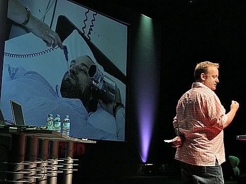
And so we'll continue to focus on products, as we always have. And if you were here last year, I probably wrestled you to the floor and tried to show you my new EyeModule 2, which was a camera that plugged into the Handspring. And I took a lot of pictures last year; very few people knew what I was up to, but I took a lot of pictures. This year -- maybe you could show the slides -- this year we're carrying this Treo, which we had a lot to do with and helped Handspring design it. Also, though we designed it a few years ago -- it's just become ubiquitous in the last year or so -- this Heartstream defibrillator which is saving lives. Maybe you've seen them in the airports? They seem to be everywhere now. Lots of lives are being saved by those. And, we're just about to announce the Zinio Reader product that I believe will make magazines even more enjoyable to read. So, we really will continue to focus on products.
But something's happened in the last 18 years since Richard started TED, and that's that people like us -- I know people in other places have caught onto this for a long time, but for us, we've really just started ... we've kind of climbed Maslow's hierarchy a little bit -- and so we're now focused more and more on human-centered design, human-centeredness in an approach to design. That really involves designing behaviors and personality into products. And I think you're starting to see that, and it's making our job even more enjoyable.
Interestingly enough, we used to primarily build 3-D models -- you know, you've seen some today -- and 3-D renderings. Then we'd go and we'd show those as communicating our ideas. But firms like ours are having to move to a point where we get those objects that we're designing and get them in motion, showing how they'll be used. And so in order to do that we've been forming internal video-production groups in order to make these kind of experience prototypes that show just what we mean about the man-machine relationship. And it's a much better way to see. It's kind of like architects who show people in their houses, as opposed to them being empty.
So I thought that I would show you a few videos to show off this new, broader definition of design in products and services and environments. I have a few of them -- they're no more than a minute or a minute-and-a-half apiece -- but I thought you might be interested in seeing some of our work over the last year, and how it responds in video.
So, Prada New York: we were asked by Rem Koolhaas and OMA to help us conceive the technology that's in their retail store in New York. He wanted a new kind of store -- a new one -- a store that had a cultural role as well as a retail one. And that meant actually designing custom technology as opposed to just buying things off the shelf and putting them to use.
So, there're lots of things. Everything has RF tags: there's RF tags on the user, on the cards, there's the staff devices that are all around the store. You pick them up, and once you see something that you're interested in, the staff person can scan them in and then they can be shown on any screen throughout the store. You can look at color, and sizes, and how it appeared on the runway, or whatever. And so then the object -- the merchandise that you're interested in -- can be scanned. It's taken into the dressing room, and in the dressing room there are scanners so that we know exactly what clothing you have in the dressing room. We can put that up on a touch screen and you can play with that, and get more information about the clothing that you're interested in as you're trying it on. It's been used a lot of places, but I particularly like the use here of liquid crystal displays in the changing room.
The last time I went to see this store, there was a huge buzz about people standing outside and wondering, "Am I going to actually get to see the people changing clothes here?" But if you push the button, of course, the whole wall goes dark. So you can try to get approval, or not, for whatever you're wearing. And then one of my favorite features of the technology is the magic mirror, where you put on the clothes. There's a big display in the mirror, and you can turn around -- but there's a three second delay. So you can see what you look like from the back or all the way around, as you look. (Applause)
About a year and a half ago we were asked to design an installation in the museum -- this is a new wing of the Science Museum in London, and it's primarily about digital and biomedical issues. And a group at Itch, which is now part of IDEO, designed this interactive wall that's about four stories tall. I don't know if anybody's seen this -- it's pretty spectacular in the room.
Anyway, it's based on the London subway system. And so you can see that the goal is to bring some of the feedback that the people who had gone to the museum were giving, and get it up on the wall so everybody could see. Just for everybody to see. So you enter your information. Then, like the London tube system, the little trains go around with what you're thinking about. And then when you get to a station, it's expanded so that you can actually read it.
Then when you exit the IMAX theatre on the fourth floor -- mostly teenagers coming out of there -- there's this big open space that has these tables in it that have interactive games which are quite fun, also designed by Durrell [Bishop] and Andrew [Hirniak] of Itch. And the topics include things that the museum is about: male fertility, choosing the sex of your baby or what a driverless car might be like. There's lots of room, so people can come up and understand what it is before they get involved.
And also, it's not shown in the video, but these are very beautiful. They go to the top of the wall and when they reach all the way to the top, after they've bounced around, they disperse into bits and go off into the atmosphere.
The next video is not done by us. This is CBS Sunday Morning that aired about two weeks ago. Scott Adams ran into us and asked us if we wouldn't help to design the ultimate cubicle for Dilbert, which sounded like a fun thing and so we couldn't pass it up. He's always been interested in technology in the future.
(Video: Scott Adams: I realized that at some point I might be the world's expert on what's wrong with cubicles. So we thought, well, wouldn't it be fun to get together with some of the smartest design guys in the world and try to figure out if we could make the cubicle better?
Narrator: Though they work in a wide-open office space spectacularly set under San Francisco's Oakland Bay Bridge, the team built their own little cubicles to fully experience the problems.
Woman: A one-way mirror. I can look out; you can look at yourself.
Narrator: They took pictures.
Woman: You feel so trapped, when someone kind of leans over and you're sort of held captive there for a minute.
SA: So far it's chaos, but a lot of people are doing stuff, so that's good. We'll see what happens.
Narrator: The first group builds a cubicle in which the walls are screens for the computer and for family photos. In the second group's scenario, the walls are alive and actually give Dilbert a group hug. (Laughter) Behind the humor is the idea of making the cubicle more human.)
David Kelley: So here's the final thing, complete with orange lighting that follows the sun across -- that follows the tracks of the sun -- across the sky. So you feel that in your cubicle. And my favorite feature, which is a flower in a vase that wilts when you leave in disappointment, and then when you come back, it comes up to greet you, happy to see you.
(SA: The storage is built right into the wall.)
DK: You know, it has homey touches like a built-in fish tank in the walls, or something to be aggressive with to release tension.
(SA: Customizable for the boss of your choice.)
DK: And of course: a hammock for your afternoon nap that stretches across your cubicle.
(SA: Life would be sweet in a cubicle like this.)
DK: This next project, we were asked to design a pavilion to celebrate the recycling of the water on the Millennium Dome in London. The dome has an incredible amount of water that washes off of it, as well as wastewater. So this building actually celebrates the water as it comes out of the recycling plant and goes into the reed bed so that it can be filtered for the final time.
The pavilion's design goal was to be kind of quiet and peaceful. In contrast to if you went inside the dome, where it's kind of wild and crazy and everybody's learning all kinds of things, or fooling around, or whatever they're doing. But it was intended to be quite quiet. And then you would wander around and gather information, in a straightforward fashion, about the recycling process and what's being done, and how they're going to reuse the water once it comes through the plant. And then, if you saw, the panels actually rotate. So you can get the information on the front side, but as they rotate, you can see the actual recycling plant behind, with all the machines as they actually process the water. You can see: there's the plant. These are all very low-budget videos, like quick prototypes.
And we're announcing a new product here tonight, which is the first time this has ever been shown in public. It's called Spyfish, and it's a company called H2Eye, started by Nigel Jagger in London. And it's a company that's trying to bring the experience -- many people have boats, or enjoy being on boats, but a very small percentage of people actually have the capability or the interest in going under the water and actually seeing what's there, and enjoying what scuba divers do. This product, it has two cameras. You throw it over the side of your boat and you basically scuba dive without getting wet.
For us -- there's the object -- for us, it was two projects. One, to design the interface so that the interface doesn't get in your way. You could have that kind of immersive experience of being underwater -- of feeling like you're underwater -- seeing what's going on. And the other one was to design the object and make sure that it was a consumer product and not a research tool. And so we spent a lot of time -- this has been going on for about seven or eight years, this project -- and [we're] just ready to start building them.
(Narrator: The Spyfish is a revolutionary subaquatic video camera. It can dive to 500 feet, to where sunlight does not penetrate, and is equipped with powerful lights. It becomes your eyes and ears as you venture into the deep. The battery-powered Spyfish sends the live video-feed through a slender cable.)
DK: This slender cable was a huge technological advancement and it allowed the whole thing to be the size that it is.
(Narrator: And this central box connects the whole system together. Maneuvering the Spyfish is simple with the wireless remote control. You watch the video with superimposed graphics that indicate your depth and compass heading. The fluid graphics and ambient sounds combine to help you completely lose yourself underwater.) (Applause)
DK: And the last thing I'll talk about is ApproTEC, which is a project that I'm very excited about. ApproTEC is a company started by Dr. Martin Fisher, who's a good friend of mine. He's a Ph.D. from Stanford. He found himself in Kenya on a Fulbright and he had a very interesting insight, which is that he said, "There must be entrepreneurs in Kenya; there must be entrepreneurs everywhere." And he noticed that for weddings and funerals there they could find enough money to put something together. So he decided to start manufacturing products in Kenya with Kenyan manufacturers -- designed by people like us, but taken there. And to this date -- he's been gone for only a few years -- he's started 19,000 companies. He's made 30,000 new jobs. And just the sales of the products -- this is a non-profit -- the sales of these products is now .6% of the GDP of Kenya. This is one guy doing this. This is a pretty spectacular thing.
So we're in the process of helping them design deep-well, low-cost manual pumps in order for these people who have a quarter acre of land to be able to grow crops in the off-season. What they do now is: they can grow crops in the rainy season but they can't grow them in the off-season. And so by doing that, the woman that you saw in the first thing -- she's a school teacher -- always wanted to send her kids to college and she's going to be able to do it because of these things. So with seed-squeezers, and pumps, and hay-balers and very straightforward things that we're designing -- my students are doing this as class projects and IDEO has donated their time to do this kind of work -- it's really amazing to see his success, Martin's.
We also were thinking about the experience of Richard, and so -- (Laughter) -- we designed this hat, because I knew I'd be the last one in the day and I needed to deal with him. So I just have one more thing to say. (Laughter) Can you read it? (Laughter) Well, it's always kind of funny when he comes up and hovers. You know, you don't want to be rude to him and you don't want to feel guilty, and so I thought this would do it, where I just sit here. (Laughter) (Applause)
So we saw a lot of interesting things being designed today in this session, and from all the different presenters. And in my own practice, from product to ApproTEC, it's really exciting that we're taking a more human-centered approach to design, that we're including behaviors and personalities in the things we do, and I think this is great. Designers are more trusted and more integrated into the business strategy of companies, and I have to say, for one, I feel very lucky at the progress that design has made since the first TED. Thanks a lot.
