I'd like you to imagine the world anew. I'd like to show you some maps, which have been drawn by Ben Hennig, of the planet in a way that most of you will never have seen the planet depicted before.
Chciałbym, żebyście wyobrazili sobie świat na nowo. Chciałbym pokazać Wam kilka map naszej planety, które zostały przygotowane przez Bena Henniga. Ukazują one planetę, tak jak nikt z was jej przedtem nie widział.
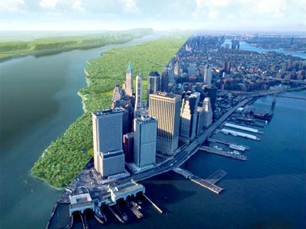
Here's an image that you're very familiar with. I'm old enough that I was actually born before we saw this image. Apparently some of my first words were "moona, moona," but I think that's my mom having a particular fantasy about what her baby boy could see on the flickering black and white TV screen. It's only been a few centuries since we've actually, most of us, thought of our planet as spherical. When we first saw these images in the 1960s, the world was changing at an incredible rate. In my own little discipline of human geography, a cartographer called Waldo Tobler was drawing new maps of the planet, and these maps have now spread, and I'm going to show you one of them now. This map is a map of the world, but it's a map which looks to you a little bit strange. It's a map in which we stretched places, so that those areas which contain many people are drawn larger, and those areas, like the Sahara and the Himalayas, in which there are few people, have been shrunk away. Everybody on the planet is given an equal amount of space. The cities are shown shining bright. The lines are showing you submarine cables and trade routes. And there's one particular line that goes from the Chinese port of Dalian through past Singapore, through the Suez Canal, through the Mediterranean and round to Rotterdam. And it's showing you the route of what was the world's largest ship just a year ago, a ship which was taking so many containers of goods that when they were unloaded, if the lorries had all gone in convoy, they would have been 100 kilometers long. This is how our world is now connected. This is the quantity of stuff we are now moving around the world, just on one ship, on one voyage, in five weeks.
To obraz, który jest Państwu dobrze znany. Ja urodziłem się zanim to zdjęcie mogło powstać. Podobno moje pierwsze słowa to "Moona, Moona," ale myślę, że to chyba fantazja mojej mamy o tym, co jej kochane dziecko dostrzegło na migoczącym, czarno białym telewizorze. Minęło dopiero kilka wieków od kiedy większość myśli o naszej planecie jako o okrągłej kuli. Kiedy pierwszy raz ujrzeliśmy te zdjęcia w 1960 roku, świat zmieniał się w niewiarygodnym tempie. W moim małym polu dziedziny naukowej - geografii, kartograf, który nazywał się Waldo Tobler, rysował nowe mapy naszej planety. Te mapy są aktualnie dostępne i mam właśnie zamiar pokazać wam jedną z nich. Ta mapa jest mapą świata, ale to mapa, która wydaje Ci się pewnie odrobinę dziwna. Jest to mapa, na której rozciągnięto miejsca. Tak, że te które są gęsto zaludnione są większe, a obszary takie jak Sahara i Himalaye, gdzie mieszka niewielu ludzi, są odpowiednio mniejsze. Każdy mieszkaniec Ziemi ma tu równy obszar do dyspozycji. Miasta to świetliste punkty, linie pokazują drogę podmorskich kabli i szlaków handlowych. Jedna szczególna linia, która biegnie z chińskiego portu Dalian przez Singapur, przez Kanał Sueski, przez Morze Śródziemne i wokół Rotterdamu. Pokazuje ona drogę jaką przebywał największy statek handlowy zeszłego roku. Statek, na który ładowano tyle kontenerów z towarami, że gdy je wyładować na ciężarówki. i jechać nimi w konwoju, miałby on długość 100 km. Oto jak bardzo obecnie nasz świat jest połączony. Oto jak wiele towaru obecnie transportujemy. I to tylko na jednym statku, w czasie jednego rejsu, w pięć tygodni.
We've lived in cities for a very long time, but most of us didn't live in cities. This is Çatalhöyük, one of the world's first cities. At its peak 9,000 years ago, people had to walk over the roofs of others' houses to get to their home. If you look carefully at the map of the city, you'll see it has no streets, because streets are something we invented. The world changes. It changes by trial and error. We work out slowly and gradually how to live in better ways. And the world has changed incredibly quickly most recently. It's only within the last six, seven, or eight generations that we have actually realized that we are a species. It's only within the last few decades that a map like this could be drawn. Again, the underlying map is the map of world population, but over it, you're seeing arrows showing how we spread out of Africa with dates showing you where we think we arrived at particular times. I have to redraw this map every few months, because somebody makes a discovery that a particular date was wrong. We are learning about ourselves at an incredible speed. And we're changing. A lot of change is gradual. It's accretion. We don't notice the change because we only have short lives, 70, 80, if you're lucky 90 years. This graph is showing you the annual rate of population growth in the world. It was very low until around about 1850, and then the rate of population growth began to rise so that around the time I was born, when we first saw those images from the moon of our planet, our global population was growing at two percent a year. If it had carried on growing at two percent a year for just another couple of centuries, the entire planet would be covered with a seething mass of human bodies all touching each other. And people were scared. They were scared of population growth and what they called "the population bomb" in 1968. But then, if you look at the end of the graph, the growth began to slow. The decade -- the '70s, the '80s, the '90s, the noughties, and in this decade, even faster -- our population growth is slowing. Our planet is stabilizing. We are heading towards nine, 10, or 11 billion people by the end of the century. Within that change, you can see tumult. You can see the Second World War. You can see the pandemic in 1918 from influenza. You can see the great Chinese famine. These are the events we tend to concentrate on. We tend to concentrate on the terrible events in the news. We don't tend to concentrate on the gradual change and the good news stories.
Ludzie żyją w miastach już od bardzo dawna, ale większość z nas nie żyje w miastach. To Çatalhöyük, jedno z pierwszych na świecie miast. W swoim szczytowym okresie 9000 lat temu, ludzie chodzili po dachach innych domów, aby dostać się do swojego. Jeśli przyjrzycie się dokładnie mapie tego miasta zobaczycie, że nie ma ono ulic, bo ulice to coś, co wymyślono dopiero później. Świat się zmienia. Zmienia się metodą prób i błędów. Pracujemy powoli i stopniowo nad tym, jak żyć w lepszy sposób. Świat uległ ogromnie szybkiej zmianie. Tylko w ciągu ostatnich sześciu, siedmiu lub ośmiu pokoleń, zdaliśmy sobie rzeczywiście sprawę z tego, że jesteśmy gatunkiem. Dopiero w ciągu ostatnich kilku dekad mapa, taka jak ta mogła powstać. Ta mapa to znów mapa światowej populacji, ale tym razem strzałki wskazują jak rozprzestrzeniliśmy się po świecie z Afryki, z szacowanymi datami kiedy przybyliśmy na dany ląd. Muszę przerysować tę mapę co kilka miesięcy, bo ktoś dokonuje odkrycia, zmieniającego konkretną datę. Uczymy się o sobie z niewiarygodną prędkością. I ulegamy zmianie. Wiele zmian jest stopniowych. To przyrost. Nie zauważamy zmiany bo mamy tylko krótkie życie, 70, 80, jeśli masz szczęście 90 lat. Ten wykres pokazuje Wam roczne tempo wzrostu liczby ludności na świecie. Było bardzo niskie do około 1850, a następnie tempo wzrostu liczby ludności zaczęło rosnąć. Tak, że mniej więcej w czasie kiedy się urodziłem, kiedy pierwszy raz zobaczyliśmy zdjęcia naszej planety z Księżyca, nasza globalna populacja rosła w tempie dwóch procent rocznie. Gdyby od tamtego momentu nadal rosła rocznie o 2 procent przez okres kilku stuleci, cała planeta byłaby pokryta kipiącą masą ludzi wszyscy stykający się ze sobą. W 1968 ludzie byli przerażeni. Przerażał ich wzrost populacji, „bomba demograficzna”. Ale jeśli spojrzeć na koniec wykresu, wzrost zaczął zwalniać. Dekada - lata 70. lata 80. lata 90., a w tej dekadzie nawet szybciej - nasz wzrost populacji spada. Nasza planeta się stabilizuje. Zbliżamy się do 9, 10 lub 11 miliardów ludzi pod koniec wieku. W ramach tej zmiany można dostrzec tumult. Można zobaczyć drugą wojnę światową. Widać pandemię grypy z 1918 roku. Widać klęskę głodu w Chinach na przełomie lat 50. i 60. Są to wydarzenia, na których zwykle się koncentrujemy. Mamy tendencję, aby koncentrować się na okropnych wydarzeniach z wiadomości, a nie na stopniowej zmianie i pozytywnych historiach.
We worry about people. We worry about how many people there are. We worry about how you can get away from people. But this is the map of the world changed again to make area large, the further away people are from each area. So if you want to know where to go to get away from everybody, here's the best places to go. And every year, these areas get bigger, because every year, we are coming off the land globally. We are moving into the cities. We are packing in more densely. There are wolves again in Europe, and the wolves are moving west across the continent. Our world is changing.
Martwimy się o ludzi. Martwimy się tym ile jest ludzi na świecie. Martwimy się tym, jak można od ludzi uciec. A to jest mapa świata, gdzie im większy obszar, tym dalej znajduje się on od ludzi. Więc jeśli chcesz wiedzieć, gdzie się udać aby uciec od wszystkich, oto najlepsze miejsca. I każdego roku, obszary te stają się coraz większe, bo co roku ludzie co raz bardziej się skupiają. Migrujemy do miast, zagęszczenie ludzi wzrasta. W Europie znów pojawiły się wilki przemieszczają się na zachód, przez cały kontynent. Nasz świat się zmienia.
You have worries. This is a map showing where the water falls on our planet. We now know that. And you can look at where Çatalhöyük was, where three continents meet, Africa, Asia, and Europe, and you can see there are a large number of people living there in areas with very little water. And you can see areas in which there is a great deal of rainfall as well. And we can get a bit more sophisticated. Instead of making the map be shaped by people, we can shape the map by water, and then we can change it every month to show the amount of water falling on every small part of the globe. And you see the monsoons moving around the planet, and the planet almost appears to have a heartbeat. And all of this only became possible within my lifetime to see this is where we are living. We have enough water.
Masz obawy. To mapa, na której pokazano stopień obfitości opadów na Ziemi. Mamy już taką wiedzę. I można spojrzeć na miejsce gdzie było Çatalhöyük, gdzie spotykają się 3 kontynenty: Afryka, Azja i Europa i można zobaczyć, że obecnie mieszka tam duża liczba ludzi na obszarze z bardzo małą ilością wody. Widać też obszary, z dużą ilością opadów deszczu. Teraz bardziej wyrafinowana mapa. Gdzie na obszar nie wpływają ludzie, lecz zasoby wody. Możemy prześledzić miesięczne zmiany w opadach na obszarze całej planety. Możecie zobaczyć jak pory deszczowe przesuwają się po kontynentach. Prawie wydaje się, że planeta ma bijące serce. A wszystko to stało się możliwe do pokazania jedynie w czasie mojego życia. Możemy zobaczyć gdzie żyjemy. Mamy wystarczającą ilość wody.
This is a map of where we grow our food in the world. This is the areas that we will rely on most for rice and maize and corn. People worry that there won't be enough food, but we know, if we just ate less meat and fed less of the crops to animals, there is enough food for everybody as long as we think of ourselves as one group of people.
To jest mapa pokazująca na jakich obszarach uprawiamy nasze jedzenie. To obszary, z których pozyskujemy najwięcej ryżu i kukurydzy. Ludzie obawiają się, że nie będzie wystarczająco dużo żywności, ale wiemy, że gdybyśmy jedli mniej mięsa i hodowali mniej zwierząt żywności starczyłoby dla wszystkich. Dopóki myślimy o sobie jako o jednej grupie ludzi.
And we also know about what we do so terribly badly nowadays. You will have seen this map of the world before. This is the map produced by taking satellite images, if you remember those satellites around the planet in the very first slide I showed, and producing an image of what the Earth looks like at night. When you normally see that map, on a normal map, the kind of map that most of you will be used to, you think you are seeing a map of where people live. Where the lights are shining up is where people live. But here, on this image of the world, remember we've stretched the map again. Everywhere has the same density of people on this map. If an area doesn't have people, we've shrunk it away to make it disappear. So we're showing everybody with equal prominence. Now, the lights no longer show you where people are, because people are everywhere. Now the lights on the map, the lights in London, the lights in Cairo, the lights in Tokyo, the lights on the Eastern Seaboard of the United States, the lights show you where people live who are so profligate with energy that they can afford to spend money powering lights to shine up into the sky, so satellites can draw an image like this. And the areas that are dark on the map are either areas where people do not have access to that much energy, or areas where people do, but they have learned to stop shining the light up into the sky. And if I could show you this map animated over time, you would see that Tokyo has actually become darker, because ever since the tsunami in Japan, Japan has had to rely on a quarter less electricity because it turned the nuclear power stations off. And the world didn't end. You just shone less light up into the sky.
I wiemy też, o tym, jakie błędy popełniamy w dzisiejszych czasach. Widzieliście już przedtem tą mapę świata. Jest to mapa powstała przez połączenie zdjęć satelitarnych, Pamiętacie zdjęcie na początku, tam było widać satelity. Mapa pokazuje jak Ziemia wygląda nocą. Kiedy zazwyczaj widzicie mapę, normalną mapę, do której większość z Was jest przyzwyczajona. Myślicie, że widzicie mapę tego gdzie żyją ludzie. Tam gdzie świecą się światła, tam żyją ludzie. Ale tu, na tej mapie znów zmieniliśmy jej normalne kształty Tutaj każde miejsce ma identyczną gęstość zaludnienia. Jeśli obszar nie ma ludzi, to go zmniejszamy tak bardzo, że znika. Więc pokazujemy wszystkich ludzi w sposób jednakowo widoczny. Teraz, światła już nie pokazują, gdzie żyją ludzie, bo ludzie są wszędzie. Teraz światła na mapie, światła w Londynie, światła w Kairze, światła w Tokio, światła na wschodnim wybrzeżu Stanów Zjednoczonych, światła pokazać, gdzie żyją ludzie, którzy są tak rozrzutni w gospodarownaniu energią że mogą sobie pozwolić na wydawanie pieniędzy aby mieć światła rozjaśniające niebo tak bardzo, że satelity mogą zrobić takie zdjęcie. Obszary, które są na mapie ciemne to obszary, gdzie albo ludzie nie mają dostępu do takiej ilości energii, albo gdzie mają, ale nauczyli się by jej tak nie marnować. Jeśli mógłbym pokazać Wam tą mapę, jak zmienia się w czasie to widać, że Tokio rzeczywiście stało się ciemniejsze, bo od czasu tsunami w Japonii Japonia musiała polegać na energii elektrycznej mniejszej o 1/4 bo wyłączyła elektrownie atomowe. I świat się przez to nie skończył. Po prostu było mniej światła.
There are a huge number of good news stories in the world. Infant mortality is falling and has been falling at an incredible rate. A few years ago, the number of babies dying in their first year of life in the world fell by five percent in just one year. More children are going to school and learning to read and write and getting connected to the Internet and going on to go to university than ever before at an incredible rate, and the highest number of young people going to university in the world are women, not men. I can give you good news story after good news story about what is getting better in the planet, but we tend to concentrate on the bad news that is immediate. Rebecca Solnit, I think, put it brilliantly, when she explained: "The accretion of incremental, imperceptible changes which can constitute progress and which render our era dramatically different from the past" -- the past was much more stable -- "a contrast obscured by the undramatic nature of gradual transformation, punctuated by occasional tumult." Occasionally, terrible things happen. You are shown those terrible things on the news every night of the week. You are not told about the population slowing down. You are not told about the world becoming more connected. You are not told about the incredible improvements in understanding. You are not told about how we are learning to begin to waste less and consume less.
Istnieje ogromna liczba dobrych newsów na świecie. Śmiertelność niemowląt spada, i spada w niewiarygodnym tempie. Kilka lat temu, liczba dzieci umierających w pierwszym roku życia na świecie spadła o 5 procent w ciągu zaledwie jednego roku. Co raz więcej dzieci idzie do szkoły, uczy się czytać, pisać, ma połączenie z Internetem, idzie na uniwersytet. Więcej niż kiedykolwiek wcześniej. Obecnie największa liczba młodych ludzi idących na uniwersytet to kobiety, a nie mężczyźni. Mogę wymieniać dobre wiadomości, jedna po drugiej o tym, co jest coraz lepsze w świecie. Choć mamy skłonności do koncentracji na złych wiadomościach, których skutki są natychmiastowe. Rebecca Solnit ujeła to znakomicie wyjaśniając: "Stopniowy przyrost zmian, które mogą stanowić postęp czynią naszą erę dramatycznie różną od przeszłości"- Przeszłość była znacznie bardziej stabilna. "Kontrast zasłonięte przez niesceniczną charakter stopniowej transformacji, przerywane okazjonalnego zgiełku. " Czasami straszne rzeczy się zdarzają. Widzicie w telewizji te okropne rzeczy, w wiadomościach, każdej nocy w tygodniu. Nie mówi się o spowolnieniu przyrostu ludności. Nie mówi się o świecie coraz bardziej ze sobą powiązanym. Nie mówi się o tym, że lepiej rozumiemy świat. Nie mówi się o tym, jak uczymy się tracić mniej i mniej konsumować.
This is my last map. On this map, we have taken the seas and the oceans out. Now you are just looking at about 7.4 billion people with the map drawn in proportion to those people. You're looking at over a billion in China, and you can see the largest city in the world in China, but you do not know its name. You can see that India is in the center of this world. You can see that Europe is on the edge. And we in Exeter today are on the far edge of the planet. We are on a tiny scrap of rock off Europe which contains less than one percent of the world's adults, and less than half a percent of the world's children. We are living in a stabilizing world, an urbanizing world, an aging world, a connecting world. There are many, many things to be frightened about, but there is no need for us to fear each other as much as we do, and we need to see that we are now living in a new world.
To moja ostatnia mapa. Na tej mapie, usuneliśmy morza i oceany Teraz po prostu patrzycie na 7,4 miliarda ludzi. Mapę sporządzono w zgodzie ze stosunkiem liczby ludności na świecie. Patrzycie na ponad miliard ludzi w Chinach, i można zobaczyć największe miasto w Chinach, ale nie znam nawet jego nazwy. Widać, że Indie są w centrum tego świata. Widać, że Europa jest na skraju. A my dzisiaj, tutaj w Exeter jesteśmy na samym brzegu planety. Jesteśmy na maleńkim skrawku skały na skraju Europy, który zawiera mniej niż jeden procent dorosłych z całego świata, i mniej niż pół procent dzieci. Żyjemy w świecie który się stabilizuje, ulega urbanizacji, starzeje się, jest coraz bardziej połaczony Istnieje wiele, wiele rzeczy których można się obawiać, ale nie ma potrzeby, abyśmy obawiali się siebie nawzajem aż tak bardzo jak się obawiamy. Musimy dostrzec, że obecnie żyjemy w nowym świecie.
Thank you very much.
Bardzo Wam dziękuję.
(Applause)
(Oklaski)