I'd like you to imagine the world anew. I'd like to show you some maps, which have been drawn by Ben Hennig, of the planet in a way that most of you will never have seen the planet depicted before.
J'aimerais vous inviter à revisiter votre image du monde. Je vais vous présenter quelques cartes de la Terre que Ben Henning a réalisées et qui la décrivent comme vous ne l'avez jamais vue auparavant.
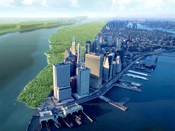
Here's an image that you're very familiar with. I'm old enough that I was actually born before we saw this image. Apparently some of my first words were "moona, moona," but I think that's my mom having a particular fantasy about what her baby boy could see on the flickering black and white TV screen. It's only been a few centuries since we've actually, most of us, thought of our planet as spherical. When we first saw these images in the 1960s, the world was changing at an incredible rate. In my own little discipline of human geography, a cartographer called Waldo Tobler was drawing new maps of the planet, and these maps have now spread, and I'm going to show you one of them now. This map is a map of the world, but it's a map which looks to you a little bit strange. It's a map in which we stretched places, so that those areas which contain many people are drawn larger, and those areas, like the Sahara and the Himalayas, in which there are few people, have been shrunk away. Everybody on the planet is given an equal amount of space. The cities are shown shining bright. The lines are showing you submarine cables and trade routes. And there's one particular line that goes from the Chinese port of Dalian through past Singapore, through the Suez Canal, through the Mediterranean and round to Rotterdam. And it's showing you the route of what was the world's largest ship just a year ago, a ship which was taking so many containers of goods that when they were unloaded, if the lorries had all gone in convoy, they would have been 100 kilometers long. This is how our world is now connected. This is the quantity of stuff we are now moving around the world, just on one ship, on one voyage, in five weeks.
Vous connaissez tous cette image-ci. Je suis suffisamment âgé pour être né avant que cette image ne soit visible. Apparemment, un de mes premiers mots fut : « lune, lune ». Mais je me demande si ce n'est pas un fantasme de ma mère sur ce que son petit garçon pouvait voir sur l'écran noir et blanc de la télévision. Cela ne fait que quelques siècles que nous pensons presque tous que la Terre est ronde. Alors que nous découvrions ces images dans les années 60, le monde se transformait à une vitesse incroyable. Dans ma discipline, qui est la géographie humaine, un cartographe, appelé Waldo Tobler, dessinait de nouvelles cartes de la planète. Ses cartes sont devenues classiques et je vais vous en montrer une. C'est une carte du monde, mais qui vous semble un peu étrange. On y a agrandi certains endroits afin que ceux davantage peuplés paraissent plus grands, et ceux, comme le Sahara et l'Himalaya, qui sont peu peuplés, soient rétrécis. Chaque personne sur Terre y reçoit un espace égal à celui des autres. Les villes apparaissent en jaune. Les lignes représentent les câbles sous-marins et les routes commerciales. Observez la ligne qui démarre du port chinois de Dalian, qui passe par Singapour, traverse le Canal de Suez, la Méditerranée et qui rejoint Rotterdam. Cette ligne montre la route de ce qui fut le plus grand navire au monde, jusqu'à il y a un an. Ce navire pouvait charger tant de containers que lorsqu'on les déchargeait et qu'on les plaçait sur des camions, le convoi faisait 100 km de long. Telle est la manière dont le monde est connecté. Voilà la quantité de produits que nous véhiculons à travers le monde, sur un navire, en un seul voyage, en cinq semaines.
We've lived in cities for a very long time, but most of us didn't live in cities. This is Çatalhöyük, one of the world's first cities. At its peak 9,000 years ago, people had to walk over the roofs of others' houses to get to their home. If you look carefully at the map of the city, you'll see it has no streets, because streets are something we invented. The world changes. It changes by trial and error. We work out slowly and gradually how to live in better ways. And the world has changed incredibly quickly most recently. It's only within the last six, seven, or eight generations that we have actually realized that we are a species. It's only within the last few decades that a map like this could be drawn. Again, the underlying map is the map of world population, but over it, you're seeing arrows showing how we spread out of Africa with dates showing you where we think we arrived at particular times. I have to redraw this map every few months, because somebody makes a discovery that a particular date was wrong. We are learning about ourselves at an incredible speed. And we're changing. A lot of change is gradual. It's accretion. We don't notice the change because we only have short lives, 70, 80, if you're lucky 90 years. This graph is showing you the annual rate of population growth in the world. It was very low until around about 1850, and then the rate of population growth began to rise so that around the time I was born, when we first saw those images from the moon of our planet, our global population was growing at two percent a year. If it had carried on growing at two percent a year for just another couple of centuries, the entire planet would be covered with a seething mass of human bodies all touching each other. And people were scared. They were scared of population growth and what they called "the population bomb" in 1968. But then, if you look at the end of the graph, the growth began to slow. The decade -- the '70s, the '80s, the '90s, the noughties, and in this decade, even faster -- our population growth is slowing. Our planet is stabilizing. We are heading towards nine, 10, or 11 billion people by the end of the century. Within that change, you can see tumult. You can see the Second World War. You can see the pandemic in 1918 from influenza. You can see the great Chinese famine. These are the events we tend to concentrate on. We tend to concentrate on the terrible events in the news. We don't tend to concentrate on the gradual change and the good news stories.
Nous vivons dans des villes depuis longtemps. Mais ce ne fut pas toujours le cas. Voici une des premières villes du monde, Çatalhöyük. Elle a eu son apogée il y a 9 000 ans. Les gens marchaient sur les toits des maisons pour rentrer à la maison. En observant bien le plan de la ville, vous constaterez qu'il n'y a pas de rues, parce que c'est nous qui avons inventé les rues. Le monde change. Il se transforme par la méthode empirique. On a découvert lentement et progressivement comment mieux vivre. Le monde s'est transformé très rapidement ces derniers temps. Il n'y a en fait que 6, 7 ou 8 générations que nous avons compris que nous sommes une espèce. Cela ne fait que quelques décennies que nous pouvons établir une telle carte. La carte de départ est une carte des populations mondiales. Les flèches nous indiquent comment nous nous sommes dispersés depuis l'Afrique et à quelle époque nous pensons avoir atteint certains rivages. Je dois régulièrement corriger cette carte à chaque fois que quelqu'un découvre qu'une date précise est incorrecte. Nous apprenons sur nous à une vitesse incroyable. Et nous sommes en mutation. De nombreux changements sont progressifs. C'est une accumulation. Nous ne remarquons pas ces changements car nos vies sont trop courtes, 70, 80 voire 90 ans pour les plus chanceux. Ce graphique montre le taux annuel de la croissance de la population dans le monde. Il est resté très bas jusqu'en 1850. Ensuite, le taux de croissance de la population a commencé à augmenter. Quand je suis né, et que nous découvrions ces premières images de la Terre prises de la Lune, la croissance de la population globale atteignait 2% par an. Si cette croissance avait continué à un taux de 2% par an pendant quelques siècles, la planète serait recouverte par une masse terrible de corps humains collés l'un à l'autre. Ça a terrifié les gens. Ils étaient terrifiés par la croissance de la population, par ce qu'ils ont nommé en 1968 : « la bombe démographique ». Mais quand on observe la fin du graphique, on constate un ralentissement de la croissance. Durant la décennie -- dans les années 70, 80, 90 et 2000 et encore davantage maintenant -- la croissance démographique ralentit. Notre planète se stabilise. On sera 9, 10 ou 11 milliards à la fin du siècle. Dans ces changements, il y a des remous. Il y a la deuxième guerre mondiale. Il y a la pandémie de grippe en 1918. Il y a la grande famine en Chine. On a tendance à se focaliser sur ces événements-là. On a tendance à se focaliser sur l'actualité choquante dans les infos. On ne regarde pas les changements progressifs et les histoires positives.
We worry about people. We worry about how many people there are. We worry about how you can get away from people. But this is the map of the world changed again to make area large, the further away people are from each area. So if you want to know where to go to get away from everybody, here's the best places to go. And every year, these areas get bigger, because every year, we are coming off the land globally. We are moving into the cities. We are packing in more densely. There are wolves again in Europe, and the wolves are moving west across the continent. Our world is changing.
On s'inquiète de la population. On s'inquiète de notre nombre. On cherche des solutions pour s'isoler des autres. Voici donc une carte du monde transformée pour agrandir les espaces où les gens sont les plus éloignés les uns des autres. Si vous voulez savoir où aller pour vous éloigner des autres, voici les endroits idéaux. Chaque année, ces espaces croissent. Car chaque année, nous quittons nos terres. Nous migrons vers les villes. Nous cherchons à nous concentrer. Les loups sont de retour en Europe et ils vont vers l'ouest à travers le continent. Notre monde se transforme.
You have worries. This is a map showing where the water falls on our planet. We now know that. And you can look at where Çatalhöyük was, where three continents meet, Africa, Asia, and Europe, and you can see there are a large number of people living there in areas with very little water. And you can see areas in which there is a great deal of rainfall as well. And we can get a bit more sophisticated. Instead of making the map be shaped by people, we can shape the map by water, and then we can change it every month to show the amount of water falling on every small part of the globe. And you see the monsoons moving around the planet, and the planet almost appears to have a heartbeat. And all of this only became possible within my lifetime to see this is where we are living. We have enough water.
Nous avons des soucis. Cette carte montre les endroits où il y a de l'eau sur notre planète. Nous savons cela maintenant. Regardez où était localisée Çatalhöyük : à la jonction des trois continents africain, asiatique et européen. Il y a un grand nombre de personnes qui vivent là, dans des régions avec très peu d'eau. On peut aussi observer les zones où il pleut beaucoup. On peut raffiner les choses davantage. Plutôt que de déformer les cartes en fonction de la population, on peut les déformer en fonction de l'eau, et les adapter chaque mois, pour illustrer le volume d'eau tombé dans chaque petite zone du globe. Voici les moussons qui se déplacent sur la planète. Ça donne l'impression que la Terre a un cœur qui bat. Ceci n'est possible que depuis que je vis, visualiser ainsi le monde où nous vivons. Nous avons suffisamment d'eau.
This is a map of where we grow our food in the world. This is the areas that we will rely on most for rice and maize and corn. People worry that there won't be enough food, but we know, if we just ate less meat and fed less of the crops to animals, there is enough food for everybody as long as we think of ourselves as one group of people.
Cette carte illustre les endroits où nous cultivons notre alimentation. Voici les zones dont nous dépendons pour le riz, le maïs et le blé. On s'inquiète souvent de la raréfaction de la nourriture, mais nous savons que si nous mangions moins de viande et nourrissions moins les animaux, il y aurait assez à manger pour tous, tant que nous nous considérons comme un seul groupe d'hommes.
And we also know about what we do so terribly badly nowadays. You will have seen this map of the world before. This is the map produced by taking satellite images, if you remember those satellites around the planet in the very first slide I showed, and producing an image of what the Earth looks like at night. When you normally see that map, on a normal map, the kind of map that most of you will be used to, you think you are seeing a map of where people live. Where the lights are shining up is where people live. But here, on this image of the world, remember we've stretched the map again. Everywhere has the same density of people on this map. If an area doesn't have people, we've shrunk it away to make it disappear. So we're showing everybody with equal prominence. Now, the lights no longer show you where people are, because people are everywhere. Now the lights on the map, the lights in London, the lights in Cairo, the lights in Tokyo, the lights on the Eastern Seaboard of the United States, the lights show you where people live who are so profligate with energy that they can afford to spend money powering lights to shine up into the sky, so satellites can draw an image like this. And the areas that are dark on the map are either areas where people do not have access to that much energy, or areas where people do, but they have learned to stop shining the light up into the sky. And if I could show you this map animated over time, you would see that Tokyo has actually become darker, because ever since the tsunami in Japan, Japan has had to rely on a quarter less electricity because it turned the nuclear power stations off. And the world didn't end. You just shone less light up into the sky.
Nous savons aussi ce que nous faisons affreusement mal. Vous avez déjà vu cette carte du monde. Cette carte est produite à l'aide d'images satellites -- rappelez-vous les satellites autour de notre planète dans la première photo que je vous ai montrée -- cette carte illustre ce à quoi notre planète ressemble la nuit. En scrutant cette carte, à laquelle nous sommes habitués, on pense voir une carte avec des lieux de vie des gens. Les endroits lumineux sont des endroits où les gens vivent. Mais rappelez-vous que sur cette image-ci du monde, nous avons déformé la carte. Il y a une densité de personnes identique partout. Nous avons rétréci les zones peu peuplées, au point de les faire disparaître. Ainsi, chaque personne est illustrée selon une importante égale. Les lumières ne vous montrent plus où les gens se trouvent. Car il y a des gens partout. Les lumières sur cette carte, à Londres, au Caire, à Tokyo, la côte Est des États-Unis, ces lumières montrent où les gens vivent, où les gens qui y vivent jouissent de tant d'énergie qu'ils peuvent se permettre de dépenser leur argent pour allumer des lumières qui illuminent le ciel, ce qui permet aux satellites de prendre ces images. Les zones sombres de la carte sont des zones où les populations n'ont pas accès à autant d'énergie ou des zones où les populations sont aisées mais elles ont appris à ne plus illuminer le ciel. Si je pouvais vous montrer une carte animée dans le temps, vous observeriez que Tokyo est devenue plus sombre, car depuis le tsunami de 2011, le Japon produit 25% d'électricité en moins maintenant que le pays a arrêté toutes ses centrales nucléaires. Et ce ne fut pas la fin du monde. Il y a juste moins de lumière orientée vers le ciel.
There are a huge number of good news stories in the world. Infant mortality is falling and has been falling at an incredible rate. A few years ago, the number of babies dying in their first year of life in the world fell by five percent in just one year. More children are going to school and learning to read and write and getting connected to the Internet and going on to go to university than ever before at an incredible rate, and the highest number of young people going to university in the world are women, not men. I can give you good news story after good news story about what is getting better in the planet, but we tend to concentrate on the bad news that is immediate. Rebecca Solnit, I think, put it brilliantly, when she explained: "The accretion of incremental, imperceptible changes which can constitute progress and which render our era dramatically different from the past" -- the past was much more stable -- "a contrast obscured by the undramatic nature of gradual transformation, punctuated by occasional tumult." Occasionally, terrible things happen. You are shown those terrible things on the news every night of the week. You are not told about the population slowing down. You are not told about the world becoming more connected. You are not told about the incredible improvements in understanding. You are not told about how we are learning to begin to waste less and consume less.
Il y a beaucoup de bonnes nouvelles dans le monde. La mortalité infantile est en régression et cette régression est incroyable. Il y a quelques années, le nombre d'enfants qui mouraient durant leur première année a régressé de 5% en un an. De plus en plus d'enfants vont à l'école, apprennent à lire et écrire, sont connectés à Internet et vont à l'université. Leur nombre augmente à une vitesse incroyable. Le plus grand nombre de jeunes gens qui entrent à l'université dans le monde est composé de femmes, pas d'hommes. Je peux vous raconter des bonnes nouvelles les unes après les autres sur ce qui s'améliore sur notre planète. Hélas, nous nous focalisons sur les mauvaises nouvelles, immédiates. Rebecca Solnit a dit ceci d'une façon que je trouve magistrale : « L'accumulation de changements incrémentiels, imperceptibles qui peuvent constituer du progrès et qui rendent notre ère fondamentalement différente du passé, » -- un passé qui était plus stable, -- « dans un contraste obscurci par la nature non spectaculaire de la transformation progressive, ponctuée par un tumulte occasionnel. » Parfois, des choses terribles ont lieu. On nous montre ces événements effroyables dans les journaux télévisés, tous les soirs de la semaine. On ne nous parle pas de la croissance démographique qui ralentit. On ne nous parle pas du monde de plus en plus connecté. On ne nous parle pas des pas de géants qui améliorent notre compréhension. On ne nous parle pas de comment nous faisons nos premiers pas pour gaspiller et consommer moins.
This is my last map. On this map, we have taken the seas and the oceans out. Now you are just looking at about 7.4 billion people with the map drawn in proportion to those people. You're looking at over a billion in China, and you can see the largest city in the world in China, but you do not know its name. You can see that India is in the center of this world. You can see that Europe is on the edge. And we in Exeter today are on the far edge of the planet. We are on a tiny scrap of rock off Europe which contains less than one percent of the world's adults, and less than half a percent of the world's children. We are living in a stabilizing world, an urbanizing world, an aging world, a connecting world. There are many, many things to be frightened about, but there is no need for us to fear each other as much as we do, and we need to see that we are now living in a new world.
Voici ma dernière carte. De cette carte, on a retiré les mers et les océans. Nous observons 7,4 miliards de personnes sur une carte proportionnelle aux populations. Un peu plus d'un milliard en Chine. On peut observer que la plus grande ville au monde est en Chine. Mais on ne connaît pas son nom. On peut observer que l'Inde est au centre de ce monde. On peut observer que l'Europe est à son extrémité. Et nous, aujourd'hui, à Exeter, nous nous trouvons à la frontière la plus éloignée du monde. Nous sommes sur un petit bout de rocher, à la limite de l'Europe, qui comprend moins de 1% de la population mondiale adulte, et moins de 0,5% de la population mondiale des enfants. Nous vivons dans un monde en cours de stabilisation et d'urbanisation, en train de vieillir et connecté. Il y a tant de choses susceptibles de nous effrayer. Mais il n'existe aucune raison de craindre les autres comme nous le faisons et nous avons besoin de réaliser que nous vivons dans un nouveau monde.
Thank you very much.
Merci beaucoup.
(Applause)
(Applaudissements)