Blah blah blah blah blah. Blah blah blah blah, blah blah, blah blah blah blah blah blah. Blah blah blah, blah.
吧啦吧啦啦。 吧啦吧啦, 吧啦,吧啦吧啦吧啦吧啦。 吧啦啦,吧啦。
So what the hell was that? Well, you don't know because you couldn't understand it. It wasn't clear. But hopefully, it was said with enough conviction that it was at least alluringly mysterious.
這是什麼鬼東西? 你不知道,因為你無法理解它。 它不清楚。 但希望它說得夠有說服力, 至少可以是很吸引人的神祕。
Clarity or mystery? I'm balancing these two things in my daily work as a graphic designer, as well as my daily life as a New Yorker every day, and there are two elements that absolutely fascinate me.
清晰還是神秘? 身為一個圖像設計師, 我每天都必須在工作中平衡這兩者; 身為一個紐約客, 讓我每天也得在生活中平衡這兩者。 而這就是非常吸引我的兩個元素。 這個有個範例。
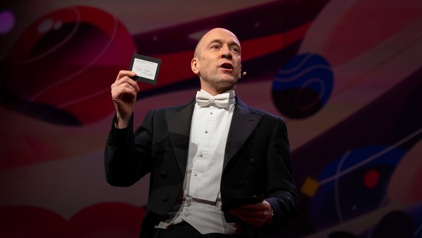
Here's an example. Now, how many people know what this is? Okay. Now how many people know what this is? Okay. Thanks to two more deft strokes by the genius Charles M. Schulz, we now have seven deft strokes that in and of themselves create an entire emotional life, one that has enthralled hundreds of millions of fans for over 50 years. This is actually a cover of a book that I designed about the work of Schulz and his art, which will be coming out this fall, and that is the entire cover. There is no other typographic information or visual information on the front, and the name of the book is "Only What's Necessary." So this is sort of symbolic about the decisions I have to make every day about the design that I'm perceiving, and the design I'm creating.
有多少人知道這是什麼? 好,現在又有多少人知道這是什麼? 好,感謝天才查爾斯·舒茲 另外兩條靈巧的筆畫, 我們現在擁有七條靈巧的筆劃 可以組合而成整個情感生活, 在過去的五十多年中 讓好幾億的粉絲深深著迷。 而這其實是一本書的封面, 是我為舒茲的傑作設計的, 即將在這個秋天上市, 而這就是封面的全部。 並沒有其他的文字排版或圖像資訊, 這本書的書名是《毫無贅筆》(暫譯) 這有點像是我每天必須做的抉擇, 包含怎麼看別人的設計, 還有怎麼決定自己的設計。
So clarity. Clarity gets to the point. It's blunt. It's honest. It's sincere. We ask ourselves this. ["When should you be clear?"]
所以 - 清晰度。 清晰才能表達重點。 它是率真的、誠實的、誠懇的。 我們這樣問自己。 (你什麼時候需要清晰?)
Now, something like this, whether we can read it or not, needs to be really, really clear. Is it?
現在,例如這個,無論我們能否看懂, 它都必須非常非常清楚。 它有嗎?
This is a rather recent example of urban clarity that I just love, mainly because I'm always late and I am always in a hurry. So when these meters started showing up a couple of years ago on street corners, I was thrilled, because now I finally knew how many seconds I had to get across the street before I got run over by a car. Six? I can do that. (Laughter)
這是城市裡近期一個 我非常喜歡的、關於清晰的例子, 主要是因為我總是遲到、 總是在趕時間。 所以當這個讀秒器幾年前 第一次出現在街角時, 我開心極了,因為現在我終於知道 我有幾秒時間能平安穿越馬路, 在我被車子輾過去之前。 六秒? 我做得到。(笑聲)
So let's look at the yin to the clarity yang, and that is mystery. Mystery is a lot more complicated by its very definition. Mystery demands to be decoded, and when it's done right, we really, really want to. ["When should you be mysterious?"] In World War II, the Germans really, really wanted to decode this, and they couldn't.
現在讓我們看看清晰的另一個對比, 也就是神秘。 神秘就其定義而言,複雜得多。 神秘需要被解譯, 而如果設計得當, 我們會非常想去解譯。 (你什麼時候需要神秘?) 第二次世界大戰期間, 德國非常非常想要破解這個, 但他們無法做到。
Here's an example of a design that I've done recently for a novel by Haruki Murakami, who I've done design work for for over 20 years now, and this is a novel about a young man who has four dear friends who all of a sudden, after their freshman year of college, completely cut him off with no explanation, and he is devastated. And the friends' names each have a connotation in Japanese to a color. So there's Mr. Red, there's Mr. Blue, there's Ms. White, and Ms. Black. Tsukuru Tazaki, his name does not correspond to a color, so his nickname is Colorless, and as he's looking back on their friendship, he recalls that they were like five fingers on a hand. So I created this sort of abstract representation of this, but there's a lot more going on underneath the surface of the story, and there's more going on underneath the surface of the jacket. The four fingers are now four train lines in the Tokyo subway system, which has significance within the story. And then you have the colorless subway line intersecting with each of the other colors, which basically he does later on in the story. He catches up with each of these people to find out why they treated him the way they did.
這裡有個範例,是我最近完成的設計, 為了村上春樹的小說設計的。 到現在為止,我已經 幫他做了超過20年的設計, 而這本小說是關於一個年輕人, 擁有四個至交好友, 但突然之間,他們在大學第一年過後, 就完全把他排擠在外,沒有任何解釋, 讓他非常難過。 而這幾個朋友的名字裡, 每一個都包含一個日文裡的顏色。 所以有紅色先生、藍色先生、 白色先生和黑色先生。 而他的名字是多崎作, 沒有任何對應的顏色, 所以他的暱稱是「無色」, 而當他回顧他們的友誼時, 回想起他們就像一隻手上的五根手指。 所以我用這樣有點抽象的表現方式, 但就像故事表面之下還隱藏許多情節, 書皮底下也藏著許多其他東西。 四根手指現在變成 東京地鐵系統裡的四條路線, 這在故事裡是個重要情節。 然後有一條沒有顏色的地鐵路線, 和其他四個顏色相交, 基本上就像他在故事中所做的事。 他回頭尋找每一個人, 想找出他們如此對待他的原因。
And so this is the three-dimensional finished product sitting on my desk in my office, and what I was hoping for here is that you'll simply be allured by the mystery of what this looks like, and will want to read it to decode and find out and make more clear why it looks the way it does.
所以這是一個立體的完成作品, 就在我辦公室裡的書桌上, 而我純粹希望你們能被這本書 視覺上的神祕感所吸引, 而想要翻開來看個究竟、 解譯一下,搞懂它為什麼長這樣。
["The Visual Vernacular."]
(「視覺方言」)
This is a way to use a more familiar kind of mystery. What does this mean? This is what it means. ["Make it look like something else."] The visual vernacular is the way we are used to seeing a certain thing applied to something else so that we see it in a different way.
這是一種更常見的神祕感表現方式。 所以這是什麼意思? 這就是他的意思。 (讓它看起來像其他東西) 視覺方言是一種方法, 讓我們習慣看到一種事物 被應用在其他事物上, 進而用不同方式看待它。
This is an approach I wanted to take to a book of essays by David Sedaris that had this title at the time. ["All the Beauty You Will Ever Need"] Now, the challenge here was that this title actually means nothing. It's not connected to any of the essays in the book. It came to the author's boyfriend in a dream. Thank you very much, so -- (Laughter) -- so usually, I am creating a design that is in some way based on the text, but this is all the text there is. So you've got this mysterious title that really doesn't mean anything, so I was trying to think: Where might I see a bit of mysterious text that seems to mean something but doesn't? And sure enough, not long after, one evening after a Chinese meal, this arrived, and I thought, "Ah, bing, ideagasm!" (Laughter) I've always loved the hilariously mysterious tropes of fortune cookies that seem to mean something extremely deep but when you think about them -- if you think about them -- they really don't. This says, "Hardly anyone knows how much is gained by ignoring the future." Thank you. (Laughter) But we can take this visual vernacular and apply it to Mr. Sedaris, and we are so familiar with how fortune cookie fortunes look that we don't even need the bits of the cookie anymore. We're just seeing this strange thing and we know we love David Sedaris, and so we're hoping that we're in for a good time.
這也是我想帶入大衛·塞德里 的散文集的設計方式, 當時的書名是這個。 (《你所需要的一切美麗》) 接下來的挑戰是這個書名 並沒有任何意義。 它和書中任何散文都沒有關聯。 它只是出現在作者男友夢中的一句話。 非常感謝各位,所以 - (笑聲) - 所以通常我設計封面時 都是根據文字, 但此處的文字就只有這樣。 我只有一個沒有任何意義的神秘標題, 因此我試著去想: 我有可能在哪裡看到一段神祕的文字, 看起來好像有什麼意義,實際上卻沒有? 果然,在不久之後, 在某個晚上,享用了一餐中國菜後, 這個送上來了,而我心想: 「啊!叮咚,點子來了!」(笑聲) 我一直很愛幸運餅乾裡 種種神秘隱晦的比喻, 似乎有些很深遠的涵義, 但當你仔細思考後-如果你思考 過的話-其實沒什麼意義。 像這個是:「很少人知道忽略未來 會帶來多少好處。」 謝謝各位。(笑聲) 但我們可以把這個視覺方言 用在塞德里先生的著作上, 而因為我們都很熟悉 幸運餅乾裡的籤語的長相, 我們甚至不用讓任何一塊餅乾出現。 我們只要看到這個奇怪的東西, 我們也知道我們都愛大衛·塞德里, 自然就會期待可以享受閱讀這本書。
["'Fraud' Essays by David Rakoff"] David Rakoff was a wonderful writer and he called his first book "Fraud" because he was getting sent on assignments by magazines to do things that he was not equipped to do. So he was this skinny little urban guy and GQ magazine would send him down the Colorado River whitewater rafting to see if he would survive. And then he would write about it, and he felt that he was a fraud and that he was misrepresenting himself. And so I wanted the cover of this book to also misrepresent itself and then somehow show a reader reacting to it.
(大衛·拉科夫 - 散文集《騙局》) 大衛·拉科夫是個很棒的作家, 他將自己的第一本書命名為「騙局」, 因為他一開始被雜誌指派到 一件他不認為自己能夠完成的任務。 所以,他這樣一個瘦小的都市人, 被《GQ》雜誌送到科羅拉多河上, 在急流中漂泊,看看他能不能存活。 然後他必須描寫這段經歷, 這讓他覺得自己是個騙子、 並感到自我扭曲。 所以我也希望這本書的封面 也有自我扭曲的感覺, 然後讓讀者不知不覺地有所反應。
This led me to graffiti. I'm fascinated by graffiti. I think anybody who lives in an urban environment encounters graffiti all the time, and there's all different sorts of it. This is a picture I took on the Lower East Side of just a transformer box on the sidewalk and it's been tagged like crazy. Now whether you look at this and think, "Oh, that's a charming urban affectation," or you look at it and say, "That's illegal abuse of property," the one thing I think we can all agree on is that you cannot read it. Right? There is no clear message here. There is another kind of graffiti that I find far more interesting, which I call editorial graffiti. This is a picture I took recently in the subway, and sometimes you see lots of prurient, stupid stuff, but I thought this was interesting, and this is a poster that is saying rah-rah Airbnb, and someone has taken a Magic Marker and has editorialized about what they think about it. And it got my attention.
這讓我想到路旁的塗鴉。 我對塗鴉一向著迷。 我相信任何住在都市環境裡的人 一定隨時都看得到塗鴉, 而且還有許多不同類型。 這是我在下東城一帶拍到的 路旁一個變電箱的照片, 它已經被畫得亂七八糟。 無論你看到這個,心裡想的是: 「喔,這真是個迷人的城市裝飾」 還是「這是非法濫用公家財產」, 我們都得同意的事實是, 你無法讀懂它。 對吧? 沒有任何清楚的訊息在裡面。 但有我發現有另一種塗鴉更加有趣, 我稱為社論性塗鴉。 這是一張我最近在地鐵站拍到的照片, 有時候你會看到許多 淫穢、愚蠢的東西, 但我想這個很有趣,這張海報上寫著 Airbnb怎樣怎樣, 然後有人拿了支麥克筆, 把它改成他們心裡想說的話。 這吸引了我的注意。
So I was thinking, how do we apply this to this book? So I get the book by this person, and I start reading it, and I'm thinking, this guy is not who he says he is; he's a fraud. And I get out a red Magic Marker, and out of frustration just scribble this across the front. Design done. (Laughter) And they went for it! (Laughter) Author liked it, publisher liked it, and that is how the book went out into the world, and it was really fun to see people reading this on the subway and walking around with it and what have you, and they all sort of looked like they were crazy. (Laughter)
我想著,這是否能應用在這本書上? 所以我拿著這個人寫的書、 開始閱讀,然後我想著, 這傢伙不像他自己說的那樣; 他是個騙子。 所以我拿了支紅色麥克筆, 出於煩躁地在封面上亂畫。 設計完成。(笑聲) 而且他們接受了!(笑聲) 作者喜歡、出版社也喜歡, 這本書就是這樣出現在世界上的, 而在地鐵上看到大家讀著這本書、 拿著它走來走去真的很逗趣, 它們全都看起來有點像瘋子。 (笑聲)
["'Perfidia' a novel by James Ellroy"] Okay, James Ellroy, amazing crime writer, a good friend, I've worked with him for many years. He is probably best known as the author of "The Black Dahlia" and "L.A. Confidential." His most recent novel was called this, which is a very mysterious name that I'm sure a lot of people know what it means, but a lot of people don't. And it's a story about a Japanese-American detective in Los Angeles in 1941 investigating a murder. And then Pearl Harbor happens, and as if his life wasn't difficult enough, now the race relations have really ratcheted up, and then the Japanese-American internment camps are quickly created, and there's lots of tension and horrible stuff as he's still trying to solve this murder. And so I did at first think very literally about this in terms of all right, we'll take Pearl Harbor and we'll add it to Los Angeles and we'll make this apocalyptic dawn on the horizon of the city. And so that's a picture from Pearl Harbor just grafted onto Los Angeles. My editor in chief said, "You know, it's interesting but I think you can do better and I think you can make it simpler." And so I went back to the drawing board, as I often do. But also, being alive to my surroundings, I work in a high-rise in Midtown, and every night, before I leave the office, I have to push this button to get out, and the big heavy glass doors open and I can get onto the elevator. And one night, all of a sudden, I looked at this and I saw it in a way that I hadn't really noticed it before. Big red circle, danger. And I thought this was so obvious that it had to have been done a zillion times, and so I did a Google image search, and I couldn't find another book cover that looked quite like this, and so this is really what solved the problem, and graphically it's more interesting and creates a bigger tension between the idea of a certain kind of sunrise coming up over L.A. and America.
(詹姆士 ·艾洛伊的小說《背叛》) 好的,詹姆士 ·艾洛伊,很棒的犯罪小說作家, 同時也是我的好友, 我們合作好多年了。 他最出名的著作可能是 《黑色大理花》和《鐵面特警隊》。 他最新的著作就叫這個, 是個非常神秘的書名; 我相信許多人瞭解它的意思, 但也有許多人不瞭解。 這是一個日裔美籍的偵探的故事, 他在1941年的洛杉磯 調查一樁謀殺案。 而不久後,珍珠港事件爆發, 彷彿他的生活還不夠艱難似的, 種族衝突又變得愈發激烈, 日裔美籍拘留營很快地成立, 局勢非常緊張; 而最糟糕的事情是 他還沒放棄破解這樁謀殺案。 所以我第一個想法非常直接, 就是,好吧,我們就把珍珠港 和洛杉磯市景放在一起, 把這個末日景象放在城市的地平線上。 所以這張珍珠港事件的照片 直接被移植在洛杉磯之上。 我們總編說:「呃,這很有趣, 但我想應該還能更好, 你應該能讓它更簡單。」 所以我回到畫板前,一如往常。 與此同時,注意我周遭的環境, 我在中城區的一棟高樓裡工作, 每天晚上,在我離開辦公室前, 必須先按下這個按鈕才能出去, 厚重的玻璃門才會打開, 而我才能進到電梯裡。 某天晚上,忽然之間 我看著這個按鈕,並開始用 過去不曾注意過的方式看它。 大大的紅色圓圈、危險的象徵。 然後我想,既然它這麼明顯, 肯定已經被使用過無數多次了, 於是我用Google做圖片搜尋, 卻發現沒有任何一本書的封面 看起來像這樣, 所以問題就這麼解決了。 在圖像上這樣更吸引人, 也製造了更大的張力, 彷彿某種黎明就要壟罩 洛杉磯和美國的上空。
["'Gulp' A tour of the human digestive system by Mary Roach."]
(瑪莉‧羅曲的《大吞一口,然後呢?》 - 一場人體消化系統之旅)
Mary Roach is an amazing writer who takes potentially mundane scientific subjects and makes them not mundane at all; she makes them really fun. So in this particular case, it's about the human digestive system. So I'm trying to figure out what is the cover of this book going to be. This is a self-portrait. (Laughter) Every morning I look at myself in the medicine cabinet mirror to see if my tongue is black. And if it's not, I'm good to go. (Laughter) I recommend you all do this. But I also started thinking, here's our introduction. Right? Into the human digestive system. But I think what we can all agree on is that actual photographs of human mouths, at least based on this, are off-putting. (Laughter) So for the cover, then, I had this illustration done which is literally more palatable and reminds us that it's best to approach the digestive system from this end. (Laughter) I don't even have to complete the sentence. All right.
瑪莉‧羅曲是個很棒的作家, 她擅長把可以很單調的科學主題 變得一點都不單調、變得非常有趣。 所以這個案子 是和人體消化系統有關。 我努力想著這本書的封面應該長怎樣。 這是一張自拍照。(笑聲) 每天早上我都會照照藥箱上的鏡子, 看看我的舌頭有沒有變黑。 如果沒有,就可以安心出門。 (笑聲) 我建議你們都試試。 我也開始思考,這是我們的入口, 對吧? 通往消化系統的入口。 但我想我們都同意 人類嘴巴的實際照片,至少像這種的, 實在令人不太愉快。(笑聲) 所以為了這個封面,我畫了一張插畫, 看起來實在比較可口, 同時也提醒我們,要探討消化系統, 最好還是從這端。 (笑聲) 我甚至不必說出下半句。
["Unuseful mystery"] What happens when clarity and mystery get mixed up? And we see this all the time. This is what I call unuseful mystery. I go down into the subway -- I take the subway a lot -- and this piece of paper is taped to a girder. Right? And now I'm thinking, uh-oh, and the train's about to come and I'm trying to figure out what this means, and thanks a lot. Part of the problem here is that they've compartmentalized the information in a way they think is helpful, and frankly, I don't think it is at all. So this is mystery we do not need. What we need is useful clarity, so just for fun, I redesigned this. This is using all the same elements. (Applause) Thank you. I am still waiting for a call from the MTA. (Laughter) You know, I'm actually not even using more colors than they use. They just didn't even bother to make the 4 and the 5 green, those idiots. (Laughter) So the first thing we see is that there is a service change, and then, in two complete sentences with a beginning, a middle and an end, it tells us what the change is and what's going to be happening. Call me crazy! (Laughter)
(「無用的神祕感」) 當清晰和神祕混淆在一起時, 會發生什麼事? 我們無時無刻看到這種案例。 我稱之為無用的神祕感。 當我走進地鐵 - 我經常搭地鐵 - 看到這張紙被貼在柱子上。 對吧? 然後我開始想,喔不, 電車快來了,我還在 試著搞清楚它到底在說什麼, 真是謝謝它了。 部份的問題來自於, 他們將資訊做了劃分, 以為這種方式很有幫助, 但老實說,我完全無法同意。 所以這是一種我們不需要的神秘。 我們需要的是有用而清楚的資訊, 所以純屬好玩,我改造了它。 裡面用了所有相同的元素。 (掌聲) 謝謝。我還在等大都會運輸署的電話。 (笑聲) 實際上,我用的顏色還沒他們多呢。 他們甚至懶得把4和5變成綠色, 這些蠢蛋。(笑聲) 所以我們首先看到的是服務變更, 然後兩個完整的句子, 包含開頭、中間、結尾, 告訴我們什麼服務變更了, 會有什麼影響。 就說我是瘋子吧!(笑聲)
["Useful mystery"] All right. Now, here is a piece of mystery that I love: packaging. This redesign of the Diet Coke can by Turner Duckworth is to me truly a piece of art. It's a work of art. It's beautiful. But part of what makes it so heartening to me as a designer is that he's taken the visual vernacular of Diet Coke -- the typefaces, the colors, the silver background -- and he's reduced them to their most essential parts, so it's like going back to the Charlie Brown face. It's like, how can you give them just enough information so they know what it is but giving them the credit for the knowledge that they already have about this thing? It looks great, and you would go into a delicatessen and all of a sudden see that on the shelf, and it's wonderful. Which makes the next thing -- ["Unuseful clarity"] -- all the more disheartening, at least to me. So okay, again, going back down into the subway, after this came out, these are pictures that I took. Times Square subway station: Coca-Cola has bought out the entire thing for advertising. Okay? And maybe some of you know where this is going. Ahem.
(「有用的神祕感」) 接著呢,這是我很愛的一種神祕感: 包裝。 這個健怡可樂罐的新設計 是由特納·達克沃斯操刀的, 對我來說是真正的藝術。 這是一件藝術品、相當漂亮。 但身為一個設計師, 我認為它如此令人醉心 部分是因為他利用了 健怡可樂的視覺方言 - 字體形狀、顏色、銀色背景 - 將其簡化為最精華的部分, 就像開頭查理布朗的臉一樣。 這就好像,如何提供恰如其分的資訊, 讓大家都知道那是什麼, 卻把利用已知線索認出這個東西 的功勞歸給他們? 它看來很棒,當你走進一間熟食店, 突然看到這個在架上時,感覺好極了。 也就讓接下來的這件事 - (「無用的清晰度」) - 更加令人沮喪, 至少對我而言。 好,現在讓我們回到地鐵站, 這個東西出現之後, 我拍了一些照片。 時代廣場地鐵站: 可口可樂把整個地方買下來做廣告。 你們有些人或許知道 接下來會看到什麼。 咳。
"You moved to New York with the clothes on your back, the cash in your pocket, and your eyes on the prize. You're on Coke." (Laughter) "You moved to New York with an MBA, one clean suit, and an extremely firm handshake. You're on Coke." (Laughter) These are real! (Laughter) Not even the support beams were spared, except they switched into Yoda mode. (Laughter) "Coke you're on." (Laughter) ["Excuse me, I'm on WHAT??"] This campaign was a huge misstep. It was pulled almost instantly due to consumer backlash and all sorts of unflattering parodies on the web -- (Laughter) -- and also that dot next to "You're on," that's not a period, that's a trademark. So thanks a lot.
「你來到紐約,背上背著衣服、 口袋裝著現金、眼裡盯著大獎。 你吸了古柯鹼。(笑聲) (註:原想表達You're on-該你上場, 卻和下方圖示連成You're on Coke-你吸了古柯鹼) 「你來到紐約,背著MBA學歷、 一套乾淨西裝, 和一個強而有力的握手。 你吸了古柯鹼。」(笑聲) 這些都是真的!(笑聲) 就連支撐柱都沒有倖免, 只是換成尤達大師惡搞圖的風格。 (笑聲) 「古柯鹼你吸了。」(笑聲) (「抱歉,我到底吸了什麼??」) 這個廣告活動是個大大的失策, 遭受消費者強烈的反彈, 讓它幾乎馬上被下架 , 當然還有網路上許多 冷嘲熱諷的惡搞 - (笑聲) - 另外,在"You're on"旁邊那個小點 不是句號,而是商標符號。 真是感謝它喔。
So to me, this was just so bizarre about how they could get the packaging so mysteriously beautiful and perfect and the message so unbearably, clearly wrong. It was just incredible to me.
對我而言,這實在太離奇了, 他們竟能將包裝設計得 如此神秘美麗、幾近完美, 卻用來傳遞如此令人無法忍受、 明確的錯誤訊息。 太令我難以置信了。
So I just hope that I've been able to share with you some of my insights on the uses of clarity and mystery in my work, and maybe how you might decide to be more clear in your life, or maybe to be a bit more mysterious and not so over-sharing. (Laughter)
所以,希望我有帶給大家 一些啟發性的見解, 透過我如何在工作中 運用清晰度和神祕感。 或許你會決定 要對生活的一切更加明確, 或是可能加入一點神祕感, 不要傳遞太多訊息。 (笑聲)
And if there's just one thing that I leave you with from this talk, I hope it's this: Blih blih blih blah. Blah blah blih blih. ["'Judge This,' Chip Kidd"] Blih blih blah blah blah. Blah blah blah.
如果各位只能從這場演講中 帶走一個想法, 我希望會是這個: 逼逼逼吧啦,吧啦逼逼。 (《評斷它吧》- 奇普·基德) 吧啦吧啦啦,吧啦吧啦。
Blah blah.
吧啦吧啦。
(Applause)
(掌聲)