Blah blah blah blah blah. Blah blah blah blah, blah blah, blah blah blah blah blah blah. Blah blah blah, blah.
Bla bla bla bla bla. Bla bla bla bla, bla bla, bla bla bla bla bla bla. Bla bla bla, bla.
So what the hell was that? Well, you don't know because you couldn't understand it. It wasn't clear. But hopefully, it was said with enough conviction that it was at least alluringly mysterious.
Bu da neydi böyle? Ne olduğunu bilmiyorsunuz çünkü anlayamadınız. Açık değildi. En azından ilgi çekici bir gizemi olduğuna inandırmaya yetecek şekilde söylendiğini umuyorum.
Clarity or mystery? I'm balancing these two things in my daily work as a graphic designer, as well as my daily life as a New Yorker every day, and there are two elements that absolutely fascinate me.
Duruluk ya da gizem? Her günüm, bir grafik tasarımcı olarak işim ve bir New York'lu olarak günlük yaşantım arasında denge kurmakla geçiyor. İki unsur var ki bende ciddi anlamda hayranlık uyandırıyor. Bir örnek vereyim.
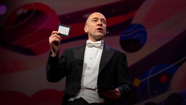
Here's an example. Now, how many people know what this is? Okay. Now how many people know what this is? Okay. Thanks to two more deft strokes by the genius Charles M. Schulz, we now have seven deft strokes that in and of themselves create an entire emotional life, one that has enthralled hundreds of millions of fans for over 50 years. This is actually a cover of a book that I designed about the work of Schulz and his art, which will be coming out this fall, and that is the entire cover. There is no other typographic information or visual information on the front, and the name of the book is "Only What's Necessary." So this is sort of symbolic about the decisions I have to make every day about the design that I'm perceiving, and the design I'm creating.
Bunun ne olduğunu kaç kişi biliyor? Peki, şimdi kaç kişi bunun ne olduğunu biliyor? Dahi Charles M. Schultz'den iki tane daha usta vuruşla beraber, şimdi yedi usta vuruş görüyoruz. 50 yılı aşkın süredir tek başlarına yüz milyonlarca hayranı kendine bağlayan bütün bir duygusal yaşamı oluşturuyorlar. Aslında bu Schulz'un çalışmaları ve sanatıyla ilgili hazırladığım bu sonbaharda piyasaya çıkacak kitabın kapağı. Kapağın tamamı bu. Kapakta başka bir tipografik bilgi ya da görsel bilgi yok ve kitabın adı da "Only What's Necessary" (Sadece Gerektiği Kadar) Bu algıladığım ve yaptığım tasarımlarla ilgili her gün verdiğim kararlara dair bir çeşit sembol.
So clarity. Clarity gets to the point. It's blunt. It's honest. It's sincere. We ask ourselves this. ["When should you be clear?"]
Duruluk. Duruluk sadede gelir. O lafını esirgemez, dürüsttür, samimidir. Kendimize bunu sormalıyız. ["Ne zaman duru olmalısın?"]
Now, something like this, whether we can read it or not, needs to be really, really clear. Is it?
Böyle bir şey okuyabilsek veya okuyamasak da mutlaka duru olması gerekiyor. Değil mi?
This is a rather recent example of urban clarity that I just love, mainly because I'm always late and I am always in a hurry. So when these meters started showing up a couple of years ago on street corners, I was thrilled, because now I finally knew how many seconds I had to get across the street before I got run over by a car. Six? I can do that. (Laughter)
Kentsel duruluk için daha yakın tarihli, çok sevdiğim bir örnek. Çünkü her zaman geç kalmışımdır ve her zaman acelem vardır. Bir kaç yıl önce bu sayaçlar sokak köşelerinde ortaya çıktığından beri çok gerginim çünkü nihayet bir arabanın altında kalmadan önce yolu kaç saniyede geçmem gerektiğini biliyorum. Altı? Başarabilirim. Şimdi de yang'ın duruluğu için yin'e bakalım ve bu da gizemdir.
So let's look at the yin to the clarity yang, and that is mystery. Mystery is a lot more complicated by its very definition. Mystery demands to be decoded, and when it's done right, we really, really want to. ["When should you be mysterious?"] In World War II, the Germans really, really wanted to decode this, and they couldn't.
Gizem tanımından dolayı daha karmaşıktır. Gizemin deşifre edilmesi gerekir ve eğer doğru yapılırsa gerçekten (deşifre) edilmesini isteriz. ["Ne zaman gizemli olmalısın?"] II. Dünya Savaşı'nda Almanlar bunu çözmeyi çok istediler ancak başaramadılar. Bu, kendisine 20 yıldan fazladır tasarım yaptığım
Here's an example of a design that I've done recently for a novel by Haruki Murakami, who I've done design work for for over 20 years now, and this is a novel about a young man who has four dear friends who all of a sudden, after their freshman year of college, completely cut him off with no explanation, and he is devastated. And the friends' names each have a connotation in Japanese to a color. So there's Mr. Red, there's Mr. Blue, there's Ms. White, and Ms. Black. Tsukuru Tazaki, his name does not correspond to a color, so his nickname is Colorless, and as he's looking back on their friendship, he recalls that they were like five fingers on a hand. So I created this sort of abstract representation of this, but there's a lot more going on underneath the surface of the story, and there's more going on underneath the surface of the jacket. The four fingers are now four train lines in the Tokyo subway system, which has significance within the story. And then you have the colorless subway line intersecting with each of the other colors, which basically he does later on in the story. He catches up with each of these people to find out why they treated him the way they did.
Haruki Murakami'nin romanı için hazırladığım tasarımdan bir örnek. Roman dört yakın arkadaşı olan bir adamla ilgili. (Arkadaşları) üniversitenin birinci yılından sonra aniden ve hiç bir açıklama yapmadan onunla olan tüm iletişimlerini kesmiş ve bu adamı mahvetmiş. Ayrıca arkadaşlarının her birinin adının Japonca'da bir renkle bağlantısı var. Yani bu Kırmızı bey, bu Mavi bey, bu Beyaz bey ve bu da Siyah bey. Tskuru Tazaki'nin adının hiç bir renkle bağlantısı yok bu yüzden onun takma adı Renksiz ve eski arkadaşlıklarına baktığında bir elin beş parmağı gibi olduklarını hatırlıyor. Bu yüzden ben de bunun bir tür temsili özetini yapmış oldum ancak hikayenin dış yüzeyinin altında çok daha fazlası var. ve bu kapağın yüzeyinin altında da çok daha fazlası var. Dört parmak hikaye için önemli olan Tokyo metro sisteminde dört tren rayı. Bir de aslında hikayenin devamında (adamın) yapacağı gibi diğer renklerle kesişen renksiz metro hattını var. Adam, ona neden böyle davrandıklarını öğrenmek için her biriyle bir araya gelecek.
And so this is the three-dimensional finished product sitting on my desk in my office, and what I was hoping for here is that you'll simply be allured by the mystery of what this looks like, and will want to read it to decode and find out and make more clear why it looks the way it does.
Bu da ofisteki masamda duran üç boyutlu nihai ürün. Umuyorum ki görüntüsünün gizeminden büyülenip neden böyle göründüğünü netleştirmek ve onu deşifre etmek için -kitabı- okumak isteyeceksiniz.
["The Visual Vernacular."]
["Görsel Anadil."]
This is a way to use a more familiar kind of mystery. What does this mean? This is what it means. ["Make it look like something else."] The visual vernacular is the way we are used to seeing a certain thing applied to something else so that we see it in a different way.
Bu daha bilindik olan bir gizemi kullanmanın yolu. Ne anlama geliyor? Bunu anlatıyor. ["Başka bir şeymiş gibi göster."] Görsel anadil, bir şeyi normalde olması gerekenden farklı bir şekilde gösterip onu farklı algılamamızı sağlamanın bir yolu.
This is an approach I wanted to take to a book of essays by David Sedaris that had this title at the time. ["All the Beauty You Will Ever Need"] Now, the challenge here was that this title actually means nothing. It's not connected to any of the essays in the book. It came to the author's boyfriend in a dream. Thank you very much, so -- (Laughter) -- so usually, I am creating a design that is in some way based on the text, but this is all the text there is. So you've got this mysterious title that really doesn't mean anything, so I was trying to think: Where might I see a bit of mysterious text that seems to mean something but doesn't? And sure enough, not long after, one evening after a Chinese meal, this arrived, and I thought, "Ah, bing, ideagasm!" (Laughter) I've always loved the hilariously mysterious tropes of fortune cookies that seem to mean something extremely deep but when you think about them -- if you think about them -- they really don't. This says, "Hardly anyone knows how much is gained by ignoring the future." Thank you. (Laughter) But we can take this visual vernacular and apply it to Mr. Sedaris, and we are so familiar with how fortune cookie fortunes look that we don't even need the bits of the cookie anymore. We're just seeing this strange thing and we know we love David Sedaris, and so we're hoping that we're in for a good time.
Bu yaklaşımı David Sedaris'in makaleleri olan bir kitaptan ele almak istiyorum Şu an -kitabın- başlığı bu: [İhtiyacınız Olabilecek Güzelliğin Tamamı] Burada iddialı olan kısım, başlığın aslında hiç bir anlam ifade etmemesi. Kitaptaki hiç bir makaleyle bağlantısı yok. Bu -fikir- bir rüyasında yazarın sevgilisinden gelmiş. Çok teşekkürler. Genellikle tasarımlarımı bir şekilde metinle bağlantılı şekilde yapıyorum ancak bunradaki tüm metin bu. Yani elinizde aslında hiç bir anlama gelmeyen gizemli bir başlığınız var. Ben de şunu bulmaya çalışıyorum: bir anlam ifade ediyor gibi gözüken ama aslında etmeyen gizemli bir parça yazıyı nerede görebilirim? Beklendiği gibi, kısa bir süre sonra, Çin yemeğinin ardından bir akşam, bu elime geçti ve şöyle düşündüm "idea-gasm!" (idea=fikir/orgasm=orgazm) Her zaman şans kurabiyelerinin komik ve gizemli mecazlarını sevmişimdir. Bunun ziyadesiyle derin bir anlamı var gibi gözüküyor ama üzerilerine ciddi ciddi düşünürseniz -eğer onları düşünüyorsanız- aslında bir anlamları yok. Bunda "Hemen hemen hiç kimse geleceği umursamayarak ne kadar kazanıldığını bilmiyor." yazıyor. Teşekkürler. Bu görsel anadili alıp Mr. Sedaris'e uygulayabiliriz. Fal kurabiyelerinin fallarının nasıl göründüğünü o kadar iyi biliyoruz ki kurabiye parçalarına bile gerek kalmıyor. Bu garip şeyi görüyor, David Sedaris'i sevdiğimizi biliyoruz ve güzel zaman geçireceğimizi umuyoruz.
["'Fraud' Essays by David Rakoff"] David Rakoff was a wonderful writer and he called his first book "Fraud" because he was getting sent on assignments by magazines to do things that he was not equipped to do. So he was this skinny little urban guy and GQ magazine would send him down the Colorado River whitewater rafting to see if he would survive. And then he would write about it, and he felt that he was a fraud and that he was misrepresenting himself. And so I wanted the cover of this book to also misrepresent itself and then somehow show a reader reacting to it.
["Sahtekar" David Rakoff'tan Denemeler] David Rakoff harika bir yazardı. İlk kitabına "sahtekar" ismini verdi çünkü dergiler tarafından yapmaya uygun olmadığı görevlere gönderiliyordu. Kendisi sıska ufak tefek şehirli bir erkek ve GQ dergisi onu Colorado Nehri'nde white-water raftingi yaparken hayatta kalıp kalamayacağını görmek için göndermiş. O da bunun hakkında yazmış ama sahtekar gibi hissetmiş ve kendisini yanlış ifade ettiğini düşünmüş. Bu yüzden ben de kitabın kapağı kendisini yanlış ifade etsin ve okuyucunun da buna olan tepkisini bir şekilde göstermek istedim
This led me to graffiti. I'm fascinated by graffiti. I think anybody who lives in an urban environment encounters graffiti all the time, and there's all different sorts of it. This is a picture I took on the Lower East Side of just a transformer box on the sidewalk and it's been tagged like crazy. Now whether you look at this and think, "Oh, that's a charming urban affectation," or you look at it and say, "That's illegal abuse of property," the one thing I think we can all agree on is that you cannot read it. Right? There is no clear message here. There is another kind of graffiti that I find far more interesting, which I call editorial graffiti. This is a picture I took recently in the subway, and sometimes you see lots of prurient, stupid stuff, but I thought this was interesting, and this is a poster that is saying rah-rah Airbnb, and someone has taken a Magic Marker and has editorialized about what they think about it. And it got my attention.
Bu da beni grafitiye yönlendirdi. Grafiti beni büyülüyor. Sanıyorum şehirde yaşayan herkes grafitiyle ve onun her türlü şekliyle sürekli karşılaşıyor Bu Lower East Side'de çektiğim, bir kaldırımın üzerindeki çılgınca karalanmış trafonun resmi. Buna baktığınızda "Hoş bir şehir sevgisi." veya "Malın illegal kötüye kullanımı." diye düşünebilirsiniz. Sanırım hepimizin anlaşabileceği tek şey bunu okuyamıyor olmanız. Değil mi? Burada net bir mesaj yok? Bu da editoryal grafiti dediğim ve daha da ilginç bulduğum başka bir grafiti. Geçen yıl metroda çektiğim bir resim. Bazen sekse dayalı ve aptalca çok fazla şey görüyorsunuz ama bence bu ilgi çekici. Bu üzerinde rah-rah Airbnb yazan bir poster ve birisi keçeli kalemi alıp ona dair fikrine göre göre tekrar düzenlemiş. Benim ilgimi çekti. Bunu kitaba nasıl uyarlayabiliriz diye düşündüm.
So I was thinking, how do we apply this to this book? So I get the book by this person, and I start reading it, and I'm thinking, this guy is not who he says he is; he's a fraud. And I get out a red Magic Marker, and out of frustration just scribble this across the front. Design done. (Laughter) And they went for it! (Laughter) Author liked it, publisher liked it, and that is how the book went out into the world, and it was really fun to see people reading this on the subway and walking around with it and what have you, and they all sort of looked like they were crazy. (Laughter)
Kitabı bu kişiden aldım ve okudum. Sonra düşündüm ki bu kişi söylediği kişi değil yani o bir sahtekar. Elime bir keçeli kalem alıp, hayal kırıklığıyla kapağı sadece karaladım. Tasarım tamamdır. Onlar da aynen kabul etti! Yazar beğendi, yayıncı beğendi, ve kitap da dünyanın karşısına böyle çıktı. İnsanları metroda bu kitabı okurken, onunla etrafta gezerken falan görmek gerçekten eğlenceliydi. Hepsi çıldırmış gibi gözüküyorlardı.
["'Perfidia' a novel by James Ellroy"] Okay, James Ellroy, amazing crime writer, a good friend, I've worked with him for many years. He is probably best known as the author of "The Black Dahlia" and "L.A. Confidential." His most recent novel was called this, which is a very mysterious name that I'm sure a lot of people know what it means, but a lot of people don't. And it's a story about a Japanese-American detective in Los Angeles in 1941 investigating a murder. And then Pearl Harbor happens, and as if his life wasn't difficult enough, now the race relations have really ratcheted up, and then the Japanese-American internment camps are quickly created, and there's lots of tension and horrible stuff as he's still trying to solve this murder. And so I did at first think very literally about this in terms of all right, we'll take Pearl Harbor and we'll add it to Los Angeles and we'll make this apocalyptic dawn on the horizon of the city. And so that's a picture from Pearl Harbor just grafted onto Los Angeles. My editor in chief said, "You know, it's interesting but I think you can do better and I think you can make it simpler." And so I went back to the drawing board, as I often do. But also, being alive to my surroundings, I work in a high-rise in Midtown, and every night, before I leave the office, I have to push this button to get out, and the big heavy glass doors open and I can get onto the elevator. And one night, all of a sudden, I looked at this and I saw it in a way that I hadn't really noticed it before. Big red circle, danger. And I thought this was so obvious that it had to have been done a zillion times, and so I did a Google image search, and I couldn't find another book cover that looked quite like this, and so this is really what solved the problem, and graphically it's more interesting and creates a bigger tension between the idea of a certain kind of sunrise coming up over L.A. and America.
["James Ellroy'un romanı Perfidia"] James Ellroy harika bir suç yazarı, iyi bir dost ve onunla yıllardır çalışıyorum. Muhtemelen en çok "Cehennem Çiçeği" ve "Los Angeles Sırları"'nın yazarı olarak biliniyor. En son kitabı bu çok gizemli isme sahipti. Eminim ki bir çok kişi ne anlama geldiğini biliyordur ama bir çoğu da bilmiyor. Hikaye 1941 yılında Los Angeles'da bir cinayeti araştıran Japon-Amerikan detektifle ilgili. Sonra "Pearl Harbor" -saldırısı- gerçekleşiyor. Böylece hayatı yeterince zor değilmiş gibi ırk ilişkileri üzerinde baskı da iyice artıyor. Ardından Japon-Amerika gözaltı kampları hızla oluşturuluyor ve tüm bu yüksek gerilim ve korkunç olaylara rağmen o halen cinayeti çözmeye çalışıyor. Bunu ilk başta genel anlamıyla ele aldım. Yani şöyle; Pearl Harbo'u alıp Los Angeles'ın üzerine ekleyecektik. Şehrin ufkunda böyle kıyamet gibi bir gün doğumu yapacaktık. Bu Pearl Harbor'un Los Angeles üzerine eklenmesiyle oluşan resmi. Baş editörüm dedi ki "Evet ilginç olmuş ama bence daha iyisini ve daha sadesini yapabilirsin." Böylece sıkça yaptığım gibi çizim masama geri döndüm ama etrafımdakilerin de farkındaydım aynı zamanda. Midtown'da yüksek bir binada çalışıyorum ve her akşam ofisten ayrılmadan önce dışarı çıkmak için bu butona basmam gerekiyor ki böylece büyük ağır cam kapılar açılsın ve asansöre binebileyim. Bir gece birden bire buna baktım ve onu daha önce hiç fark etmediğim bir şekilde gördüm. Büyük kırmızı daire; tehlike. Bunu zilyon kere yaptığım çok bariz diye düşündüm. Google resim taraması yaptım. Buna benzeyen başka bir kitap kapağı bulamadım. Bu da sorunu çözmüş oluyordu. Grafiksel olarak daha ilginç ve L.A. ve Amerika'nın üzerine belli bir çeşit güneşin doğuşu fikrine göre daha büyük bir gerilim oluşturuyor.
["'Gulp' A tour of the human digestive system by Mary Roach."]
["Mary Roach'dan Yutkunmak, İnsan sindirim sistemine bir yolculuk."]
Mary Roach is an amazing writer who takes potentially mundane scientific subjects and makes them not mundane at all; she makes them really fun. So in this particular case, it's about the human digestive system. So I'm trying to figure out what is the cover of this book going to be. This is a self-portrait. (Laughter) Every morning I look at myself in the medicine cabinet mirror to see if my tongue is black. And if it's not, I'm good to go. (Laughter) I recommend you all do this. But I also started thinking, here's our introduction. Right? Into the human digestive system. But I think what we can all agree on is that actual photographs of human mouths, at least based on this, are off-putting. (Laughter) So for the cover, then, I had this illustration done which is literally more palatable and reminds us that it's best to approach the digestive system from this end. (Laughter) I don't even have to complete the sentence. All right.
Mary Roach potansiyel olarak olağan bilimsel konuları alıp olağanın dışına çıkartıp çok eğlenceli hale getiren inanılmaz bir yazar. Bu durumda, kitap insanların sindirim sistemiyle ilgili. Kitabın kapağının ne olacağını düşünmeye çalışıyordum. Bu bir otoportre. Her sabah ilaç dolabının aynasından dilim siyah mı diye kendime bakıyorum. Eğer değilse gitmeye hazırım demektir. Hepinize bunu yapmanızı öneririm. Bunun aynı zamanda bir başlangıcımız olduğunu düşünmeye başladım. Değil mi? Sindirim sistemimizin içine. Hepimizin insan ağzı fotoğraflarının, en azından bunu baz alırsak, rahatsız edici olduğundan hem fikir olduğumuzu düşünüyorum. O zaman kapağı şu şekilde tamamlamalıydım; çok daha hoşa gidecek şekilde olmalı ve bize sindirim sistemine en iyi yaklaşımın bu uçtan olduğunu hatırlatmalıydı. Cümlemi tamamlamama bile gerek kalmadı. Peki o zaman.
["Unuseful mystery"] What happens when clarity and mystery get mixed up? And we see this all the time. This is what I call unuseful mystery. I go down into the subway -- I take the subway a lot -- and this piece of paper is taped to a girder. Right? And now I'm thinking, uh-oh, and the train's about to come and I'm trying to figure out what this means, and thanks a lot. Part of the problem here is that they've compartmentalized the information in a way they think is helpful, and frankly, I don't think it is at all. So this is mystery we do not need. What we need is useful clarity, so just for fun, I redesigned this. This is using all the same elements. (Applause) Thank you. I am still waiting for a call from the MTA. (Laughter) You know, I'm actually not even using more colors than they use. They just didn't even bother to make the 4 and the 5 green, those idiots. (Laughter) So the first thing we see is that there is a service change, and then, in two complete sentences with a beginning, a middle and an end, it tells us what the change is and what's going to be happening. Call me crazy! (Laughter)
["Gereksiz gizem"] Duruluk ve gizem birbirine karışırsa ne olur? Yani bunu hep görürsek. Buna gereksiz gizem diyorum. Metroya iniyorum -metroyu çok kullanırım- ve bu kağıt bir kirişe bantlanmış. Şunu düşünüyorum "Eyvah" Metro gelmek üzere ve bunun ne anlama geldiğini anlamaya çalışıyorum, yani çok teşekkürler. Problemin bir kısmı bilgiyi faydalı olacağını düşündükleri bir şekilde bölümlere ayırmışlar ama açıkçası hiç de öyle olmamış. Bu ihtiyacımız olmayan bir gizem. İhtiyacımız olan faydalı bir duruluk. Sırf eğlence için bunu tekrar düzenledim. Aynı elementler kullanılarak yapıldı. Teşekkürler. Halen MTA'dan telefon bekliyorum. (MTA: Metropolitan toplu taşıma müdürlüğü) Onların kullandığından daha çok renk bile kullanmadım aslında. 4 ve 5'i yeşil yapma zahmetine bile katlanmamışlar. Ah bu ahmaklar. Öncelikle bir servis değişikliği olduğunu görüyoruz. Sonrada başı, ortası ve sonu olan iki düzgün cümleyle bu değişikliğin ne olduğunu ve nasıl olacağını anlatıyor. Çıldırmış olmalıyım!
["Useful mystery"] All right. Now, here is a piece of mystery that I love: packaging. This redesign of the Diet Coke can by Turner Duckworth is to me truly a piece of art. It's a work of art. It's beautiful. But part of what makes it so heartening to me as a designer is that he's taken the visual vernacular of Diet Coke -- the typefaces, the colors, the silver background -- and he's reduced them to their most essential parts, so it's like going back to the Charlie Brown face. It's like, how can you give them just enough information so they know what it is but giving them the credit for the knowledge that they already have about this thing? It looks great, and you would go into a delicatessen and all of a sudden see that on the shelf, and it's wonderful. Which makes the next thing -- ["Unuseful clarity"] -- all the more disheartening, at least to me. So okay, again, going back down into the subway, after this came out, these are pictures that I took. Times Square subway station: Coca-Cola has bought out the entire thing for advertising. Okay? And maybe some of you know where this is going. Ahem.
["Gerekli Gizem"] Pekala Sevdiğim gizemden bir parça; ambalajlama. Bu, bana göre tam bir sanat eseri olan, Turner Duckworth tarafından tekrar tasarlanmış olan diyet kola kutusu. Bu bir sanat eseri. Çok güzel. Bir tasarımcı olarak beni bu kadar mutlu eden yanı ise diyet kolanın görsel anadilini; yazı karakterini, renklerini, gümüş arka planını, alıp bunu en önemli kısımları kalana kadar eksiltmesi. Charlie Brown'un yüzüne geri dönmek gibi yani. Bunun ne olduğunu bildiklerine dair sadece yeterli olan bilgiyi verirken bununla ilgili zaten bildikleri bilgileri kullanmalarının hakkını nasıl teslim ederiz, demek gibi. Harika gözüküyor. Bir şarküteriye gireceksiniz ve bunu birden bire rafta göreceksiniz. Muhteşem. Bu da bir sonrakini hazırlıyor. ["Gereksiz Duruluk"] Bana göre şarküterideki bir çok şey. Tamam metroya tekrar inelim, bu ambalaj piyasaya çıktıktan sonra bu fotoğrafları çekmiştim. Times Meydanı metro istasyonu: Coca-Cola tüm bu şeyi reklam için satın almış. Tamam mı? Bazılarınız bunun sonunu biliyordur belki. "Sırtındaki kıyafetler, cebindeki paralar
"You moved to New York with the clothes on your back, the cash in your pocket, and your eyes on the prize. You're on Coke." (Laughter) "You moved to New York with an MBA, one clean suit, and an extremely firm handshake. You're on Coke." (Laughter) These are real! (Laughter) Not even the support beams were spared, except they switched into Yoda mode. (Laughter) "Coke you're on." (Laughter) ["Excuse me, I'm on WHAT??"] This campaign was a huge misstep. It was pulled almost instantly due to consumer backlash and all sorts of unflattering parodies on the web -- (Laughter) -- and also that dot next to "You're on," that's not a period, that's a trademark. So thanks a lot.
ve gözlerin ödüle dikili New York'a geldin. Kola'ya hazırsın." (Coke'un uyuşturucu anlamı da var.) "MBA'inle, temiz bir takım (MBA:İşletme yüksek lisans programı) ve sert bir tokalaşmayla New York'a geldin. Kola'ya hazırsın." Bunlar gerçek! Yoda moduna geçmek dışında kolonlar bile unutulmamış. "Hazırsın kola'ya." ["Özür dilerim, NEYE hazırım??"] Bu kampanya çok yanlış bir adımdı. Tüketici nazarında geri teptiği ve internetteki her türlü kötüleyici parodilerinden dolayı kampanya aniden durduruldu. Ayrıca "You're on"un yanındaki benek bir nokta değil, ticari markası. Çok teşekkürler gerçekten.
So to me, this was just so bizarre about how they could get the packaging so mysteriously beautiful and perfect and the message so unbearably, clearly wrong. It was just incredible to me.
Son derece gizemli bir güzelliği olan ve neredeyse kusursuz bu ambalajın yanında dayanılmaz derecede yanlış bir mesaj kullanabilmeleri, bence çok garipti. Akıl almazdı.
So I just hope that I've been able to share with you some of my insights on the uses of clarity and mystery in my work, and maybe how you might decide to be more clear in your life, or maybe to be a bit more mysterious and not so over-sharing. (Laughter)
Umarım işimde; duruluk ve gizemin kullanımının iç yüzünü, hayatınızda nasıl daha duru ya da biraz daha gizemli olabileceğinizi, yani gerektiğinden fazla şey paylaşmamayı anlatabilmişimdir.
And if there's just one thing that I leave you with from this talk, I hope it's this: Blih blih blih blah. Blah blah blih blih. ["'Judge This,' Chip Kidd"] Blih blih blah blah blah. Blah blah blah.
Bu konuşmadan size tek bir şey bırakacaksam umarım o şu olur: Blih blih blih blah. Blah blah blih blih. ["'Bunu Yargıla,' Chip Kidd"] Blih blih blah blah blah. Blah blah blah.
Blah blah.
Blah blah.
(Applause)