Blah blah blah blah blah. Blah blah blah blah, blah blah, blah blah blah blah blah blah. Blah blah blah, blah.
Bla bla bla bla bla. Bla bla bla bla, bla bla, bla bla bla bla bla bla. Bla bla bla, blah.
So what the hell was that? Well, you don't know because you couldn't understand it. It wasn't clear. But hopefully, it was said with enough conviction that it was at least alluringly mysterious.
Wat was dat in vredesnaam? Dat weet je niet, want je kon het niet begrijpen. Het was niet duidelijk. Maar hopelijk werd het met genoeg overtuiging gezegd waardoor het in ieder geval verleidelijk mysterieus werd.
Clarity or mystery? I'm balancing these two things in my daily work as a graphic designer, as well as my daily life as a New Yorker every day, and there are two elements that absolutely fascinate me.
Duidelijkheid of mysterie? In mijn werk als grafisch ontwerper probeer ik hier een balans in te vinden, net als in mijn dagelijks leven als New Yorker, iedere dag. Er zijn twee elementen die me werkelijk fascineren.
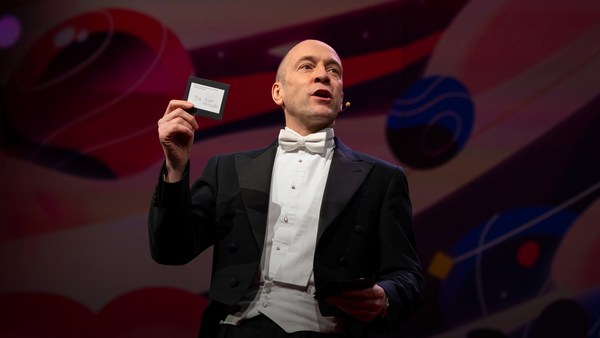
Here's an example. Now, how many people know what this is? Okay. Now how many people know what this is? Okay. Thanks to two more deft strokes by the genius Charles M. Schulz, we now have seven deft strokes that in and of themselves create an entire emotional life, one that has enthralled hundreds of millions of fans for over 50 years. This is actually a cover of a book that I designed about the work of Schulz and his art, which will be coming out this fall, and that is the entire cover. There is no other typographic information or visual information on the front, and the name of the book is "Only What's Necessary." So this is sort of symbolic about the decisions I have to make every day about the design that I'm perceiving, and the design I'm creating.
Hier is een voorbeeld. Hoeveel mensen weten wat dit is? Oké. Hoeveel mensen weten het nu? Dankzij nog twee bekwame streken van het genie Charles M. Schulz, hebben we nu zeven pennenstreken die op zichzelf een compleet emotioneel leven creeëren. Één dat honderden miljoenen fans al ruim vijftig jaar heeft weten te boeien. Dit is trouwens het omslag, dat ik heb ontworpen, van een boek over het werk van Schulz, dat dit najaar verschijnt. En dit is het gehele omslag. Verdere typografische of visuele informatie ontbreekt op de voorkant. En de naam van het boek is "Only What's Necessary". Dit staat eigenlijk symbool voor de beslissingen die ik dagelijks moet maken wat betreft het ontwerp dat ik waarneem en het ontwerp dat ik ga creeëren.
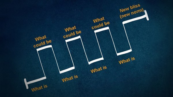
So clarity. Clarity gets to the point. It's blunt. It's honest. It's sincere. We ask ourselves this. ["When should you be clear?"]
Duidelijkheid dus. Duidelijkheid komt tot de kern. Het is direct. Het is eerlijk. Het is oprecht. We vragen onszelf dit af. ["Wanneer moet je duidelijk zijn?"]
Now, something like this, whether we can read it or not, needs to be really, really clear. Is it?
Iets als dit, of we het nou kunnen lezen of niet. moet heel erg duidelijk zijn. Is dat het?
This is a rather recent example of urban clarity that I just love, mainly because I'm always late and I am always in a hurry. So when these meters started showing up a couple of years ago on street corners, I was thrilled, because now I finally knew how many seconds I had to get across the street before I got run over by a car. Six? I can do that. (Laughter)
Dit is een vrij recent voorbeeld van stedelijke duidelijkheid waar ik van hou, voornamelijk omdat ik altijd te laat ben en altijd haast heb. Toen deze apparaten een paar jaar geleden op straathoeken verschenen was ik door het dolle heen, nu wist ik precies hoeveel seconden ik had voor ik overreden zou worden. Zes? Dat ga ik redden. (Gelach)
So let's look at the yin to the clarity yang, and that is mystery. Mystery is a lot more complicated by its very definition. Mystery demands to be decoded, and when it's done right, we really, really want to. ["When should you be mysterious?"] In World War II, the Germans really, really wanted to decode this, and they couldn't.
Laten we eens kijken naar de yin die hoort bij deze yang. Dat is mysterie. Mysterie is per definitie een stuk ingewikkelder. Dat vraagt erom ontcijferd te worden. Wordt het op de juiste manier gedaan, dan willen we dat ook. ["Wanneer mysterieus zijn?"] In de Tweede Wereldoorlog wilden de Duitsers dit met alle macht decoderen, maar dat lukte niet.
Here's an example of a design that I've done recently for a novel by Haruki Murakami, who I've done design work for for over 20 years now, and this is a novel about a young man who has four dear friends who all of a sudden, after their freshman year of college, completely cut him off with no explanation, and he is devastated. And the friends' names each have a connotation in Japanese to a color. So there's Mr. Red, there's Mr. Blue, there's Ms. White, and Ms. Black. Tsukuru Tazaki, his name does not correspond to a color, so his nickname is Colorless, and as he's looking back on their friendship, he recalls that they were like five fingers on a hand. So I created this sort of abstract representation of this, but there's a lot more going on underneath the surface of the story, and there's more going on underneath the surface of the jacket. The four fingers are now four train lines in the Tokyo subway system, which has significance within the story. And then you have the colorless subway line intersecting with each of the other colors, which basically he does later on in the story. He catches up with each of these people to find out why they treated him the way they did.
Hier is een voorbeeld van een ontwerp dat ik onlangs heb gemaakt voor een roman van Haruki Murakami, voor wie ik al ruim twintig jaar ontwerp. Deze roman gaat over een jonge man met vier dierbare vrienden die plots, na hun eerste studiejaar, zonder uitleg, al het contact compleet verbreken en hij is er kapot van. De namen hebben in het Japans allemaal een associatie met een kleur. Je hebt meneer rood, meneer blauw, mevrouw wit en mevrouw zwart. Tsukuru Tazaki, zijn naam, heeft geen associatie met een kleur. Zijn bijnaam is kleurloos en hij kijkt terug op hun vriendschap en herinnert zich dat ze als vijf vingers aan één hand waren. Ik maakte hier een soort van abstracte representatie van, maar er gebeurt nog veel meer onder de oppervlakte van dit verhaal en ook onder de oppervlakte van dit omslag. De vier vingers zijn nu vier trajecten van de metro van Tokio, die ook in het verhaal terugkomen. En dan heb je nog de kleurloze metrolijn die met de andere kleuren kruist, wat hij ook doet, later in het verhaal. Hij zoekt ze allemaal weer op om erachter te komen waarom ze hem zo behandeld hebben.
And so this is the three-dimensional finished product sitting on my desk in my office, and what I was hoping for here is that you'll simply be allured by the mystery of what this looks like, and will want to read it to decode and find out and make more clear why it looks the way it does.
Dit is het driedimensionale eindproduct op mijn bureau in mijn kantoor. Waar ik op hoopte, is dat je simpelweg verleid wordt door het mysterie van hoe het er uitziet en het boek zal willen lezen om te ontcijferen en erachter te komen waarom het er zo uitziet.
["The Visual Vernacular."]
["Visuele spreektaal"]
This is a way to use a more familiar kind of mystery. What does this mean? This is what it means. ["Make it look like something else."] The visual vernacular is the way we are used to seeing a certain thing applied to something else so that we see it in a different way.
Dit is een manier om een wat bekendere vorm van mysterie te gebruiken. Wat betekent dit? Dit is wat het betekent. ["Laat het op iets anders lijken"] Visuele spreektaal is onze normale zienswijze van iets toe te passen op iets anders, zodat we dat anders gaan zien.
This is an approach I wanted to take to a book of essays by David Sedaris that had this title at the time. ["All the Beauty You Will Ever Need"] Now, the challenge here was that this title actually means nothing. It's not connected to any of the essays in the book. It came to the author's boyfriend in a dream. Thank you very much, so -- (Laughter) -- so usually, I am creating a design that is in some way based on the text, but this is all the text there is. So you've got this mysterious title that really doesn't mean anything, so I was trying to think: Where might I see a bit of mysterious text that seems to mean something but doesn't? And sure enough, not long after, one evening after a Chinese meal, this arrived, and I thought, "Ah, bing, ideagasm!" (Laughter) I've always loved the hilariously mysterious tropes of fortune cookies that seem to mean something extremely deep but when you think about them -- if you think about them -- they really don't. This says, "Hardly anyone knows how much is gained by ignoring the future." Thank you. (Laughter) But we can take this visual vernacular and apply it to Mr. Sedaris, and we are so familiar with how fortune cookie fortunes look that we don't even need the bits of the cookie anymore. We're just seeing this strange thing and we know we love David Sedaris, and so we're hoping that we're in for a good time.
Deze aanpak wilde ik gebruiken voor een boek met essays van David Sedaris, destijds getiteld: ["All the Beauty You Will Ever Need"] De uitdaging hier was dat de titel helemaal niets betekent. Het heeft niets te maken met een van de essays in het boek. Het was in een droom tot de vriend van de auteur gekomen. En bedankt, dus -- (Gelach) -- meestal maak ik een design dat ergens gebaseerd is op de tekst, maar dit is alle tekst die er was. Je hebt dus een mysterieuze titel, die niets betekent. Ik probeerde te bedenken: waar vind ik mysterieuze teksten die niets betekenen, al lijkt het wel zo? En ja hoor, niet veel later op een avond, na een Chinese maaltijd, kwam dit te voorschijn en dacht ik: "Ah, bing, ideegasme!" (Gelach) Ik ben altijd dol geweest op de hilarisch mysterieuze boodschappen in gelukskoekjes die heel diepzinnig lijken, maar, als je er over nadenkt -- als je dat al doet -- eigenlijk niets betekenen. Hier staat "Bijna niemand weet hoeveel je wint door de toekomst te negeren". Dank je. (Gelach) Maar we kunnen deze visuele spreektaal ook toepassen op meneer Sedaris, we zijn zo gewend aan gelukskoekjes dat we het koekje zelf niet eens meer nodig hebben. We zien alleen dit rare dingetje en weten dat we dol zijn op David Sedaris, dus hopen we dat het leuk zal worden.
["'Fraud' Essays by David Rakoff"] David Rakoff was a wonderful writer and he called his first book "Fraud" because he was getting sent on assignments by magazines to do things that he was not equipped to do. So he was this skinny little urban guy and GQ magazine would send him down the Colorado River whitewater rafting to see if he would survive. And then he would write about it, and he felt that he was a fraud and that he was misrepresenting himself. And so I wanted the cover of this book to also misrepresent itself and then somehow show a reader reacting to it.
["Fraud" Essays door David Rakoff"] Rakoff was een geweldige schrijver. Zijn eerste boek heette "Fraud", omdat hij van tijdschriften opdracht kreeg dingen te doen waar hij niet geschikt voor was. Hij was een kleine, magere stadsjongen die door GQ magazine in een raft de Colorado-rivier werd afgestuurd om te kijken of hij het zou overleven. Vervolgens schreef hij erover, maar hij voelde zich een fraudeur en iemand die zich anders voordeed. Ik wilde dus ook dat het omslag zich anders zou voordoen en zou laten zien hoe een lezer erop reageerde.
This led me to graffiti. I'm fascinated by graffiti. I think anybody who lives in an urban environment encounters graffiti all the time, and there's all different sorts of it. This is a picture I took on the Lower East Side of just a transformer box on the sidewalk and it's been tagged like crazy. Now whether you look at this and think, "Oh, that's a charming urban affectation," or you look at it and say, "That's illegal abuse of property," the one thing I think we can all agree on is that you cannot read it. Right? There is no clear message here. There is another kind of graffiti that I find far more interesting, which I call editorial graffiti. This is a picture I took recently in the subway, and sometimes you see lots of prurient, stupid stuff, but I thought this was interesting, and this is a poster that is saying rah-rah Airbnb, and someone has taken a Magic Marker and has editorialized about what they think about it. And it got my attention.
Dit bracht me op het idee van graffiti. Ik ben gefascineerd door graffiti. Iedereen die in een stadse omgeving woont, komt constant graffiti tegen en er zijn een heleboel vormen. Deze foto nam ik op de Lower East Side. Het is een transformatorhuisje dat helemaal is volgetagd. Of je hier nu naar kijkt en denkt: "O, wat een leuke stadse kunst". Of je denkt: "Dit is vandalisme", we zullen het er allemaal mee eens zijn dat je niet echt kunt lezen wat er staat. Toch? Er is geen duidelijke boodschap. Er is een vorm van graffiti die ik interessanter vind. Redactionele graffiti noem ik het maar. Deze foto nam ik onlangs in de metro -- soms zie je heel veel wellustige, stomme dingen, maar dit vond ik wel interessant. Het is een poster waar op staat: Hiep hoi Airbnb. Iemand heeft met een stift de boel geredigeerd en zijn mening gegeven. Het trok mijn aandacht.
So I was thinking, how do we apply this to this book? So I get the book by this person, and I start reading it, and I'm thinking, this guy is not who he says he is; he's a fraud. And I get out a red Magic Marker, and out of frustration just scribble this across the front. Design done. (Laughter) And they went for it! (Laughter) Author liked it, publisher liked it, and that is how the book went out into the world, and it was really fun to see people reading this on the subway and walking around with it and what have you, and they all sort of looked like they were crazy. (Laughter)
Dus vroeg ik me af hoe we dit op het boek konden toepassen. Ik kreeg dit boek, begon het te lezen en dacht, deze gozer is anders dan hij zich voordoet, hij is een bedrieger. En ik pak een rode stift, en begon gefrustreerd op de voorkant te krabbelen. En klaar is Kees. (Gelach) Ze zijn er in getrapt! (Gelach) De schrijver en uitgever vonden het leuk en zo ging dat boek de wereld in. Het was echt enorm leuk om mensen in de metro dit te zien lezen, of er mee rond zien lopen en zo meer. Ze zagen er allemaal uit alsof ze niet goed wijs waren. (Gelach)
["'Perfidia' a novel by James Ellroy"] Okay, James Ellroy, amazing crime writer, a good friend, I've worked with him for many years. He is probably best known as the author of "The Black Dahlia" and "L.A. Confidential." His most recent novel was called this, which is a very mysterious name that I'm sure a lot of people know what it means, but a lot of people don't. And it's a story about a Japanese-American detective in Los Angeles in 1941 investigating a murder. And then Pearl Harbor happens, and as if his life wasn't difficult enough, now the race relations have really ratcheted up, and then the Japanese-American internment camps are quickly created, and there's lots of tension and horrible stuff as he's still trying to solve this murder. And so I did at first think very literally about this in terms of all right, we'll take Pearl Harbor and we'll add it to Los Angeles and we'll make this apocalyptic dawn on the horizon of the city. And so that's a picture from Pearl Harbor just grafted onto Los Angeles. My editor in chief said, "You know, it's interesting but I think you can do better and I think you can make it simpler." And so I went back to the drawing board, as I often do. But also, being alive to my surroundings, I work in a high-rise in Midtown, and every night, before I leave the office, I have to push this button to get out, and the big heavy glass doors open and I can get onto the elevator. And one night, all of a sudden, I looked at this and I saw it in a way that I hadn't really noticed it before. Big red circle, danger. And I thought this was so obvious that it had to have been done a zillion times, and so I did a Google image search, and I couldn't find another book cover that looked quite like this, and so this is really what solved the problem, and graphically it's more interesting and creates a bigger tension between the idea of a certain kind of sunrise coming up over L.A. and America.
["Perfidia", roman door James Ellroy"] James Ellroy, geweldige misdaadschrijver, een goede vriend met wie ik al jaren samenwerk. Hij is waarschijnlijk het meest bekend van "De zwarte dahlia" en "L.A. Confidential". Dit is zijn meest recente roman, met een enorm mysterieuze titel. Veel mensen weten wat het betekent, maar velen ook niet. Het is een verhaal over een Japans-Amerikaanse rechercheur in LA die in 1941 een moord onderzoekt. En dan vindt Pearl Harbor plaats. Alsof zijn leven niet moeilijk genoeg was spelen de rassenkwesties nu pas echt op. Kort daarna worden de Japans-Amerikaanse interneringskampen opgezet en ontstaat er een hoop spanning en ellende, terwijl hij nog steeds bezig is een moord op te lossen. In eerste instantie zat ik heel letterlijk te denken, we nemen Pearl Harbor en voegen dat samen met Los Angeles en dan maken we er een apocalyptische dageraad van aan de stadshorizon. Dit is een foto van Pearl Harbor geplakt op Los Angeles. Mijn hoofdredacteur zei: "Weet je, dat is interessant maar ik denk dat je het beter en eenvoudiger kan maken". Dus begon ik weer van voren af aan, zoals wel vaker. Maar ik neem ook kennis van mijn omgeving, ik werk in een hoog gebouw in Midtown, en elke avond, voor ik van kantoor vertrek moet ik op deze knop drukken voor ik naar buiten kan. Dan gaan de zware glazen deuren open en kan ik de lift instappen. Ineens, op een nacht,, keek ik er op een hele andere manier naar, zoals me nog niet eerder opgevallen was. Grote rode cirkel, gevaar. En het was ineens zo duidelijk, dat was vast al tig keer gedaan, dus ik zocht via Google Images en kon geen enkel boekomslag vinden dat er uitzag zoals deze. Dus dat loste het probleem op en het is grafisch ook veel interessanter en dat creëert een nog grotere spanning tussen het idee van een bepaalde zonsopkomst boven LA en Amerika.
["'Gulp' A tour of the human digestive system by Mary Roach."]
["Hap Slik Weg" van Mary Roach"]
Mary Roach is an amazing writer who takes potentially mundane scientific subjects and makes them not mundane at all; she makes them really fun. So in this particular case, it's about the human digestive system. So I'm trying to figure out what is the cover of this book going to be. This is a self-portrait. (Laughter) Every morning I look at myself in the medicine cabinet mirror to see if my tongue is black. And if it's not, I'm good to go. (Laughter) I recommend you all do this. But I also started thinking, here's our introduction. Right? Into the human digestive system. But I think what we can all agree on is that actual photographs of human mouths, at least based on this, are off-putting. (Laughter) So for the cover, then, I had this illustration done which is literally more palatable and reminds us that it's best to approach the digestive system from this end. (Laughter) I don't even have to complete the sentence. All right.
Mary Roach is een fantastische schrijver, die op het oog alledaagse wetenschappelijke onderwerpen neemt en die onalledaags maakt; ze maakt ze echt enorm leuk. In dit geval, gaat het over de menselijke spijsvertering. Ik probeer uit te vogelen hoe het omslag er uit moet komen te zien. Dit is een zelfportret. (Gelach) Ik bekijk mezelf elke ochtend in de spiegel van het medicijnkastje om te zien of mijn tong zwart is. Zo niet, dan is het goed. (Gelach) Ik kan het iedereen aanraden. Maar ik bedacht me ook dat dit onze introductie was. Toch? Tot de menselijke spijsvertering. Ik denk dat iedereen het er mee eens is dat echte foto's van menselijke monden, zoals dit, nogal een afknapper zijn. (Gelach) Voor het omslag heb ik er een illustratie van laten maken, die letterlijk beter te verteren is. En ons eraan herinnert dat de spijsvertering het beste van deze kant te benaderen is. (Gelach) Ik hoef die zin toch verder niet af te maken? Prima.
["Unuseful mystery"] What happens when clarity and mystery get mixed up? And we see this all the time. This is what I call unuseful mystery. I go down into the subway -- I take the subway a lot -- and this piece of paper is taped to a girder. Right? And now I'm thinking, uh-oh, and the train's about to come and I'm trying to figure out what this means, and thanks a lot. Part of the problem here is that they've compartmentalized the information in a way they think is helpful, and frankly, I don't think it is at all. So this is mystery we do not need. What we need is useful clarity, so just for fun, I redesigned this. This is using all the same elements. (Applause) Thank you. I am still waiting for a call from the MTA. (Laughter) You know, I'm actually not even using more colors than they use. They just didn't even bother to make the 4 and the 5 green, those idiots. (Laughter) So the first thing we see is that there is a service change, and then, in two complete sentences with a beginning, a middle and an end, it tells us what the change is and what's going to be happening. Call me crazy! (Laughter)
["Zinloos mysterie"] Wat gebeurt er als duidelijkheid en mysterie door elkaar gehaald worden? We zien dit zo vaak. Dit noem ik zinloos mysterie. Toen ik naar de metro ging -- ik reis veel met de metro -- zag ik dit stuk papier op een balk geplakt zitten. En ik denk, oh oh, de metro komt er bijna aan en ik probeer te bedenken wat dit betekent, bedankt hé. Een van de problemen is dat ze de informatie zo versnipperd hebben. Ze denken dat het behulpzaam is, maar dat waag ik te betwijfelen. Dit is dus mysterie dat we niet kunnen gebruiken. We hebben behulpzame duidelijkheid nodig, dus heb ik, voor de lol, dit ontworpen. Hier worden dezelfde onderdelen gebruikt. (Applaus) Bedankt. Ik wacht nog steeds op een telefoontje van de MTA. (Gelach) Ik gebruik niet eens meer kleuren dan dat zij gebruikte. Ze namen niet eens de moeite om de 4 en de 5 groen te maken. Sukkels. (Gelach) Het eerste dat we hier zien is een omleiding, en dan, in twee volledige zinnen, met een begin, midden en eind wordt ons verteld wat de wijziging is en wanneer het zal plaatsvinden. Noem me maar gek! (Gelach)
["Useful mystery"] All right. Now, here is a piece of mystery that I love: packaging. This redesign of the Diet Coke can by Turner Duckworth is to me truly a piece of art. It's a work of art. It's beautiful. But part of what makes it so heartening to me as a designer is that he's taken the visual vernacular of Diet Coke -- the typefaces, the colors, the silver background -- and he's reduced them to their most essential parts, so it's like going back to the Charlie Brown face. It's like, how can you give them just enough information so they know what it is but giving them the credit for the knowledge that they already have about this thing? It looks great, and you would go into a delicatessen and all of a sudden see that on the shelf, and it's wonderful. Which makes the next thing -- ["Unuseful clarity"] -- all the more disheartening, at least to me. So okay, again, going back down into the subway, after this came out, these are pictures that I took. Times Square subway station: Coca-Cola has bought out the entire thing for advertising. Okay? And maybe some of you know where this is going. Ahem.
["Bruikbare geheimzinnigheid"] Oké. Dit is een stukje geheimzinnigheid waar ik dol op ben: verpakking. Het nieuwe ontwerp van het Coca Cola light blikje door Turner Duckworth is wat mij betreft een stukje kunst. Een waar kunstwerk. Het is prachtig. Wat het voor mij, als ontwerper, zo hartverwarmend maakt is dat het de visuele spreektaal van Coca Cola light heeft genomen -- de lettertypes, kleuren, de zilveren achtergrond -- en heeft teruggebracht tot de meest essentiële onderdelen, net zoals bij het gezicht van Charlie Brown. Hoe kun je mensen precies genoeg informatie geven dat ze weten wat het is, maar ze ook eer laten toekomen voor de kennis die ze al bezitten over dit onderwerp? Het ziet er geweldig uit, als je een delicatessenwinkel in zou gaan en dit in het schap zag staan, dat is toch fantastisch. Dat maakt het volgende -- ["Onbruikbare duidelijkheid"] -- des te erger. Voor mij tenminste. Oké, we gaan weer de metrotunnel in, nadat dit was uitgebracht nam ik deze foto's. Times Square metrostation: Coca Cola heeft alle advertentieruimte opgekocht. Een aantal van jullie weten al waar dit heen gaat. Ahum.
"You moved to New York with the clothes on your back, the cash in your pocket, and your eyes on the prize. You're on Coke." (Laughter) "You moved to New York with an MBA, one clean suit, and an extremely firm handshake. You're on Coke." (Laughter) These are real! (Laughter) Not even the support beams were spared, except they switched into Yoda mode. (Laughter) "Coke you're on." (Laughter) ["Excuse me, I'm on WHAT??"] This campaign was a huge misstep. It was pulled almost instantly due to consumer backlash and all sorts of unflattering parodies on the web -- (Laughter) -- and also that dot next to "You're on," that's not a period, that's a trademark. So thanks a lot.
"Je bent naar New York gekomen, met de kleren die je aan had, het geld in je portemonnee, en je blik op oneindig. Je zit aan de Coke." (Gelach) "Je bent naar New York gekomen met een MBA, één schoon pak, en een stevige handdruk. Je zit aan de Coke". (Gelach) Deze zijn dus echt! (Gelach). Zelfs de steunbalken werden niet gespaard, alleen zijn ze toen op de Yoda-modus overgestapt. (Gelach) "Coke je zit aan". (Gelach) ["Sorry, WAAR zit ik aan??"] Deze campagne was een flinke miskleun. Het werd vrijwel direct teruggetrokken vanwege beroering onder klanten en allerlei onflattueze parodieën op internet -- (Gelach) -- Trouwens, dat puntje achter "You're on" is geen punt, maar een trademark-teken. Én bedankt.
So to me, this was just so bizarre about how they could get the packaging so mysteriously beautiful and perfect and the message so unbearably, clearly wrong. It was just incredible to me.
Voor mij was dit zo'n raadsel, hoe ze de verpakking zo geheimzinnig mooi en perfect hadden weten te maken en de boodschap zo ondraaglijk, overduidelijk verkeerd. Ik vond het ongelofelijk.
So I just hope that I've been able to share with you some of my insights on the uses of clarity and mystery in my work, and maybe how you might decide to be more clear in your life, or maybe to be a bit more mysterious and not so over-sharing. (Laughter)
Ik hoop dat ik een aantal van mijn inzichten met jullie heb kunnen delen over het gebruik van duidelijkheid en mysterie in mijn werk, en hoe je wellicht in je eigen leven besluit duidelijker te worden, of misschien juist mysterieuzer, zodat je niet meer álles meer deelt! (Gelach)
And if there's just one thing that I leave you with from this talk, I hope it's this: Blih blih blih blah. Blah blah blih blih. ["'Judge This,' Chip Kidd"] Blih blih blah blah blah. Blah blah blah.
Als er één ding is waarmee ik jullie wil achterlaten dan hoop ik dat het het volgende is: Bli, bli, bli, bla. Bla bla bli bli. ["Judge This", Chip Kidd] Bli bli bla bla bla. Bla bla bla.
Blah blah.
Bla bla.
(Applause)
(Applaus)