Blah blah blah blah blah. Blah blah blah blah, blah blah, blah blah blah blah blah blah. Blah blah blah, blah.
Bla bla bla bla bla. Bla bla bla bla. Bla bla bla bla bla bla bla bla. Bla bla bla bla.
So what the hell was that? Well, you don't know because you couldn't understand it. It wasn't clear. But hopefully, it was said with enough conviction that it was at least alluringly mysterious.
Koji je to bio vrag? Ne znate jer niste razumjeli. Nije bilo jasno. Ali nadam se da je djelovalo dovoljno uvjerljivo da je barem bilo misteriozno.
Clarity or mystery? I'm balancing these two things in my daily work as a graphic designer, as well as my daily life as a New Yorker every day, and there are two elements that absolutely fascinate me.
Jasnoća ili misterioznost? Balansiram između ovih dviju krajnosti na poslu grafičkog dizajnera, ali i u svakodnevnom životu Njujorčanina svaki dan. Fasciniraju me dva elementa.
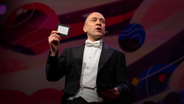
Here's an example. Now, how many people know what this is? Okay. Now how many people know what this is? Okay. Thanks to two more deft strokes by the genius Charles M. Schulz, we now have seven deft strokes that in and of themselves create an entire emotional life, one that has enthralled hundreds of millions of fans for over 50 years. This is actually a cover of a book that I designed about the work of Schulz and his art, which will be coming out this fall, and that is the entire cover. There is no other typographic information or visual information on the front, and the name of the book is "Only What's Necessary." So this is sort of symbolic about the decisions I have to make every day about the design that I'm perceiving, and the design I'm creating.
Evo primjer. Koliko vas zna što je ovo? Dobro. A sada? Dobro. Zahvaljujući dvama spretnim potezima genija Charlesa M. Schulza, sada imamo sedam spretnih poteza kistom koji u, a i sami po sebi stvaraju potpuno nov emocionalni život, život koji očarava stotine milijuna fanova preko pedeset godina. Ovo je naslovnica knjige koju sam dizajnirao o Schulzovu radu i umjetnosti koja izlazi ove jeseni, i to je cijela naslovnica. Nema nikakvih drugih pisanih ili vizualnih informacija na naslovnici, a naslov knjige jest: "Samo ono najnužnije". Simbolično predstavlja odluke koje ja donosim svaki dan, a koje se tiču dizajna koji opažam i dizajna koji stvaram.
So clarity. Clarity gets to the point. It's blunt. It's honest. It's sincere. We ask ourselves this. ["When should you be clear?"]
Jasnoća. Jasnoća precizira. Direktna je, poštena, iskrena. Pitamo se: ["Kada treba biti jasan?"]
Now, something like this, whether we can read it or not, needs to be really, really clear. Is it?
Nešto poput ovoga, bez obzira na to znamo li to protumačiti ili ne, treba biti jako, jako jasno. Je li jasno?
This is a rather recent example of urban clarity that I just love, mainly because I'm always late and I am always in a hurry. So when these meters started showing up a couple of years ago on street corners, I was thrilled, because now I finally knew how many seconds I had to get across the street before I got run over by a car. Six? I can do that. (Laughter)
Ovo je prilično svjež primjer gradske jasnoće koji mi je baš super, prvenstveno zbog toga što uvijek kasnim i uvijek žurim. Kad su se ovakvi brojači prije nekoliko godina počeli pojavljivati na ulicama, bio sam oduševljen jer sam konačno znao koliko imam vremena da pređem ulicu prije nego što me pokupi auto. Šest? Mogu ja to. (Smijeh)
So let's look at the yin to the clarity yang, and that is mystery. Mystery is a lot more complicated by its very definition. Mystery demands to be decoded, and when it's done right, we really, really want to. ["When should you be mysterious?"] In World War II, the Germans really, really wanted to decode this, and they couldn't.
Sad promotrimo suprotnu stranu jasnoće: misterioznost. Misterioznost je kompliciranija sama po sebi. Ona treba biti dešifrirana, a kad je dobro odrađena, zaista je želimo dešifrirati. ["Kada treba biti misteriozan?"] Za vrijeme Drugog svjetskog rata Nijemci su ovo zaista željeli dešifrirati, ali nisu mogli.
Here's an example of a design that I've done recently for a novel by Haruki Murakami, who I've done design work for for over 20 years now, and this is a novel about a young man who has four dear friends who all of a sudden, after their freshman year of college, completely cut him off with no explanation, and he is devastated. And the friends' names each have a connotation in Japanese to a color. So there's Mr. Red, there's Mr. Blue, there's Ms. White, and Ms. Black. Tsukuru Tazaki, his name does not correspond to a color, so his nickname is Colorless, and as he's looking back on their friendship, he recalls that they were like five fingers on a hand. So I created this sort of abstract representation of this, but there's a lot more going on underneath the surface of the story, and there's more going on underneath the surface of the jacket. The four fingers are now four train lines in the Tokyo subway system, which has significance within the story. And then you have the colorless subway line intersecting with each of the other colors, which basically he does later on in the story. He catches up with each of these people to find out why they treated him the way they did.
Ovo je primjer dizajna koji sam nedavno napravio za roman Harukija Murakamija, za kojeg dizajniram već više od 20 godina, a ovo je roman o mladom čovjeku koji ima četiri dobra prijatelja koji ga iznenada, nakon prve godine studija, potpuno otpile bez objašnjenja, što ga potpuno shrva. Imena prijatelja u japanskom jeziku imaju određene konotacije s bojama. Gosp. Crveni i gosp. Plavi te gđica Bijela i gđica Crna. Tsukuru Tazaki - njegovo ime ne odgovara nijednoj boji, pa mu je nadimak Bezbojni i kako se prisjeća njihovog prijateljstva, sjeća se kako su bili kao pet prstiju jedne ruke. Stoga sam osmislio ovaj pomalo apstraktan prikaz toga, ali još se puno toga odvija ispod površine te priče, kao i ispod površine korica knjige. Četiri prsta sada predstavljaju četiri željezničke linije podzemne željeznice u Tokiju koja je bitna za priču. Tu imate i bezbojnu liniju koja je na križanju sa svakom drugom bojom, a kasnije u knjizi on radi upravo to; pronalazi svakoga od njih da sazna zašto su bili takvi prema njemu.
And so this is the three-dimensional finished product sitting on my desk in my office, and what I was hoping for here is that you'll simply be allured by the mystery of what this looks like, and will want to read it to decode and find out and make more clear why it looks the way it does.
Ovo je trodimenzionalni gotov proizvod koji stoji na mom stolu u uredu. Nadao sam se da će promatrač biti toliko očaran misterioznim izgledom korica da će je poželjeti pročitati, dešifrirati i razjasniti si zašto izgleda tako kako izgleda.
["The Visual Vernacular."]
["Vizualna varijacija."]
This is a way to use a more familiar kind of mystery. What does this mean? This is what it means. ["Make it look like something else."] The visual vernacular is the way we are used to seeing a certain thing applied to something else so that we see it in a different way.
Ovako se koristi poznatiji oblik misterija. Što to znači? Ovo: ["Neka izgleda kao nešto drugo."] Vizualnom varijacijom način na koji promatramo određenu stvar primjenjujemo na nešto drugo kako bismo to vidjeli u drukčijem svjetlu.
This is an approach I wanted to take to a book of essays by David Sedaris that had this title at the time. ["All the Beauty You Will Ever Need"] Now, the challenge here was that this title actually means nothing. It's not connected to any of the essays in the book. It came to the author's boyfriend in a dream. Thank you very much, so -- (Laughter) -- so usually, I am creating a design that is in some way based on the text, but this is all the text there is. So you've got this mysterious title that really doesn't mean anything, so I was trying to think: Where might I see a bit of mysterious text that seems to mean something but doesn't? And sure enough, not long after, one evening after a Chinese meal, this arrived, and I thought, "Ah, bing, ideagasm!" (Laughter) I've always loved the hilariously mysterious tropes of fortune cookies that seem to mean something extremely deep but when you think about them -- if you think about them -- they really don't. This says, "Hardly anyone knows how much is gained by ignoring the future." Thank you. (Laughter) But we can take this visual vernacular and apply it to Mr. Sedaris, and we are so familiar with how fortune cookie fortunes look that we don't even need the bits of the cookie anymore. We're just seeing this strange thing and we know we love David Sedaris, and so we're hoping that we're in for a good time.
Taj sam pristup htio primijeniti na knjigu eseja Davida Sedarisa koja je tada nosila ovo ime. ["Sva ljepota koja će vam ikad zatrebati"] Stvar je u tome da taj naslov zapravo ne znači ništa. Nema veze ni s jednim esejom iz knjige. Autorovom je dečku ideja došla u snu. Hvala vam, dakle... -- (Smijeh) -- inače kreiram dizajn koji se na neki način temelji na tekstu, ali ovo je sav tekst. Misteriozni naslov koji ne znači ništa. Razmišljao sam: gdje možemo vidjeti misteriozni tekst koji izgleda kao da nešto znači, ali ne znači? Nedugo zatim, nakon jedne kineske večere, stiglo je ovo i pomislih: "Ah, to je to, idejagazam!" (Smijeh) Uvijek sam volio duhovito misteriozne stilske figure u kolačićima sudbine koje izgledaju kao da znače nešto iznimno duboko, ali kad malo razmislite o njima, ako razmislite, ne znače ništa. Ovaj kaže: "Malo tko zna koliko dobivamo izbjegavajući budućnost." Hvala. (Smijeh) Ali ovu vizualnu varijaciju možemo primijeniti na gosp. Sedarisa, a budući da znamo kako kolačići sudbine izgledaju, komadići kolačića nam više ni ne trebaju. Vidimo samo nešto neobično i znamo da volimo Davida Sedarisa i nadamo se da će nam se i ovo svidjeti.
["'Fraud' Essays by David Rakoff"] David Rakoff was a wonderful writer and he called his first book "Fraud" because he was getting sent on assignments by magazines to do things that he was not equipped to do. So he was this skinny little urban guy and GQ magazine would send him down the Colorado River whitewater rafting to see if he would survive. And then he would write about it, and he felt that he was a fraud and that he was misrepresenting himself. And so I wanted the cover of this book to also misrepresent itself and then somehow show a reader reacting to it.
["'Prevarant', eseji Davida Rakoffa"] David Rakoff krasan je pisac koji je svojoj prvoj knjizi nadjenuo ime "Prevarant" jer su ga časopisi slali na zadatke da obavlja poslove za koje nije bio opremljen. Ovog mršavog malenog gradskog čovjeka časopis GQ poslao je na rijeku Colorado na rafting da vide hoće li preživjeti, a zatim je trebao pisati o tome, no on je to smatrao prevarom i krivim prikazivanjem njega samog. Zato sam htio da korice ove knjige također same po sebi budu krivo prikazivanje koje će pokazati čitateljevu reakciju na njega.
This led me to graffiti. I'm fascinated by graffiti. I think anybody who lives in an urban environment encounters graffiti all the time, and there's all different sorts of it. This is a picture I took on the Lower East Side of just a transformer box on the sidewalk and it's been tagged like crazy. Now whether you look at this and think, "Oh, that's a charming urban affectation," or you look at it and say, "That's illegal abuse of property," the one thing I think we can all agree on is that you cannot read it. Right? There is no clear message here. There is another kind of graffiti that I find far more interesting, which I call editorial graffiti. This is a picture I took recently in the subway, and sometimes you see lots of prurient, stupid stuff, but I thought this was interesting, and this is a poster that is saying rah-rah Airbnb, and someone has taken a Magic Marker and has editorialized about what they think about it. And it got my attention.
To me dovelo do grafita koji me fasciniraju. Svatko tko živi u gradskom okruženju s vremena na vrijeme nailazi na njih, a postoje i različite vrste grafita. U četvrti Lower East Sidea uslikao sam ovaj transformator na pločniku koji je naveliko išaran. Možete pomisliti da je to šarmantna urbana afektacija ili da je to protuzakonita zloupotreba vlasništva, ali mislim da ćemo se svi složiti s tim da je nečitljivo. Zar ne? Tu nema jasne poruke. Postoji još jedna vrsta grafita koja je meni puno zanimljivija, a nazivam ih editorijalskim grafitima. Ovu sam sliku nedavno uslikao u podzemnoj željeznici. Nekad naiđete na puno lascivnih, glupih stvari, ali ovaj mi je bio zanimljiv. Na ovom posteru piše rah-rah Airbnb i netko je uzeo marker i uredio ga na način da sad pokazuje što on misli o tome. To me zainteresiralo,
So I was thinking, how do we apply this to this book? So I get the book by this person, and I start reading it, and I'm thinking, this guy is not who he says he is; he's a fraud. And I get out a red Magic Marker, and out of frustration just scribble this across the front. Design done. (Laughter) And they went for it! (Laughter) Author liked it, publisher liked it, and that is how the book went out into the world, and it was really fun to see people reading this on the subway and walking around with it and what have you, and they all sort of looked like they were crazy. (Laughter)
pa sam počeo razmišljati kako to primijeniti na ovu knjigu. Dobijem knjigu ovog autora, počnem je čitati i razmišljam kako taj tip nije ono za što se izdaje, on je prevarant; uzmem crveni marker i iz frustracije to napišem na naslovnicu. Gotov dizajn. (Smijeh) I njima se to svidjelo! (Smijeh) Svidjelo se autoru, svidjelo se izdavaču i knjiga je tako i tiskana. Bilo je super gledati ljude kako je čitaju po podzemnim željeznicama, hodaju uokolo s njom ili što već i svi su izgledali pomalo ludo. (Smijeh)
["'Perfidia' a novel by James Ellroy"] Okay, James Ellroy, amazing crime writer, a good friend, I've worked with him for many years. He is probably best known as the author of "The Black Dahlia" and "L.A. Confidential." His most recent novel was called this, which is a very mysterious name that I'm sure a lot of people know what it means, but a lot of people don't. And it's a story about a Japanese-American detective in Los Angeles in 1941 investigating a murder. And then Pearl Harbor happens, and as if his life wasn't difficult enough, now the race relations have really ratcheted up, and then the Japanese-American internment camps are quickly created, and there's lots of tension and horrible stuff as he's still trying to solve this murder. And so I did at first think very literally about this in terms of all right, we'll take Pearl Harbor and we'll add it to Los Angeles and we'll make this apocalyptic dawn on the horizon of the city. And so that's a picture from Pearl Harbor just grafted onto Los Angeles. My editor in chief said, "You know, it's interesting but I think you can do better and I think you can make it simpler." And so I went back to the drawing board, as I often do. But also, being alive to my surroundings, I work in a high-rise in Midtown, and every night, before I leave the office, I have to push this button to get out, and the big heavy glass doors open and I can get onto the elevator. And one night, all of a sudden, I looked at this and I saw it in a way that I hadn't really noticed it before. Big red circle, danger. And I thought this was so obvious that it had to have been done a zillion times, and so I did a Google image search, and I couldn't find another book cover that looked quite like this, and so this is really what solved the problem, and graphically it's more interesting and creates a bigger tension between the idea of a certain kind of sunrise coming up over L.A. and America.
["'Perfidia', roman Jamesa Ellroya"] James Ellroy, izvrstan autor krimića, dobar prijatelj s kojim sam surađivao dugi niz godina i vjerojatno najpoznatiji kao autor "Crne Dalije" i "L. A. Povjerljivo". To je naslov najnovijeg romana, iznimno misteriozno ime za koje sam siguran da puno ljudi zna što znači, ali puno ih ne zna. Roman govori o japansko-američkom detektivu u Los Angelesu godine 1941. koji istražuje ubojstvo, no iskrsne napad na Pearl Harbor, a kao da mu život već nije bio dovoljno težak, uzburkaju se strasti oko međurasnih odnosa, ubrzo se osnivaju japansko-američki zatočenički logori te se stvaraju tenzije i ostale grozote dok se on još uvijek bavi rješavanjem slučaja. U početku sam to doslovno shvaćao; uzmemo Pearl Harbor, dodamo ga Los Angelesu i pretvorimo sve ovo u smak svijeta na obzoru grada. Ovo je slika Pearl Harbora samo presađena na Los Angeles. Mom glavnom uredniku ideja je bila zanimljiva, ali mislio je da mogu ja i bolje, ako ne i jednostavnije. Stoga sam se vratio na početak. Također, budući da živim u susjedstvu u kojem živim, radim u neboderu u središtu grada i svake noći prije nego što odem iz ureda, moram pritisnuti ovo dugme da izađem, velika i teška staklena vrata otvore mi put do dizala. Jedne noći, iznenada, gledao sam i vidio sve to u sasvim novom svjetlu. Veliki crveni gumb, opasnost. Pomislio sam je to toliko očito da mora da je iskorišteno već milijun puta, pa sam pretražio slike na Googleu, ali nisam pronašao nijednu naslovnicu koja je tako izgledala. To je riješilo problem, a grafički je zanimljvije i stvara veće tenzije između pomisli na određenu vrstu sutona koji se spušta nad L.A. i Ameriku.
["'Gulp' A tour of the human digestive system by Mary Roach."]
["'Gutljaj', Putovanje probavnim sustavom, autorice M. Roach"]
Mary Roach is an amazing writer who takes potentially mundane scientific subjects and makes them not mundane at all; she makes them really fun. So in this particular case, it's about the human digestive system. So I'm trying to figure out what is the cover of this book going to be. This is a self-portrait. (Laughter) Every morning I look at myself in the medicine cabinet mirror to see if my tongue is black. And if it's not, I'm good to go. (Laughter) I recommend you all do this. But I also started thinking, here's our introduction. Right? Into the human digestive system. But I think what we can all agree on is that actual photographs of human mouths, at least based on this, are off-putting. (Laughter) So for the cover, then, I had this illustration done which is literally more palatable and reminds us that it's best to approach the digestive system from this end. (Laughter) I don't even have to complete the sentence. All right.
Mary Roach sjajna je spisateljica koja uzima naoko dosadne znanstvene teme i pretvara ih u zabavnu tematiku. U ovom konkretnom slučaju radi se o ljudskom probavnom sustavu. Pokušavam smisliti naslovnicu knjige. Ovo je autoportret. (Smijeh) Svakog jutra pogledam se u ogledalo da provjerim je li mi jezik crn. Ukoliko nije, sve je u redu. (Smijeh) Predlažem da svi to počnete raditi. No, počeo sam razmišljati kako nam je to uvod. Zar ne? Uvod u probavni sustav. Vjerujem da se svi slažemo da su slike ljudskih usta, ako je vjerovati ovome, odvratne. (Smijeh) Stoga sam se za naslovnicu odlučio za ilustraciju koja je malo manje odvratna i koja nas podsjeća da je probavnom sustavu bolje pristupiti s ovog kraja... (Smijeh) Ne moram čak ni završiti ovu rečenicu. Dobro.
["Unuseful mystery"] What happens when clarity and mystery get mixed up? And we see this all the time. This is what I call unuseful mystery. I go down into the subway -- I take the subway a lot -- and this piece of paper is taped to a girder. Right? And now I'm thinking, uh-oh, and the train's about to come and I'm trying to figure out what this means, and thanks a lot. Part of the problem here is that they've compartmentalized the information in a way they think is helpful, and frankly, I don't think it is at all. So this is mystery we do not need. What we need is useful clarity, so just for fun, I redesigned this. This is using all the same elements. (Applause) Thank you. I am still waiting for a call from the MTA. (Laughter) You know, I'm actually not even using more colors than they use. They just didn't even bother to make the 4 and the 5 green, those idiots. (Laughter) So the first thing we see is that there is a service change, and then, in two complete sentences with a beginning, a middle and an end, it tells us what the change is and what's going to be happening. Call me crazy! (Laughter)
["Beskorisni misterij"] Što se dogodi kad se jasnoća i misterij pomiješaju? To se jako često događa, a to ja nazivam beskorisnim misterijem. Odem u podzemnu željeznicu, često idem podzemnom željeznicom, i naletim na ovaj letak nalijepljen na gredu. I mislim si: oh, ne! Dolazi vlak i pokušavam shvatiti što sve to znači i baš ti hvala. Ovdje je djelomično problem u tome što su kategorizirali informacije na način na koji oni misle da je koristan, a iskreno, uopće nije. To je misterij koji nam ne treba. Treba nam korisna jasnoća, pa sam, zabave radi, ovo redizajnirao korištenjem istih elemenata. (Pljesak) Hvala, još uvijek čekam da mi se jave iz MTA-a. (Smijeh) Čak nisam ni koristio ništa više boja nego oni, oni se samo nisu sjetili 4 i 5 obojiti u zeleno, budale. (Smijeh) Prvo opazimo izmjenu usluge, a zatim nam dvije pune rečenice s glavom i repom govore o tome o kakvoj se izmjeni radi i što će se dogoditi. Nisam normalan! (Smijeh)
["Useful mystery"] All right. Now, here is a piece of mystery that I love: packaging. This redesign of the Diet Coke can by Turner Duckworth is to me truly a piece of art. It's a work of art. It's beautiful. But part of what makes it so heartening to me as a designer is that he's taken the visual vernacular of Diet Coke -- the typefaces, the colors, the silver background -- and he's reduced them to their most essential parts, so it's like going back to the Charlie Brown face. It's like, how can you give them just enough information so they know what it is but giving them the credit for the knowledge that they already have about this thing? It looks great, and you would go into a delicatessen and all of a sudden see that on the shelf, and it's wonderful. Which makes the next thing -- ["Unuseful clarity"] -- all the more disheartening, at least to me. So okay, again, going back down into the subway, after this came out, these are pictures that I took. Times Square subway station: Coca-Cola has bought out the entire thing for advertising. Okay? And maybe some of you know where this is going. Ahem.
["Koristan misterij"] Dobro. Evo misterij kakav volim: ambalaža. Ovaj redizajn limenke dijetalne Cole Turnera Duckwortha uistinu je umjetnost. Remek-djelo. Predivna je. Dijelom mi se toliko sviđa kao dizajneru upravo zato što je to vizualna varijacija dijetalne Cole. Font, boje, siva pozadina, a sve je svedeno na osnovne dijelove, kao da se vraćamo na lice Charlija Browna. Kako im dati tek toliko informacija da znaju o čemu se radi, ali cijeneći znanje koje već posjeduju o toj stvari? Sjajno izgleda, ušli bi u slastičarnicu, iznenada to ugledali na polici i krasno je. Tu dolazimo do sljedeće stvari ["Beskorisna jasnoća"] koja tim više rastužuje, barem mene. Vratimo se opet na podzemnu željeznicu. Nakon što je ovo izišlo, uslikao sam ove slike. Podzemna željeznica na Times Squareu: Coca-Cola otkupila je cijelu željeznicu za reklamiranje. Neki od vas možda znaju na što ciljam. Aha.
"You moved to New York with the clothes on your back, the cash in your pocket, and your eyes on the prize. You're on Coke." (Laughter) "You moved to New York with an MBA, one clean suit, and an extremely firm handshake. You're on Coke." (Laughter) These are real! (Laughter) Not even the support beams were spared, except they switched into Yoda mode. (Laughter) "Coke you're on." (Laughter) ["Excuse me, I'm on WHAT??"] This campaign was a huge misstep. It was pulled almost instantly due to consumer backlash and all sorts of unflattering parodies on the web -- (Laughter) -- and also that dot next to "You're on," that's not a period, that's a trademark. So thanks a lot.
"Došao si u NY s odjećom u ruksaku, novcem u džepu i usredotočen na krajnji cilj. Na 'koki' si."(Smijeh) "Došao si u NY s diplomom s MBA-a, jednim čistim odijelom i čvrstim stiskom ruke. Na 'koki' si." (Smijeh) To su prave reklame! (Smijeh) Nisu poštedjeli ni nosive grede, samo što su se poigrali s redom riječi. (Smijeh) "'Koka' na kojoj si." (Smijeh) ["Oprostite, na ČEMU sam?"] Cijela je kampanja bila veliki promašaj od koje se odustalo gotovo odmah zbog negodovanja potrošača i različitih parodija po internetu - (Smijeh) - a i ova točka pored "si" nije točka već zaštitni znak. Baš vam hvala.
So to me, this was just so bizarre about how they could get the packaging so mysteriously beautiful and perfect and the message so unbearably, clearly wrong. It was just incredible to me.
Meni je bilo jednostavno zaprepašćujuće to kako su uspjeli ambalažu napraviti tako misteriozno lijepom i savršenom, a poruku tako nepodnošljivo, jasno krivom. To mi je bilo nevjerojatno.
So I just hope that I've been able to share with you some of my insights on the uses of clarity and mystery in my work, and maybe how you might decide to be more clear in your life, or maybe to be a bit more mysterious and not so over-sharing. (Laughter)
Nadam se da sam uspio podijeliti s vama neke od svojih spoznaja o upotrebi jasnoće i misterija u mom poslu i možda vam i pomogao odlučiti kada da u životu budete jasniji, a kada malo misteriozniji i nepovjerljivi. (Smijeh)
And if there's just one thing that I leave you with from this talk, I hope it's this: Blih blih blih blah. Blah blah blih blih. ["'Judge This,' Chip Kidd"] Blih blih blah blah blah. Blah blah blah.
Ako ćete već nešto zapamtiti iz mog govora, neka to bude ovo: Blih blih blih blah. Bla bla blih. ["'Procijeni ovo', Chip Kidd"] Blih blih bla bla bla. Bla bla bla.
Blah blah.
Bla bla.
(Applause)
(Pljesak)