Blah blah blah blah blah. Blah blah blah blah, blah blah, blah blah blah blah blah blah. Blah blah blah, blah.
בלה בלה בלה בלה בלה , בלה בלה בלה בלה, בלה בלה, בלה בלה בלה בלה בלה בלה, בלה בלה בלה בלה,
So what the hell was that? Well, you don't know because you couldn't understand it. It wasn't clear. But hopefully, it was said with enough conviction that it was at least alluringly mysterious.
אז מה זה היה לעזאזל? ובכן, אתם לא יודעים בגלל שלא יכולתם להבין את זה. זה לא היה ברור. אבל בתקווה, זה נאמר עם מספיק כוונה שזה היה לפחות מעט מסתורי.
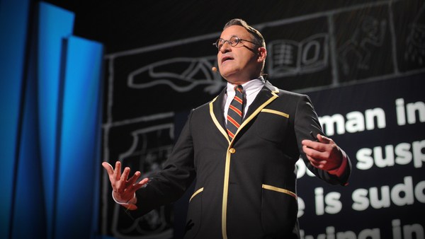
Clarity or mystery? I'm balancing these two things in my daily work as a graphic designer, as well as my daily life as a New Yorker every day, and there are two elements that absolutely fascinate me.
בהירות או מסתורין? אני מאזן את שני הדברים האלה בעבודה היום יומית כמעצב גרפי, כמו גם החיים היום יומיים כניו יורקי כל יום, ויש שני אלמנטים שלגמרי מרתקים אותי.
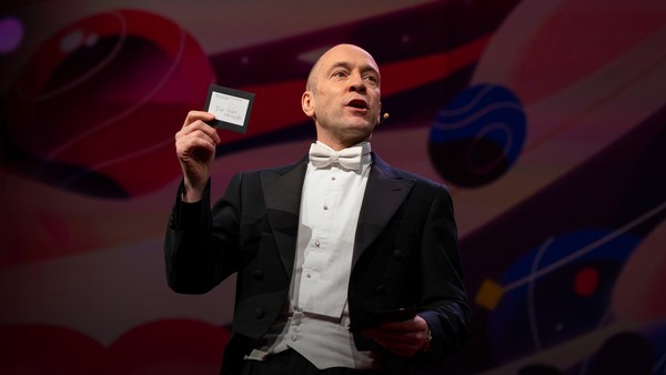
Here's an example. Now, how many people know what this is? Okay. Now how many people know what this is? Okay. Thanks to two more deft strokes by the genius Charles M. Schulz, we now have seven deft strokes that in and of themselves create an entire emotional life, one that has enthralled hundreds of millions of fans for over 50 years. This is actually a cover of a book that I designed about the work of Schulz and his art, which will be coming out this fall, and that is the entire cover. There is no other typographic information or visual information on the front, and the name of the book is "Only What's Necessary." So this is sort of symbolic about the decisions I have to make every day about the design that I'm perceiving, and the design I'm creating.
הנה דוגמה. עכשיו, כמה אנשים יודעים מה זה? אוקיי, עכשיו כמה אנשים יודעים מה זה? אוקיי, תודות לעוד שתי משיכות עט גאוניות של הגאון צ'ארלס מ. שולץ, עכשיו יש לנו שבע משיכות עט שבעצמן יוצרות חיים אמוציונליים שלמים, כאלה שריתקו מאות מליונים של מעריצים במשך 50 שנה. זה למעשה עטיפה של ספר שעיצבתי סביב העבודה של שולץ והאמנות שלו, שיצא בסתיו הזה, וזאת כל העטיפה. אין מידע טיפוגרפי אחר או מידע ויזואלי על החזית, והשם של הספר הוא "רק מה שדרוש." אז זה סוג של סימבוליזם על ההחלטות שאני צריך לקבל כל יום בנוגע לעיצוב שאני קולט, והעיצוב שאני יוצר.
So clarity. Clarity gets to the point. It's blunt. It's honest. It's sincere. We ask ourselves this. ["When should you be clear?"]
אז בהירות. בהירות מגיעה לנקודה. זה בוטה, זה כן, זה אמיתי. אנחנו שואלים את עצמנו. ["מתי אתה צריך להיות ברור?"]
Now, something like this, whether we can read it or not, needs to be really, really clear. Is it?
עכשיו, משהו כזה, בין אם נוכל לקרוא את זה או לא, צריך להיות באמת, באמת ברור. באמת?
This is a rather recent example of urban clarity that I just love, mainly because I'm always late and I am always in a hurry. So when these meters started showing up a couple of years ago on street corners, I was thrilled, because now I finally knew how many seconds I had to get across the street before I got run over by a car. Six? I can do that. (Laughter)
זו דוגמה די עדכנית לבהירות אורבנית שאני פשוט אוהב, בעיקר בגלל שאני תמיד מאחר ואני תמיד ממהר. אז כשהמונים האלה התחילו להופיע לפני כמה שנים בפינות הרחובות, התרגשתי, בגלל שלבסוף ידעתי כמה שניות היו לי כדי לעבור את הכביש לפני שתדרוס אותי מכונית. שש? אני יכול לעשות את זה. (צחוק)
So let's look at the yin to the clarity yang, and that is mystery. Mystery is a lot more complicated by its very definition. Mystery demands to be decoded, and when it's done right, we really, really want to. ["When should you be mysterious?"] In World War II, the Germans really, really wanted to decode this, and they couldn't.
אז בואו נביט על הין לבהירות שהיא יאנג, וזו תעלומה. מסתורין הוא הרבה יותר מסובך לפי הגדרתו. מסתורין דורש להיות מפוענח, וכשזה נעשה נכון, אנחנו באמת באמת רוצים. ["מתי אתם צריכים להיות מסתוריים?"] במלחמת העולם השניה, הגרמנים באמת באמת רצו לפענח את זה, והם לא הצליחו.
Here's an example of a design that I've done recently for a novel by Haruki Murakami, who I've done design work for for over 20 years now, and this is a novel about a young man who has four dear friends who all of a sudden, after their freshman year of college, completely cut him off with no explanation, and he is devastated. And the friends' names each have a connotation in Japanese to a color. So there's Mr. Red, there's Mr. Blue, there's Ms. White, and Ms. Black. Tsukuru Tazaki, his name does not correspond to a color, so his nickname is Colorless, and as he's looking back on their friendship, he recalls that they were like five fingers on a hand. So I created this sort of abstract representation of this, but there's a lot more going on underneath the surface of the story, and there's more going on underneath the surface of the jacket. The four fingers are now four train lines in the Tokyo subway system, which has significance within the story. And then you have the colorless subway line intersecting with each of the other colors, which basically he does later on in the story. He catches up with each of these people to find out why they treated him the way they did.
הנה דוגמה לעיצוב שעשיתי לאחרונה לרומן של הארוקי מורקמי, עבורו עשיתי עבודות עיצוב במשך 20 שנה עכשיו, וזה רומן על איש צעיר שיש לו ארבעה חברים יקרים שפתאום, אחרי השנה הראשונה שלו בקולג', מתנתקים ממנו לגמרי בלי הסברים בכלל, והוא הרוס. ולכל אחד משמות החברים יש קונוטציה ביפנית לשם של צבע. אז יש את מר אדום, יש את מר כחול, יש את גברת לבן, וגברת שחור. טצוקורו טזקי, שמו לא מתייחס לצבע, אז הכינוי שלו הוא חסר צבע, וכשהוא מביט על החברות שלהם, הוא נזכר שכולם היו כמו חמש אצבעות על יד. אז יצרתי סוג של יצוג מופשט של זה, אבל יש הרבה יותר שמתרחש מתחת לפני השטח של הסיפור, ויש הרבה יותר שמתרחש מתחת לפני העטיפה. ארבע האצבעות הם עכשיו ארבעה קווי רכבת ברכבת התחתית של טוקיו, שיש לה משמעות בתוך הסיפור. ואז יש לכם את קו הרכבת חסר הצבע שנחתך עם כל אחד מהקוים הצבעוניים, שלמעשה הוא עושה זאת בהמשך הסיפור. הוא מגיע לאנשים האלו כדי לגלות למה הם התייחסו אליו כך.
And so this is the three-dimensional finished product sitting on my desk in my office, and what I was hoping for here is that you'll simply be allured by the mystery of what this looks like, and will want to read it to decode and find out and make more clear why it looks the way it does.
וכך זה מוצר תלת מימדי מוגמר שיושב על השולחן שלי במשרדי, ומה שקיוויתי לו פה היה שפשוט תמשכו למסתורין של איך שזה נראה, ותרצו לקרוא את זה כדי לפענח ולגלות ולעשות את זה יותר ברור למה זה נראה כך.
["The Visual Vernacular."]
["שפת המקום הויזואלית."]
This is a way to use a more familiar kind of mystery. What does this mean? This is what it means. ["Make it look like something else."] The visual vernacular is the way we are used to seeing a certain thing applied to something else so that we see it in a different way.
זו דרך לשתמש במסתורין יותר מוכר. מה זה אומר? זה מה שזה אומר. ["לגרום לזה להראות כמו משהו אחר."] שפת המקום הויזואלית היא דרך בה אנחנו רגילים לראות דבר מסויים שמוכל על משהו אחר כך שאנחנו רואים אותו בדרך אחרת.
This is an approach I wanted to take to a book of essays by David Sedaris that had this title at the time. ["All the Beauty You Will Ever Need"] Now, the challenge here was that this title actually means nothing. It's not connected to any of the essays in the book. It came to the author's boyfriend in a dream. Thank you very much, so -- (Laughter) -- so usually, I am creating a design that is in some way based on the text, but this is all the text there is. So you've got this mysterious title that really doesn't mean anything, so I was trying to think: Where might I see a bit of mysterious text that seems to mean something but doesn't? And sure enough, not long after, one evening after a Chinese meal, this arrived, and I thought, "Ah, bing, ideagasm!" (Laughter) I've always loved the hilariously mysterious tropes of fortune cookies that seem to mean something extremely deep but when you think about them -- if you think about them -- they really don't. This says, "Hardly anyone knows how much is gained by ignoring the future." Thank you. (Laughter) But we can take this visual vernacular and apply it to Mr. Sedaris, and we are so familiar with how fortune cookie fortunes look that we don't even need the bits of the cookie anymore. We're just seeing this strange thing and we know we love David Sedaris, and so we're hoping that we're in for a good time.
זו גישה אותה רציתי לקחת לספר של מאמרים מאת דייויד סדריס שהיתה לו את הכותרת הזו באותו הזמן. ["כל היופי אותו אי פעם תצטרכו"] עכשיו, האתגר פה היה שהכותרת למעשה לא אומרת כלום. היא לא קשורה לאף אחד מהמאמרים בספר. זה הגיע לחבר של הסופר בחלום. תודה רבה לך, אז -- (צחוק) -- אז בדרך כלל, אני יוצר עיצוב שמבוסס בצורה כלשהי על הטקסט, אבל זה כל הטקסט שיש. אז יש לכם את הכותרת המסתורית הזו שבאמת לא אומרת כלום, אז ניסיתי לחשוב: איפה אני אראה טקסט יותר מסתורי שנראה שמשמעותו משהו אבל היא לא? וברור, לא הרבה אחרי זה, ערב אחד אחרי ארוחה סינית, זה הגיע, וחשבתי, "אה, בינג, אורגזמה רעיונית!" (צחוק) תמיד אהבתי את המליצה המסתורית והמצחיקה של עוגיית מזל שנראתה כאילו היא מתכוונת למשהו מאוד עמוק אבל כשאתם חושבים עליהן -- אם אתם חושבים עליהן -- הן באמת לא. זה אומר, "כמעט אף אחד לא יודע כמה מרווח מהתעלמות מהעתיד." תודה לכם. (צחוק) אבל אנחנו יכולים לקחת את השפה המקומית הויזואלית וליישם אותה למר סדריס, ואנחנו מכירים כל כך טוב איך מזל של עוגיית מזל נראה שאנחנו לא צריכים בכלל את החלקים של העוגייה יותר. אנחנו רק רואים את הדבר המוזר הזה ואנחנו יודעים שאנחנו אוהבים את דייויד סדריס, וכך אנחנו מקווים שיהיה לנו זמן טוב.
["'Fraud' Essays by David Rakoff"] David Rakoff was a wonderful writer and he called his first book "Fraud" because he was getting sent on assignments by magazines to do things that he was not equipped to do. So he was this skinny little urban guy and GQ magazine would send him down the Colorado River whitewater rafting to see if he would survive. And then he would write about it, and he felt that he was a fraud and that he was misrepresenting himself. And so I wanted the cover of this book to also misrepresent itself and then somehow show a reader reacting to it.
["חיבורי תרמית של דייויד ראקוף"] דייויד ראקוף היה סופר נפלא והוא קרא לספר הראשון שלו "תרמית" מפני שהוא נשלח למשימות על ידי מגזינים כדי לעשות דברים שלא היתה לו היכולת לעשות. אז הוא היה בחור אורבני רזה וקטן ומגזין GQ היו שולחים אותו לנהר קולורדו לראפטינג כדי לראות אם הוא ישרוד. ואז הוא היה כותב על זה, והוא הרגיש שהוא היה מתחזה ושהוא לא יצג את עצמו היטב. וכך רציתי שהעטיפה של הספר הזה גם לא תייצג את עצמה היטב ואז איך שהוא תראה קורא שמגיב לה.
This led me to graffiti. I'm fascinated by graffiti. I think anybody who lives in an urban environment encounters graffiti all the time, and there's all different sorts of it. This is a picture I took on the Lower East Side of just a transformer box on the sidewalk and it's been tagged like crazy. Now whether you look at this and think, "Oh, that's a charming urban affectation," or you look at it and say, "That's illegal abuse of property," the one thing I think we can all agree on is that you cannot read it. Right? There is no clear message here. There is another kind of graffiti that I find far more interesting, which I call editorial graffiti. This is a picture I took recently in the subway, and sometimes you see lots of prurient, stupid stuff, but I thought this was interesting, and this is a poster that is saying rah-rah Airbnb, and someone has taken a Magic Marker and has editorialized about what they think about it. And it got my attention.
זה הוביל אותי לגרפיטי. אני מוקסם מגרפיטי. אני חושב שכל אחד שחי בסביבה עירונית נתקל בגרפיטי כל הזמן, ויש כל מיני סוגים שונים שלה. זו תמונה שצילמתי בלוואר איסט סייד של קופסת שנאי על המדרכה וזה היה מתוייג כמו משוגע. עכשיו בין אם אתם מסתכלים על זה וחושבים, "הו, זו העמדת פנים עירונית מקסימה," או שאתם מביטים בזה ואומרים, "זה שימוש לא חוקי ברכוש," הדבר היחיד שאני חושב שאנחנו יכולים להסכים עליו זה שאתם לא יכולים לקרוא את זה. נכון? איו מסר ברור פה. יש סוג נוסף של גרפיטי שאני מוצא הרבה יותר מעניין. שאני קורא לו גרפיטי מערכתי. זו תמונה שצילמתי לאחרונה ברכבת התחתית, ולפעמים אתם רואים הרבה דברים שטופי זימה ומטופשים, אבל חשבתי שזה מעניין, וזה פוסטר שאומר רה-רה אייר בי אנד בי, ומישהו לקח מרקר וערכו מה שהם חושבים על זה. וזה תפש את תשומת הלב שלי.
So I was thinking, how do we apply this to this book? So I get the book by this person, and I start reading it, and I'm thinking, this guy is not who he says he is; he's a fraud. And I get out a red Magic Marker, and out of frustration just scribble this across the front. Design done. (Laughter) And they went for it! (Laughter) Author liked it, publisher liked it, and that is how the book went out into the world, and it was really fun to see people reading this on the subway and walking around with it and what have you, and they all sort of looked like they were crazy. (Laughter)
אז חשבתי, איך אנחנו מיישמים את זה לספר הזה? אז אני מקבל את הספר הזה של האדם הזה, ואני מתחיל לקרוא אותו, ואני חושב, הבחור הזה הוא לא מי שהוא אומר שהוא; הוא מתחזה. ואני מוציא מרקר אדום, ומתוך יאוש פשוט משרבט את זה לרוחב החזית. העיצוב גמור. (צחוק) והם הלכו על זה!(צחוק) הסופר אהב את זה, המוציא לאור אהב את זה, וכך הספר יצא לעולם, וזה היה באמת כיף לראות אנשים קוראים את זה בתחתית והולכים עם זה ומה שתרצו, וכולם סוג של נראו כאילו הם משוגעים. (צחוק)
["'Perfidia' a novel by James Ellroy"] Okay, James Ellroy, amazing crime writer, a good friend, I've worked with him for many years. He is probably best known as the author of "The Black Dahlia" and "L.A. Confidential." His most recent novel was called this, which is a very mysterious name that I'm sure a lot of people know what it means, but a lot of people don't. And it's a story about a Japanese-American detective in Los Angeles in 1941 investigating a murder. And then Pearl Harbor happens, and as if his life wasn't difficult enough, now the race relations have really ratcheted up, and then the Japanese-American internment camps are quickly created, and there's lots of tension and horrible stuff as he's still trying to solve this murder. And so I did at first think very literally about this in terms of all right, we'll take Pearl Harbor and we'll add it to Los Angeles and we'll make this apocalyptic dawn on the horizon of the city. And so that's a picture from Pearl Harbor just grafted onto Los Angeles. My editor in chief said, "You know, it's interesting but I think you can do better and I think you can make it simpler." And so I went back to the drawing board, as I often do. But also, being alive to my surroundings, I work in a high-rise in Midtown, and every night, before I leave the office, I have to push this button to get out, and the big heavy glass doors open and I can get onto the elevator. And one night, all of a sudden, I looked at this and I saw it in a way that I hadn't really noticed it before. Big red circle, danger. And I thought this was so obvious that it had to have been done a zillion times, and so I did a Google image search, and I couldn't find another book cover that looked quite like this, and so this is really what solved the problem, and graphically it's more interesting and creates a bigger tension between the idea of a certain kind of sunrise coming up over L.A. and America.
["פרפידיה, רומן של ג'יימס אלרוי"] אוקיי, ג'יימס אלרוי, סופר פשע מדהים, חבר טוב, עבדתי איתו הרבה שנים. הוא כנראה ידוע ביותר כסופר של "דליה השחורה" ו" לוס אנג'לס החשאית." הרומן האחרון שלו נקרא כך, שזה שם מאוד מסתורי שאני בטוח שהרבה אנשים יודעים מה זה אומר, אבל הרבה אנשים לא. וזה סיפור על בלש יפני אמריקאי בלוס אנג'לס ב 1941 שחוקר רצח. ואז פרל הארבור התרחשה, וכאילו שהחיים שלו לא היו מסובכים מספיק, עכשיו יחסי הגזע באמת העלו מדרגה, ואז מחנות הריכוז ליפנים אמריקאים מוקמים במהירות, ויש הרבה לחץ ודברים נוראיים כשהוא עדיין מנסה לפתור את הרצח הזה. וכך חשבתי לראשונה ממש מילולית על זה במונחים של בסדר, ניקח את פרל הארבור ונוסיף אותה ללוס אנג'לס ונעשה את השחר האפוקליפטי על האופק של העיר. וכך זו התמונה של פרל הארבור ממש מולבשת על לוס אנג'לס. העורך שלי אמר, "אתה יודע, זה מעניין אבל אני חושב שאתה יכול לעשות יותר טוב ושאתה יכול לעשות את זה פשוט יותר." וכך חזרתי לשולחן השרטוט, כמו שאני עושה הרבה. אבל גם, להיות בחיים בסביבה שלי, עבדתי ברב קומות במרכז העיר, וכל לילה, לפני שעזבתי את המשרד, הייתי חייב ללחוץ על הכפתור הזה כדי לצאת, ודלתות הזכוכית העבה והכבדה נפתחו ויכולתי להגיע למעלית. ולילה אחד, פתאום, הבטתי בזה וראיתי את זה בדרך שמעולם לא ראיתי את זה לפני כן. עיגול גדול אדום, סכנה. וחשבתי שזה היה כל כך ברור שהייתי צריך לעשות את זה זיליון פעמים, וכך עשיתי חיפוש תמונות בגוגל, ולא יכולת למצוא עטיפת ספר נוספת שנראתה ממש כך, וכך זה באמת מה שפתר את הבעיה, וגרפית זה יותר מעניין ויוצר מתח גדול יותר בין הרעיון של סוג מסויים של זריחה שעולה על לוס אנג'לס ואמריקה.
["'Gulp' A tour of the human digestive system by Mary Roach."]
["בליעה, סיור במערכת העיכול האנושית של מארק רואץ'."]
Mary Roach is an amazing writer who takes potentially mundane scientific subjects and makes them not mundane at all; she makes them really fun. So in this particular case, it's about the human digestive system. So I'm trying to figure out what is the cover of this book going to be. This is a self-portrait. (Laughter) Every morning I look at myself in the medicine cabinet mirror to see if my tongue is black. And if it's not, I'm good to go. (Laughter) I recommend you all do this. But I also started thinking, here's our introduction. Right? Into the human digestive system. But I think what we can all agree on is that actual photographs of human mouths, at least based on this, are off-putting. (Laughter) So for the cover, then, I had this illustration done which is literally more palatable and reminds us that it's best to approach the digestive system from this end. (Laughter) I don't even have to complete the sentence. All right.
מרי רואץ' היא כתבת מדהימה שלוקחת פרוייקטים מדעיים רגילים פוטנציאלית והופכת אותם ללא רגילים בכלל; היא הופכת אותם לכיף באמת. אז במקרה הספציפי הזה, זה נוגע למערכת העיכול האנושית. אז אני מנסה להבין מה תהיה העטיפה של הספר הזה. זה פורטרט עצמי.(צחוק) כל בוקר אני מביט בעצמי במראה של ארון התרופות כדי לראות אם הלשון שלי שחורה. ואם היא לא, אני בסדר. (צחוק) אני ממליץ לכולכם לעשות את זה. אבל אני גם מתחיל לחשוב, הנה ההקדמה שלנו. נכון? לתוך מערכת העיכול האנושית. אבל אני חושב שמה שאנחנו יכולים להסכים עליו זה שתמונות מסויימות של פיות של אנשים, לפחות בהתבסס על זה, דוחים. (צחוק) אז לעטיפה, אז, עשיתי את האיור הזה שמילולית יותר ניתן לבליעה ומזכיר לנו שהכי טוב לגשת למערכת העיכול מהקצה הזה. (צחוק) אני אפילו לא צריך להשלים את המשפט. בסדר.
["Unuseful mystery"] What happens when clarity and mystery get mixed up? And we see this all the time. This is what I call unuseful mystery. I go down into the subway -- I take the subway a lot -- and this piece of paper is taped to a girder. Right? And now I'm thinking, uh-oh, and the train's about to come and I'm trying to figure out what this means, and thanks a lot. Part of the problem here is that they've compartmentalized the information in a way they think is helpful, and frankly, I don't think it is at all. So this is mystery we do not need. What we need is useful clarity, so just for fun, I redesigned this. This is using all the same elements. (Applause) Thank you. I am still waiting for a call from the MTA. (Laughter) You know, I'm actually not even using more colors than they use. They just didn't even bother to make the 4 and the 5 green, those idiots. (Laughter) So the first thing we see is that there is a service change, and then, in two complete sentences with a beginning, a middle and an end, it tells us what the change is and what's going to be happening. Call me crazy! (Laughter)
["מסתורין לא מועיל"] מה קורה כשבהירות ומסתורין מתערבבים? ואנחנו רואים את זה כל הזמן. זה מה שאני קורא לו מסתורין לא מועיל. אני נכנס לרכבת התחתית -- אני נוסע בתחתית הרבה -- ופיסת הנייר הזו מודבקת לקורה. נכון? ועכשיו אני חושב, או-או, והרכבת עומדת להגיע ואני מנסה להבין מה זה אומר, ותודה רבה. חלק מהבעיה פה היא שהם מידרו את המידע בדרך שהם חושבים שהיא יעילה, ולמעשה, אני לא חושב שזה כך בכלל. אז זה מסתורין שאנחנו לא צריכים. מה שאנחנו צריכים זו בהירות מועילה, אז רק בשביל הכיף, עיצבתי מחדש את זה. זה משתמש בכל אותם אלמנטים. (מחיאות כפיים) תודה לכם. אני עדיין מחכה לשיחה מה MTA. (צחוק) אתם יודעים, אני למעשה אפילו לא משתמש ביותר צבעים משהם משתמשים. הם פשוט לא טרחו אפילו לעשות את ה 4 וה 5 ירוקים, האידיוטים האלה. (צחוק) אז הדבר הראשון שאנחנו רואים זה שיש שינוי בשרות, ואז, בשני משפטים שלמים עם התחלה, אמצע וסוף, זה אומר לנו מה השינוי ומה עומד להתרחש. תקראו לי משוגע! (צחוק)
["Useful mystery"] All right. Now, here is a piece of mystery that I love: packaging. This redesign of the Diet Coke can by Turner Duckworth is to me truly a piece of art. It's a work of art. It's beautiful. But part of what makes it so heartening to me as a designer is that he's taken the visual vernacular of Diet Coke -- the typefaces, the colors, the silver background -- and he's reduced them to their most essential parts, so it's like going back to the Charlie Brown face. It's like, how can you give them just enough information so they know what it is but giving them the credit for the knowledge that they already have about this thing? It looks great, and you would go into a delicatessen and all of a sudden see that on the shelf, and it's wonderful. Which makes the next thing -- ["Unuseful clarity"] -- all the more disheartening, at least to me. So okay, again, going back down into the subway, after this came out, these are pictures that I took. Times Square subway station: Coca-Cola has bought out the entire thing for advertising. Okay? And maybe some of you know where this is going. Ahem.
["מסתורין יעיל"] בסדר. עכשיו, הנה פיסה של מסתורין שאני אוהב: אריזה. העיצוב מחדש הזה של פחית הדיאט קוקה קולה על ידי טרנר דאקוורת' הוא בשבילי באמת פיסת אמנות. זו יצירת אומנות, זה יפיפה. אבל חלק ממה שעושה את זה לכל כך מרגש בשבילי כמעצב זה שהוא לקח את השפה של דיאט קוקה קולה -- הפונט, הצבעים, והרקע הכסוף -- והוא הפחית אותם לחלקים הכי חיוניים, כך שזה כמו לחזור לפנים של צ'ארלי בראון. זה כאילו, איך אתם יכולים לתת להם רק מספיק מידע שהם ידעו מה זה אבל לתת להם את הקרדיט על הידע שכבר יש להם בנוגע לדבר הזה? זה נראה מעולה, והייתם נכנסים למעדנייה ופתאום רואים את זה על המדף, וזה נפלא. מה שהופך את הדבר הבא -- ["בהירות לא מועילה"] -- עוד יותר לא מרגשת, לפחות בשבילי. אז בסדר, שוב, חזרה למטה לרכבת התחתית, אחרי שזה יצא, אלה תמונות שצילמתי. תחנת התחתית של כיכר טיימס: קוקה קולה קנו את כולה לפרסום. אוקיי? ואולי כמה מכם יודעים לאן זה הולך. אהם.
"You moved to New York with the clothes on your back, the cash in your pocket, and your eyes on the prize. You're on Coke." (Laughter) "You moved to New York with an MBA, one clean suit, and an extremely firm handshake. You're on Coke." (Laughter) These are real! (Laughter) Not even the support beams were spared, except they switched into Yoda mode. (Laughter) "Coke you're on." (Laughter) ["Excuse me, I'm on WHAT??"] This campaign was a huge misstep. It was pulled almost instantly due to consumer backlash and all sorts of unflattering parodies on the web -- (Laughter) -- and also that dot next to "You're on," that's not a period, that's a trademark. So thanks a lot.
"עברת לניו יורק עם הבגדים על גופך, הכסף בכיסך, והעיניים על הפרס. אתם על קוק."(צחוק) "עברת לניו יורק עם תואר שני במנהל, חליפה אחת נקיה, ולחיצת יד חזקה במיוחד. אתם על קוק."(צחוק) אלה אמיתיים!(צחוק) זה לא נחסך אפילו מקורות התמיכה, אבל הם עברו למוד יודה.(צחוק) "קוק אתם על זה."(צחוק) ["סלחו לי, אני על מה?"] הקמפיין היה צעד שגוי ענק. הוא הוסר כמעט מייד בשל תלונות של הצרכנים וכל סוגי הפרודיות הלא מחמיאות ברשת -- (צחוק) -- וגם הנקודה ליד "קדימה,," זו לא נקודה, זה סימן מסחרי. אז תודה רבה.
So to me, this was just so bizarre about how they could get the packaging so mysteriously beautiful and perfect and the message so unbearably, clearly wrong. It was just incredible to me.
אז בשבילי, זה היה פשוט מוזר בנוגע לאיך שהם יכלו להגיע לאריזה כל כך יפה ומושלמת במסתורין שלה והמסר כל כך בלתי נסבל ושגוי בברור. זה היה פשוט מדהים בשבילי.
So I just hope that I've been able to share with you some of my insights on the uses of clarity and mystery in my work, and maybe how you might decide to be more clear in your life, or maybe to be a bit more mysterious and not so over-sharing. (Laughter)
אז אני פשוט מקווה שהייתי מסוגל לחלוק איתכם כמה מהתובנות שלי על השימוש בבהירות ומסתורין בעבודה שלי, ואולי איך שאתם אולי תחליטו להיות יותר ברורים בחייכם, או אולי להיות מעט יותר מסתוריים ולא כל כך חולקים מדי. (צחוק)
And if there's just one thing that I leave you with from this talk, I hope it's this: Blih blih blih blah. Blah blah blih blih. ["'Judge This,' Chip Kidd"] Blih blih blah blah blah. Blah blah blah.
ואם יש רק דבר אחד שאני אשאיר לכם מההרצאה הזו, אני מקווה שזה זה: בלי בלי בלי בלה, בלה בלה בלי בלי. ["'תשפטו את זה', צ'יפ קיד"] בלי בלי בלה בלה בלה. בלה בלה בלה.
Blah blah.
בלה בלה.
(Applause)
(מחיאות כפיים)