Blah blah blah blah blah. Blah blah blah blah, blah blah, blah blah blah blah blah blah. Blah blah blah, blah.
Blablablablabla. Blablablabla, blablablaaa blablablabla bla. Blablablabla.
So what the hell was that? Well, you don't know because you couldn't understand it. It wasn't clear. But hopefully, it was said with enough conviction that it was at least alluringly mysterious.
Mais c'est quoi, ce charabia ? Eh bien, vous ne savez pas parce que vous ne pouviez pas comprendre. Ce n’était pas clair. Mais j'espère l'avoir prononcé avec assez de conviction pour vous convaincre de son côté mystérieux et séduisant.
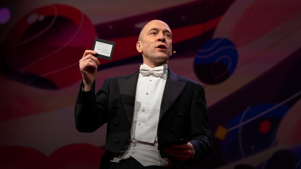
Clarity or mystery? I'm balancing these two things in my daily work as a graphic designer, as well as my daily life as a New Yorker every day, and there are two elements that absolutely fascinate me.
Clarté ou mystère ? Je pèse ces deux éléments quotidiennement, en tant que graphiste, et comme citoyen de New-York. Il y a deux éléments qui me fascinent profondément. Voici un exemple.
Here's an example. Now, how many people know what this is? Okay. Now how many people know what this is? Okay. Thanks to two more deft strokes by the genius Charles M. Schulz, we now have seven deft strokes that in and of themselves create an entire emotional life, one that has enthralled hundreds of millions of fans for over 50 years. This is actually a cover of a book that I designed about the work of Schulz and his art, which will be coming out this fall, and that is the entire cover. There is no other typographic information or visual information on the front, and the name of the book is "Only What's Necessary." So this is sort of symbolic about the decisions I have to make every day about the design that I'm perceiving, and the design I'm creating.
Qui d'entre vous sait ce que c'est ? D'accord. Maintenant, qu'en dites-vous ? Okay. Grâce à deux coups de pattes du génie Charles M. Shulz, on a sept traits habiles, qui, seuls, créent une vie émotionnelle complète. Une vie émotive qui captive des centaines de millions de fans depuis plus de 50 ans. Ce dessin est en fait la couverture que j'ai conçue pour un livre sur le travail de Schultz et de son art, qui va sortir cet automne. Voici la couverture dans son intégralité. Il n'y a aucune autre information typographique ou visuelle sur la première de couverture. Le titre est : « Rien que le nécessaire. » Ceci est assez symbolique des décisions que je dois faire au quotidien sur le design que je croise ou crée.
So clarity. Clarity gets to the point. It's blunt. It's honest. It's sincere. We ask ourselves this. ["When should you be clear?"]
Commençons par la clarté. La clarté va droit au but. C’est direct, honnête et sincère. Nous nous demandons ça : [ Quand doit-on être clair ? ]
Now, something like this, whether we can read it or not, needs to be really, really clear. Is it?
Un truc comme ça, qu'on puisse le lire ou non, doit être très, très, clair. Est-ce le cas ?
This is a rather recent example of urban clarity that I just love, mainly because I'm always late and I am always in a hurry. So when these meters started showing up a couple of years ago on street corners, I was thrilled, because now I finally knew how many seconds I had to get across the street before I got run over by a car. Six? I can do that. (Laughter)
Voici un exemple assez récent de la clarté urbaine comme je les aime. Surtout parce que je suis toujours en retard et pressé. Quand ces compteurs ont commencé à fleurir au coins des rues, il y a quelques années, j’étais ravi parce que je savais enfin combien de secondes il me restait pour traverser la rue, avant de me faire écraser par une voiture. Six ? Je peux le faire. (Rires)
So let's look at the yin to the clarity yang, and that is mystery. Mystery is a lot more complicated by its very definition. Mystery demands to be decoded, and when it's done right, we really, really want to. ["When should you be mysterious?"] In World War II, the Germans really, really wanted to decode this, and they couldn't.
Regardons à présent le yin de la clarté, notre yang. Le yin de la clarté, c’est le mystère. Par définition, le mystère est beaucoup plus compliqué. Le mystère exige d’être décodé, et quand c'est bien ficelé, nous en avons vraiment envie. [ « Quand doit-on être mystérieux ? » ] Pendant la Seconde Guerre mondiale, les Allemands voulaient décoder ça, mais ils n'y arrivaient pas, en dépit de leurs efforts.
Here's an example of a design that I've done recently for a novel by Haruki Murakami, who I've done design work for for over 20 years now, and this is a novel about a young man who has four dear friends who all of a sudden, after their freshman year of college, completely cut him off with no explanation, and he is devastated. And the friends' names each have a connotation in Japanese to a color. So there's Mr. Red, there's Mr. Blue, there's Ms. White, and Ms. Black. Tsukuru Tazaki, his name does not correspond to a color, so his nickname is Colorless, and as he's looking back on their friendship, he recalls that they were like five fingers on a hand. So I created this sort of abstract representation of this, but there's a lot more going on underneath the surface of the story, and there's more going on underneath the surface of the jacket. The four fingers are now four train lines in the Tokyo subway system, which has significance within the story. And then you have the colorless subway line intersecting with each of the other colors, which basically he does later on in the story. He catches up with each of these people to find out why they treated him the way they did.
Voici un exemple d’un graphisme que j’ai réalisé récemment pour la couverture d'un roman de Haruki Murakami. Je fais du graphisme pour lui depuis plus de 20 ans. C'est un roman dont le héros est un jeune homme qui a quatre bons amis. Tout d'un coup, après leur première année à la fac, ses amis l'excluent de leur groupe sans aucune explication. Ce qui anéantit notre héros. Les noms de famille des amis incluent une couleur, en japonais. Il y a Messieurs Rouge et Bleu, et les filles : Blanche, et Noire. Le nom de Tsukuru Tazaki ne correspond pas à une couleur. Il est donc « Incolore ». Quand il repense à leur amitié, il se rappelle qu'ils étaient comme les doigts de la main. Alors j’ai créé une représentation abstraite de cette idée. En fait, beaucoup de choses se passent sous la surface de l'histoire. Il y a donc beaucoup de sens cachés sur la jaquette : les quatre doigts ressemblent aussi à quatre lignes du réseau de métro de Tokyo, qui tient un rôle important dans l'histoire. Il y a enfin la ligne de métro incolore qui croise chacune des autres couleurs. C'est au fond une allégorie de l'histoire du héros. Il retrouve chaque personne pour savoir pourquoi ils l'ont traité de cette manière.
And so this is the three-dimensional finished product sitting on my desk in my office, and what I was hoping for here is that you'll simply be allured by the mystery of what this looks like, and will want to read it to decode and find out and make more clear why it looks the way it does.
Voici le produit fini, tridimensionnel. Là, il est posé sur mon bureau. J'espérais, en vous le présentant, que le mystère qui en émane vous séduirait, et que ça susciterait chez vous l'envie de lire le roman, et découvrir la raison du choix de ce graphisme.
["The Visual Vernacular."]
[ « Le jargon visuel. » ]
This is a way to use a more familiar kind of mystery. What does this mean? This is what it means. ["Make it look like something else."] The visual vernacular is the way we are used to seeing a certain thing applied to something else so that we see it in a different way.
Voici une façon d'utiliser un genre mystérieux plus familier. Qu'est-ce que ca signifie ? Voici ce que ça signifie : [ « Déguiser et travestir. » ] Le jargon visuel est une façon habituelle de voir une certaine chose appliquée à autre chose, pour percevoir celle-ci d’une façon neuve.
This is an approach I wanted to take to a book of essays by David Sedaris that had this title at the time. ["All the Beauty You Will Ever Need"] Now, the challenge here was that this title actually means nothing. It's not connected to any of the essays in the book. It came to the author's boyfriend in a dream. Thank you very much, so -- (Laughter) -- so usually, I am creating a design that is in some way based on the text, but this is all the text there is. So you've got this mysterious title that really doesn't mean anything, so I was trying to think: Where might I see a bit of mysterious text that seems to mean something but doesn't? And sure enough, not long after, one evening after a Chinese meal, this arrived, and I thought, "Ah, bing, ideagasm!" (Laughter) I've always loved the hilariously mysterious tropes of fortune cookies that seem to mean something extremely deep but when you think about them -- if you think about them -- they really don't. This says, "Hardly anyone knows how much is gained by ignoring the future." Thank you. (Laughter) But we can take this visual vernacular and apply it to Mr. Sedaris, and we are so familiar with how fortune cookie fortunes look that we don't even need the bits of the cookie anymore. We're just seeing this strange thing and we know we love David Sedaris, and so we're hoping that we're in for a good time.
C'est une approche que j'ai choisie pour illustrer un livre d’essais de David Sedaris qui lui avait d'abord donné ce titre. [ « Toute la beauté dont on n'aura jamais besoin »] Tout le défi réside dans le fait que ce titre ne veut rien dire. Il n'y a aucun lien avec les essais compilés dans le livre. C'est le compagnon de l'auteur qui a rêvé du titre. Je cache ma joie... (Rires) D'habitude, je crée une illustration qui a un lien ou l’autre avec le texte. Mais dans ce cas précis, il n'y a rien. On a juste ce titre mystérieux qui ne signifie rien. Le point de départ de ma réflexion est le suivant : où pourrais-je trouver un bout de texte mystérieux qui semble faire sens, mais qui, en fait, ne signifie rien ? Et bien sûr, peu de temps après, un soir, après un repas chinois, j'ai eu mon illumination : « Ah, enfin, un idégasme ! » (Rires) J’affectionne beaucoup les maximes mystérieuses et désopilantes qu'on trouve dans les biscuits chinois. Ça semble très profond, mais quand on y réfléchit bien, ça ne veut rien dire. Celui-ci : « Peu de personnes connaissent le bénéfice d'ignorer l'avenir. » C'est formidable ! (Rires) Mais on peut récupérer cette œuvre visuelle et l'appliquer à M. Sedaris. On sait si bien à quoi ressemblent ces billets dans les biscuits, qu'on n’a même plus besoin des miettes du biscuit. On voit cette chose étrange, on sait aussi qu'on adore David Sedaris. On se met donc à anticiper un moment de pur bonheur.
["'Fraud' Essays by David Rakoff"] David Rakoff was a wonderful writer and he called his first book "Fraud" because he was getting sent on assignments by magazines to do things that he was not equipped to do. So he was this skinny little urban guy and GQ magazine would send him down the Colorado River whitewater rafting to see if he would survive. And then he would write about it, and he felt that he was a fraud and that he was misrepresenting himself. And so I wanted the cover of this book to also misrepresent itself and then somehow show a reader reacting to it.
[ « Imposteur » Essais par David Rakoff ] David Rakoff était un écrivain incroyable. Il a nommé son premier roman « Imposteur » [ Imposteur ] parce qu’on l'envoyait toujours en mission pour des magazines pour accomplir des choses qu’il était incapable de faire. Il était du genre maigrichon urbain, mais le magazine GQ l'envoyait faire une descente en rafting sur le fleuve Colorado pour voir s’il en survivrait. Il devait ensuite écrire sur le sujet. Il se sentait comme un imposteur. Il pensait donner une image fausse de lui-même. J'ai voulu que la couverture de son livre soit trompeuse et ressemble au résultat d'un lecteur qui réagit à l'imposture.
This led me to graffiti. I'm fascinated by graffiti. I think anybody who lives in an urban environment encounters graffiti all the time, and there's all different sorts of it. This is a picture I took on the Lower East Side of just a transformer box on the sidewalk and it's been tagged like crazy. Now whether you look at this and think, "Oh, that's a charming urban affectation," or you look at it and say, "That's illegal abuse of property," the one thing I think we can all agree on is that you cannot read it. Right? There is no clear message here. There is another kind of graffiti that I find far more interesting, which I call editorial graffiti. This is a picture I took recently in the subway, and sometimes you see lots of prurient, stupid stuff, but I thought this was interesting, and this is a poster that is saying rah-rah Airbnb, and someone has taken a Magic Marker and has editorialized about what they think about it. And it got my attention.
Ça m’a conduit aux graffitis. Les graffitis me fascinent. Je pense que toute personne qui habite en ville croise des graffitis tout le temps. Il y a plein de styles différents. Voici une photo que j’ai prise dans le Lower East Side. C'est une cabine électrique sur le trottoir. Elle est taguée à mort. Vous pouvez envisager ça comme étant une appropriation urbaine charmante, ou comme une dégradation illégale de bien public. Cependant, nous nous rejoignons sur un point : c'est illisible. On est bien d'accord ? Il n'y a pas de message clair. Il y a un autre type de graffitis que je trouve beaucoup plus intéressants, et que j’appelle les graffitis rédactionnels. Voici une photo que j’ai prise récemment dans le métro. On voit parfois beaucoup de trucs lubriques et stupides, mais celui-ci est, à mon avis, intéressant. C’est une affiche qui nous baratine sur Airbnb. Quelqu'un a pris un gros marqueur pour exprimer son opinion rédactionnelle. Ça a attiré mon attention. Ça m'a fait réfléchir comment appliquer ça à mon bouquin.
So I was thinking, how do we apply this to this book? So I get the book by this person, and I start reading it, and I'm thinking, this guy is not who he says he is; he's a fraud. And I get out a red Magic Marker, and out of frustration just scribble this across the front. Design done. (Laughter) And they went for it! (Laughter) Author liked it, publisher liked it, and that is how the book went out into the world, and it was really fun to see people reading this on the subway and walking around with it and what have you, and they all sort of looked like they were crazy. (Laughter)
J'imagine recevoir un bouquin. Je commence à le lire et je pense : « Ce mec n'est pas ce qu'il dit être ; c'est un imposteur. » Je m'arme aussitôt de mon marqueur rouge, et de frustration, je gribouille ça sur la couverture. [ Imposteur ] Mission accomplie. (Rires) Ils ont adoré ! (Rires) L’auteur a adoré. L’éditeur a adoré. Voilà comment le livre est paru partout dans le monde. C'était vraiment amusant de voir les gens lire ça dans le métro, ou se promener le bouquin en main. Ils avaient tous l’air un peu fou. (Rires)
["'Perfidia' a novel by James Ellroy"] Okay, James Ellroy, amazing crime writer, a good friend, I've worked with him for many years. He is probably best known as the author of "The Black Dahlia" and "L.A. Confidential." His most recent novel was called this, which is a very mysterious name that I'm sure a lot of people know what it means, but a lot of people don't. And it's a story about a Japanese-American detective in Los Angeles in 1941 investigating a murder. And then Pearl Harbor happens, and as if his life wasn't difficult enough, now the race relations have really ratcheted up, and then the Japanese-American internment camps are quickly created, and there's lots of tension and horrible stuff as he's still trying to solve this murder. And so I did at first think very literally about this in terms of all right, we'll take Pearl Harbor and we'll add it to Los Angeles and we'll make this apocalyptic dawn on the horizon of the city. And so that's a picture from Pearl Harbor just grafted onto Los Angeles. My editor in chief said, "You know, it's interesting but I think you can do better and I think you can make it simpler." And so I went back to the drawing board, as I often do. But also, being alive to my surroundings, I work in a high-rise in Midtown, and every night, before I leave the office, I have to push this button to get out, and the big heavy glass doors open and I can get onto the elevator. And one night, all of a sudden, I looked at this and I saw it in a way that I hadn't really noticed it before. Big red circle, danger. And I thought this was so obvious that it had to have been done a zillion times, and so I did a Google image search, and I couldn't find another book cover that looked quite like this, and so this is really what solved the problem, and graphically it's more interesting and creates a bigger tension between the idea of a certain kind of sunrise coming up over L.A. and America.
[ « Perfidia » un roman de James Ellroy ] James Ellroy est un auteur de polars incroyable. C'est aussi un bon ami. Je travaille avec lui depuis des années. Il est mieux connu pour ses autres romans : « Le dahlia noir » et « L.A. Confidential ». Voici le titre de son nouveau roman. C'est un titre très mystérieux. Beaucoup savent ce que ça signifie, mais beaucoup d'autres, sans doute pas. C'est l'histoire d'un inspecteur américain d'origine japonaise, dans le Los Angeles de 1941. Il enquête sur un meurtre. Pearl Harbor arrive, et comme si sa vie n'était pas déjà assez difficile, les tensions raciales s'accentuent, on crée les camps d'internement pour les Américains d'origine japonaise. La société est en agitation totale, des tas de choses horribles se passent, et lui, il essaie de résoudre ce meurtre. Dans un premier temps, j’ai réfléchi très littéralement : d'un côté Pearl Harbor, de l'autre, Los Angeles. Entre les deux, une aube apocalyptique, qui menace l'horizon de la ville. J'ai donc greffé une photo de Pearl Harbor sur Los Angeles. Mon rédacteur en chef a dit : « Je trouve ça intéressant, certes, mais je pense que tu peux faire mieux. Tu pourrais simplifier les choses. » Je suis retourné à ma planche à dessin, comme je le fais souvent. Je suis très observateur et mon environnement m’inspire souvent. Je travaille dans un gratte-ciel dans Midtown. Chaque nuit, avant de quitter le bureau, je dois appuyer sur ce bouton pour sortir. Il actionne les grandes portes de verre et je peux entrer dans l'ascenseur. Et un soir, j’ai eu une illumination en le regardant. Il m’est apparu différemment. Un grand cercle rouge. Attention danger ! Je trouvais mon idée si évidente qu’elle devait faire l’objet de millions de publications. J’ai donc fait une recherche d'illustrations sur Google, sans trouver aucune autre couverture semblable. Ce gros bouton a vraiment résolu mon problème. Graphiquement, c'est plus intéressant. Il y a une tension forte entre un certain lever du soleil et celui sur L.A. et l’Amérique.
["'Gulp' A tour of the human digestive system by Mary Roach."]
[ « Gulp ! - Une odyssée à travers le canal alimentaire » Mary Roach ]
Mary Roach is an amazing writer who takes potentially mundane scientific subjects and makes them not mundane at all; she makes them really fun. So in this particular case, it's about the human digestive system. So I'm trying to figure out what is the cover of this book going to be. This is a self-portrait. (Laughter) Every morning I look at myself in the medicine cabinet mirror to see if my tongue is black. And if it's not, I'm good to go. (Laughter) I recommend you all do this. But I also started thinking, here's our introduction. Right? Into the human digestive system. But I think what we can all agree on is that actual photographs of human mouths, at least based on this, are off-putting. (Laughter) So for the cover, then, I had this illustration done which is literally more palatable and reminds us that it's best to approach the digestive system from this end. (Laughter) I don't even have to complete the sentence. All right.
Mary Roach est un auteur incroyable qui traite de sujets scientifiques potentiellement ordinaires, et les rend extraordinaires, et même très amusants. Donc, dans ce cas-ci, il s'agit du tube digestif humain. Je dois imaginer une première de couverture appropriée pour ce bouquin. Ceci est un auto-portrait. (Rires) Chaque matin, je me scrute dans le miroir de l’armoire à pharmacie. Je vérifie que ma langue n’est pas noire. Si elle n’est pas, je suis bon pour la route. (Rires) C'est une bonne habitude que je vous recommande. Ça m’a fait réfléchir au sujet : voici notre ouverture. Exact, non ? L’ouverture vers le tube digestif. On est tous bien d’accord que des photos réalistes de nos cavités buccales sont peu appétissantes. (Rires) Alors pour la première de couverture, j’ai réalisé cette illustration qui est littéralement plus savoureuse et qui nous rappelle qu’il est préférable d’aborder le tube digestif par ce côté-ci. (Rires) Visiblement, vous me suivez bien sur ce coup-là.
["Unuseful mystery"] What happens when clarity and mystery get mixed up? And we see this all the time. This is what I call unuseful mystery. I go down into the subway -- I take the subway a lot -- and this piece of paper is taped to a girder. Right? And now I'm thinking, uh-oh, and the train's about to come and I'm trying to figure out what this means, and thanks a lot. Part of the problem here is that they've compartmentalized the information in a way they think is helpful, and frankly, I don't think it is at all. So this is mystery we do not need. What we need is useful clarity, so just for fun, I redesigned this. This is using all the same elements. (Applause) Thank you. I am still waiting for a call from the MTA. (Laughter) You know, I'm actually not even using more colors than they use. They just didn't even bother to make the 4 and the 5 green, those idiots. (Laughter) So the first thing we see is that there is a service change, and then, in two complete sentences with a beginning, a middle and an end, it tells us what the change is and what's going to be happening. Call me crazy! (Laughter)
[ « Mystère superflu » ] Que se passe-t-il quand la clarté et le mystère sont confondus ? Ça arrive tout le temps. Voici ce que j’appelle un mystère superflu. Je descends dans le métro, je prends souvent le métro, et je remarque ce morceau de papier scotché à un pilier. Hum. Ça m’afflige de voir ça. Le métro arrive. Et moi, je suis là en train d'essayer de déchiffrer. Merci beaucoup. Une partie du problème est relatif au cloisonnement des informations. C’est censé faciliter la compréhension. Franchement, c’est tout le contraire. Voici donc un mystère dont nous n'avons pas besoin. On a besoin de clarté salutaire. Du coup, je l'ai re-liftée, juste pour le fun. Avec exactement les mêmes éléments. (Applaudissements) Merci. J’attends toujours un appel de la part du MTA. (Rires) Je n’utilise même pas davantage de couleurs qu'eux. Ils n’ont même pas pris la peine de faire le 4 et le 5 en vert. Quels abrutis ! (Rires) La première chose qui saute aux yeux : un changement de service. Ensuite, deux phrases complètes, avec un début, un milieu et une fin, nous disent de quel changement il s’agit, et ses conséquences. Suis-je vraiment tordu ? (Rires)
["Useful mystery"] All right. Now, here is a piece of mystery that I love: packaging. This redesign of the Diet Coke can by Turner Duckworth is to me truly a piece of art. It's a work of art. It's beautiful. But part of what makes it so heartening to me as a designer is that he's taken the visual vernacular of Diet Coke -- the typefaces, the colors, the silver background -- and he's reduced them to their most essential parts, so it's like going back to the Charlie Brown face. It's like, how can you give them just enough information so they know what it is but giving them the credit for the knowledge that they already have about this thing? It looks great, and you would go into a delicatessen and all of a sudden see that on the shelf, and it's wonderful. Which makes the next thing -- ["Unuseful clarity"] -- all the more disheartening, at least to me. So okay, again, going back down into the subway, after this came out, these are pictures that I took. Times Square subway station: Coca-Cola has bought out the entire thing for advertising. Okay? And maybe some of you know where this is going. Ahem.
[ « Un mystère utile » ] Bon. Voici une part de mystère que j’adore : les emballages. Turner Duckworth a réalisé ce lifting des canettes de Coca Cola Light. C'est pour moi une véritable œuvre d'art. C'est de l'art. Absolument magnifique. En tant que designer, ce qui m'attire dans ce graphisme, c'est qu'il a adopté la visuelle propre au Coca Light : la police, les couleurs, le fond argenté, pour réduire ces éléments à leur essence. C'est comme le visage de Charlie Brown. Tout l’art réside à fournir suffisamment d’indices pour être reconnu, mais pas trop, afin de ne pas injurier l’intelligence des consommateurs. Le look est génial. Imaginez que vous entrez dans une épicerie, et survoliez du regard cet objet dans un rayon. C’est magnifique. Ça rend aussi ceci : [ « La clarté superflue » ] d'autant plus démoralisante, au moins pour moi. Retournant dans le métro, après la sortie du relooking du coca. Voici les photos que j’ai prises. Coca-Cola a acheté la totalité de l'espace publicitaire de la station de métro de Times Square. Jusque là, tout va bien. Certains d'entre vous savent sans doute où je veux en venir. Hum.
"You moved to New York with the clothes on your back, the cash in your pocket, and your eyes on the prize. You're on Coke." (Laughter) "You moved to New York with an MBA, one clean suit, and an extremely firm handshake. You're on Coke." (Laughter) These are real! (Laughter) Not even the support beams were spared, except they switched into Yoda mode. (Laughter) "Coke you're on." (Laughter) ["Excuse me, I'm on WHAT??"] This campaign was a huge misstep. It was pulled almost instantly due to consumer backlash and all sorts of unflattering parodies on the web -- (Laughter) -- and also that dot next to "You're on," that's not a period, that's a trademark. So thanks a lot.
« Tu as déménagé à New York, comme seul bagage tes fringues sur le dos, du fric en poche, le regard fixé sur l’objectif. Tu es sur de bons rails [de Coke]. » (Rires) « Tu as déménagé à New York un MBA en poche, un costume propre, et la poignée de main extrêmement ferme. Tu es sur de bons rails [de Coke]. » (Rires) C'est véridique ! (Rires) Aucun support ne nous a été épargné. Sur les pilliers, ils sont passés en mode Yoda. (Rires) « Sur de bons rails, tu es ». (Rires) [ « Pardon, je suis sur quoi ? » ] Cette campagne fut un faux-pas gargantuesque. Elle a été retirée presque immédiatement, suite au retour de flamme des consommateurs, et aux parodies peu flatteuses sur le web. (Rires) J’allais oublier : ce point à côté du texte, ce n’est pas un point, c'est le symbole de marque déposée.
So to me, this was just so bizarre about how they could get the packaging so mysteriously beautiful and perfect and the message so unbearably, clearly wrong. It was just incredible to me.
Merci pour la précision. Ça me paraissait si étrange de pouvoir créer un emballage parfait, nimbé de la beauté du mystère, et de se planter si lamentablement sur l’accroche publicitaire.
So I just hope that I've been able to share with you some of my insights on the uses of clarity and mystery in my work, and maybe how you might decide to be more clear in your life, or maybe to be a bit more mysterious and not so over-sharing. (Laughter)
C’était juste incroyable. J’espère que j’ai pu partager avec vous certaines de mes idées au sujet de la clarté et du mystère indispensables dans mon travail. Maintenant, vous pouvez choisir d’être plus clair dans votre vie, ou de cultiver un peu de mystère, de ne plus trop partager tous vos secrets. (Rires)
And if there's just one thing that I leave you with from this talk, I hope it's this: Blih blih blih blah. Blah blah blih blih. ["'Judge This,' Chip Kidd"] Blih blih blah blah blah. Blah blah blah.
Si vous devez retenir une seule chose de ma présentation, j’espère que ce sera ceci : Blablablabla. Blablablabla. [« Évaluez ça, Chip Kidd » ] Blablablablabla. Blablabla.
Blah blah.
Blabla.
(Applause)
(Applaudissements)