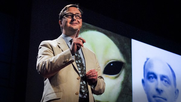
Hi. (Laughter)
Hallo. (Gelach)
I did that for two reasons. First of all, I wanted to give you a good visual first impression. But the main reason I did it is that that's what happens to me when I'm forced to wear a Lady Gaga skanky mic.
Dat heb ik om twee redenen gedaan. Eerst en vooral wilde ik jullie een goede visuele eerste indruk geven Maar de belangrijkste reden is dat dit ervan komt als ik gedwongen word om een skanky Lady Gaga-microfoon te dragen.
(Laughter)
(Gelach)
I'm used to a stationary mic. It's the sensible shoe of public address.
Ik ben een statische microfoon gewend. Dat is de verstandige schoen van het spreken voor publiek.
(Laughter)
(Gelach)
But you clamp this thing on my head, and something happens. I just become skanky. (Laughter) So I'm sorry about that. And I'm already off-message.
Maar als je dit op mijn hoofd klemt, gebeuren er rare dingen. Ik word zelf skanky. (Gelach) Mijn excuses. Ik ben al van mijn onderwerp afgedwaald.
(Laughter)
(Gelach)
Ladies and gentlemen, I have devoted the past 25 years of my life to designing books. ("Yes, BOOKS. You know, the bound volumes with ink on paper. You cannot turn them off with a switch. Tell your kids.") It all sort of started as a benign mistake, like penicillin. (Laughter)
Dames en heren, ik heb de voorbije 25 jaar van mijn leven besteed aan het ontwerpen van boeken. "Ja, BOEKEN. Van die ingebonden volumes met inkt op papier. Je kunt ze niet uitzetten met een knop. Vertel het aan je kinderen." Het begon allemaal als een goedaardige vergissing, zoals penicilline. (Gelach)
What I really wanted was to be a graphic designer at one of the big design firms in New York City. But upon arrival there, in the fall of 1986, and doing a lot of interviews, I found that the only thing I was offered was to be Assistant to the Art Director at Alfred A. Knopf, a book publisher. Now I was stupid, but not so stupid that I turned it down.
Wat ik echt wilde, was grafisch designer zijn bij één van de grote designbureaus in New York City. Toen ik daar aankwam, in de herfst van 1986, ging ik overal solliciteren, maar het enige aanbod dat ik kreeg, was om assistent te worden van de artdirector van Alfred A. Knopf, een uitgever van boeken. Ik was wel dom, maar niet zo dom om het af te wijzen.
I had absolutely no idea what I was about to become part of, and I was incredibly lucky. Soon, it had occurred to me what my job was. My job was to ask this question: "What do the stories look like?" Because that is what Knopf is. It is the story factory, one of the very best in the world. We bring stories to the public.
Ik had er geen idee van waar ik deel van zou gaan uitmaken. Ik was een gelukzak. Het drong al snel tot me door wat mijn taak was. Mijn taak was om deze vraag te stellen: "Hoe zien deze verhalen eruit?" Want dat is de essentie van Knopf. Het is een verhalenfabriek, één van de beste ter wereld. We brengen het publiek verhalen.
The stories can be anything, and some of them are actually true. But they all have one thing in common: They all need to look like something. They all need a face. Why? To give you a first impression of what you are about to get into. A book designer gives form to content, but also manages a very careful balance between the two.
Die verhalen kunnen alles zijn, en sommige ervan zijn zelfs waar. Maar ze hebben allemaal één ding gemeen: ze moeten een uitzicht hebben. Ze moeten een gezicht hebben. Waarom? Om je een eerste indruk te geven van waar je je in gaat begeven. Een boekontwerper geeft vorm aan inhoud maar zorgt ook voor een delicaat evenwicht tussen beide.
Now, the first day of my graphic design training at Penn State University, the teacher, Lanny Sommese, came into the room and he drew a picture of an apple on the blackboard, and wrote the word "Apple" underneath, and he said, "OK. Lesson one. Listen up." And he covered up the picture and he said, "You either say this," and then he covered up the word, "or you show this. But you don't do this." Because this is treating your audience like a moron. (Laughter) And they deserve better.
Op de eerste dag van mijn opleiding grafisch ontwerp aan Penn State University kwam de lesgever, Lanny Sommese, het lokaal binnen en tekende een appel op het bord. Hij schreef er het woord "appel" onder. Hij zei: "Les één. Goed opletten." Hij bedekte het beeld en zei: "Ofwel zeg je dit," en hij bedekte het woord, "of je toont dit. Maar dit doe je niet. Want dit betekent dat je je publiek voor idioot verslijt. (Gelach) Ze verdienen beter."
And lo and behold, soon enough, I was able to put this theory to the test on two books that I was working on for Knopf. The first was Katharine Hepburn's memoirs, and the second was a biography of Marlene Dietrich. Now the Hepburn book was written in a very conversational style, it was like she was sitting across a table telling it all to you. The Dietrich book was an observation by her daughter; it was a biography. So the Hepburn story is words and the Dietrich story is pictures, and so we did this. So there you are. Pure content and pure form, side by side. No fighting, ladies.
En warempel, kort erna kon ik die theorie uittesten op twee boeken waar ik aan werkte bij Knopf. Het eerste waren de memoires van Katharine Hepburn, en het tweede een biografie van Marlene Dietrich. Het Hepburn-boek was in conversatie-stijl geschreven, alsof je met haar aan tafel zat en ze je alles vertelde. Het Dietrich-boek was een observatie door haar dochter, een biografie. Het Hepburn-boek zijn dus woorden en het Dietrich-boek beelden. Dus deden we dit. Daar ga je. Pure inhoud en pure vorm, naast elkaar. Niet vechten, dames.
("What's a Jurassic Park?") Now, what is the story here? Someone is re-engineering dinosaurs by extracting their DNA from prehistoric amber. Genius! (Laughter)
"Wat is een Jurassic Park?" Wat is het verhaal hier? Iemand re-engineert dinosaurussen door hun DNA uit prehistorisch amber te halen. Geniaal! (Gelach)
Now, luckily for me, I live and work in New York City, where there are plenty of dinosaurs. (Laughter) So, I went to the Museum of Natural History, and I checked out the bones, and I went to the gift shop, and I bought a book. And I was particularly taken with this page of the book, and more specifically the lower right-hand corner.
Gelukkig voor mij leef en werk ik in New York City waar het stikt van de dinosaurussen. (Gelach) Dus ging ik naar het Natuurhistorisch Museum, de beenderen bekijken. Ik ging naar de museumwinkel en kocht een boek. Ik was gefascineerd door deze pagina van het boek, meer bepaald door de rechteronderhoek.
Now I took this diagram, and I put it in a Photostat machine, (Laughter) and I took a piece of tracing paper, and I taped it over the Photostat with a piece of Scotch tape -- stop me if I'm going too fast -- (Laughter) -- and then I took a Rapidograph pen -- explain it to the youngsters -- (Laughter) and I just started to reconstitute the dinosaur.
Ik nam deze prent en stak ze in een fotokopieermachine, (Gelach) ik nam een vel kalkeerpapier, plakte die over de fotokopie met een stuk plakband -- hou me tegen als ik te snel ga -- (Gelach) en toen nam ik een rapidografpen -- leg maar uit aan de jongelui -- (Gelach) en ik begon aan de wedersamenstelling van de dinosaurus.
I had no idea what I was doing, I had no idea where I was going, but at some point, I stopped -- when to keep going would seem like I was going too far. And what I ended up with was a graphic representation of us seeing this animal coming into being. We're in the middle of the process. And then I just threw some typography on it. Very basic stuff, slightly suggestive of public park signage. (Laughter)
Ik had er geen idee van wat ik deed, ik had geen idee van waar ik heenging, maar op een bepaald punt stopte ik -- toen ik vond dat verder gaan, te ver zou gaan. Het resultaat was een grafische weergave van hoe we dit dier tot leven zien komen. We zitten er middenin. Vervolgens gooide ik er wat typografie tegenaan. Heel eenvoudige dingen, met een zekere suggestie van openbare parkwegwijzers. (Gelach)
Everybody in house loved it, and so off it goes to the author. And even back then, Michael was on the cutting edge. ("Michael Crichton responds by fax:") ("Wow! Fucking Fantastic Jacket") (Laughter) (Applause) That was a relief to see that pour out of the machine. (Laughter) I miss Michael.
Iedereen in huis was er dol op, dus ging het richting auteur. En ook toen al was Michael mee met de jongste trends. Michael Chrichton antwoordt per fax: "Wow! Fucking Fantastische Omslag" (Gelach) (Applaus) Wat een opluchting om dat uit de machine te zien rollen. (Gelach) Ik mis Michael.
And sure enough, somebody from MCA Universal calls our legal department to see if they can maybe look into buying the rights to the image, just in case they might want to use it. Well, they used it. (Laughter) (Applause)
En zie, iemand van MCA Universal belde onze juridische dienst om te zien of ze misschien de aankoop van de beeldrechten kunnen onderzoeken, voor zover ze het misschien zouden willen gebruiken. Ze hébben het gebruikt. (Gelach) (Applaus)
And I was thrilled. We all know it was an amazing movie, and it was so interesting to see it go out into the culture and become this phenomenon and to see all the different permutations of it. But not too long ago, I came upon this on the Web. No, that is not me. But whoever it is, I can't help but thinking they woke up one day like, "Oh my God, that wasn't there last night. Ooooohh! I was so wasted." (Laughter)
Ik vond het spannend. We weten allemaal dat het een geweldige film was. Het was zo interessant om te zien hoe het deel werd van de cultuur, een fenomeen, in allerlei verschillende verschijningsvormen. Niet zo lang geleden stootte ik hierop, op het internet. Dat ben ik niet. Wie het ook is, ik kan het niet helpen om te denken dat hij op een dag wakker werd en dacht: "Help, dat was er gisteren niet. Oooh! Ik was ver heen." (Gelach)
But if you think about it, from my head to my hands to his leg. (Laughter) That's a responsibility. And it's a responsibility that I don't take lightly. The book designer's responsibility is threefold: to the reader, to the publisher and, most of all, to the author. I want you to look at the author's book and say, "Wow! I need to read that."
Bedenk maar even, van mijn hoofd naar mijn handen naar zijn been. (Gelach) Wat een verantwoordelijkheid. Ik neem die verantwoordelijkheid niet licht op. De boekontwerper heeft een drievoudige verantwoordelijkheid: jegens de lezer, jegens de uitgever en bovenal jegens de auteur. Ik wil dat je naar het boek van de auteur kijkt en zegt: "Wow! Dat moet ik lezen."
David Sedaris is one of my favorite writers, and the title essay in this collection is about his trip to a nudist colony. And the reason he went is because he had a fear of his body image, and he wanted to explore what was underlying that. For me, it was simply an excuse to design a book that you could literally take the pants off of. But when you do, you don't get what you expect. You get something that goes much deeper than that. And David especially loved this design because at book signings, which he does a lot of, he could take a magic marker and do this. (Laughter) Hello! (Laughter)
David Sedaris is één van mijn favoriete auteurs. Het titelstuk in deze verzameling gaat over zijn bezoek aan een nudistenkamp. Hij ging erheen omdat hij bang was van zijn lichaamsbeeld. Hij wilde de oorzaak daarvan kennen. Voor mij was het een excuus om een boek te ontwerpen waar je letterlijk de broek van kon aftrekken. Maar als je dat doet, krijg je niet wat je verwacht. Je krijgt iets dat veel dieper gaat. David was erg dol op dit ontwerp, want tijdens signeersessies, die hij regelmatig doet, kon hij dit doen met een magic marker. (Gelach) Hallo! (Gelach)
Augusten Burroughs wrote a memoir called ["Dry"], and it's about his time in rehab. In his 20s, he was a hotshot ad executive, and as Mad Men has told us, a raging alcoholic. He did not think so, however, but his coworkers did an intervention and they said, "You are going to rehab, or you will be fired and you will die."
Augusten Burroughs schreef memoires met de titel "Droog", over zijn verblijf in een afkickcentrum. In zijn twintiger jaren was hij een hippe reclameman, en, zoals we van Mad Men leerden, een zware alcoholicus. Hij vond weliswaar van niet, maar zijn collega's kwamen tussenbeide en zeiden: "Je gaat afkicken of je wordt ontslagen en sterft."
Now to me, this was always going to be a typographic solution, what I would call the opposite of Type 101. What does that mean? Usually on the first day of Introduction to Typography, you get the assignment of, select a word and make it look like what it says it is. So that's Type 101, right? Very simple stuff. This is going to be the opposite of that. I want this book to look like it's lying to you, desperately and hopelessly, the way an alcoholic would.
Voor mij moest dit een typografische oplossing krijgen, wat ik het omgekeerde van Type 101 zou noemen. Wat betekent dat? Op de eerste dag van Introductie tot de Typografie krijg je meestal de taak om een woord te selecteren en te zorgen dat het eruit ziet als zijn betekenis. Dat is Type 101. Heel simpele dingen. Dit zal het omgekeerde doen. Ik wil dat dit boek eruitziet alsof het je beliegt, desperaat en hopeloos, zoals een alcoholicus zou doen.
The answer was the most low-tech thing you can imagine. I set up the type, I printed it out on an Epson printer with water-soluble ink, taped it to the wall and threw a bucket of water at it. Presto! Then when we went to press, the printer put a spot gloss on the ink and it really looked like it was running.
Het antwoord was zo low tech als je maar kan bedenken. Ik zette de het drukwerk, drukte het af op een Epson-printer, met wateroplosbare inkt, plakte het tegen de muur en gooide er een emmer water tegenaan. Presto! Toen we in druk gingen, voegde de drukker een spot gloss toe aan de inkt, zodat het er echt uitzag alsof het uitliep.
Not long after it came out, Augusten was waylaid in an airport and he was hiding out in the bookstore spying on who was buying his books. And this woman came up to it, and she squinted, and she took it to the register, and she said to the man behind the counter, "This one's ruined." (Laughter) And the guy behind the counter said, "I know, lady. They all came in that way." (Laughter) Now, that's a good printing job.
Niet lang nadat het was verschenen, werd Augusten belaagd in een luchthaven. Hij verstopte zich in de boekhandel, en keek stiekem wie zijn boeken kocht. Er kwam een vrouw op het boek af, ze kneep haar ogen toe, bracht het naar de kassa en zei tegen de man achter de kassa: "Dit exemplaar is beschadigd." (Gelach) De man achter de kassa zei: "Weet ik, mevrouw. De hele levering was zo." (Gelach) Dat heeft die drukker goed gedaan.
A book cover is a distillation. It is a haiku, if you will, of the story. This particular story by Osama Tezuka is his epic life of the Buddha, and it's eight volumes in all. But the best thing is when it's on your shelf, you get a shelf life of the Buddha, moving from one age to the next. All of these solutions derive their origins from the text of the book, but once the book designer has read the text, then he has to be an interpreter and a translator.
Een boekomslag is een distillaat. Het is een haiku van het verhaal, als je wil. Dit specifieke verhaal van Osamu Tezuka is zijn epische 'Leven van Boeddha'. Het zijn acht volumes in totaal. Het beste is dat het op je boekenplank een 'Boekenplankleven van Boeddha' geeft, van levensfase tot levensfase. Al deze oplossingen hebben hun wortels in de tekst van het boek, maar zodra de boekontwerper de tekst heeft gelezen, moet hij een tolk zijn en een vertaler.
This story was a real puzzle. This is what it's about. ("Intrigue and murder among 16th century Ottoman court painters.")
Dit verhaal was echt een raadsel. Het ging hierover. "Intrige en moord onder de 16e-eeuwse Ottomaanse hofschilders"
(Laughter)
(Gelach)
All right, so I got a collection of the paintings together and I looked at them and I deconstructed them and I put them back together. And so, here's the design, right? And so here's the front and the spine, and it's flat. But the real story starts when you wrap it around a book and put it on the shelf.
Dus zocht ik een verzameling schilderijen uit, bekeek ze, deconstrueerde ze en stelde ze weer samen. Dit is het ontwerp. Dit is de voorkant en de rug. Het is vlak. Maar het echte verhaal begint als je dit rond een boek doet en op de plank zet.
Ahh! We come upon them, the clandestine lovers. Let's draw them out. Huhh! They've been discovered by the sultan. He will not be pleased. Huhh! And now the sultan is in danger. And now, we have to open it up to find out what's going to happen next. Try experiencing that on a Kindle. (Laughter)
Ahh! We zitten ze op de huid, de stiekeme geliefden. Laten we ze uit hun tent lokken. Huhh! Ze zijn ontdekt door de sultan. Dat zal hij niet fijn vinden. Huhh! Nu is de sultan in gevaar. Nu moeten we het openen om te ontdekken wat er dan gebeurt. Probeer dat maar eens te ervaren op een Kindle. (Gelach)
Don't get me started. Seriously. Much is to be gained by eBooks: ease, convenience, portability. But something is definitely lost: tradition, a sensual experience, the comfort of thingy-ness -- a little bit of humanity.
Breek me de bek niet open. Echt. Er is veel te zeggen voor eBooks: gemak, comfort, draagbaarheid. Maar er is ook verlies: traditie, een zinnelijke ervaring, het comfort van dingsigheid -- een beetje menselijkheid.
Do you know what John Updike used to do the first thing when he would get a copy of one of his new books from Alfred A. Knopf? He'd smell it. Then he'd run his hand over the rag paper, and the pungent ink and the deckled edges of the pages. All those years, all those books, he never got tired of it. Now, I am all for the iPad, but trust me -- smelling it will get you nowhere. (Laughter) Now the Apple guys are texting, "Develop odor emission plug-in." (Laughter)
Weet je wat John Updike placht te doen zodra hij een exemplaar in handen kreeg van één van zijn nieuwe boeken van Alfred A. Knopf? Hij rook eraan. Dan streek hij over het lompenpapier, de scherpe inkt en de ruwe kantjes van de pagina's. Zelfs na al die jaren, al die boeken kreeg hij er nooit genoeg van. Ik ben een groot voorstander van de iPad, maar geloof me vrij, eraan ruiken heeft geen enkele zin. (Gelach) De Apple-jongens sturen nu een bericht "Ontwikkel geur-emissie-plug-in". (Gelach)
And the last story I'm going to talk about is quite a story. A woman named Aomame in 1984 Japan finds herself negotiating down a spiral staircase off an elevated highway. When she gets to the bottom, she can't help but feel that, all of a sudden, she's entered a new reality that's just slightly different from the one that she left, but very similar, but different. And so, we're talking about parallel planes of existence, sort of like a book jacket and the book that it covers.
Het laatste verhaal waarover ik het ga hebben, is me er eentje. Een vrouw genaamd Aomame, in het Japan van 1984, komt terecht op een wenteltrap, om van een om van een viaduct af te raken. Beneden aangekomen kan ze niet anders dan ervaren dat ze plots in een andere realiteit is terechtgekomen, die net iets anders is dan diegene die ze heeft verlaten, erg gelijkend, maar anders. We hebben het dus over parallelle existentievlakken, zoals een boekomslag en het boek waar hij om zit.
So how do we show this? We go back to Hepburn and Dietrich, but now we merge them. So we're talking about different planes, different pieces of paper. So this is on a semi-transparent piece of velum. It's one part of the form and content. When it's on top of the paper board, which is the opposite, it forms this. So even if you don't know anything about this book, you are forced to consider a single person straddling two planes of existence. And the object itself invited exploration interaction, consideration and touch.
Hoe tonen we dat? We keren terug naar Hepburn en Dietrich, maar nu smelten we ze samen. We hebben het over verschillende vlakken, verschillende stukken papier. Dit is op een halfdoorschijnend stuk perkament. Het is één deel van vorm en inhoud. Als het bovenop de papieren kaft zit, die er tegenover staat, vormt het dit. Zelfs als je niets weet over dit boek, moet je rekening houden met één persoon die schrijlings op twee existentievlakken zit. Het object zelf nodigt uit tot verkenning, interactie, beschouwing en aanraking.
This debuted at number two on the New York Times Best Seller list. This is unheard of, both for us the publisher, and the author. We're talking a 900-page book that is as weird as it is compelling, and featuring a climactic scene in which a horde of tiny people emerge from the mouth of a sleeping girl and cause a German Shepherd to explode. (Laughter) Not exactly Jackie Collins. Fourteen weeks on the Best Seller list, eight printings, and still going strong.
Dit kwam binnen als nummer twee van de New York Times-bestsellerslijst. Dat is ongehoord, voor ons, de uitgever, en voor de auteur. We hebben het over een boek van 900 pagina's, dat even bizar als meeslepend is en een climax bevat waarin een horde kleine mensen uit de mond van een slapend meisje komen en een Duitse Scheper doen ontploffen. (Gelach) Niet bepaald Jackie Collins. Veertien weken op de bestsellerslijst, acht drukken, verkoopt nog steeds goed.
So even though we love publishing as an art, we very much know it's a business too, and that if we do our jobs right and get a little lucky, that great art can be great business.
Hoewel we het uitgeven als kunst waarderen, weten we heel goed dat het ook een bedrijf is, en dat, als wij ons werk goed doen en een beetje geluk hebben, grootste kunst grootste business kan zijn.
So that's my story. To be continued. What does it look like? Yes. It can, it does and it will, but for this book designer, page-turner, dog-eared place-holder, notes in the margins-taker, ink-sniffer, the story looks like this.
Dat is mijn verhaal. Wordt vervolgd. Hoe ziet het eruit? Ja. Het kan, het is zo, het zal zo zijn, maar voor deze boekontwerper, bladomslager, plaatshouder met ezelsoren, aantekeningen-in-de-marge-maker, inktsnuiver ziet het verhaal er zo uit.
Thank you.
Hartelijk dank.
(Applause)
(Applaus)