I really love color. I notice it everywhere and in everything. My family makes fun of me because I like to use colors with elusive-sounding names, like celadon ...
저는 정말로 색을 사랑합니다. 모든 것과 모든 곳에서 색을 보죠. 제 가족들은 저를 놀립니다. 왜냐면 저는 알아듣기 힘든 이름으로 색을 부르는 것을 좋아하거든요. 예를 들어 청자색이라거나
(Laughter)
(웃음)
ecru ... carmine. Now, if you haven't noticed, I am black, thank you --
엷은 갈색 양홍색 같이요. 혹시 모르셨을 분들을 위해, 저는 흑인입니다. 고마워요.
(Laughter)
(웃음)
and when you grow up in a segregated city as I have, like Chicago, you're conditioned to believe that color and race can never be separate. There's hardly a day that goes by that somebody is not reminding you of your color. Racism is my city's vivid hue.
여러분이 제가 사는 도시 시카고처럼 인종차별적인 도시에서 자랐다면 색과 인종은 절대 분리될 수 없다고 믿을 수 밖에 없을 겁니다. 단 하루라도 다른 사람들이 당신의 색깔을 상기시키지 않고 넘어가는 날이 없을 거예요. 인종차별은 제 도시의 선명한 색조 같은 것이죠.
Now, we can all agree that race is a socially constructed phenomenon, but it's often hard to see it in our everyday existence. Its pervasiveness is everywhere. The neighborhoods I grew up in were filled with a kind of culturally coded beauty. Major commercial corridors were lined with brightly painted storefronts that competed for black consumer dollars. The visual mash-ups of corner stores and beauty supply houses, currency exchanges, are where I actually, inadvertently learned the foundational principles of something I would later come to know is called color theory. I can remember being pretty intimidated by this term in college -- color theory. All these stuffy old white guys with their treatises and obscure terminologies. I'd mastered each one of their color palettes and associated principles. Color theory essentially boils down to the art and science of using color to form compositions and spaces. It's not so complicated.
우리는 모두 인종이란 사회적으로 만들어진 현상이란 데 동의할 것입니다. 하지만 일상적인 생존 속에서 그 사실을 알기란 어렵죠. 인종차별은 모든 곳에서 넘쳐나니까요. 제가 자란 동네는 문화적으로 코드화 된 아름다움이 넘쳐났습니다. 주요 상업 지대에는 흑인 소비자들의 돈을 얻기 위해 경쟁하는 밝게 칠해진 가게 외관들이 줄지어 있었죠. 모퉁이 가게들과 미용용품점들 환전소들의 시각적 조합은 우연히도 제가 나중에 알게 된 색채 이론이라고 불리는 것의 기본 원칙을 배운 곳이었습니다. 대학교에서 이 용어에 꽤 겁을 먹었던 게 기억나네요. 색채 이론. 논문과 모호한 용어들로 무장한 꽉 막히고 나이든 백인 남자들. 저는 그들 각각의 색 팔레트와 연상되는 법칙들을 익혔습니다. 색채 이론은 본질적으로 색을 이용하여 구조와 공간을 형성하는 예술이자 과학입니다. 그리 복잡하지 않죠.
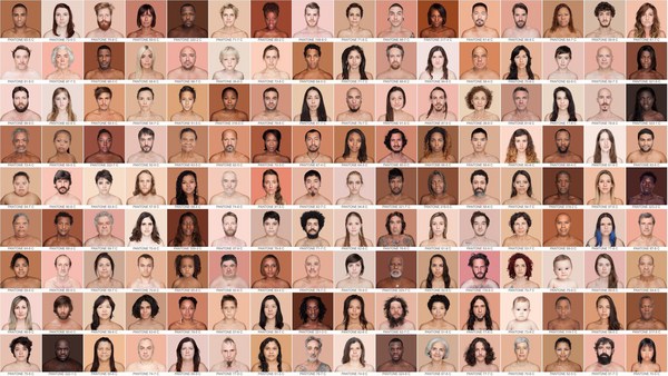
This was my bible in college. Josef Albers posited a theory about the color red, and it always has stuck with me. He argues that the iconic color of a cola can is red, and that in fact all of us can agree that it's red but the kinds of reds that we imagine are as varied as the number of people in this room. So imagine that. This color that we've all been taught since kindergarten is primary -- red, yellow, blue -- in fact is not primary, is not irreducible, is not objective but quite subjective. What?
이 책은 대학시절 제 바이블이었어요. 조세프 알버스는 빨간색에 대한 이론을 만들었습니다. 지금도 저에게 와닿는 이론이죠. 그는 콜라의 상징적인 색은 빨강이라고 했습니다. 사실 우리 모두가 빨강이라는 데 동의할 수 있겠죠. 하지만 우리가 상상하는 종류의 빨간색은 이 공간에 있는 사람들의 수만큼이나 다양할 것입니다. 상상해보세요. 우리가 유치원 시절부터 배운 이 기본적인 색들을요. 빨강, 노랑, 파랑... 사실, 이것은 기본적이지 않습니다. 더 쪼개지 못하는 것도 아니고요. 객관적이지도 않습니다 오히려 꽤 주관적인 것이지요. 뭐라고?
(Laughter)
(웃음)
Albers called this "relational." Relational. And so it was the first time that I was able to see my own neighborhood as a relational context. Each color is affected by its neighbor. Each other is affected by its neighbor.
알버스는 이것을 "상관적인"이라고 불렀습니다. 상관적인 이라고요. 그래서 처음으로 제 동네를 상관적인 맥락으로 바라볼 수 있게 되었죠. 각각의 색은 바로 그 이웃으로부터 영향을 받습니다. 각각의 사람들은 바로 그 이웃으로부터 영향을 받습니다.
In the 1930s, the United States government created the Federal Housing Administration, which in turn created a series of maps which were using a color-coding system to determine which neighborhoods should and should not receive federal housing loans. Their residential security map was its own kind of color palette, and in fact was more influential than all of those color palettes that I had been studying in college combined. Banks would not lend to people who lived in neighborhoods like mine. That's me in D86. Their cartographers were literally coloring in these maps and labeling that color "hazardous." Red was the new black, and black neighborhoods were colored.
1930년 미국 정부는 연방 주택 관리청을 설립했습니다. 그곳은 어떤 동네가 연방 주택 대출을 받거나 받으면 안될지를 결정하기 위해 컬러 코딩 시스템을 이용해 일련의 지도를 만들었죠. 그 주거 보안 지도에는 자체적인 색채 팔레트가 있었습니다. 제가 대학에서 공부한 색채 팔레트들 보다 훨씬 더 영향력이 큰 것이었죠. 은행은 제 동네 같은 곳의 사람들에게는 대출해주지 않았어요. D86이 제 동네예요. 지도제작자는 말그대로 지도를 색칠하고 그 색을 '위험한'이라고 표시했습니다. 빨강은 새로운 검정이었어요. 그리고 흑인 동네는 색이 칠해졌죠.
The problem persists today, and we've seen it most recently in the foreclosure crisis. In Chicago, this is best symbolized by these Xs that are emblazoned on the fronts of vacated houses on the South and West Side. The reality is that someone else's color palettes were determining my physical and artistic existence. Ridiculous.
이런 문제는 지금도 유효합니다. 우리는 이런 문제들을 최근 금융 위기에서도 보았죠. 시카고에서는, 남쪽과 서쪽에 있는 빈 집들의 정면에 이런 X표시들을 해서 표식을 상징화 합니다. 누군가가 만든 색채 팔레트로 나의 신체적 예술적 존재를 결정한다는 것이 현실입니다. 웃기는 일이죠.
I decided that I'd create my own color palette and speak to the people who live where I do and alter the way that color had been defined for us. It was a palette that I didn't have to search far for and look for in a treatise, because I already knew it. What kind of painter emerges from this reality? What color is urban? What color is ghetto? What color is privilege? What color is gang-related? What color is gentrification? What color is Freddie Gray? What color is Mike Brown? Finally, I'd found a way to connect my racialized understanding of color with my theoretical understanding of color. And I gave birth to my third baby: "Color(ed) Theory."
저는 저만의 색채 팔레트를 만들기로 했습니다. 제가 사는 곳의 사람들과 이야기 나누고 색이 우리를 정의해 온 방식을 바꿨습니다. 그것은 제가 찾아 헤매거나 논문을 찾아볼 필요가 없는 팔레트였습니다. 왜냐면 이미 알고 있던 것이었거든요. 어떤 화가가 현실로부터 벗어날까? 어떤 색이 도시적인가? 슬럼가는 무슨 색인가? 어떤 색이 특별할까? 어떤 색이 갱단과 관련있을까? 젠트리피케이션은 무슨 색일까? 프레디 그레이는 무슨 색일까? 마이크 브라운은 무슨 색일까? 마침내 저는 제 인종주의적인 색채에 대한 이해화 이론적인 이해를 연결할 방법을 찾았습니다. 그리고 세 번째 자식을 낳았죠 "색채(화된) 이론"
(Laughter)
(웃음)
"Color(ed) Theory" was a two-year artistic project in which I applied my own color palette to my own neighborhoods in my own way. Now, if I walked down 79th Street right now and I asked 50 people for the name of the slightly greener shade of cyan, they would look at me sideways.
"색채(화된) 이론"은 2년짜리 예술 프로젝트였습니다. 제 동네에 저의 색채 팔레트를 적용하는 것이었죠. 저만의 방식으로요. 제가 79번가 거리를 걸어가면서 50명에게 희미한 초록색을 띈 청록색의 이름을 물어봅니다. 그들은 저를 이상하게 바라보겠죠.
(Laughter)
(웃음)
But if I say, "What color is Ultra Sheen?" -- oh, a smile emerges, stories about their grandmother's bathroom ensue. I mean, who needs turquoise when you have Ultra Sheen? Who needs teal when you have Ultra Sheen? Who needs ultramarine when you have ...
하지만 만약 "Ultra Sheen이 무슨 색인가요?"라고 물으면 오, 미소가 지어지면서 할머니의 화장실 같은 이야기가 이어집니다. Ultra sheen이 있다면 누가 터키옥색이 필요하겠어요? Ultra Sheen이 있다면 청록색이 필요하겠어요? 누가 군청색이 필요할까요 만약
(Audience) Ultra Sheen.
Ultra Sheen이 있다면요.
(Laughter)
(웃음)
This is exactly how I derived my palette. I would ask friends and family and people with backgrounds that were similar to mine for those stories and memories. The stories weren't always happy but the colors always resonated more than the product itself. I took those theories to the street. "Ultra Sheen." "Pink Oil Moisturizer." If you're from Chicago, "Harold's Chicken Shack."
이게 바로 저의 팔레트를 만들어 낸 방법입니다. 저는 친구들과 가족들 그리고 저와 같은 배경을 가지고 비슷한 이야기와 기억을 가진 사람들에게 물었습니다. 그 이야기들이 항상 행복하지는 않았어요. 하지만 색은 항상 그 제품 이상의 것을 공명할 수 있게 했죠. 저는 이 이론을 가지고 거리로 나갔습니다. "울트라 쉰" "핑크 오일 모이스쳐라이저" 여러분이 시카고 사람이라면 알, "해롤드의 치킨집".
(Laughter)
(웃음)
"Currency Exchange + Safe Passage." "Flamin' Red Hots." "Loose Squares" ... and "Crown Royal Bag."
"환전소 + 안전 통행권" "불타는 레드 핫" "루즈 스퀘어"(담배) 그리고 "크라운 로열 백"
I painted soon-to-be-demolished homes in a much-maligned area called Englewood. We'd gather up as much paint as I could fit in my trunk, I'd call my most trusted art homies, my amazing husband always by my side, and we'd paint every inch of the exteriors in monochromatic fashion. I wanted to understand scale in a way that I hadn't before. I wanted to apply the colors to the biggest canvas I could imagine ... houses. So I'd obsessively drive up and down familiar streets that I'd grown up on, I'd cross-reference these houses with the city's data portal to make sure that they'd been tagged for demolition -- unsalvageable, left for dead. I really wanted to understand what it meant to just let color rule, to trust my instincts, to stop asking for permission. No meetings with city officials, no community buy-in, just let color rule in my desire to paint different pictures about the South Side.
저는 잉글우드라는 위험 지역에 있는 곧 철거될 집들을 칠했습니다. 우리는 트럭에 실을 수 있는 최대한 페인트를 모으고 제가 가장 신뢰하는 예술가 동료들에게 연락을 했죠. 제 훌륭한 남편이 항상 제 옆에 있었고요. 그리고 우리는 집 외관의 모든 부분을 단색으로 칠했습니다. 저는 이전에 해보지 않은 방식으로 스케일을 이해하고 싶었습니다. 제가 상상할 수 있는 가장 큰 캔버스에 색을 칠하고 싶었죠. 바로 집에요. 그래서 저는 미친듯이 제가 자란 거리를 왔다갔다 하며 도시 데이터 포털과 이 집들을 교차 검증했습니다. 이 집들이 철거하기로 되어 있는지, 구조될 수 없는, 죽은 것인지 확인하기 위해서요. 저는 그저 색이 지배하도록 하는 것이 어떤 의미인지 이해하고 싶었습니다. 제 본능을 믿고 허가를 받는 것은 그만두고 도시 공무원들과 회의 없이 지역단체의 승인 없이 그저 색이 지배하도록 남부 지역에 다른 그림을 구상하려는 저의 욕망만을 가지고요.
These houses sit in stark contrast to their fully lined counterparts. We'd paint to make them stand out like Monopoly pieces in these environments. And we'd go on these early Sunday mornings and keep going until we ran out of that paint or until someone complained.
이 집들은 반대쪽에 늘어선 집들과는 확연히 대조되었습니다. 우린 그 집들을 이런 환경 속에서 모노폴리 조각처럼 돋보이게 칠했죠. 우린 일요일 아침에 시작해 페인트가 다 떨어지거나 누군가 불평을 할 때까지 계속 했습니다.
"Hey, did you paint that?" a driver asked as I was taking this image one day.
"이봐, 저거 다 칠했어요?" 제가 이 사진들을 찍고 있을 때 어떤 사람이 물었어요.
Me, nervously: "Yes?"
저는, 긴장하면서 "네?"
His face changed. "Aw, I thought Prince was coming."
그의 표정이 변했어요. "오, 프린스(가수)가 오는 줄 알았네요"
(Laughter)
(웃음)
He had grown up on this block, and so you could imagine when he drove past and saw one of its last remaining houses mysteriously change colors overnight, it was clearly not a Crown Royal bag involved, it was a secret beacon from Prince.
그는 이 구역에서 자란 사람이었어요. 그러니까 상상해보세요 그가 운전하면서 남아있던 집 중 하나가 밤새 신비롭게도 색이 바뀐 걸 본거죠. 분명 "크라운 로열 백"이 관련된 건 아닐테고 프린스의 비밀스러운 신호라고 생각한 거죠.
(Laughter)
(웃음)
And though that block was almost all but erased, it was the idea that Prince could pop up in unexpected places and give free concerts in areas that the music industry and society had deemed were not valuable anymore. For him, the idea that just the image of this house was enough to bring Prince there meant that it was possible. In that moment, that little patch of Eggleston had become synonymous with royalty. And for however briefly, Eric Bennett's neighborhood had regained its value. So we traded stories despite being strangers about which high school we'd gone to and where we'd grown up, and Mrs. So-and-so's candy store -- of being kids on the South Side. And once I revealed that in fact this project had absolutely nothing to do with Prince, Eric nodded in seeming agreement, and as we parted ways and he drove off, he said, "But he could still come!"
비록 그 구역이 거의 사라져가는 곳이었지만 예상치 못한 곳에서 프린스가 나타나 음악 산업과 사회가 더이상 가치가 없는 이 지역에 무료 콘서트를 해 줄 거라는 생각이 가능했던 거죠. 그에게는, 단지 이 집의 이미지가 프린스를 데려오기에 충분할 거라는 그 생각이 그걸 가능하게 한 겁니다. 바로 그 순간, 이글스턴의 이 작은 부분이 명예로움과 동의어가 된 순간이었죠. 그리고 아주 잠깐이나마 에릭 베넷의 동네가 그 가치를 되찾은 순간이요. 그래서 낯선 사이였지만 이야기를 나눴어요. 어떤 고등학교를 다녔는지 어디서 자랐는지 누구의 과자 가게를 갔는지 남부지역의 아이들로서요. 그리고 제가 이 프로젝트가 프린스와 전혀 관련이 없다는 걸 밝히자 에릭이 알겠다는 듯이 고개를 끄덕였어요. 그리고 각자 갈 길을 가려던 찰나 그가 말했죠, "그래도 프린스가 올 수도 있잖아요!"
(Laughter)
(웃음)
He had assumed full ownership of this project and was not willing to relinquish it, even to me, its author. That, for me, was success.
그는 이 프로젝트를 마음대로 추정하고는 물러서지를 않았어요. 작가인 저에게조차 말이죠. 그게, 저에게는 성공이었습니다.
I wish I could tell you that this project transformed the neighborhood and all the indices that we like to rely on: increased jobs, reduced crime, no alcoholism -- but in fact it's more gray than that. "Color(ed) Theory" catalyzed new conversations about the value of blackness. "Color(ed) Theory" made unmistakably visible the uncomfortable questions that institutions and governments have to ask themselves about why they do what they do. They ask equally difficult questions of myself and my neighborhood counterparts about our value systems and what our path to collective agency needs to be. Color gave me freedom in a way that didn't wait for permission or affirmation or inclusion. Color was something that I could rule now. One of the neighborhood members and paint crew members said it best when he said, "This didn't change the neighborhood, it changed people's perceptions about what's possible for their neighborhood," in big and small ways.
이 프로젝트가 동네를 바꿔놨다고 말할 수 있다면 좋았겠네요. 우리가 신뢰하는 지표들을 가지고요. 일자리가 늘어나고, 범죄가 줄어들고, 알콜중독자들이 사라지고... 하지만 사실은 그것보단 훨씬 회색이에요. "색채(화된) 이론"은 '검정'의 가치에 대해 새로운 대화를 촉진시켰습니다. "색채(화된) 이론"은 기관과 정부가 그들 자신에게 물어야하는 불편한 질문들을 명백하게 보이도록 만들었죠. 왜 그들이 그 일을 하고 있는지에 대해서요. 그것은 제 자신과 동네의 반대급부에 똑같이 어려운 질문을 던졌어요. 우리의 가치 체계에 대해서 그리고 우리가 한 집단으로서 어떤 길로 가야하는지에 대해서요. 색은 저에게 자유로움을 주었습니다. 허락이나 확인이나 포섭을 기다리지 않아도 되는 방식으로요. 이제 색은 제가 지배할 수 있는 어떤 것이었어요. 이웃 주민들과 페인트 동료들이 잘 표현해주었습니다. "이건 동네를 바꾸지 않았어, 자신들의 동네가 가진 가능성에 대해 사람들의 인식을 바꾼 거야 작고 큰 방식으로 말이야"
Passersby would ask me, "Why are you painting that house when you know the city's just going to come and tear it down?" At the time, I had no idea, I just knew that I had to do something. I would give anything to better understand color as both a medium and as an inescapable way that I am identified in society. If I have any hope of making the world better, I have to love and leverage both of these ways that I'm understood, and therein lies the value and the hue.
지나가는 사람들이 이렇게 묻겠죠. "어차피 철거해 버릴 집을 왜 색칠하는 거죠?" 그때 저는 아무 생각이 없었어요. 단지 뭔가를 해야한다는 것만 알았죠. 저는 색채를 자신을 사회 속에서 정체화하는 수단이자 피할 수 없는 방식으로 더 나은 이해를 하기 위해 무엇이든 할 것입니다. 세상을 더 나은 곳으로 만드는 희망을 가지고 있다면 제가 이해되는 이 방식을 사랑하고 지렛대로 삼아야합니다. 그리고 그 가운데에 가치와 색채가 있을 것입니다.
Thank you.
감사합니다.
(Applause and cheers)
(박수와 환호)